
Rose Print Card
Posted: June 7, 2024 Filed under: Correspondence, Darkroom Door, Echidna Studios, gel press, Roses digital stamp set | Tags: Darkroom Door stamps, Echidna Studios, gel printing 1 Comment
I’ve shared quite a few gel print collage cards now made from squares or rectangles. Today’s card also combines a couple of gel prints but in a different style. Both the blue background print and the gold strip are gel prints.

The background print and the little banner tag both feature rose stencils from my ‘roses digital stamp set‘ available as a digital file in the Echidna Studios etsy store. The set has three rose designs and I have cut stencils of different sizes from each of the designs which I have used mainly for gel printing but also with alcohol inks and basic stenciling.

To complete this card I added some stamping using a Darkroom Door text stamp and a little sentiment. This post includes an affiliate link from Foiled Fox. If you buy through these links I receive a small commission at no extra cost to you. If you buy from Echidna Studios etsy store my daughter and I get all kinds of excited.
Can’t wait to see you
Posted: November 9, 2022 Filed under: clocks, Correspondence, Darkroom Door, pocket watch | Tags: Darkroom Door stamps, Fabriano Watercolour Paper, Ranger Distress inks 4 Comments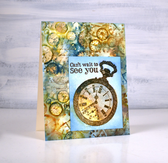
Time to show off a new Darkroom Door beauty today. Darkroom Door’s latest release is now available and I chose the ‘clocks’ texture stamp for a vintage style card. Darkroom Door is always coming out with fresh new ideas and sometimes expand older themes and collections. The clocks are also available as a full background stamp. Having a smaller texture stamp featuring clocks is going to be wonderful for journal pages. I paired it with another DD stamp, pocket watch.
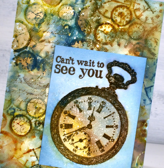
I used the texture stamp to fill my background by stamping it four times on a hot pressed watercolour panel. The panel was splattered with masking fluid because that is the mode I am in right now. I inked the clock stamp with a mix of yellow and browns initially, spritzed on the stamp and blended after stamping on the paper. I added the blue and rust a second time round because I needed more contrast.
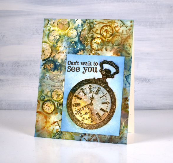
I used the same mix of colours to fill and surround the embossed pocket watch and also embossed a partial sentiment from the ‘long distance’ sentiment set. When I had trimmed and arranged the two layers I decided to add a bit of script over the top using a stamp from the DD correspondence set. I enjoyed working with these images and colours so much you might see them expanded to fill a journal page.
(Compensated affiliate links from Foiled Fox, Scrap n Stamp)
Winter Garden art journal page
Posted: July 14, 2021 Filed under: Art Journal, bookworm, Correspondence, Darkroom Door, gel press, little swirls, nomad, Paper Rose, snowflakes, Trees, Wildflowers Vol 1 | Tags: Art Journal, Darkroom Door stamps, Fabriano art journal, gel press, Paper Rose 12 Comments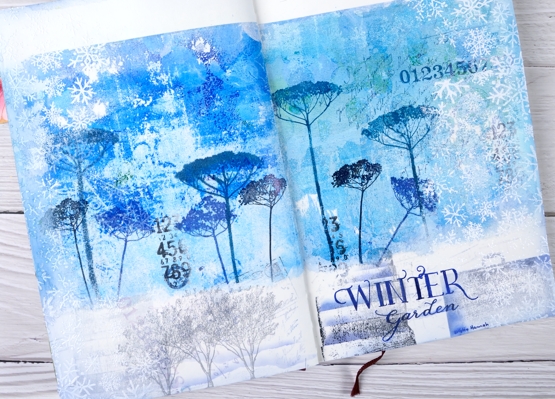
It’s been a while since I worked in my book themed art journal. As I looked over a table covered in gel prints I settled on two blue ones filled with pattern and paint. Both were on rice paper and sized 6″x6″ which is not big enough to cover the whole journal page. I decided to tear a rough edge on the bottom and glue the panels with space above and below.
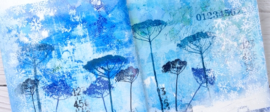
The inspiration for the page is Kristin Hannah’s novel ‘Winter Garden’. I used Darkroom Door floral stamps to decorated the gel prints with blue flowers then added more stamping to the blue area and the white space at the bottom of the page.
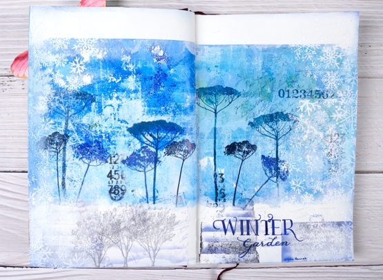
Picking from a few themes in the book I stamped trees to represent the orchard, a suitcase to represent the escape from Leningrad, books from the library where the main character worked. I also used number, correspondence and snowflake stamps to complete the collage.
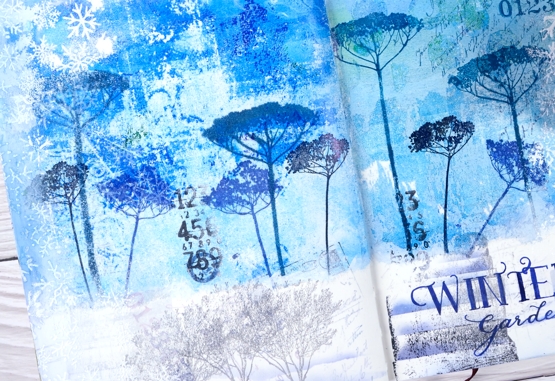
I am always in two minds about adding words to my pages and this time was no exception. Rather than a quote I just added the name of the novel and author. I used pigment and archival inks for all the stamping, white gesso around the edges and white ink and embossing powder to add the snowflake borders.
Have you read any Kristin Hannah? My book club considers ‘The Nightingale’ our best choice so far! We are always searching for good book club reads; if you have any suggestions please leave them in the comments.
Supplies
(Compensated affiliate links used when possible)
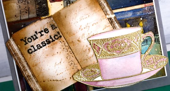
Books & Tea
Posted: November 13, 2020 Filed under: book spines, classic motorcycles, Correspondence, Cup of tea, Darkroom Door, Finetec paints, mini open book, sennelier watercolours | Tags: Darkroom Door stamps, Fabriano Watercolour Paper, Finetec artist mica watercolour paint, sennelier watercolours 7 Comments
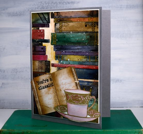
Ever since I created a ‘what should I read next?‘ art journal page I’ve been wanting to do a similar design on a card featuring the Darkroom Door ‘mini book’ and ‘book spines’ stamps. This time a teacup joined the party.
What is more delightful than a cup of tea and a good book? Maybe a cup of tea with another book lover?
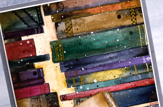
I stamped the book spines stamp three times in hickory smoke archival ink on a piece of hot pressed watercolour paper (which had been splattered with masking fluid). I set out both my Sennelier watercolour paint palette and a Finetec pearlescent set to paint the books. I mainly used the Sennelier paints but added drops and swipes of pearlescent paints here and there for interest.
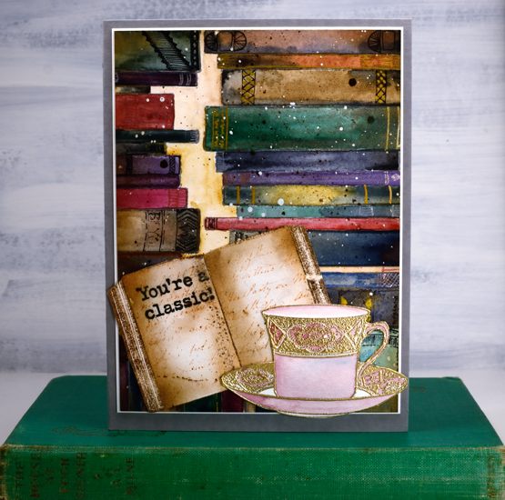
Once the paints dried I used a handful of gel pens to add decoration to the book spines. I decided not to add titles (there is other pressing work to be done after all) just patterns. I removed the masking fluid, blended tea dye and vintage photo ink around the edges then splattered some vintage photo ink over the panel.
The mini book is stamped in versafine vintage sepia and then stamped with a script stamp from the DD ‘correspondence’ set and a sentiment stamp from DD ‘classic motorcycles’. The teacup from DD ‘cup of tea’ set is embossed in gold powder then painted a pale rose. I fussy cut both the book and the cup (I know – I’m surprised too). The book panel is matted in cream then attached to a grey luxe card base. I attached the mini book and teacup to hang over the edges of the panel ever so slightly.
Right now I would love to curl up on the couch with a good book and a cup of tea but I am editing my next online class! I am very excited to get it finished for you as it has a seasonal theme which might interest you right about now.
Supplies
Ink and doodle journal page
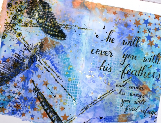
Posted: August 25, 2020 Filed under: Art Journal, Correspondence, Darkroom Door, Feathers, mesh, starry night 12 Comments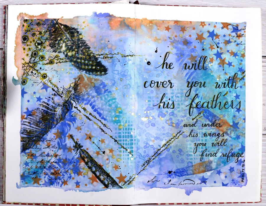
I’ve had oxide inks out on my desk the last few days so I put them to use on a journal page.
I taped the edges of the pages with painter’s tape which gave me a border and held the pages flattish while I worked and painted the page area inside the tape with absorbent ground so I could add water to the inks and move them around a little.
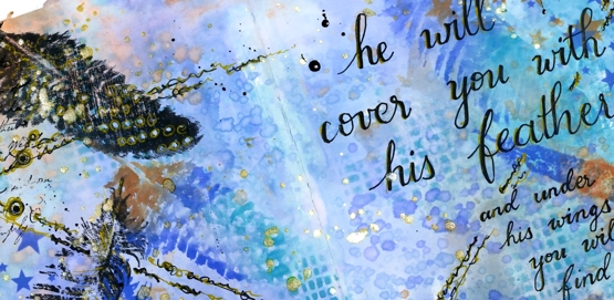
Because the journal pages do not lie flat any more I was only able to pick up sections of ink from my glass mat. To get more coverage I squished ink on a piece of acetate, spritzed it and dragged it across the pages spreading ink as I went.
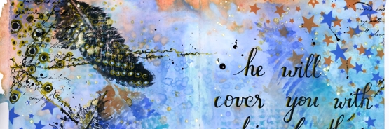
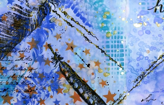
I added visual texture with two stencils from Darkroom Door then stamped feathers from the DD ‘feathers’ stamp set in black and then in the oxide inks. When it came to doodling on the page I used black and gold gel pens and wrote the verse with the same pens. I finished it off with gold and black splatters then removed the tapes to reveal an uneven but quite artistic border.
This was an unplanned experimental page as many of my pages are. I was inspired mainly by what was on my desk and a desire to doodle some of the design and not just stamp.
I am rather frustrated by the paper in this journal. It is good paper but not made to handle wet media so I am limited in creating the kind of blends and wet into wet designs I love to do. The question is do I persevere and learn some new techniques that don’t rely so much on watercolour (gasp) or do I buy a good watercolour journal?
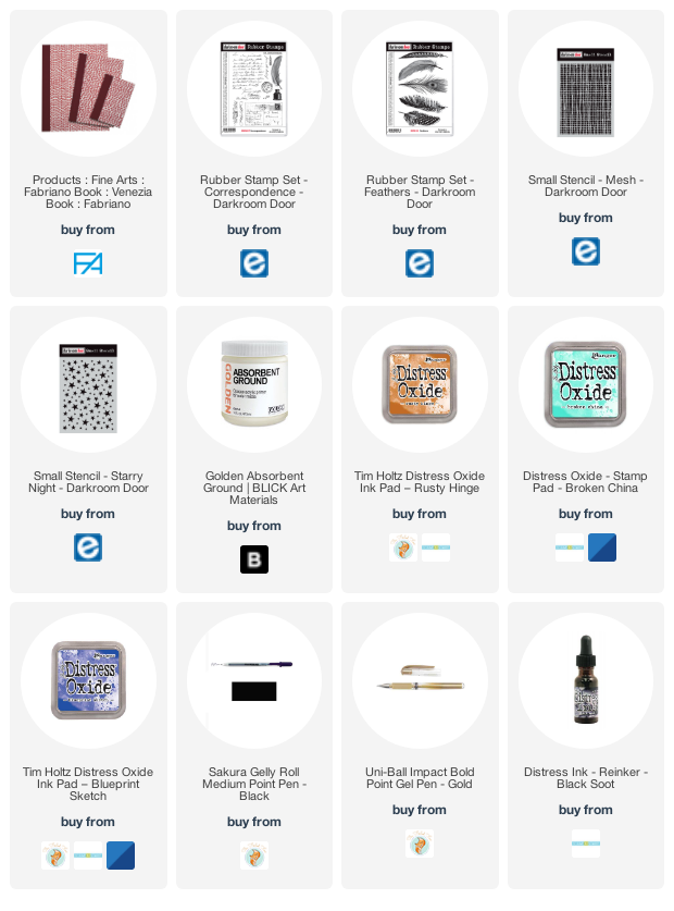
Supplies
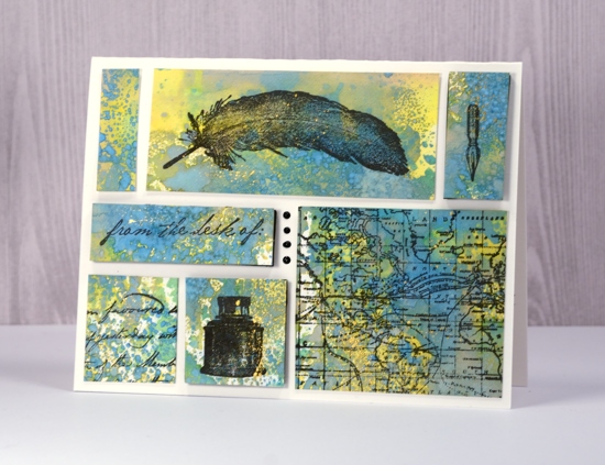
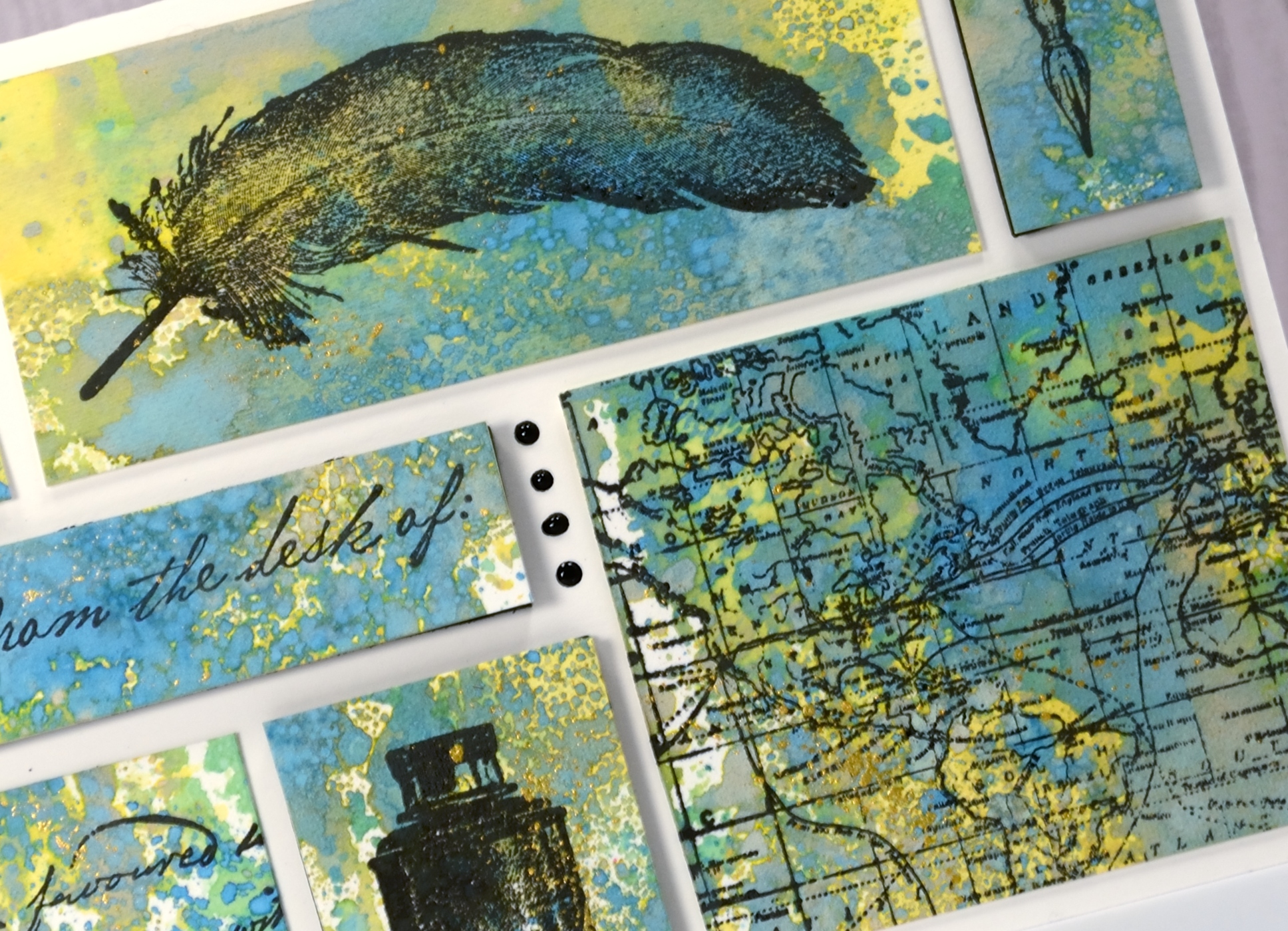
Correspondence
Posted: November 30, 2017 Filed under: Correspondence, World Map | Tags: Darkroom Door stamps, distress oxide inks, Finetec artist mica watercolour paint 7 Comments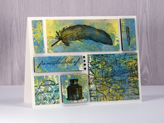
Supplies used:
Stamps: Darkroom Door Correspondence set, Darkroom Door World Map
Ink: Versafine Ink Onyx Black
Distress Oxide inks: Fossilized Amber, Broken China, Cracked Pistachio
Also: gold paint, Nuvo Black ebony crystal drops, black foam sheet, craft mat
Paper: Neenah solar white, Hot pressed watercolour paper
Watercolour wildflowers
Posted: April 5, 2017 Filed under: Correspondence, Wildflowers Vol 2 | Tags: Darkroom Door stamps, Ranger Distress stains 10 Comments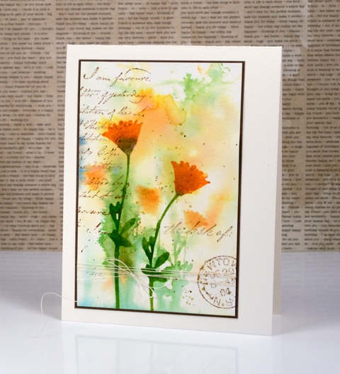
I have a couple more wildflower cards today using stamps from the Darkroom Door set, Wildflowers vol 2. I did some wet into wet watercolour stamping to create backgrounds which give the impression of more plants behind the ones featured in the foreground.
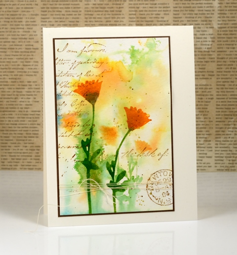
I dropped peeled paint, scattered straw and spiced marmalade distress stain onto a wet watercolour panel and let it move around and blend. When it was still damp I inked one of the wildflower stamps in spiced marmalade and peeled paint stain and stamped it on the panel. The image blurred a little but still looked like flowers. I let the panel dry completely before stamping similar but larger flowers in the same stains but with added rusty hinge stain at the base of the flower head.
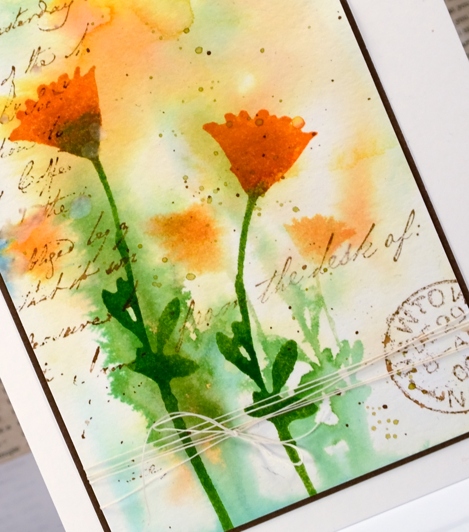
To give the panel an aged look I added images from the ‘Correspondence‘ set in vintage sepia ink with water drops and splatters of stain over the top. I tied some vintage linen thread around the panel and matted with brown to finish it off.
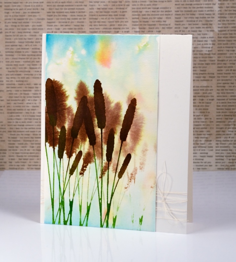
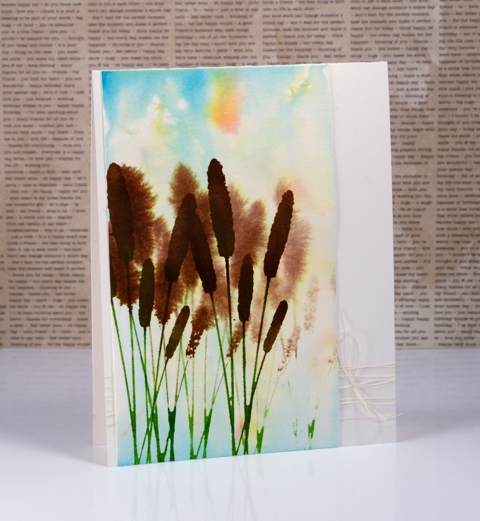
Although I used some of the same techniques for the cattails card I didn’t add any vintage elements so it has a cleaner more modern look over all. I still started with a watery blend of distress stains (broken china, scattered straw and spiced marmalade) over the whole watercolour panel. I stamped the cattails stamp a couple of times into the damp background which gave it a bit of depth and movement I think. Once the stamping was dry I stamped again over the top to get sharper foreground images.
Thanks for dropping in today.
Supplies
Stamps: Wildflowers vol 2 , Correspondence (Darkroom Door)
Inks: Spiced Marmalade, Peeled Paint, Rusty Hinge, Scattered Straw, Vintage photo, Broken China distress stains (Ranger)
Paper: hot pressed watercolour paper (Fabriano) brown cardstock
Also: vintage linen thread


