
Can’t wait to see you
Posted: November 9, 2022 Filed under: clocks, Correspondence, Darkroom Door, pocket watch | Tags: Darkroom Door stamps, Fabriano Watercolour Paper, Ranger Distress inks 4 Comments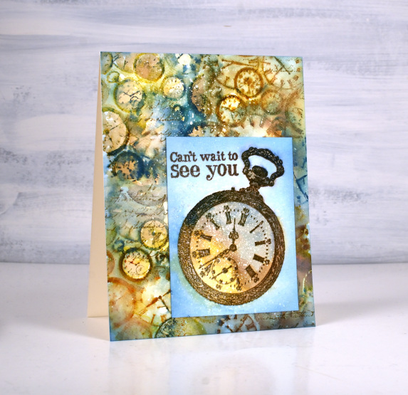
Time to show off a new Darkroom Door beauty today. Darkroom Door’s latest release is now available and I chose the ‘clocks’ texture stamp for a vintage style card. Darkroom Door is always coming out with fresh new ideas and sometimes expand older themes and collections. The clocks are also available as a full background stamp. Having a smaller texture stamp featuring clocks is going to be wonderful for journal pages. I paired it with another DD stamp, pocket watch.
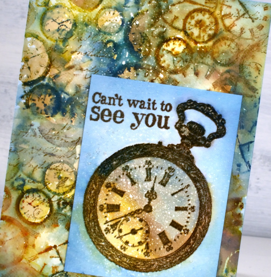
I used the texture stamp to fill my background by stamping it four times on a hot pressed watercolour panel. The panel was splattered with masking fluid because that is the mode I am in right now. I inked the clock stamp with a mix of yellow and browns initially, spritzed on the stamp and blended after stamping on the paper. I added the blue and rust a second time round because I needed more contrast.
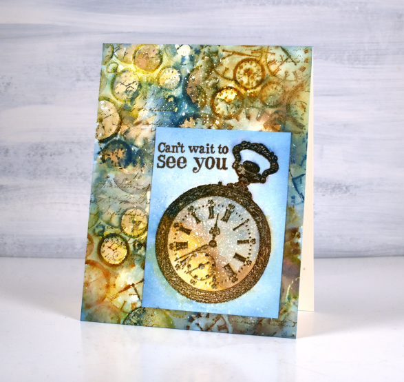
I used the same mix of colours to fill and surround the embossed pocket watch and also embossed a partial sentiment from the ‘long distance’ sentiment set. When I had trimmed and arranged the two layers I decided to add a bit of script over the top using a stamp from the DD correspondence set. I enjoyed working with these images and colours so much you might see them expanded to fill a journal page.
(Compensated affiliate links from Foiled Fox, Scrap n Stamp)


What a spectacular background! I’m always fascinated with your color combinations. The blue gives more of that vintage look that I love. I also love that you achieved some crisp images with the watery ones.
It is quite some time since I added a comment, but I am sure many of your regular viewers will be inspired by this card and its message, so apt as we hopefully and tentatively move forward through and from the Covid 19 epidemic. I could use a large supply of this card and its message; but I could equally use use a card which expresses appreciation of a recent visit and looks forward to future occasions.
I just love the mix of the pocket watch and the background clocks which look great and the colours with the brown and the blue together give it a bright but vintage feel..a really beautiful card Heather. x
This is dreamy! Your layers in the background are wonderful — so much depth! And there’s that Uncharted Mariner again. Love all the colors you used. You have a great eye for what works together to make your cards gorgeous art. Thank you for giving me ideas to ponder.