
Ink and doodle journal page
Posted: August 25, 2020 Filed under: Art Journal, Correspondence, Darkroom Door, Feathers, mesh, starry night 12 Comments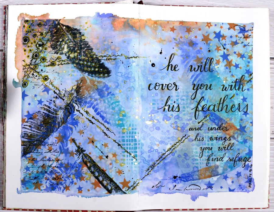
I’ve had oxide inks out on my desk the last few days so I put them to use on a journal page.
I taped the edges of the pages with painter’s tape which gave me a border and held the pages flattish while I worked and painted the page area inside the tape with absorbent ground so I could add water to the inks and move them around a little.
Because the journal pages do not lie flat any more I was only able to pick up sections of ink from my glass mat. To get more coverage I squished ink on a piece of acetate, spritzed it and dragged it across the pages spreading ink as I went.
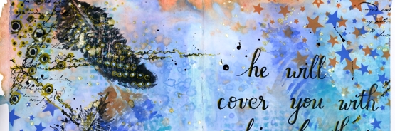
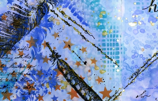
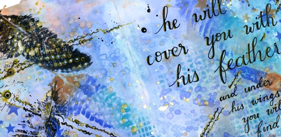
I added visual texture with two stencils from Darkroom Door then stamped feathers from the DD ‘feathers’ stamp set in black and then in the oxide inks. When it came to doodling on the page I used black and gold gel pens and wrote the verse with the same pens. I finished it off with gold and black splatters then removed the tapes to reveal an uneven but quite artistic border.
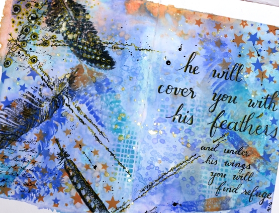
This was an unplanned experimental page as many of my pages are. I was inspired mainly by what was on my desk and a desire to doodle some of the design and not just stamp.
I am rather frustrated by the paper in this journal. It is good paper but not made to handle wet media so I am limited in creating the kind of blends and wet into wet designs I love to do. The question is do I persevere and learn some new techniques that don’t rely so much on watercolour (gasp) or do I buy a good watercolour journal?
Supplies


Great journal spread
Absolutely gorgeous! I need to get my art journal out but it’s SO misshapen, it’s hard to accomplish anything, lol! But you’ve inspired me!
So Nice
So beautiful and inspiring!!! I am sitting here for the longest time just gazing at it. I love it when you add your doodles as they add so much. Love it!
This is one of the most beautiful journal pages I have ever seen…and I am around alot of ‘hard-core’ art journalers who do amazing work. You have so much depth in these pages; the composition is wonderful! I keep seeing little details and layers! Were you pleased with the Absorbent Ground? My vote?…having learned from you that watercolour papers are not created equal…I’d say, if you can find a good quality paper – GO FOR THE WATERCOLOUR JOURNAL!♥ TFS and Blessing my day!
Thank you Clelie, I feel like I have a lot to learn in art journalling but I also feel that the learning and experimenting is part of the journalling. When I look at this page I can see things I’d change or add. This is actually the second ink and doodled page I did, I’m not sure if I will share the other; maybe I will add to that one and share it another day.
Thanks for your vote, I ordered a 100% cotton watercolour paper art journal!!
A very pretty background Karen with the blue and orange tones, and love the added feathers and sentiment. Beautiful with lots of interest Karen. x
Sorry Heather I think I was having a funny five minutes and thought I was on Karen Dunbrook’s blog and was interrupted and finished the comment in a hurry. A good job I came back to check where I had got to..lol. This is a gorgeous journal page with so much beautiful detail. x
Hi Pat, not to worry, I have done the same thing in the past! And it’s a compliment to be mistaken for Karen Dunbrook.
Thanks for your kind words.
Absolutely beautiful page. I would push outside your comfort zone (or maybe do both and get a watercolour journal as well) as this is absolutely stunning. X
Thank you Niki, I think I am going to do both; I’ve ordered a new watercolour journal but I want to keep working in the old one too. Stay tuned!
I can’t wait to see what you create.