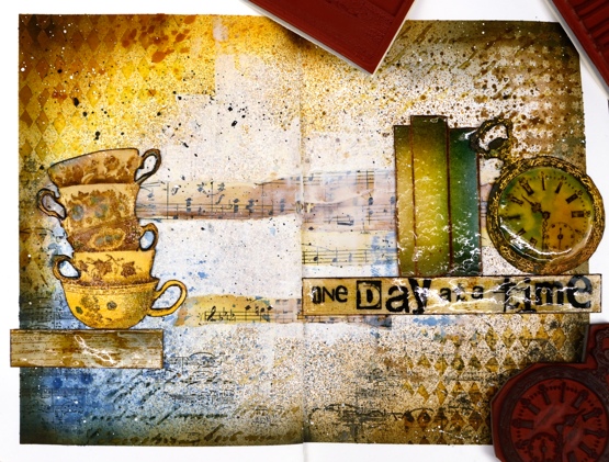
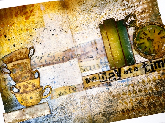
A Day at a Time journal page
Posted: January 20, 2021 Filed under: alphabet medley, Art Journal, book spines, Darkroom Door, diamonds, handwritten script, plaid, pocket watch, sheet music, teacups, Woodgrain | Tags: Darkroom Door stamps, Darkroom Door stencils, Ranger Distress inks, Ranger Distress stains, WOW embossing powders 7 Comments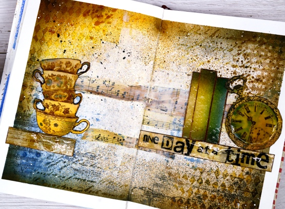
This page is in one of my Fabriano art journals. I’ve mentioned before that I have a love/hate relationship with these journals as the pages are not really meant for watercolour and I always want to do watercolour. I can’t bear to quit though because there are quite a few completed pages in the journals and I want to get to the end.
I began this spread with some inspiration pages open on my Pinterest ‘journal‘ board but no real plan; I was after a look but didn’t have a theme. I rarely use my distress stain sprays as sprays; I usually paint with them but this time I taped the edges of the pages then put the book in my recycle paper box and sprayed with vintage photo, faded jeans and wild honey spray stains. I then sprayed some water but as I mentioned, this paper doesn’t act like watercolour paper so the stains didn’t blend and move.
Next I added some texture with modelling paste through the Darkroom Door diamonds & handwritten script stencils. Once that dried I blended round the edges of the pages with faded jeans, vintage photo, wild honey and black soot distress inks which highlighted the added texture. I was happy with my chosen colours but still didn’t know what the focus should be. I coloured some strips of sheet music and added Darkroom Door ‘plaid’ and ‘sheet music’ stamping here and there.

Initially I wanted to use the pocket watch and the teacups so I stamped them in vintage photo and swiped them through diluted inks to pick up colour as well as adding colour with a paint brush. Once they were painted and cut out I clear embossed the clock face three times with high gloss embossing powder to look like glass and used normal clear embossing powder for the cups.
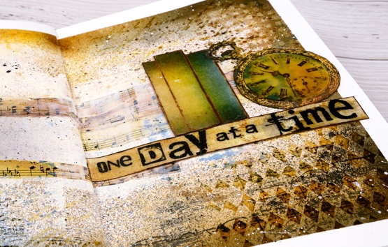
To brighten up the centre of the double page I ended up spreading white absorbent ground over the strips of sheet music and out towards the edges. Then began the longish process of turning the page into a composition. After much rearranging I realised that the tower of teacups and the pocket watch need a third element so I tried a floral piece then just a single shelf (stamped with DD woodgrain background stamp) and finally realised the ‘book spines’ stamp would probably work again. Honestly I’m not trying to put that stamp in every single journal page. Even with the books it still took a while to balance the layout and come up with some words. I finally decided on ‘one day at a time’ stamped on the shelf with the DD alphabet medley stamps. As Vicky Papaioannou often does on her amazing art journal pages, I finished with both black and white splatter then removed the masking tape before gluing down my elements.

It’s nothing like my initial inspiration photos on Pinterest but it did give me some good practice at adding texture and layers to my art journal, two things I don’t find easy. I only have one of my art journal pages on youtube as there is so much humming and ha-ing as I work out what I want. If I cut out the pondering parts is an art journal page process something you’d like to see in a video?
Supplies
(Compensated affiliate links used when possible)
Virtual Coffee
Posted: May 4, 2020 Filed under: brick wall, coffee time, Darkroom Door, handwritten script, Stencils, World Map | Tags: Darkroom Door stamps, Darkroom Door stencils, Ranger Distress inks 4 Comments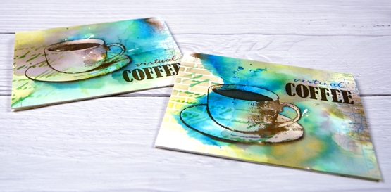
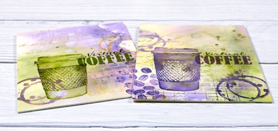
I posted a coffee themed card using the Darkroom Door ‘coffee time’ set recently which prompted a request for a pack of coffee themed cards. These ones are on their way to Australia, and were made with the addition of the word ‘virtual’ because, well, you know why. I rarely do multiples and when I do they are never exactly the same. This time I did four of one colour scheme with the cup and saucer stamp from Darkroom Door’s ‘coffee time’ set and then four more in a different colour scheme a little more like my original coffee card featuring the take out cup from the same set.
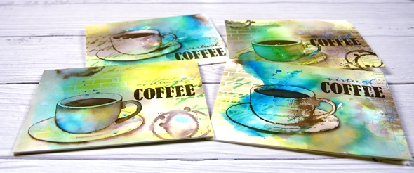
The nice thing about making multiples is starting with a large panel to create the background. I used hot pressed watercolour paper for both sets and splattered masking fluid over the panel first. I like the addition of some random white spots and shapes from a masking fluid splatter but often I wish I’d done more when I remove it from the finished project. To create the cards above I smooshed ground espresso, salty ocean and crushed olive distress inks on my glass mat. I spritzed water over the inks until they were spread over a large area then placed the watercolour panel over the top and moved it around to soak up random coloured patterns. When I turned the panel over there were blotches of each colour along with blends and blank areas. I did some further spritzing and picking up of colour until I was satisfied with the coverage. Once the panel was dry I cut it into four pieces and used both the DD handwritten script and brick wall stencils to add pattern in the same three distress inks. I used blending brushes to apply the ink which gave me soft blends that faded away into nothing at the edges.
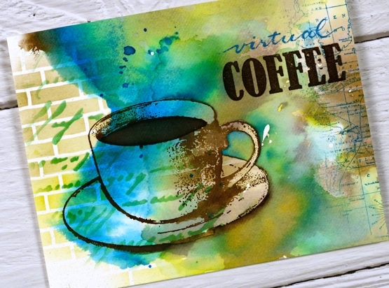
Next I add coffee cups and coffee stains in ground espresso ink. I blended ink inside the cup on some panels but on others I added more ink outside the cup to darken the negative space. It is hard to describe my process with the cups as I did each one differently and kept playing with the three inks until I was happy with the results. On a couple of the panels I added a partial print of the world map stamp. With all the artsy stuff done I just needed to add the ‘virtual coffee’ label. The word ‘coffee’ is part of one of the word stamps from the set so I masked, stamped and embossed then wrote the word ‘virtual’ above and embossed that. I was interested to see I could write the words with a papermate flair pen and then if I covered it with clear embossing powder straight away I could get the shiny embossed effect. I do have clear embossing pens but it is impossible to see what I’ve written with a clear pen!
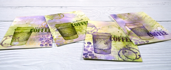
I also did four more cards with the takeaway cup stamp using much the same technique and a peeled paint/scattered straw/dusty concord colour scheme. I added a few stamped coffee beans to these ones; the ‘coffee time’ set is a very cool collection of stamps.
Thanks for joining me for ‘virtual coffee’ today. I hope your week is off to a good start.
Supplies
Coffee with a friend
Posted: April 22, 2020 Filed under: coffee time, Darkroom Door, global postmarks, handwritten script, World Map | Tags: Brusho, Darkroom Door stamps, Darkroom Door stencils, distress oxide inks, Ranger Distress inks 6 Comments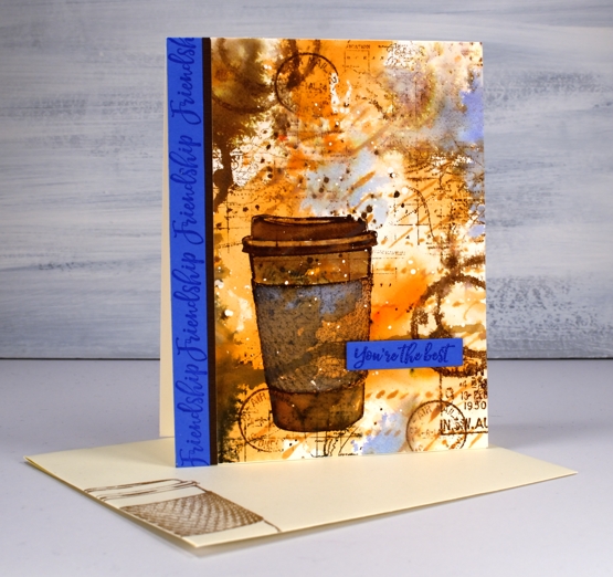
Are you missing the coffee shops? I’m sure you are missing your friends and perhaps you are missing coffee with friends. This one is for a friend of mine who loves her coffee!
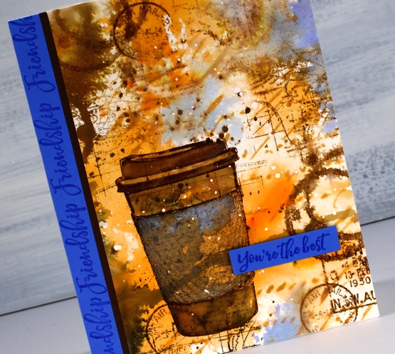
I began with a piece of hot pressed watercolour paper and splattered a few drops of masking fluid over the whole thing. Once the masking fluid was dry I sprinkled sandstone brusho on my glass mat, spritzed the brusho with water and swiped this panel through it. It took a few swipes before I had an orange and brown abstract background. I added some dark brown brusho on one side and spritzed that to make it blend and spread a bit. Once I’d dried that I blended through the new Darkroom Door ‘handwritten script’ stencil with rusty hinge oxide ink.
At this point the panel was very much just an abstract background so I stamped the cup from DD ‘coffee time’ in gathered twigs distress ink and blended the stamping with some water and extra ink. The set also has a coffee cup stain stamp so I added that here and there, spritzing it to make it blurry. I stamped some postmarks from the ‘global postmarks’ set because I can’t help myself.
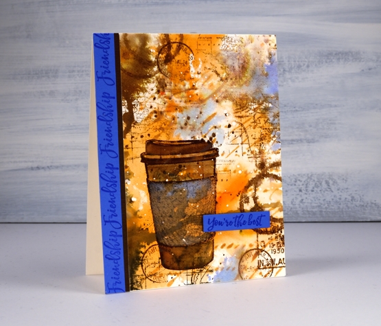
Unfortunately the coffee cup did not stand out enough from the background and the background itself looked incomplete. DD world map stamp and blueprint sketch distress ink came to the rescue. I stamped the world map several times on the panel in gathered twigs ink and then, to break up the orange and brown monopoly, I added some blueprint sketch ink in just a few places. I found some blue cardstock that matched the blue and stamped ‘friendship’ and ‘you’re the best’ from the DD ‘friendship’ strip of sentiments to finish the card. Oh, and I added a thin strip of brown cardstock separating the blue from the patterned panel.
I’m glad I didn’t give up on this panel; it is just the thing for my friend who I will enjoy a coffee with again one day.
Supplies