Trees from strips and scraps
Posted: November 29, 2023 Filed under: Darkroom Door, Dies, Music Background, Penny Black, sheet music, starry night | Tags: Darkroom Door stamps, Penny Black creative dies, Penny Black stamps 5 Comments
I have a few more cards made from leftovers today; I love leftovers, especially the ones in the fridge but the paper ones are nice too! The card above is my favourite of the mix and it is so simple, just strips and stars. I stamped one of those strips with a music background stamp but the rest are just patterned or gold shimmer cardstock.
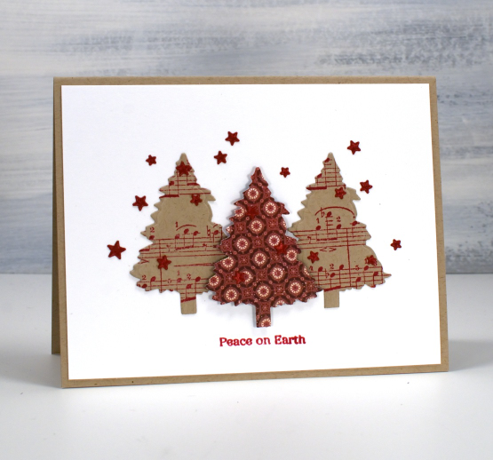
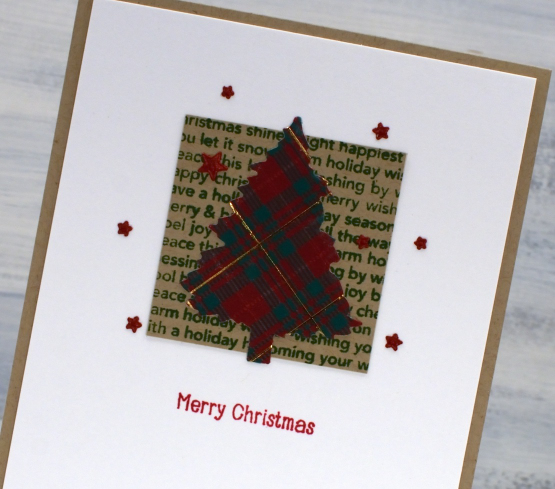
I made use of one tree die for the rest of today’s cards, it’s from Penny Black’s ‘evergreen tree‘ die set. The trees above are cut from stamped and patterned paper. The tree below I cut from a piece of kraft that I had coloured my own plaid pattern on with coloured pencils and a gel pen. It was fun but not necessary if you want to be quick. The pretty music stamp featured below is from Darkroom Door and the larger one above from Penny Black.

The final card shows another tree cut with the same die but from printed plaid paper attached to a panel stamped with an old holiday word stamp. The little stars I cut with the PB ‘starry night die’ and used small sentiments from the PB holiday snippets set. It is an old set now but I use it all the time on Christmas cards.
Today’s post features affiliate links to The Foiled Fox. If you buy through these links I receive a small commission at no extra cost to you.
A Day at a Time journal page
Posted: January 20, 2021 Filed under: alphabet medley, Art Journal, book spines, Darkroom Door, diamonds, handwritten script, plaid, pocket watch, sheet music, teacups, Woodgrain | Tags: Darkroom Door stamps, Darkroom Door stencils, Ranger Distress inks, Ranger Distress stains, WOW embossing powders 7 Comments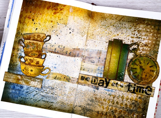
This page is in one of my Fabriano art journals. I’ve mentioned before that I have a love/hate relationship with these journals as the pages are not really meant for watercolour and I always want to do watercolour. I can’t bear to quit though because there are quite a few completed pages in the journals and I want to get to the end.
I began this spread with some inspiration pages open on my Pinterest ‘journal‘ board but no real plan; I was after a look but didn’t have a theme. I rarely use my distress stain sprays as sprays; I usually paint with them but this time I taped the edges of the pages then put the book in my recycle paper box and sprayed with vintage photo, faded jeans and wild honey spray stains. I then sprayed some water but as I mentioned, this paper doesn’t act like watercolour paper so the stains didn’t blend and move.
Next I added some texture with modelling paste through the Darkroom Door diamonds & handwritten script stencils. Once that dried I blended round the edges of the pages with faded jeans, vintage photo, wild honey and black soot distress inks which highlighted the added texture. I was happy with my chosen colours but still didn’t know what the focus should be. I coloured some strips of sheet music and added Darkroom Door ‘plaid’ and ‘sheet music’ stamping here and there.

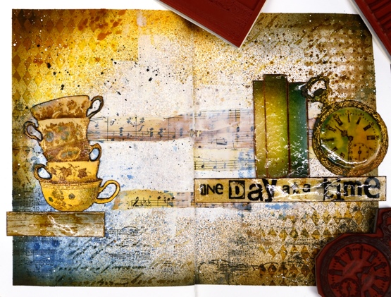
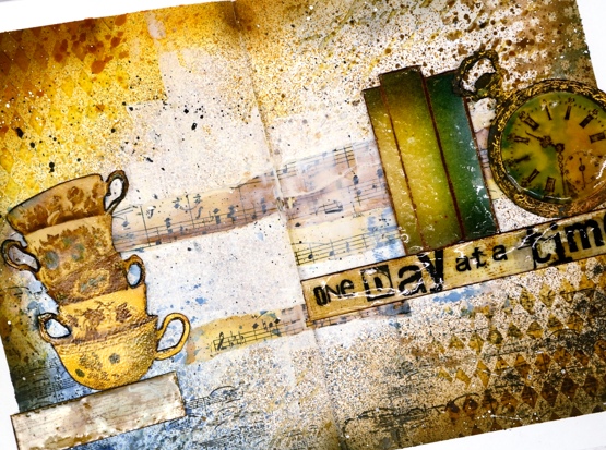
Initially I wanted to use the pocket watch and the teacups so I stamped them in vintage photo and swiped them through diluted inks to pick up colour as well as adding colour with a paint brush. Once they were painted and cut out I clear embossed the clock face three times with high gloss embossing powder to look like glass and used normal clear embossing powder for the cups.
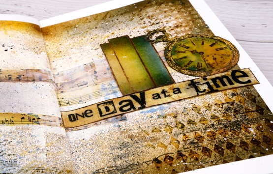
To brighten up the centre of the double page I ended up spreading white absorbent ground over the strips of sheet music and out towards the edges. Then began the longish process of turning the page into a composition. After much rearranging I realised that the tower of teacups and the pocket watch need a third element so I tried a floral piece then just a single shelf (stamped with DD woodgrain background stamp) and finally realised the ‘book spines’ stamp would probably work again. Honestly I’m not trying to put that stamp in every single journal page. Even with the books it still took a while to balance the layout and come up with some words. I finally decided on ‘one day at a time’ stamped on the shelf with the DD alphabet medley stamps. As Vicky Papaioannou often does on her amazing art journal pages, I finished with both black and white splatter then removed the masking tape before gluing down my elements.

It’s nothing like my initial inspiration photos on Pinterest but it did give me some good practice at adding texture and layers to my art journal, two things I don’t find easy. I only have one of my art journal pages on youtube as there is so much humming and ha-ing as I work out what I want. If I cut out the pondering parts is an art journal page process something you’d like to see in a video?
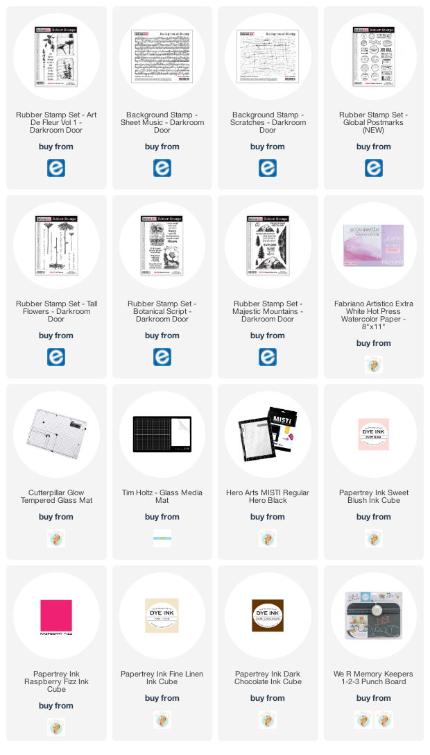
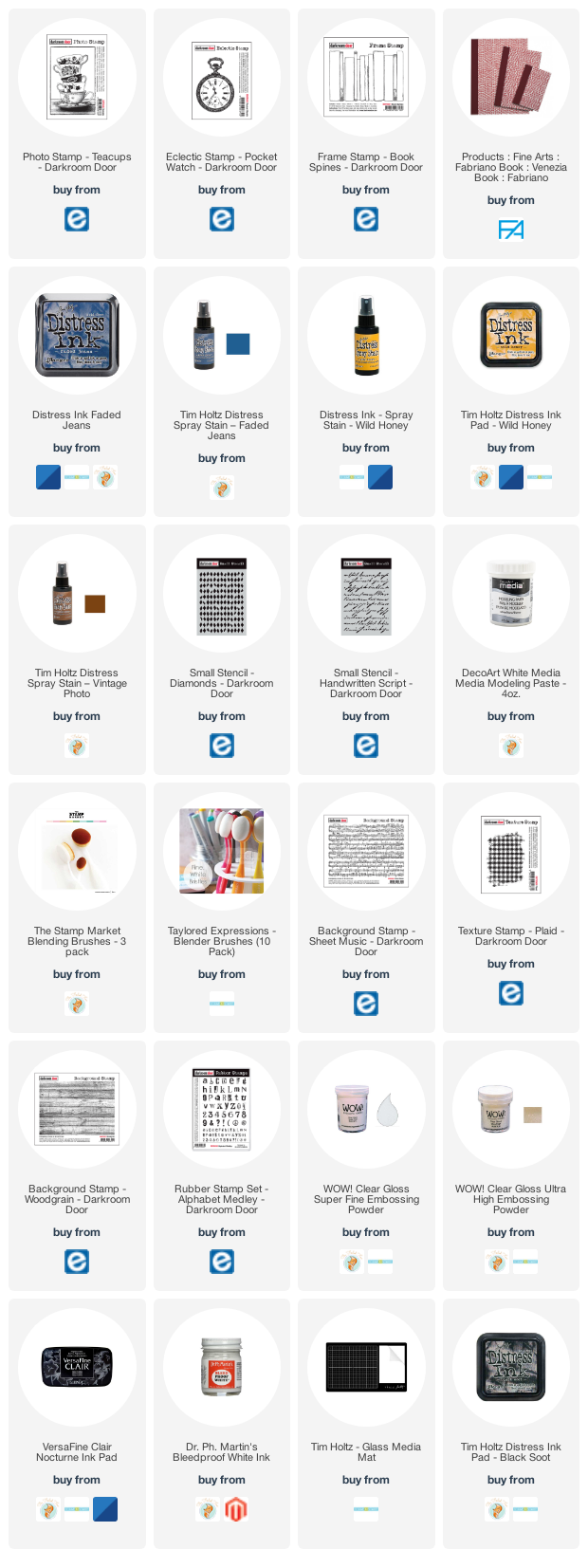
Supplies
(Compensated affiliate links used when possible)
Art de Fleur
Posted: October 23, 2020 Filed under: Art de Fleur vol 1, Botanical Script, Darkroom Door, global postmarks, majestic mountains, scratches, sheet music, tall flowers | Tags: Darkroom Door stamps, Fabriano Watercolour Paper, Papertrey ink 5 Comments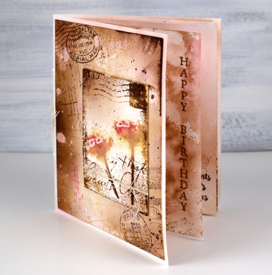
This card is the cardmaking version of going down a rabbit hole. I know how easy that is on the interwebs, but apparently it is possible with a card as well. What started out as a vintage style two layer card became a little more than that. I just kept thinking of stamps and papers and techniques I wanted to add.
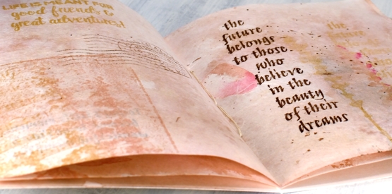
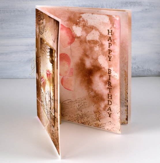
I decided an insert would be nice; I don’t usually put anything on the inside of my cards so an insert is quite the departure. An insert turned into two inserts which is more like a little book when you count both sides of the pages!
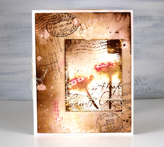
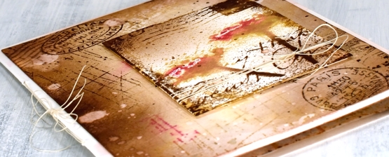
The front panel, which was initially going to be the whole deal features several Darkroom Door stamps: scratches background stamp, sheet music background stamp, global postmarks, art de fleur vol 1.
For the whole card I stuck with four Papertrey ink cubes (listed below); I used them for stamping, watercolouring, splattering and blending with a blending brush.
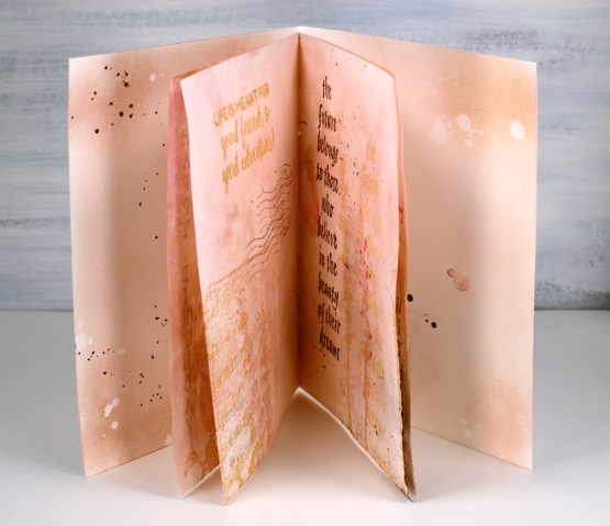
The inside pages are not watercolour paper but handmade paper from a Hanji gifts in Toronto. It is handmade paper with rose petals embedded in it. It was very white straight out of the packet so I smooshed some brown and pink inks on my glass mat, diluted with water then swiped the paper through the ink. This resulted in the colour I wanted but removed the sizing and wrinkled the paper. I ironed it, which did the trick then added little bits of stamping on every page. I used a couple of sentiments and some quote stamps, all from Darkroom Door and reused the same background stamps plus the floral stamps from the Art de Fleur set.
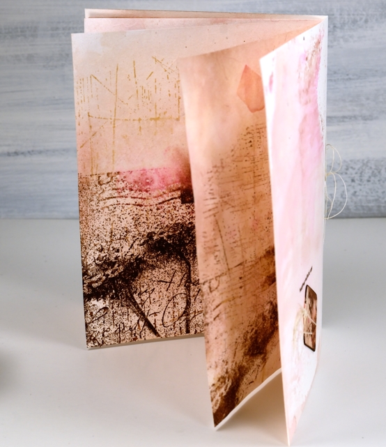
To join it all together I poked holes and used some fine twine for a little ‘book binding’. With all the ‘vintaging’ I did on the front panel and pages the card base itself looked very stark so I swiped that through some smooshed ink too so everything would co-ordinate.
I was so deep down the rabbit hole by this point I realised an ordinary envelope was just not an option so I pulled out another sheet of the handmade rose petal paper, inked it, ironed it and used my envelope punch board to create an custom envelope, which I failed to photograph. All in all a very satisfying but surprising creative project. Now, back to work!
Supplies