
Poppy birthdays
Posted: February 25, 2020 Filed under: little lowercase letters, My Favorite Things, phrase builder you, Pink Fresh studio, poppy background, YAY for you | Tags: Fabriano Watercolour Paper, grafix, My Favorite Things, Pink Fresh studio, Ranger Distress inks, WOW embossing powders 5 Comments
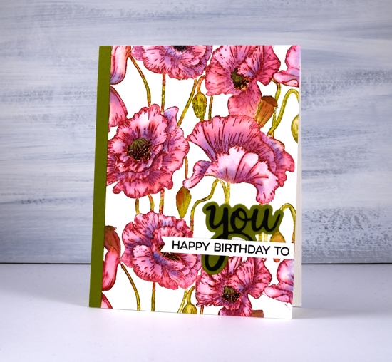
When I pulled out the MFT ‘poppies background’ stamp my intention was to do some loose watercolour with splashes and dabs here and there. As you can see I didn’t manage that; I stayed inside the lines. It was not a fiddly job though, painting this panel. I was surprised at how quickly I was able to get it done. I put the stamp in the stamp positioner along with a piece of cold pressed watercolour paper. Using the papertrey ink cubes I was able to ink the flowers in ‘scarlet jewel’ and the buds, stems and pods in ‘ripe avocado’. If the inks ended up on the wrong section I either wiped it off or let it be because a little green in the flowers or red in the stems doesn’t matter.
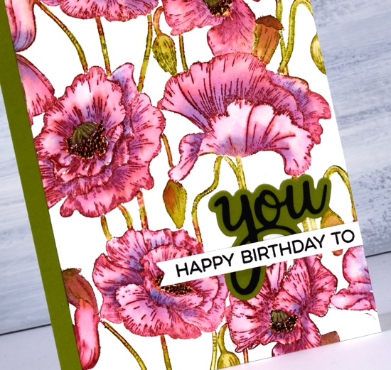
I blended one petal at a time which sounds time consuming but they are large petals so it wasn’t bad. As I finished blending the ink into one petal I picked up a little bit of ‘blueberry sky’ ink and dropped it into the wet petal at the inner edge. When I came to the poppy centres I got mixed up and did the centres black and the surrounding dots in yellow so to fix it I went over the yellow with little black dots then went over the black center with a gold gel pen to turn it yellowish! Adding a sentiment took me an age, not because it was too fiddly but because I couldn’t decide how to arrange it and my embossing game was definitely off. I ended up with ‘you’ from Pink Fresh ‘phrase builder: you’ set overlaid with a sentiment from MFT ‘YAY for you’ set.
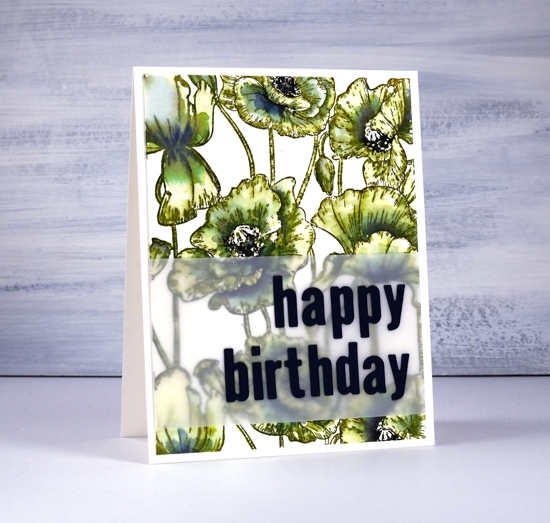
The second panel definitely involved more slap dash watercolouring but I still managed to stay inside the lines. I stamped the whole image in distress peeled paint which blends very easily with water. As I wanted some depth of colour in the centres of the flowers I smooshed faded jeans and chipped sapphire distress inks on my glass mat and picked up ink to paint shadows on the petals. I inked up the centres of the poppies with a chipped sapphire marker then chose a dark blue (not black) cardstock to die-cut the letters for the sentiment.
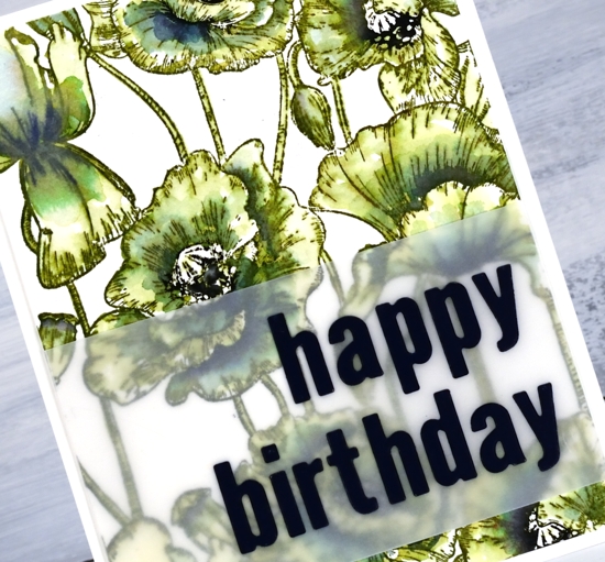
The die-cut letters got a little lost when placed straight on the busy background panel so I attached them to a piece of vellum first. To line them up I perfectly magnets held the vellum in place on my Wendy Vecchi magnetic board and, because it was vellum I was able to see a whole grid of lines to get them straight vertically and horizontally. I was pretty happy with this arrangement and might just have to do all my sentiments on vellum to experience the same satisfaction! I put ‘stick it’ adhesive on the back of the dark blue cardstock before I cut the letters so I would not have to deal with glue or tiny bits of tape for each letter. That would not have given me any satisfaction at all!
Even though green poppies are a bit of an oddity I think that one ended up being my favourite.
In other news make sure you pop over to the Penny Black blog to enter their giveaway; you have until March 1. I will be sharing plenty of new PB product in the weeks to come.
Supplies


Love this Heather…looking forward to new classes in the spring.
These are both absolutely gorgeous Heather, and if I had to pick one I think I would go for the pretty green version too as it is so different but works really well. x
Really lovely cards Heather. I, too, prefer the stunning green one.
Would never have thought of stamping poppies in green but I love that card. The first one is pretty too
Both cards are gorgeous! I especially love the pink poppies!