Poppy birthdays
Posted: February 25, 2020 Filed under: little lowercase letters, My Favorite Things, phrase builder you, Pink Fresh studio, poppy background, YAY for you | Tags: Fabriano Watercolour Paper, grafix, My Favorite Things, Pink Fresh studio, Ranger Distress inks, WOW embossing powders 5 Comments
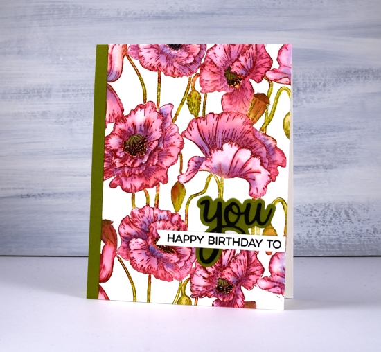
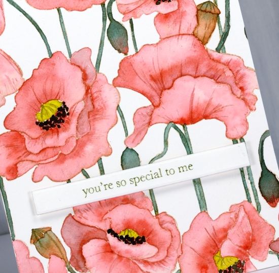
When I pulled out the MFT ‘poppies background’ stamp my intention was to do some loose watercolour with splashes and dabs here and there. As you can see I didn’t manage that; I stayed inside the lines. It was not a fiddly job though, painting this panel. I was surprised at how quickly I was able to get it done. I put the stamp in the stamp positioner along with a piece of cold pressed watercolour paper. Using the papertrey ink cubes I was able to ink the flowers in ‘scarlet jewel’ and the buds, stems and pods in ‘ripe avocado’. If the inks ended up on the wrong section I either wiped it off or let it be because a little green in the flowers or red in the stems doesn’t matter.
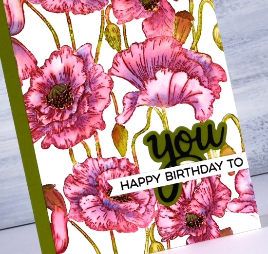
I blended one petal at a time which sounds time consuming but they are large petals so it wasn’t bad. As I finished blending the ink into one petal I picked up a little bit of ‘blueberry sky’ ink and dropped it into the wet petal at the inner edge. When I came to the poppy centres I got mixed up and did the centres black and the surrounding dots in yellow so to fix it I went over the yellow with little black dots then went over the black center with a gold gel pen to turn it yellowish! Adding a sentiment took me an age, not because it was too fiddly but because I couldn’t decide how to arrange it and my embossing game was definitely off. I ended up with ‘you’ from Pink Fresh ‘phrase builder: you’ set overlaid with a sentiment from MFT ‘YAY for you’ set.
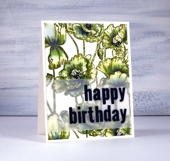
The second panel definitely involved more slap dash watercolouring but I still managed to stay inside the lines. I stamped the whole image in distress peeled paint which blends very easily with water. As I wanted some depth of colour in the centres of the flowers I smooshed faded jeans and chipped sapphire distress inks on my glass mat and picked up ink to paint shadows on the petals. I inked up the centres of the poppies with a chipped sapphire marker then chose a dark blue (not black) cardstock to die-cut the letters for the sentiment.
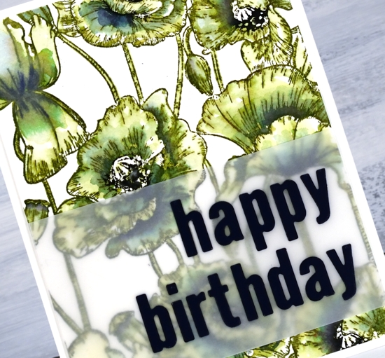
The die-cut letters got a little lost when placed straight on the busy background panel so I attached them to a piece of vellum first. To line them up I perfectly magnets held the vellum in place on my Wendy Vecchi magnetic board and, because it was vellum I was able to see a whole grid of lines to get them straight vertically and horizontally. I was pretty happy with this arrangement and might just have to do all my sentiments on vellum to experience the same satisfaction! I put ‘stick it’ adhesive on the back of the dark blue cardstock before I cut the letters so I would not have to deal with glue or tiny bits of tape for each letter. That would not have given me any satisfaction at all!
Even though green poppies are a bit of an oddity I think that one ended up being my favourite.
In other news make sure you pop over to the Penny Black blog to enter their giveaway; you have until March 1. I will be sharing plenty of new PB product in the weeks to come.
Supplies
Poppy background watercoloured
Posted: August 29, 2019 Filed under: Ink to Paper, My Favorite Things, poppy background | Tags: Faber-Castell Polychromos Colour Pencil, Ink to Paper, My Favorite Things, Ranger Distress inks, sennelier watercolours 10 Comments
I did not plan to post this stamp two days in a row but it was there on the desk within reach and you have to admit it is perfect for no line watercolour because the outlines are so clear. So, instead of working on my to do list I painted on this card.
I stamped on hot pressed watercolour paper with antique linen distress ink for a pale but easily seen outline image. I decided to use my sennelier watercolours because they are lovely to work with. I used a red, a yellow, and a green. To make brown I mixed the red and green, then to make the black I added more red and green. The green I used for the stems and buds was not straight from the pan I mixed in a little red first to make it more olive toned. Once again I was happy with the results from sticking to a limited palette. You can definitely try the same approach with whatever watercolours you have on hand. If your green is a little bright, as mine was, add in a bit of red.
I painted the petals one at a time with diluted red and while each was wet I added more red where I wanted depth or shadow. I paid attention this time to whether I was painting buds or pods. I painted the buds with green blended into red and painted the pods in browns. I added a little of the mixed green to my yellow before painting the poppy centres and used my red+green=almost-black to paint the little black dots around the poppy centres.
After all the painting was done I added a bit more shading and veins on petals with polychromos coloured pencils.
I decided to use another of the lovely little sentiments from my new Ink to Paper ‘tagged’ sentiments set. To achieve a matching olive green on the sentiment I stamped with versafine clair shady lane ink but I stamped on a scrap first so I could get a pale ‘second generation’ print.
I hope you see how versatile this stamp is; it worked beautifully with the loose distress stain watercolour and the more precise no-line watercolour. I have an idea for a third look too.
Supplies
Poppy Background split
Posted: August 28, 2019 Filed under: Ink to Paper, My Favorite Things, poppy background | Tags: Ink to Paper, My Favorite Things, Ranger Distress stains 10 Comments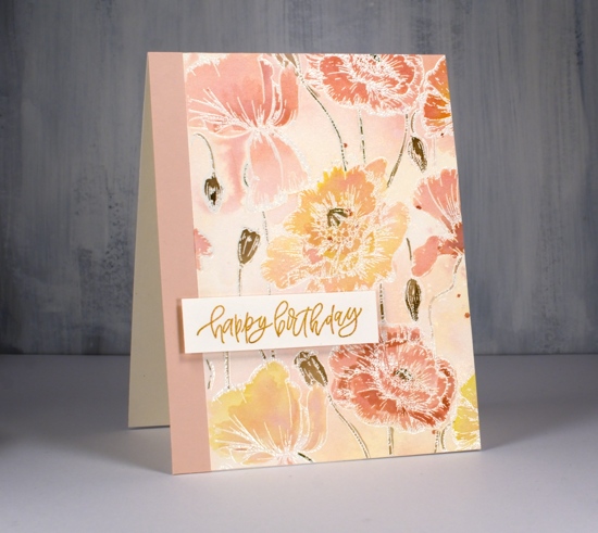
While I was a way this lovely MFT poppy background stamp arrived. (Thank you Foiled Fox) It has lovely detail which I will try to paint more realistically later but I thought I’d start with some emboss resist loose colour.
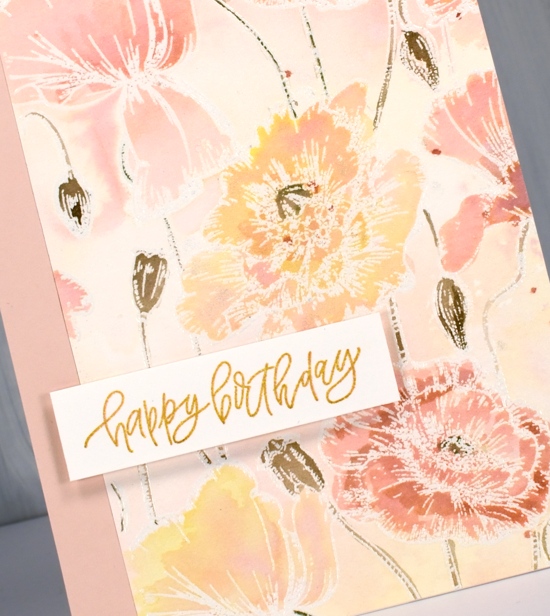
I embossed the large stamp on hot pressed watercolour paper with versamark and clear embossing powder. Next I sprayed some tattered rose, scattered straw and spun sugar distress stains on my glass mat then spritzed some homemade gold shimmer spray (interference gold pearl-ex mixed with water) to blend the three colours. I swiped my panel through the stains and discovered the spun sugar was not showing so I added more tattered rose and swiped again. Once it dried I had a panel with patches of blended colour, some yellow some pink, some blends of the two.
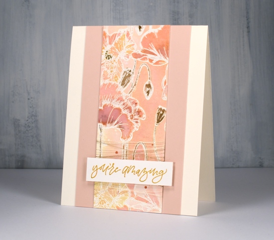
I painted all the poppies and buds by picking up undiluted stain from my glass mat with a paint brush. I did a few layers letting them dry in between coats so I could see how dark they were. I used frayed burlap to paint the stems, buds and pods and splattered a few dots of tattered rose over the finished panel.
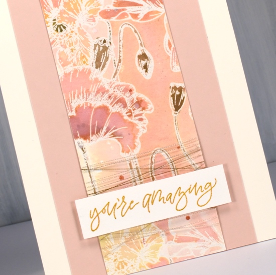
Rather than make a big square card I cut the panel in two pieces and paired them with some blush coloured cardstock and cream card bases. The sentiments are from an ‘Ink to Paper’ set called ‘tagged’. It is a sweet little set featuring several different fonts and nine sentiments. To make my sentiments match my watercoloured panel I stamped them first in versafine clair golden meadow but it was too yellow so I stamped over the top with tattered rose until it was a little more peachy. I think these new stamps are peachy don’t you?
Supplies