
Faith & floral journal page
Posted: February 16, 2021 Filed under: A Pocket Full, Art Journal, Arteza, Footnotes, illustrious, Penny Black, springtime sigh, tranquil buds, watercolour real brush pens | Tags: Art Journal, Arteza, Penny Black creative dies, Penny Black stamps 6 Comments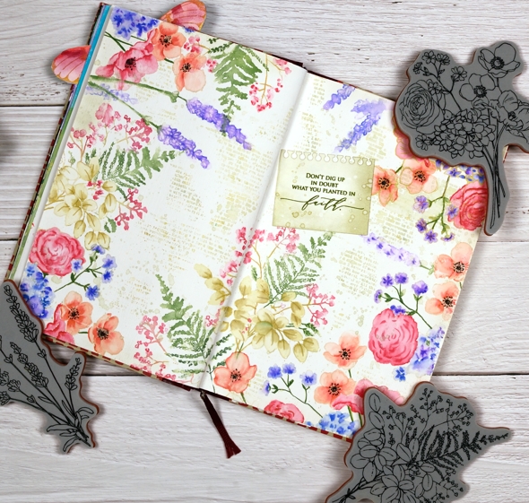
I know it is not spring yet, in fact it is still very winter where I am; we’ve had some of our coldest days and nights just in the last few days. Maybe because it’s so cold now is a nice time to muse about spring.
Sometimes I have a plan for a journal page, other times I work it out as I go along. To begin this one I painted absorbant ground on the journal double page. It is a base preparation a bit like gesso which makes the paper act a little more like watercolour paper. I should probably just switch to a journal with watercolour paper pages but I stubbornly want to keep adding to the this one.
Once the base dried I stamp the Penny Black ‘springtime sigh’ stamp in one corner then coloured with Arteza real brush pens. The colouring is not precise, the surface doesn’t react the same as watercolour paper but I found blending with very little water gave me the most control.

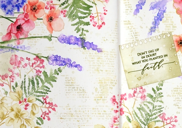
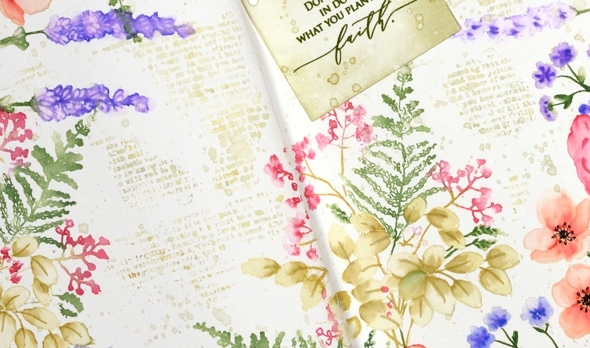
I stamped first with Gina K skeleton leaves amalgam ink which I have used for no-line watercolour in the past but it remained too distinct on the journal page so I switched to antique linen which worked a bit better. I restamped and coloured springtime sigh several times then decided I wanted fewer little flowers to colour! I switched to the new Penny Black ‘illustrious’ stamp which co-ordinated well. I don’t know for sure but I wonder if both stamps were drawn by the same artist, the scale and style is similar.

When stamping the ‘illustrious’ stamp I was able to ink most of the stamp with Arteza real brush pens which cut down on the colouring. I still used antique linen ink on the large open leaves then blended with a marker to shade the leaves. When I had almost framed the double page spread I switched to the PB ‘tranquil buds’ stamp to add some lavender.
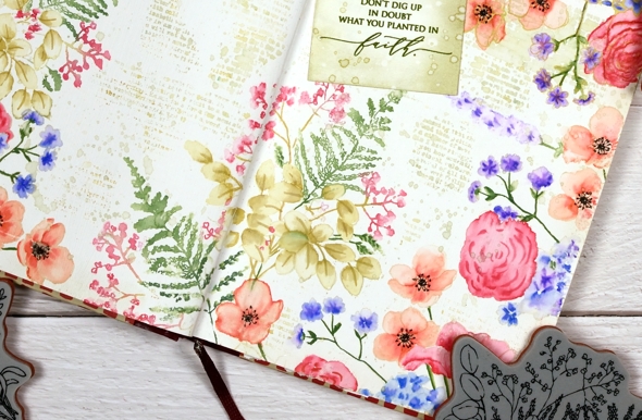
Next came the tricky stage when I had to decide what was happening with the empty area of the journal page. Writing, stamping, hand lettering or empty space were all options. I decided a bit of ‘filler’ in the shape of a text stamp would be nice and instead of the large script one I often use I chose the smaller typed text stamp from the PB ‘footnotes’ set. I stamped it here, there and everywhere in old paper ink, often spritzing with water before stamping so it just stamped a blurry pattern. I also added splatter then chose a phrase from the new PB ‘inspirational sentiments’ set.
Is that cute notebook die-cut covering a failed stamping attempt? Yes it is but I’m quite happy with that because the notebook page looks sweet. I cut it with a die from the PB ‘a pocket full’ set. I love how this page turned out even though I had no idea at the beginning it would progress this way. That’s the beauty of a journal page.
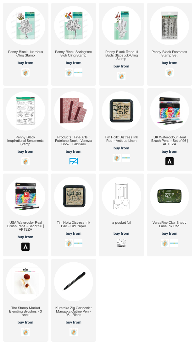
Supplies
(Compensated affiliate links used when possible)


Do beautiful, as always! Appreciate the time you put into explaining how you made this, your comments are always so helpful. Springtime soon, darling, soon!
WOW! What a wonderful, Spring garden, Heather! So uplifting and something to open up and look at often!
What an incredible amount of work went into this! It’s just gorgeous! The colors are so spring-like, something that is a long way off here too. I can’t begin to imagine painting all this but thank you for sharing it.
Gorgeous Heather…a wonderful double page in your journal and I love the colours and mixture of flowers with the script in the background. We have had much milder weather for a couple of days and it is supposed to be reaching nearly 16C/61F at the end of the week. Don’t suppose it will last for long though. x
STUNNING! Your journal page is so uplifting with these gorgeous spring colours and flowers. LOVE the soft text filler … really gives this a vintage look. LOVE IT Heather! xx
I applaud your stubbornness! Absolutely beautiful results! Love the layout and color palette!!!