Moving Alcohol Inks with Air – Video
Posted: February 3, 2021 Filed under: Alcohol Ink, Brutus Monroe, CAS, Dies, grafix, light as a feather, nesting squares, Penny Black, polar bears, Tutorial, Waffle Flower | Tags: grafix, grafix craft plastic, Penny Black creative dies, Penny Black stamps, pinata alcohol ink, Ranger Alcohol Ink, Tutorial, video 16 Comments
I’ve had the alcohol inks out recently and spent some time trying to get soft wavy patterns on craft plastic. I have seen several artists who do this technique beautifully but I am very much still a beginner with it. I have a few cards to share today along with a video showing my process for two of the panels. I worked on white craft plastic from Grafix which is heavyweight and totally opaque. For most of the panels featured today I used only two alcohol inks plus plenty of 99% rubbing alcohol; each panel was created with a metallic and a non-metallic ink.
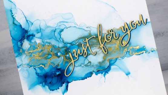
This first panel was made with turquoise AI and gilded alloy AI; I love the range of blues when diluted with rubbing alcohol. The ‘for you’ Penny Black die cut is two layers of turquoise cardstock topped with one layer of pale gold.
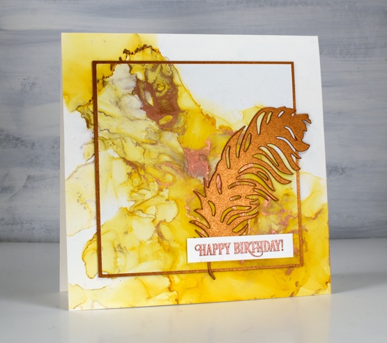
This warm toned card was made with honeycomb AI and mined alloy AI then die cut with a WaffleFlower square nesting die. I used the WaffleFlower additional square dies to cut a larger copper square then added the PB ‘light as a feather’ die cut and a PB birthday sentiment embossed in Brutus Monroe penny embossing powder.
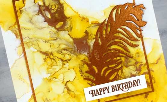
You can see the process for both cards above in the video below.
As I am working on alcohol ink panels I am evaluating my process and working out what I want to try next. I just bought a cheap lazy susan to work on the blown flowers and I’m pretty sure I don’t need to use as much coloured ink when I make the initial drops. You can be sure I will let you know what I discover.
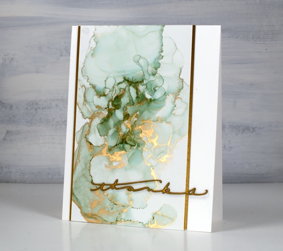
I have a couple more cards made off camera using the same technique shown in the video. The card above features juniper AI and statue alloy AI with the PB ‘many thanks’ die cut from antique gold cardstock and stacked twice.
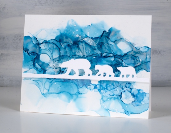
When this panel was finished it reminded me of photos of the artic and far north where the icebergs and glaciers are made up of beautiful shades of blue. It’s kind of a cross section perspective where we can see below and above the ice the bears are walking on. I did use two blue inks plus a silver for this one, ranger turquoise and stream with pinata silver. The bear die is ‘polar bears’ from Penny Black.
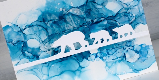
We’ve been watching Cecilia Blomdahl’s youtube channel about her life on Svalbard, an island off the north coast of Norway. She lives in the world’s northern most town. Polar bears are definitely around so you don’t wander outside the village without your weapon!
Supplies
(Compensated affiliate links used when possible)
Marbled hearts
Posted: February 2, 2021 Filed under: Alcohol Ink, All my hearts, Foiling, Penny Black | Tags: Foiling, Penny Black creative dies, Penny Black stamps, Ranger Alcohol Ink 7 Comments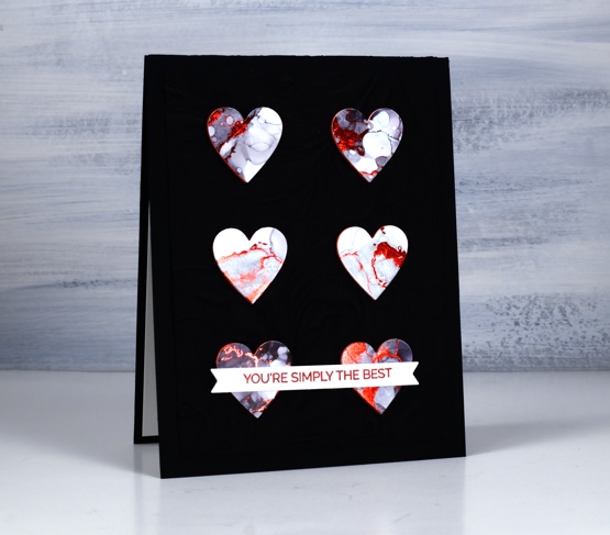
These hearts were cut from another alcohol inked panel, this one done with only pitch black ink from Ranger. The ink was diluted with rubbing alcohol and moved around on the panel with air and tilting. I also added some bubbles or circles by splattering some rubbing alcohol over the pattern.
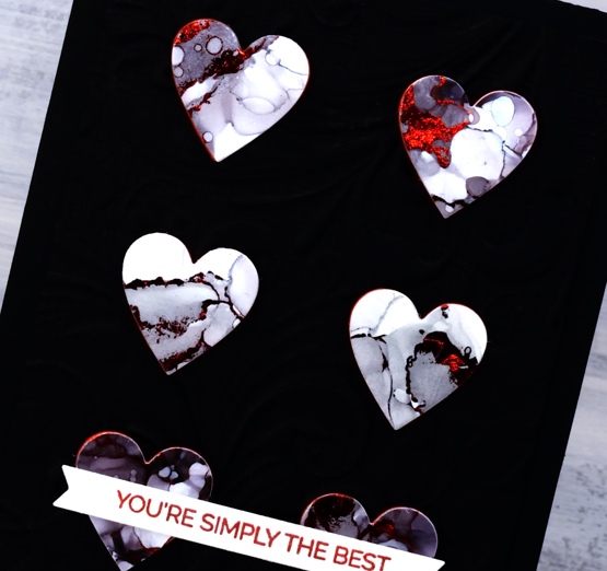
I didn’t add foil straight away after completing the panel instead I came back to it days later and ran the panel through the minc with some red foil over the top. The red foil stuck to some nice fine lines as you can see as well as some chunkier sections. What you can’t see is an area where a large blob of foil attached itself. I avoided that area when cutting six hearts using a small heart die from the Penny Black set ‘all my hearts’. I cut six hearts from red foam to pop the hearts up on the card base.
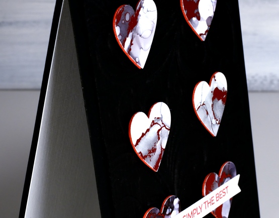
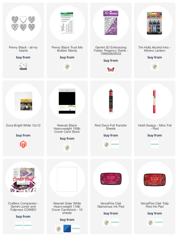
I tried several times to take a photo which would show the dry embossed background behind the popped up hearts but I didn’t succeed. It seems you’re not going to see the shine of the foil and the dimension of the background in one photo. If you click on the photo above you might be able to see the texture a bit better. I used the embossing folder that came with the Gemini Junior, it’s called ‘Regency Swirls’ and it is one of those very detailed 3D folders. I am wanting to add to my embossing folder collection, I’d love to hear your suggestions for some subtle ones and some really fancy ones.
I completed the card with a sentiment from Penny Black’s ‘trust me’ set stamped in red ink and popped up on a narrow banner. Thanks for dropping in today; I will be back tomorrow with an alcohol ink tutorial video.
Supplies
(Compensated affiliate links used when possible)
Alcohol ink + foil
Posted: January 28, 2021 Filed under: Alcohol Ink, all the birthdays, Concord & 9th, Metropolitan, Penny Black, poppy edger | Tags: Concord & 9th, Penny Black creative dies, Penny Black stamps, pinata alcohol ink, Ranger Alcohol Ink 11 Comments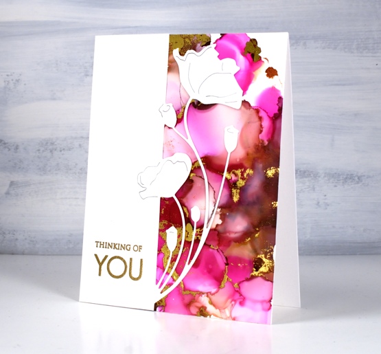
When I get the alcohol inks out I always have a stack of panels at the end of the session. Some sit around and never amount to much but others wait for inspiration to hit. This one was created on white craft plastic (Grafix dura-bright white) with ginger and burgandy Ranger alcohol inks and Pinata magenta. I added gold foil using the minc well after the inks had dried.
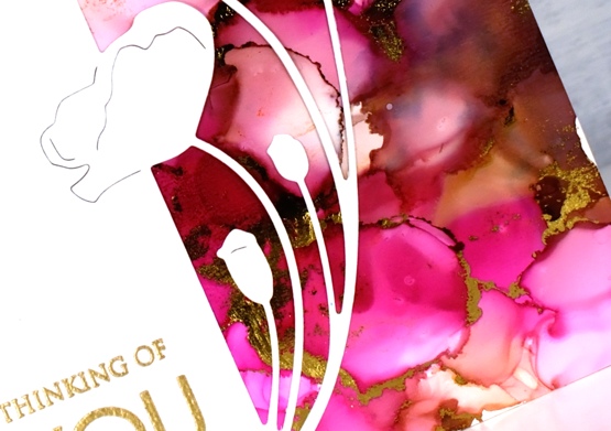
Sometimes it is possible to make the foil stick soon after finishing the inking. There is a sweet spot as far as letting the ink dry enough that it is not gooey but not so much that it is dry to touch. The sections that will hold the foil are the ‘seams’ between colours where the ink is thicker. If you press foil on these areas when they are a bit tacky you can get it to stick with just a bit of burnishing. If the panel has dried it sometimes possible to get foil to stick by running the panel through a minc or laminator using some heat. This can be risky as sometimes the foil sticks to more of the panel than you expected.
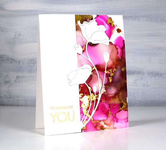
When I ran this panel through the minc I was happy with most of the foiling but there were a few sections that didn’t look great so I just used the part that looked good and covered the rest with this pretty poppy edger from Penny Black. I finished the card with a gold embossed sentiment from the PB ‘only you’ set.
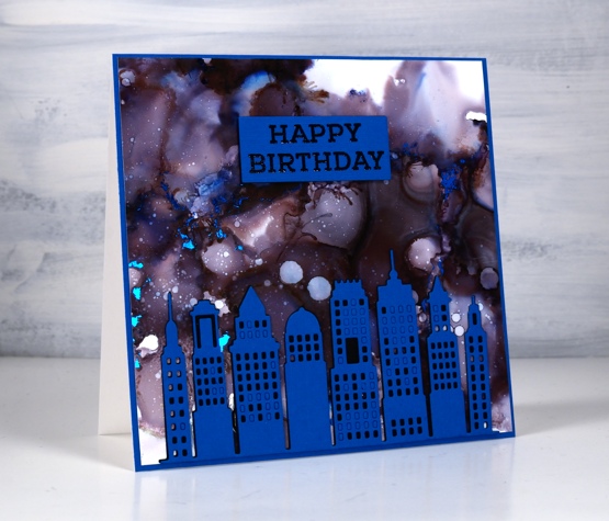
This second panel amazes me because it was created with only black alcohol ink plus rubbing alcohol. The blue and burgandy tones appeared when the black ink was diluted. Cool huh? I pressed the blue foil onto this panel at just the right time to get it to stick when the seams were tacky. It is hard to get it to show in the photo but there are small sections of blue foil here and there across the sky.
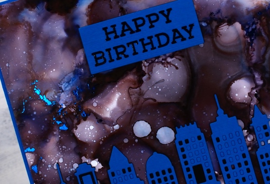
The inking on both panels was pretty experimental, a drop here and there some rubbing alcohol and tilting and blowing the ink to make a random pattern. I cut the Penny Black metropolitan die from both black and blue cardstock then stacked blue on black without removing all the window cut outs. I ended up using spray adhesive on the back of the blue die cut because gluing is not my gifting.
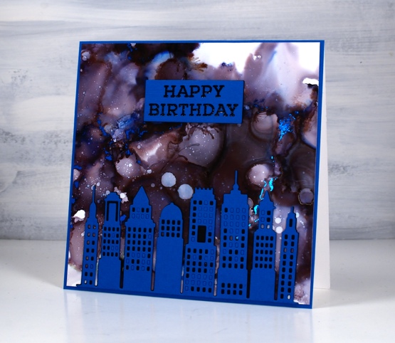
The sentiment is from the Concord & 9 ‘all the birthdays set stamped in black and embossed in clear then stacked up on two layers of black cardstock. More alcohol inks next week; I’m having fun.
Supplies
(Compensated affiliate links used when possible)
For some reason the images did not want to display on this list but if you click the word Supplies, above, you will get to the complete list.
2020’s favourite posts
Posted: December 31, 2020 Filed under: Arteza, Brusho, Coloured pencil, Darkroom Door, Finetec paints, Hand painted, Penny Black, watercolour real brush pens | Tags: Darkroom Door stamps, Darkroom Door stencils, distress oxide inks, Faber-Castell Albrecht Durer Watercolour pencils, Faber-Castell Polychromos Colour Pencil, Finetec artist mica watercolour paint, Penny Black stamps, Ranger Distress inks 6 CommentsI looked through the stats for 2020 to see which posts were viewed the most. It is not necessarily an accurate indicator of favourites but it is fun to look back and see what appealed. I’ve included a link to the original post next to every photo. I’m featuring only cards I made and posted this year. Here they are in no particular order.
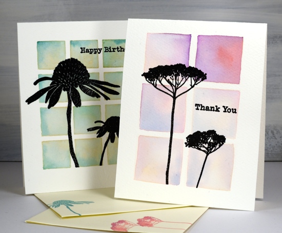
Back in January I used Darkroom Door stencils as a guide to paint watercolour backgrounds for silhouette stamping with DD stamps.
In February as I was preparing to teach a class using pearlescent paints on black watercolour paper I created this embossed and painted card. The class didn’t happen but the plan is still in my mind for either an online or in-person class hopefully some time in 2021.

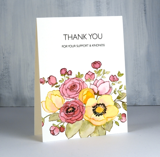
This card and the next favourite feature the same Penny Black stamp and no-line watercolour technique. I used distress inks and markers for the watercolouring on this one.
Same stamp as shown above, Unforgettable from Penny Black but this time watercoloured with Arteza real brush pens.
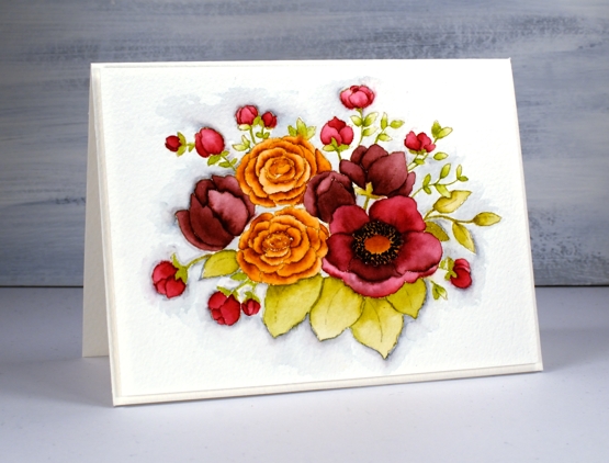

This lilac card along with three other colour schemes featured the ‘lovely lilacs‘ stamp from Penny Black and there is a video tutorial as well.
Another video post once again with Arteza watercolour brush pens this time with Penny Black’s nature’s glory stamp.

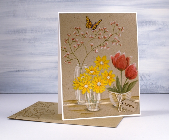
Now this one is a little different, pencil colouring on kraft cardstock, again with a video. 2020 has definitely seen me create the most videos!
This one is also one of my favourites so it is nice to see it as a reader favourite too. It is the second post in the top ten to feature the lovely lilacs stamp from PB.
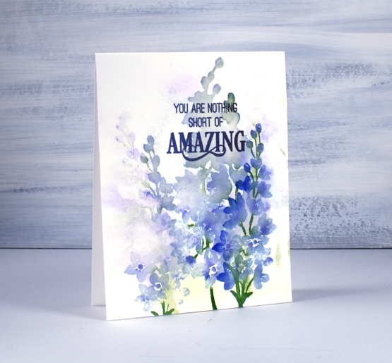

I’m happy to see one of my hand painted pieces in the favourites. This is a brusho & cling wrap painting I did after watching a CeeCee Creations video.
Another video post made the top ten, this one featuring die cut distress oxide painted leaves. This is the only one not featuring flowers.
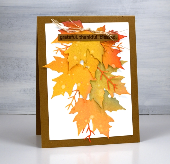
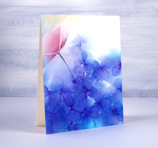
This one just missed out on the top ten so I’m adding it here at the end because I think it might be my favourite of the year. It’s a brusho and cling wrap panels that made me think of hydrangeas so I turned the random patterns into massed flowers.
Thank you for dropping it to read my posts this year. I love sharing the details of my cards, journal pages and creative adventures. In a year when face to face interactions have been limited I have been encouraged over and over by the comments and conversations here on my blog.
It has been my best year ever for producing you tube videos and also the year I fulfilled a long time dream of producing online classes. Again thank you for your support in those endeavours.
I’m looking forward to sharing more creative pursuits on the blog with you in 2021, there will be watercolour and stamping (of course!) but also alcohol ink art, gel printing, lettering and journaling. I hope you are safe and well where you are and pray that 2021 will be a year of health and happiness for you.
Pretty fantastic
Posted: December 29, 2020 Filed under: fragments, Giraffe, glasses, Penny Black, perspective, Pink Ink Designs | Tags: Paper Rose, Penny Black creative dies, Penny Black stamps, Pink Ink Designs 4 Comments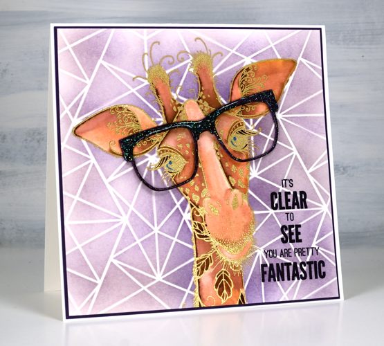
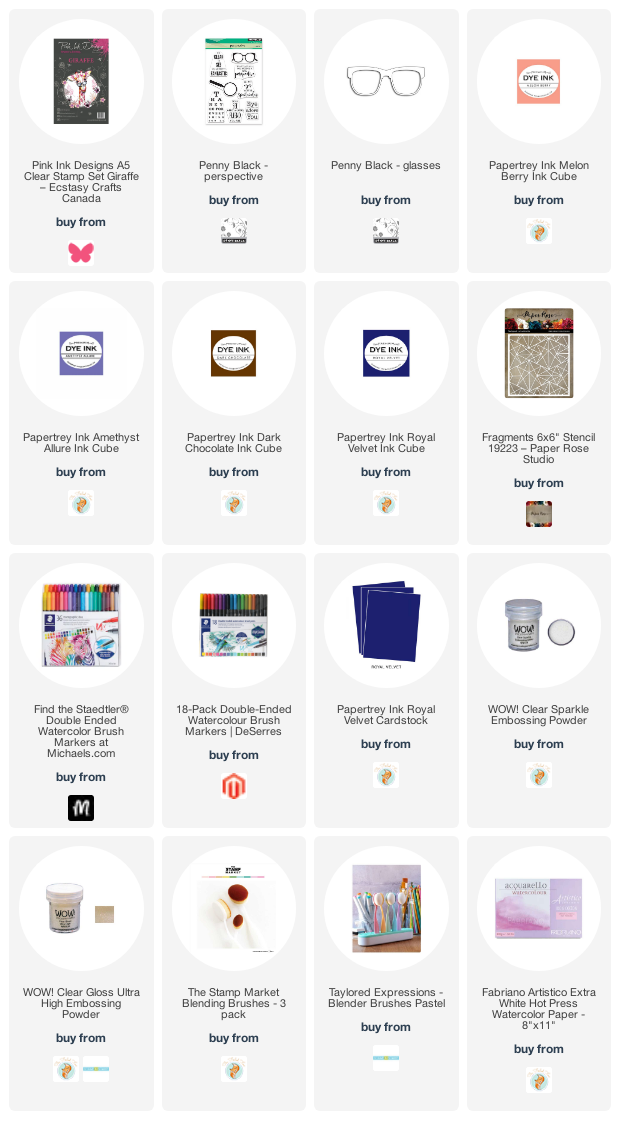
Children’s cards are something of a rarity for me but this one ended up being so much fun I might try them more often. I’ve had this gold embossed giraffe image sitting round for a while. The stamp, from Pink Ink Designs is called ‘giraffe’, no surprises there! It’s a large stamp so I cropped a bit of the neck off so it would fit on a 6×6 card.
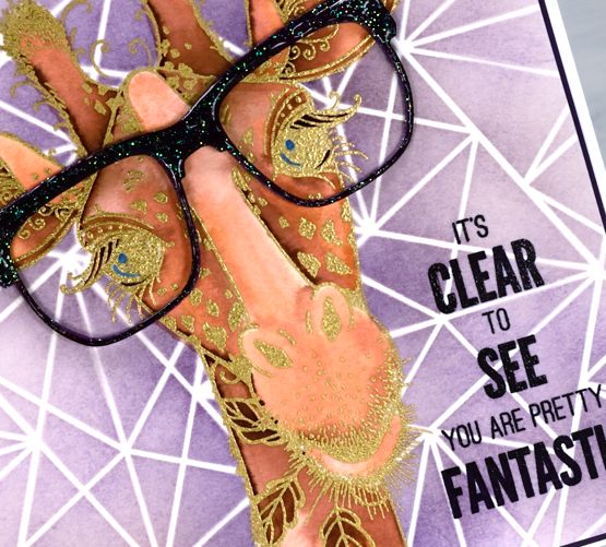
I used Staedtler watercolour markers and papertrey ink cubes to watercolour the giraffe and the amethyst ink cube for the blended background. I decided on the stencil background after I’d finished watercolouring the giraffe so I cut a giraffe shaped mask and positioned it over the giraffe while I used blending brushes and the Paper Rose studio ‘fragments’ stencil.
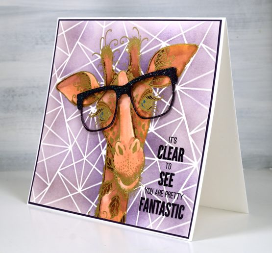
The giraffe stamp set comes with a pair of glasses stamp but I went bigger and sparklier with a die cut from Penny Black. I embossed the purple glasses in clear sparkle powder first then clear gloss ultra high to seal the sparkle and make them shiny. The sentiment is from the PB set ‘perspective’. Pink Ink Designs has some beautiful big animal and fantasy stamps. They totally captured my imagination when I saw them. I’ve already shared a card with the dragon stamp and have one with a sea turtle still to come. Not my usual themes that’s for sure.
Supplies
(Compensated affiliate links used when possible)
No-line Watercolour with Karin brushmarkers
Posted: December 21, 2020 Filed under: frozen vista, Karin brushmarkers, Penny Black, poinsettia poem | Tags: Fabriano Watercolour Paper, Karin brushmarkers, Papertrey ink, Penny Black stamps, Tsukineko Versafine inks 8 Comments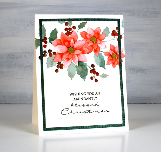
I’m happy to be teaming up with the Foiled Fox again to bring you some more Karin brushmarker experimenting, this time I put them to work on no-line watercolour. I was pretty sure they would do a good job and I wasn’t disappointed. I also discovered that Papertrey Ink’s ‘soft stone‘ ink works well as a base stamping ink for no-line watercolour. To begin I stamped the same Penny Black poinsettia poem stamp on two pieces of hot pressed watercolour paper. On the design above I used only three Karin brush markers (red 209, teal 377 and henna 105) When colouring the leaves I inverted the red marker tip to tip with the teal before colouring to create the more browny green you see on the leaves.
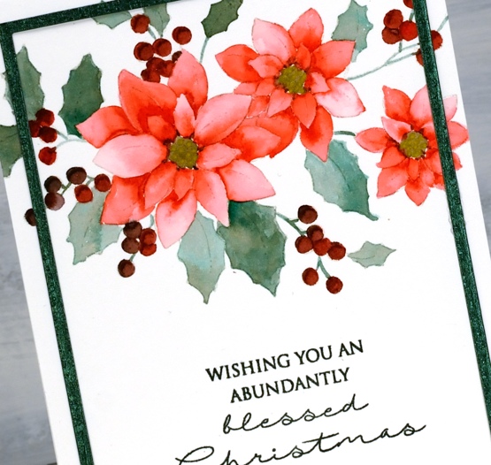
I painted the petals one by one as is usually the case with no-line watercolour and I used the Red 209 marker. I used a slightly different methods for each card. On the above panel I barely touched the marker to the paper in each petal then blended the ink with water to fill the petal. On the panel below I painted a petal with water first then added a dot or two from the marker which flowed into the wet area. The effect is similar but the petals are paler where I applied water first and marker second.

On the second card I used magenta 170, lush green 228 and sepia 074. Once again I did a bit of tip to tip colour blending for the leaves and berries. It takes a bit of trial and error plus some scrap paper for testing to get the right mix of colour when doing the tip to tip blends. After adding ink to a marker tip the first strokes of colour will be the most intense and as you continue to apply ink to paper the intensity will decrease as the colour returns to its original tone. Make sure you visit the Foiled Fox blog where I provide even more detail about today’s projects.

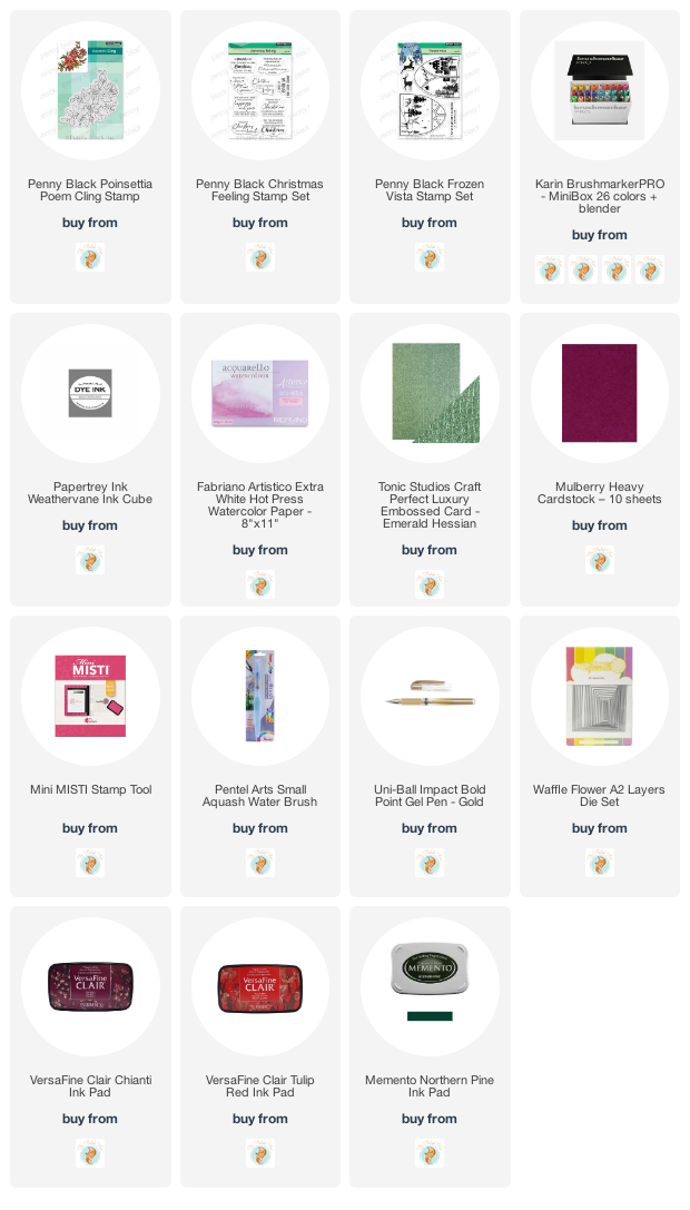
I used a textured shimmer green cardstock to create a die-cut frame for the card at the top of the post. It is easy to cut a narrow frame by using two rectangle dies from the Waffleflower A2 layer dies. For the second card I used mulberry cardstock to create a co-ordinating mat and stamped with both versafine clair tulip red & chianti to stamp the sentiment in a matching colour. When I don’t have the exact ink colour for a sentiment I try a combination of two inks, something a stamp positioner makes quite straight forward. I stamped the sentiment on the first card with my beloved memento northern pine ink. The sentiments are from Penny Black sets, Christmas feeling and frozen vista.
Supplies
(Compensated affiliate links used when possible)
Bethlehem scenes with Karin brushmarkers
Posted: December 17, 2020 Filed under: Ink to Paper, Karin brushmarkers, lighting the way, Penny Black, three kings, Uncategorized | Tags: Ink to Paper, Karin brushmarkers, Penny Black creative dies, Penny Black stamps 2 Comments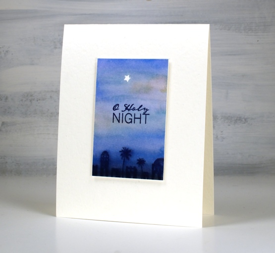
I’ve continued to experiment with the Karin brushmarkers from the Foiled Fox, this time using them for watercolour backgrounds. These three backgrounds feature combinations of rosewood 272, cyan 207, royal blue 045 and black 030.
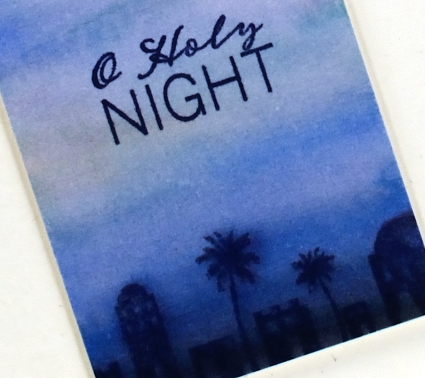
I tried different methods of applying the marker to the hot pressed watercolour paper and found that to achieve smooth transitions from one colour to the next it was better to touch the markers to wet paper. It still worked applying the marker first then the water but I prefer the very soft blends made when the paper was already wet. I don’t think I will often use the markers for backgrounds as it probably uses up ink at a faster rate but little scenes like the one above did not require much application.
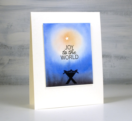
The tiny star was masked by die cutting a star (PB Xmas tree border set) from frog tape (painter’s tape for delicate surfaces) then positioning it firmly on the panel before painting. I stamped the manger above in versafine clair nocturne once the panel was totally dry.
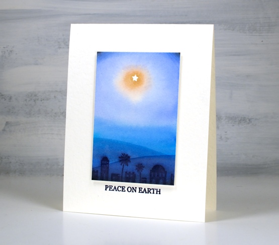
To get a soft image of the Bethlehem stamp I stamped it in chipped sapphire distress ink while the background was still slightly wet. On the panel above I took a wet paint brush and painted a hill shape across the lower part of the panel waited then painted another one even lower down. I didn’t need to add any ink the paint brush just dragged ink from the Bethlehem image. I popped up each panel with two pieces of cardstock, attached it to a white luxe card base then added sentiments from the Ink to Paper Be Merry Mini set.
The current Christmas card designs are looking minimal for two reasons, I still need quite a few cards and I like simple and elegant!
Supplies
(Compensated affiliate links used when possible)
Cabin by the lake
Posted: December 16, 2020 Filed under: cozy cabin, Penny Black, quietude, Stamped Landscapes, tannenbaum trio | Tags: grafix, Penny Black stamps, Ranger Distress inks, Ranger Distress stains 7 Comments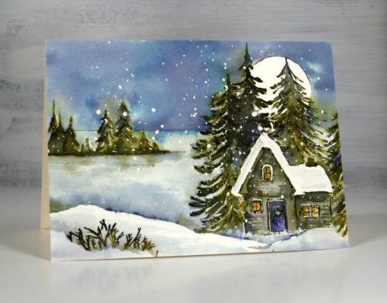
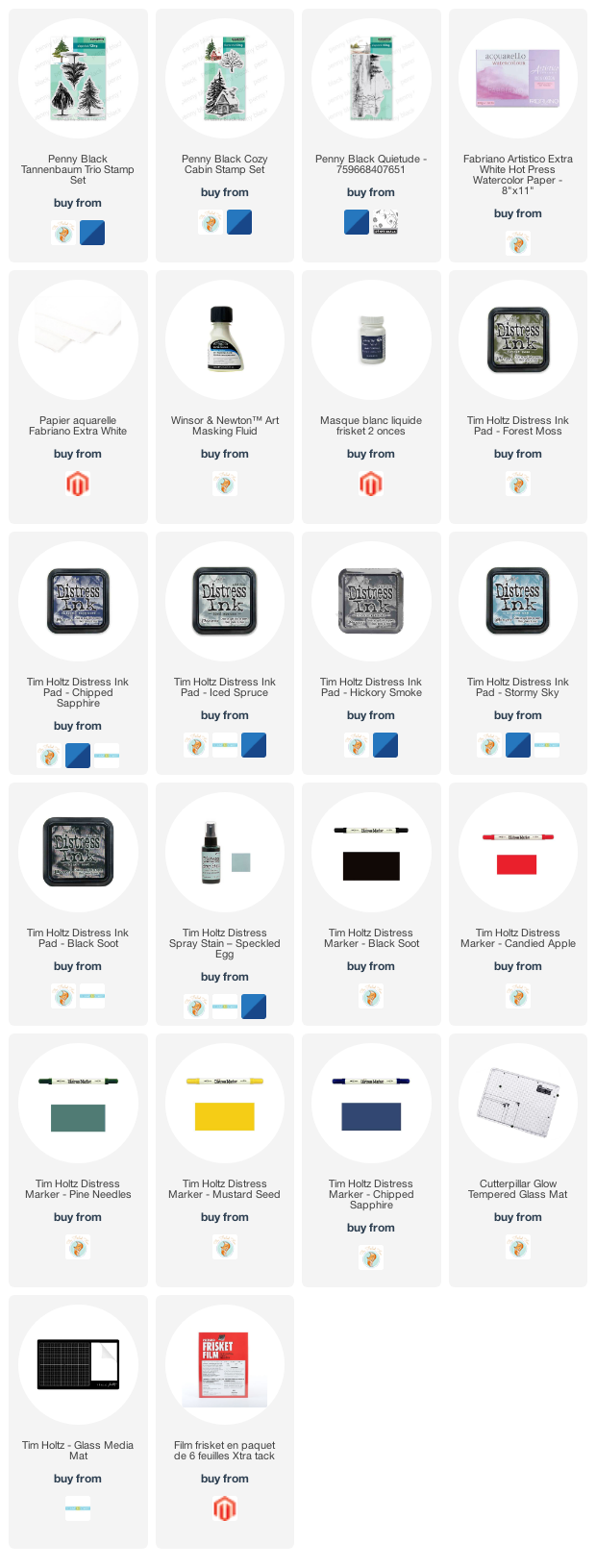
I’ve been trying to make some smaller panels and one layer cards over the last few days as I still need quite a few cards so how exactly did this happen!? Not smaller and not quicker but definitely satisfying. I was thinking about some of the scenic cards released by Penny Black this year and wanted to combine them into new scenes. I made the left side of ‘quietude’ + ‘cosy cabin’ + 1/3 ‘tannenbaum trio’ = a cabin by a frozen lake.
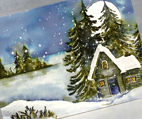
I worked on hot pressed watercolour paper with masking fluid splattered on it and began by stamping the small trees and horizon from the quietude stamp in iced spruce, forest moss and chipped sapphire. I blended over the trees with a paint brush but came back to them later to do more. I stamped the cozy cabin stamp next, forest moss and chipped sapphire on the trees, hickory smoke and black soot on the cabin. I remembered to colour inside the windows with a mustard seed marker before I got carried away with blending this time so it looks cozy inside. To add more trees behind the house I made a cabin post-it mask then stamped one of the tannenbaum trio stamps twice on the right hand side of the cabin.
Before adding the sky I made sure everything was dry then positioned a frisket film circle mask over the trees. I used speckled egg distress stain to paint the sky initially then when I had covered it all dropped in some chipped sapphire. Green ink did bleed out of the stamped trees but I kept a paper towel on hand to dab it dry before it could move too far.
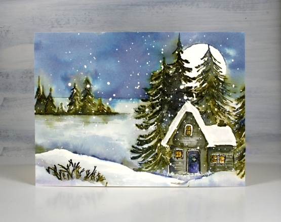
The lake area is mainly iced spruce and stormy sky to keep it paler and frozen looking but I added chipped sapphire and forest moss at the bottom where the lake is in shadow behind the snowbank. The snowbank looked too large and stark in the left hand corner so I stamped just the tips of the branches from the single tree in the cozy cabin set to look like a bit of foreground foliage. ( hot tip for my Ottawa people, all three sets featured on this card are listed in the Crop A While online store, just saying…)
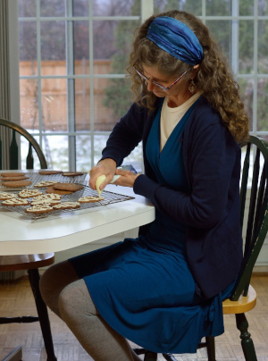
Quick update on Dressember: my card making friends keep pushing the fundraising total higher and I am so very appreciative. As I write this it has reached $1190.25. Thank you so much. Here is a photo from day 12 as I decorate gingerbread. Decorating the gingerbread is my favourite part of the process or maybe equal first place with eating it. This first batch unfortunately spread while baking to such an extent that the tree and mitten shapes were unrecognizable so the decorating was the only clue to what they were meant to be!
Supplies
(Compensated affiliate links used when possible)
Shimmer on grey
Posted: December 14, 2020 Filed under: Coliro paints, Finetec paints, Penny Black, {heart} Christmas | Tags: Coliro paints, Penny Black stamps, Tsukineko Versafine inks 3 Comments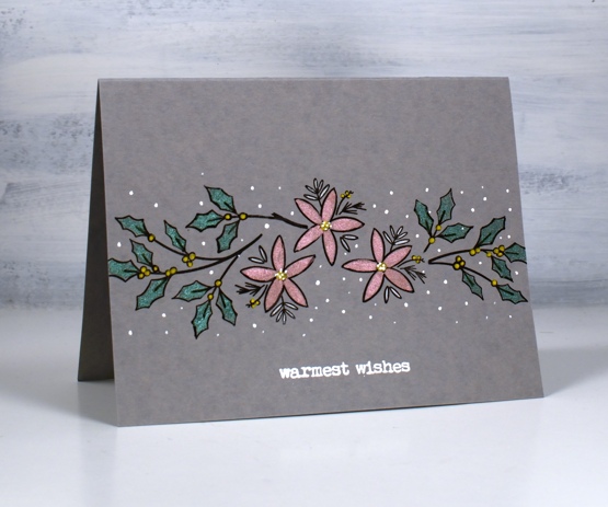
I saw a beautiful card by Dawn Wolesagle featuring shimmer paint on a dark grey base and decided to try my own. I know mine do not have the impact of Dawn’s card but I like the simplicity of design and colour on these one layer cards. I’m going to try the technique again with an even darker background.
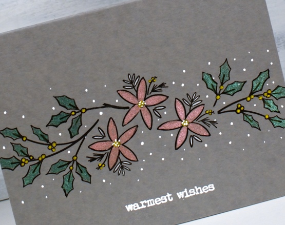
I used the textured grey luxe cardstock from the Foiled Fox and combined outline stamps from the Penny Black set {heart Christmas} to make a design with versafine clair nocturne ink.
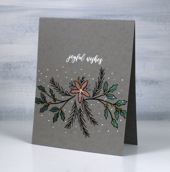
I painted the leaves in moss green pearlescent paint from the Coliro ocean set and the flowers with rose from the vintage set then switched to gel pens to fill the berries with gold and dot white around the designs.
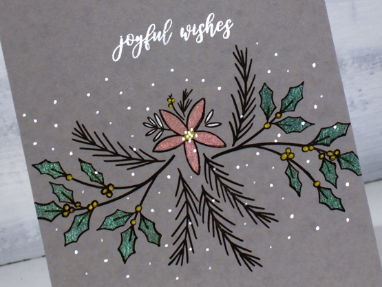
The sentiments are both from the Penny Black merry up set stamped in Brutus Monroe alabaster ink and embossed in alabaster powder.
The fundraising total on my Dressember campaign page continues to grow thanks to friends near and far including many blog readers and class participants. Thank you so much for getting involved in the fight against human trafficking. To learn more about the work being done visit the Dressember blog
Supplies
(Compensated affiliate links used when possible)

From our house to yours
Posted: December 11, 2020 Filed under: birches, Karin brushmarkers, Penny Black, warm reception | Tags: Karin brushmarkers, Penny Black stamps 6 Comments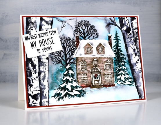
I’m excited to tell you about today’s card. I teamed up with the Foiled Fox to do some experimenting with Karin brushmarkers and I’m so glad I did. The Foiled Fox sent me the pack of 26 and I plan to try them out on my favourite watercolour techniques. Make sure you visit the Foiled Fox blog today to read more about my thoughts and process.
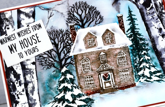
I worked on Fabriano hot pressed watercolour paper in a stamp postioner to complete this inviting little scene. I thought I would stamp in a pale ink and colour with the markers but I decided instead to ink with the markers directly on the stamps. It worked brilliantly. The Karin brushmarkers are water-based, ink filled markers with a nylon brush-like tip. Water-based means they blend with water. They are made and inkfilled in such a way that you can see the ink in the barrel and right to the last drop the colours will have full intensity. Nylon brush tips tend to be stronger than felt tips so I was willing to try inking the stamps directly keeping in mind that I did not want to damage the tips. The inks are highly pigmented and flow generously from the tip so I did not need apply much pressure as I inked the stamps gently with the sides of the nylon tips.
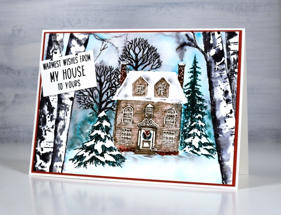
After inking the PB birches in black and grey I blended them a little then covered them with masking tape before stamping the PB warm reception stamp bit by bit. I did the trees first, then the house, inking and blending to build up the whole scene. I explain the colours and technique in more detail over on the Foiled Fox blog. As I’d left it until the end to paint a sky I chose to clear emboss the warm reception stamp so it would resist ink when I added it all around the house and trees.
To finish it off I matted in a brownish red and added a little sentiment to look like it was tacked to the trees. Definitely stay tuned for more projects featuring the Karin markers.
Karin markers used: red 209, sepia 074, neutral grey 3 131, black 030, lush green, 228, arctic blue 264
Supplies
(Compensated affiliate links used when possible)