Alcohol ink gel print
Posted: April 12, 2021 Filed under: Alcohol Ink, gel press, Penny Black, Taylored Expressions | Tags: gel press, gel printing, Penny Black creative dies, Penny Black stamps, pinata alcohol ink, Ranger Alcohol Ink, Taylored Expressions 5 Comments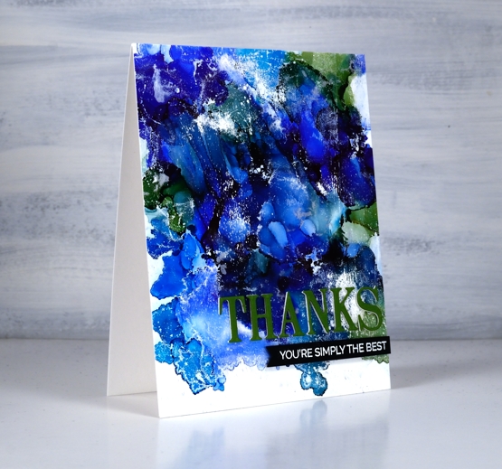
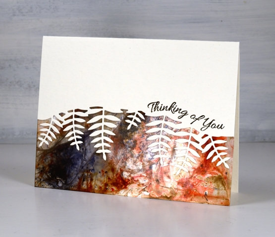
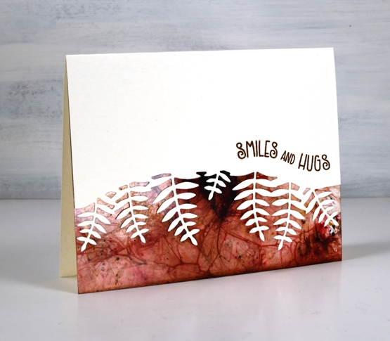
I tried a technique this week that I’ve seen demonstrated by gel printing wizards but never tried myself. In some ways it’s not that different from making abstract alcohol ink patterns on yupo or craft plastic but I found that I ended up with more of a distressed look which is rather nice.
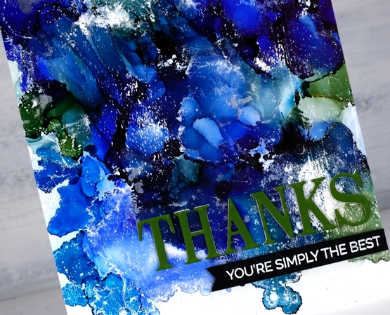
I started with a not entirely clean gel plate and three or four alcohol inks, I’m not sure exactly which ones I used as I was very much in experimenting mode. Obviously there was a green and some blues in there and in real life you can see I also had a silver. I dropped dots of the different colours on the gel plate added rubbing alcohol and blew it all around with the air blower. It dried quite quickly so it took several additions of inks and rubbing alcohol before I was happy with the coverage. Once the AI had dried completely I brayered white acrylic paint over the painted area and took a print on some white cardstock. You can see the usual overlapping patterns of alcohol ink blobs but also some white patches and ‘grazes’ from the acrylic paint.
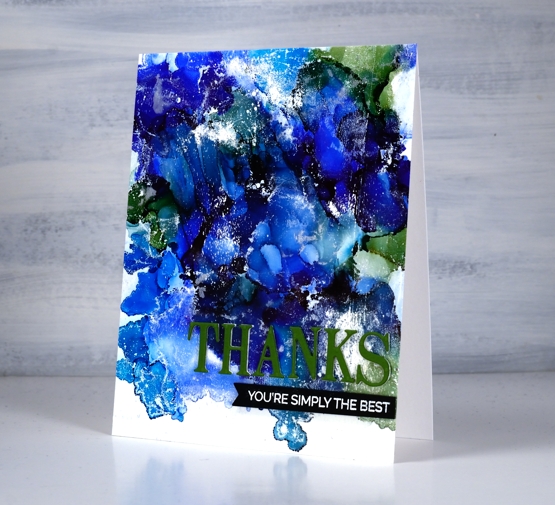
I trimmed the panel and added a three layer PB die cut sentiment along with an additional sentiment strip. I will definitely be trying this technique again.
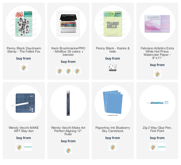
Supplies
(Compensated affiliate links used when possible)
Fern Border
Posted: March 12, 2021 Filed under: Brusho, fern border, Penny Black | Tags: Brusho, Penny Black creative dies, Penny Black stamps, Tsukineko Versafine inks 6 Comments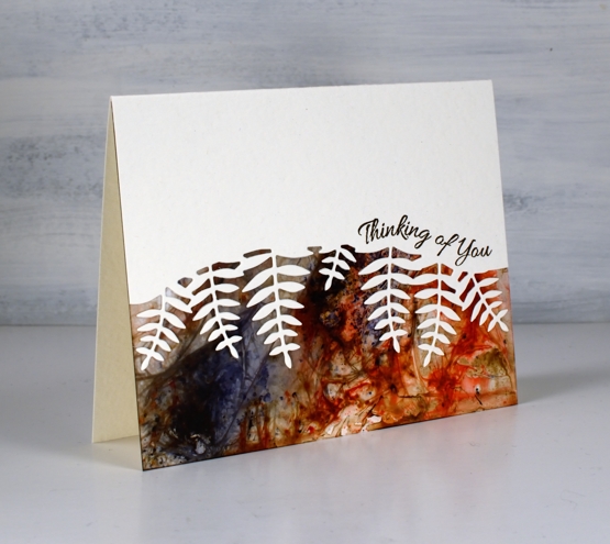
I was looking through my pile of possibilities recently and found some lovely brusho panels I made quite a while back at a class taught by my friend The Crafty Cigale. Instead of using brusho watercolour powders on watercolour paper we worked on photo paper. I remember the process being so much fun that I kept on making panel after panel.
I’ve chosen two of the panels as borders for today’s cards. Initially I thought I would cut into the brusho panel using the Penny Black fern border die and I tried, but using the patterned print as a background showed it off better while still featuring the delicate shape of the fern fronds.
Before die-cutting the fern border I applied double sided adhesive to the back of the card front so once cut I could easily attach it to the patterned panel. The sentiments from the banner sentiments mimicked the curve of the border die so they were an obvious choice in two versafine brown inks
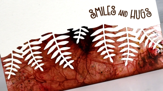
The card bases are Luxe White cardstock from Foiled Fox, which is a creamy colour with a soft pebbly texture. I’ll be back tomorrow with some more birch themed pages from my bullet journal. Thanks for dropping by.
Supplies
(Compensated affiliate links used when possible)
Vintage collage card
Posted: March 8, 2021 Filed under: Coliro paints, Darkroom Door, diamonds, Dies, Finetec paints, French Script, Gazette, gerberas, gift card pocket, global postmarks, Penny Black, shall we dance, Stencils | Tags: Coliro paints, Darkroom Door stamps, Darkroom Door stencils, Fabriano Watercolour Paper, Finetec artist mica watercolour paint, Penny Black creative dies, Penny Black stamps, Ranger Distress inks 4 Comments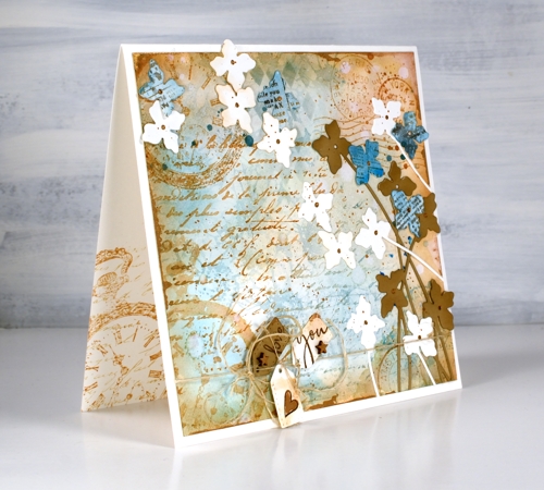
A friend commissioned me to make a ‘vintage’ themed card recently and I happily pulled out a bunch of Darkroom Door stamps to do so. You can see the pocket watch stamp managed to feature three times but the French script, global postmarks, and gerberas also contributed. I stamped, blended and painted with two brown tones of distress ink, two blues and a black. (all the supplies are listed below)
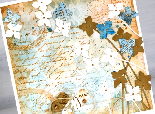
To begin I smooshed some speckled egg and antique linen distress inks on a glass mat, added water swiped the panel through the diluted ink. After that the gerbera background stamp became part of the base layer in speckled egg distress ink. I layered the other stamps over the top in tea dye and antique linen inks and blended some speckled egg ink through the DD diamonds stencil. Of course there is splatter, watermarks and extra blending to darken the edges. To add a dimensional feature I die cut several stems of flowers with the Penny Black ‘shall we dance’ die, some are from watercolour paper, some from tan cardstock and a few from paper painted with salty ocean ink and stamped with the DD gazette stamp.
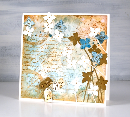
Almost finished, I added a strand of twine around the base and tied some tiny tags on with stamped PB sentiments on them and some little wooden stars I found. I was pretty happy with all this vintageness but decided to risk some gold paint. I splattered and added it to the tiny stars and heart, the flower centres. Where it worked best though was unevenly painted along the edges of the square panel. You probably can’t even see it clearly but it ended up being one of my favourite parts of the card.
By the way there are yummy new stamps on the Darkroom Door website. You will see them here soon, a few are winging their way here as you read this! Have a great day.
Supplies
(Compensated affiliate links used when possible)
Fern and floral art journal page
Posted: March 5, 2021 Filed under: Art Journal, fresh ferns, garden variety, Penny Black | Tags: Art Journal, Fabriano art journal, Penny Black creative dies, Penny Black stamps, Tsukineko Memento inks, Tsukineko Versafine inks 8 Comments
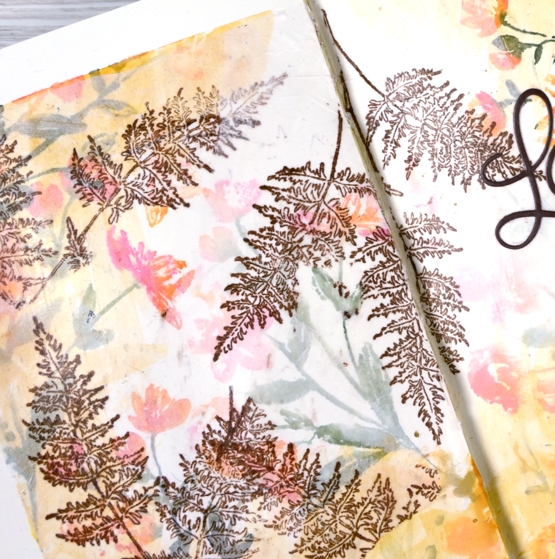
Recently when I was making a card with the new Penny Black stamps, ‘garden variety’ and ‘fresh fern’ I also began an art journal page. I really need to be braver with my art journal, I tend to reach for the same mediums that I use all the time in my cards. Today’s journal page was not particularly adventurous but I did pull out my box of pastes, gels and mixed mediums only to find several of them had dried up completely in their containers while others that used to be thick had turned to liquid. Those ones got tossed but a jar of distress collage medium came in handy along with some modelling paste. I think they might have both done the same job in the end.
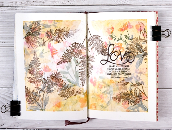
I’m still working in my Fabriano art journals made up of drawing paper so I’m trying not to rely on my watercolour habits and techniques. I began as usual by taping the edges of the pages both to keep the book open and to create an attractive frame.
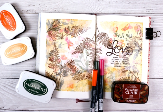
I inked the garden variety stamp with tangelo, northern pine and rosebud memento inks, spritzed it and stamped on the pages multiple times. I did first and second generation stamping to get both bold and pale prints. Then, feeling all brave and mixed media-ish I coloured some modelling paste with peanut brittle memento ink and applied it around the edges with a little plastic applicator (an old bank/library card would do). This step didn’t really yield the results I wanted but it was all in the spirit of experimentation so on I went.

I hadn’t used tissue paper in a while so I scrounged through our wrapping paper box and found some white, stamped the fresh fern in rich cocoa memento ink then tore it into sections before gluing it on the journal pages with collage medium. The tissue became almost transparent which gave the flowers behind a soft pearly look. I stamped the verse from 1 Corinthians on tissue too and glued it down in the same way replacing the first word, ‘love’ with a die cut.

I would love to know if you have an art journaller you admire. I am a big fan of Vicky Papaioannou and have watched many if not all her art journaling videos. I am interested to know what gels, pastes and mediums people use for what purposes. Which are best for resist effects, which are great for gluing, etc. Please share any recommendations you have.
Supplies
(Compensated affiliate links used when possible)
Daydream Watercoloured Flowers -Video
Posted: February 18, 2021 Filed under: daydream, Karin brushmarkers, Penny Black, Tutorial | Tags: Karin brushmarkers, Penny Black creative dies, Penny Black stamps, Tutorial 7 Comments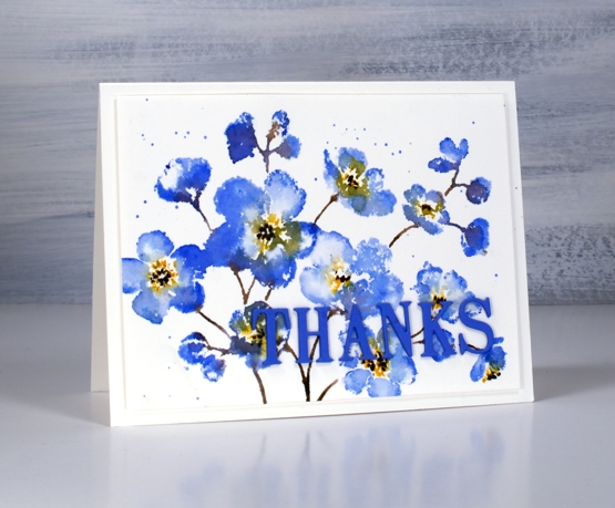
Penny Black has a new release called ‘Daydream’ and it’s filled with spring goodness. I guess many of us start daydreaming about spring in February. The stamp featured in my card today is called ‘daydream’ and I’ve paired it up with a new die, ‘thanks & hello’.
I’m enjoying working with the Karin brushmarkers both for watercolouring line images and for inking stamps. In today’s video I ink the stamp with four markers but my technique is slightly different to my usual method and involves some ‘water stamping’
In the video below you can see why the juicy Karin markers are perfect for this technique. As I’ve mentioned in previous posts, a little ink goes a long way. I’m looking forward to trying this technique again on a different stamp with even less ink for a paler more subtle look.
I chose to keep the panel simple on a white background but you could add a pale wash before starting or do some second generation stamping for background flowers. Maybe I’ll try that next.

This blue which has a hint of purple is my favourite blue. It reminds me of cornflowers which featured in my bridal bouquet and was the colour of my bridesmaid’s skirts.
Supplies
(Compensated affiliate links used when possible)
Faith & floral journal page
Posted: February 16, 2021 Filed under: A Pocket Full, Art Journal, Arteza, Footnotes, illustrious, Penny Black, springtime sigh, tranquil buds, watercolour real brush pens | Tags: Art Journal, Arteza, Penny Black creative dies, Penny Black stamps 6 Comments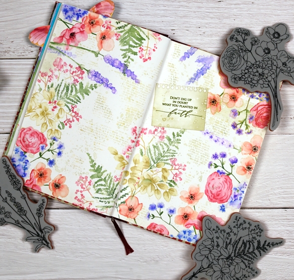
I know it is not spring yet, in fact it is still very winter where I am; we’ve had some of our coldest days and nights just in the last few days. Maybe because it’s so cold now is a nice time to muse about spring.
Sometimes I have a plan for a journal page, other times I work it out as I go along. To begin this one I painted absorbant ground on the journal double page. It is a base preparation a bit like gesso which makes the paper act a little more like watercolour paper. I should probably just switch to a journal with watercolour paper pages but I stubbornly want to keep adding to the this one.
Once the base dried I stamp the Penny Black ‘springtime sigh’ stamp in one corner then coloured with Arteza real brush pens. The colouring is not precise, the surface doesn’t react the same as watercolour paper but I found blending with very little water gave me the most control.

I stamped first with Gina K skeleton leaves amalgam ink which I have used for no-line watercolour in the past but it remained too distinct on the journal page so I switched to antique linen which worked a bit better. I restamped and coloured springtime sigh several times then decided I wanted fewer little flowers to colour! I switched to the new Penny Black ‘illustrious’ stamp which co-ordinated well. I don’t know for sure but I wonder if both stamps were drawn by the same artist, the scale and style is similar.

When stamping the ‘illustrious’ stamp I was able to ink most of the stamp with Arteza real brush pens which cut down on the colouring. I still used antique linen ink on the large open leaves then blended with a marker to shade the leaves. When I had almost framed the double page spread I switched to the PB ‘tranquil buds’ stamp to add some lavender.
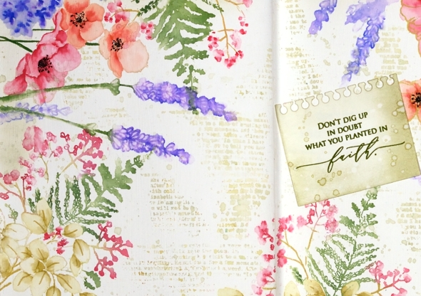
Next came the tricky stage when I had to decide what was happening with the empty area of the journal page. Writing, stamping, hand lettering or empty space were all options. I decided a bit of ‘filler’ in the shape of a text stamp would be nice and instead of the large script one I often use I chose the smaller typed text stamp from the PB ‘footnotes’ set. I stamped it here, there and everywhere in old paper ink, often spritzing with water before stamping so it just stamped a blurry pattern. I also added splatter then chose a phrase from the new PB ‘inspirational sentiments’ set.
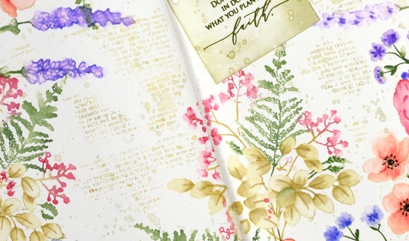
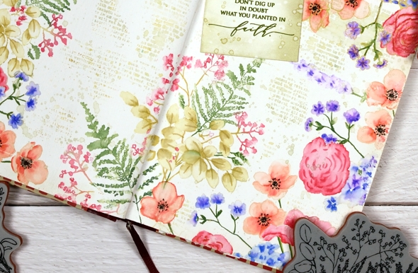
Is that cute notebook die-cut covering a failed stamping attempt? Yes it is but I’m quite happy with that because the notebook page looks sweet. I cut it with a die from the PB ‘a pocket full’ set. I love how this page turned out even though I had no idea at the beginning it would progress this way. That’s the beauty of a journal page.
Supplies
(Compensated affiliate links used when possible)
Freshly cut flowers
Posted: February 15, 2021 Filed under: Foiled Fox store, fresh cut, love you Mom, Papertrey Inks, Penny Black | Tags: Fabriano Watercolour Paper, Papertrey ink, Penny Black creative dies, Penny Black stamps 2 Comments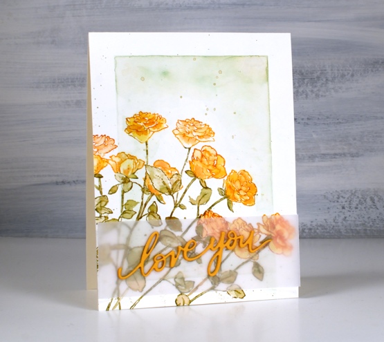
I’ve teamed up with the Foiled Fox again to share a post on their blog. If you pop over there you can read all the process details for this floral card featuring a stamp and a die from Penny Black.
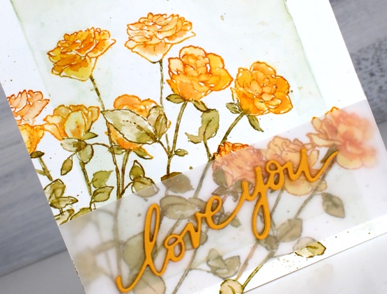
This stamp is called Fresh Cut and it is a rubber cling stamp of five long stem roses. I did some masking and partial stamping to fill the corner of my panel with eleven orange roses. I guess I should have added one more to have a dozen!
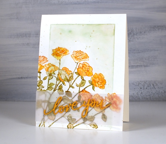
You might recognise the background style on this card; it is inspired by some of Jill Foster’s amazing cards for Penny Black. Because all those roses make the panel a little busy I separated the stacked die-cut words from the roses with a piece of vellum, just to make it easier to read. Don’t forget to visit the Foiled Fox blog today for all the details and while you are there browse awhile for more inspiration.
Supplies
(Compensated affiliate links used when possible)
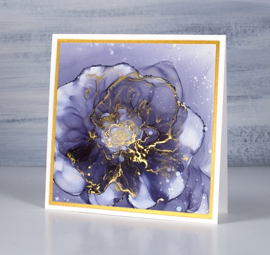
Alcohol Ink Flowers – Video
Posted: February 10, 2021 Filed under: Alcohol Ink, grafix | Tags: grafix, grafix craft plastic, Penny Black creative dies, Ranger Alcohol Ink 15 Comments
Last week I posted a video showing my method for abstract alcohol ink backgrounds. This week’s video is less abstract. In it I show you how I created the purple flower in the card above. I’ve been experimenting with creating flowers and sometimes have more success than other times. I’ve included four cards in this post but there are several panels that I will probably wipe clean.Did you know you can wipe your yupo or craft plastic clean with rubbing alcohol? I don’t always get the panels back to pristine white but so close it doesn’t matter.
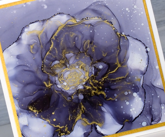
To create this rose I used only two alcohol inks, eggplant and gilded alloy along with plenty of isopropyl alcohol. You can see my process in the video below.
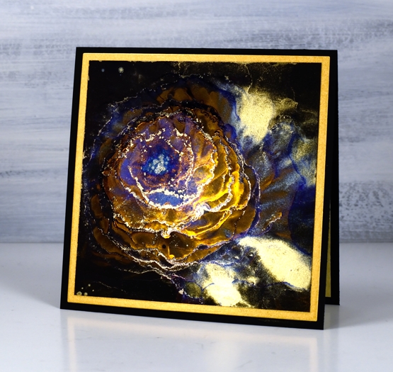
The next flower is on black craft plastic, messier and more experimental but a similar process of moving the inks towards the centre leaving rims of gilded and indigo ink as I went.
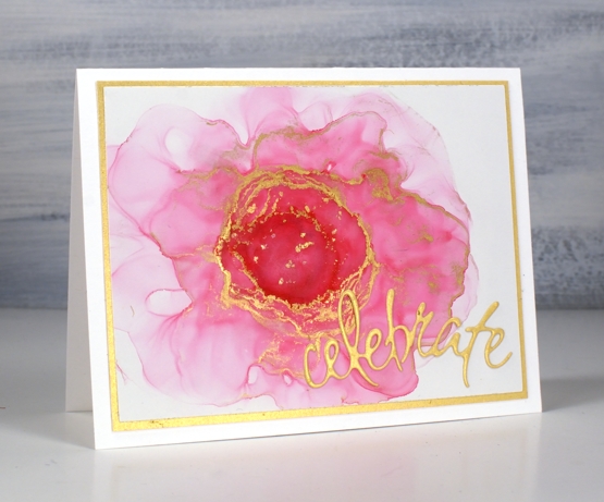
On the panel below I used Ranger flamingo and gilded alloy inks. The pattern is a bit lopsided but it’s definitely floralish. I added a gold mat and gold die cut from the PB set ‘celebrations’.
Have you tried alcohol ink flowers? Do you think you might?
Supplies
(Compensated affiliate links used when possible)
Flower truck…is coming
Posted: February 8, 2021 Filed under: ...is coming, A2 layers, Additional A2 layers, buckets of flowers, hanging planters, Penny Black, pretty picket, silver linings, Waffle Flower | Tags: Penny Black creative dies, Waffle Flower dies 3 Comments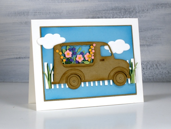
Not my usual style, you know I don’t often take the cute route (pun intended) but this little truck really appealed to me. As I worked on this card and looked through my dies for flowers I realised I could also turn it into an icecream truck or a pumpkin truck and maybe a postal delivery truck.
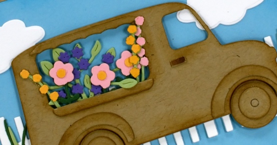
My initial plan was to die cut everything from kraft cardstock except for the flowers but once I’d done the truck and flowers I decided to add more colour with a picket fence and some clouds on a bright blue background. I used a blending brush to add ‘brushed corduroy’ distress ink around all the pieces of the truck and ‘mermaid lagoon’ around the blue panel. I’ve listed all the dies below; as you can imagine the fiddliness factor on this card was high but I persevered and the satisfaction factor is also high.
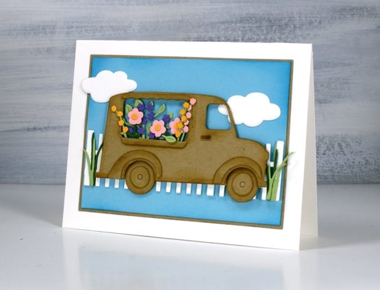
I haven’t added a sentiment but feel that it could be good for many occasions so I will wait and see. I’d be happy to see a truck bursting with flowers in my driveway right about now when everything is covered in snow.
Supplies
(Compensated affiliate links used when possible)
2021 BuJo – February pages
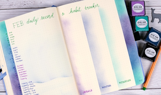
Posted: February 6, 2021 Filed under: Bullet Journal, Dingbat notebooks, Hand lettered, Nature's Beauty, Papertrey Inks, Penny Black, Stabilo .88 fine line pens | Tags: Bullet Journal, Dingbats notebook, Hand lettering, Papertrey ink, Penny Black creative dies 8 Comments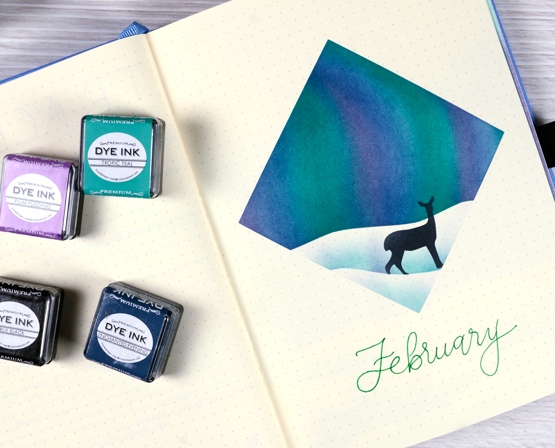
We are still in the thick of winter here in Canada so I chose a northern lights theme for my February journal pages. Like last month I masked a shape and did all the blending inside the shape. This time I masked a square and positioned a hilly mask to create a horizon. I used Papertrey Ink cubes and makeup brushes to blend the sky.
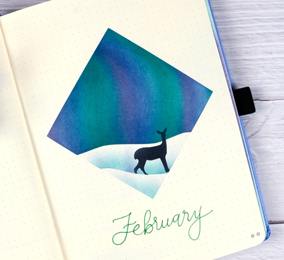
After blending a bold blue, green and purple sky I moved the horizon mask lower to lightly blend a snowbank shadow then positioned a die-cut mask for a deer and blended blue, then black through that. I did film the process just to give you an idea. It’s portrait orientation for instagram and it is 4x normal speed but you can see the steps.
Below are a couple more February pages completed using the same theme. As you can imagine the combination wish list and to-do list took a lot of ink blending which ended up being visible through the paper on the next page. Maybe they bled through because I used more ink on this page for greater depth of colour or maybe these inks are juicier than distress inks; I’m not sure but you can see the bleed through if you look at the February calendar page in the next photo. I’m not too worried about the bleed through, once I have recorded things on the calendar page it will be less obvious I imagine.
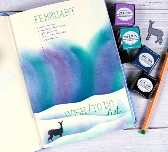
I used Stabilo point 88 finelines for the lettering once again but do intend to try some other pens I have on hand (confession – I have many types of pens and markers on hand!)
Last month I did a modified version of the traditional 7 x 6 grid for the January calendar page and a separate habit tracking page. This month I combined the calendar and habit tracker on a list style page. I will record any appointments and outings (you know, the exciting ones like the grocery store) on the left hand side and note down what we cooked, how much water I drank and whether I took all my vitamins on the right hand side. Do you struggle to drink enough water each day? I am the worst in my family but I have become much better since I put a reminder app on my phone. I also am quite good taking my supplements at breakfast but not so good the rest of the day!
I have a couple more pages to get done for February which I hope to share next week. Thanks for dropping by. Let me know if you are a bullet journal user; I’d love to hear what you use it for.
Supplies
(Compensated affiliate links used when possible)