
2021 BuJo – February pages
Posted: February 6, 2021 Filed under: Bullet Journal, Dingbat notebooks, Hand lettered, Nature's Beauty, Papertrey Inks, Penny Black, Stabilo .88 fine line pens | Tags: Bullet Journal, Dingbats notebook, Hand lettering, Papertrey ink, Penny Black creative dies 8 Comments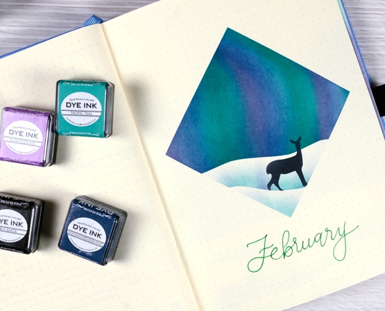
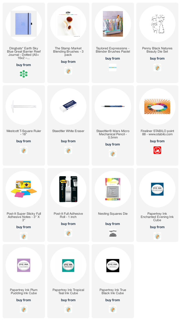
We are still in the thick of winter here in Canada so I chose a northern lights theme for my February journal pages. Like last month I masked a shape and did all the blending inside the shape. This time I masked a square and positioned a hilly mask to create a horizon. I used Papertrey Ink cubes and makeup brushes to blend the sky.
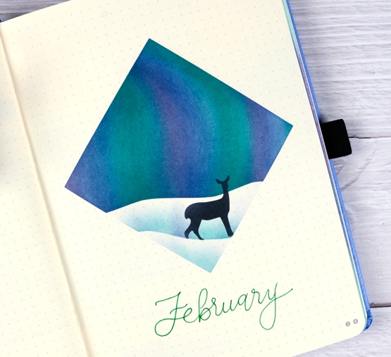
After blending a bold blue, green and purple sky I moved the horizon mask lower to lightly blend a snowbank shadow then positioned a die-cut mask for a deer and blended blue, then black through that. I did film the process just to give you an idea. It’s portrait orientation for instagram and it is 4x normal speed but you can see the steps.
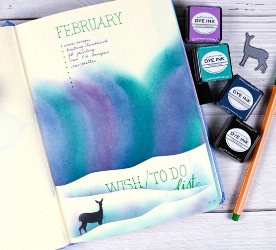
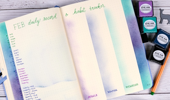
Below are a couple more February pages completed using the same theme. As you can imagine the combination wish list and to-do list took a lot of ink blending which ended up being visible through the paper on the next page. Maybe they bled through because I used more ink on this page for greater depth of colour or maybe these inks are juicier than distress inks; I’m not sure but you can see the bleed through if you look at the February calendar page in the next photo. I’m not too worried about the bleed through, once I have recorded things on the calendar page it will be less obvious I imagine.
I used Stabilo point 88 finelines for the lettering once again but do intend to try some other pens I have on hand (confession – I have many types of pens and markers on hand!)
Last month I did a modified version of the traditional 7 x 6 grid for the January calendar page and a separate habit tracking page. This month I combined the calendar and habit tracker on a list style page. I will record any appointments and outings (you know, the exciting ones like the grocery store) on the left hand side and note down what we cooked, how much water I drank and whether I took all my vitamins on the right hand side. Do you struggle to drink enough water each day? I am the worst in my family but I have become much better since I put a reminder app on my phone. I also am quite good taking my supplements at breakfast but not so good the rest of the day!
I have a couple more pages to get done for February which I hope to share next week. Thanks for dropping by. Let me know if you are a bullet journal user; I’d love to hear what you use it for.
Supplies
(Compensated affiliate links used when possible)


That is just outstanding Heather! I look at your various creations and just go WOW!
But this one just ‘sings’ to me! Perhaps it’s the colours or the subject matter or that extra bright Bujo paper. I just love it!
Carol
________________________________
Beautiful! Really love what you’re doing with this journal!
Ooh, so pretty and vivid!! Using the blender brush on the deer also gives it more depth…brilliant!
This journal seems to me like it is a gift to yourself, creating for the beautiful artist that you are. I think I better spend more time pondering that. Thank you for sharing and inspiring! Yum!!
Very pretty. Will have to try again. Last time I tried northern lights they didn’t turn out well. But like yours.
I am LOVING watching you work your journals. (I STILL occasionally ‘mull over’ your Story Book card series from years ago…oh, LOTHLORIEN!♥ AND WIND IN THE WILLOWS!♥ and thought how wonderful it would be to have a literary journal of children’s favorites!) But, I don’t journal. I bought a few ☺ eons ago thinking I would start an Art Journal and never followed through. Watching what you are doing, I am thinking I should pull one out and do a Technique Journal. I have been at this long enough to be frustrated trying to remember ‘how DID I do this technique???’. Who knows, maybe it will jump start me!☺ ♥♥♥
What beautiful pages and love the wintry color combination. I do have to try northern lights, something I haven’t attempted before. Thank you for all the inspiration. I do think that the bleed through simply makes that page look tinted.
This is just brilliant Heather and love the Northern Lights with that sweet deer and then the theme followed through so beautifully on the next pages, and I don’t think the bleed through matters at all as it looks as though it is part of the design. I just adore the colours. x
So eye-catching!! Great to see how to create the sky!!