Bell & Berries
Posted: October 28, 2020 Filed under: bell & berries, Coliro paints, Finetec paints, fragile branches, Penny Black | Tags: Coliro paints, Fabriano Watercolour Paper, Papertrey ink, Penny Black stamps, Tsukineko Memento inks 13 Comments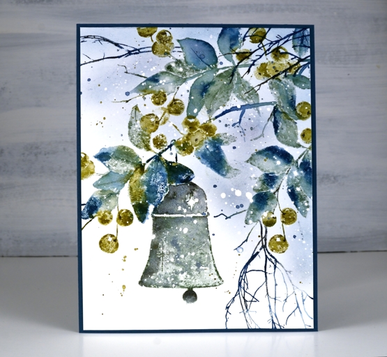
Over the summer I kept reaching for the blues and greens; they were refreshing in the hot weather. It appears that my fascination with them is continuing into the winter! I created this wintry panel with the Penny Black ‘bell & berries stamp and the versatile PB ‘fragile beauty’ set.
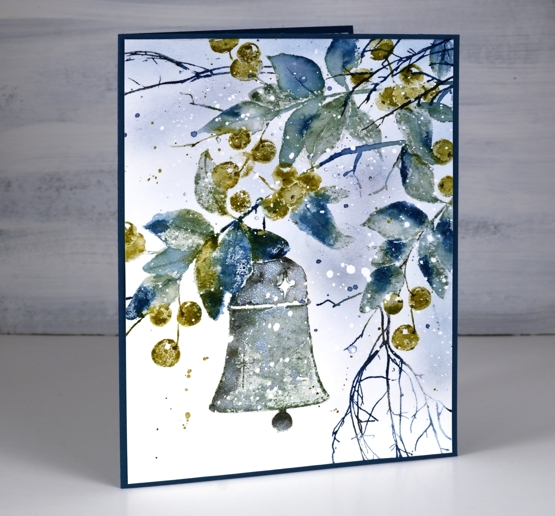
When I started this panel by stamping only the branch section of the stamp at the very top I chose only blue, grey and green inks. Choosing green over red for the berries helped to create a fresh frosty look. After stamping only the top branch I repositioned the stamp and stamped the whole image then finally a bit more branch on the right hand side. The extra twigs were added in dark blue.
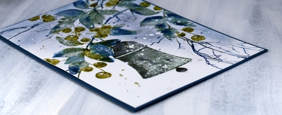
I inked the leaves with papertrey ‘enchanted evening’, a dark blue and ‘stormy sea’, a grey blue. I used the olive toned ‘prairie grass’ for the berries. When I spritzed the stamp before stamping on the hot pressed watercolour paper the inks began to blend. I did further blending on the paper with a paint brush and water but didn’t blend every part of the image, some leaves and berries I kept unblended to show the texture of the paper and stamp.
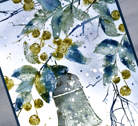
The paper had spots of masking fluid splattered over it before I began which caused the white dots you see in the finished panel.
I stamped the bell in a mix of stormy sea and true black ink and also added ‘blue silver’ pearlescent paint from the Coliro ‘ocean’ set so there is a shimmer to it in real life.
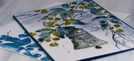
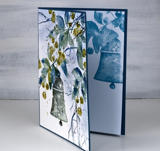
I used a piece of dark blue cardstock for a card base then stamped the ‘bell & berries’ on both an insert panel and the envelope.
I woke up to the frosty look of fresh snow on autumn leaves this morning; it’s pretty but it can go now!
Supplies
Bloom Art Journal page
Posted: October 26, 2020 Filed under: Art Journal, Christmas bush, Darkroom Door, sketched alphabet, torn text | Tags: Art Journal, Darkroom Door stamps, Fabriano art journal 2 Comments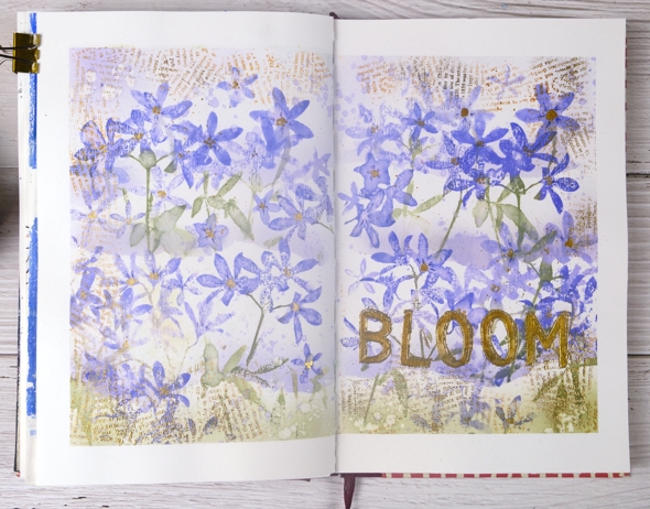
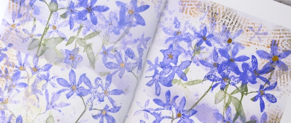
After making a Christmas card with the new Darkroom Door Christmas Bush stamp set I was keen to use the silhouette stamps for a different project. I decided to fill a journal page spread with them and chose a different colour scheme to do so. I think they look a bit like violets.
I taped the edges of the pages which frames the layout, keeps the pages flat and protects any pages underneath which are poking out. I painted absorbant ground over the whole area as a base before stamping and painting.
I wanted to have layers of flowers and so I tore a ripped edge on some masking paper and attached it across both pages. I used blending brushes to apply colour over the torn edge then did generational stamping in blueprint sketch, shaded lilac and peeled paint distress inks. Once the top section was completed I masked again, further down the page this time and repeated the process twice.
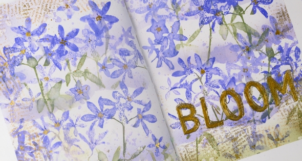
For highlights and details I used markers and gold paint to add details to the petals and centres to the flowers. I also used gold embossing to make a print border and title with the Darkroom Door ‘torn text’ and ‘sketched alphabet’ stamps. The Christmas Bush stamps proved to be very versatile as I thought they would when I first saw them.
Supplies
Art de Fleur
Posted: October 23, 2020 Filed under: Art de Fleur vol 1, Botanical Script, Darkroom Door, global postmarks, majestic mountains, scratches, sheet music, tall flowers | Tags: Darkroom Door stamps, Fabriano Watercolour Paper, Papertrey ink 5 Comments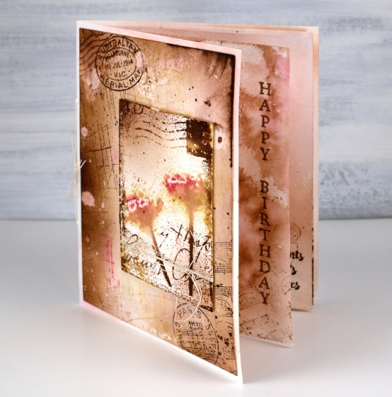
This card is the cardmaking version of going down a rabbit hole. I know how easy that is on the interwebs, but apparently it is possible with a card as well. What started out as a vintage style two layer card became a little more than that. I just kept thinking of stamps and papers and techniques I wanted to add.
I decided an insert would be nice; I don’t usually put anything on the inside of my cards so an insert is quite the departure. An insert turned into two inserts which is more like a little book when you count both sides of the pages!
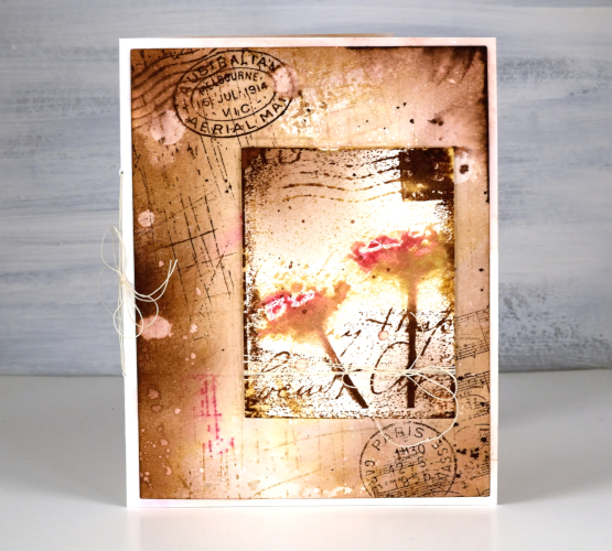
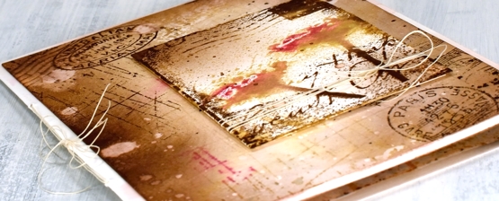
The front panel, which was initially going to be the whole deal features several Darkroom Door stamps: scratches background stamp, sheet music background stamp, global postmarks, art de fleur vol 1.
For the whole card I stuck with four Papertrey ink cubes (listed below); I used them for stamping, watercolouring, splattering and blending with a blending brush.
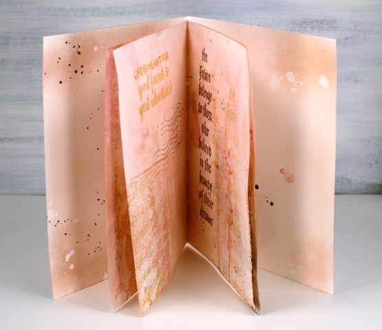
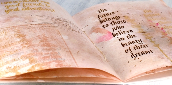
The inside pages are not watercolour paper but handmade paper from a Hanji gifts in Toronto. It is handmade paper with rose petals embedded in it. It was very white straight out of the packet so I smooshed some brown and pink inks on my glass mat, diluted with water then swiped the paper through the ink. This resulted in the colour I wanted but removed the sizing and wrinkled the paper. I ironed it, which did the trick then added little bits of stamping on every page. I used a couple of sentiments and some quote stamps, all from Darkroom Door and reused the same background stamps plus the floral stamps from the Art de Fleur set.
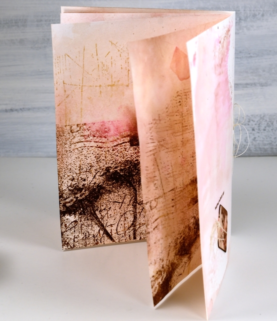
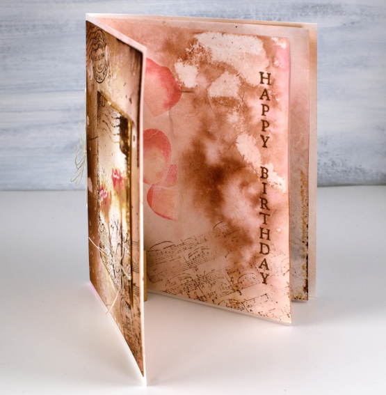
To join it all together I poked holes and used some fine twine for a little ‘book binding’. With all the ‘vintaging’ I did on the front panel and pages the card base itself looked very stark so I swiped that through some smooshed ink too so everything would co-ordinate.
I was so deep down the rabbit hole by this point I realised an ordinary envelope was just not an option so I pulled out another sheet of the handmade rose petal paper, inked it, ironed it and used my envelope punch board to create an custom envelope, which I failed to photograph. All in all a very satisfying but surprising creative project. Now, back to work!
Supplies
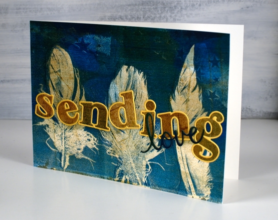
Gel printed feathers again
Posted: October 21, 2020 Filed under: gel press, Heather lowercase die set, phrase builder you, Pink Fresh studio | Tags: gel press, gel printing, Pink Fresh studio 10 Comments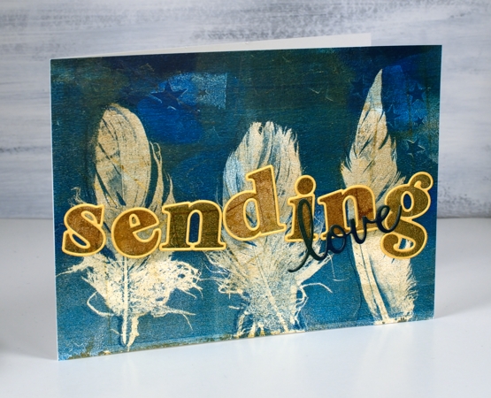
Last year I did my first gel prints with feathers and I was thrilled with the detail in the prints. When I was gel printing with leaves a few months ago I did a few feather prints at the same time. It’s the same process.
The letters and word added to this feather print were cut from the same panel. I was working on my large gel plate and lifting the prints on A4 pieces of cardstock. The mustard/gold paint was over the whole print before I added dark turquoise paint to one end as I printed feathers.
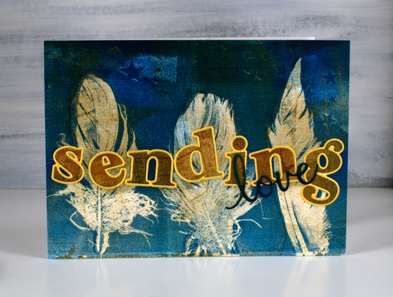
I cut the letters for the word ‘sending’ with the ‘Heather lowercase’ dies from Pinkfresh studio. There are capital letter dies in the same style and co-ordinating stamps for both lower and upper case but I just bought the lowercase dies. Buying alphabet dies or stamps is quite the investment so I worked out what I would get the most use from and it was these pretty letter dies. I am way more likely to make words with all lowercase than with all caps. After I had ordered the dies I realised they were all double dies in that they cut a very narrow border around every letter which gives you a bonus delicate die cut letter which can be used as a border for the solid letter. Maybe you know all this but I was pretty happy to get double the letter fun.
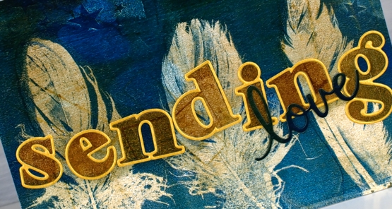
I cut all the letters for the word ‘sending’ and arranged them on top of the feather panel but they did not stand out enough until I cut the same letters from shimmer gold cardstock so I could give each one the narrow border. I added double sided adhesive to the back before cutting the letters so it would be easy to attach them to the panel. I cut the word love from a teal section of the printed panel twice and layered them to make them stand out a bit more, the die is from the Pinkfresh phrase builder ‘sending’ set.
I’m very keen to get out my gel plates again but my to do list has other things on it right now. It’s fun to have a stack of prints to put to use in the interim.
Supplies
Christmas Bush
Posted: October 19, 2020 Filed under: Christmas bush | Tags: brutus monroe embossing powder, Darkroom Door stamps, Ranger Distress inks 4 Comments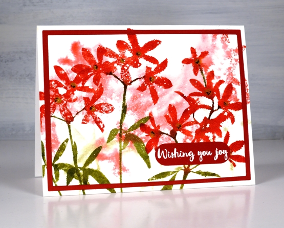
Christmas Bush is a both a plant that grows in Australia and a new stamp set from Darkroom Door. This is my first project featuring the set but there will be more. I’m not sure if my parents ever had a Christmas Bush in their garden; I don’t remember one in any of my own gardens. I have just read about the plant and apparently it has white flowers which are not that prominent but the sepals grow large and red and they provide the drama.
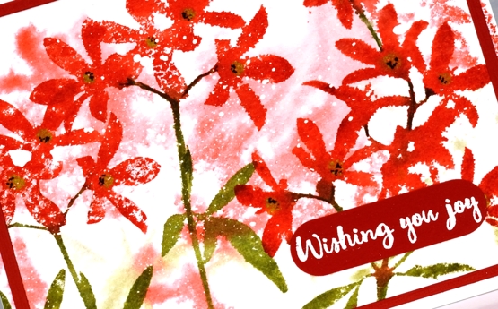
I worked on hot pressed watercolour paper that I’d splattered earlier with masking fluid. I wasn’t wanting the look of snow; I know the Christmas bush blooms in summer. I wanted the white splatter to add some texture and variation to the design. I started by stamping one of the large sprays of flowers on the panel with plenty of water spritzed on both paper and stamp so it diluted and bled into the surrounding area. Once the background dried I stamped the flowers several times in festive berries and peeled paint distress inks.
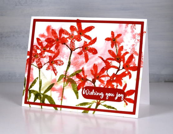
Rather than mat the panel I used two Waffleflower A2 layer dies taped together to cut a narrow frame from red cardstock then embossed a sentiment from the ‘Christmas Bush’ set on the same cardstock.
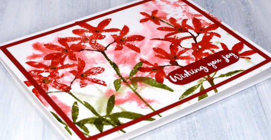
I must admit it was the floral silhouettes that first drew me to this stamp set not the plan of making Christmas cards. Now that I have made one with the bold contrast of red and green I will be designing some more. My dad usually asks me if I’m going to make some Australian Christmas cards because I tend to make many wintery looking ones. Here is my first one for 2020 and it has an Australian theme, so that’s a good start.
Supplies
Blossom birthday
Posted: October 16, 2020 Filed under: all the birthdays, Brutus Monroe, Concord & 9th, meadow blossoms, Papertrey Inks | Tags: Concord & 9th, Fabriano Watercolour Paper, Kuretake Zig clean color real brush markers, Papertrey ink 4 Comments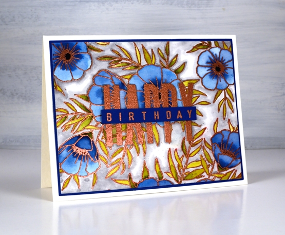
Even as my flowers fade and disappear I am still inspired to make floral cards. I’ve teamed up with the Foiled Fox today to share a blog post here and over there. If you are looking for all the creative process details pop over to the Foiled Fox blog. Today’s card features the C&9 ‘all the birthdays’ set again. It has only been in my house a week or so and already it has helped me out several times. Having one set with at least ten different ways to stamp happy birthday is a winner. There are probably more than 20 combinations when you look at all the separate word stamps and single letters in the set.
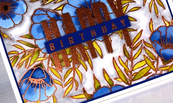
I wanted to combine a background image with a sentiment and ended creating my own background by repeat stamping with two stamps from the Concord & 9th ‘meadow blossoms’ set. Before heating the panel I stamped the word HAPPY from the new C&9 ‘all the birthdays’ set. I embossed with copper powder then coloured with ink from Papertrey ink cubes. The ink cubes are very juicy so I often smoosh them on my glass mat then pick up ink with a paint brush.
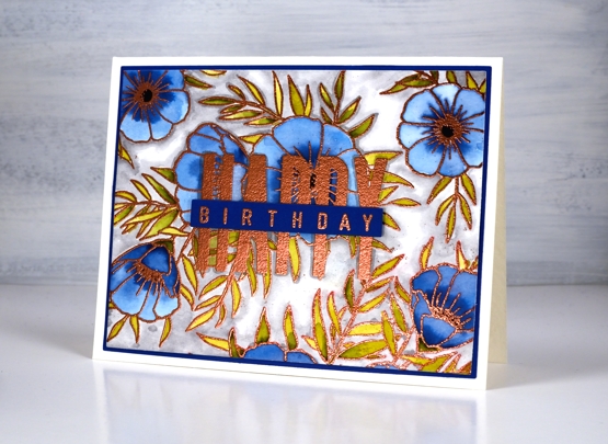
I filled the background with a grey zig clean color real brush pen and blended it with water. To complete the card I matted with with the dark blue cardstock I keep reaching for and finished the sentiment on a strip of the same blue. Having this new birthday set has got my birthday card production back on track. I have no excuses for not sending out birthday cards. Thank you Foiled Fox!
Supplies
Autumn lanterns
Posted: October 14, 2020 Filed under: Flower lanterns, fragile branches, Penny Black, Script | Tags: Fabriano Watercolour Paper, Penny Black stamps, Tsukineko Memento inks, Wendy Vecchi 5 Comments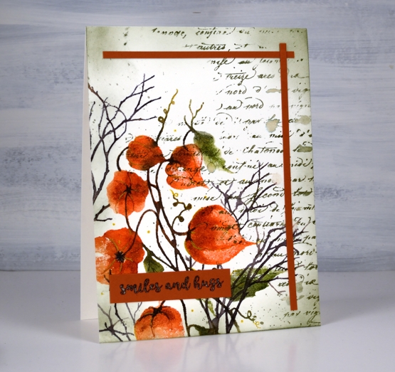
I have some dried Chinese lanterns in the corner of my workroom. They are lasting well, I’ve had them at least seven years, probably longer. A few have broken or fallen off the stems and the colour has faded so they are not the deep orange you see in the image on my card. I used Penny Black’s ‘flower lanterns’, ‘fragile beauty’ and ‘script background’ stamps to create this panel.
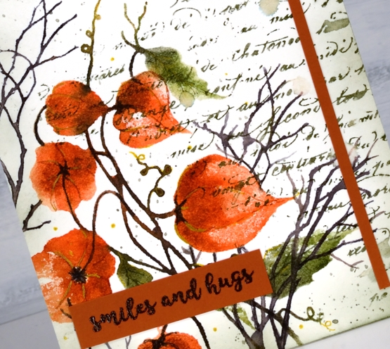
Just to mix things up a bit I pulled out memento inks for this project. There was a time when I used memento inks on every project and they are still within reach of my work table. The ‘Morocco’ browny orange is a beautiful colour so I started with that and used potter’s clay, olive grove, bamboo leaf and espresso truffle, some inkpads, some markers. I was very happy to see the ink pads are juicy as ever.
Memento inks don’t always blend once on the watercolour paper so I blend with a spritz of water to the stamp before stamping. I also smoosh some ink on my mat and pick it up with a brush if I want to add depth to a very specific area. I added some details with a gold gel pen after I had built up the lanterns and leaves with ink.
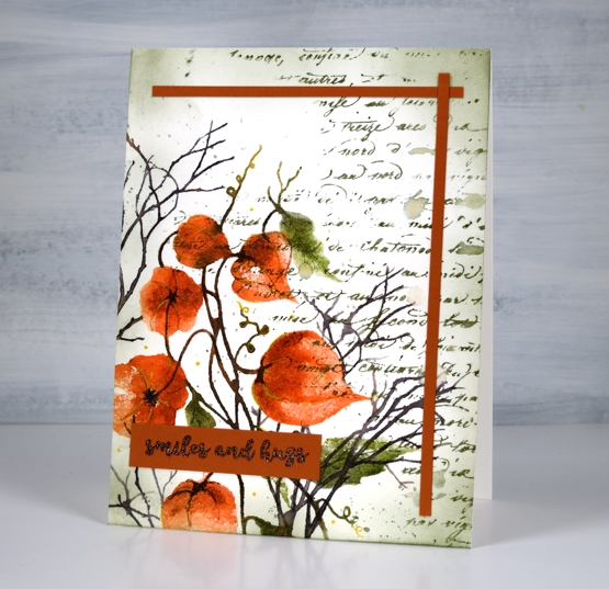
You can see some of my favourite ‘finishing touches’ on this panel: a script stamp, splatter and ink blended edges. I added two strips of co-ordinating cardstock as a half frame then balanced them with the sentiment from PB ‘banner sentiments’.
Supplies
Blue Dragon
Posted: October 13, 2020 Filed under: Dragon, Finetec paints, Pink Ink Designs | Tags: Ranger Distress inks, WOW embossing powders 6 Comments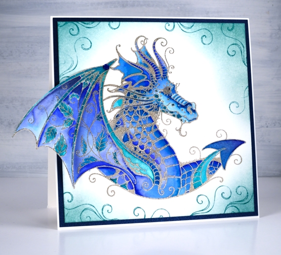
I’ve had this Pink Ink Designs dragon stamp for a quite a while and even started a couple of watercoloured panels with it but I was inspired to finally complete a card for an eight year old I know.
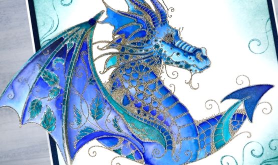
I did the stamping and embossing ages ago so I can’t remember if it is platinum or silver embossing powder. I used a mix of watercolour markers and finetec shimmer paint to colour the dragon then some distress ink to add shading and swirls to the edges. The wing is made from two stamps, the main body of the dragon plus an extra extension of wing. I have attached the extension with a little blue brad so it can fold in when the card fits goes in an envelope. I framed the design with a piece of dark blue metallic cardstock I bought from Crop A While along with matching envelopes.
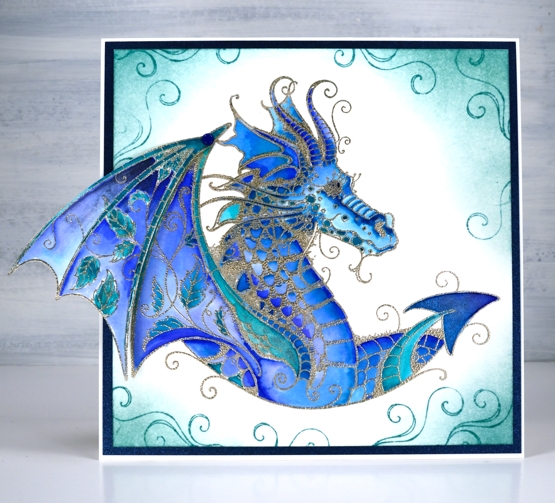
I first saw this stamp at Crop A While, my local scrapbooking store and fell in love with it straight away. I remember my friend and store owner, Carole being quite surprised that I would even take a second glance at a dragon stamp and then from the same brand, a sea turtle stamp. I admit it is a bit out of character for me. The initial appeal of this dragon stamp set was to make an art journal page with it. It hasn’t happened yet but the design has been simmering in my mind for a while now.
Crop A While has an online store, curbside pick up and in-store shopping available right now and the owners, Tom and Carole are happy to help you with orders, just phone or email them.
Supplies
Enjoy
Posted: October 9, 2020 Filed under: Darkroom Door, fine leaves, sketched alphabet | Tags: Darkroom Door stamps, Ranger Distress inks, Ranger Distress stains 3 Comments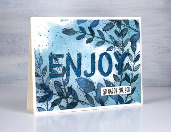
I paired the new DD ‘sketched alphabet’ with leaves again, this time from the set ‘fine leaves’ which have a hand drawn sketch style of their own.
I had left over ink on my glass mat the other day after creating a dramatic sky in greys and blues. Rather than waste the ink I swiped a piece of watercolour paper through it picking up as much as possible and spritzing with water to move the ink around. The watercolour panel already had masking fluid splattered over it hence the white dots over the finished design.
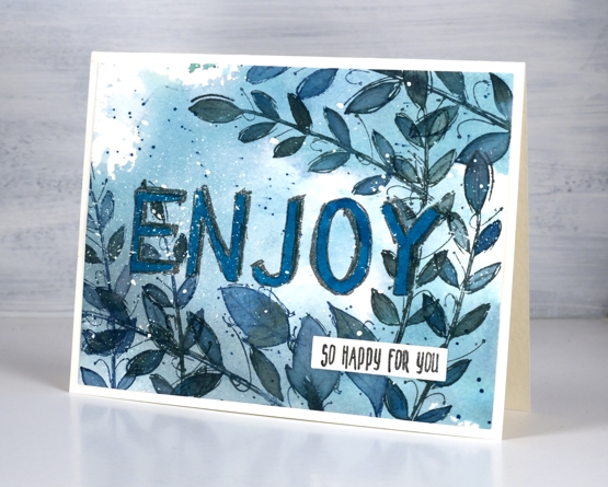
I stamped the letters first in hickory smoke archival ink then covered a couple with masks I made for a previous card before stamping leaves from the fine leaves set in iced spruce and stormy sky. I filled most of the panel with leaves and painted them with both ink colours. I added some ink splatter and then coloured the letters with a blue watercolour marker to help them stand out a bit more. I stamped one of the sentiments from the DD ‘baby sentiment set’ to complete the card. I think this one could have several uses, maybe retirement, new house, new job or the like.
Supplies
All the Birthdays
Posted: October 7, 2020 Filed under: A2 layers, Additional A2 layers, all the birthdays, CAS, Concord & 9th, nesting squares, Waffle Flower | Tags: Concord & 9th, gel press, gel printing, Ranger archival inks, ranger embossing powders, Tsukineko Versafine inks, Waffle Flower dies, WOW embossing powders 4 Comments
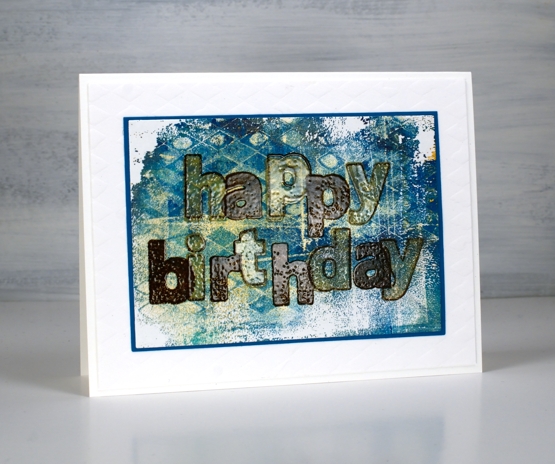
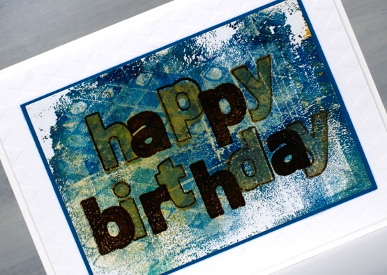
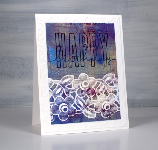
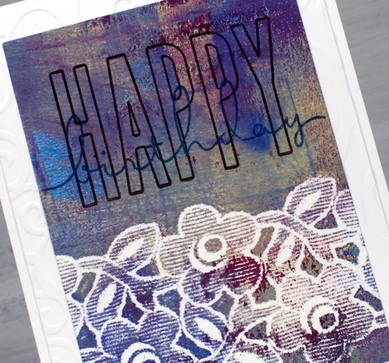
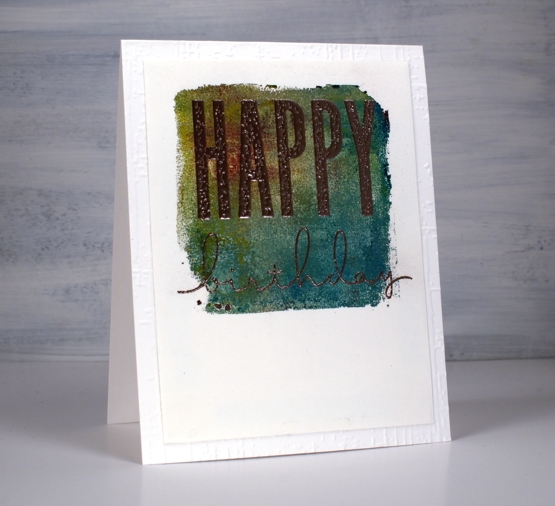
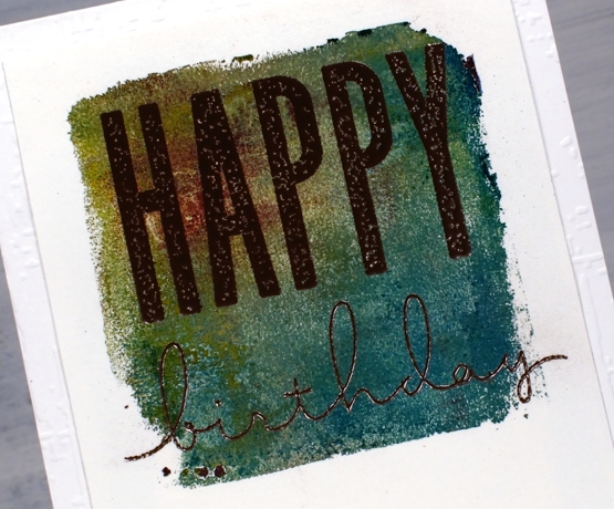
I made a short stack of birthday cards yesterday with a new Concord & 9th set, ‘All the Birthdays’. I pulled out several prints from earlier gel printing sessions and chose some which would work as panels for birthday cards.
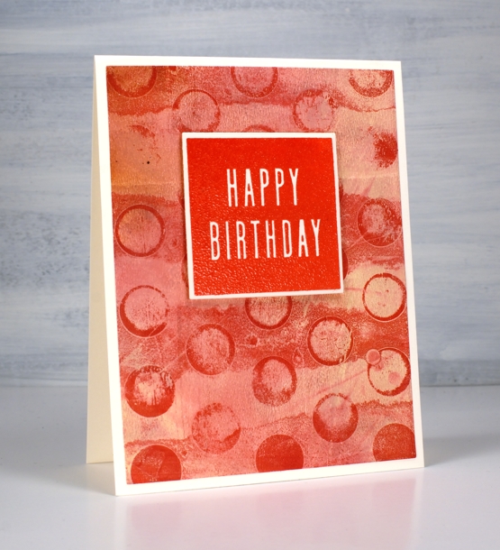
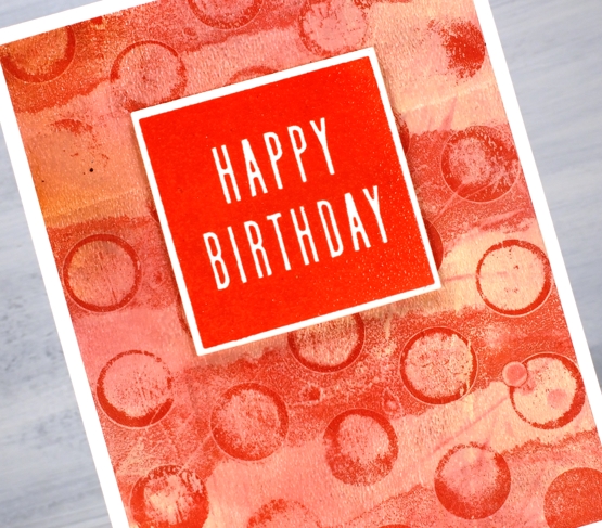
On the card above I used ranger blue embossing powder and the card below versafine tulip red was the perfect match for my printed background.
Some were printed using the petite set A gel presses so they were already shaped as squares. Others I cut from larger prints. I used stencils and lace to make the prints and a range of acrylic paints.
One of the stamp combinations from the C&9 ‘all the birthdays’ is a pair of stamps that overlap to spell ‘happy birthday’; there are outline stamps that frame the solid letters also. That is what I used on the card below with gold and brown inks then clear embossing powder.
I also added some texture to a few of the card bases or mats with embossing folders and stencils.
The printed panel below included such pretty blues and purples I wanted to match them in the sentiment so I stamped with archival dusty concord and faded jeans then, before the ink dried embossed in clear powder.
The card below features rose gold embossing powder; it looks a little darker than expected on this panel, maybe because of the depth of colour in the print.
I really enjoyed pairing sentiments from the C&9 set with my leftover gel prints. I did have some embossing challenges though; I’m just not an embossing champion. Stray powder, over heating, underheating, even when I use a powder tool and preheat the heat tool I still make mistakes. This lot took me all afternoon but I am very happy with them and I’m pleased to have boosted my birthday card stash. Now if I can just remember to send them…
Supplies