Ferns on ferns
Posted: March 2, 2021 Filed under: fresh ferns, Penny Black | Tags: Penny Black stamps, Ranger Distress inks 12 Comments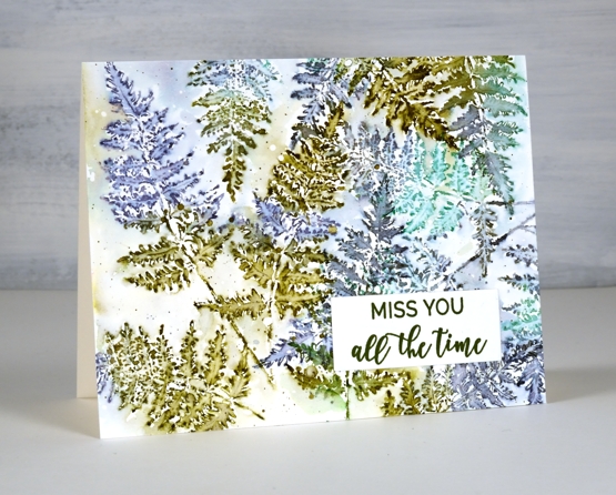
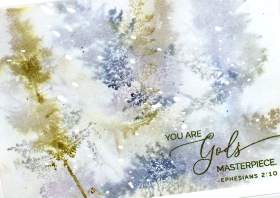
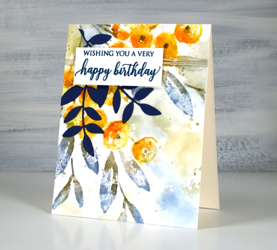
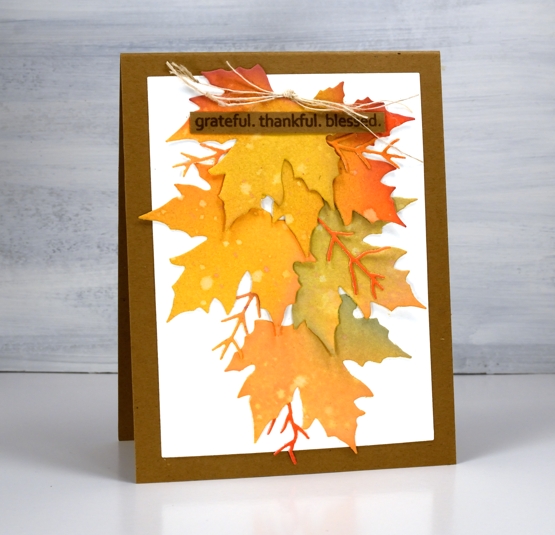
After I had added some ferns to a recent floral card I knew the PB ‘fresh fern’ stamp wanted to be the star of its own card. I started by making this card and just kept on playing with the fern stamp and a variety of blue and green inks.
On the card above I stamped with forest moss, chipped sapphire and lucky clover then blended inside the fronds with a fine tip paintbrush and water. I overlapped some of the ferns and added some diluted ink around the ferns once I’d filled the panel. This one is finished with a sentiment from PB ‘family sentiments.’
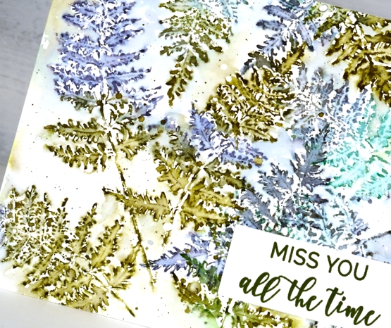
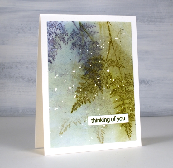
I think this second card is my favourite; I know it is very diluted and abstract but the glimpses of fern appeal to me even more than whole fern images. I stuck with forest moss and chipped sapphire because they are always winners and added iced spruce. I stamped on partly wet watercolour paper and dabbed the stamping dry before repeating the process.
The hot pressed watercolour panel had masking fluid splattered on it before I started so that’s why there are white dots here and there. I finished this one off with a stamp from the PB ‘inspirational sentiments’ set.
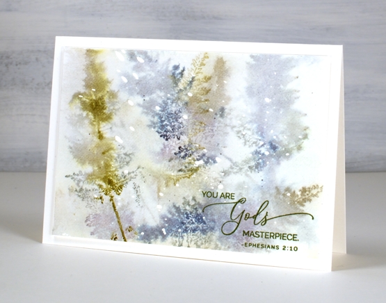
I added even more water to this next panel. As with the previous one I had masking fluid dots on the watercolour paper and worked with chipped sapphire, forest moss and stormy sky ink. After each print I painted water over the whole panel which spread some ink over the background and left some staining the paper. On the last two prints I didn’t blend with a paint brush so the ferns just softened on the damp paper.
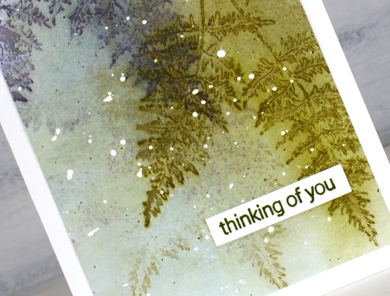
I finished this one off by stamping the sentiment from PB ‘pansy gaze’ in versafine clair shady lane ink. After completing this one I thought I should stop diluting everything and stay inside the lines, just to see how it looked.
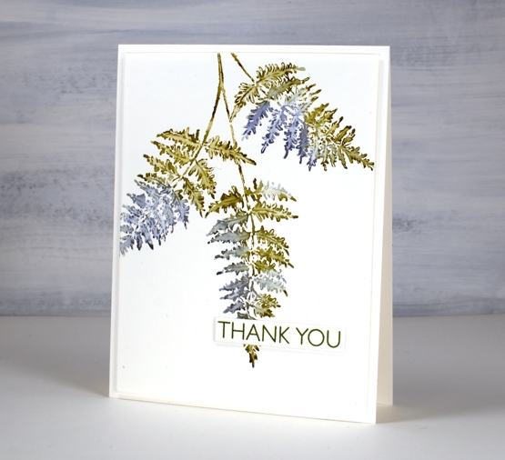
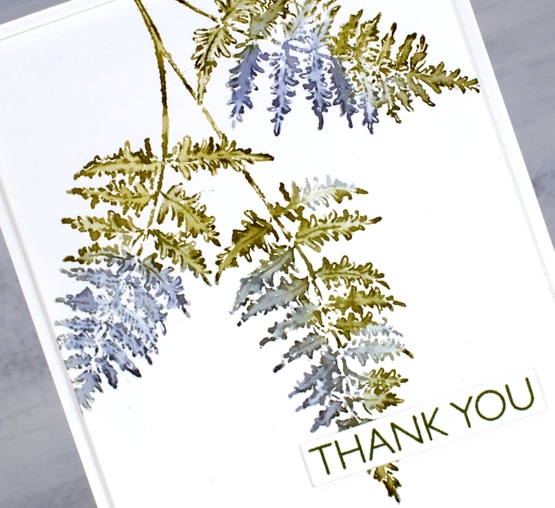
Same three inks and a size 0 paintbrush were all I needed for this very clean print of the ‘fresh fern. I popped a sentiment from PB ‘million thanks’ up over the tip of the fern and kept it all very simple.
So tell me, which one suits you? Blended and blurry or crisp and clean?
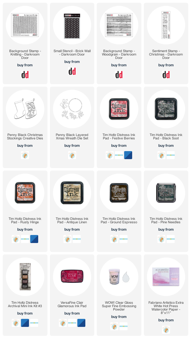
Supplies
(Compensated affiliate links used when possible)
Garden Variety
Posted: February 24, 2021 Filed under: fresh ferns, garden variety, Penny Black, Uncategorized | Tags: distress markers, Penny Black stamps, Ranger Distress inks 7 Comments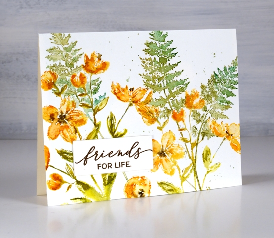
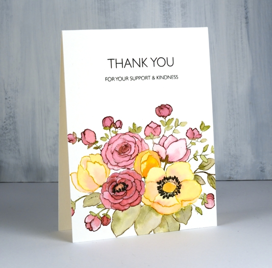
I’m enjoying having new flowers to arrange, stamp-wise, that is. Penny Black’s new ‘Daydream collection has some lovely floral stamps including the ‘garden variety’ I’ve used for today’s card alongside ‘fresh fern’, another new one. I used distress inks and markers to ink the stamps; I generally pick at least two colours for the flowers and two colours for the foliage then give the stamp a spritz so the inks begin to blend.
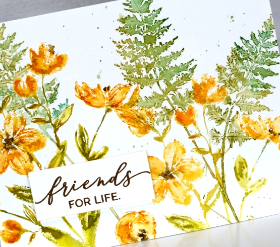
Once I’ve stamped the images I decide whether to blend further with a paint brush and water, for this card I kept it minimal but sometimes I do more blending for a looser watery look. I stamped the ferns after the flowers which required some partial stamping and as well as a little masking to make the ferns appear to be behind.
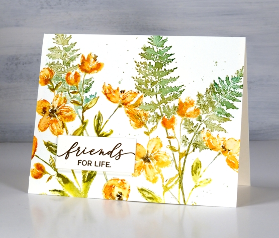
I finished the panel off with splatter then stamped a sentiment and stacked it up on three layers. I have an art journal page in process with the ‘garden variety’ stamp which I will hopefully finish and share with you next week.
Have a great day; thanks for spending some of it here on the blog with me.
Supplies
(Compensated affiliate links used when possible)
Rosa
Posted: February 5, 2021 Filed under: Leaves, Penny Black, rosa | Tags: distress markers, Penny Black creative dies, Penny Black stamps, Ranger Distress inks 8 Comments
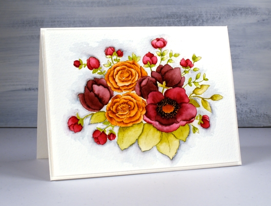
This is ‘Rosa’ a new floral stamp from Penny Black. When I have a new brushstroke stamp I usually reach for the distress inks for the first test drive. That’s what I used for both cards in today’s post and I love the watercolour effects I was able to get.
The ‘rosa’ stamp is made up of round flowers and long leaves in an impressionistic style. For this orange and blue card I kept the stamp in the positioner while I worked on the hot pressed watercolour panel stamping the flowers first in fossilized amber and spiced marmalade, the leaves in faded jeans and forest moss and the flower centres in ground espresso.
Because I was experimenting with the new stamp I didn’t plan or paint a background for the panel. Once the flowers were finished I decided I wanted some colour around them. Rather than paint some pale washy colour I smooshed the faded jeans and forest moss mini distress cubes on a piece of acetate, spritzed it generously then pressed it onto the panel here and there to transfer ink around the flowers. I finished the card with some twine, blue leaf die cuts and a sentiment also stamped in blue. If you’re wondering why I chose to have blue leaves it’s not just because I love blue. Blue and orange are complementary colours, opposites on the colour wheel so when they are placed next to each other they provide a contrast that makes the other colour pop!
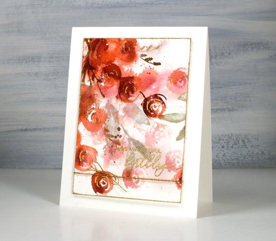
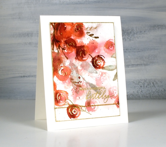
The second card features generational stamping stamping and plenty of spritzing to make the paler background flowers bleed into the surrounding area.
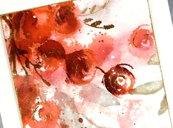
The flowers are stamped in abandoned coral and aged mahogany, the leaves are forest moss and the stems ground espresso. Because I added plenty of water when stamping this panel most of the definition in the flowers was lost so I drew some swirls on the flowers with a glue pen, let it dry to a tacky state then pressed gold foil on top. I added more gold details with an embossed sentiment, a gold cord and gold embossed edges round the panel.
Rosa is such a pretty stamp, I’m looking forward to playing with it again. I think it might make a pretty art journal page.
Supplies
(Compensated affiliate links used when possible)
2021 BuJo – January pages
Posted: January 30, 2021 Filed under: Bullet Journal, Dingbat notebooks, Stabilo .88 fine line pens | Tags: Bullet Journal, Dingbats notebook, Ranger Distress inks 15 Comments
As I mentioned last weekend I have started a new journal or bullet journal or BuJo for short. This is the second one I’ve used and I am enjoying the process of working out what I need and don’t need to include. As you can imagine I am also enjoying making it pretty but in ways that don’t take all the time I should be spending on the ‘to do’ list I write in the journal!

This is my January title page; I know it’s almost February and I should be sharing the Feb page but I will catch up and start sharing ahead by March (I hope). I’m going to have a different theme for each month, otherwise I would get sick of them I’m sure. The January theme as you can see was mountains and trees. Start with what you know, right?
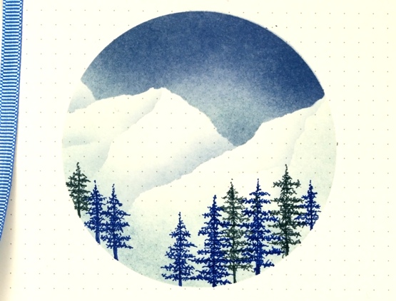
I die cut a 3¾” circle from a large post it then tore some more post-it edges to mask mountain tops while I blended a blue sky with chipped sapphire and stormy sky distress inks and blending brushes. Not too surprising that I would pick my favourite blue distress inks for my first theme. After blending the dark sky I turned the torn edge of the post it on its side to blend shadows on the mountain sides with stormy sky ink. I drew the trees with a Stabilo point 88 dark blue and a Papermate flair grey.

For the month double page spread I used the same products and method but added a circle mask for the moon before blending the sky. At present I don’t have activities outside the home other than groceries and exercise so I am recording those along with birthdays and the meals we make just so I remember what we’ve eaten lately and for ideas later when I don’t know what to cook.

During January I have also been using a habit tracking page for water consumption, vitamins and correspondence, a to-do list page and a project tracking page for design work, blogging and class planning. I’m still working the kinks out of the layouts and content but I used the same mountain and trees theme.
Supplies
(Compensated affiliate links used when possible)

Stockings are hung
Posted: January 29, 2021 Filed under: brick wall, Christmas sentiments, Darkroom Door, Dies, knitting, layered Xmas wreath die set, Penny Black, stockings, Woodgrain | Tags: Darkroom Door stamps, Darkroom Door stencils, Penny Black creative dies, Ranger archival inks, Ranger Distress inks 6 Comments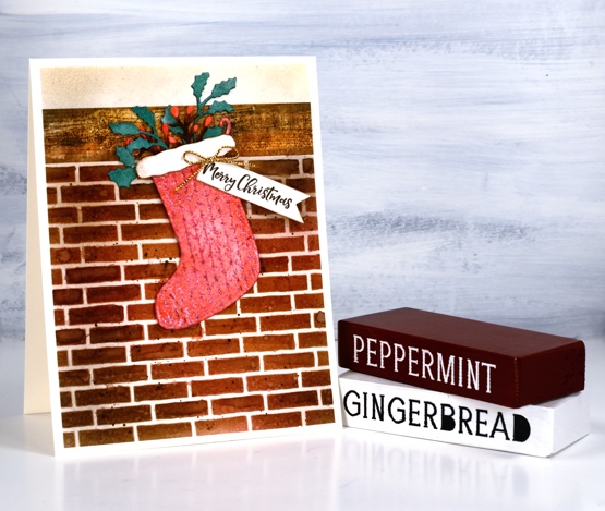
When I was making knitted panel cards a few weeks back I thought I should create a knitted stocking card at the same time. I also decided to try and make at least one, but hopefully more than one Christmas card each month. Usually I don’t feel like making Christmas cards after Christmas but I’m happy to right now so I made this little stocking and hung it by the chimney with care.

I stamped the Darkroom Door knitting pattern in versafine clair ‘glamorous’ ink, embossed in clear powder then painted over it with festive berries distress ink. I cut out a stocking with one of the Penny Black Christmas Stocking dies. To fill the stocking I cut foliage from watercolour paper using the PB layered wreath set then coloured the die-cuts with festive berries, pine needles and ground espresso distress inks. The stocking needed a bit more trim so I cut out a white cloud shape to and blended some brown ink around the edges.

To create a chimney I used a stencil and a stamp from Darkroom Door, the woodgrain stamp for the mantle and brick wall stencil for the bricks. I worked on hot pressed watercolour paper for both so I could blend distress inks and add watermarks. I stamped the wood with ground espresso archival ink so it wouldn’t blend then painted and blended ground espresso, black soot and rusty hinge distress inks over the top. I blended the same three distress inks through the stencil then spritzed some water over it before lifting the stencil. I blended some of the bricks with a paintbrush and added some black soot splatter.
The mortar around the bricks looked too white so I blended antique linen ink over the whole panel and used some to blend above the mantel too. To finish of the card I added a gold bow and a sentiment from the DD Christmas sentiment strip stamp.
So that’s one Christmas card done so far in 2021! Do you make Christmas cards all year?
Supplies
(Compensated affiliate links used when possible)
A Day at a Time journal page
Posted: January 20, 2021 Filed under: alphabet medley, Art Journal, book spines, Darkroom Door, diamonds, handwritten script, plaid, pocket watch, sheet music, teacups, Woodgrain | Tags: Darkroom Door stamps, Darkroom Door stencils, Ranger Distress inks, Ranger Distress stains, WOW embossing powders 7 Comments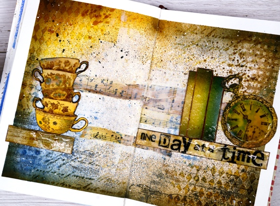
This page is in one of my Fabriano art journals. I’ve mentioned before that I have a love/hate relationship with these journals as the pages are not really meant for watercolour and I always want to do watercolour. I can’t bear to quit though because there are quite a few completed pages in the journals and I want to get to the end.
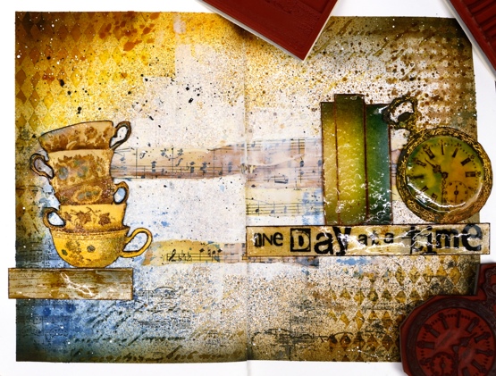
I began this spread with some inspiration pages open on my Pinterest ‘journal‘ board but no real plan; I was after a look but didn’t have a theme. I rarely use my distress stain sprays as sprays; I usually paint with them but this time I taped the edges of the pages then put the book in my recycle paper box and sprayed with vintage photo, faded jeans and wild honey spray stains. I then sprayed some water but as I mentioned, this paper doesn’t act like watercolour paper so the stains didn’t blend and move.
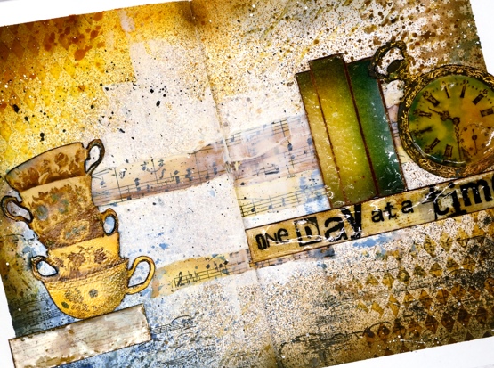
Next I added some texture with modelling paste through the Darkroom Door diamonds & handwritten script stencils. Once that dried I blended round the edges of the pages with faded jeans, vintage photo, wild honey and black soot distress inks which highlighted the added texture. I was happy with my chosen colours but still didn’t know what the focus should be. I coloured some strips of sheet music and added Darkroom Door ‘plaid’ and ‘sheet music’ stamping here and there.

Initially I wanted to use the pocket watch and the teacups so I stamped them in vintage photo and swiped them through diluted inks to pick up colour as well as adding colour with a paint brush. Once they were painted and cut out I clear embossed the clock face three times with high gloss embossing powder to look like glass and used normal clear embossing powder for the cups.
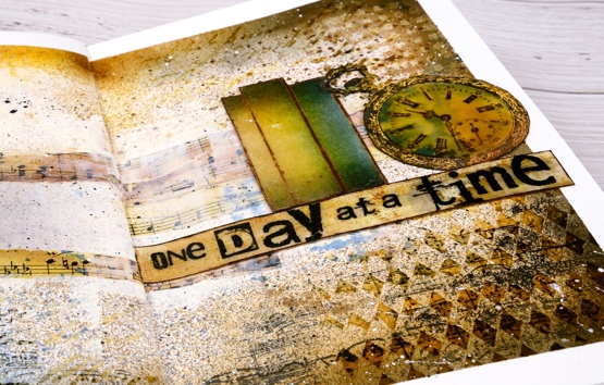
To brighten up the centre of the double page I ended up spreading white absorbent ground over the strips of sheet music and out towards the edges. Then began the longish process of turning the page into a composition. After much rearranging I realised that the tower of teacups and the pocket watch need a third element so I tried a floral piece then just a single shelf (stamped with DD woodgrain background stamp) and finally realised the ‘book spines’ stamp would probably work again. Honestly I’m not trying to put that stamp in every single journal page. Even with the books it still took a while to balance the layout and come up with some words. I finally decided on ‘one day at a time’ stamped on the shelf with the DD alphabet medley stamps. As Vicky Papaioannou often does on her amazing art journal pages, I finished with both black and white splatter then removed the masking tape before gluing down my elements.

It’s nothing like my initial inspiration photos on Pinterest but it did give me some good practice at adding texture and layers to my art journal, two things I don’t find easy. I only have one of my art journal pages on youtube as there is so much humming and ha-ing as I work out what I want. If I cut out the pondering parts is an art journal page process something you’d like to see in a video?
Supplies
(Compensated affiliate links used when possible)
Reading Year journal page
Posted: January 1, 2021 Filed under: book spines, Darkroom Door, Woodgrain | Tags: Coliro paints, Darkroom Door stamps, Ranger Distress inks 11 Comments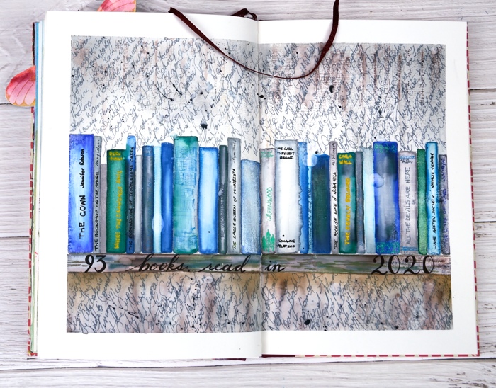
I know 2020 was a very different year from what any of us imagined but I hope you are able to look back on it and see some new habits or achievements that please and encourage you. I’ve always been a reader but I have to admit I spent more time immersed in stories this year. I read physical books, listened to many audio books as I worked on art and in the last week read e-books on my new e-reader. I was hoping to reach 100 books but fell a little short with a total of 93 and three currently on the go.
It is highly possible that I had years as a child when I read more than 93 but I don’t know; I didn’t keep a record. I have this year’s books written in a bullet journal but I decided to record them on an art journal page as well. This is the second book filled spread in my art journal and who knows, there may be more.
I love the book spines stamp from Darkroom Door and this time stamped it across the pages instead of in piles. After I had coloured all the book spines with watercolour markers and pearlescent paints I drew a shelf underneath and then stamped the DD woodgrain stamp above and below the shelf of books in grey and brown distress inks. I added a few titles to book spines with gel pens then used a scribbly script to fill the surrounding area with all the rest of the books. It soon became apparent that there would not be room for author names so I just did book titles. Once I had filled the space I had to squeeze the last few in between lines. I splattered some black soot distress ink over the page before removing the masking tape and adding the hand lettered title.
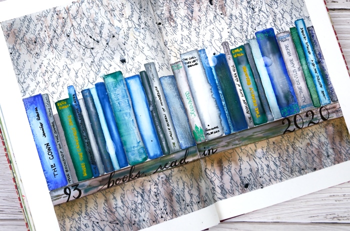
I read mysteries, war novels, crime novels, literary fiction, comedy, romance, historical fiction and a thriller. There were books I didn’t care to finish so they are not on the list and there were a handful I read twice. I read several series; I do like a good series and I took pains to try and have them arrive in my library holds in the right order or close to it.
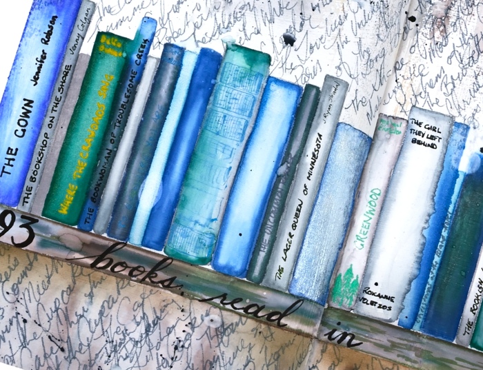
The book club I belong to did manage to meet this year, once indoors before the pandemic started then two more times, outdoors around a picnic table then, in late October, around a bonfire. We discussed ‘Where the Crawdad’s Sing’, ‘Small Great Things’, ‘The Lager Queen of Minnesota’ and ‘The River’. If you know of some good ‘book club books’ please let me know in the comments below. I have received helpful recommendations from you before which I’m looking forward to reading in 2021.
Happy New Year!
Supplies
(Compensated affiliate links used when possible)
2020’s favourite posts
Posted: December 31, 2020 Filed under: Arteza, Brusho, Coloured pencil, Darkroom Door, Finetec paints, Hand painted, Penny Black, watercolour real brush pens | Tags: Darkroom Door stamps, Darkroom Door stencils, distress oxide inks, Faber-Castell Albrecht Durer Watercolour pencils, Faber-Castell Polychromos Colour Pencil, Finetec artist mica watercolour paint, Penny Black stamps, Ranger Distress inks 6 CommentsI looked through the stats for 2020 to see which posts were viewed the most. It is not necessarily an accurate indicator of favourites but it is fun to look back and see what appealed. I’ve included a link to the original post next to every photo. I’m featuring only cards I made and posted this year. Here they are in no particular order.
Back in January I used Darkroom Door stencils as a guide to paint watercolour backgrounds for silhouette stamping with DD stamps.
In February as I was preparing to teach a class using pearlescent paints on black watercolour paper I created this embossed and painted card. The class didn’t happen but the plan is still in my mind for either an online or in-person class hopefully some time in 2021.
This card and the next favourite feature the same Penny Black stamp and no-line watercolour technique. I used distress inks and markers for the watercolouring on this one.
Same stamp as shown above, Unforgettable from Penny Black but this time watercoloured with Arteza real brush pens.

This lilac card along with three other colour schemes featured the ‘lovely lilacs‘ stamp from Penny Black and there is a video tutorial as well.
Another video post once again with Arteza watercolour brush pens this time with Penny Black’s nature’s glory stamp.

Now this one is a little different, pencil colouring on kraft cardstock, again with a video. 2020 has definitely seen me create the most videos!
This one is also one of my favourites so it is nice to see it as a reader favourite too. It is the second post in the top ten to feature the lovely lilacs stamp from PB.

I’m happy to see one of my hand painted pieces in the favourites. This is a brusho & cling wrap painting I did after watching a CeeCee Creations video.
Another video post made the top ten, this one featuring die cut distress oxide painted leaves. This is the only one not featuring flowers.
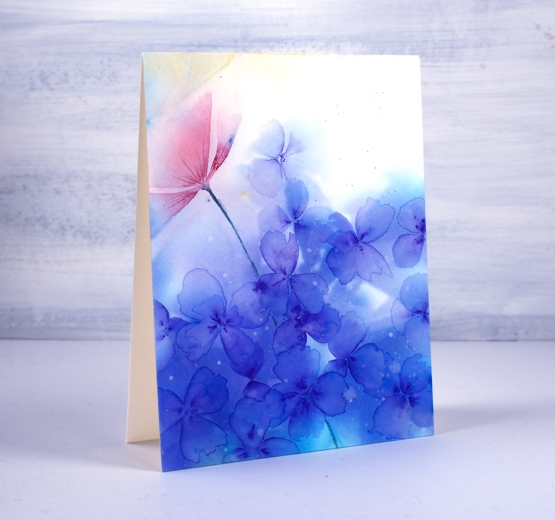
This one just missed out on the top ten so I’m adding it here at the end because I think it might be my favourite of the year. It’s a brusho and cling wrap panels that made me think of hydrangeas so I turned the random patterns into massed flowers.
Thank you for dropping it to read my posts this year. I love sharing the details of my cards, journal pages and creative adventures. In a year when face to face interactions have been limited I have been encouraged over and over by the comments and conversations here on my blog.
It has been my best year ever for producing you tube videos and also the year I fulfilled a long time dream of producing online classes. Again thank you for your support in those endeavours.
I’m looking forward to sharing more creative pursuits on the blog with you in 2021, there will be watercolour and stamping (of course!) but also alcohol ink art, gel printing, lettering and journaling. I hope you are safe and well where you are and pray that 2021 will be a year of health and happiness for you.
Cabin by the lake
Posted: December 16, 2020 Filed under: cozy cabin, Penny Black, quietude, Stamped Landscapes, tannenbaum trio | Tags: grafix, Penny Black stamps, Ranger Distress inks, Ranger Distress stains 7 Comments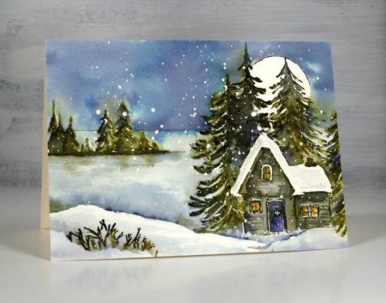
I’ve been trying to make some smaller panels and one layer cards over the last few days as I still need quite a few cards so how exactly did this happen!? Not smaller and not quicker but definitely satisfying. I was thinking about some of the scenic cards released by Penny Black this year and wanted to combine them into new scenes. I made the left side of ‘quietude’ + ‘cosy cabin’ + 1/3 ‘tannenbaum trio’ = a cabin by a frozen lake.
I worked on hot pressed watercolour paper with masking fluid splattered on it and began by stamping the small trees and horizon from the quietude stamp in iced spruce, forest moss and chipped sapphire. I blended over the trees with a paint brush but came back to them later to do more. I stamped the cozy cabin stamp next, forest moss and chipped sapphire on the trees, hickory smoke and black soot on the cabin. I remembered to colour inside the windows with a mustard seed marker before I got carried away with blending this time so it looks cozy inside. To add more trees behind the house I made a cabin post-it mask then stamped one of the tannenbaum trio stamps twice on the right hand side of the cabin.
Before adding the sky I made sure everything was dry then positioned a frisket film circle mask over the trees. I used speckled egg distress stain to paint the sky initially then when I had covered it all dropped in some chipped sapphire. Green ink did bleed out of the stamped trees but I kept a paper towel on hand to dab it dry before it could move too far.
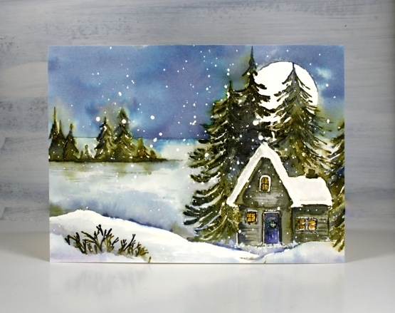
The lake area is mainly iced spruce and stormy sky to keep it paler and frozen looking but I added chipped sapphire and forest moss at the bottom where the lake is in shadow behind the snowbank. The snowbank looked too large and stark in the left hand corner so I stamped just the tips of the branches from the single tree in the cozy cabin set to look like a bit of foreground foliage. ( hot tip for my Ottawa people, all three sets featured on this card are listed in the Crop A While online store, just saying…)
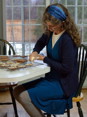
Quick update on Dressember: my card making friends keep pushing the fundraising total higher and I am so very appreciative. As I write this it has reached $1190.25. Thank you so much. Here is a photo from day 12 as I decorate gingerbread. Decorating the gingerbread is my favourite part of the process or maybe equal first place with eating it. This first batch unfortunately spread while baking to such an extent that the tree and mitten shapes were unrecognizable so the decorating was the only clue to what they were meant to be!
Supplies
(Compensated affiliate links used when possible)
Tannenbaum Scene – video
Posted: December 10, 2020 Filed under: Penny Black, tannenbaum trio | Tags: Penny Black stamps, Ranger Distress inks, Tutorial, video 3 Comments
Last week I posted a card and video made with stamps from the Penny Black tannenbaum trio stamp set. I filled the scene with trees on the previous project making more of a forest. Today’s card features a different colour scheme and a painted sky.

As often is the case for my winter scenes I started with a panel of hot pressed watercolour paper splattered with masking fluid. I painted the sky first and stamped the trees last but the video gives you all the details so here it is.
We had a decent fall of snow yesterday so it’s looking a bit more like the video around here now. What’s it like where you are?
Supplies
(Compensated affiliate links used when possible)