Daydream Watercoloured Flowers -Video
Posted: February 18, 2021 Filed under: daydream, Karin brushmarkers, Penny Black, Tutorial | Tags: Karin brushmarkers, Penny Black creative dies, Penny Black stamps, Tutorial 7 Comments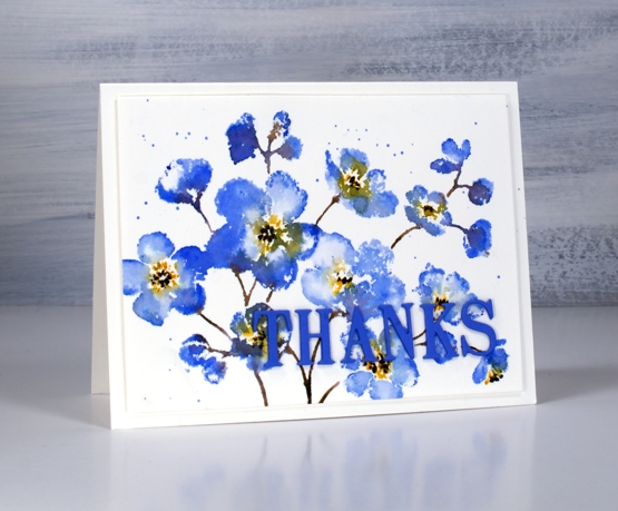
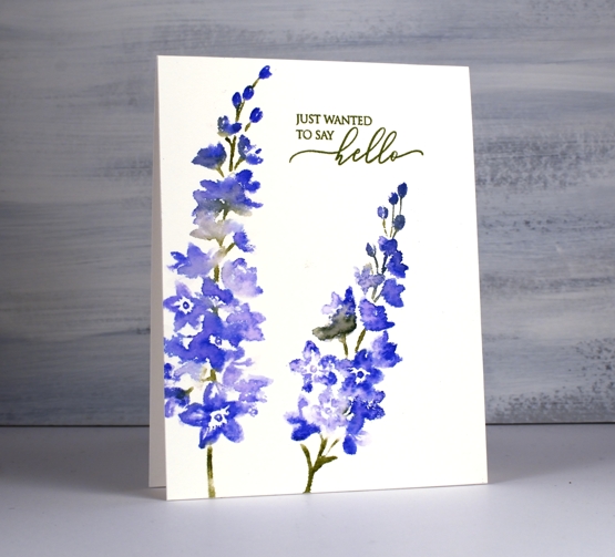
Penny Black has a new release called ‘Daydream’ and it’s filled with spring goodness. I guess many of us start daydreaming about spring in February. The stamp featured in my card today is called ‘daydream’ and I’ve paired it up with a new die, ‘thanks & hello’.
I’m enjoying working with the Karin brushmarkers both for watercolouring line images and for inking stamps. In today’s video I ink the stamp with four markers but my technique is slightly different to my usual method and involves some ‘water stamping’
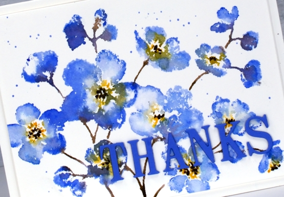
In the video below you can see why the juicy Karin markers are perfect for this technique. As I’ve mentioned in previous posts, a little ink goes a long way. I’m looking forward to trying this technique again on a different stamp with even less ink for a paler more subtle look.
I chose to keep the panel simple on a white background but you could add a pale wash before starting or do some second generation stamping for background flowers. Maybe I’ll try that next.

This blue which has a hint of purple is my favourite blue. It reminds me of cornflowers which featured in my bridal bouquet and was the colour of my bridesmaid’s skirts.
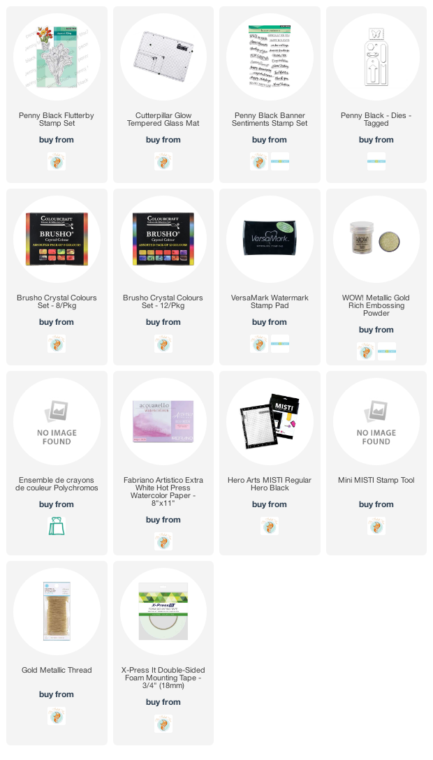
Supplies
(Compensated affiliate links used when possible)
Moving Alcohol Inks with Air – Video
Posted: February 3, 2021 Filed under: Alcohol Ink, Brutus Monroe, CAS, Dies, grafix, light as a feather, nesting squares, Penny Black, polar bears, Tutorial, Waffle Flower | Tags: grafix, grafix craft plastic, Penny Black creative dies, Penny Black stamps, pinata alcohol ink, Ranger Alcohol Ink, Tutorial, video 16 Comments
I’ve had the alcohol inks out recently and spent some time trying to get soft wavy patterns on craft plastic. I have seen several artists who do this technique beautifully but I am very much still a beginner with it. I have a few cards to share today along with a video showing my process for two of the panels. I worked on white craft plastic from Grafix which is heavyweight and totally opaque. For most of the panels featured today I used only two alcohol inks plus plenty of 99% rubbing alcohol; each panel was created with a metallic and a non-metallic ink.
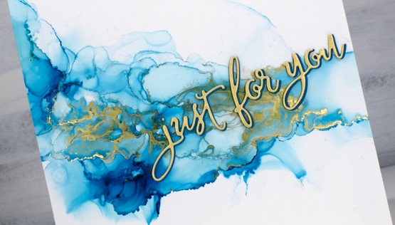
This first panel was made with turquoise AI and gilded alloy AI; I love the range of blues when diluted with rubbing alcohol. The ‘for you’ Penny Black die cut is two layers of turquoise cardstock topped with one layer of pale gold.
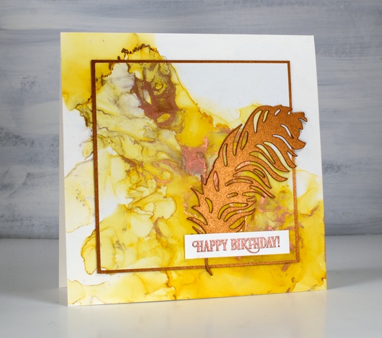
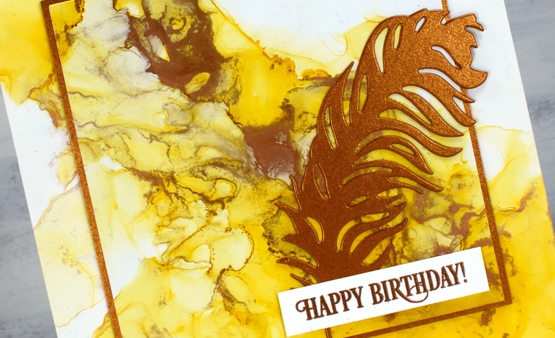
This warm toned card was made with honeycomb AI and mined alloy AI then die cut with a WaffleFlower square nesting die. I used the WaffleFlower additional square dies to cut a larger copper square then added the PB ‘light as a feather’ die cut and a PB birthday sentiment embossed in Brutus Monroe penny embossing powder.
You can see the process for both cards above in the video below.
As I am working on alcohol ink panels I am evaluating my process and working out what I want to try next. I just bought a cheap lazy susan to work on the blown flowers and I’m pretty sure I don’t need to use as much coloured ink when I make the initial drops. You can be sure I will let you know what I discover.
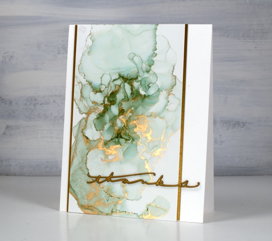
I have a couple more cards made off camera using the same technique shown in the video. The card above features juniper AI and statue alloy AI with the PB ‘many thanks’ die cut from antique gold cardstock and stacked twice.
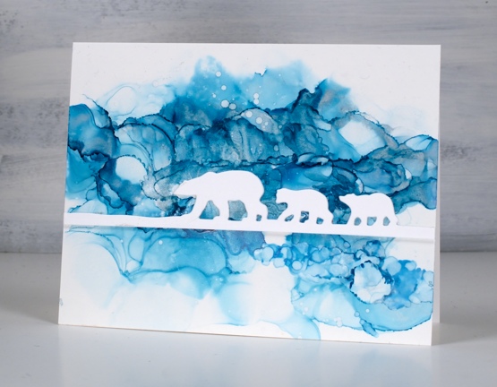
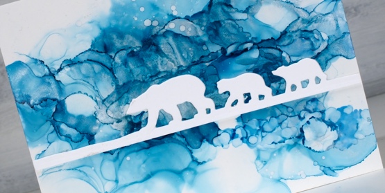
When this panel was finished it reminded me of photos of the artic and far north where the icebergs and glaciers are made up of beautiful shades of blue. It’s kind of a cross section perspective where we can see below and above the ice the bears are walking on. I did use two blue inks plus a silver for this one, ranger turquoise and stream with pinata silver. The bear die is ‘polar bears’ from Penny Black.
We’ve been watching Cecilia Blomdahl’s youtube channel about her life on Svalbard, an island off the north coast of Norway. She lives in the world’s northern most town. Polar bears are definitely around so you don’t wander outside the village without your weapon!
Supplies
(Compensated affiliate links used when possible)
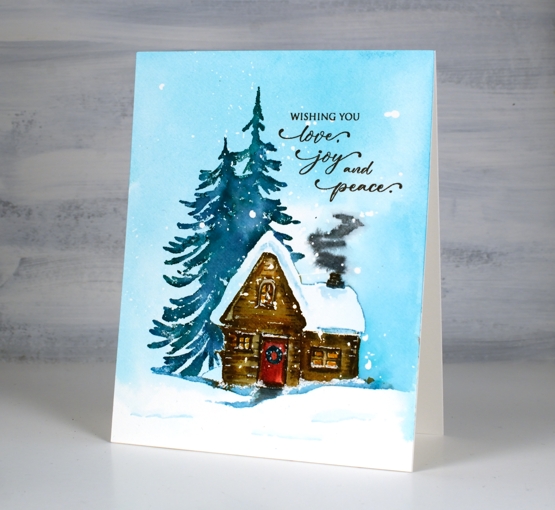
Cozy Cabin video
Posted: November 11, 2020 Filed under: cozy cabin, Penny Black, Stamped Landscapes, Tutorial | Tags: distress markers, Fabriano Watercolour Paper, grafix, Penny Black stamps, Ranger Distress stains, video 6 Comments
This cute cabib is another new stamp from Penny Black; the set is called ‘Cozy Cabin’ and it includes this tree shadowed cabin plus an extra tree not shown on this card. Once again I enjoyed bringing this scene to life with splattered masking fluid and distress inks.
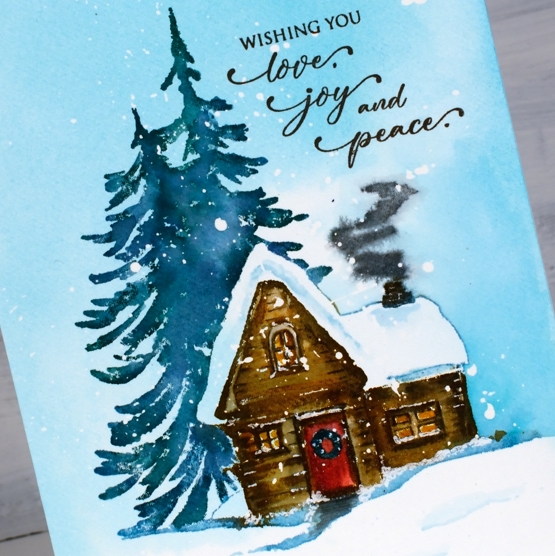
I used a stamp, paint, stamp, paint process to build up the colour and definition of the cabin. I had my glass mat at hand so I could smoosh inks then pick up colour with a paintbrush.
When we go cross country skiing in Gatineau Park we come across cabins that look a little like this. There are several scattered across the park for the use of skiers, complete with a wood stove, tables and benches so we can warm up, eat our snacks, and rest a little before heading back out in the snow.
I’m in no hurry for the snow to come but I do have new skis and boots after years of hand-me-downs so the pressure will be on this year to make good use of them!
Supplies
Oxide Leaves Video
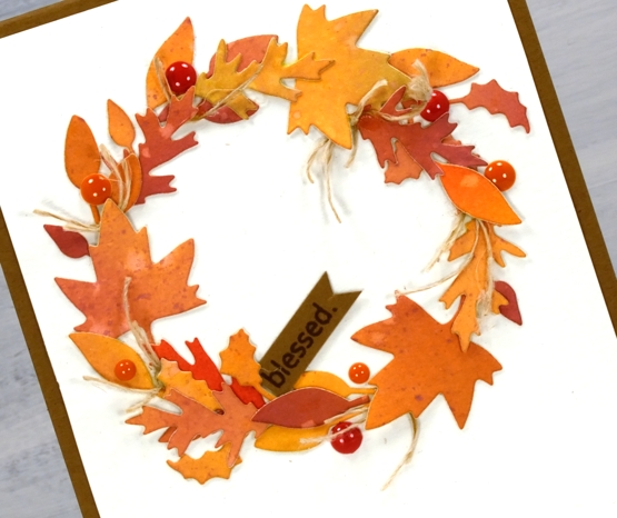
Posted: September 25, 2020 Filed under: Dies, fall foliage, golden delight, Penny Black, pumpkin & leaves, Tutorial | Tags: distress oxide inks, Fabriano Watercolour Paper, Penny Black creative dies, Penny Black stamps, video 5 Comments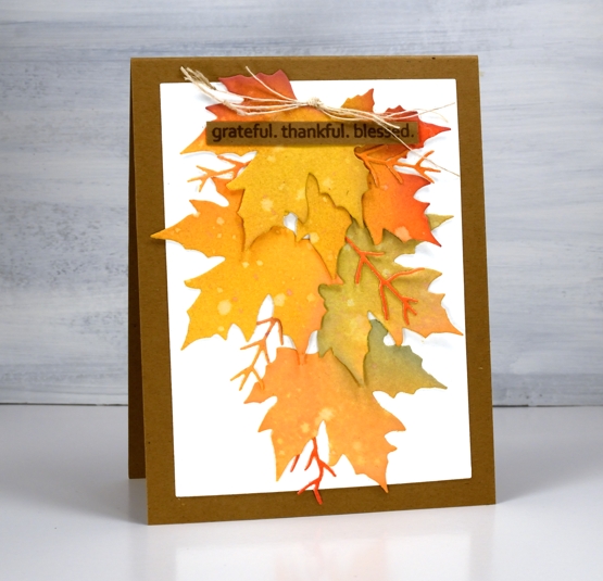
There is no denying it anymore, autumn is in the air and on the trees and definitely in the cards. This week the weather has been lovely, the sun has shone and the frost warnings have gone. Can’t complain.
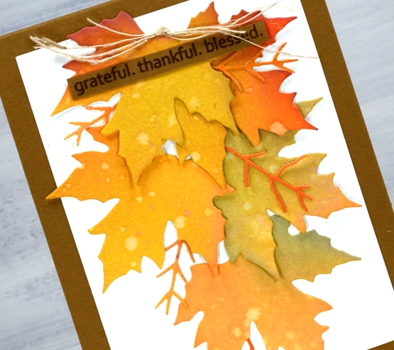
I really am a seasonal stamper; I’m inspired by what is going on outside in the world. With a few exceptions, like Christmas card prep, I like to stamp what I see in the garden and surrounds. The leaves on my trees are beginning to turn, nothing spectacular yet and nothing to rake (yay) but the signs are there. I chose oxide inks to blend several three coloured panels which I then cut up into leaves. The process and chit chat is all in the video below.
After the video was completed I looked at the wreath and decided it needed some brighter pops of colour and luckily I had some enamel dots which matched exactly. I added them before taking the photos below.
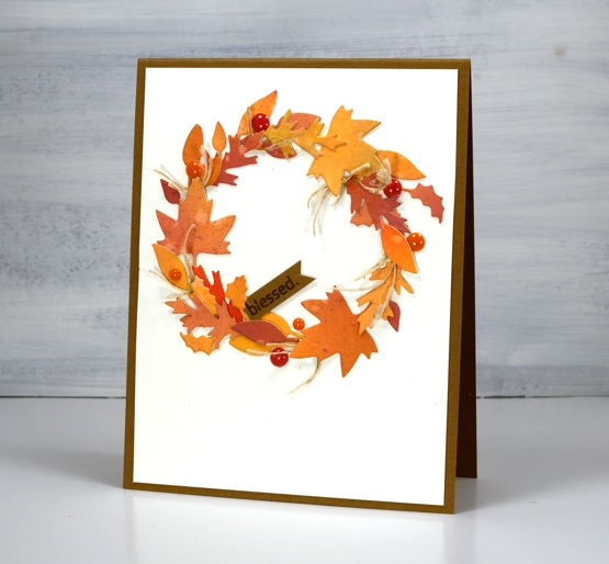
I really enjoy arranging all the elements on die cut cards like the two I’ve shared today but the gluing drives me a little crazy. Sometimes I use double sided adhesive but if the die cuts are not going to be sitting flat that doesn’t really work. If you have any suggestions for attaching fiddly little die cuts please leave them in the comments; I’d love to know. You might notice I try not to include much gluing in the video because it doesn’t make for very entertaining viewing.
I hope you are surrounded by some fall beauty where you are or perhaps enjoying some spring sunshine in the southern hemisphere.
Supplies
No-line watercolour Magnolias -video
Posted: September 2, 2020 Filed under: Inktense pencils, magnolia blossoms, My Favorite Things, Tutorial | Tags: Gina K inks, Inktense, My Favorite Things, Tsukineko Versafine inks 11 Comments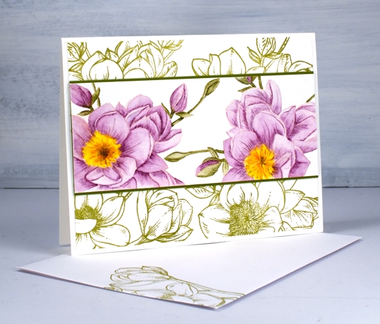
This is a card which changed shape and style several times before it turned into the design you see above. The watercoloured flowers and the green stamped flowers are from the same MFT ‘magnolia blossoms’ set.
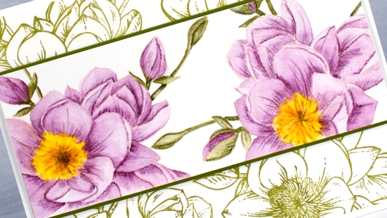
I almost didn’t keep making the video as I made mistakes and alterations but the point of the video was the no-line colouring not the card layout so I kept going. I used Gina K’s ‘barely there’ amalgam ink to stamp the flowers; the ink is a pale peach colour which almost disappeared with both the purple and the green watercolouring. I used Derwent Inktense pencils for the no-line watercolour shading an area lightly and minimally before blending the ink to fill the petal or leaf.
My initial layout for the painted panel involved both stamps from the set but you see in the video a series of unfortunate events caused me to slice up the first panel, add another flower and come up with the layout you see below.
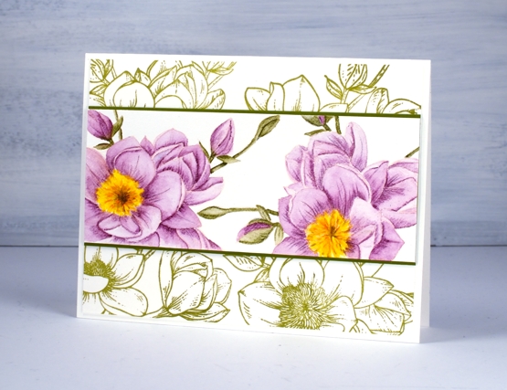
One thing I didn’t initially plan was the simple green stamping behind the coloured panel but I’m glad I tried it. These stamps are definitely stunning when left uncoloured in their simple outline beauty.
Supplies
Masked Wildflowers Video
Posted: May 29, 2020 Filed under: Darkroom Door, Tutorial, warm wishes, Wildflowers Vol 1 | Tags: Darkroom Door stamps, Fabriano Watercolour Paper, Ranger Distress inks, Tutorial 11 Comments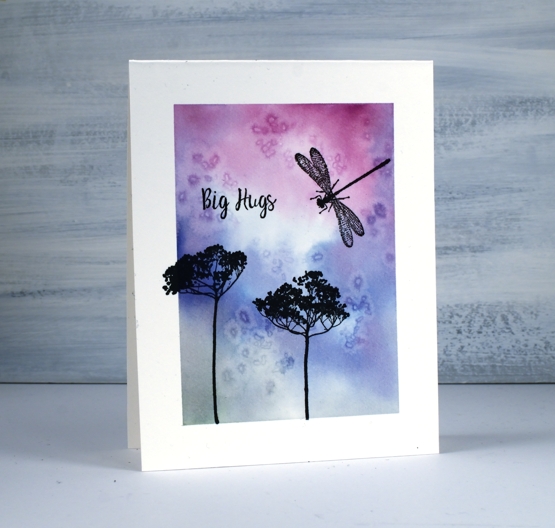
I have a simple design for you today and I turned on the camera while I was doing it. It’s probably something you have tried before but might be new to a few readers. I used washi tape to mask off a frame on a one layer hot pressed watercolour card base then created a watercolour background with distress inks and salt.
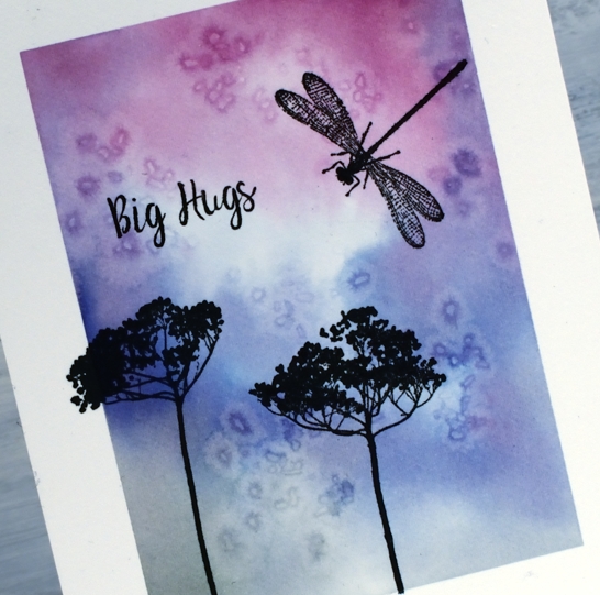
The stamps are some of my favourite silhouette stamps from the Darkroom Door ‘wildflowers vol 1’ set with a sentiment from a recent set ‘warm wishes’.
It was fun creating a one layer card again; some of you will remember when I was part of the ‘One Layer Wednesday’ challenge and ‘One Layer Simplicity’ challenge a few years back.
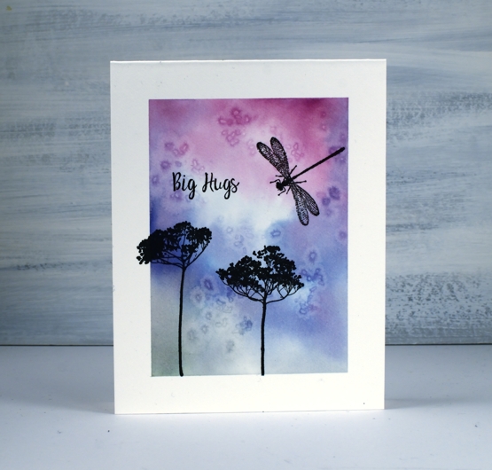
Let me know if you try this technique, I’d love to hear or see what you came up with.
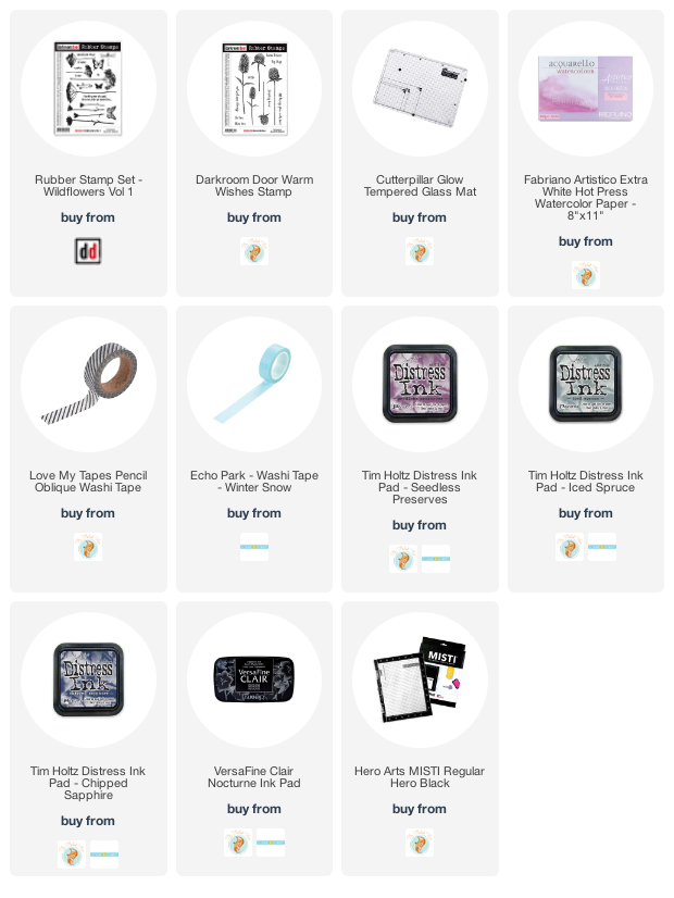
Supplies
Pencil colouring on kraft paper
Posted: May 1, 2020 Filed under: Alluring, Coloured pencil, Penny Black, Tutorial | Tags: Faber-Castell Polychromos Colour Pencil, Penny Black creative dies, Penny Black stamps, Tutorial, video 11 Comments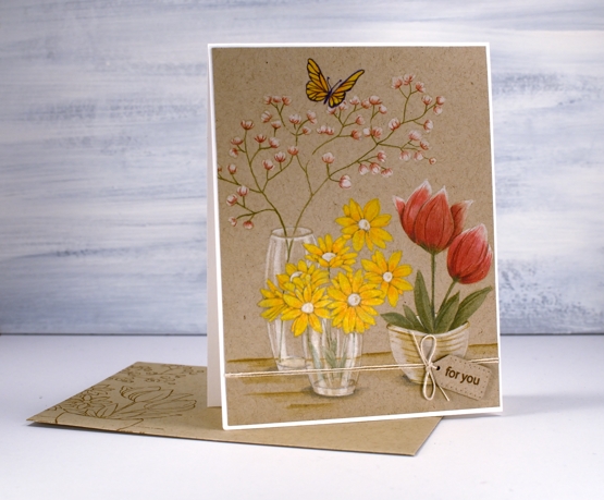
I’ve been doing some coloured pencil work, nothing too fancy but definitely satisfying to see it come together. I filmed as I coloured so you can see how I approached each flower as well as the glass vases. I don’t often complete a whole card with coloured pencils, I’m more likely to bring them in at the end to add details and shading but this time they are took the starring role. I like the look of pencil on kraft paper too, I find it a bit less intimidating than bright white paper.
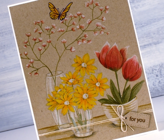
It took me a long time to finish the colouring so I’m sure you won’t be surprised to hear I didn’t include every last second of footage. I sped it up and chopped it up so it wouldn’t be too long but I made sure to include my process for each element. I even did one part more than once!?! but I’ll tell you about that during the video. Towards the end of the video I referred to colouring wizard Kathy Racoosin, if you haven’t checked out her blog and wonderfully instructive youtube channel, make sure you do.
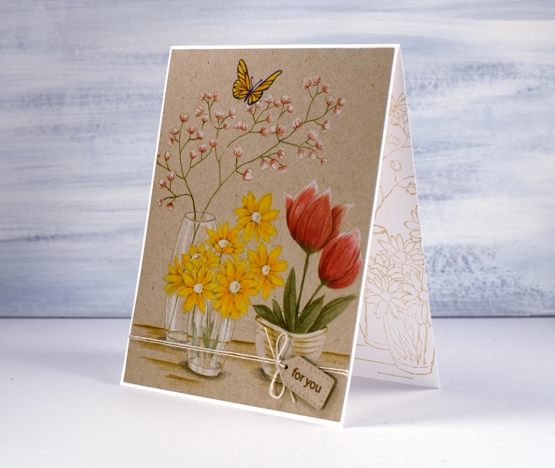
As you can see I stamped a print on a matching envelope and on the inside of the card too. It is always best to do this while the stamp and inks are still on the table, buy you already knew that didn’t you?
When I showed this one to my daughter she absolutely made my day by saying it reminded her of story books she would read and reread as a child because she enjoyed the illustrations so much!
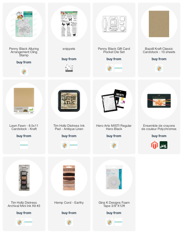
Supplies
Stamping with Arteza Real Brush pens
Posted: April 17, 2020 Filed under: Arteza, nature's glory, Penny Black, Tutorial, Watercolour, watercolour real brush pens | Tags: Arteza, Fabriano Watercolour Paper, Penny Black stamps, Tutorial, video 10 Comments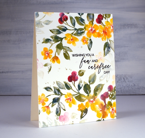
Hi there, this pretty stamp, ‘nature’s glory’ is making its second appearance on the blog and I’ve paired it up with Arteza real brush pens. I did all the inking with the brush pens and made a video to give you an idea of the process. One of the tricky steps when creating watercolour cards with stamps is when, where and how much water to add, hopefully the video will give you an idea.
You probably noticed in the video the way the brush pen bristles were able to easily get into small sections of the stamp so I could ink the flowers, berries and leaves. I spritzed the stamp before pressing onto the hot pressed watercolour paper so the inks would blend on the stamp rather than me blending them on the paper. I love the softness of the blends including the areas that get more water and the ones that look a little dry because they got less water.
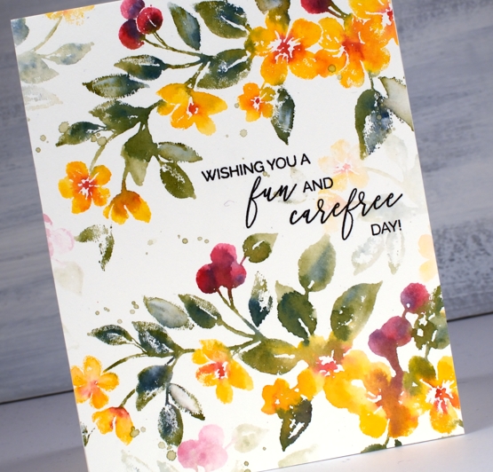
The soft background leaves and flowers were all stamped with ink left on the stamp after doing the bold images. The ink is certainly intense enough that an extra spritz of water is all you need in order to stamp the pale images that appear to be further back between the branches. Dabbing these pale images with a paper towel after stamping makes them even paler and removes any liquid sitting on the surface.

I even had enough ink on the stamp to get a pale print on my envelope then finished with splatter as you know I like to do.
The card below was done with the same stamping technique but I created the soft coloured background at the beginning of my process. I scribbled the blue, yellow and green pens on my glass mat first, spritzed with water then swiped the hot pressed watercolour panel through the ink picking up sections of diluted colour which I dried before transferring the panel to my stamp positioner to do all the flowers. If you are wondering about the sentiment, it is for one of my friends who was told this by a student! When she relayed the experience to me I knew it had to become a card. I did a bit of partial stamping with MFT ‘birdie brown greeting stamps’ then cut the letters b, a, b, y from dark green cardstock (I know it looks black ) with MFT ‘little lowercase dies’.
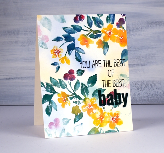
If you are a teacher connecting with your students on line, encouraging them and trying to come up with methods that work in the current situation please know I think you are the best of the best…baby!
Supplies
Three colour brusho video
Posted: April 9, 2020 Filed under: Brusho, flutterby, Penny Black, Tagged, Tutorial, Watercolour | Tags: Brusho, Faber-Castell Polychromos Colour Pencil, Fabriano Watercolour Paper, Penny Black creative dies, Penny Black stamps, Tutorial, video 7 Comments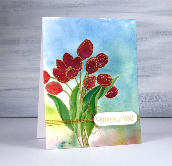
A while back I posted three cards all painted with the same three brusho paint colours and my Welsh friend, Karen requested a video. Well this is it, a different stamp and three different colours (Brusho sunburst lemon, prussian blue, rose red) but the same technique. Here is the one that prompted the video request.

As with the card above I embossed the outline stamp, ‘flutterby’ in gold powder then swiped up a brusho background by sprinkling brusho on my glass mat then spritzing water over it to activate the powders and turn them into liquid watercolour paint. From there I moved onto painting petals and leaves with individual colours and secondary colours. Take a look at the video and you will see what I mean.
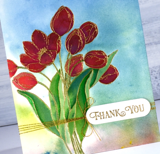
After all the painting was done I added some extra shading in shadow areas with Faber-Castell polychromos pencils and some gold thread detail. The sentiment is from PB ‘banner sentiments’ gold embossed and die cut with a die from the PB ‘tagged’ set.
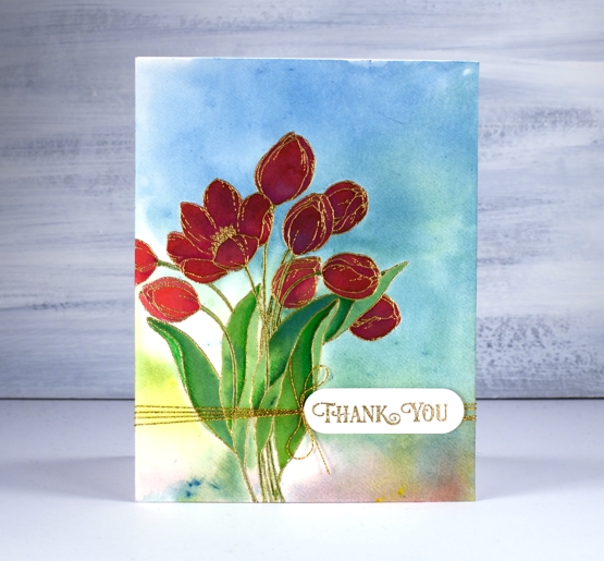
One of the things I like about this technique is the way the background works with the painted images even though the are painted right over the top of a multicoloured panel. The colours work because they are the same colours and because the background is not too bold. You can see in the tulip on the left what the true colour of the rose red brusho is, but the ones that are painted over the blue background still look red, just a deeper red perhaps in shadow not full sun.
Happy Easter my friends. Stay home, stay healthy, stay hopeful and maybe try a new art or craft technique!
Supplies
Lovely Lilacs video
Posted: April 3, 2020 Filed under: lovely lilacs, Penny Black, Tutorial, Watercolour | Tags: Fabriano Watercolour Paper, Penny Black stamps, Ranger Distress inks, Tutorial, video 25 Comments
I am so happy to have a video for you today especially as so many of us are staying home to stay healthy. I hope this simple technique and pretty card featuring Penny Black’s ‘lovely lilacs’ set will inspire you in your creating. Check out the video below and then read further for the different colour combinations I came up with. They all require a light and a dark colour in the same ‘family’ for the flowers and a green for the stems. That’s it; so simple and so pretty!
The inks are listed in the video and linked below but just for reference while you are reading, on the card above I used milled lavender distress ink, seedless preserves & peeled paint distress markers and shady lane versafine clair ink for the sentiment. All the cards are stamped on Fabriano hot pressed watercolour paper. The sentiments are from two different PB sets, ‘carefree wishes’ and ‘magical friendship’.
As I have been home a lot more than usual I have been spending quite a bit of time making videos. I’ve said before they take me a long time and that is still true but I am feeling more confident with the editing software since I’ve spent days sitting in front of it! Other than the mammoth grocery runs ( I did one today that I am hoping will feed the four of us for two weeks) and some outdoor exercise, I haven’t been out and about at all. I am sure it is the same for many of you.
The card above is the first one I did with this technique and it was stamped with shaded lilac distress ink, blueprint sketch & forest moss distress markers. I think this might be my favourite colour combo.
This red and pink one ended up with splatter and was stamped with worn lipstick distress ink and aged mahogany & forest moss distress markers.
I’m not sure that lilacs come in all these colours but when has that ever stopped me. The colour pairs are spun sugar + worn lipstick, tumbled glass + salty ocean and milled lavender + dusty concord.
I hope you find this technique appealing; please let me know if you try it and if you come up with new colour combinations.