AI + Stencils Blue Edition
Posted: January 31, 2022 Filed under: Alcohol Ink, crackle, Darkroom Door, geometric stars, grafix, mesh, MFT stencils, My Favorite Things, Pink Fresh studio, Stencils, tall flowers, Uncategorized, you are everything | Tags: Darkroom Door stamps, Darkroom Door stencils, grafix, grafix craft plastic, My Favorite Things, pinata alcohol ink, Pink Fresh studio, Ranger Alcohol Ink 11 Comments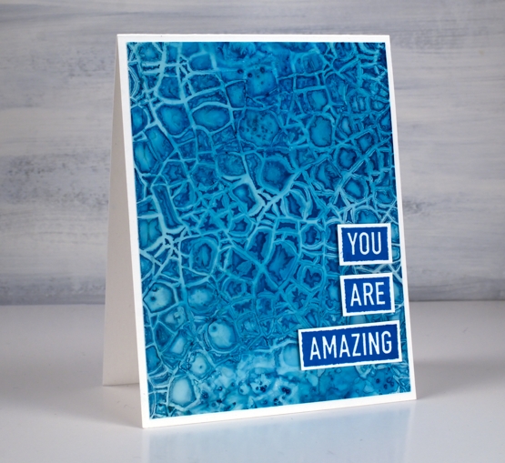
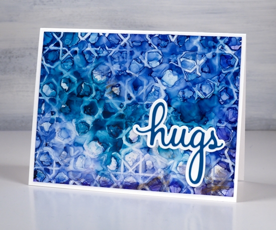
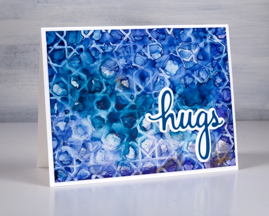
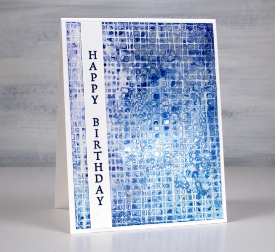
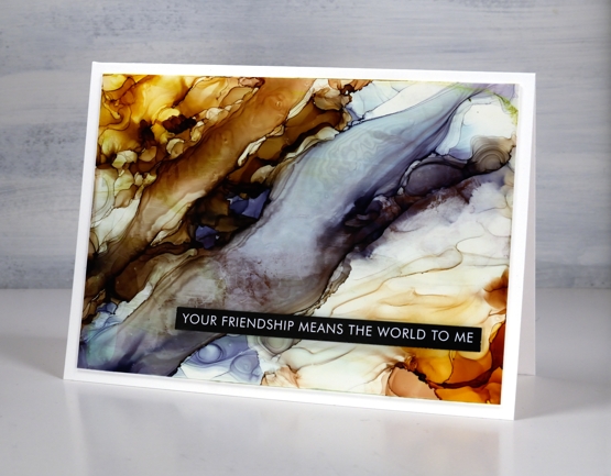
After success with one of my detailed stencils over an alcohol ink panel I tried a few more all with a mix of blue inks. The one above features the Darkroom Door crackle stencil over a mix of cloudy blue and stream inks.
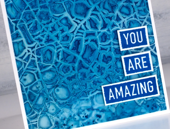
There is also a little bit of salt sprinkled on the panel where the stencil did not make consistent contact. This technique is definitely not for the impatient among us!
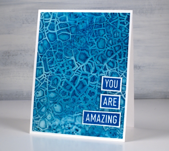
I am still working on Grafix white craft plastic and often starting over the top of a panel that already had ink on it. All the card bases are Neenah solar white.
The stencil above is MFT geometric stars and I positioned it over a panel of denim and stream inks with some leftover copper as well. The ‘print’ is not very consistent but I like the way a distinct line is right next to a blurry pattern.
I finished this one off with a die from the Pinkfresh Studio ‘sending’ die set.
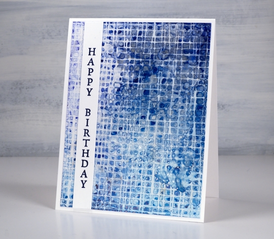
I worked with the DD mesh stencil a couple of times because it didn’t make consistent contact on my first attempts. I found if I taped it over the alcohol ink panel onto a piece of scrap cardboard I could bend the cardboard slightly to make sure stencil stayed pressed onto the wet alcohol inks. I just popped the piece in the right sized container to keep it bent while it dried.
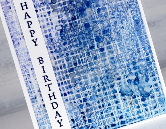
This one is a mix of denim, cloudy blue, silver and a tiny bit of stream down in the right hand corner. I added a sentiment from the DD ‘tall flowers’ set.
As you can see my fascination with this technique continues. I did pick up a couple more detail stencils the other day for this very purpose. I will also give it a try with some watercolour paints and paper. I’m sure the result will be different as the watercolour paints soak in but I think there could be a pretty and subtle pattern. Stay tuned!
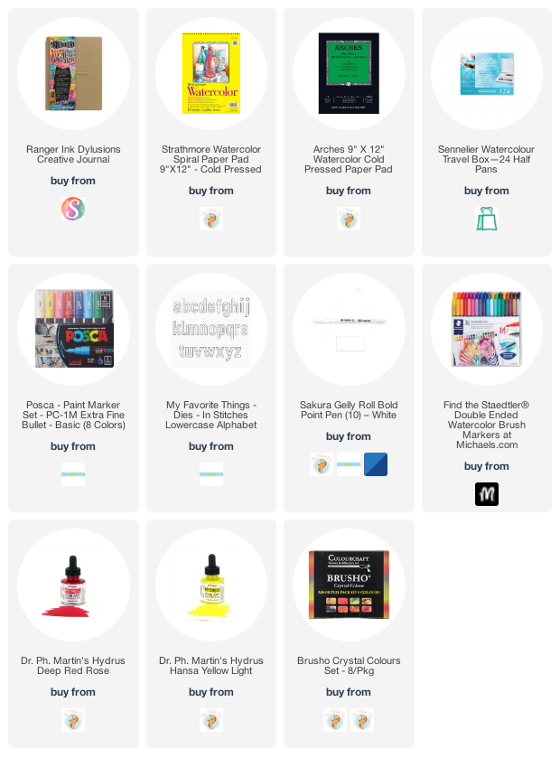
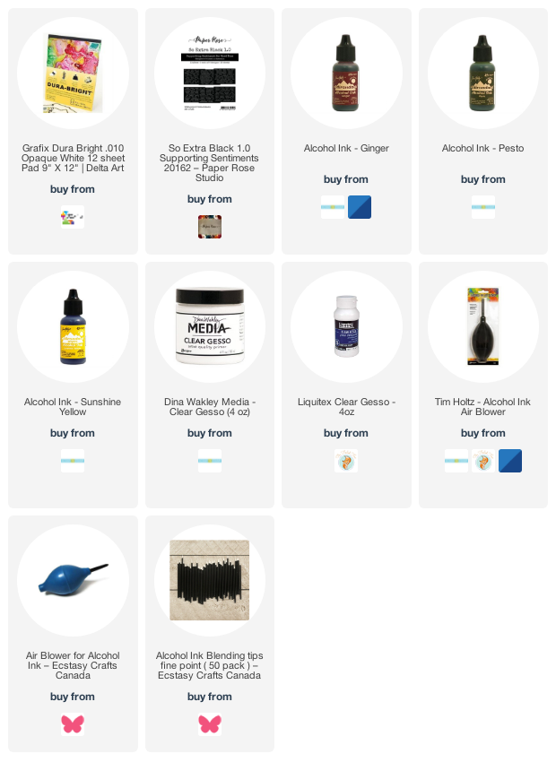
Supplies
(Compensated affiliate links used when possible)
AI Abstract and Landscape
Posted: January 28, 2022 Filed under: Alcohol Ink, grafix, Paper Rose, so extra supporting sentiments | Tags: grafix, grafix craft plastic, Paper Rose, pinata alcohol ink, Ranger Alcohol Ink 6 Comments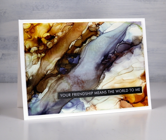
While trying the stencil and alcohol ink techniques earlier this week I also returned to techniques I’ve used before. The Grafix white craft plastic panel above was a grey & blue one which wasn’t very interesting. I added warm tones either side and using tilting and air blowing to create a pattern that looks a little like a rock cross section.
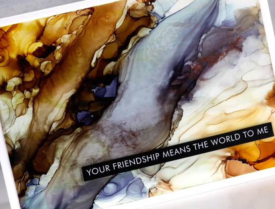
I used some clear gesso to seal this one but it did drag some colour and leave some texture lines so I wouldn’t recommend it as the best sealing solution. I could use a spray sealant but it is very, very cold outside so I’m not popping into the back yard to use aerosol cans right now!
I would tell you the ink colours I used if I knew. I picked up a panel with ink from a previous session then start putting more ink here and there and in no time I saw colours and patterns appear with no idea which ink went where!
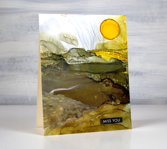
On this second panel I have a bit more of an idea of the landscape colours. I began with a previously inked panel and added pesto, ginger and sunshine yellow inks along with generous amounts of rubbing alcohol to move the inks.
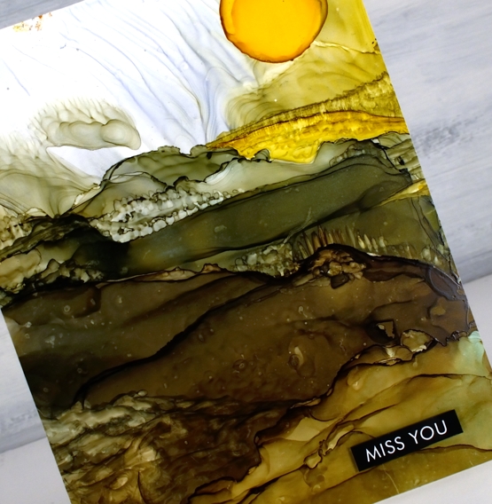
As I tipped the panel and used an air blower I was able to create stripes across the panel which looked a bit like hills. I feel like this is still a fluke for me; I wish I could give you exact instructions but it works sometimes and not others.
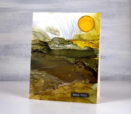
To add the look of trees and crops I used an alcohol ink paint brush and a very small amount of alcohol ink or isopropyl alcohol. I wanted to add texture to the ink that was already there rather than add more ink because when you add more ink it tends to displace the ink you already have on the panel. With this in mind I added a drop of sunshine yellow at the end to be the sun. It did not expand neatly in a circle so I used a paint brush which meant the sun was a bit larger than intended! I finished both cards with sentiments from the Paper Rose Studio ‘so extra supporting sentiments’ pack.
Alcohol ink art seems to be equal parts fabulous and frustrating but I will keep on persevering and see if I can come up with some processes I can recreate and share with you.
Supplies
(Compensated affiliate links used when possible)
Beauty of the Earth journal page
Posted: January 26, 2022 Filed under: Art Journal, Brutus Monroe, Darkroom Door, honeycomb, Nature Walk, number medley, Stencils, World Map, you are everything | Tags: Art Journal, Darkroom Door stamps, Darkroom Door stencils, Ranger archival inks, Ranger Distress inks, Ranger Distress stains 5 Comments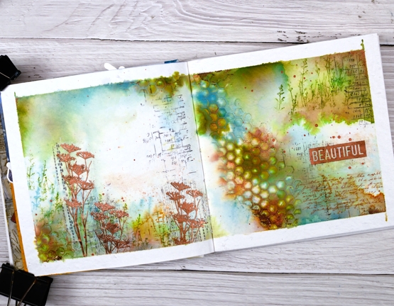
I have another double page spread in the 6″x 6″ journal today. Don’t tell the others but this one seems to be getting all the attention at present!
The pages in this journal are thick watercolour paper so I wanted to take advantage of that and use watercolour techniques. Most of the pages I have completed up until now have had a base layer of gesso or acrylic paint.
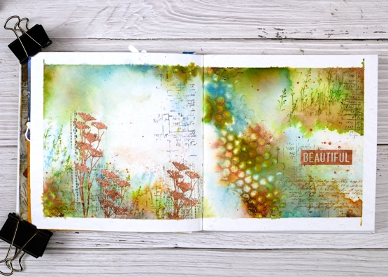
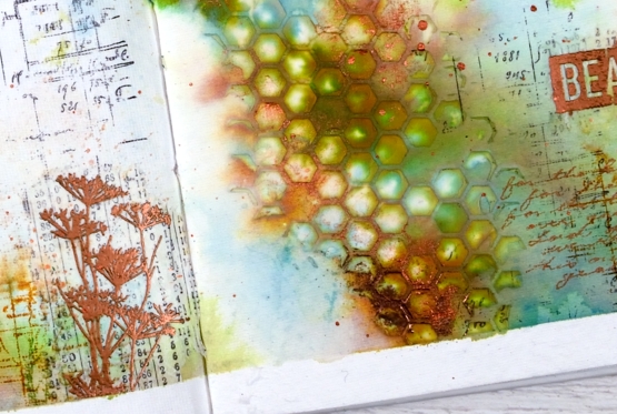
As you can see I taped the edges of the pages with tape before starting. I added some stamping in black here and there using a stamp from the Darkroom Door ‘number medley’ set. Next I used the DD ‘honeycomb’ stencil and modeling paste to add a texture strip from left to right down the centre of the spread. I added a small section bottom left also. Once the paste was dry I began painting colour around the honeycomb and across both pages. I spent a while doing this so as to see the blends and build up some depth of colour.
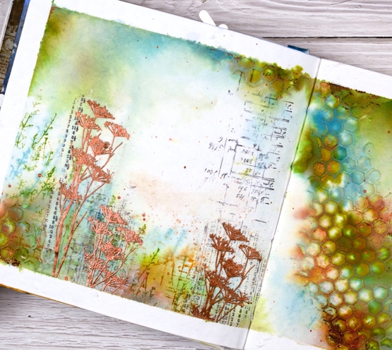
Other than some black stamping I used only three colours of distress ink, both spray stain and from the ink pads. I took care to keep some white space; sometimes I realise too late that I have colour all over the pages. I stamped some grasses in peeled paint archival ink so they would not dilute and broken china distress ink so they would dilute. I also stamped sections of the world map in rusty hinge. Although I loved the combo of peeled paint, rusty hinge and broken china I thought a bit of metallic shine would be nice so I added some wildflowers embossed in Brutus Monroe ‘penny’ powder.
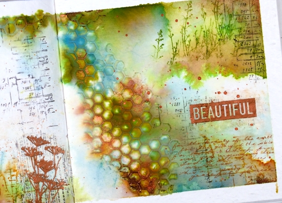
With a copper coloured gel pen I wrote the first verse of ‘For the Beauty of the Earth’ in the lower right hand corner then added the embossed word ‘beautiful’. And of course there is some copper splatter to finish it off. This is a style and look I have been hoping to create so you’ll probably see a few more like this one.
Supplies
(Compensated affiliate links used when possible
Alcohol Ink + Stencil
Posted: January 24, 2022 Filed under: Alcohol Ink, Dies, little swirls, Paper Rose, Penny Black, so extra supporting sentiments | Tags: Paper Rose, Penny Black creative dies, Ranger Alcohol Ink 11 Comments
This card was inspired by the wonder and wizardry of my friend Ardyth who just happened to be the Featured Stamper on SplitcoastStampers yesterday. Ardyth has been doing quite a few alcohol ink techniques lately and I have been loving them while waiting for an opportunity to get my own inks out again. Take a look at Ardyth’s videos here and here for inspiration and instructions.
When I pulled out the inks and the substrates I found several panels from another session. The panels hadn’t inspired me enough to make them into cards when I first made them so I decided to work over the top of them. The panel for this card is Grafix white craft plastic and was originally covered in blue patterns, you can see a little remaining in the top right corner.
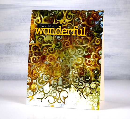
I lay the Paper Rose Studio ‘little swirls’ stencil on top of the panel and sprinkled ginger, pesto and sunshine alcohol inks over the stencil along with some rubbing alcohol to move the inks a little further. I was impatient so I pulled up one corner to check on the pattern before the inks dried. That is why the top left corner does not have distinct detail like the lower right. Once dry I removed the stencil and was left with this amazing pattern. Thank you for all the inspiration Ardyth!

Those sharper swirls at the bottom are my favourite part of the design but I love the whole effect. I will definitely be playing with this technique again. I finished off the card with a stacked PB die cut and a sentiment strip from the black Paper Rose Studio black ‘so extra’ set. I ended up sealing this panel with clear gesso. I haven’t done this before but some of my alcohol ink panels end up a bit sticky so I wanted to see if clear gesso worked as a sealant. I’ll will keep testing the process and let you know more next time I post about alcohol inks. Meanwhile head over and drool over all Ardyth’s clever cards!
Supplies
(Compensated affiliate links used when possible)
Fine Baubles
Posted: January 21, 2022 Filed under: Darkroom Door, fine baubles, gel press, large stars, Stencils | Tags: Darkroom Door stamps, Darkroom Door stencils, gel press 4 Comments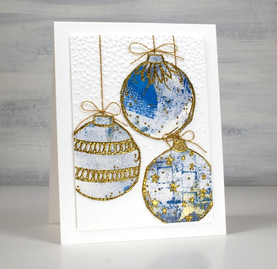
To make these cards I pulled out some gel printed paper and the Darkroom Door ‘fine baubles’ stamp set. I have a box of gel printed pieces longing to come out of the box and into the world.
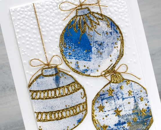
Last year I resolved to make a few Christmas cards every month of the year but that didn’t happen. This year I have resolved no such thing and look what happened: two done already! I embossed the large baubles on the gel print panel in a gold powder which is slightly chunky; it’s not my usual gold but there is a whole jar of it and I am committed to using up what I have where possible. It worked well for these baubles because I needed it to stand out against the patterns of the gel prints. I cut the baubles out which, although simple, still counts as fussy cutting in my book.
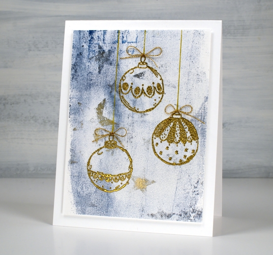
I embossed three of the smaller baubles on the other end of the gel print and did not cut them out because in doing so I would have lost the pretty stars on the print. It was hard to capture the gold of the stars in the photo but it is subtle and pretty in real life and is not blue as it appears below.
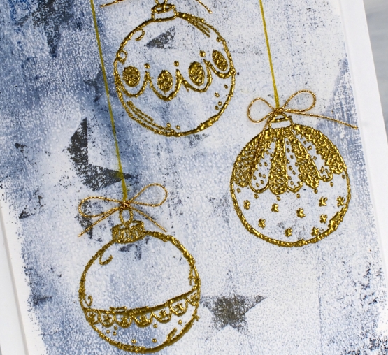
I attached gold cord behind the larger baubles as well as bows from cord too. The smaller baubles also got the bows but the cord is drawn with a gold gel pen.
No sentiments at this stage but that might change before I send them out in eleven months time!
Supplies
(Compensated affiliate links used when possible)
Butterfly Gold journal page
Posted: January 19, 2022 Filed under: Art Journal, Butterflies, Darkroom Door, honeycomb, mesh, Mixed Media, Stencils, transfer sheet, Wings | Tags: Art Journal, Darkroom Door stamps, Darkroom Door stencils, Mixed Media 6 Comments
I have a new spread in the 6 x 6 art journal today though not a seasonal one this time. These pages include a couple of photos from a magazine along with some layering of stamped tissue paper, book pages, stamping and some transfers.
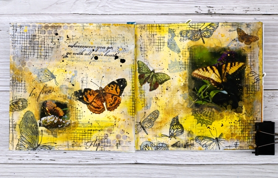
I began by stamping butterflies on white tissue paper in black archival ink then ripped up the paper before gluing it to the pages. I also ripped up some old book pages and accidentally ended up with a strip mentioning butterflies
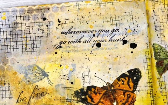
Over the paper layers I painted with white gesso and acrylic paint before stenciling gold paint through the Darkroom Door honeycomb stencil.

I glued the butterfly photos down and painted over the edges to soften the transition from journal page to photo. I used a black fineline pen to sketch over some of the stamped butterflies and added random texture using the DD mesh stamp.

The page was almost finished at this point but the two butterfly photos were at opposite sides of the spread with a lot of space in between. A visit to Crop A While ended up helping me out. I wasn’t there looking for anything butterfly related but after talking about transfer sheets Carole showed me the Vintage Butterflies sheet from ‘Dress my Craft’ and I had the final elements for this page.
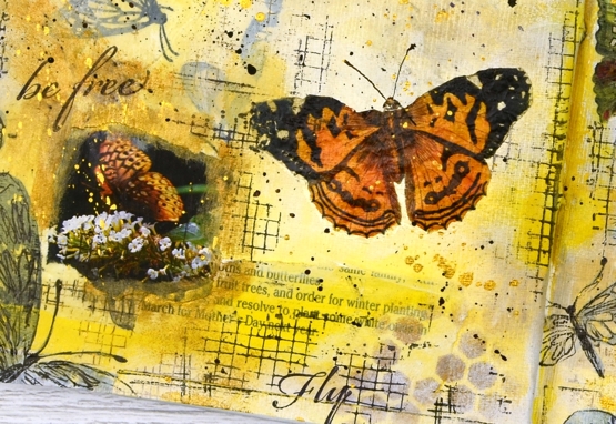
I had not used transfer sheets in a very long time, they work just like the temporary flag tattoos my children applied to themselves on Canada Day years ago. Unlike the temporary tattoos these ones should stay stuck rather than gradually looking rattier and scrappier over a period of weeks!
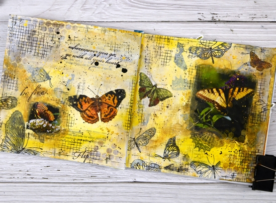
I used three of the transfer butterflies to create a visual path across the two pages then finished things up with quotes from the Darkroom Door ‘Wings’ set and of course some black, white and gold splatter!
Thank you for all the kind and generous messages about the cardinal card; it is always lovely to hear from you.
Supplies
(Compensated affiliate links used when possible)
Trilling Trio
Posted: January 17, 2022 Filed under: Penny Black, Stampin Up, subtle, trilling trio | Tags: Penny Black stamps, Stampin Up 15 Comments
Trilling Trio from Penny Black arrived on the scene late last year and features three different birds. My card today uses just the cardinal stamp but I have coloured it two ways so as to have the male and the female on my panel.
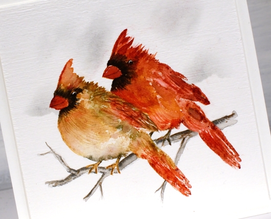
I worked with distress inks and watercolour pencils on hot pressed watercolour paper and I kept the panel in the stamp positioner so I could build the colours gradually. I stamped the female cardinal first in antique linen ink so it gave me a pale outline then I used tea dye, vintage photo and barn door inks to add colour. I spritzed the stamp lightly before stamping so the colours would blend but then did more blending with a paintbrush. I added black around the eye and beak both by stamping and by colouring directly on the panel. To add texture to the feathers I used sharpened watercolour pencils. I added the male cardinal behind using more barn door ink along with the tea dye and black soot inks.
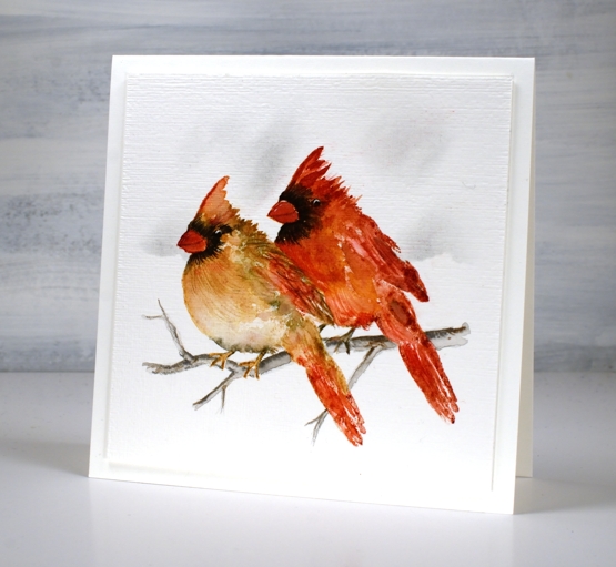
Once the birds were completed I drew a small branch with watercolour pencils, blended it and then used a blending brush and a torn piece of post-it note to add shadow in the background. I ran the panel through with the ‘subtle’ embossing folder from SU; it adds such nice canvas texture! There are two more delightful bird stamps in the set which I hope to feature soon!
We are getting much snow today so I will be hunkered down in the work room or maybe taking a turn clearing the path and driveway!
Supplies
(Compensated affiliate links used when possible)
Winter Tree art journal page
Posted: January 13, 2022 Filed under: 6"x 6" journal, A blizzard, Art Journal, Darkroom Door, Dies, French Script, Mixed Media, Snowflake trio, snowflakes | Tags: Art Journal, Darkroom Door stamps, Mixed Media, Penny Black creative dies 12 Comments
I continue to create and experiment in my 6×6 art journal, definitely inspired by the current season and view. When I started this page I had a technique in mind but no picture in my head of how it might turn out. I couldn’t be happier with the end result!

I am trying a range of techniques and methods in my art journals because that is what they’re for and because I have a series of workshops coming up this year (temporarily postponed until restrictions change). On this spread I started by layering and gluing torn papers on the pages. I pulled blue pieces from my considerable stash of papers, some old (Penny Black 6×6 packs) and some new (decorative rice paper) along with Dina Wakley printed white collage paper. After gluing the strips here and there I added modeling past through a stencil and let that dry.
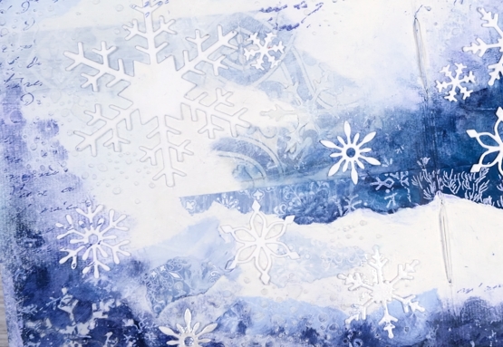
Over the papers and paste I painted white gesso and then a couple of blues from Dina Wakley’s acrylic selection. You can see some of the patterns show through from the papers and in real life you can also see the texture from the stencilled paste. I added stamping in blue and white with Darkroom Door background stamps, ‘snow flakes’ and ‘French Script’.
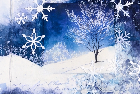
I had started the page with a vague idea of adding a picture from a Christmas card or magazine. In choosing the tree picture you see included I fell down a rabbit hole of memories going through boxes of saved cards! I have saved cards since childhood and I was sorting and reading for quite a while. I didn’t open every single card but I found some adorable and hilarious cards made by my children and some I taught in school, I also found many sweet notes in cards from my parents, aunts, uncles and grandparents. The picture I chose of the single tree on a snowy hill was in a Christmas card from a sweet friend.
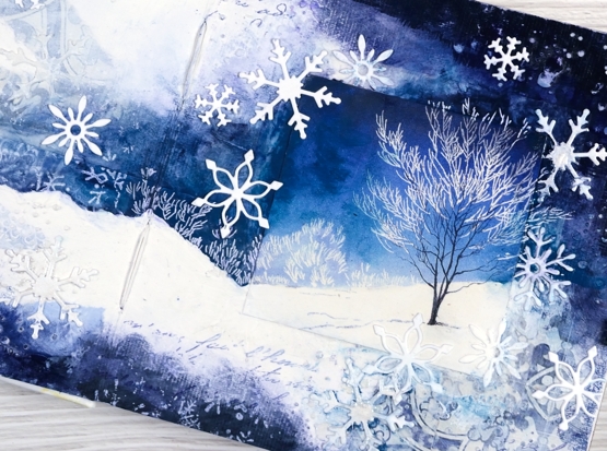
It is worth noting at this point that I didn’t plan this layout or have this card on hand when I started the painting so the colours did not match perfectly. You know how I feel about the matchy-matchy so I ended up adding paint to the sky around the tree to make the blue a bit more purply and less aqua. I also extended the scene by turning a white area that was already on the page into a clearly defined snowy hill. I used a white gel pen to add more foliage to carry the scene off the little square onto my page. I finished off the page with some die cut Penny Black snowflakes.
I know that is a lot of description that would be better understood with video footage but it didn’t happen this time. As I continue to make pages I will try to capture some of them on film.
Do you save the cards you are given? Do you put them to use making something new? Just wondering…
Supplies
(Compensated affiliate links used when possible)
Winter Wildflowers
Posted: January 10, 2022 Filed under: Darkroom Door, Nature Walk, Woodgrain | Tags: Darkroom Door stamps, Ranger archival inks, Ranger Distress inks 4 Comments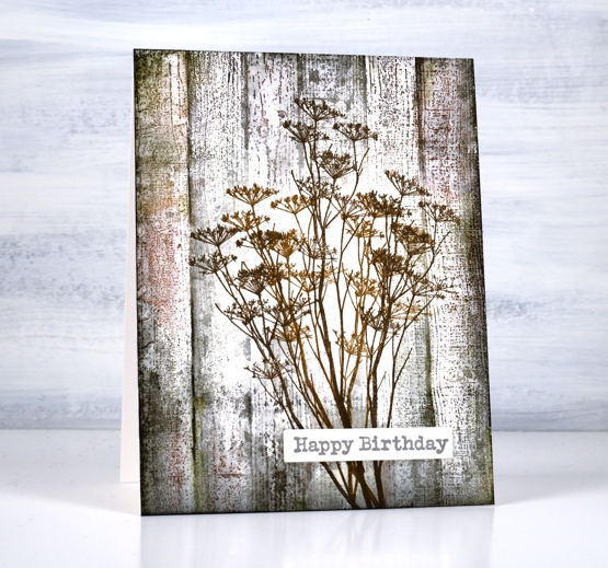
The bright and beautiful flowers of spring and summer delight me as you know but so do those left standing through autumn and winter. On a snowy walk recently I was happy to see the brown tones that show up bold and contrasting against the snow. Queen Anne’s Lace closes up and dries out after summer but that makes it all the better to balance some snow like icing.
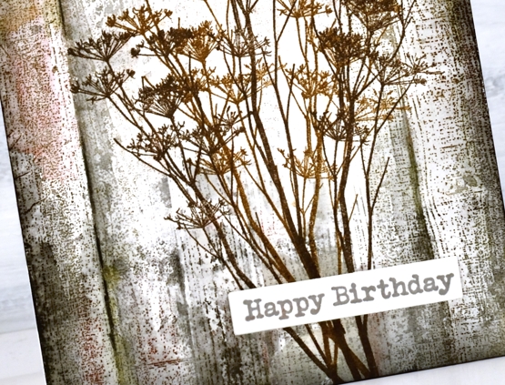
For this wintery image of dried stems against aged wood paneling I stamped the flower stems from Darkroom Door’s ‘nature walk’ first in brown archival inks so they wouldn’t blend when I worked on the background. I stamped the DD ‘woodgrain’ stamp over the top first in hickory smoke distress ink then a few more times adding black soot, forest moss and barn door distress inks. I blended as sparingly as I could to retain the texture of the stamp.
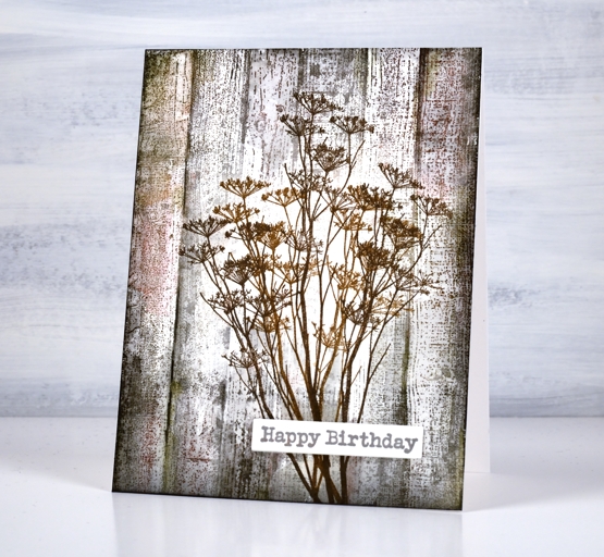
I added a sentiment from the DD ‘happy birthday’ set and now I am wondering if I can recreate the same aged wood effect on a journal page. This seems to be the way I roll at present; a journal page inspires a card then a card inspires a journal page.
By the way my Art Journal Adventure class has been postponed for now due to current restrictions here in Ontario but we will reschedule when possible. In the interim I will continue scheming and dreaming up themes and techniques!
Supplies
(Compensated affiliate links used when possible)
Gingerbread Journal page
Posted: January 7, 2022 Filed under: Art Journal, Brusho, My Favorite Things | Tags: Art Journal, Brusho, Dr Ph Martin Hydrus watercolor paints, My Favorite Things 7 Comments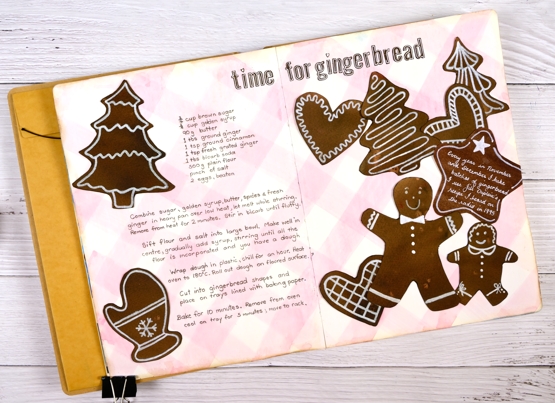
Six years ago I was given a delightful and incredibly thoughtful gift. Four friends I met through teaching card making classes gave me an art journal. It’s a large Dylusions 9″x11″, a very generous gift in itself.
The journal was just part of the gift. What amazed and touched me deeply was that these friends worked on individual pages in this journal far enough in advance to have completed four different spreads before they gave it to me. Each person completed a 2 or 3 page spread describing Christmas traditions they were familiar with.
I have in my journal pages about Polish and German Christmas traditions along with a description and illustration of Mummering in Newfoundland and a depiction of the carol, ‘I Saw Three Ships’. The depiction is set in Bass Strait with a view of a King Island lighthouse, a nod to my birthplace! I was speechless when I opened the gift and it still brings me joy whenever I look at it.
After Christmas that year I began two different spreads in the journal having decided it was to be filled with Christmas themed art journalling. Although I began soon after receiving the journal I didn’t finish a page until last week. I am embarrassed to have let it sit so long but in the interim I have completed many journal pages in other books and have ideas aplenty dancing around in my head – like sugarplums!
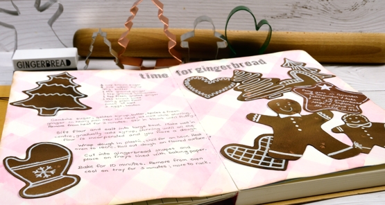
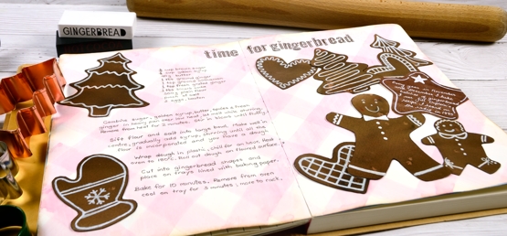
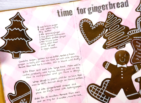
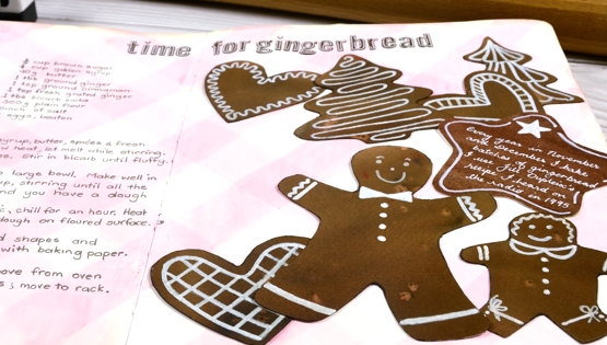
Gingerbread baking and decorating is a tradition for me and a fitting choice for my first Christmas spread. I started making gingerbread in Australia in 1995 after hearing a radio interview with Jill Dupleix whose recipe I use to this day, more often than not with gluten free flour now. This year I made several batches, a couple with friends on a Sunday afternoon where much mixing, cutting and decorating was enjoyed.
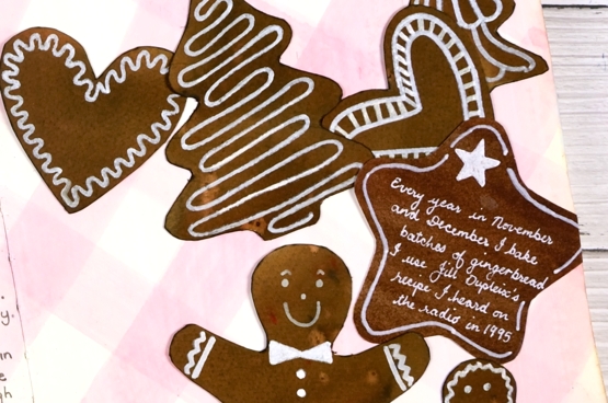
I used my own cookie cutters to trace the shapes onto watercolour paper painted with dark brown and light brown brusho. The background ‘check tablecloth’ I painted with a mix of Dr Ph Martin’s deep red rose and hansa yellow. The gingerbread shapes sat for years with pale white patterns on them and it was only this year after trying quite a few white paints and pens that I was able to make the patterns bolder with a posca paint pen.
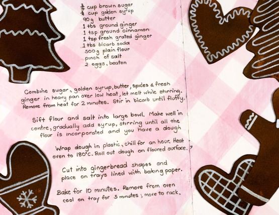
I finally added the recipe, glued the cookies down and added a title using MFT little lowercase letters (I think they are retired now but they worked to look like little gingerbread letters).
So that is the story of a wonderful journal, four kind and generous friends and an adventure started in 2015 which I am happily continuing even though I made a very slow start.
Supplies
(Compensated affiliate links used when possible)