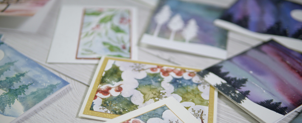
Winter Wonder Online Class
Posted: November 18, 2020 Filed under: Darkroom Door, online class, Penny Black, Pink Fresh studio | Tags: online class 30 CommentsI’m excited! I have a new online class which will be available on Friday, November 20 and registration is open now! My new class is full of snowy scenes, winter skies, frosty leaves and berries. I’ve created the class to provide step by step instruction for some of my favourite techniques along with plenty of inspiration for you to make your own winter wonder cards.
I think it might be best if you watch the promo below; you will get glimpses of all the projects and you’ll see the delightful animation my son and I made with Penny Black dies and Pink Fresh Studio alphabet dies.
If you would like to join me in creating winter themed cards for Christmas, New Year, Thank You or Birthday cards then click over to the course site to register or learn more. WINTER WONDER
I will be giving away a registration here on my blog. To enter you need to leave a comment below telling me your favourite thing about winter! (If you win but have already registered I’ll refund your registration fee) I will randomly draw a winner on Sunday evening (Nov 22) so you have a few days to enter.
I will also do two random draws from the first 50 registrations for gift cards from either Foiled Fox or Crop A While.
Birdhouse Blessings
Posted: November 16, 2020 Filed under: birdhouse blessings, Finetec paints, Penny Black, sennelier watercolours | Tags: Finetec artist mica watercolour paint, Penny Black stamps, Ranger Distress inks, sennelier watercolours 5 Comments
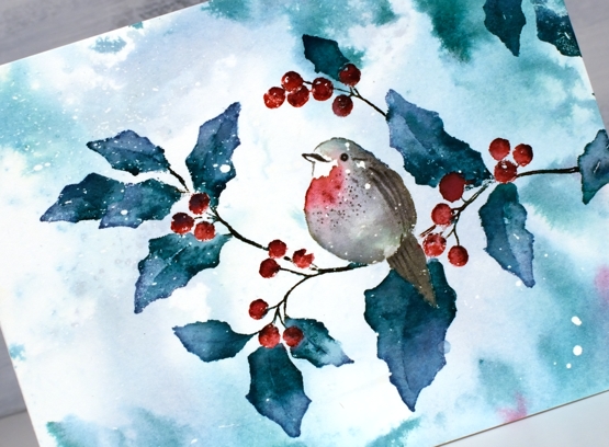
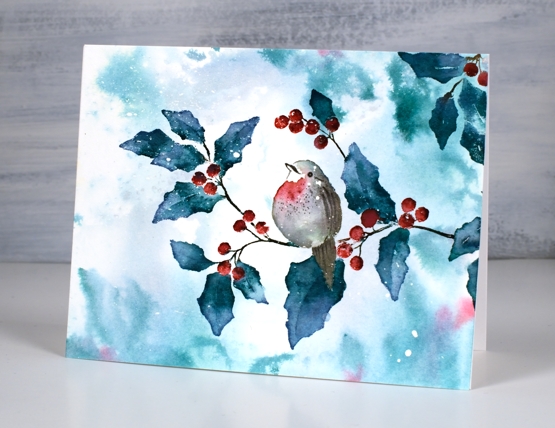
This delightful scene is called ‘birdhouse blessings’ and it makes me want to have birdhouses and bird feeders scattered across my backyard. A few days ago my husband and I were doing what may well be our final outdoor workout of the year and watched chickadees and a cardinal flit back and forth from tree to hedge.

I worked on a hot pressed watercolour panel which I’d splattered with masking fluid (as per usual). I only just got my hands on some speckled egg distress ink and stain so that’s what I used for the background colour. It is a lovely colour and I’m very happy with the inky background. I smooshed ink on my glass mat, diluted it then swiped the panel through it to pick up colour.
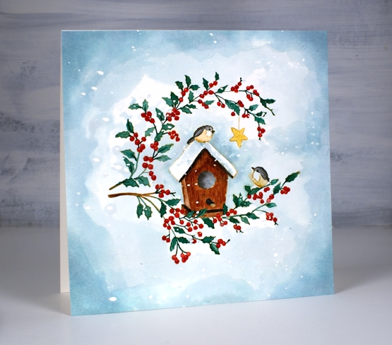
I stamped the large stamp in antique linen then did some no-line watercolour with Sennelier watercolour paints. While painting those little leaves and berries I did wonder if I should have chosen watercolour markers instead of paint brush and paints but I was already committed, so me and my very small paint brush kept on painting. When I finished painting all the elements I used speckled egg distress stain to darken the edges of the panel and frame the little scene. When I removed the masking fluid there were pretty little snowflakes over the whole panel.
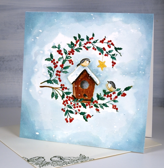
I painted the little star in gold and debated whether I would add a gold frame as well. Decided in the end I liked it just the way it was. (psst a little bird wants to tell you ‘Winter Wonder’ is coming!)
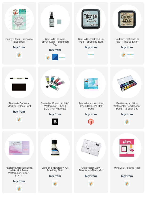
Supplies
Books & Tea
Posted: November 13, 2020 Filed under: book spines, classic motorcycles, Correspondence, Cup of tea, Darkroom Door, Finetec paints, mini open book, sennelier watercolours | Tags: Darkroom Door stamps, Fabriano Watercolour Paper, Finetec artist mica watercolour paint, sennelier watercolours 7 Comments
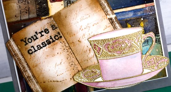
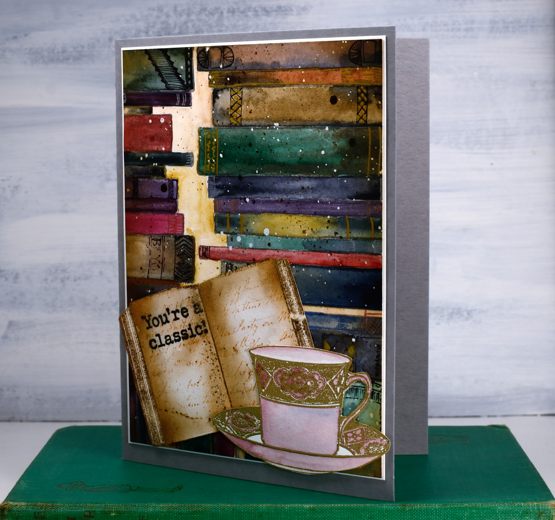
Ever since I created a ‘what should I read next?‘ art journal page I’ve been wanting to do a similar design on a card featuring the Darkroom Door ‘mini book’ and ‘book spines’ stamps. This time a teacup joined the party.
What is more delightful than a cup of tea and a good book? Maybe a cup of tea with another book lover?
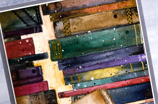
I stamped the book spines stamp three times in hickory smoke archival ink on a piece of hot pressed watercolour paper (which had been splattered with masking fluid). I set out both my Sennelier watercolour paint palette and a Finetec pearlescent set to paint the books. I mainly used the Sennelier paints but added drops and swipes of pearlescent paints here and there for interest.
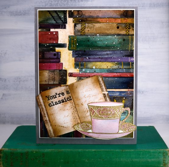
Once the paints dried I used a handful of gel pens to add decoration to the book spines. I decided not to add titles (there is other pressing work to be done after all) just patterns. I removed the masking fluid, blended tea dye and vintage photo ink around the edges then splattered some vintage photo ink over the panel.
The mini book is stamped in versafine vintage sepia and then stamped with a script stamp from the DD ‘correspondence’ set and a sentiment stamp from DD ‘classic motorcycles’. The teacup from DD ‘cup of tea’ set is embossed in gold powder then painted a pale rose. I fussy cut both the book and the cup (I know – I’m surprised too). The book panel is matted in cream then attached to a grey luxe card base. I attached the mini book and teacup to hang over the edges of the panel ever so slightly.
Right now I would love to curl up on the couch with a good book and a cup of tea but I am editing my next online class! I am very excited to get it finished for you as it has a seasonal theme which might interest you right about now.
Supplies
Cozy Cabin video
Posted: November 11, 2020 Filed under: cozy cabin, Penny Black, Stamped Landscapes, Tutorial | Tags: distress markers, Fabriano Watercolour Paper, grafix, Penny Black stamps, Ranger Distress stains, video 6 Comments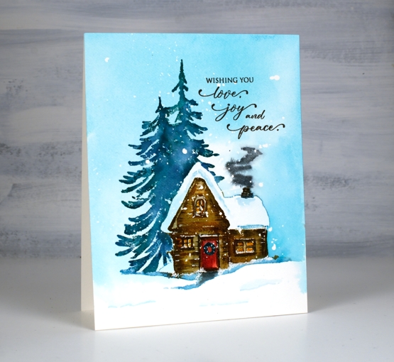
This cute cabib is another new stamp from Penny Black; the set is called ‘Cozy Cabin’ and it includes this tree shadowed cabin plus an extra tree not shown on this card. Once again I enjoyed bringing this scene to life with splattered masking fluid and distress inks.

I used a stamp, paint, stamp, paint process to build up the colour and definition of the cabin. I had my glass mat at hand so I could smoosh inks then pick up colour with a paintbrush.
When we go cross country skiing in Gatineau Park we come across cabins that look a little like this. There are several scattered across the park for the use of skiers, complete with a wood stove, tables and benches so we can warm up, eat our snacks, and rest a little before heading back out in the snow.

I’m in no hurry for the snow to come but I do have new skis and boots after years of hand-me-downs so the pressure will be on this year to make good use of them!
Supplies
Winter Window
Posted: November 9, 2020 Filed under: art deco window, juniper, layered Xmas wreath die set, Penny Black, Winter lantern | Tags: Dr PH Martin, Penny Black creative dies, Penny Black stamps 6 Comments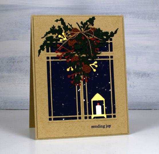
Sometimes I get inspired by the detailed and delicate foliage dies from Penny Black. The new ‘juniper’ die set got me started for this design along with a navy panel of cardstock splattered with white paint.
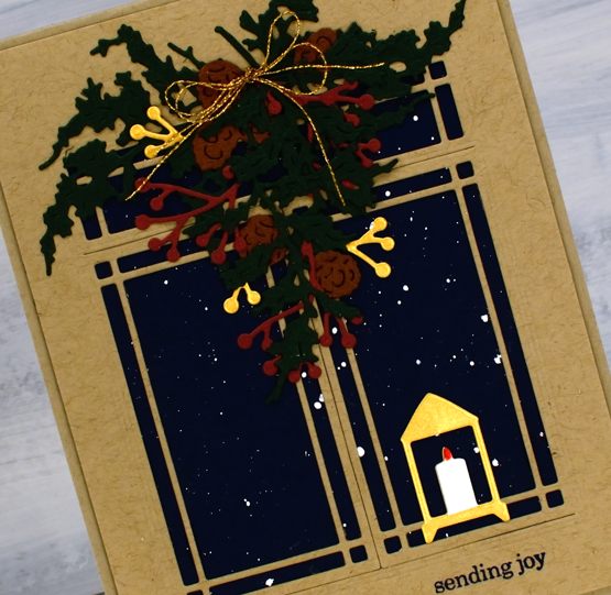
I gathered other dies to combine into a winter window scene. I could have chosen brighter reds and greens but I am in a muted vintage style phase right now so forest green and burgandy were my picks for the juniper and berries. All the dies are listed below; I picked from a few sets and added double sided adhesive to all the cardstock before die cutting. The window die is designed to open but I chose the adhesive backing so it would be stuck down firmly to keep the snow outside and the candle from blowing out!

Supplies
Masked Snowscape
Posted: November 5, 2020 Filed under: grafix, Nature's Friend, sennelier watercolours, winter woodland | Tags: grafix, Penny Black stamps, sennelier watercolours 5 Comments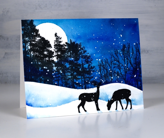
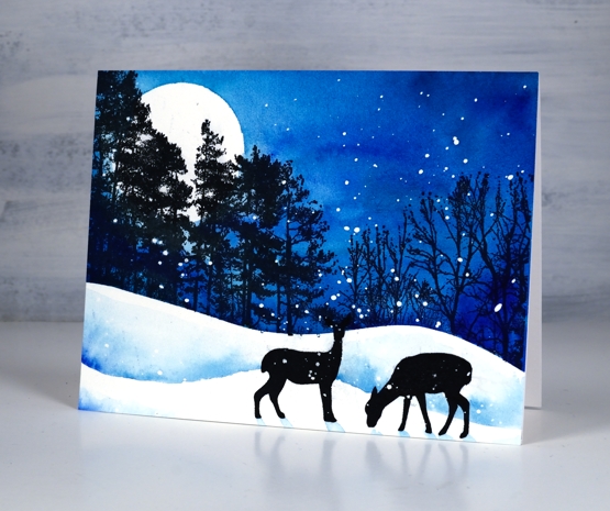
I teamed up with Grafix to create some videos this year. My first project was very definitely a summer scene, but this one, as you can see is not! We have had a few snowfalls already but currently are enjoying a reprieve and a few really nice mild days. Grafix makes a wide range of art plastics and films; I used their extra tack frisket film to mask the snowbanks and moon on this card and splattered Grafix liquid frisket to create the falling snow.
I worked on hot pressed watercolour paper and painted the sky and shadows with Sennelier watercolours. The trees and deer are stamped with the ever useful versafine clair nocturne ink. The video below shows my whole process.
If you are keen to create cards featuring the beauty of a northern winter I am working very hard on a new project that might interest you. Can’t wait to share more soon.
Supplies
Wreath & Wings
Posted: November 4, 2020 Filed under: Coliro paints, Hand lettered, mirthful, wreath & wings | Tags: Coliro paints, distress markers, Hand lettering, Penny Black creative dies, Penny Black stamps, Ranger Distress inks, Staedtler watercolour brush pens 6 Comments
I’ve combined a new PB stamp, ‘wreath & wings’ with a new PB die, ‘mirthful’ for simple elegant style Christmas card.

I used distress inks and markers to ink the wreath elements and birds, keeping the stamp in the positioner so I could work a bit at a time. I inked the stamp, stamped the image then did a bit of blending with a paintbrush to fill the leaves, berries and birds.

I used a gold gel pen to colour some of the berries then continued the gold highlights in the die cut word. The die has decorative diamond cut outs so I cut gold ones to add to the burgandy letters and framed the panel in the same burgandy cardstock.
For the second card I decided to use the curve of the wreath as a hanging garland. Using a centering ruler to help me with positioning I stamped half the wreath on the centre top edge of the watercolour panel, then stamped another part loop either side.
Once again I worked on hot pressed watercolour paper so I could blend the ink on the leaves. I used ocean coliro pearlescent paint on some of the leaves and berries for a little shimmer.
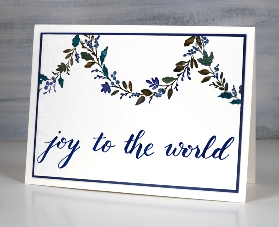
I wrote the sentiment for this one using the darkest blue marker from the Staedtler watercolour 36 brush pen set and matted the panel in a dark blue cardstock.
Even though I don’t like to over do my designs I’m wondering if the blue card is a bit sparsely decorated. What do you think?
Burgandy Card Supplies
Blue Card Supplies
 <
<
Season’s Tweetings video
Posted: November 3, 2020 Filed under: season's tweetings | Tags: distress markers, Penny Black stamps, Ranger Distress inks, Tutorial, video 9 Comments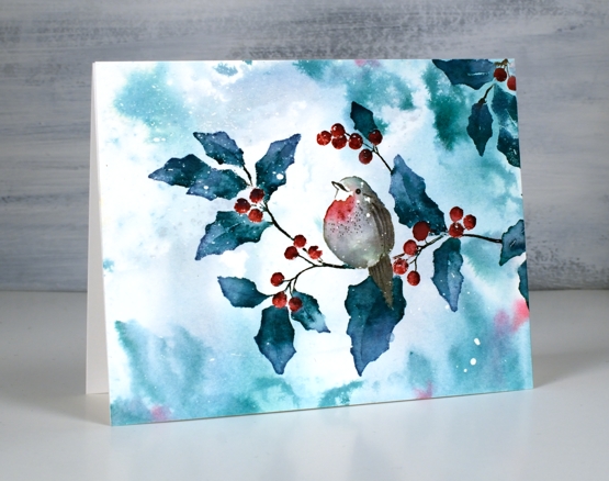
This sweet bird on a branch is a single stamp from the new Penny Black release ‘Season of Hope’. The stamp is called ‘season’s tweetings’ and I used it here to create both the bokeh background and the foreground watercoloured image. I filmed my process so you’ll see how I use the same blending technique to build up colour on the leaves and just a few tones to paint the little bird. (the video might look familiar to you if you have a membership with Penny Black)
We have a few centimetres of snow on the ground this morning so this sort of scene is becoming way more likely!
Thanks for dropping by today, I will be back with more of the PB new release over the coming weeks.
Supplies
Daisy & Dahlia
Posted: November 2, 2020 Filed under: all the birthdays, Brusho, Colorado Craft Company, Concord & 9th, Daisy & Dahlia, Papertrey Inks | Tags: Colorado Craft Company, Concord & 9th 8 Comments
This bunch of flowers is a single large stamp from the Colorado Craft Company and I’m over on the Foiled Fox blog today describing how it inspired me. It’s called ‘daisy & dahlia’ and it is from the ‘big and bold’ collection.

For this square card I chose autumn tones, because despite that sprinkle of snow we had last week it is definitely still autumn. I used Papertrey ink cubes which are very juicy and blend well with water after they’re stamped on watercolour paper.

I used one of the inks from the floral panel to stamp a bold birthday square with one of the stamps from Concord & 9th’s ‘all the birthdays’ set.
On my second card I used a similar colour scheme but threw in the contrast of purple paint. I embossed the stamp on a rectangular panel with platinum embossing powder then sprinkled four different colours of brusho powder strategically on the panel.
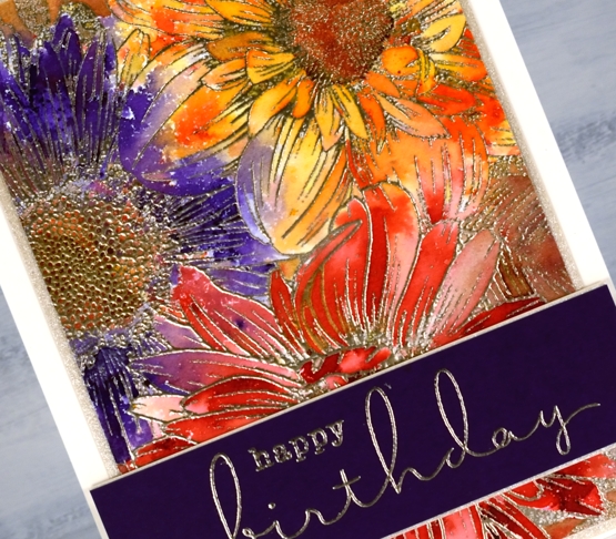
If you have used brusho powders at all you will know you can’t really be very strategic; it goes where ere it will! I still ended up with a red flower, an orange flower and a purple flower but my favourite bits are the ends of the petals that ended up multicoloured.

Once again I chose stamps from the C&9 ‘all the birthdays’ set to create a purple sentiment band trimmed in quartz shimmer cardstock.
An idea I have yet to try with this big beauty is to stamp it in one colour to highlight the detail of the design. Make sure you pop over to The Foiled Fox for more details and tips on these cards and techniques.
Supplies
Seashells Filmstrip
Posted: October 30, 2020 Filed under: Darkroom Door, seashell filmstrip | Tags: Darkroom Door stamps, Fabriano Watercolour Paper, Ranger Distress inks 4 Comments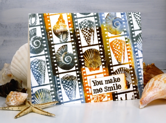
Before you wonder why a seashell card has popped up right after a snow covered bell card remember that not everyone is heading into winter right now. I can wistfully look at these seashells and wish I was entering an Australian summer and that wistfulness would not just be about the weather! Speaking of Australia, this stamp is from Darkroom Door and is one of their new filmstrip stamps.
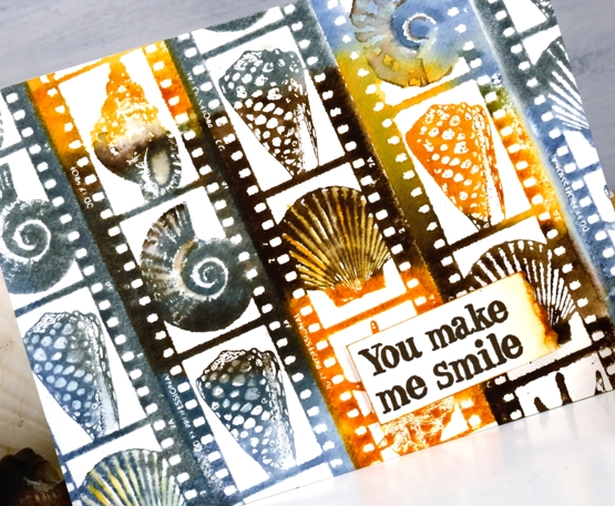
I used a stamp positioner to stamp the filmstrip edge to edge moving my panel up or down each time to feature a different portion of the stamp. I used five different inks to ink the stamp fairly randomly then spritzed it before stamping so the inks were already moving. I continued blending the colours with a paintbrush on the watercolour paper panel.
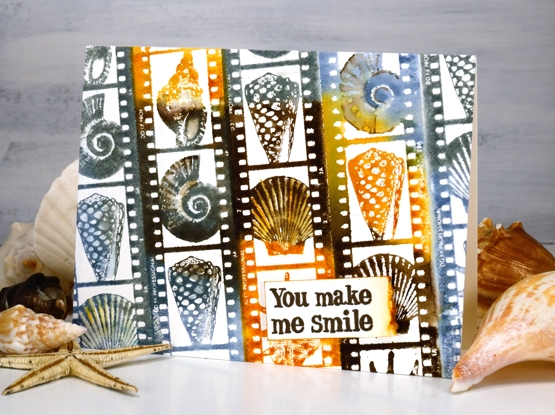
You can see some shells are more sharply defined than others which corresponds to how much water I added before and after stamping. I stamped a sentiment from the DD sentiment strip – friendship stamp. I have kept the stamp as one long strip (I think many people have done so), so I can stamp them all at once or stamp a section and cut out the one I want. In this case I stamped a section, cut out the sentiment I was after then ripped one edge and coloured the tear with wild honey distress ink.
I have a shell collection which sits untouched in a box for years at a time and then an occasion like this arises and I open the box and remember how delighted I always am when walking on a beach looking for shells.
Supplies