Mooneys Trees
Posted: October 6, 2023 Filed under: baby blue leaf embossing folder, Echidna Studios, Mooneys Trees, Paper Rose, Taylored Expressions, weathered | Tags: Echidna Studios, gel press, gel printing, Paper Rose, Taylored Expressions 6 Comments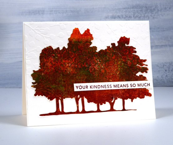
If you live in the same city as me you might have walked past these trees, sat under them or perhaps photographed them. My daughter worked from her own photo to create some digital stamps in different forms. Check out the sketch style, outline, silhouette and simplified version in the Echidna Studios etsy store. The set is named Mooneys Trees because they are growing in Mooneys Bay park.
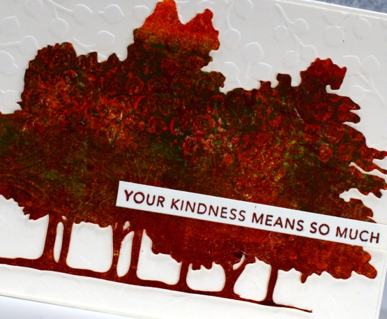
I used the simplified version to cut several pieces to gel print on. As you can see the trees fit on a 5.5″x4.25″ card base so I was able to print patterns on them on a 5×7 gel plate. If you are on IG you can watch a very short video of me printing the one above.
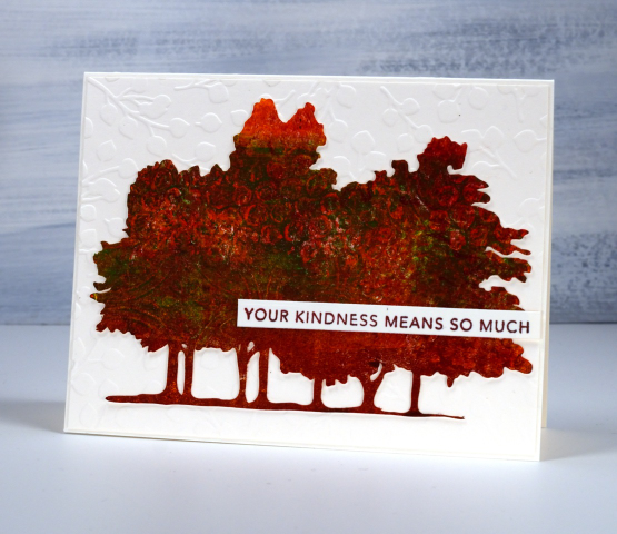
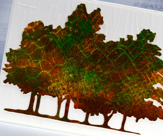
All the trees featured in this blog post were made by printing three layers of paint on top of each other, letting the paint dry in between layers. I varied the paint colours and texture on each layer. On the card above you might be able to pick out bubble wrap and textured cardboard patterns.
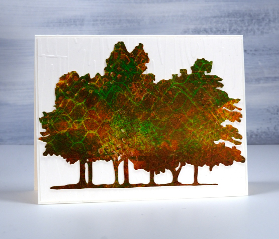
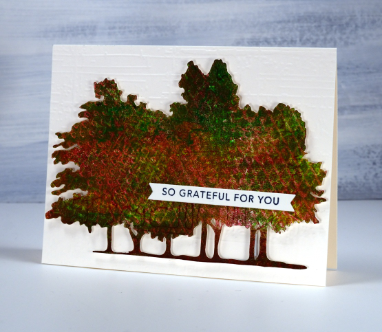
On the card directly above and below I used hessian (burlap) to add one texture as well as cardboard packaging on another layer. I also had plastic trays featuring criss-cross patterns to press on the gel plate.
Each printed tree cutout is attached to an embossed panel of cardstock. Only one of the tree cutouts is popped up because that task had too much of a fiddliness factor! The embossed background below is called ‘weathered’ from Taylored Expressions. The embossing folder used on the card at the top of the page is ‘baby blue’ from Paper Rose Studio and the embossing folder on the second card is from Close to my Heart but I don’t know the name; it creates the look of a wooden fence.
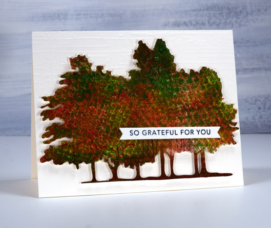
The two sentiments are from Taylored Expressions ‘simple strips background stamp‘ which stamps 18 sentiments to be cut out with the co-ordinating die. I really enjoyed making cards featuring local trees which are changing colour right now and of course I loved gel printing the cutouts to look autumnal.
My blogpost today features affiliate links to Scrap’n’Stamp. If you buy through these links I receive a small commission at no extra cost to you.
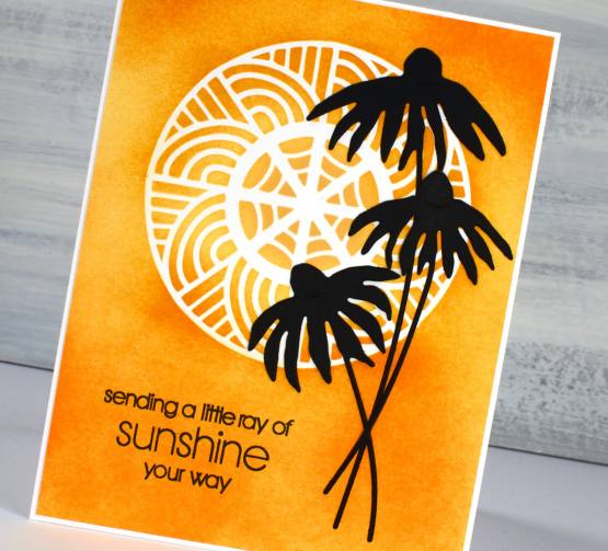
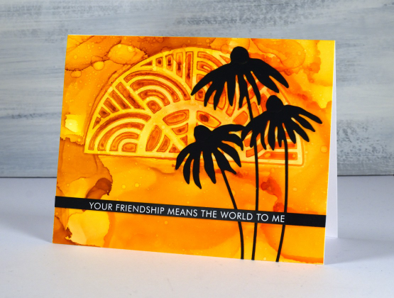
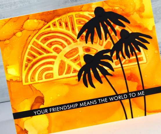
Lattice Blooms
Posted: May 1, 2023 Filed under: Brusho, Echidna Studios, lattice blooms, Paper Rose, Taylored Expressions | Tags: Brusho, distress oxide inks, Echidna Studios, Paper Rose, Taylored Expressions 3 Comments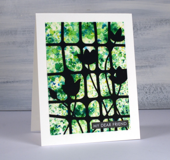
If you have used them you will have recognised at once that this is a brusho background and so is the next card with yellow, orange and red. To create a background like this with brusho you have to be patient and watch the brusho powder slowly react with spritzed water from above. If you don’t spritz enough water the powder stays dry; if you spritz too much water the diluted powders all run together giving you a blended background but not a confetti one like you see here. I worked on a panel of hot pressed watercolour paper and sprinkled brusho sparingly over it before spritzing with water.
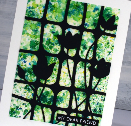
The lattice with blooms cut from black cardstock is another image I designed to be cut or printed. So far I have just used it on the cards featured today but I will also be using it as a stencil on my gel plate. The digital file can be found in the Echidna Studios etsy store.
To complete both brusho cards I used sentiments cut from the Paper Rose Studio ‘so extra’ supporting sentiments panels. There are loads of words and phrases to choose from.
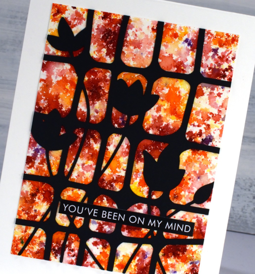
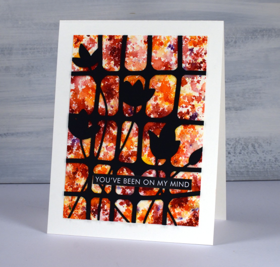
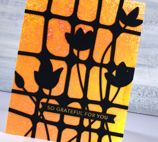
The card below also has a watercolour background but this one was done with oxide sprays. I have only recently dipped my toe in the oxide spray pool (just picture that literally for a minute!) With many oxide inks and many many distress sprays I didn’t think I needed the oxide sprays as well. To be clear I only have seven but with those seven I can get some very pretty backgrounds. Because the oxide formula reacts with water it also reacts with other sprays when you layer them. The pigments make them less transparent so the effect is quite speckly as you can see in the close up.
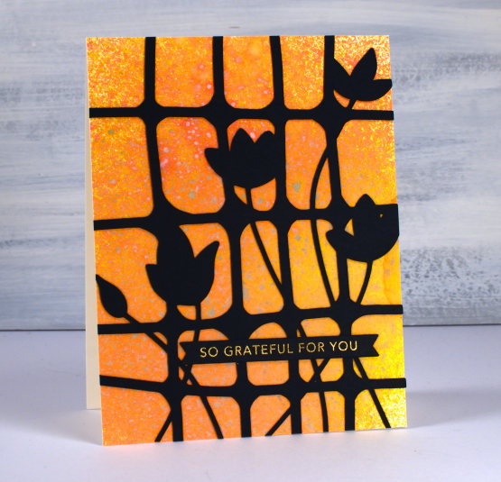
I cut the lattice blooms bigger for this card so it stretches from edge to edge. The card is finished with a Taylored Expressions sentiment strip embossed with gold. Those sentiment strips are still one of the cleverest ideas I’ve seen in stamp and die design.
(Compensated affiliate links from Foiled Fox, Ecstasy Crafts & Scrap n Stamp)
Turning
Posted: April 27, 2023 Filed under: Alcohol Ink, delicate daisies, Echidna Studios, grafix, Paper Rose, Penny Black, skewed squares, turning | Tags: Echidna Studios, Penny Black creative dies, Penny Black stamps, Ranger Alcohol Ink, Ranger Distress inks 2 Comments
As you know I have recently been featuring some designs from my daughter’s etsy store Echidna Studios. They are available as digital stamps/cutting files. What I haven’t mentioned is that some of the designs in her store are designed by me! She has just added a batch of digital images that I designed as stencils but they can also be printed. The circle masked on the card above and the half circle on the second card are from a digital set called ‘turning‘. The beauty of digital designs is that they can be cut or printed in any size. I cut both stencils from Grafix matte duralar using my cricut.
I blended three distress inks through the stencil onto neenah solar white cardstock then added the PB delicate daisies die-cuts and a PB sentiment.
To create the half turn stenciled card I worked on Grafix white craft plastic with three alcohol inks. I dropped isopropyl alcohol and alcohol inks on the panel then dropped the stencil into position. I tried to be patient so the inks would dry and give me a complete impression of the stencil. I did help it along with an air blower and managed not to lift it too early! I splattered a little isopropyl over the top for extra interest.
Once again I finished the card with black elements: the PB daisies and a sentiment strip from Paper Rose Studio. I hope you visit Echidna Studios store and check out the designs there. I will be featuring more in the weeks ahead. See if you can guess which of the stamp sets I designed, they are different from my daughter’s very realistic style. If you are on IG we would love you to follow Echidna Studios there too. And if you do happen to be on Instagram check out Gina Ferrari and see if you recognise anyone among her portraits.
By the way, a while back I showed a sneak peak of a squares stencil I had designed and cut. You can see I used it on the card below and in the video here. The stencil is called skewed squares and it is now available as a digital file in the Echidna Studios store.
Thanks for dropping by today. I hope the sun is shining where you are; it is peeping through the clouds here.
(Compensated affiliate links from Foiled Fox, Ecstasy Crafts & Scrap n Stamp)
New YouTube channel – New Video
Posted: February 11, 2023 Filed under: Alcohol Ink, baby blue leaf embossing folder, Branch 9 die, cricut, Dies, grafix, Moda Scrap, my designs, ornate tile embossing folder, Paper Rose, Penny Black, Pink & Main, scripty, silhouette birds, so extra supporting sentiments, Stampin Up, thank you squares, Tim Holtz, Tutorial | Tags: cricut, grafix, grafix craft plastic, Penny Black creative dies, Penny Black stamps, Ranger Alcohol Ink, Stampin Up, Tim Holtz 6 Comments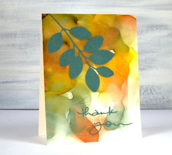
If you have been visiting this blog for a while you will know I had a youtube channel for many years. In 2022 after ten years of adding videos and gathering a community of 7000 subscribers my channel was deleted. In recent weeks I have started again with a new channel and some videos ‘from the archive’. My new channel is called Heather Telford Art and I would be very happy if you decided to like, subscribe and tell your friends! There is content on there that you may remember from the last few years and starting today there is new content also! The new ‘2 for 1 Alcohol Ink Panels’ is freshly filmed for my new channel and I hope it will be the first of many!
There are quite a few photos in this post because, well, this is a 2 for 1 technique and I created three panels which of course became six panels and one was cut in half so there are seven cards to show you in this blog post! Grab a cup of tea. I have added a linked supply list at the very bottom of this long post.
As well as a new youtube channel I am also a new Cricut owner. The stencil used on the card below was designed by me and cut on my Cricut. It is available as a cutting file from Echidna Studios etsy store.
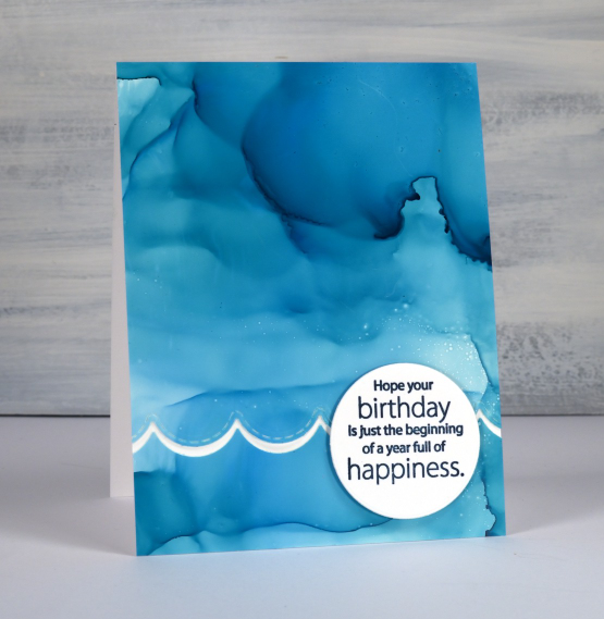
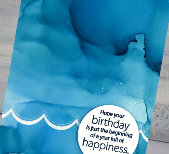
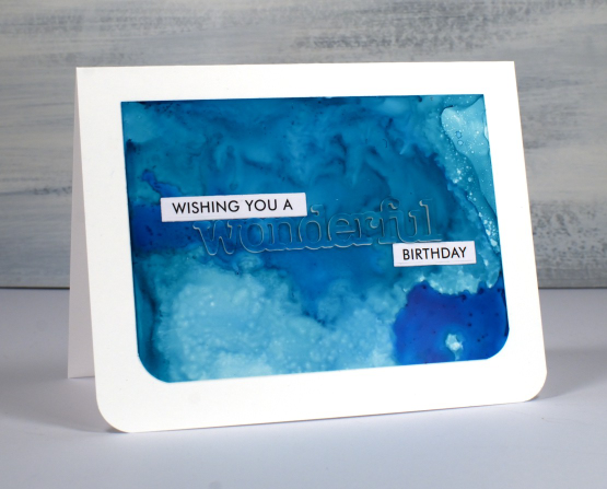
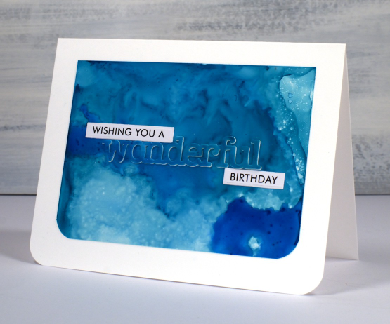
Most of the 2 for 1 smooshed panels I left as a full card fronts adding only a sentiment or some die-cutting. As the panel below reminded me of the ocean, the PB wavy scallop border seemed a nice touch.
The panel below is a half panel from the first one I showed on the video. I love the patterns from the isopropyl alcohol ink spray even though they don’t stay distinct. Even when die-cutting the word from the panel I couldn’t leave it off so I popped it up. Not so funny story: I guess I haven’t popped up a die cut word in a while because I flicked those little shapes inside the letters into the garbage when I poked the word from the die. So yes, I had to hunt through my garbage to complete the card.
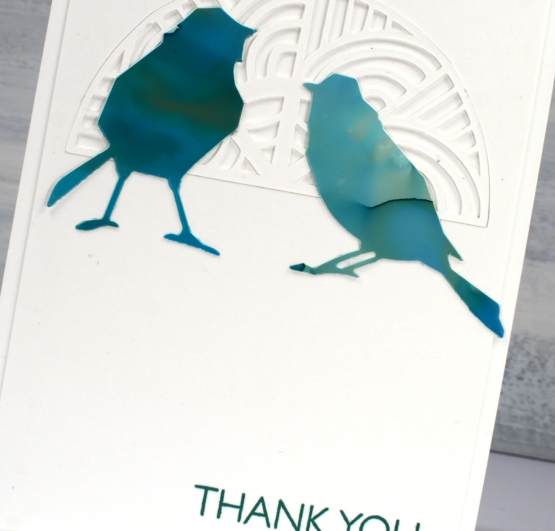
I don’t know why I hadn’t tried it before but seeing how well Grafix craft plastic responds when put in an embossing folder has been a revelation! I thought it might crack but it doesn’t so you can have the subtle impression of your embossing folder on a panel or the bold inked pattern as I’ve done on the card below. Sentiments in circles might be a little fad I go with for a while too; they look cute!
You can see the soft look of embossed script on the panel below, especially in the close up. This detailed embossing folder is from Stampin’ Up and is called ‘scripty’. I don’t think it is available anymore but you might something similar.
For this final card I cut six little birds from the panel and played with layouts for quite a while. I ended up just using two which means I have four birds in hand for another project. (pun definitely intended)
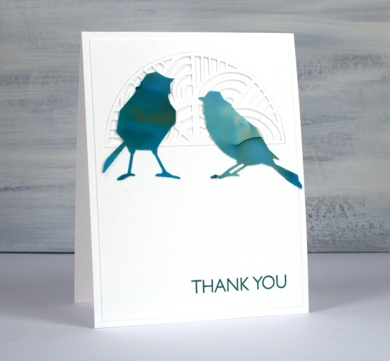
The intricate half circle cut out behind the birds is also one of my new cricut cutting files but more about that in another post. If you got this far, you’re a champion. Thank you for supporting me here on my blog and I would love to see you over on youtube as well.
(Compensated affiliate links from Foiled Fox, Scrap n Stamp)
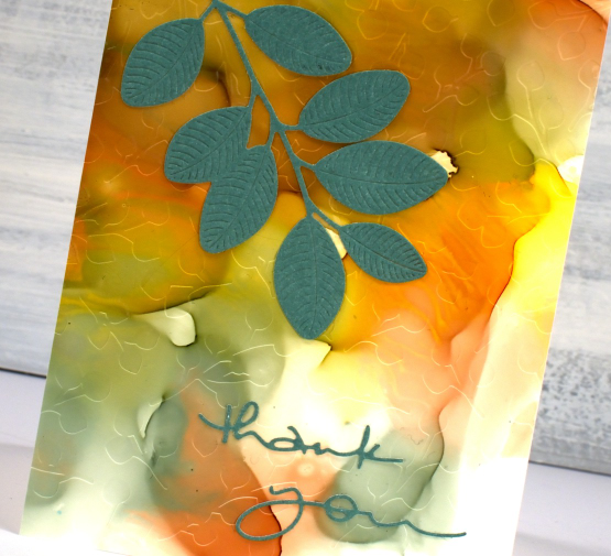
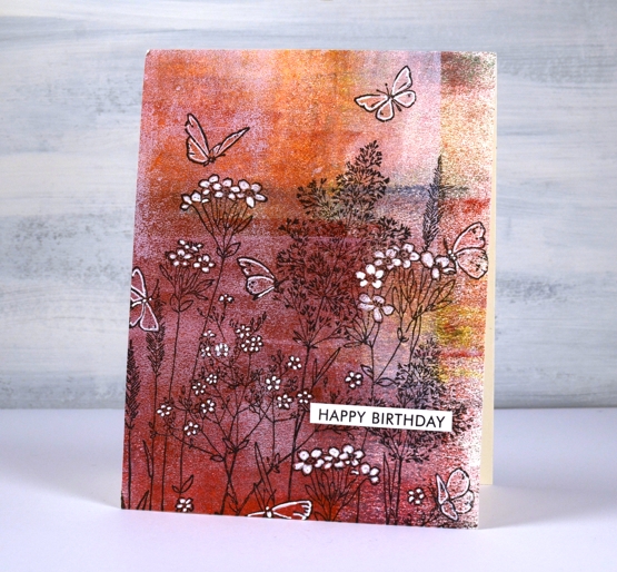
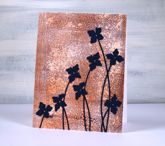
Dancing on gel prints
Posted: July 21, 2022 Filed under: butterfly dance, Dies, Paper Rose, Penny Black, shall we dance | Tags: gel press, gel printing, Penny Black creative dies, Penny Black stamps 8 Comments
I have a couple more cards incorporating gel prints today. This first one is made with a clean up sheet; maybe you can recognise the criss cross of brayer marks on the paper. When I stamped the PB ‘butterfly garden’ stamp over the background it was a bit too delicate to show up well. Highlighting petals and wings with a white gel pen worked to keep the design subtle but still noticeable.
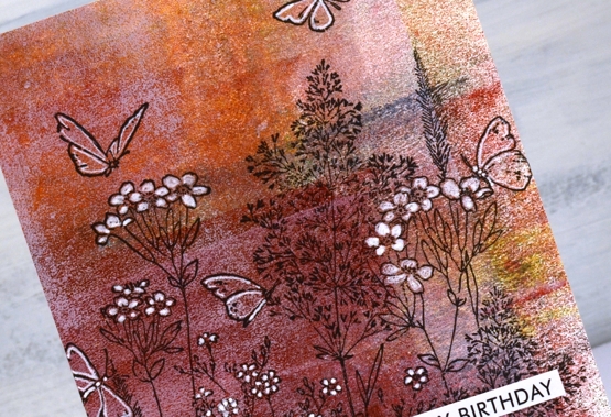
I cut the gel print to fill the card front and added a sentiment from the Paper Rose Studio ‘so extra’ sentiment strips.
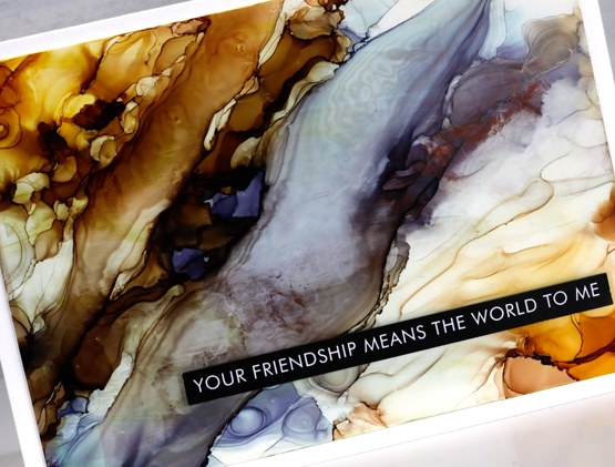
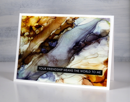
The gel print below has a delicate blue pattern over bronze made when the paint separates on the gel plate before you get a chance to take a print. I used a bronze print to pull the blue paint which had separated evenly over the whole plate. You can’t tell from the photo but the bronze has a metallic sheen to it.
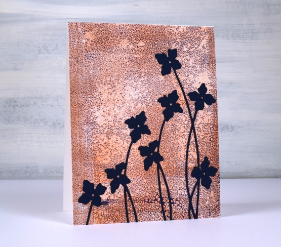
I cut flowers from navy cardstock using the Penny Black ‘shall we dance’ die to complete a card I can use for any occasion.
The Penny Black sale continues at The Foiled Fox so if you have a wish list, take a look.

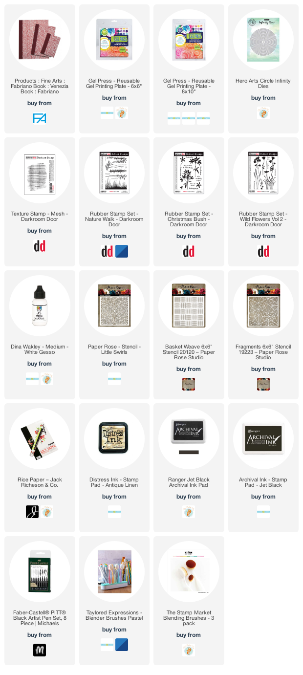
Supplies
(Compensated affiliate links used when possible)
AI Abstract and Landscape
Posted: January 28, 2022 Filed under: Alcohol Ink, grafix, Paper Rose, so extra supporting sentiments | Tags: grafix, grafix craft plastic, Paper Rose, pinata alcohol ink, Ranger Alcohol Ink 6 Comments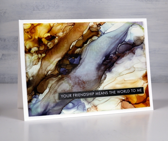
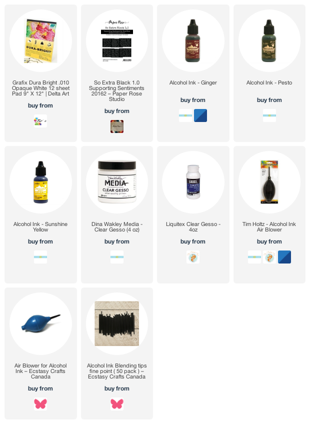
While trying the stencil and alcohol ink techniques earlier this week I also returned to techniques I’ve used before. The Grafix white craft plastic panel above was a grey & blue one which wasn’t very interesting. I added warm tones either side and using tilting and air blowing to create a pattern that looks a little like a rock cross section.
I used some clear gesso to seal this one but it did drag some colour and leave some texture lines so I wouldn’t recommend it as the best sealing solution. I could use a spray sealant but it is very, very cold outside so I’m not popping into the back yard to use aerosol cans right now!
I would tell you the ink colours I used if I knew. I picked up a panel with ink from a previous session then start putting more ink here and there and in no time I saw colours and patterns appear with no idea which ink went where!
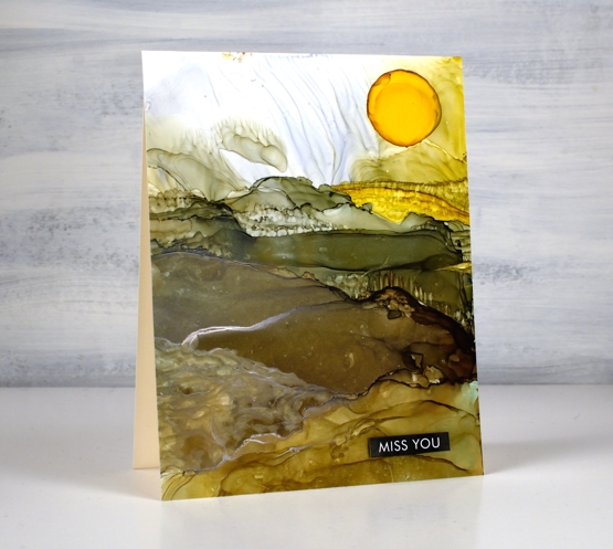
On this second panel I have a bit more of an idea of the landscape colours. I began with a previously inked panel and added pesto, ginger and sunshine yellow inks along with generous amounts of rubbing alcohol to move the inks.
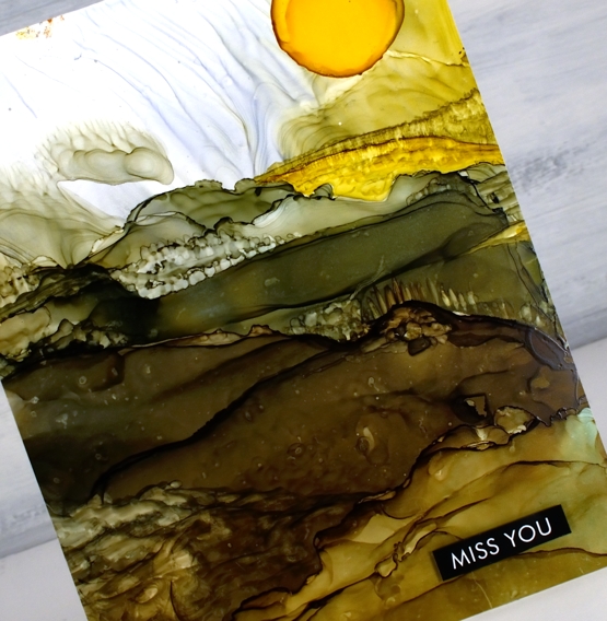
As I tipped the panel and used an air blower I was able to create stripes across the panel which looked a bit like hills. I feel like this is still a fluke for me; I wish I could give you exact instructions but it works sometimes and not others.
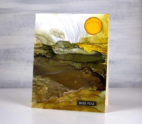
To add the look of trees and crops I used an alcohol ink paint brush and a very small amount of alcohol ink or isopropyl alcohol. I wanted to add texture to the ink that was already there rather than add more ink because when you add more ink it tends to displace the ink you already have on the panel. With this in mind I added a drop of sunshine yellow at the end to be the sun. It did not expand neatly in a circle so I used a paint brush which meant the sun was a bit larger than intended! I finished both cards with sentiments from the Paper Rose Studio ‘so extra supporting sentiments’ pack.
Alcohol ink art seems to be equal parts fabulous and frustrating but I will keep on persevering and see if I can come up with some processes I can recreate and share with you.
Supplies
(Compensated affiliate links used when possible)
Alcohol Ink + Stencil
Posted: January 24, 2022 Filed under: Alcohol Ink, Dies, little swirls, Paper Rose, Penny Black, so extra supporting sentiments | Tags: Paper Rose, Penny Black creative dies, Ranger Alcohol Ink 11 Comments
This card was inspired by the wonder and wizardry of my friend Ardyth who just happened to be the Featured Stamper on SplitcoastStampers yesterday. Ardyth has been doing quite a few alcohol ink techniques lately and I have been loving them while waiting for an opportunity to get my own inks out again. Take a look at Ardyth’s videos here and here for inspiration and instructions.
When I pulled out the inks and the substrates I found several panels from another session. The panels hadn’t inspired me enough to make them into cards when I first made them so I decided to work over the top of them. The panel for this card is Grafix white craft plastic and was originally covered in blue patterns, you can see a little remaining in the top right corner.
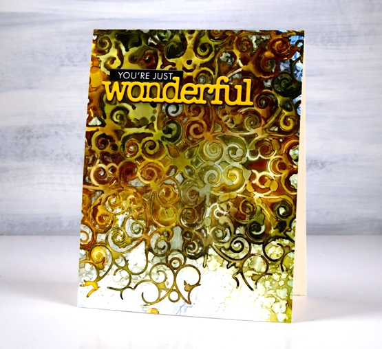
I lay the Paper Rose Studio ‘little swirls’ stencil on top of the panel and sprinkled ginger, pesto and sunshine alcohol inks over the stencil along with some rubbing alcohol to move the inks a little further. I was impatient so I pulled up one corner to check on the pattern before the inks dried. That is why the top left corner does not have distinct detail like the lower right. Once dry I removed the stencil and was left with this amazing pattern. Thank you for all the inspiration Ardyth!

Those sharper swirls at the bottom are my favourite part of the design but I love the whole effect. I will definitely be playing with this technique again. I finished off the card with a stacked PB die cut and a sentiment strip from the black Paper Rose Studio black ‘so extra’ set. I ended up sealing this panel with clear gesso. I haven’t done this before but some of my alcohol ink panels end up a bit sticky so I wanted to see if clear gesso worked as a sealant. I’ll will keep testing the process and let you know more next time I post about alcohol inks. Meanwhile head over and drool over all Ardyth’s clever cards!
Supplies
(Compensated affiliate links used when possible)
Artful August Home Journal page
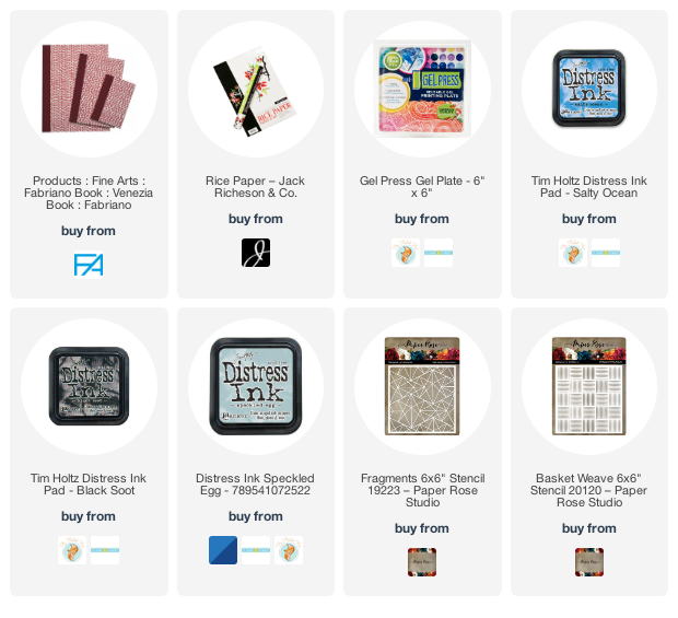
Posted: August 25, 2021 Filed under: Art Journal, basket weave, Darkroom Door, fragments, gel press, honeycomb, Paper Rose, Stencils | Tags: Art Journal, Darkroom Door stencils, gel press, gel printing, Paper Rose, Ranger Distress inks 2 Comments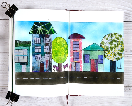
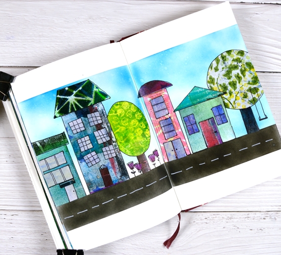
The fun and inspiration continues in Rachel Greig’s Artful August challenge. I am so impressed and inspired by what I have seen. Rachel’s own art has been beautiful and unique every single day. As I mentioned in my last post I have not participated every day but I have definitely enjoyed the times I have followed the prompts. Today’s prompt is ‘Home’ and I decided to make an art journal page of a street.
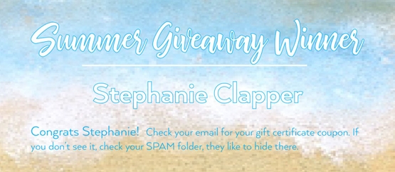
Make sure you read to the end of this post to find out the winner of Summer Giveaway I hosted with the Foiled Fox.
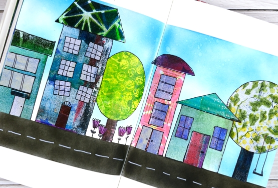
None of these quirky houses look anything like my home but I have had thirteen different homes over the years so I wasn’t going for realism, instead I wanted to create more of a neighbourhood feel. Once again I cut up gel prints to make the houses, trees and flowers. I particularly like the gel print trees. The one on the left was printed with bubble wrap and the one on the right features texture from three different stencils which ended up giving me leaves and a branch to hang a swing on.
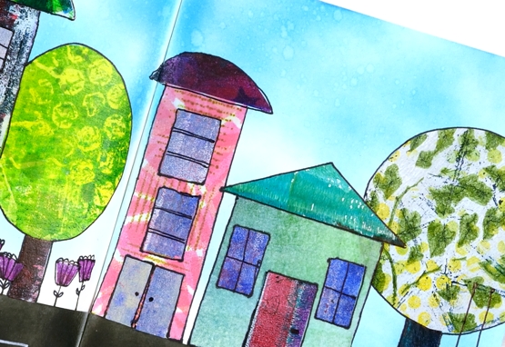
I began by masking the top and bottom edges then used blending brushes to fill the sky with blue distress inks and the road with black soot ink. I cut all the shapes by hand not worrying about perspective or scale and glued them on with multi matte medium. Once the glue dried I drew around all the edges and added detail with with a black ultrafine sharpie. I added markings to the road with a white sharpie paint pen.
Thank you to everyone who entered the Summer Giveaway by telling us your favourite summer activity. I enjoyed reading about beach walks, mountain hikes, picnics, porches and time spent with friends. I hope you are all still enjoying those pastimes. Summer is not over yet! Congratulations to Stephanie Clapper, check your email for your gift certificate to the wonderful Foiled Fox online store.
Supplies
(Compensated affiliate links used when possible)
Artful August Circle Journal Page
Posted: August 5, 2021 Filed under: Art Journal, basket weave, Christmas bush, Darkroom Door, fragments, gel press, gelli plate, little swirls, mesh, Nature Walk, Paper Rose, Wildflowers Vol 2 | Tags: Art Journal, Darkroom Door stamps, gel press, gel printing, gelli plate 6 Comments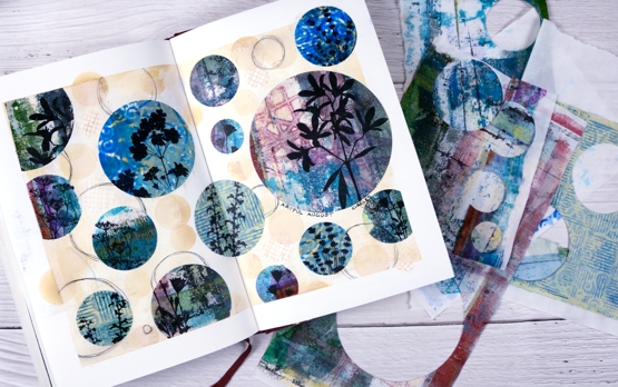
Rachel Greig from Darkroom Door is hosting ‘Artful August’, a challenge to make something arty each day in August. She has provided 31 prompts and I am going to play along as often as I can. Circles was the prompt yesterday so I cut circles from a just few of the many gel print panels I have piling up. I used only gelprints done on rice paper and they cut and adhered very easily.
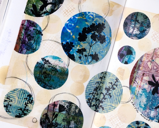
Once I had cut circles in different sizes from different gel printed panels I stamped flower silhouettes from several Darkroom Door sets. Before gluing the circles to the pages I painted the pages with a base of gesso + light brown paint and added some scribbly circles by tracing inside circle dies.

I glued the printed, stamped circles with matte medium both on the back of the paper and over the top to seal it. To add a bit more interest around the circles I blended antique linen ink through a homemade paper stencil.
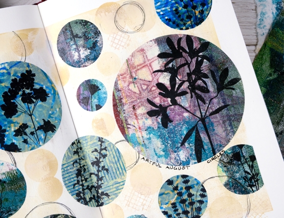
The prompts in the challenge are very open and participants are encouraged to interpret them in any way and with any medium. If you are on instagram you can view the submissions by searching for #artfulaugust or #rachelgreigartfulaugustchallenge
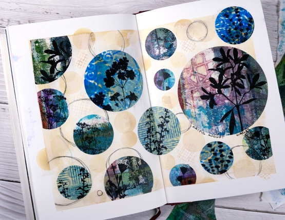
As I participate in the challenge I will have simple experiments along with some completed projects like this one. The fun is simply playing with the prompts. In making today’s journal pages I was very happy to use some pretty scraps, experiments and clean up pages from gel printing sessions. There are always too many to turn into cards but each one has a unique texture and colour mix.
Supplies
(Compensated affiliate links used when possible)
Winter Garden art journal page
Posted: July 14, 2021 Filed under: Art Journal, bookworm, Correspondence, Darkroom Door, gel press, little swirls, nomad, Paper Rose, snowflakes, Trees, Wildflowers Vol 1 | Tags: Art Journal, Darkroom Door stamps, Fabriano art journal, gel press, Paper Rose 12 Comments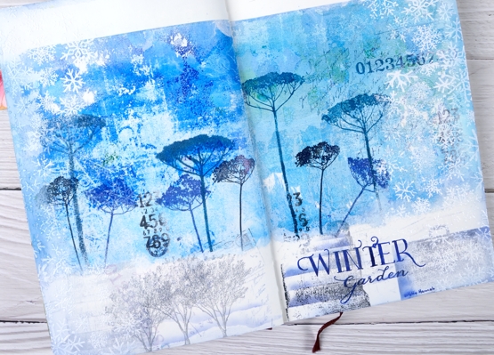
It’s been a while since I worked in my book themed art journal. As I looked over a table covered in gel prints I settled on two blue ones filled with pattern and paint. Both were on rice paper and sized 6″x6″ which is not big enough to cover the whole journal page. I decided to tear a rough edge on the bottom and glue the panels with space above and below.
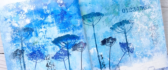
The inspiration for the page is Kristin Hannah’s novel ‘Winter Garden’. I used Darkroom Door floral stamps to decorated the gel prints with blue flowers then added more stamping to the blue area and the white space at the bottom of the page.
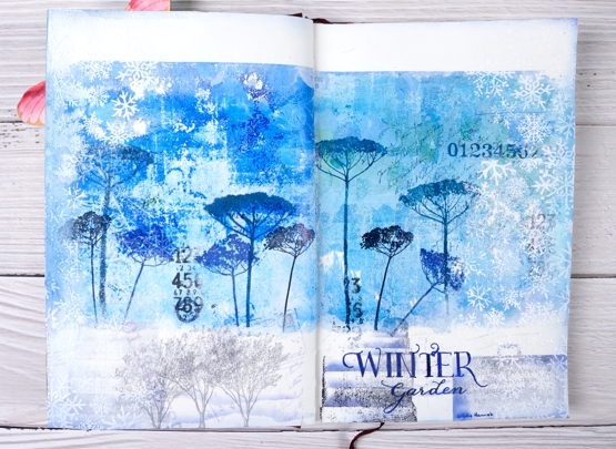
Picking from a few themes in the book I stamped trees to represent the orchard, a suitcase to represent the escape from Leningrad, books from the library where the main character worked. I also used number, correspondence and snowflake stamps to complete the collage.
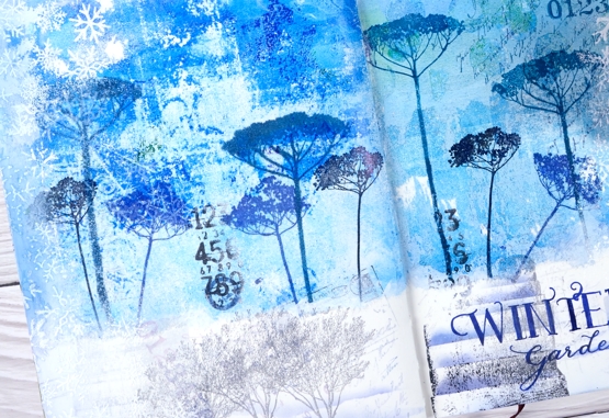
I am always in two minds about adding words to my pages and this time was no exception. Rather than a quote I just added the name of the novel and author. I used pigment and archival inks for all the stamping, white gesso around the edges and white ink and embossing powder to add the snowflake borders.
Have you read any Kristin Hannah? My book club considers ‘The Nightingale’ our best choice so far! We are always searching for good book club reads; if you have any suggestions please leave them in the comments.
Supplies
(Compensated affiliate links used when possible)