Pink Majesty
Posted: November 4, 2024 Filed under: Finetec paints, Penny Black, Scarlet Majesty, Stampin Up, subtle | Tags: distress markers, Fabriano Watercolour Paper, Finetec artist mica watercolour paint, Papertrey ink, Penny Black stamps, Ranger Distress inks 10 Comments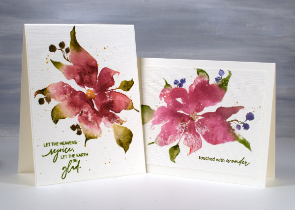
Today’s cards feature the beautiful Penny Black stamp, ‘scarlet majesty‘ but as the title suggests, I have chosen pinks over scarlet for the ink colours. I worked on Fabriano hot pressed watercolour paper in my stamp positioner.
I inked most of the petals with a pink ink then added darker ink with more of a burgandy such as aged mahogany. I use a mix of small cube ink pads and markers to ink the stamp. The leaves were inked with peeled paint and the berries a purply blue such as chipped sapphire. Before stamping I spritz the stamp so the inks can move a little. I stamp the first impression then decide whether more ink is needed, more water or often some blending with a paintbrush and water.
I don’t remember fiddling much with this panel as I liked the watery blends and the paler veins showing through here and there. I painted the centre of the poinsettia with gold finetec paint and of course added some splatter.
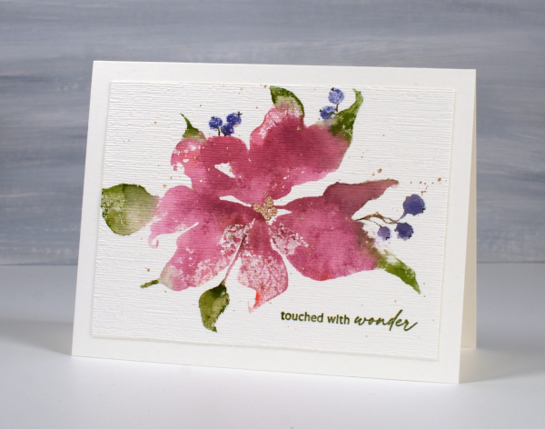
The sentiment is from PB ‘jolly snippets‘ and the texture from the retired SU ‘subtle’ embossing folder.
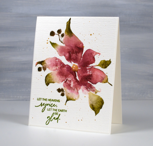
I used the same technique on this second card but used darker inks for leaves, petals and berries. My guess is aged mahogany, forest moss and a dark brown which was possibly made by mixing the first two. (I don’t always take note of my ink colours)
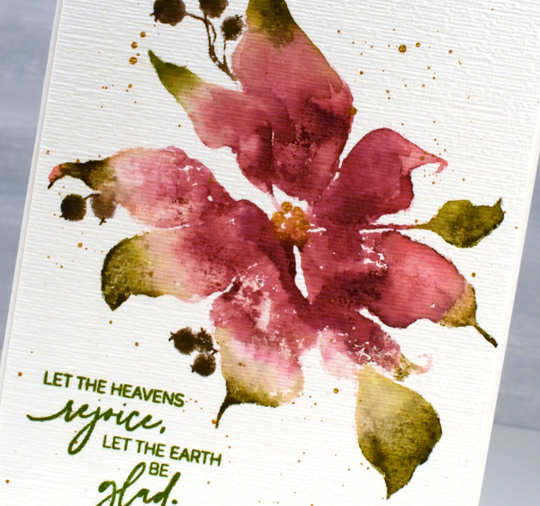
I think ‘scarlet majesty’ is a stunning stamp; I like the curl at the ends of the petals. Here are a few more cards made with it. I will admit that it is tricky to ink because you can’t always see where to try and define edges. I have another post coming up where I handle this issue by adding lines after stamping. I’ll share that soon. The sentiment this time came from the PB set, ‘promise of hope’.

Today’s post features affiliate links to The Foiled Fox. If you buy through these links I receive a small commission at no extra cost to you.
Window Box
Posted: August 8, 2024 Filed under: Echidna Studios, Finetec paints, Stampin Up, Window box | Tags: Coliro paints, digital stamps, Echidna Studios, Fabriano Watercolour Paper, Finetec artist mica watercolour paint, Staedtler watercolour brush pens, Stampin Up 4 Comments
Don’t you just want a window like this? With blooming flowers not wilting in the heat! This digital stamp is called ‘Window Box’ and it is new from Echidna Studios. My daughter designed it and there are three files to play with in the set, the image you see here as well as a separate window image and a separate window box image. I’m looking forward to trying the window box image by itself enlarged to fill a card front.
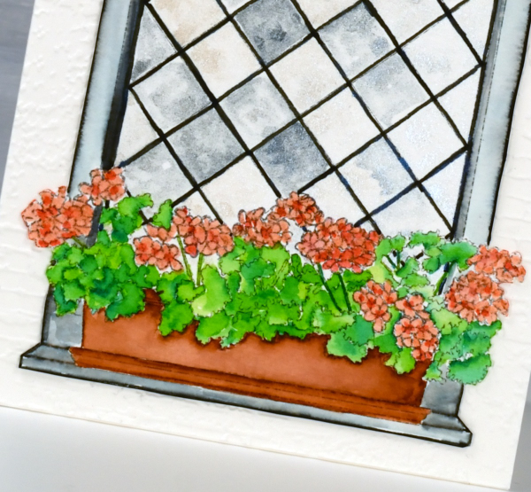
I printed the image on hot pressed watercolour paper and used Staedtler watercolour brush markers to colour the flowers, leaves, box and window frame. The window panes I painted with Coliro pearlcolors from Finetec. Some pearl or metallic paints are ‘interference’ paints which look very different on black paper as compared to white. The blue pearl paint I used from the ‘Ocean’ set looks very blue on black paper but looked silvery grey on white even with a touch of cream depending on the way the light hits it. This was exactly the effect I wanted so the panes appear like old leadlight windows where each pane reflects the light differently.
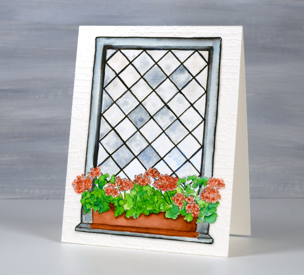
I coloured the leaves with two greens, blending them together with water and a paintbrush. I used the same technique for the flowers with a coral and a peach coloured marker. The planter was painted with a terracotta colour and the frame with black, diluted to appear grey in places. I wasn’t planning to cut this image out but it really needed to be attached to an embossed panel of aged brick. I’m sure you understand. The embossing folder is ‘exposed brick’ from Stampin Up. This post includes affiliate links from Foiled Fox. If you buy through these links I receive a small commission at no extra cost to you.
By the Garden Gate
Posted: March 28, 2024 Filed under: Echidna Studios, garden fence, Inktense pencils, Stampin Up | Tags: digital stamps, Echidna Studios, Inktense, Kuretake Zig clean color real brush markers, Stampin Up 5 Comments
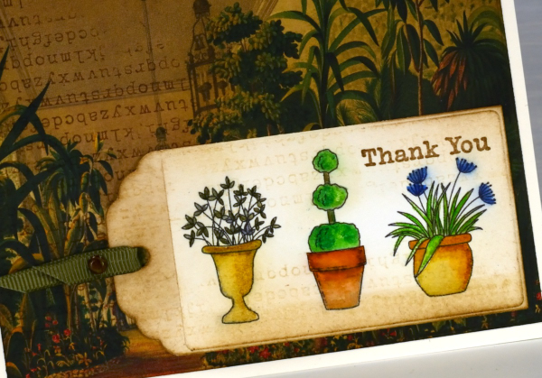
The Garden Fence set is an Echidna Studios digital stamp set that I designed and my daughter digitised. The set includes a gate, three pots and a grass & flowers image. Each image is stackable which means you can arrange your own garden design with pots and gate beside each other, behind each other or even on top of each other if that sounds fun!
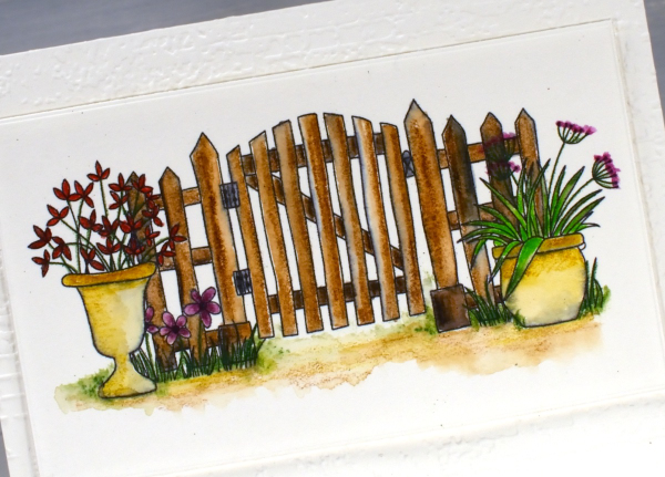
Both the gate scene above and the individual pots on the tag shown later in this post were printed on hot press watercolour paper on an ink jet printer. In the past I have always printed on a laser printer but my daughter recently bought a second hand printer to test some colour printing of our designs. We printed some black outline images to see how they were to watercolour.
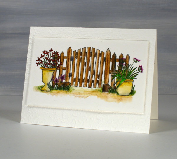
The gate design above I coloured with inktense watercolour pencils and blended the ink with water and a very fine brush. The ink from the printer did bleed a bit so you can some some grey tones here and there. Because I used very little water I was able to keep the bleeding to a minimum. I received the lovely ‘exposed brick‘ embossing folder for my birthday from a couple of friends who know just what I like. It seemed an appropriate background for the slightly aged garden gate.
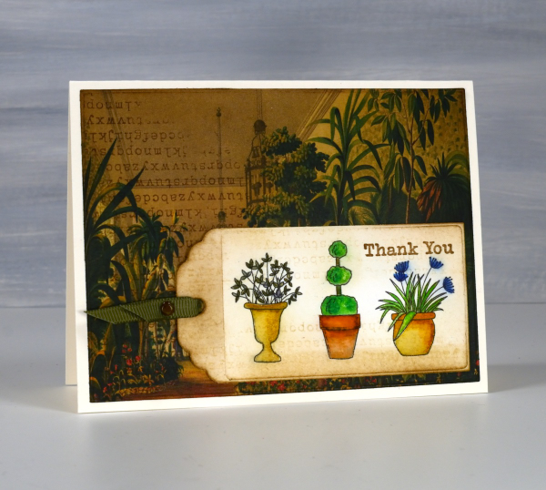
On this little tag I used a mix of inktense pencils and Zig clean color real brush markers; again there was some bleeding when I added water but no so much as to make me stop colouring and blending. All that to say if you have an ink jet printer it might be worth printing and watercolouring some images just to see how it goes.
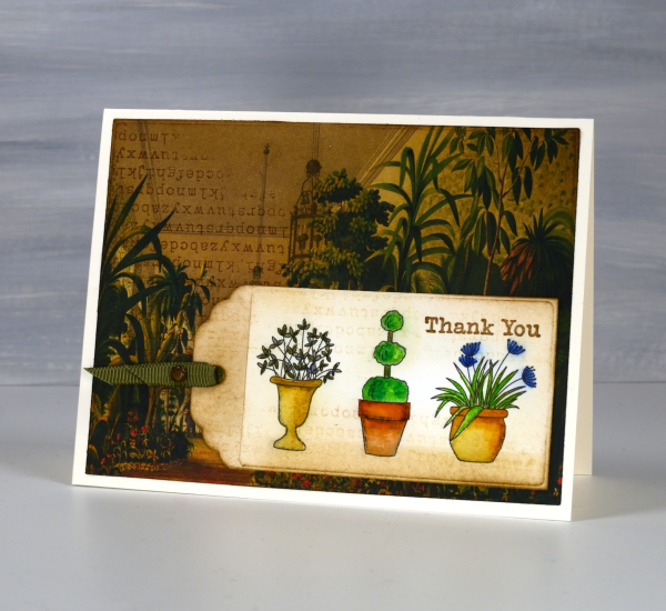
I’ve been making some vintage style collage cards lately (I’ll share them on the blog soon) so I decided to find a book page as background for my watercoloured tag. I blended vintage photo and antique linen inks around the background and tag and added some typewriter alphabet stamping on both. Unfortunately I stamped the alphabet upside down on my background but I continued with my card anyway! I like the pairing of old fashioned conservatory with modern little pots just for fun.
I’ve featured the Garden Fence set before; take a look here and here. This post includes affiliate links from Foiled Fox and Scrap’n’Stamp . If you buy through these links I receive a small commission at no extra cost to you.
The leaves are turning – video
Posted: October 16, 2023 Filed under: Echidna Studios, gel press, Mooneys Trees, Stampin Up, timber embossing folder, Tutorial | Tags: Echidna Studios, gel press, gel printing, Tutorial, video 7 Comments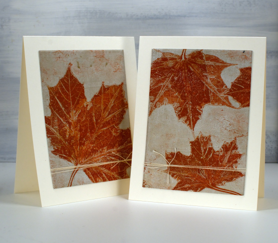
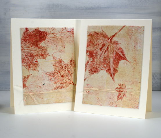
As the leaves start to turn around me I brought a few green ones to the gel plate and printed them in the colours of autumn. I filmed as I printed so you can see a few different techniques. There is a brief appearance of backyard wildlife that must have come in on the freshly picked leaves. Let me know if you know what it was.
As you will see in the video I used a 5″x7″ gel plate and a mix of liquitex, decoart and sennelier acrylic paints to pull prints on printer paper.
Recently I have been turning 5×7 inch prints into card fronts with a strip left for a matching envelope. For today’s cards I attached the whole print to cardstock then used WaffleFlower rectangle dies to cut panels from each print, added twine to both panels then attached them to cream card bases. There are no strips left for the envelopes but twice as many cards. I have left them without sentiments but if needed I can tie a little sentiment tag onto the twine.
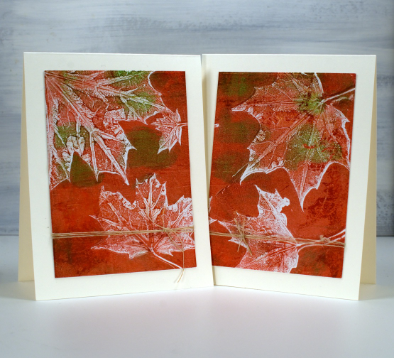
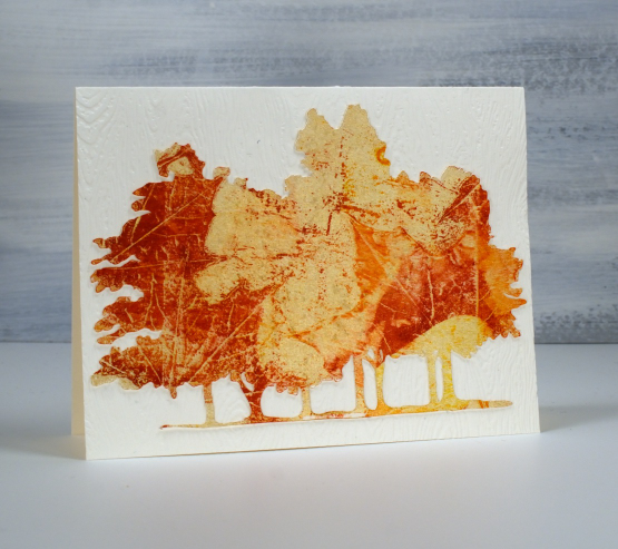
The print below is also featured in the video. I thought it would be fun to print leaves onto the Mooneys Trees cut out. I used the digital cutting file to cut from cream cardstock then picked up the leaf print from the gel plate. My new timber embossing folder from SU was the perfect background.
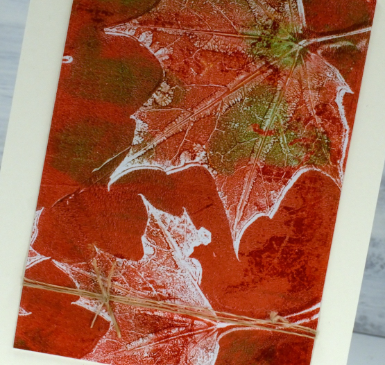
The close up below is the two step print, pulling first the background with the leaves still on the plate, then the leaf texture after they have been removed.
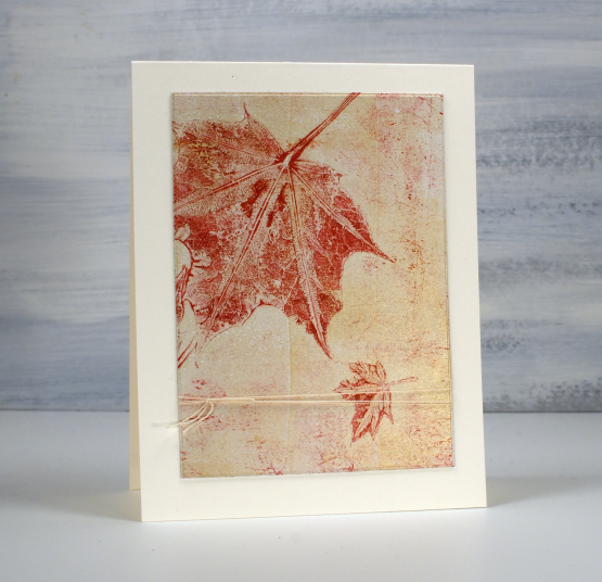
I think this final card might be my favourite. I didn’t plan it this way but it looks like that little leaf is falling away from the bigger one.
Today’s post features affiliate links to the following companies. If you buy through these links I receive a small commission at no extra cost to you. The Foiled Fox & Scrap’n’Stamp
New YouTube channel – New Video
Posted: February 11, 2023 Filed under: Alcohol Ink, baby blue leaf embossing folder, Branch 9 die, cricut, Dies, grafix, Moda Scrap, my designs, ornate tile embossing folder, Paper Rose, Penny Black, Pink & Main, scripty, silhouette birds, so extra supporting sentiments, Stampin Up, thank you squares, Tim Holtz, Tutorial | Tags: cricut, grafix, grafix craft plastic, Penny Black creative dies, Penny Black stamps, Ranger Alcohol Ink, Stampin Up, Tim Holtz 6 Comments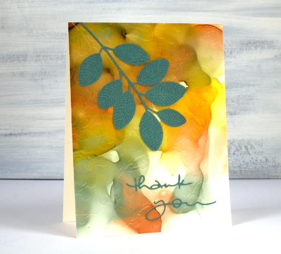
If you have been visiting this blog for a while you will know I had a youtube channel for many years. In 2022 after ten years of adding videos and gathering a community of 7000 subscribers my channel was deleted. In recent weeks I have started again with a new channel and some videos ‘from the archive’. My new channel is called Heather Telford Art and I would be very happy if you decided to like, subscribe and tell your friends! There is content on there that you may remember from the last few years and starting today there is new content also! The new ‘2 for 1 Alcohol Ink Panels’ is freshly filmed for my new channel and I hope it will be the first of many!
There are quite a few photos in this post because, well, this is a 2 for 1 technique and I created three panels which of course became six panels and one was cut in half so there are seven cards to show you in this blog post! Grab a cup of tea. I have added a linked supply list at the very bottom of this long post.
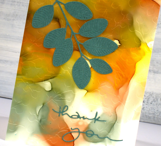
As well as a new youtube channel I am also a new Cricut owner. The stencil used on the card below was designed by me and cut on my Cricut. It is available as a cutting file from Echidna Studios etsy store.
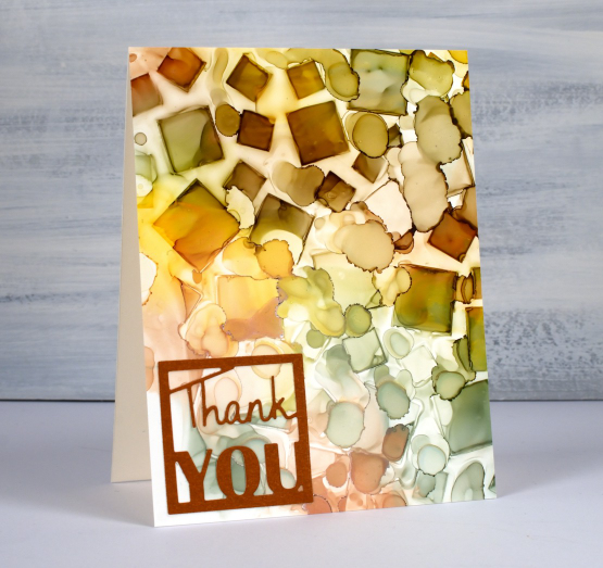
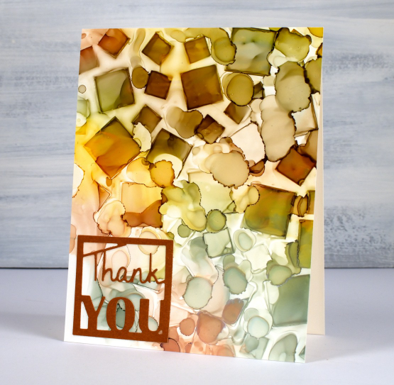
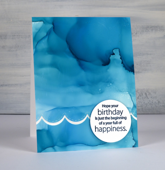
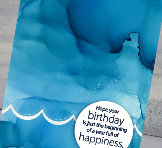
Most of the 2 for 1 smooshed panels I left as a full card fronts adding only a sentiment or some die-cutting. As the panel below reminded me of the ocean, the PB wavy scallop border seemed a nice touch.
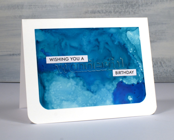
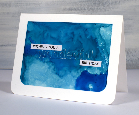
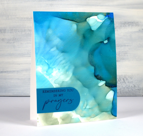
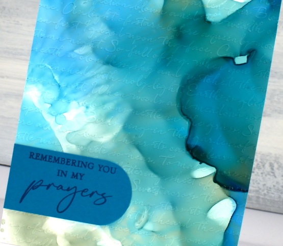
The panel below is a half panel from the first one I showed on the video. I love the patterns from the isopropyl alcohol ink spray even though they don’t stay distinct. Even when die-cutting the word from the panel I couldn’t leave it off so I popped it up. Not so funny story: I guess I haven’t popped up a die cut word in a while because I flicked those little shapes inside the letters into the garbage when I poked the word from the die. So yes, I had to hunt through my garbage to complete the card.
I don’t know why I hadn’t tried it before but seeing how well Grafix craft plastic responds when put in an embossing folder has been a revelation! I thought it might crack but it doesn’t so you can have the subtle impression of your embossing folder on a panel or the bold inked pattern as I’ve done on the card below. Sentiments in circles might be a little fad I go with for a while too; they look cute!
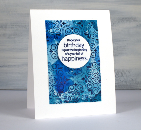
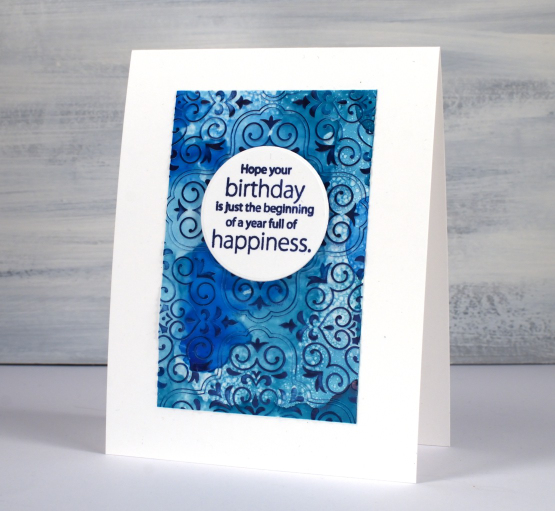
You can see the soft look of embossed script on the panel below, especially in the close up. This detailed embossing folder is from Stampin’ Up and is called ‘scripty’. I don’t think it is available anymore but you might something similar.
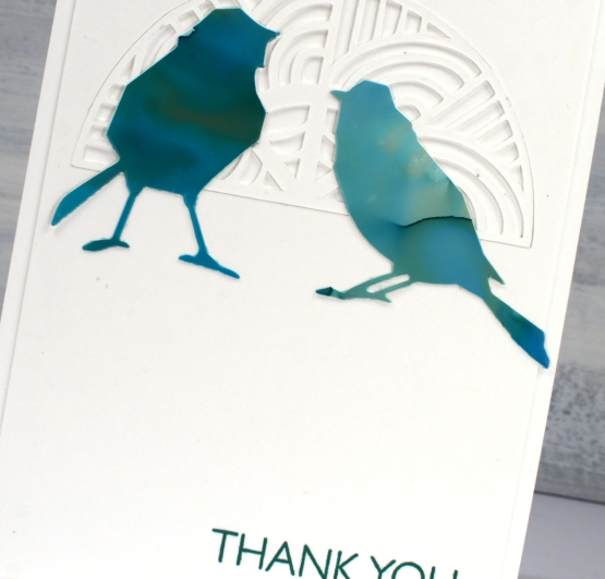
For this final card I cut six little birds from the panel and played with layouts for quite a while. I ended up just using two which means I have four birds in hand for another project. (pun definitely intended)
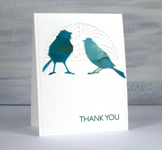
The intricate half circle cut out behind the birds is also one of my new cricut cutting files but more about that in another post. If you got this far, you’re a champion. Thank you for supporting me here on my blog and I would love to see you over on youtube as well.
(Compensated affiliate links from Foiled Fox, Scrap n Stamp)
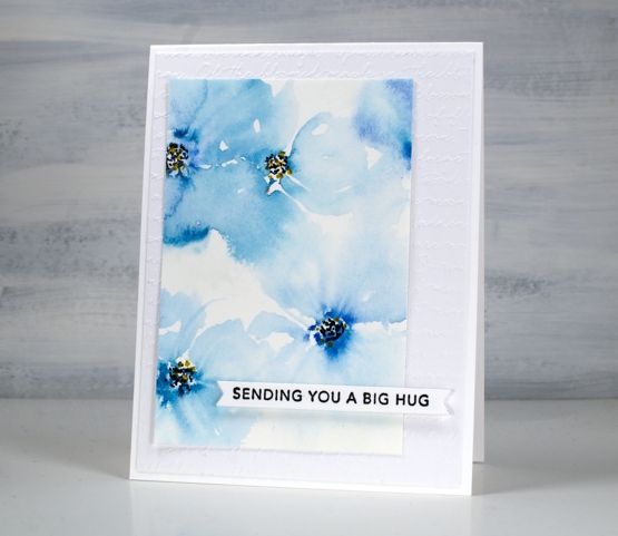
Blue Florals
Posted: May 12, 2022 Filed under: Hand painted, scripty, sennelier watercolours, Stampin Up, Taylored Expressions | Tags: Hand painted, sennelier watercolours, Staedtler watercolour brush pens, Stampin Up, Taylored Expressions 17 Comments
I spent a little while painting florals the other day. My watercolour paints were on my table so I painted two precut card panels with a few blues. I started the flowers on both cards by putting five little dabs of paint in a circle then blending them out with a wet paint brush. After blending I added dots to the centres with black and yellow markers.

Both the bold and the soft florals looked ok but the leaves I’d added didn’t work. I set the panels aside, happy that I had practised but not planning to use either pieces. When I came back to them a day or so later I did some extreme cropping which took out the leaves I didn’t like and left me with some nice blends and a configuration which had some balance.

Even if I had not cropped them and put them on cards the exercise was worthwhile. Even after years of making, practising and learning I still have the niggling feeling that everything I work on should ‘work out’! I know it is unrealistic and I am getting better at spending time practising and playing just to grow and enjoy.
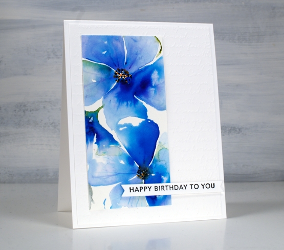
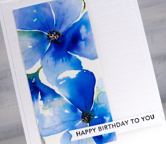
The pale blue ‘washy-er’ panel is my favourite but I love the colours in both. After cropping them I added them to an embossed panel (SU scripty) and popped up some Taylored Expressions sentiments over the top.
Supplies
(Compensated affiliate links used when possible)

Trilling Trio
Posted: January 17, 2022 Filed under: Penny Black, Stampin Up, subtle, trilling trio | Tags: Penny Black stamps, Stampin Up 15 Comments
Trilling Trio from Penny Black arrived on the scene late last year and features three different birds. My card today uses just the cardinal stamp but I have coloured it two ways so as to have the male and the female on my panel.
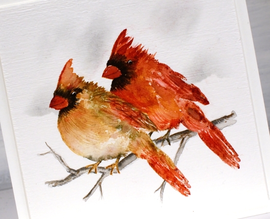
I worked with distress inks and watercolour pencils on hot pressed watercolour paper and I kept the panel in the stamp positioner so I could build the colours gradually. I stamped the female cardinal first in antique linen ink so it gave me a pale outline then I used tea dye, vintage photo and barn door inks to add colour. I spritzed the stamp lightly before stamping so the colours would blend but then did more blending with a paintbrush. I added black around the eye and beak both by stamping and by colouring directly on the panel. To add texture to the feathers I used sharpened watercolour pencils. I added the male cardinal behind using more barn door ink along with the tea dye and black soot inks.
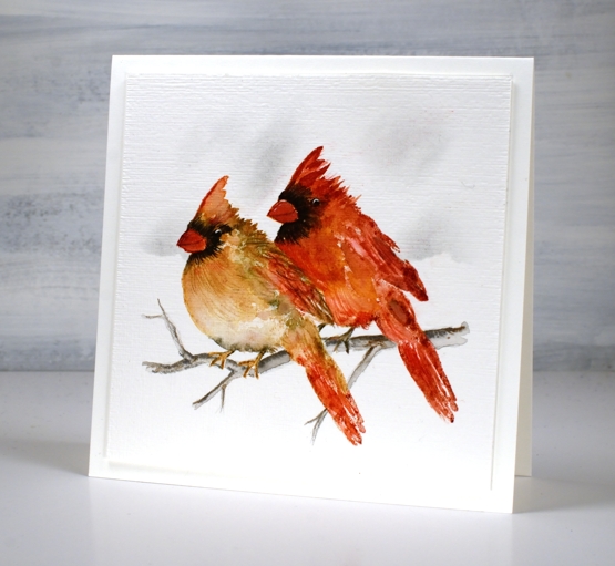
Once the birds were completed I drew a small branch with watercolour pencils, blended it and then used a blending brush and a torn piece of post-it note to add shadow in the background. I ran the panel through with the ‘subtle’ embossing folder from SU; it adds such nice canvas texture! There are two more delightful bird stamps in the set which I hope to feature soon!
We are getting much snow today so I will be hunkered down in the work room or maybe taking a turn clearing the path and driveway!
Supplies
(Compensated affiliate links used when possible)
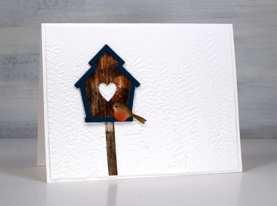
Rustic Birdhouse
Posted: January 3, 2022 Filed under: Penny Black, rustic birdhouse, Stampin Up | Tags: Penny Black creative dies, Stampin Up 8 Comments
When I do any art journalling these days I do so with a large sheet of watercolour paper on my work surface. It is not the most expensive brand and it does have a bit of texture, currently I am using Canson XL. As I create any blending off the edge of an element ink ends up on the large sheet. Excess paint or ink is wiped off on the sheet. I try out a pen, ink or marker on the sheet to make sure it is the colour I want and has plenty of juice left in it. Consequently pattern and colour builds up on the sheet over time as journal projects are finished.
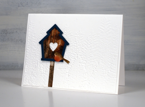
The most recent page I made involved brown and black paints so I often wiped the brush off on the large sheet. When painting strips of paper for tree trunks I lay those strips on the large sheet. I ended up with a rough painted area resembling woodgrain so I cut it off the larger sheet and die cut birdhouses from it with the PB ‘rustic birdhouse’ die.
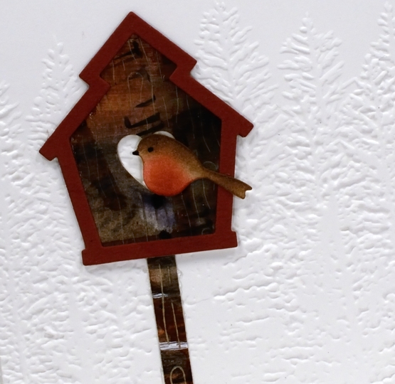
I die-cut the frames from deep red and petrol blue, blended ink on white die-cut birds then put together two birdhouses.
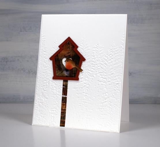
The large piece of ‘clean-up/practice’ paper provided me with unique patterned paper for the birdhouses. The embossed background was created with the ‘evergreen forest 3D folder’ from SU.
Happy New Year everyone, I’m looking forward to sharing all sorts of things here on the blog this year and I can’t wait to chat with you along the way.
Supplies
(Compensated affiliate links used when possible)
Gilded Wheat
Posted: September 20, 2021 Filed under: gilded wheat, Penny Black, Stampin Up, subtle | Tags: Faber-Castell Albrecht Durer Watercolour pencils, Penny Black stamps, Ranger Distress inks, Stampin Up 14 Comments
This beautiful wheat stalk, ‘gilded wheat’ is new from Penny Black. You know that feeling when you think maybe a project is complete but you’re not sure so you keep going? I had that feeling after I had finished stamping, painting and highlighting the wheat stalks. I just wasn’t sure whether to add a background or not.
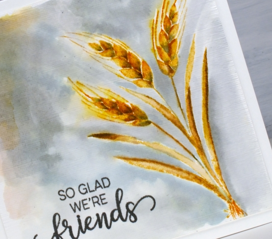
I stamped the wheat in scattered straw and wild honey distress inks then blended with a paint brush. To add shadow to the sides of the leaves and the base of the wheat berries I used iced spruce ink. After painting I switched to watercolour pencils and added more shadow with a similar grey-green spruce colour.
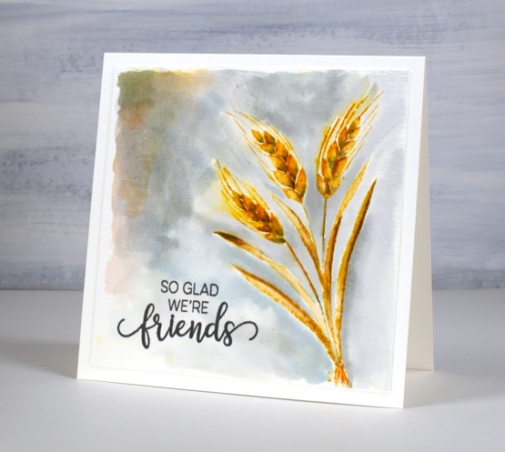
I could have stopped there and not added the background painting which is kind of patchy but I liked the contrast of the gold colours and the grey so I kept going. Before putting the card together I stamped a sentiment from the PB ‘choose happy’ set and ran the panel through the die cutting machine in the SU ‘subtle’ embossing folder. Sometimes people ask me how I settle on my colour combos; this one was inspired by the small leaves at the top of the previous card. Who knew grey and gold would be so happy together?
Supplies
(Compensated affiliate links used when possible)
Mixed Media-ish
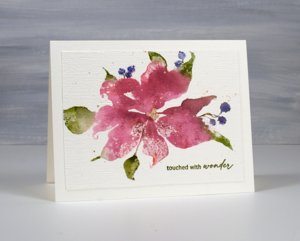
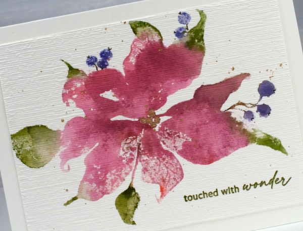
Posted: May 17, 2021 Filed under: daisy delight, Darkroom Door, French Script, scratches, scripty, Stampin Up, you are everything | Tags: Brutus Monroe, Darkroom Door stamps, distress oxide inks, Stampin Up, Tsukineko Versafine inks 5 Comments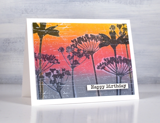
I have in my workroom a few new items to try but with one thing and another I haven’t had a chance. I recently bought two new pads of paper, one is rice paper and the other is mixed media paper from Fabriano, that’s the one I used for today’s cards. I’m very taken with Fabriano 100% cotton watercolour paper so I wanted to see what I thought of the mixed media.
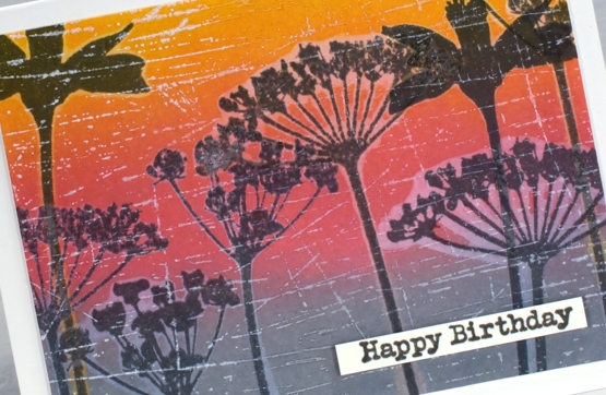
It is quite a while since I’ve done anything with my oxide inks so I pulled them out to make a blended background. After blending I did some water-stamping with both the DD ‘daisy delight’ background stamp and the floral silhouettes from the DD ‘you are everything’ set. The paper worked brilliantly for both steps. After drying the panels I stamped again with versafine clair inks and, as I hadn’t moved the stamps, the inked images landed inside the watermark images.
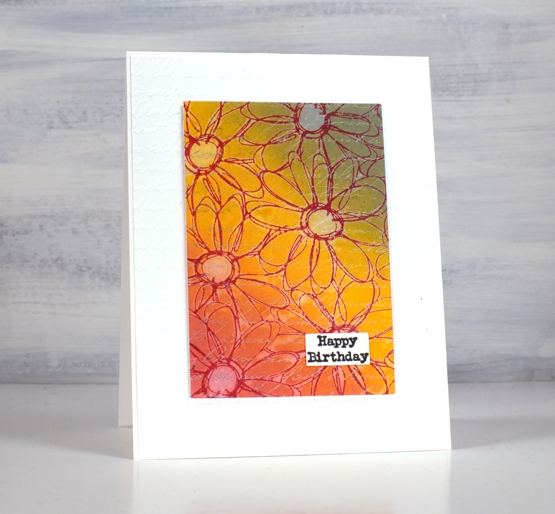
I dried all the stamping with a heat tool before adding background stamps over the top for added texture. I used white ink for both the DD ‘French script’ stamp and the DD ‘scratches’ stamp. The daisy stamp ended up with a double dose of script when I embossed a white base layer with the SU ‘scripty embossing folder.
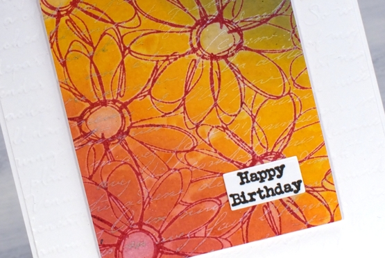
I gave both cards a little birthday label and pronounced the mixed media paper a success. Of course I will put it through it’s paces with gel printing and a few other processes but so far so good.
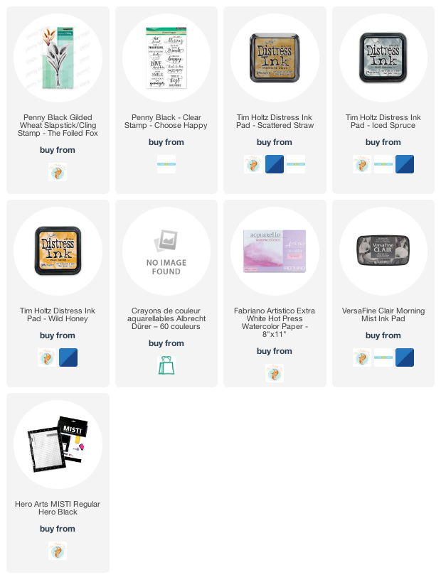
Supplies
(Compensated affiliate links used when possible)