
Blue Florals
Posted: May 12, 2022 Filed under: Hand painted, scripty, sennelier watercolours, Stampin Up, Taylored Expressions | Tags: Hand painted, sennelier watercolours, Staedtler watercolour brush pens, Stampin Up, Taylored Expressions 17 Comments
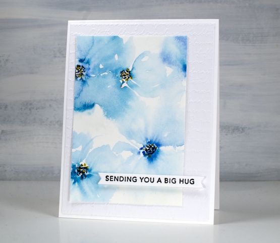
I spent a little while painting florals the other day. My watercolour paints were on my table so I painted two precut card panels with a few blues. I started the flowers on both cards by putting five little dabs of paint in a circle then blending them out with a wet paint brush. After blending I added dots to the centres with black and yellow markers.

Both the bold and the soft florals looked ok but the leaves I’d added didn’t work. I set the panels aside, happy that I had practised but not planning to use either pieces. When I came back to them a day or so later I did some extreme cropping which took out the leaves I didn’t like and left me with some nice blends and a configuration which had some balance.

Even if I had not cropped them and put them on cards the exercise was worthwhile. Even after years of making, practising and learning I still have the niggling feeling that everything I work on should ‘work out’! I know it is unrealistic and I am getting better at spending time practising and playing just to grow and enjoy.
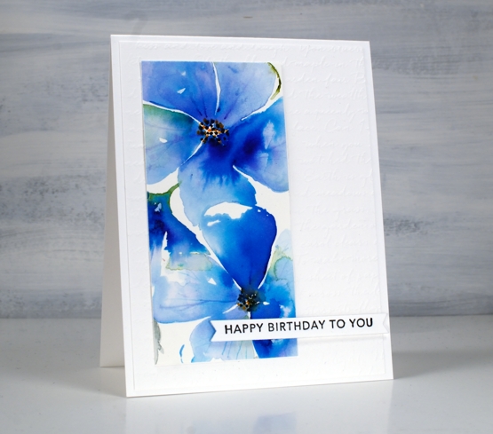
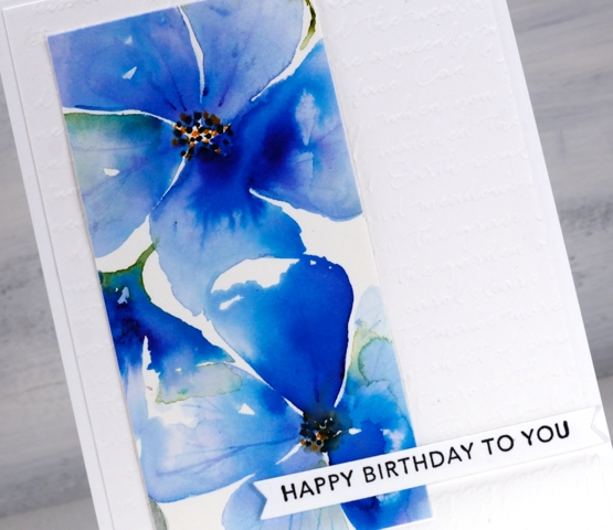
The pale blue ‘washy-er’ panel is my favourite but I love the colours in both. After cropping them I added them to an embossed panel (SU scripty) and popped up some Taylored Expressions sentiments over the top.
Supplies
(Compensated affiliate links used when possible)


They are both lovely. It is often the case that projects look different after they have dried and when you come back. I think I like the darker one better.
These are lovely! I was looking for a simple yet elegant card design to make, this is perfect. Thank you for sharing!
WOW! Hand painted and done so beautifully! I love the dreamy effect of the pale blues and the saturated colors of the darker ones. I’d say you mastered this. Maybe some day I’d give this a try. Before I read your description I went in looking for the stamps. These are so well done!
Video Request
Would dearly love to see just how you transformed those “five little dabs of paint” into the gorgeous flowers on your cards. Pretty Please!
I so agree! I love the dreamy feeling of those blue flowers and you make it sound so very easy…LOL! So now that you’ve practiced, maybe a short video would help us non-artists types ….a little bit!!
When I grow up (70 now☺), I want to be just like YOU!♥ You are amazing! I, too, would love to see you work this out on paper! I would have problems keeping the edges clean and crisp on the darker card…do you dry between each petal? I LOVE the ethereal look of the paler flowers…just gorgeous!I LOVE THEM BOTH! Thank you, Heather, for bringing a smile to my heart!♥ With Love and a Prayer…☺
Both these panels are just amazing Heather, from the five little dabs of paint to these gorgeous finished cards…wow! What talent. I love them both but if I had to choose a favourite I think it would be the paler floaty one.
Both these panels are amazing Heather. From five little dabs of paint to these gorgeous finished cards wow! What talent. I like them both but if I had to pick a favourite it would be the paler, floaty one.
Oops..now you have it twice it must be right!! 🙂
These are truly beautiful. So simple and yet complex.
I am grateful that you shared that not everything works as planned. It’s nice to know that happens to others as well, and even more reassuring that no work is ever wasted (and may be even better than originally designed!).
I can’t wait to try this myself. Like them both very much.
They are gorgeous, I have tried this before and mine didn’t turn out as nice
These are both gorgeous Heather and the washy flowers look really pretty, personally I especially love the second with the darker tones, and the embossed white background shows them off really well. x
Beautiful! Love the blues!
Dreamy and Delightful! I think the key is to play…someday! And if it doesn’t quite look as lovely as you imaged, crop it down until it does — great advice! Thank you!
Play, ponder, crop as needed! 😁
Two beauties, Heather! Glad you looked again and saved them. It would have been a shame to toss these beauties!