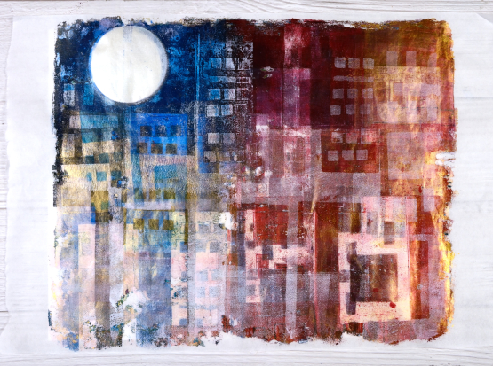
Gel print city journal page
Posted: June 17, 2021 Filed under: Art Journal, gel press, Waffle Flower | Tags: Fabriano art journal, gel press, gel printing, gelli plate, Waffle Flower dies 5 Comments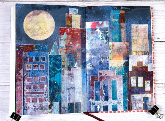
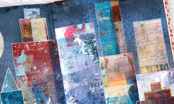
Continuing my week of gel prints you might see a resemblance between yesterday’s projects and todays. I posted large cityscape projects yesterday made by masking areas of the gel plate with paper rectangles cut from stiff magazine paper. Some of the masks had little shapes cut from them with dies. I used the magazine masks over and over on several prints and experiments so by the end they were covered in paint and way more interesting than they started out.
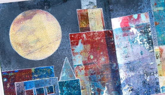
Rather than save the masks or throw them away I turned them into a city scape art journal page. Once again my scraps are prettier than some of my prints! Every time I brayered a new colour onto the gel plate I lay the rectangle masks paint side down so they ended up picking up paint, pattern and texture while occasionally letting a bit of text or photo show through.
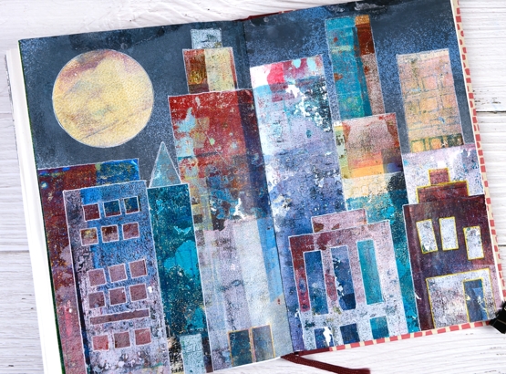
The background sky was done with distress sprays, a few blues and a black (listed below) spritzed over the open spread to cover the top half of both pages.
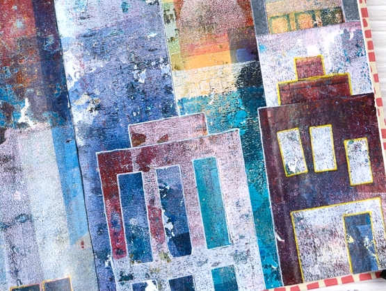
Once the sky was dry I arranged and rearranged the ‘buildings’ so I would have contrasting heights and colours across the scene. Some of the tiny shapes die cut from the masks also had paint on them so I used a few as doors on this scene. The windows are all cut outs revealing some of the prints underneath. I used matte medium and a Tim Holtz collage brush to glue everything down then decided to outline the shapes with gel pens to separate them a little more.
This art journal design was one of those rare ones that turned out as I imagined it might. Doesn’t always go that way!
I mentioned a couple of days ago I am appearing on Craft Roulette Live Improv show on Friday night. I’d love to see you there if you are free. You can hop on the chat and say hello. The details are here and here
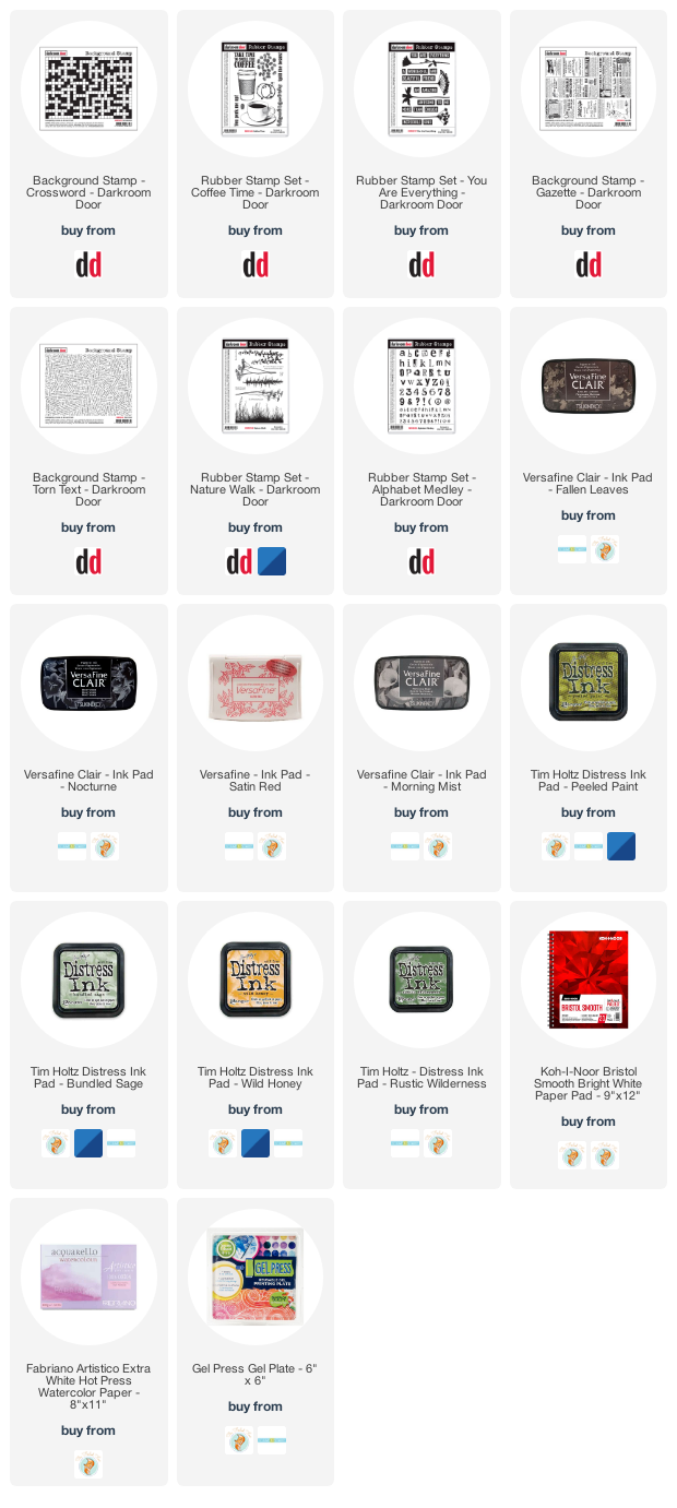
Supplies
(Compensated affiliate links used when possible)
Gel print cityscapes
Posted: June 16, 2021 Filed under: Darkroom Door, gel press, large stars, Stencils | Tags: gel printing 11 Comments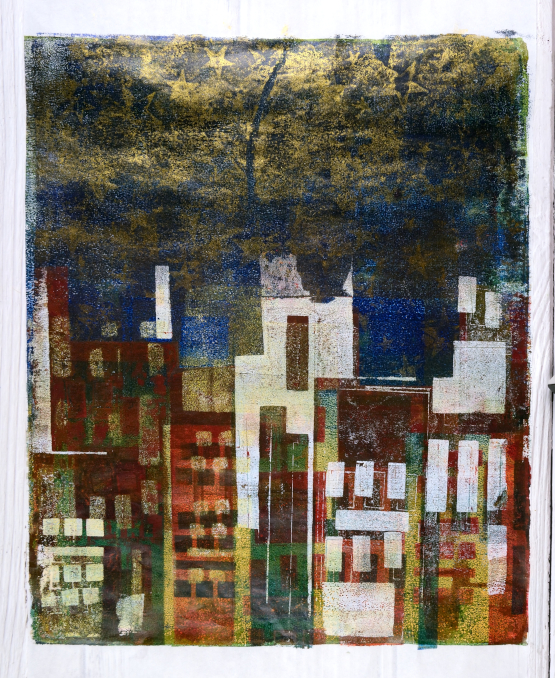
Yesterday was coast line, today we are back to the city. I hesitated before sharing these as I am still experimenting with the technique but I think these two panels are good representations of what I am aiming for.
These panels are quite large; they are printed on rice paper from a 12″x18″ pad. My gel plate for these is 12″ x 14″ so it was tight on the edges and sometimes I didn’t get it lined up exactly. With gel printing not getting things lined up exactly is part of the charm in my opinion. I initially bought the rice paper for painting but it was the perfect size for large gel prints so I tried it and liked it.
My technique for both these panels was the same. I began with a two or three colour base layer then every time I printed over the top I lay rectangular pieces of thick magazine paper over sections of the panel to mask ‘buildings’. Some of the rectangles had little squares and rectangles cut out; I used the Waffle Flower ‘color combos’ dies for that.
The tall panel has gold stars in the sky created using the Darkroom Door large ‘stars’ stencil but other than that I didn’t add texture to the layers. I plan to do more of that as I keep experimenting.
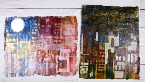
My plan wasn’t to make one rather dark and the other light but that is what happened. Both feature gold paint but in the lighter one it has showed up as a sheen in the photograph and distracts a bit from the ‘buildings’.
The process is enjoyable but takes some planning and thinking because any surface that I want to preserve has to be masked on the next and subsequent layers. Sometimes I get it right, sometimes not, but I’m still happy with these abstract cityscapes.
Supplies
From the ocean or the shore?
Posted: June 15, 2021 Filed under: gel press | Tags: gel press, gel printing 11 Comments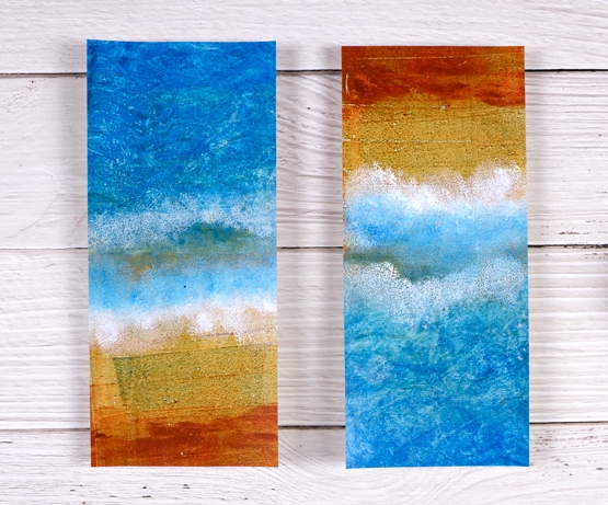
Today’s gel prints are inspired by aerial views of parts of the West Australian coast. I haven’t been there but the views I’ve seen on youtube show these colours. These panels are roughly slimline card size but they are not made into cards yet because I’m not sure if I want to send them or display them. I think a very slim black strip with a sentiment could look good but I can’t commit to it yet. I’ve already started worked on a larger similar print so I might be able to part with these ones.
I also have a bit of exciting/terrifying news about Craft Roulette; if you want to hear more about that make sure you read to the end of this post.
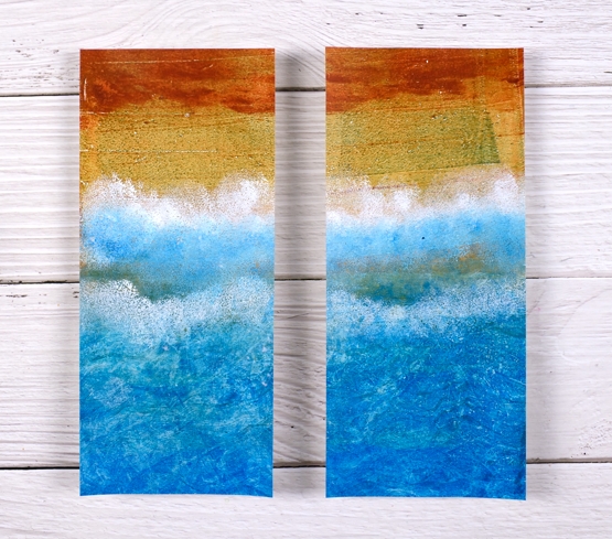
I also wonder which way you think they should be oriented. The view above appears to be looking from the ocean back to the beach. The view below is from land out to the ocean. What’s your preference? There is no right or wrong of course.
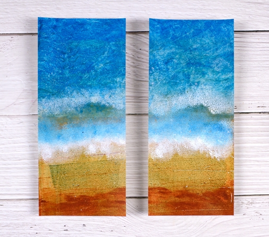
I created these on a large gel plate in a few layers, not too many as I didn’t want to muddy the sandy end. I started with blue acrylic paint in two tones covering half the plate then mustard covering the other. The next print once again had blue but I put some texture marks in it with a homemade ‘wide comb’ edge and added a rusty colour at the other end.
The final prints were to add the white foam and extra blue so I sponged the blue and white acrylic paint onto the gel plate in roughly the middle, took another print and then repeated the sponging. I used a mixture of acrylic paints, some liquitex basics, some decoarts Americana, but in the midst of a gel printing session I don’t always take note of what colours I use and by the end of the session all the colours are out on the table! The cardstock is a lightweight white card, about 60lb weight, not the usual 110lb I use for card bases.
In other news, on Friday evening I will be a guest on Craft Roulette, a live improv crafting game show on youtube hosted by Mary Gunn. I have never created live before and it is improv so I don’t even know what I will be making until they spin the wheel. Pop over to the Craft Roulette youtube channel; you can find out what it is all about, check out old episodes and get ready to watch on Friday night. It is 6:30 MT so that’s 7:30 EST and beyond that you will have to do the math!
Supplies
(Compensated affiliate links used when possible)
Gel print backgrounds
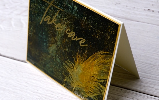
Posted: June 14, 2021 Filed under: Brutus Monroe, contemporary, gel press, perfumed | Tags: brutus monroe embossing powder, gel press, gel printing, Penny Black creative dies, Penny Black stamps, WOW embossing powders 8 Comments
I have had my gel plate out recently and I am addicted. It is what happens when I get it out. Gel printing can be frustrating because some of the prints are a whole lot of nothing much while others are full of pattern, texture and colour. I never know whether the next print will be the former or the latter so I keep on printing. I have a stack of prints sitting around and I decided it was time to cut a few up to make cards. I added some stamping and die-cuts.
This first card is my favourite but I must be honest with you, it isn’t a gel print. It is the scrap paper I cleaned the brayer on! I love how pretty the colours and blends are but I’m a bit miffed that my clean up page was prettier than many of my prints!
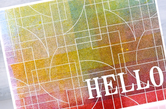
To turn it into a card I stamped and embossed the PB ‘contemporary’ stamp in white and added the hello, cut with the PB ‘thanks & hello’
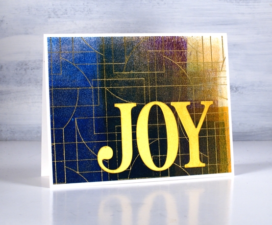
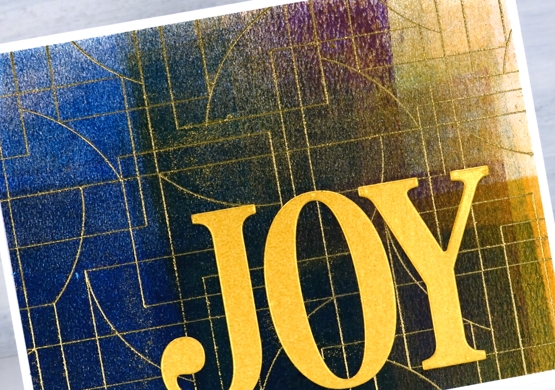
Same deal with this background but embossed with gold and adorned with the PB ‘jumbo joy’ die.
I’m glad to add another card to my very small Christmas card stack. My resolution to add to it every month seems to be a bit off and on.
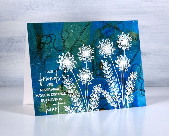
This background is a recent print and includes a fun thread printing technique I saw on Birgit Koopsen’s instagram. She recently completed a challenge gel printing every day in May. She generously shared all the techniques she tried.
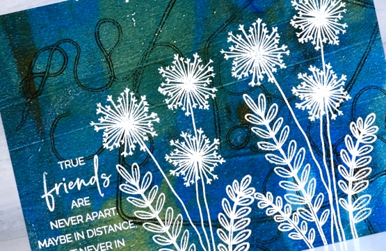
I added flowers from the PB ‘perfumed’ set and a sentiment in white embossing powder.
I guess the title of this post was a bit inaccurate as only one of these cards features a gel print background! Watching beauty emerge when gel printing is so much fun. To glance over at my brayer clean up sheet and realise I have to save it because it looks like a pastel check table cloth is a bonus. To see the pale ghosts of stencils turn up on third or fourth prints also amazes me.
I did not participate in Birgit’s recent challenge as I was busy busy launching the new online Floral Faves class but now the gel plate is out I am challenging myself to post something gel-print related every day this week. See you tomorrow.
Supplies
(Compensated affiliate links used when possible)
Crossword
Posted: April 20, 2021 Filed under: alphabet medley, crossword, Darkroom Door, Gazette, gel press, Nature Walk, torn text, you are everything | Tags: Darkroom Door stamps, gel printing, Ranger Distress inks, Tsukineko Versafine inks 4 Comments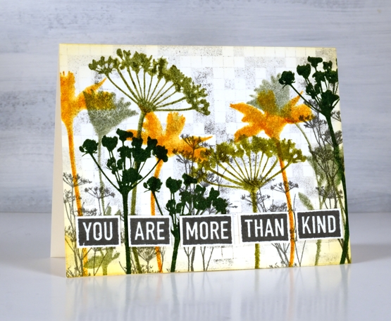
Darkroom Door added four new background stamps to their line up recently and I’ve shown you ‘handwoven‘ and ‘daisy delight‘ in previous posts. Today I have three very different cards featuring the ‘crossword’ background stamp.
On this first floral card I have used the crossword stamp as a background. I stamped it on scrap first with versafine clair morning mist ink then on a panel of watercolour paper to get a pale grey image adding interest behind the silhouette flowers stamped in different distress inks. I used the same grey ink to stamp words from the ‘you are everything’ set to pop up along the bottom of the panel.
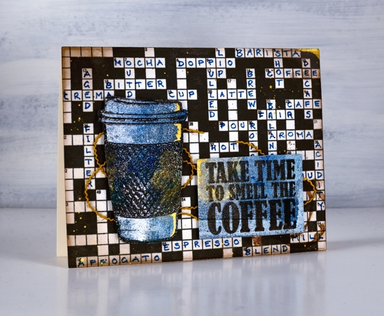
In this second card the stamp functions as both a background and a crossword (of sorts). Although the stamped image is a solvable crossword which comes with printed clues in the packet I have populated it with coffee themed words to work on my coffee themed card. I feel like coffee and the crossword is not an uncommon past time. I stamped the background with fallen leaves versafine clair ink and stamped the sentiment and coffee cup in the same ink on a gel printed panel. I added some blending and ink splatter in both brown and gold before popping up the coffee and sentiment over some gold cord.
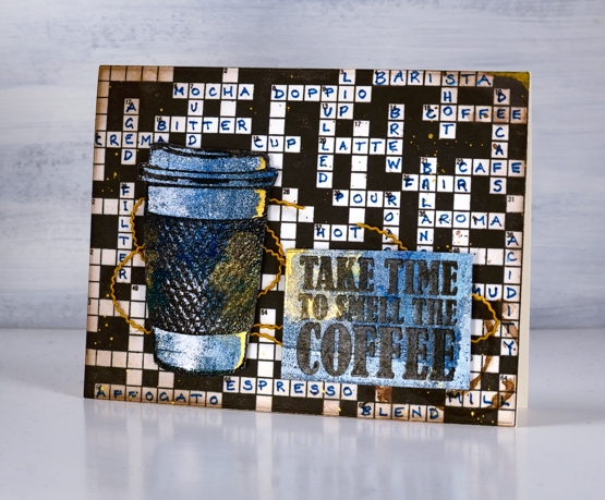
Although it took some time to stamp the background and foreground images the hardest part of the coffee card was definitely finding and arranging coffee themed words in the crossword!
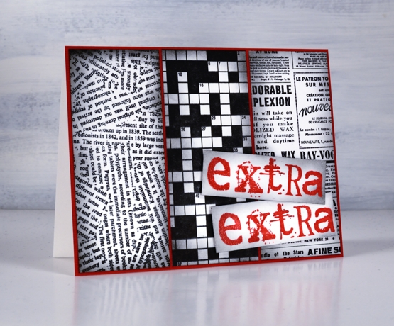
My last card reminds me of the riddle, “what is black and white and red all over?” A newspaper!
Get it?
“Read all over!”
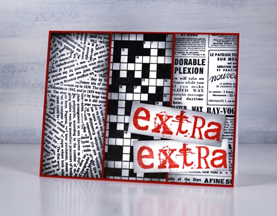
On both the second and third cards I used bristol cardstock for sharper stamped images as I wasn’t adding any water or waterbased inks. I stamped a strip of three different DD background stamps, blended the edges and attached them to a red panel then used the ‘alphabet medley’ set to stamp the words in versafine satin red ink. I’m thinking I can use this card for any exciting occasion and stamp another sentiment inside which is more specific.
Supplies
(Compensated affiliate links used when possible)
Alcohol ink gel print
Posted: April 12, 2021 Filed under: Alcohol Ink, gel press, Penny Black, Taylored Expressions | Tags: gel press, gel printing, Penny Black creative dies, Penny Black stamps, pinata alcohol ink, Ranger Alcohol Ink, Taylored Expressions 5 Comments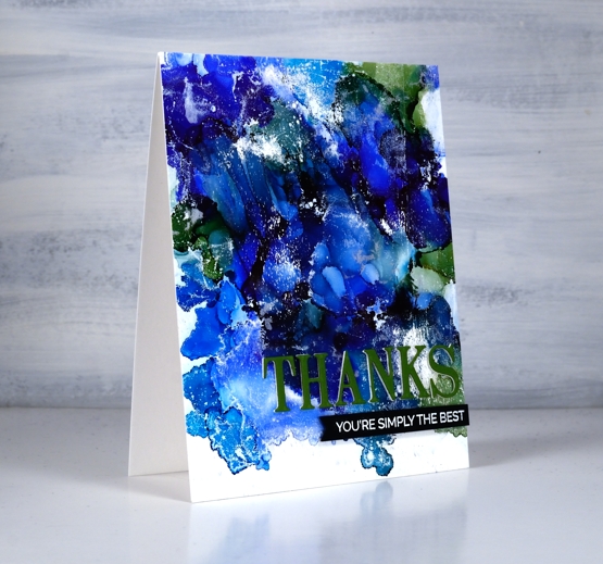
I tried a technique this week that I’ve seen demonstrated by gel printing wizards but never tried myself. In some ways it’s not that different from making abstract alcohol ink patterns on yupo or craft plastic but I found that I ended up with more of a distressed look which is rather nice.
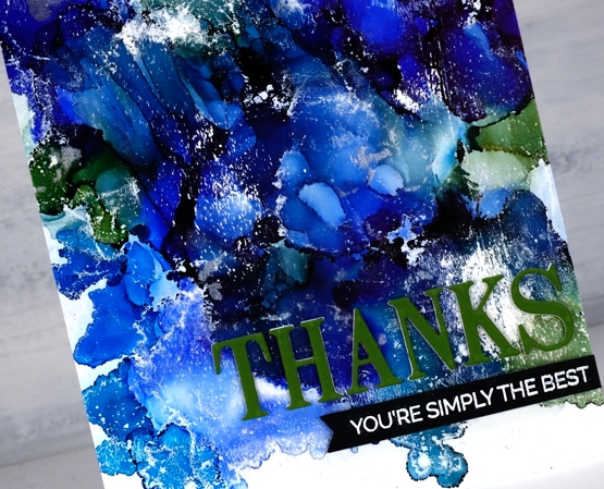
I started with a not entirely clean gel plate and three or four alcohol inks, I’m not sure exactly which ones I used as I was very much in experimenting mode. Obviously there was a green and some blues in there and in real life you can see I also had a silver. I dropped dots of the different colours on the gel plate added rubbing alcohol and blew it all around with the air blower. It dried quite quickly so it took several additions of inks and rubbing alcohol before I was happy with the coverage. Once the AI had dried completely I brayered white acrylic paint over the painted area and took a print on some white cardstock. You can see the usual overlapping patterns of alcohol ink blobs but also some white patches and ‘grazes’ from the acrylic paint.
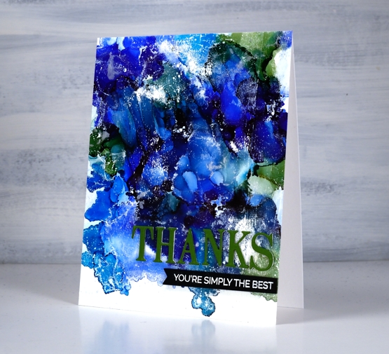
I trimmed the panel and added a three layer PB die cut sentiment along with an additional sentiment strip. I will definitely be trying this technique again.
Supplies
(Compensated affiliate links used when possible)
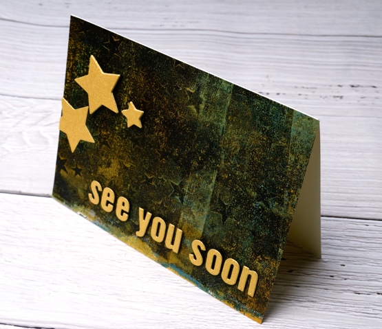
See you soon
Posted: January 5, 2021 Filed under: Darkroom Door, gel press, My Favorite Things, Pink Fresh studio, starry night, Stencils | Tags: Darkroom Door stencils, gel press, gel printing, Pink Fresh studio 11 Comments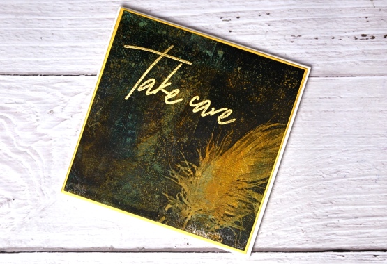
Just popping in with a couple of cards carrying a couple of messages for you. I hope your new year is off to a good start; I am still enjoying the beauty of an array of Christmas cards sent from around the world, thank you my creative friends for brightening up the midwinter days.
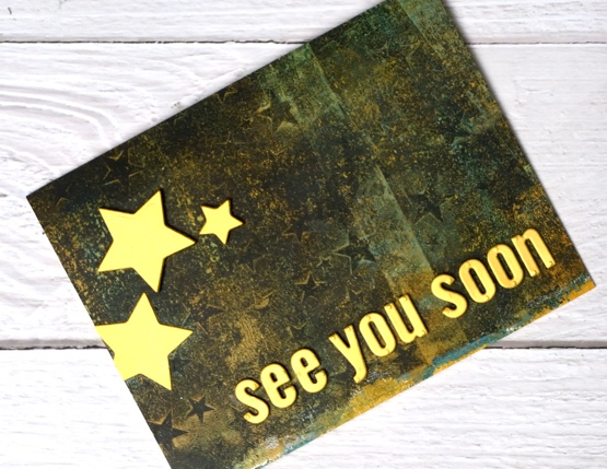
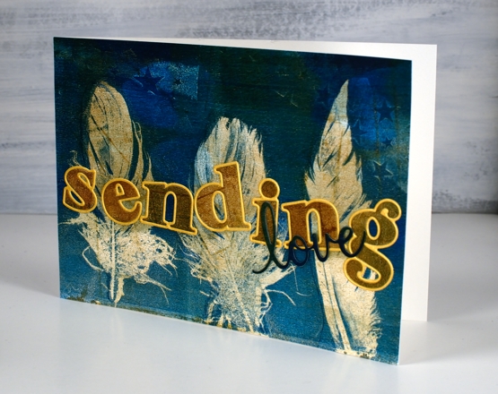
I made today’s cards from a gel printed panel done several months ago. I can’t remember the paints but you can see there was definitely orange, aqua and black. The panel I cut up is shown below, most of it included distinct or faint stars made with the Darkroom Door small starry night stencil. Along one edge there were two very distinct feather prints made with real feathers.
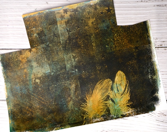
I ended up cutting a square which included one feather, leaving me one for another project. I also cut a rectangle covered in colour and texture which became the base for die cut letters and stars. I chose gold cardstock and gold embossing powder to add some brightness and shimmer on top of the dark background featuring a ‘scripted bold sentiments’ stamp from Pinkfresh Studio, alphabet dies from MFT and nesting star dies from We R Memory Keepers. I popped up the letters and the stars on black foam which kind of makes them appear to be floating.

I wanted to let you know I am taking a short blogging break so I can devote some time to planning and prep. I will be working on projects to share with you over the coming months. Ideally I would have done this before I stopped for Christmas but that didn’t happen so I’m doing it over the next week or so. I have lovely ideas and projects floating round in my head, I have a little stash of stencils and stamps that haven’t been out of their packets and some new release products from Penny Black on the way.
It has been a while since I devoted time to gel printing, alcohol inks, stenciling and lettering so that’s on the list along with some more hand painting. I will be making some videos to share here on my blog and youtube channel. I have a new online class in the works also. So you see while it’s quiet on the blog it will be busy behind the scenes.
As always I am happy to answer questions and I’m open to requests or suggestions for new projects and videos. If you feel like diving into one of my online classes just click on COLOUR CLUES or WINTER WONDER to learn more. (Here is a discount code for COLOUR CLUES which will take 20% of the price until January 15, 2021 HTNY21 )
So take care everyone, I’m looking forward to sharing techniques and experiments, cards, journal pages, paintings and more here on the blog during 2021. See you soon…
Supplies
(Compensated affiliate links used when possible)
Gel printed feathers again
Posted: October 21, 2020 Filed under: gel press, Heather lowercase die set, phrase builder you, Pink Fresh studio | Tags: gel press, gel printing, Pink Fresh studio 10 Comments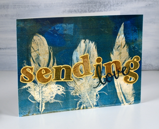
Last year I did my first gel prints with feathers and I was thrilled with the detail in the prints. When I was gel printing with leaves a few months ago I did a few feather prints at the same time. It’s the same process.
The letters and word added to this feather print were cut from the same panel. I was working on my large gel plate and lifting the prints on A4 pieces of cardstock. The mustard/gold paint was over the whole print before I added dark turquoise paint to one end as I printed feathers.
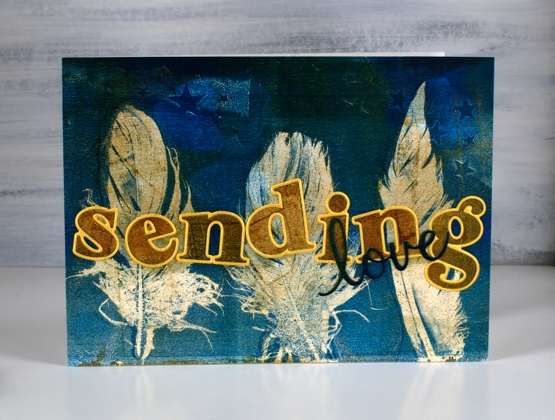
I cut the letters for the word ‘sending’ with the ‘Heather lowercase’ dies from Pinkfresh studio. There are capital letter dies in the same style and co-ordinating stamps for both lower and upper case but I just bought the lowercase dies. Buying alphabet dies or stamps is quite the investment so I worked out what I would get the most use from and it was these pretty letter dies. I am way more likely to make words with all lowercase than with all caps. After I had ordered the dies I realised they were all double dies in that they cut a very narrow border around every letter which gives you a bonus delicate die cut letter which can be used as a border for the solid letter. Maybe you know all this but I was pretty happy to get double the letter fun.
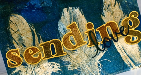
I cut all the letters for the word ‘sending’ and arranged them on top of the feather panel but they did not stand out enough until I cut the same letters from shimmer gold cardstock so I could give each one the narrow border. I added double sided adhesive to the back before cutting the letters so it would be easy to attach them to the panel. I cut the word love from a teal section of the printed panel twice and layered them to make them stand out a bit more, the die is from the Pinkfresh phrase builder ‘sending’ set.
I’m very keen to get out my gel plates again but my to do list has other things on it right now. It’s fun to have a stack of prints to put to use in the interim.
Supplies
Gel print pumpkins
Posted: September 21, 2020 Filed under: gel press, leaf pattern, Penny Black, pretty picket, pumpkin & leaves, sign, trio of trees | Tags: gel press, gel printing, Penny Black creative dies, Penny Black stamps 4 Comments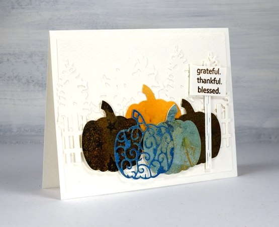
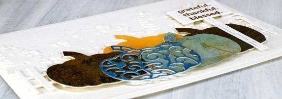
Despite what the title suggests this post isn’t about gel printing, it’s about using more dies on one card than I’ve ever done before. I tend to use dies sparingly, not because I don’t like them, but because they are usually called in to highlight or frame some watercolouring. This time the dies are the feature and I used some leftover pieces of gel printed paper for the pumpkins.
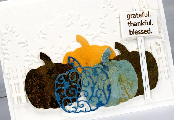
On the first card I built up a background for the gel print pumpkins with a row of die cut trees and then a die cut picket fence. Each pumpkin is two layer as the original cardstock used for printing was light weight. I tried to find prints in pumpkin colours and found a couple of blue/greens, some goldy browns and a pale orange; I didn’t have a strong orange in the pile. The fact that one of the prints had stars on it was definitely a bonus.
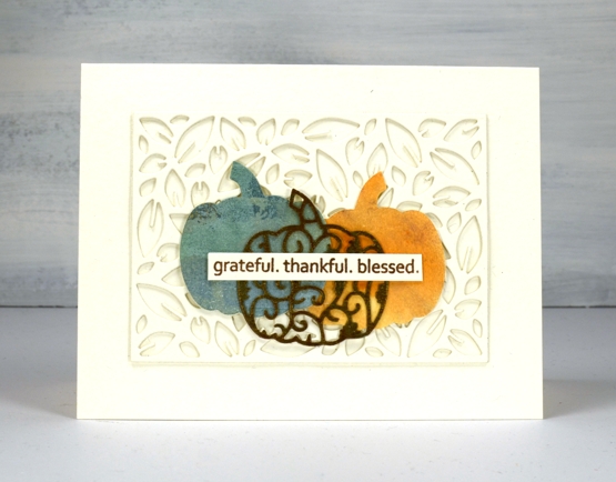
On the second card I stacked two leaf pattern die cut panels to create a textured background then layered the pumpkins on top of that. All the background die cutting and card bases are either luxe textured white cardstock or a cheap cold pressed watercolour paper that I thought was luxe textured white until I placed them side by side and had to rearrange things a bit.
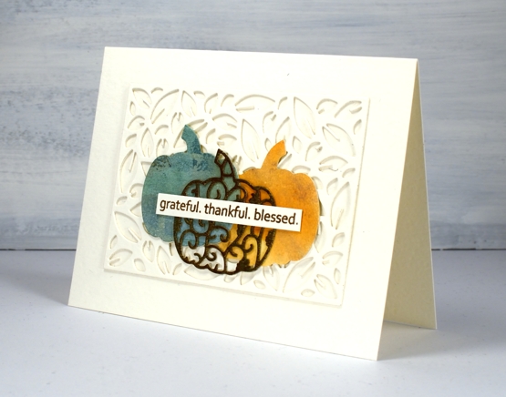
All the dies are listed and linked below and I made two messages with the same ‘golden delight’ sentiment stamp. I know I have other sentiments for thanksgiving but I can’t go past this one. For the cute little sign by the pumpkin patch I stamped one word, masked, then next word, masked and then the last one and wonder of wonders, it worked first go!
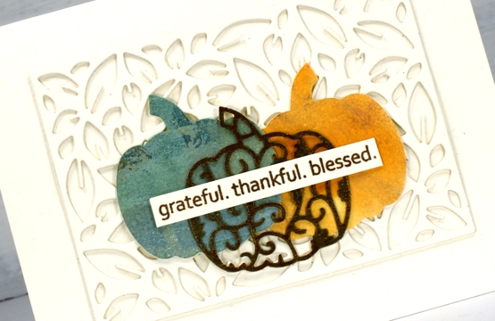
The layering and adhering of dies was a labour of love because I am just not great at the whole fiddly nature of gluing die cuts. When I imagined the card in my head it was way more intricate than either of these but it’s important to know your own limits and sometimes quit while you’re ahead!
Supplies
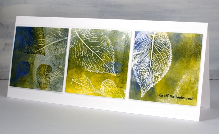
Gel Print Leaves video
Posted: August 28, 2020 Filed under: Darkroom Door, gel press, gelli plate, Nature Walk | Tags: Darkroom Door stamps, gel printing, Wendy Vecchi 18 Comments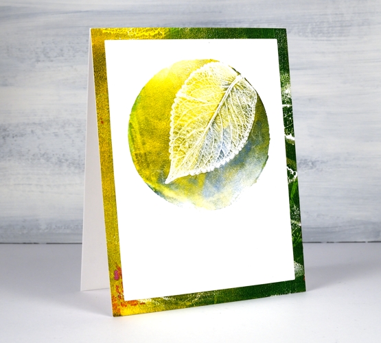
Last week I posted a card featuring gel printed leaves from herbs I grew. I tried to explain my process but a few of you wished for a video so I picked some more leaves and had some fun printing them.
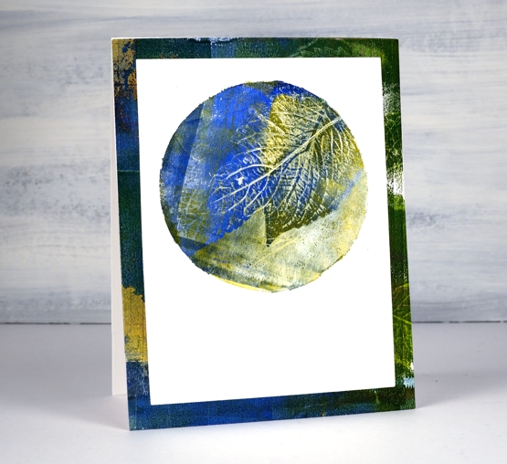
I used two different methods in the video, the leaf printed in yellow at the top of the page uses a two step method. The blue + green leaf above uses three steps and has one technique layered over the other technique.
I think the part of gel printing that gives me most inconsistent results is the way I apply ink. I’m getting better but I still get unwanted lines from the edge of the brayer. That wasn’t so evident on these prints as I was working on little gel plates called ‘petites’ from Gel Press.
I did a bunch of prints for this video on the square and the circle ‘petite’ plates as shown on the top cards. For the ‘slimline’ card I used three of the square prints but die-cut them smaller so I could fit them side by side on a 8¾” x 3¾” card.
I hope you give this a try, it’s quite satisfying and addicting once you get going!

….And did I mention I now have an online class called COLOUR CLUES?…
Supplies