
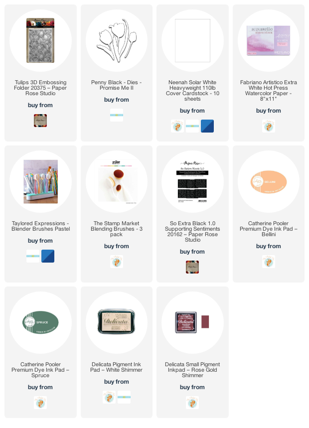
3D Tulips
Posted: June 11, 2021 Filed under: Paper Rose, so extra supporting sentiments, tulips 3D | Tags: Catherine Pooler inks, delicata inks, Paper Rose 6 Comments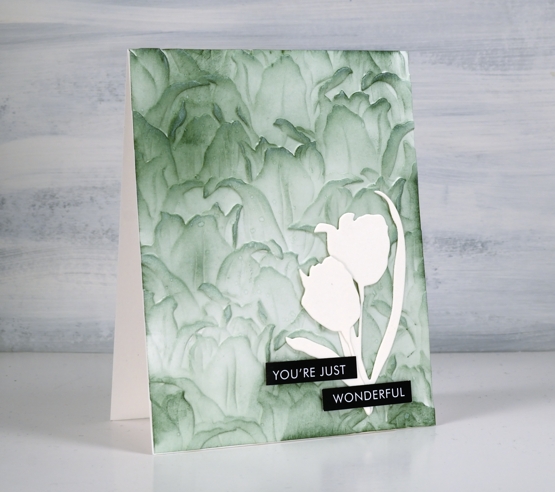
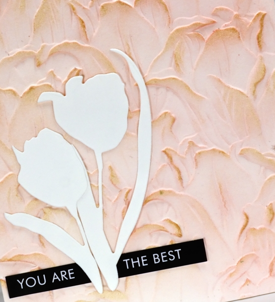
My embossing folder collection has grown a bit more this week. I ordered a couple from Paper Rose Studio and tried out the Tulips 3D folder today. After a few experiments with watercolour paper and neenah cardstock I used the same technique on both these cards with different inks.
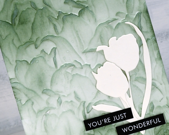
The green panel above was done with neenah solar white cardstock and the pink below is watercolour paper. As I didn’t end up adding more than a spritz of water the effect is the same on both panels. I embossed the cardstock then used blending brushes to add Catherine Pooler spruce ink to the card above and bellini to the card below. For added detail and shimmer I used delicata inks direct to the panel, shimmer white over the spruce and rose gold over the bellini.
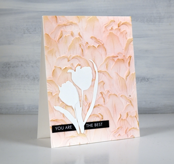
To complete the cards I added tulip diecuts from Penny Black (promise me II) and sentiment strips from Paper Rose Studio. I have seen printed sentiment strips from a few companies now and decided to try these. They are printed on slightly glossy cardstock and are designed to pair with die-cut words. There are several copies of each sheet of words or phrases so if I botch the cutting I can try again.
I know tulip season is over but I had to give this folder a try. I also know tulips don’t come in green but I think the spruce one is my favourite of the two.
I appreciated all the suggestions and comments about the alcohol ink panels. I am considering a few of the ideas and will do a video as requested as soon as possible. Thank you for taking the time to enter the discussion; I love hearing from you and gathering new ideas.
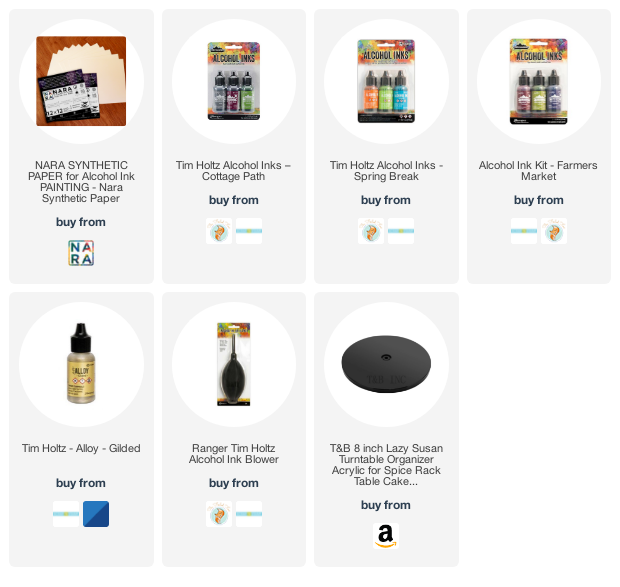
Supplies
(Compensated affiliate links used when possible)
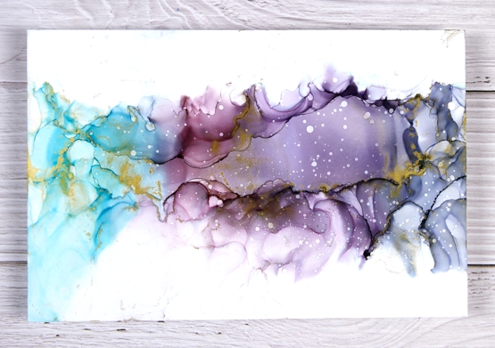
Alcohol ink experiments
Posted: June 9, 2021 Filed under: Alcohol Ink | Tags: Ranger Alcohol Ink 23 Comments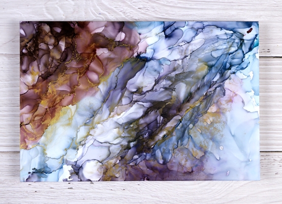
I’ve taken a bit of time in the last week to experiment with some neglected mediums in my workroom. It has been both enjoyable and challenging as I try to remember process and techniques I haven’t tried in a while. These three alcohol ink panels used different combinations of turquoise, eggplant, currant and gilded alloy inks. The panels are larger than my usual card size, more than double at 6″x 9″ and I’m wondering how to use them.
I could cut them up and put them on card bases but I thought I would ask you what you for ideas. They would probably make nice journal or notebook covers.
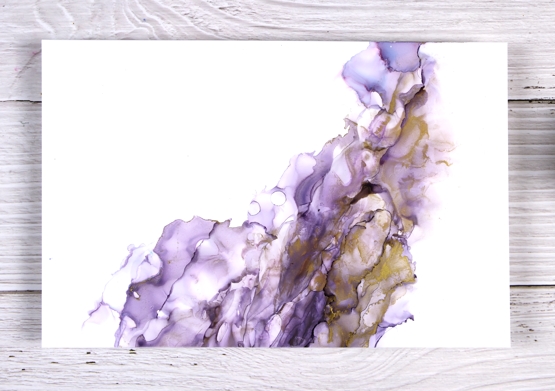
I used a different type of paper for these. It is made by Nara, I ordered from Amazon just to see what it was like. It was very similar to yupo or grafix white craft plastic which I have used in the past. To create the patterns I used copious amounts of isopropyl alcohol and a hand ink blower to move the ink forwards and backwards creating dried edges and soft diluted ‘clouds’.
If I don’t come up with any ideas right now I may end up cutting circles from the panels to make Christmas cards; the patterns make very pretty Christmas balls. Let me know what you think and if you would like to see a video of any of the above processes.
Before I go thank you so much for your enthusiastic response to the pencil coloured animals. It seems we have animal lovers as well as plant lovers around here which is wonderful. What about lovers of abstract colourful patterns?!
Supplies
(Compensated affiliate links used when possible)
Animal cards – pencil on kraft
Posted: June 7, 2021 Filed under: Cow's it going?, Lion, Pink Ink Designs, Sea Turtle, whale | Tags: Faber-Castell Polychromos Colour Pencil, Pink Ink Designs 19 Comments
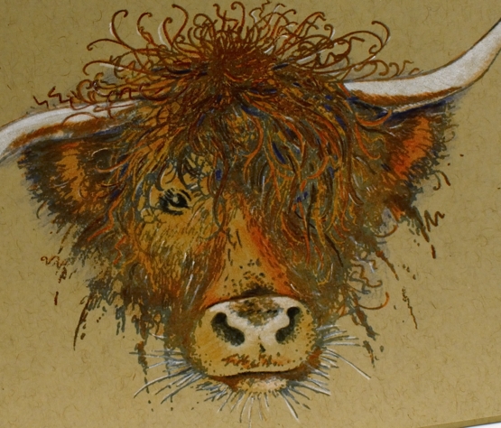
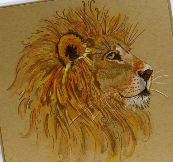
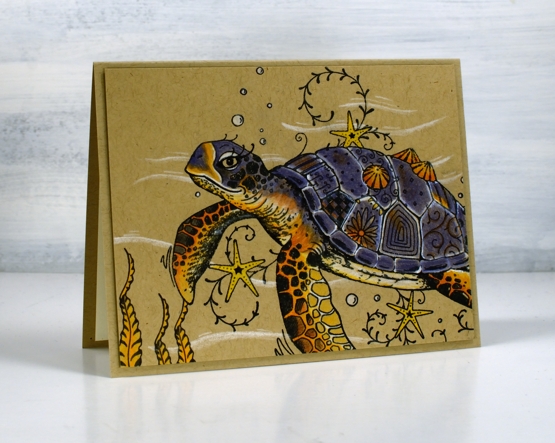
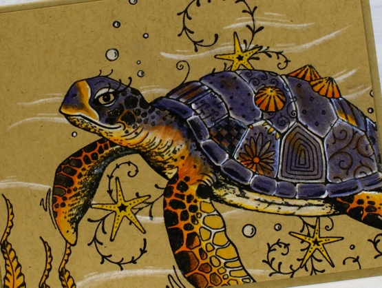
Recently I put together a set of animal themed cards as a gift for an animal lover I know. I did not realise how much I would enjoy colouring these animal images from Pink Ink Designs. I own five of these large stamp sets featuring animals and have only watercoloured them up until now. (the one not featured in today’s post is the dragon). Coloured pencil on kraft turned out to be quite effective for the beasts! I used Faber Castell Polychromos pencils and will always recommend them.

The artist who designs these stamps is very talented and as you can see on the whale there are some whimsical details added to the otherwise realistic image. I stamped the whale in cobalt archival ink then coloured with blue, white and black pencils before adding white dots over the top with a gel pen.
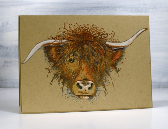
The highland cow is a beauty, no added whimsy but plenty of personality. She’s been on the blog before. I stamped the image with papertrey weathervane ink and rusty hinge distress then added colour with pencils (Faber Castell polychromos).
I don’t remember ever colouring a lion before so I had a reference photo in front of me to work out where the shadows were and where the colours of the fur changed. The stamp has a crown on the lion which I didn’t want for this card so I left it un-inked and filled the gap with more of his mane.
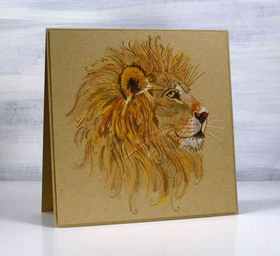
The image is stamped in Papertrey ‘classic kraft’ ink and all the colouring is once again pencil. As I worked on these animals I saw again and again the impact of white pencil highlights.
The turtle has also been on the blog before, in watercolour and pearlescent paint. As with the other animals she looks good in pencil on kraft. She has plenty of whimsy in her patchwork shell. Choosing dark blue for her shell was not so realistic but her underbody and fins were inspired by a photo I found.
I’m sure you are wondering what is next for these amazing animal stamps ( or maybe you’re saying enough already, where are the flowers and trees?!) I think each of these animals deserves it’s own art journal feature at the very least, so yes, they’ll be back.
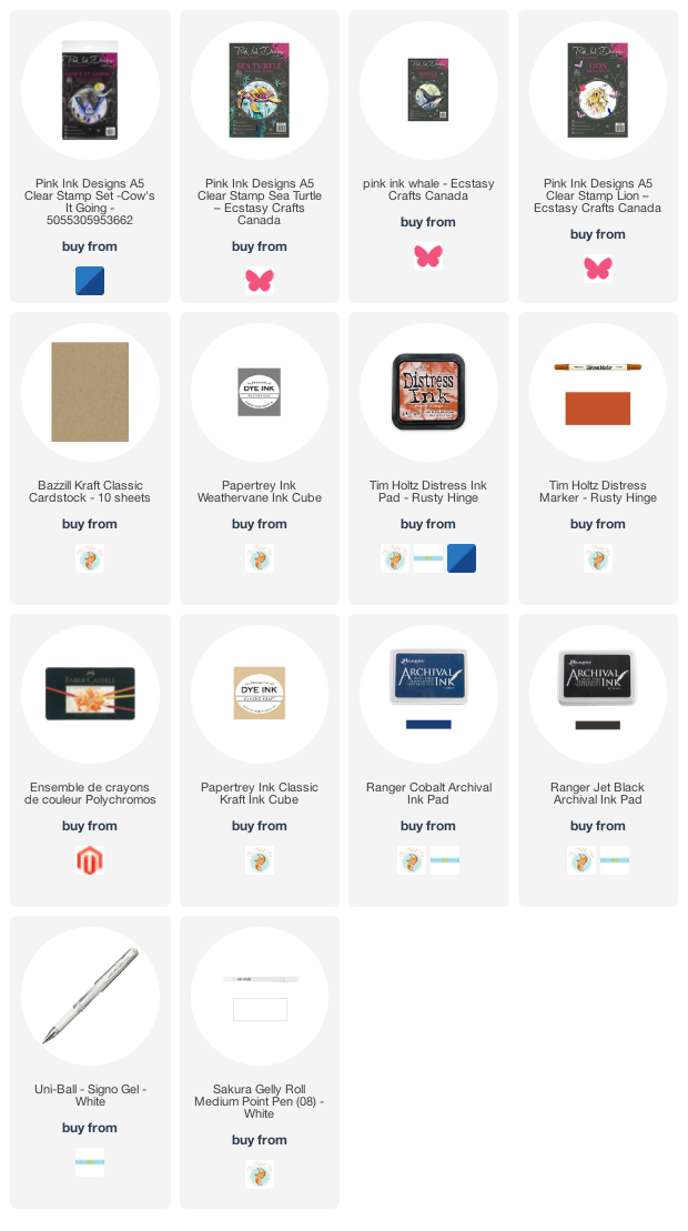
Supplies
(Compensated affiliate links used when possible)
2021 BuJo – June theme
Posted: June 4, 2021 Filed under: Bullet Journal, delight, Dingbat notebooks, Penny Black | Tags: Bullet Journal, Dingbats notebook, Gina K inks, Penny Black stamps, Staedtler watercolour brush pens 3 Comments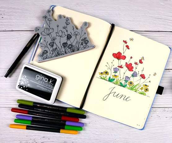
New month, new bullet journal theme. I chose the PB delight stamp because it is just that, delightful. I also tried colouring with markers, just colouring no water blending! The journal pages are very smooth and a decent weight but nothing like watercolour paper so I’ve been hesitant to do much blending with water. I used Staedtler brush pens which are water-based ink and coloured the flowers and leaves as minimally as possible.
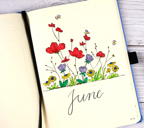
The red tended to go through the paper a bit but only where I had layered ink over ink. I stamped the image first in Gina K obsidian amalgam ink which doesn’t bleed when water based ink touches it. Stamping without a stamp positioner is not something I do very often any more, it was a bit nerve wracking but it worked ok. I didn’t put the stamp on an acrylic block, I just pressed it down with my hand, that way I could apply pressure to the whole stamp bit by bit.
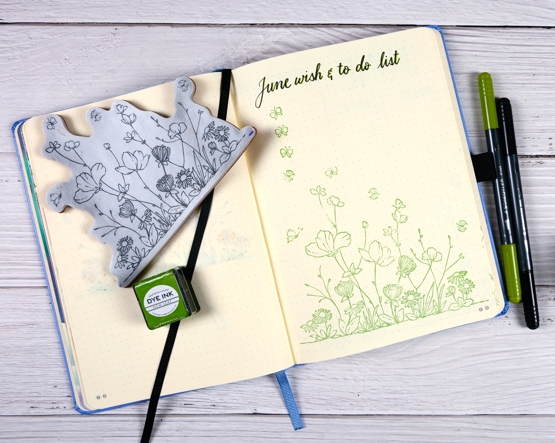
For the wish & to do list I just stamped in Papertrey ‘new leaf’ ink and repeated the butterflies for list items. By the way for the first time this year I completed all items my wish & to do list in May! Of course the big item was launching the new online course but there were birthday cards made and sent on time which is rather surprising for me!
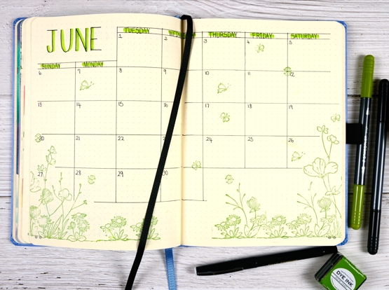
I used ‘new leaf’ ink again on the calendar page along with a pilot fineliner for the grid, a micron pen for the days of the week and staedtler brush pens for the shadows over the letters.
Supplies
(Compensated affiliate links used when possible)
If you have a garden…
Posted: May 31, 2021 Filed under: Art Journal, Darkroom Door, Hand lettered, Papertrey Inks, scratches, Wildflowers Vol 2, you are everything | Tags: Art Journal, Darkroom Door stamps, Fabriano art journal, Papertrey ink, Ranger Distress inks, Tsukineko Versafine inks 8 Comments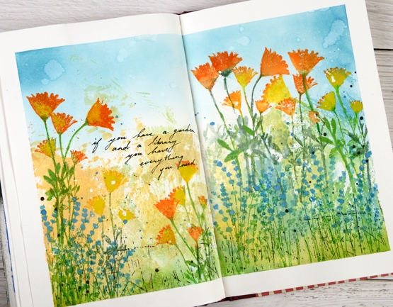
The rest of the quote says, ‘… and a library you have everything you need.’ My art journal is pretty much all book or flower related pages; I guess there is room for a new inspiration. Currently with a garden that is looking promising and an online course newly launched you could say flowers are on my mind.
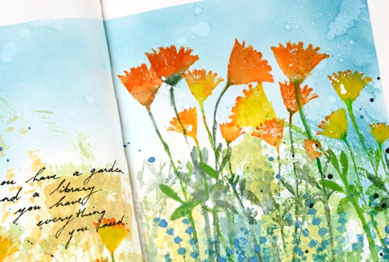
The background for this page was created months ago when I was making subtle backgrounds for a few cards. Instead of swiping a whole panel through waterbased inks I was inking a piece of acetate then spritzing it and swiping it on a stamped panel. I opened a spread in the art journal and swiped the acetate across the pages a few times to leave some ink there. I don’t remember the exact colours but the smooshed ink covered the lower half of the pages in blue, green, yellow and pale orange. Last week I pulled it out again and turned the page into a messy garden.
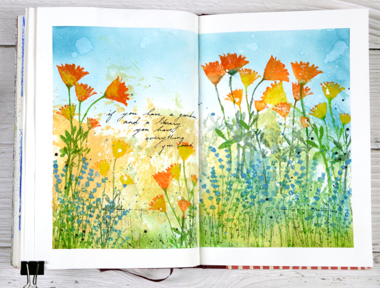
As I said the lower half of the pages is smooshed ink. The upper half is broken china distress inks applied with a blending brush. The flowers are a mix of silhouette stamps from Darkroom Door’s ‘you are everything’ and ‘wildflowers vol 2’ sets. I inked with papertrey ink cubes, spritzed the stamp and stamped on the pages. Sometimes I blended the stamped ink, other times not. To make the blue flowers stand out a bit more I painted blue gouache paint over the stamping. The gouache works well on the journal pages so you will probably see more.
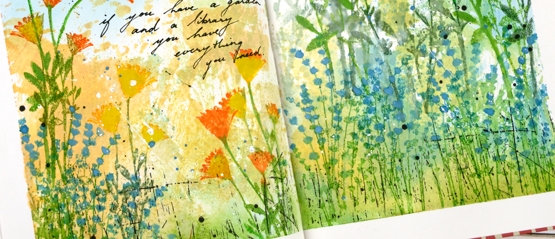
Once all the flowers were added I stamped the DD ‘scratches’ background stamp in black on the lower section of the page and added black and white splatter all over. I added the quote with a black gel pen. If you are in my Floral Faves online class you might this was inspired by one of the projects in lesson 3.
Supplies
(Compensated affiliate links used when possible)
Daisy Sunshine
Posted: May 28, 2021 Filed under: dancing daisies, Penny Black | Tags: distress markers, Fabriano Watercolour Paper, Papertrey ink, Penny Black stamps, Tsukineko Versafine inks 11 Comments
Last week I asked what your favourite floral stamp was and several people mentioned PB ‘dancing daisies‘. That was all the motivation I needed to get it inked up. I used the same technique for today’s card as I did for a recent lilac card. I inked the stamp with three ink colours (listed below), spritzed and stamped on hot pressed watercolour paper. Without re-inking I spritzed the stamp again and stamped another print then another spritz, another pale watery print. I dried the panel a little then dipped it in a bucket of water. The result was the background you see in pale colours.
I made sure the panel was totally dry before putting it in a stamp positioner to do a bold focal print. I used the same colours berry sorbet for petals, orange zest for centre and prairie grass for leaves and stems. I stamped a second time adding aged mahogany shadows on the flower centre and abandoned coral definition on the petals. I did some blending with a paint brush but not on all the stamping.
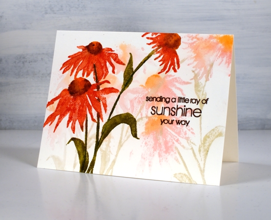
I finished the panel with a sentiment from PB ‘thinking of you’ in acorn versafine clair ink. I’m glad to have been reminded about dancing daisies; it’s a lovely stamp which I’ve used a few times over the years.
Supplies
(Compensated affiliate links used when possible)
One colour floral
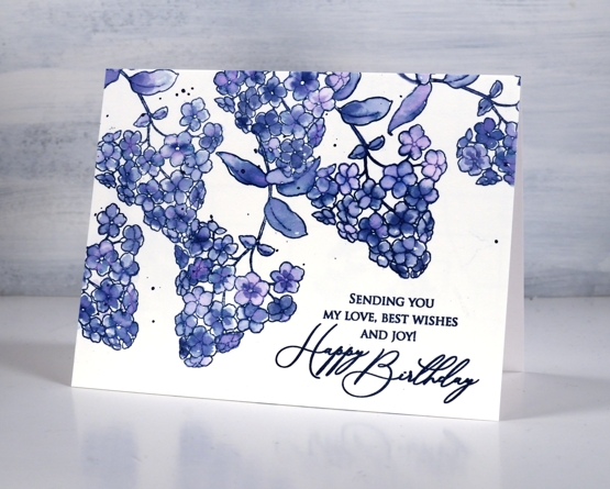
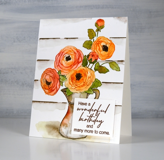
Posted: May 26, 2021 Filed under: Catherine Pooler inks, Penny Black, thriving | Tags: Catherine Pooler inks, Penny Black stamps 5 Comments
I know I’ve been talking a lot about FLORAL FAVES, my new online class, but today’s post is not all about a favourite stamp or a favourite technique. Today the star is my favourite colour. I am team blue all the way! Some might consider this particular blue a bit sneaky because it dilutes to pink and purple tones but I just consider it clever. The way this design turned out with overlapping flowers in shades of blue reminds me of a piece of clothing my mother had when I was very young, perhaps a skirt. My mother was definitely team blue as well!
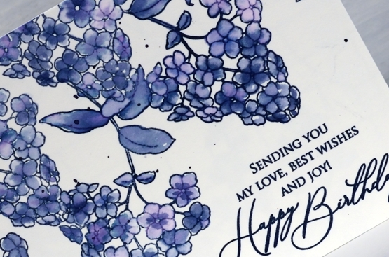
Juniper Mist ink from Catherine Pooler is one of those magical inks that separates into several different colours. It might not be quite as magical as Memento northern pine, but it’s definitely up there.
Using a stamp from the transparent PB set ‘thriving’, I stamped what might be a lilac several times on hot pressed watercolour paper with juniper mist and painted each flower and leaf with water. I didn’t spend long on the painting so it’s a little messy but that’s the style for this one. As I painted I varied the amount of water I blended with, added extra ink for some flowers and dabbed other ones. Dabbing away wet ink when using juniper mist leaves a pink print.
I’m keeping it floral here on the blog for a while longer to celebrate the launch of my new online class FLORAL FAVES. Thank you to everyone who has joined already. The lesson content is all available now so dive in!
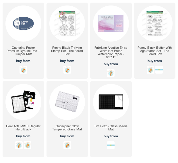
Supplies
(Compensated affiliate links used when possible)
Companions & a winner
Posted: May 24, 2021 Filed under: Classes, companions, Karin brushmarkers, online class, Penny Black | Tags: Karin brushmarkers, online class, Penny Black stamps 5 Comments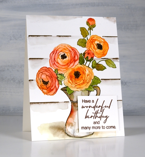
I have a video and a prize winner to share today but first thank you for participating in the giveaway. I really enjoyed reading what your favourite flower stamps are and I’m planning to go back and read through again and feature some of them in upcoming posts. Several of you named stamps that have been on the blog recently, some of which feature in the new online class FLORAL FAVES. Others mentioned older classics which I hadn’t thought about in a while. Dancing Daisies came up several times so I pulled it out and made a sample for the class. But without further ado let me announce the winner of a registration in my new FLORAL FAVES class!
Denise Bryant
Gorgeous card! I love the design and colors! The effect of the layering to frame the design is so pretty!
My favorite flower stamp is Penny Black’s ‘Together’. It reminds me of the agapanthus plants my grandmother grew in her yard.
Congratulations, Denise, I will be in touch by email.
Another stamp mentioned among the favourites was PB companions which features in today’s card.
After watercolouring on bristol cardstock I can recommend it. I wouldn’t choose it over hot pressed watercolour paper but it worked well and is more of a bright white, if you like that for your stamping.
Flowers continue to my focus right now as I proof read for the 15th time and put the finishing touches on the lessons in the FLORAL FAVES class ready for Wednesday (when the lessons will be available). I also planted more flowers in the garden over the weekend. I transplanted the morning glories I grew from seed; they look rather spindly but they started out that way last year and ended up a big success.
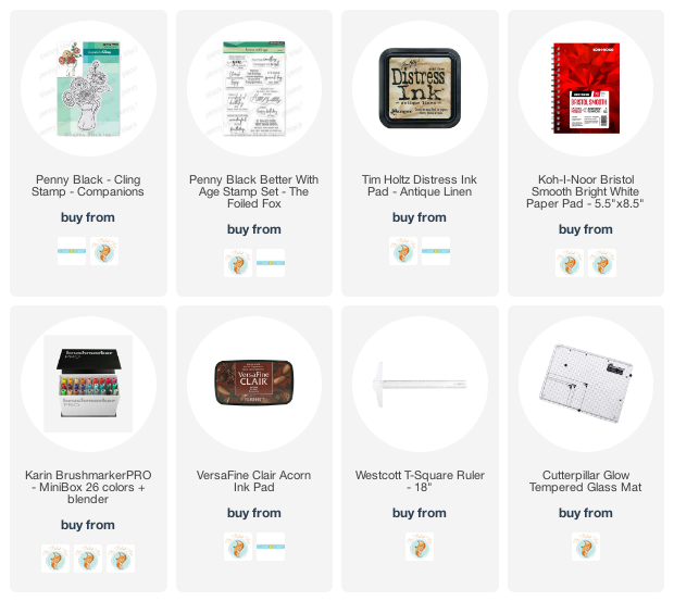
Supplies
(Compensated affiliate links used when possible)
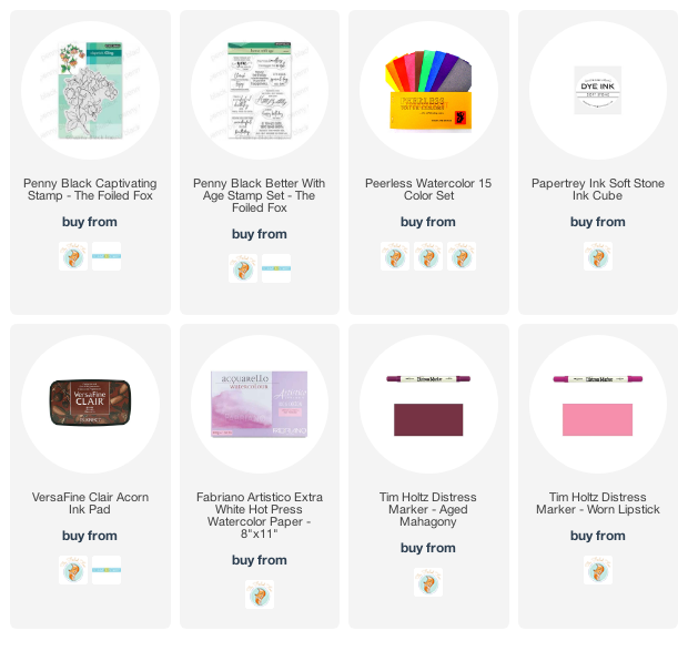
Captivating
Posted: May 21, 2021 Filed under: captivating | Tags: Fabriano Watercolour Paper, Peerless Transparent Watercolors, Penny Black stamps, Tsukineko Versafine inks 11 Comments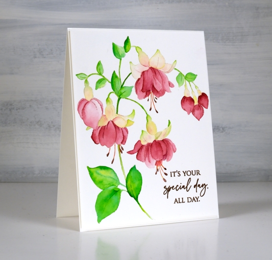
This gorgeous stamp from Penny Black is called captivating; it’s a single large stamp which fills a card front and lives up to its name. Before painting I did a quick search on my phone and used a reference photo as inspiration. Fuchsias can be a single colour or two toned; I chose pink and white using Peerless watercolours and a few no-line watercolour techniques.
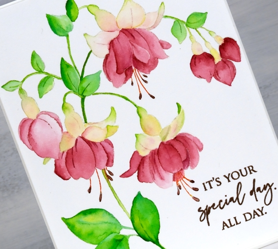
Peerless watercolour paints blend beautifully; they actually advertise as ‘self blending’ so the soft transitions from dark to light on the leaves and petals shine with this kind of paint. After stamping in papertrey soft stone ink I used a couple of greens for the leaves and a single red for the lower petals which I diluted as I blended to add depth and variation. The upper petals have a little yellow, green and pink but not much as I wanted them to appear white.
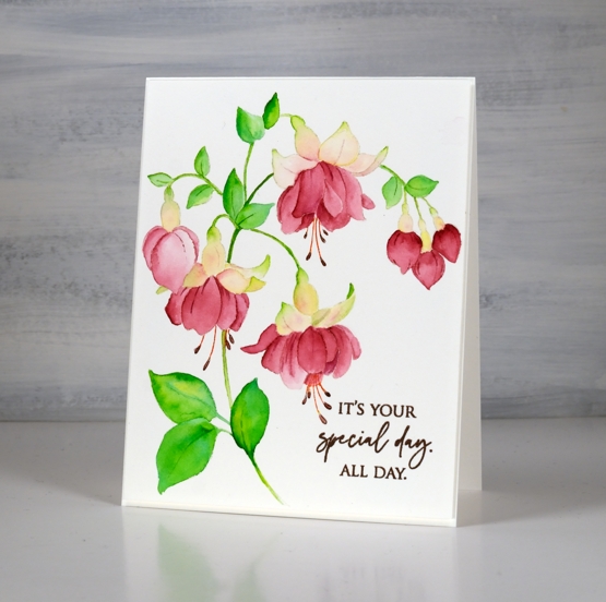
I posted yesterday about my new online class Floral Faves. I use the Captivating stamp in the no-line watercolour lesson covering the process from beginning to end.
Supplies
(Compensated affiliate links used when possible)
Floral Faves – Online Class
Posted: May 20, 2021 Filed under: Classes, Concord & 9th, Darkroom Door, online class, Penny Black | Tags: Concord & 9th, Darkroom Door stamps, distress markers, Karin brushmarkers, online class, Penny Black stamps, Ranger Distress inks, sennelier watercolours 1 Comment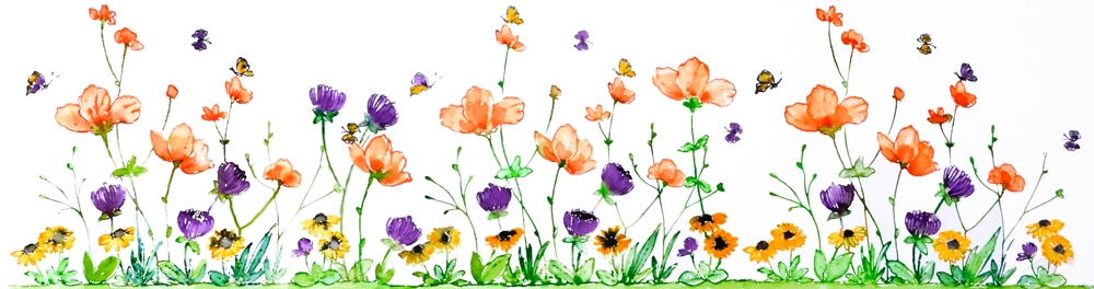
After months of work behind the scenes and a few weeks of hints here on the blog I am happy to open registration to my new online class FLORAL FAVES. As the name suggests this one is all about flowers; stamping them, painting them, arranging them (on paper) and turning them into card sized works of art.
Once again my videographer son Ben has filmed and edited while I have designed, uploaded and scripted the content which is now hosted on the Podia platform.
I hope you are inspired to join me in pairing your floral stamps to work with watercolour techniques. Every project is taught through video along with downloadable instructions, photos, tips and complete supply lists. We will work with different styles of stamps including background, outline, silhouette and brushstroke. We will pair all the favourite stamps with all the favourite mediums; dye inks, watercolour markers and watercolour paints .
As summer unfolds I’m sure you will be spending plenty of time outdoors, maybe in your garden, but when you need a quiet creative hour or two I hope you will join me in creating some bright and beautiful floral cards.
Registration is open now. Once registered you will have access to the introduction and supply pages. All the lesson content will be accessible on Wednesday May 26.


