Landscapes from leftovers
Posted: July 21, 2021 Filed under: Dies, gel press, into the woods, Penny Black, tall trees | Tags: gel press, gel printing, Penny Black creative dies 7 Comments
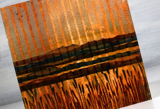
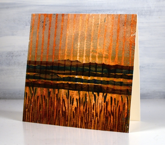
In my recent gel printing video I kept a piece of heavy weight paper off to the side for cleaning my brayer. I turned it around half way through the printing session so it ended up browns on one side and blue/grey/yellow on the other.

The colour and texture was too yummy to waste so I cut two rectangles which both spanned the centre or ‘horizon’ line of the large sheet. Because the panel above has a dark sky I punched a circle moon from another area and made it a night scene with the addition of black silhouette trees die-cut with the PB ‘into the woods’ die.
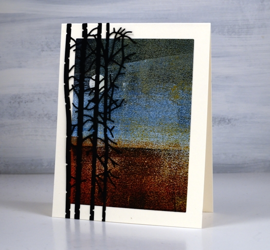
Not only is there plenty of visual texture in these panels the brayered paper is also very rough to touch. There is no trick to making these papers; I definitely don’t keep the clean up sheets every time but I find if I work with the same colours for a while and flip the sheet around when it has plenty of paint on it the combination of colour and texture can be beautiful.
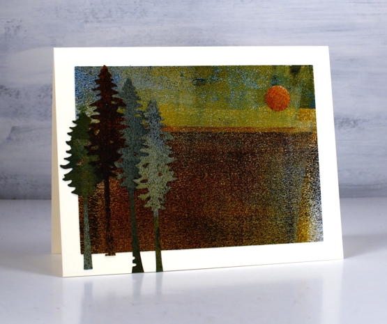
The second card is more of a late afternoon scene. The colour of the sun is similar to what we saw two days ago when the sky was hazy due to bushfires in northwestern Ontario.

The trees blend into the landscape somewhat as there is not a lot of contrast between the die cuts and the base. I used the PB ‘tall trees’ dies and cut them from the left over edges of the panel.
This is not the first time I’ve used scraps and scratch paper for cards and journal pages. This cityscape is made from gel printing masks and two of these cards are from a clean up sheet. Today I glued a large ‘clean up’ sheet into my art journal as a background for a future page. I don’t know what to do with it yet but I liked it too much to toss it away.
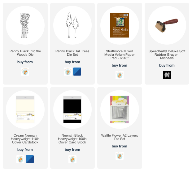
Supplies
(Compensated affiliate links used when possible)
Gel print backgrounds – stripes and grid
Posted: July 20, 2021 Filed under: companions, Finetec paints, gel press, mountain magic, Penny Black | Tags: gel press, gel printing, Penny Black stamps 9 Comments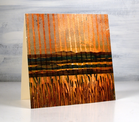
Yesterday I posted a gel printing video where I used both an egg carton and a piece of corrugated cardboard to add texture to my prints. I used a couple of the corrugated cardboard prints to make today’s cards.
You can see how I printed this panel in the video. To turn it into a card I used a couple of new stamps from Penny Black. I stamped the mountain stamp five times in browns and blue then inked the rushes with a brown and a blue ink. I love the way it looks like a sunset or sunrise because of the background print. It wasn’t something I tried to create but a possibility I saw when looking at the prints.
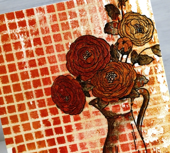
The print below was made with the same piece of corrugated cardboard pressed down on the gel press twice to create a grid pattern. You can see the process in yesterday’s video. I decided to stamp flowers on it as an experiment. I knew it might be too much pattern but I wanted to try. I stamped and embossed the Penny Black ‘companions’ stamp in versafine clair nocturne ink and it looked bold just as an outline.
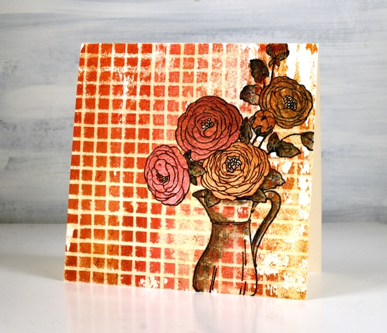
By painting inside the flowers I was able to separate them from the background enough to make them a feature not a competitor with the very busy grid pattern. I used a couple of layers of pearlescent paint on the flowers but quite diluted pearlescent black on the leaves and jug.
Tell me what ‘recycled’ items you have used for gel printing. I am keen to print with ‘all the things’! To be honest gel printing is top of my list of techniques right now. I hope you enjoyed the two recent gel printing videos. I will definitely make more. Tomorrow I have a couple of cards made from the piece of cardstock I used to clean my brayer. I showed a glimpse of it at the end of the video.
See you soon.
Supplies
(Compensated affiliate links used when possible)
Gel Printing with recycled cardboard
Posted: July 19, 2021 Filed under: carved leaves, Darkroom Door, gel press, layered Xmas wreath die set, Penny Black, sleigh, Tutorial | Tags: Darkroom Door stamps, gel press, gel printing, Penny Black creative dies, Penny Black stamps, video 8 Comments
I posted a video last week featuring gel prints with stencils. In today’s technique video I use cardboard found at home. One piece was the packaging for eggs and the other a piece of corrugated cardboard.
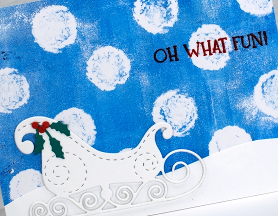
The huge snowballs falling in the card above were printed using the large circles on the egg carton. I could have done more on the gel plate with extra colour or texture but I kept it simple which works well behind the more intricate sleigh. You can see my process in the video below.
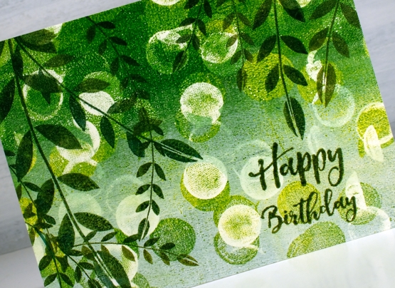
The card below also features a gel print background made with an egg carton but I pulled two prints on the one panel both with green and white paint and egg carton circles.
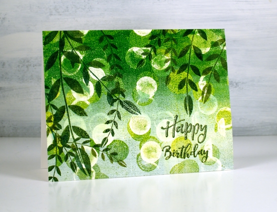
The card below also features a gel print background made with an egg carton but I pulled two prints on the one panel both with green and white paint and egg carton circles. I stamped leaves from the Darkroom Door stamp set, ‘carved leaves vol 1’ over the bokeh-like circle background. To get the right tones of green in the stamping I used both shady lane and rain forest versafine clair inks one over the top of the other. The sentiment is from the ‘happy birthday’ sentiment strip.
In the video I also made prints with a piece of corrugated cardboard pressing it down on the gel press once for a striped pattern and twice for a grid pattern. I’ve turned a couple of those prints into cards which will be on the blog tomorrow. I hope you try gel printing with some recycling you find at your place. See you soon.
Supplies
(Compensated affiliate links used when possible)
Fine Flowers
Posted: July 16, 2021 Filed under: Darkroom Door, fine flowers vol 2, you are everything | Tags: Darkroom Door stamps, Ranger Distress inks 8 Comments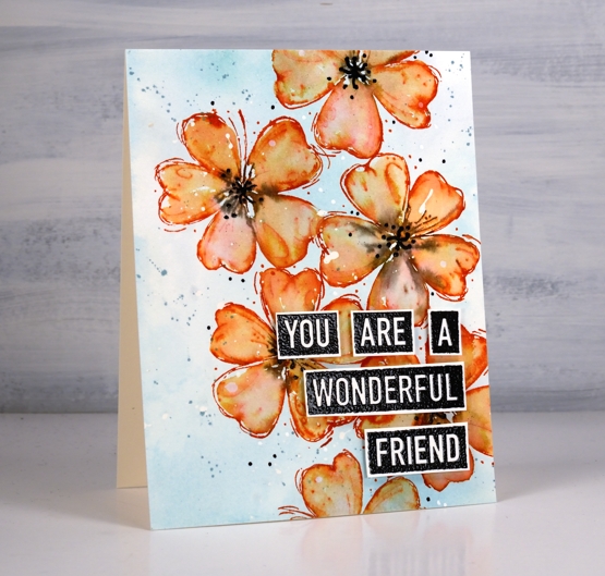
I put some new inks and stamps to work on this card. The flower is from the Darkroom Door set, Fine Flowers vol 2 designed by my friend Godelieve (Stamping Matilda). There are six flowers in the set so this is just the beginning of the fun.
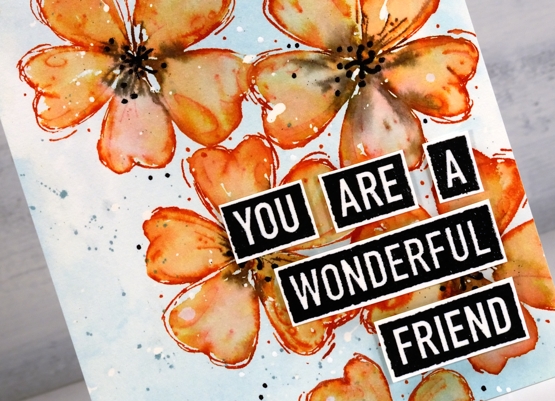
The background colour is a newish ink, speckled egg distress. I splattered masking fluid on a piece of water colour paper, smooshed speckled egg on a glass mat then added water before pressing the watercolour panel into the ink to create soft blurry blue smudges. The flowers are stamped with another new distress ink, crackling campfire. It stamps as a warm red but dilutes to more of an orange as you can see on the petals. I stamped the flowers one at a time and blended the stamped ink to fill the petals. I inked the centres with a black soot marker which blurred into the orange. To make the centres more prominent I drew dots and squiggles with a black embossing pen then embossed in black powder.
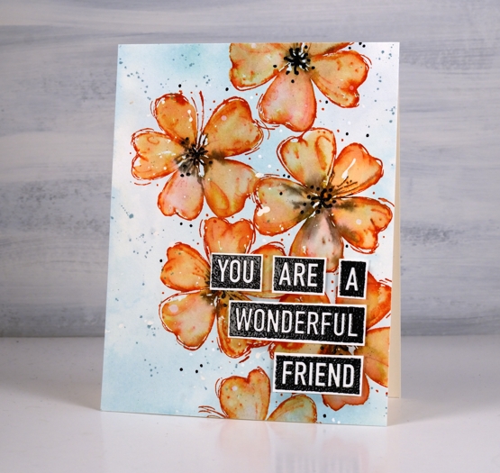
Before adding the embossed sentiment from DD ‘you are everything’ set I splattered speckled egg ink and also some water. At the risk of over dotting I also added white and black with gel pens. The stamp has its own little dots around it so adding a few more seemed fitting.
This watercolour technique is one featured in my Floral Faves online class and the colour choice is covered in my Colour Clues class. Both classes are self paced and filled with instructional videos and photo inspiration.
Supplies
(Compensated affiliate links used when possible)
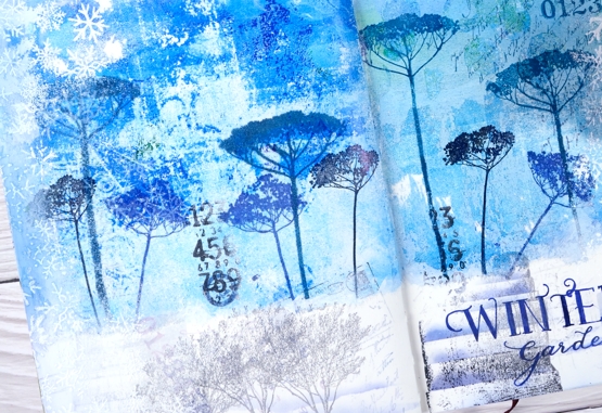
Winter Garden art journal page
Posted: July 14, 2021 Filed under: Art Journal, bookworm, Correspondence, Darkroom Door, gel press, little swirls, nomad, Paper Rose, snowflakes, Trees, Wildflowers Vol 1 | Tags: Art Journal, Darkroom Door stamps, Fabriano art journal, gel press, Paper Rose 12 Comments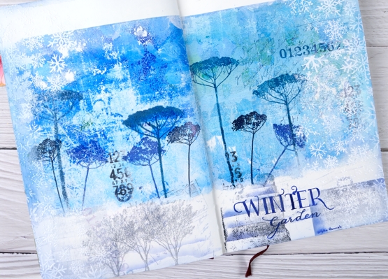
It’s been a while since I worked in my book themed art journal. As I looked over a table covered in gel prints I settled on two blue ones filled with pattern and paint. Both were on rice paper and sized 6″x6″ which is not big enough to cover the whole journal page. I decided to tear a rough edge on the bottom and glue the panels with space above and below.
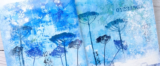
The inspiration for the page is Kristin Hannah’s novel ‘Winter Garden’. I used Darkroom Door floral stamps to decorated the gel prints with blue flowers then added more stamping to the blue area and the white space at the bottom of the page.
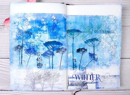
Picking from a few themes in the book I stamped trees to represent the orchard, a suitcase to represent the escape from Leningrad, books from the library where the main character worked. I also used number, correspondence and snowflake stamps to complete the collage.
I am always in two minds about adding words to my pages and this time was no exception. Rather than a quote I just added the name of the novel and author. I used pigment and archival inks for all the stamping, white gesso around the edges and white ink and embossing powder to add the snowflake borders.
Have you read any Kristin Hannah? My book club considers ‘The Nightingale’ our best choice so far! We are always searching for good book club reads; if you have any suggestions please leave them in the comments.
Supplies
(Compensated affiliate links used when possible)
Gel Printing with stencils + video
Posted: July 12, 2021 Filed under: Butterflies, classic cars vol 1, Darkroom Door, fragments, gel press, gelli plate, Heather lowercase stamp set, little swirls, Nature Walk, Paper Rose, Pink Fresh studio, so extra supporting sentiments | Tags: Darkroom Door stamps, gel press, gel printing, Paper Rose, Pink Fresh studio 7 Comments
In recent gel printing sessions I have used some of my intricate stencils from Paper Rose Studio. This stencil, ‘little swirls‘ makes a particularly beautiful background. I’ve been printing on a 6″x6″ gel plate with a 6″x6″ stencil but I cut the print down to make a 4¼” x 5½” card.
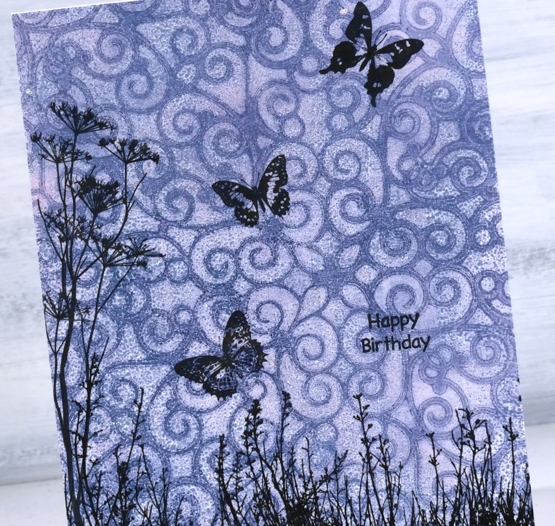
I used stamps from Darkroom Door’s nature walk , butterflies and happy birthday sets. (all linked at the end of the post). The process for making this type of print is shown in the video below.
After any gel printing session I usually have quite a pile of prints, some become cards but I am hoping to use more in my art journal. I have to be a bit more adventurous in tearing and layering and turning them into more than just a patterned print.
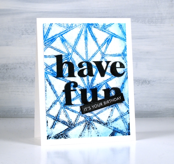
The making of the background above is included in the video. To turn it into a birthday card I stamped ‘have fun’ directly on the print then popped up a sentiment strip on top. The words are stamped in Gina K obsidian amalgam ink using the Pink Fresh Studio ‘Heather’ lowercase alphabet set.
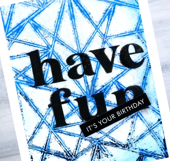
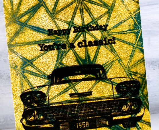
The making of the background below is also part of the video and you can see the mustard paint beaded on the surface of the gel plate making an allover pattern when printed. I didn’t necessarily want the beading but was happy when it ended up uniform. Paints of different brands perform differently on the gel press so experimentation is necessary to work out how much paint and which brands will give you the results you want.
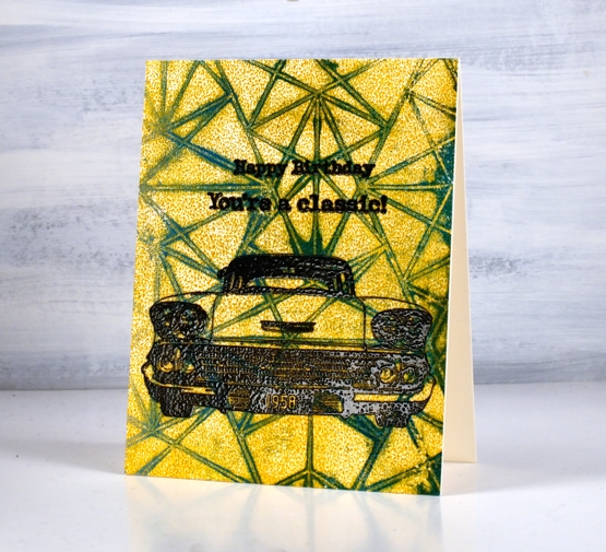
I turned this background into another birthday card by embossing a car from the Darkroom Door Classic Cars vol 1 set along with a sentiment from the same set plus one from the Happy Birthday set.
I also filmed some gel printing with a few textured surfaces from the recycling box; I’ll be sharing that video soon.
I’d love to hear how you use your gel prints; I’m always open to ideas.
Supplies
(Compensated affiliate links used when possible)
Puppy’s Quilt in Pencil
Posted: July 9, 2021 Filed under: Colorado Craft Company, Coloured pencil, puppy's quilt | Tags: Colorado Craft Company, Faber-Castell Polychromos Colour Pencil 6 Comments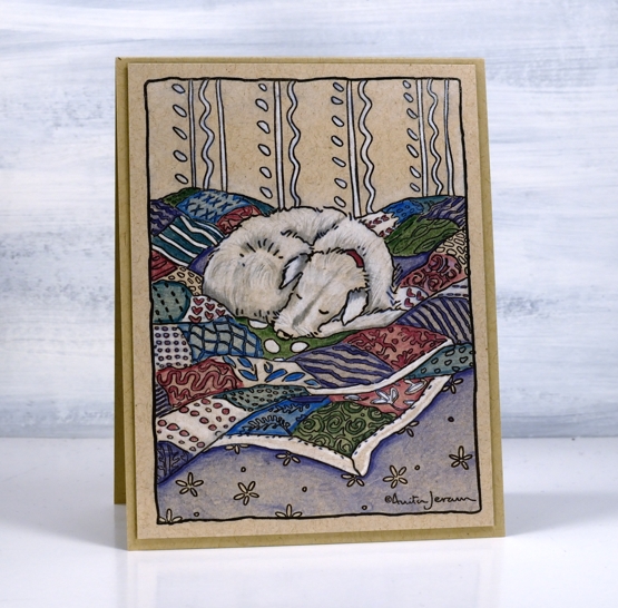
More pencil on kraft cardstock, this time Faber Castell polychromos pencils and a black stamped image from the Colorado Craft Company. My first card with this stamp, ‘puppy’s quilt‘ featured watercolour and lots of blue. This time I have included more white which is always eye catching on kraft along with blue, green and burgandy.
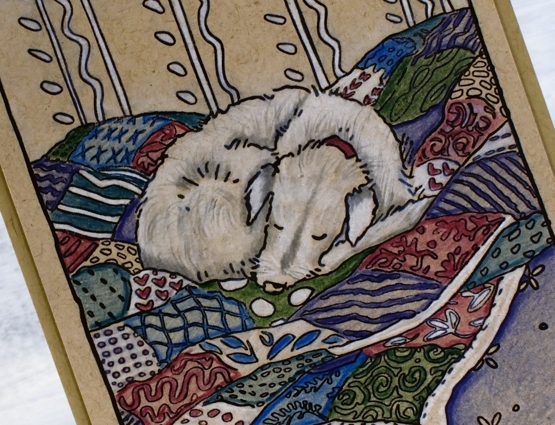
A bonus when colouring an animal on kraft cardstock is using the light brown of the kraft as a colour in the fur or feathers. I have coloured the dog with white and grey but there are light tan areas that show through the shading.
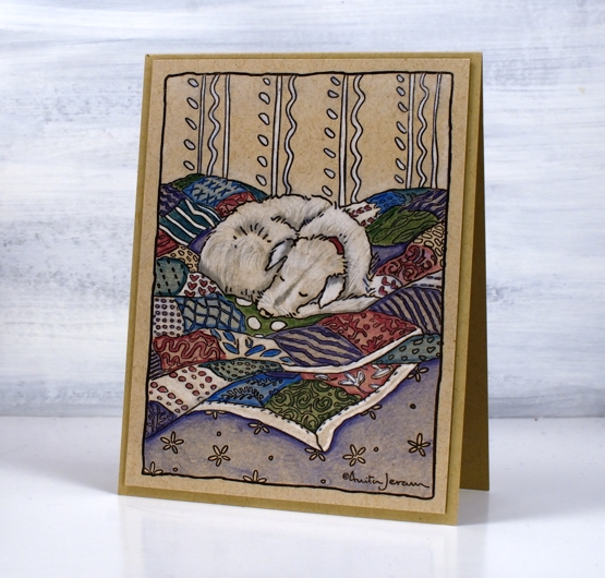
I used archival jet black ink for the outline stamping, I like the way it dries quickly before I have a chance to smudge it! Having used both the inktense and the polychromos pencils on kraft I think I would say the inktense are a little brighter and chalkier, the polychromos more muted and creamier. Not sure how helpful that comparison is but you can compare the two looks if you go back to Monday’s floral card.
Supplies
(Compensated affiliate links used when possible)
2021 BuJo – July theme
Posted: July 7, 2021 Filed under: Bullet Journal, Dingbat notebooks | Tags: Bullet Journal, Dingbats notebook, Pitt artist pens, Staedtler watercolour brush pens 5 Comments
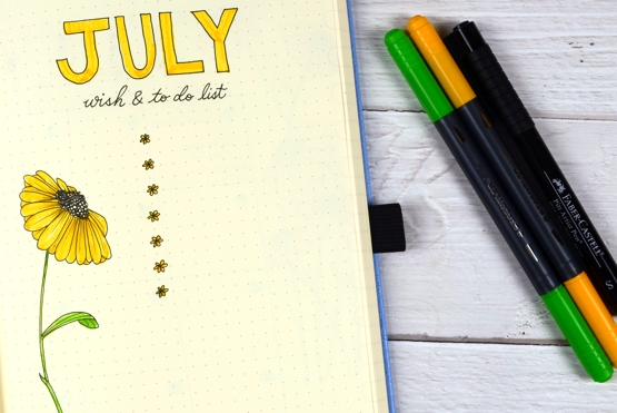
With all the flowers blooming in my garden right now I have a wealth of inspiration. I decided to go for daisies but then realised I didn’t want to fiddle with white petals and settled on black-eyed Susans instead.
I tested the black fine tip markers currently in my possession to see which ones were waterproof and would give me a dark black. I ended up choosing the small and the medium from a set of Faber Castell Pitt artist pens. I did most of the drawing with the small tip (0.3mm) and then used the medium (0.7mm) for the calendar page.
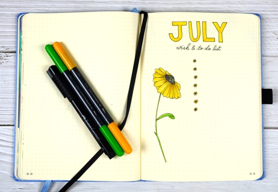
I drew all the daisies myself and let the black ink dry before colouring with orangey-yellow and light green brushmarkers from the Staedtler set of watercolour brushmarkers.
I used the same four pens for all the pages. On the calendar page below I made a couple of mistakes, in marker! Not ideal but I came up with some fixes that satisfied me. I will do a bit more pencil sketching next time; I think by the time I got to the calendar page I was not being as careful as I had been for the previous two pages!
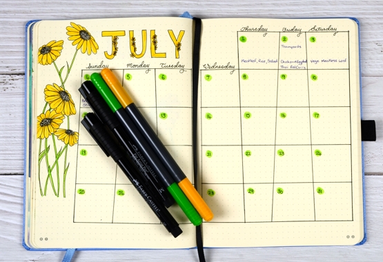
The first mistake you can probably guess was a vertical line which did not line up to make even 7×7 dot squares! To cover the mistake I made all the vertical lines off by one dot! The second mistake was drawing the title letters in pen without sketching them in pencil first. Both the downstroke of the J and the curve of the U ended up narrower than the rest of the letters. Solution? A few little flowers to pad them out!
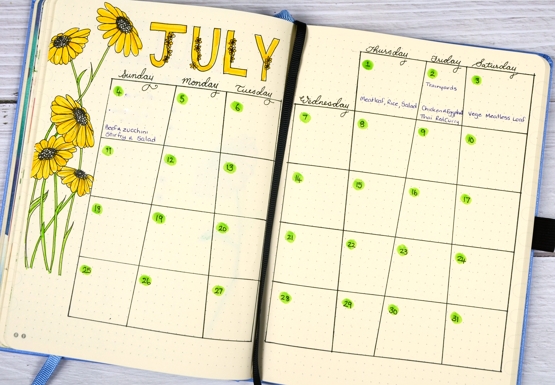
Despite the errors along the way I am happy with the July theme because it is bright and happy and showed me I could draw my elements from scratch and not need a stamp or die every time! Hope your July is off to a great start.
Supplies
(Compensated affiliate links used when possible)
Floral Focus in pencil
Posted: July 5, 2021 Filed under: Brutus Monroe, floral focus, Heather lowercase die set, Inktense pencils, Pink Fresh studio | Tags: brutus monroe embossing powder, Inktense, Pink Fresh studio 7 Comments
Last week I shared a card featuring the Pinkfresh Studio background stamp, ‘floral focus‘ watercoloured with Karin Markers. Today I have another card with the same stamp but pencil coloured this time using Derwent inktense pencils. At some point I should do pencil colouring on white or cream cardstock again but I am still in love with the look of pencil on kraft. Inktense pencils are watersoluble but you can also use them as traditional pencils with no water added, that’s what I did here.
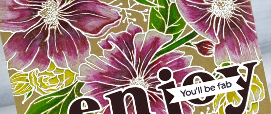
I embossed the background stamp in white powder, another technique that looks great on kraft cardstock then used the inktense pencils to fill the flowers and leaves. The flowers are coloured with red violet, fuchsia and antique white. The leaves and stems I did with felt green and apple green and the small flowers are coloured with sun yellow and antique white.
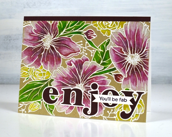
To finish the card I added a strip of violet cardstock and cut letters from the same cardstock with the Pinkfresh ‘Heather lowercase letter’ dies. The little sentiment is from PF set ‘scripted bold sentiments. You might think this is an odd pairing of sentiments; I was thinking it would suit someone starting something new, some encouragement along with a reminder to enjoy the experience.
Supplies
(Compensated affiliate links used when possible)
Captivating Blue
Posted: June 30, 2021 Filed under: captivating, Catherine Pooler inks, Penny Black | Tags: Catherine Pooler inks, Penny Black stamps, Ranger Distress inks 8 Comments
I’ve been creating backgrounds for landscape stamping lately often by smooshing a few inks on my glass mat, diluting the ink then swiping the watercolour paper through it. The background for this floral card was done the same way and features faded jeans and kitsch flamingo distress inks plus some scattered salt for subtle patterns.
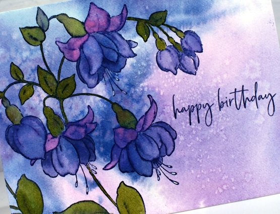
I stamped the Penny Black ‘captivating’ stamp in Catherine Pooler ‘juniper mist’ ink then blended the stamped ink to fill all the lower petals of the fuchsias. I painted the upper petals with kitsch flamingo and the leaves with CP eucalyptus ink. For the tips of the little stamen I used a white gel pen.
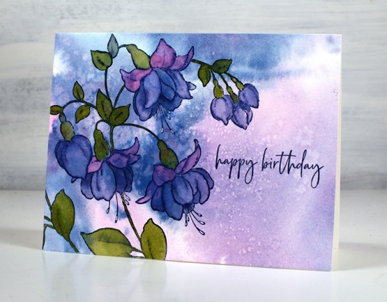
With all the pattern in the background I kept the sentiment simple with part of a stamp from the PB ‘carefree wishes’ set in CP juniper mist.
This stamp features in one of the lessons included in my Floral Faves online class where I teach a range of techniques for use with floral stamps. It’s a self paced class where you can access the video content at your own convenience.
Supplies
(Compensated affiliate links used when possible)