Pretty Papers
Posted: January 21, 2026 Filed under: cricut, My Favorite Things, Patterned papers, Penny Black | Tags: cricut, My Favorite Things, Penny Black creative dies 7 Comments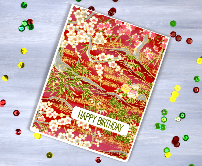
If you are anything like me you probably have a stash of pretty papers. Maybe they are scrapbooking papers or rice papers, perhaps they are pretty papers you made yourself by watercolouring or printing. I have quite the stash in all the above categories. So in the spirit of using what I have (UWIH), I pulled out some of the pretties and turned them into cards.
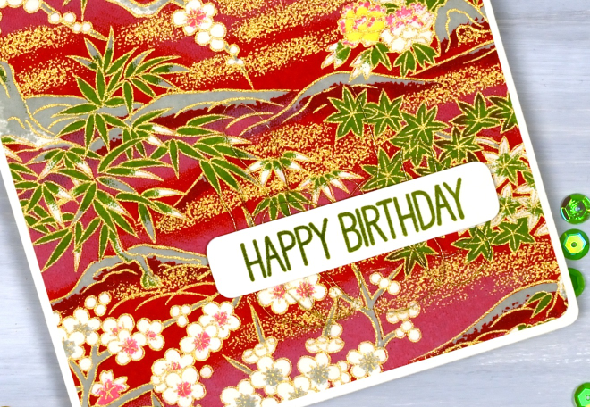
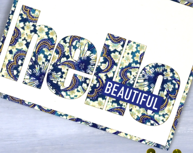
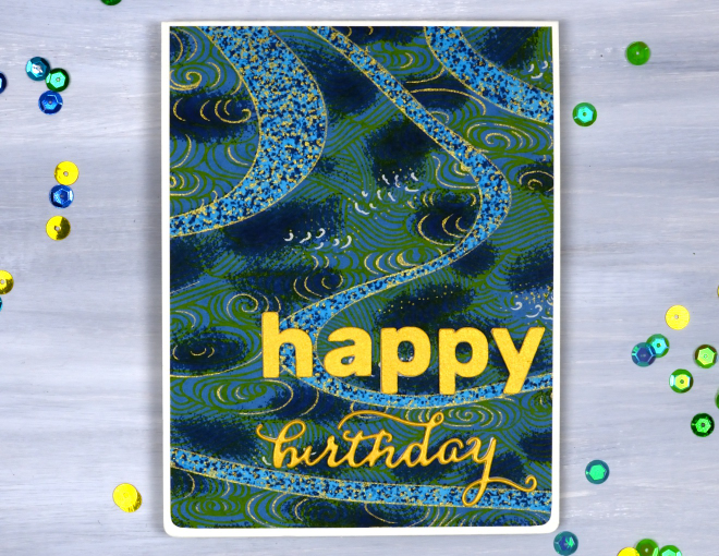
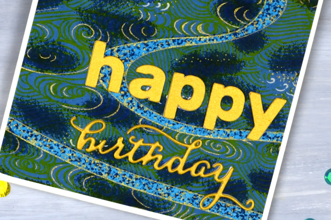
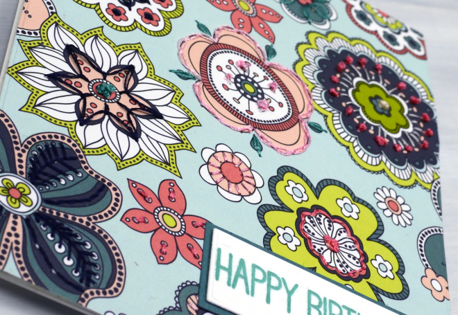
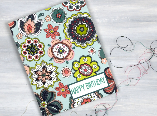
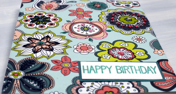
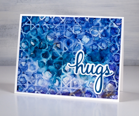
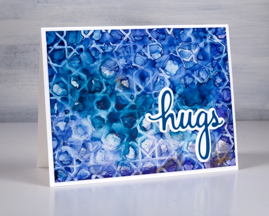
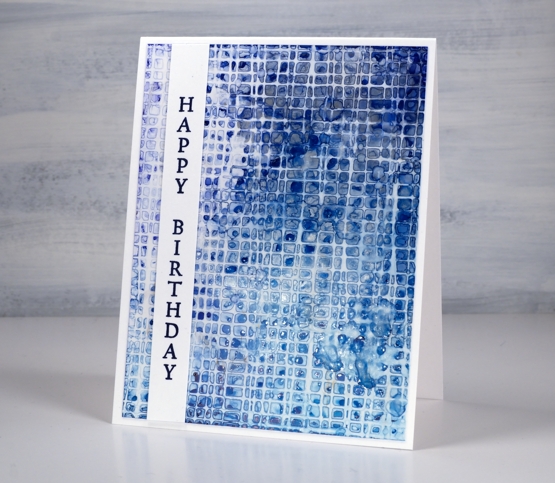
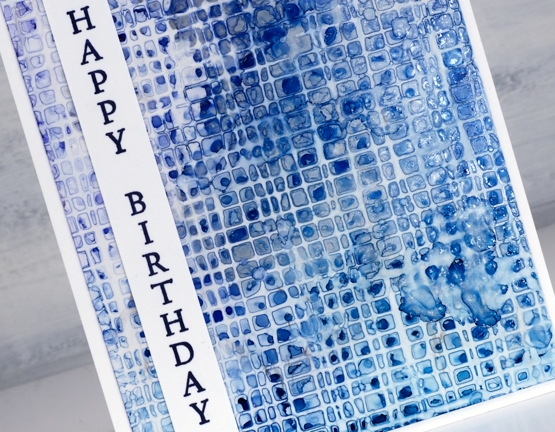
All the papers on today’s cards are rice papers featuring bold colours and gold details. They were a lovely gift from a lovely person. Because the papers are so beautiful I really didn’t do much to turn them into cards. (the red one, the bluey-green one, the blue floral one)
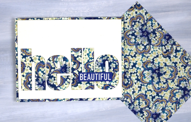
All the cards featured today use a panel that fills or almost fills a card front. I simply added sentiments and rounded corners to the red card and the bluey-green cards. For the hello card above I used the cricut to cut the word hello from a cream panel so the pretty paper would be revealed. I added the word ‘Beautiful’ from a Darkroom Door set, ‘You are Everything‘.
The word birthday below is die cut; the other letters are cricut-cut.
I like the finishing touch of rounded corners and have a corner rounder that I really like; it’s the Kadomaru PRO which gives me the choice or large, medium or small corners. What else do you do with pretty papers? I’d love to read your suggestions in the comments.
The Stitched card
Posted: January 15, 2026 Filed under: My Favorite Things, Stitching | Tags: Mixed Media, My Favorite Things 8 Comments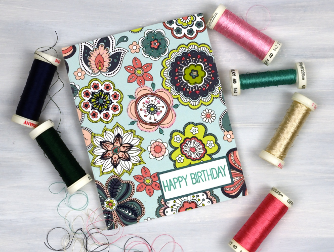
I decided to try something new. I’ve done hand embroidery before, but not on cards. I’ve stitched on cards before but with a sewing machine. This panel was my practice for another project but as you can imagine it takes a while to hand embroider on cardstock so I turned it into a card despite the mistakes I made.
The patterned paper is from a paper pad; it had a bit of weight but I ironed fusible interfacing to the back to make it stiffer and less likely to tear. I used machine embroidery thread in a double strand but I think I will try some hand embroidery thread because it might be a bit thicker and show up a little more.
I used the patterns on the flowers as my guide for stitching. I didn’t stitch on every flower or on every part of a flower. I used French knots (some a bit rough!), daisy stitch and plenty of simple straight stitches covering lines on the patterned paper. The sentiment is from the MFT Birdie Brown greetings galore set.
Snow on snow on snow
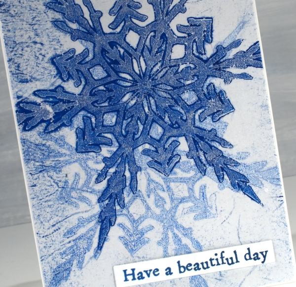
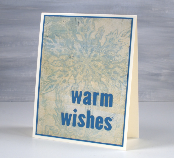
Posted: January 13, 2025 Filed under: cricut, Echidna Studios, gel press, grafix, My Favorite Things, snowflake digital stamp set | Tags: cricut, Echidna Studios, gel press, gel printing, grafix 6 Comments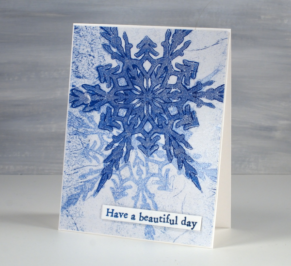
Today’s cards were gel printed using snowflake masks I cut on the cricut using the Snowflake Digital Stamp Set from Echidna Studios. I love how detailed these snowflakes are; there are six in the set and I have printed them, foiled them, cut them and now gel printed with them.
I remember when I first saw the six pointed detail of a snowflake that had landed on me. It is not always possible but occasionally the flakes are very distinct and separate instead of in clumps and I am always amazed by their beauty.
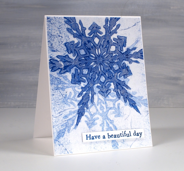
I cut my stencils from Grafix matte dura-lar as it is semi-transparent and light weight. On the panel above I made a pale print with blue and white then, after it had dried created a dark print on the plate which I pulled on the same paper but with a transparent medium (either transparent white paint or more likely matte medium). The little sentiment is from AALL & Create ‘everyday sentiments’ set.
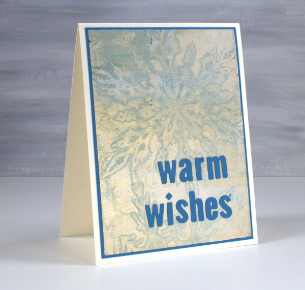
On this second card I used a pale blue paint which didn’t give me a very bold print but pulling it with gold paint created a soft shimmery effect.
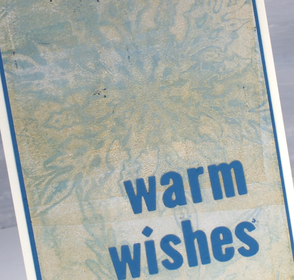
Always looking for the matchy-matchy, I found a scrap of cardstock in the same blue tone and cut a mat and sentiment using MFT little lowercase letter dies.
Stripes and strips
Posted: November 14, 2023 Filed under: Christmas background, Dies, Hand drawn, Hand lettered, My Favorite Things, Penny Black, starry night | Tags: collage, My Favorite Things, Penny Black creative dies 8 Comments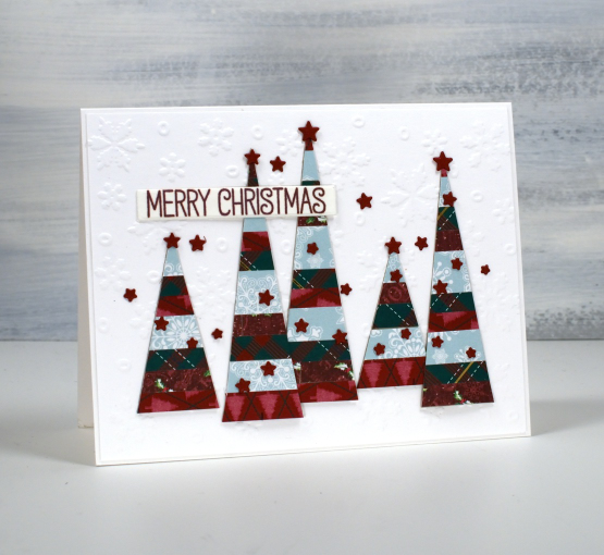
If you have scraps of patterned or solid coloured paper today’s post is for you. I made a panel of striped cardstock by cutting thin strips of patterned paper and gluing them to a piece of light cardstock. From my homemade ‘striped cardstock’ I cut a hand drawn tree, a hand drawn bird and some simple triangle trees. You could use dies for all the elements I was just playing with ideas and decided to sketch and cut myself.
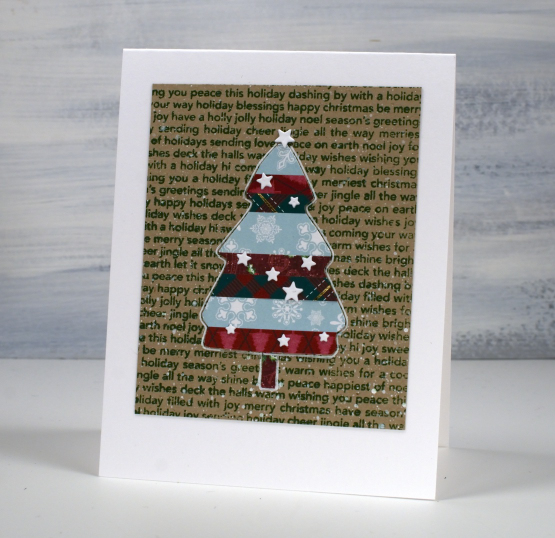
I used an embossed snowflake background for the card at the top of the page, a stamped kraft background for the tree above and then plain kraft for the bird. The little stars that decorate each card I did not hand cut of course! They are cut with the PB ‘starry night die’ and applied with the help of one of those sticky ended tools. Little embellishments have a high fiddliness factor which I don’t appreciate but these tiny stars were necessary!

I added outlines to both the bird and the tree with white or black gel pen along with some dots and a handwritten sentiment.
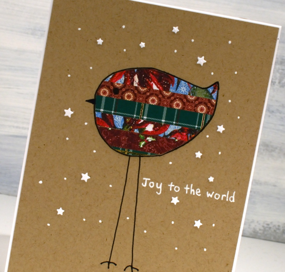
Cutting my own shapes was fun and put some of the many paper scraps to good use!
Happy Day Roses
Posted: September 5, 2023 Filed under: Brusho, My Favorite Things, Roses all over, Taylored Expressions | Tags: Brusho, My Favorite Things, Taylored Expressions 7 Comments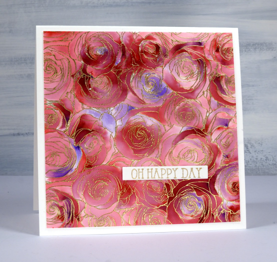
I made this large square card recently to give to a friend of ours on her wedding day. Our whole family was able to attend and celebrate with the bride and her family and it was indeed a happy day.
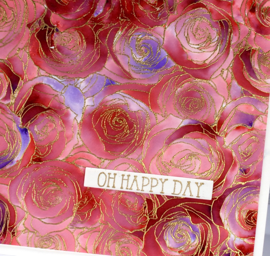
To make this card I used an old favourite technique with brusho and embossing. You might be surprised to know that I only used one colour of brusho, the crimson. I embossed the MFT ‘roses all over background stamp’ with gold powder on hot pressed watercolour paper. This stamp seems to be retired which is a travesty as it is lovely and also perfect for this technique. After a little research I discovered MFT have come out with a similar stamp which should also work. I could call the technique ‘sprinkle, spritz, trap, wait, wait, spritz and blend technique’ because that just about covers it. Sometimes with repeats.
I sprinkle brusho powder over the embossed panel, not too generously, but hopefully some powder lands in most of the roses if not all the little sections. I spritz from above with water and then watch the brusho magic happen. You have to be patient and see how much colour spreads from that first spritz before you add more water. I want variation of colour trapped in the little sections so I don’t flood the panel with water. After the spritzing activates most of the brusho powder I use a paint brusho to fill the petals(sections) with colour. As you can see some areas are quite dark and others are pale. I pick up paint from the darkest areas with the paintbrush if I need to add paint to a bare section.
The sentiment is from a Taylored Expressions set called ‘in & out birthday’.
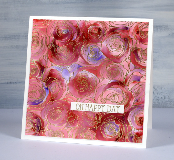
Here is another example of this technique but done with two colours of brusho.
Alcohol Ink Gel Print
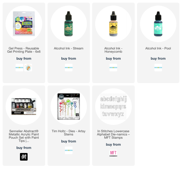
Posted: June 19, 2023 Filed under: Alcohol Ink, artsy stems, gel press, little lowercase letters, My Favorite Things, Tim Holtz | Tags: gel press, gel printing, My Favorite Things, Ranger Alcohol Ink, Tim Holtz 3 Comments
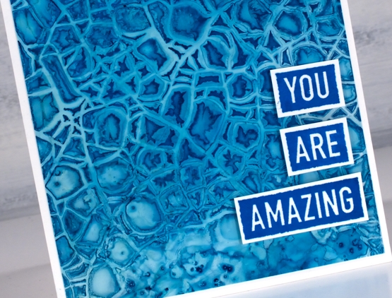
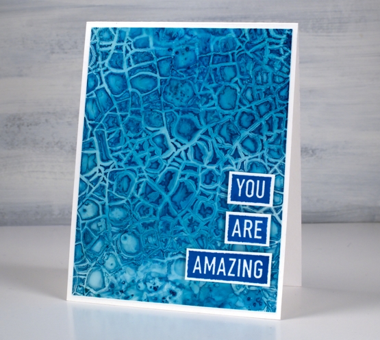
Last Monday I posted a faux batik look created on the gel plate. Today’s card is not faux alcohol ink; I did create a design on the gel plate with alcohol inks then picked it up with acrylic paint. Alcohol inks dry quite quickly so they are fun to fiddle with on a gel plate.

I can’t remember exactly which inks I used but I imagine there was a blue and yellow alcohol ink involved and perhaps ‘stream’ which is a deep teal colour. I sprinkled them on the gel plate, added some isopropyl alcohol to get the colours moving and then used a homemade stamp to add the flower shapes. In my online gel printing course I have a whole lesson about making and using homemade stamps with acrylic paints. Using them with alcohol inks is also an option as shown on this card. The speckled look over the panel is from adding a spritz of isopropyl alcohol to the plate before letting it dry.

I pulled the print with gold acrylic paint which has given the whole panel a goldish tint and in real life a bit of shine and shimmer. To finish the card I added a die-cut flower and letters in a co-ordinating colour. The letters were cut with MFT ‘little lowercase letters’ which might not be available anymore but I have linked to a similar set.
(Compensated affiliate links from Foiled Fox & Scrap n Stamp)
AI + Stencils Blue Edition
Posted: January 31, 2022 Filed under: Alcohol Ink, crackle, Darkroom Door, geometric stars, grafix, mesh, MFT stencils, My Favorite Things, Pink Fresh studio, Stencils, tall flowers, Uncategorized, you are everything | Tags: Darkroom Door stamps, Darkroom Door stencils, grafix, grafix craft plastic, My Favorite Things, pinata alcohol ink, Pink Fresh studio, Ranger Alcohol Ink 11 Comments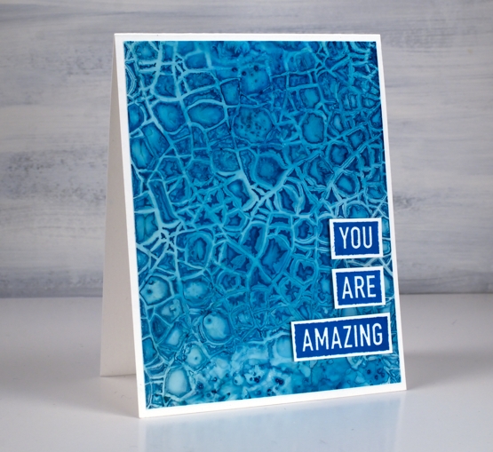
After success with one of my detailed stencils over an alcohol ink panel I tried a few more all with a mix of blue inks. The one above features the Darkroom Door crackle stencil over a mix of cloudy blue and stream inks.
There is also a little bit of salt sprinkled on the panel where the stencil did not make consistent contact. This technique is definitely not for the impatient among us!
I am still working on Grafix white craft plastic and often starting over the top of a panel that already had ink on it. All the card bases are Neenah solar white.
The stencil above is MFT geometric stars and I positioned it over a panel of denim and stream inks with some leftover copper as well. The ‘print’ is not very consistent but I like the way a distinct line is right next to a blurry pattern.
I finished this one off with a die from the Pinkfresh Studio ‘sending’ die set.
I worked with the DD mesh stencil a couple of times because it didn’t make consistent contact on my first attempts. I found if I taped it over the alcohol ink panel onto a piece of scrap cardboard I could bend the cardboard slightly to make sure stencil stayed pressed onto the wet alcohol inks. I just popped the piece in the right sized container to keep it bent while it dried.
This one is a mix of denim, cloudy blue, silver and a tiny bit of stream down in the right hand corner. I added a sentiment from the DD ‘tall flowers’ set.
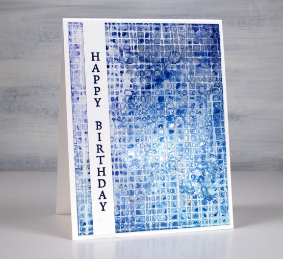
As you can see my fascination with this technique continues. I did pick up a couple more detail stencils the other day for this very purpose. I will also give it a try with some watercolour paints and paper. I’m sure the result will be different as the watercolour paints soak in but I think there could be a pretty and subtle pattern. Stay tuned!
Supplies
(Compensated affiliate links used when possible)
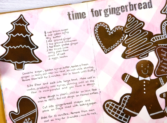
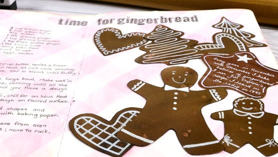
Gingerbread Journal page
Posted: January 7, 2022 Filed under: Art Journal, Brusho, My Favorite Things | Tags: Art Journal, Brusho, Dr Ph Martin Hydrus watercolor paints, My Favorite Things 7 Comments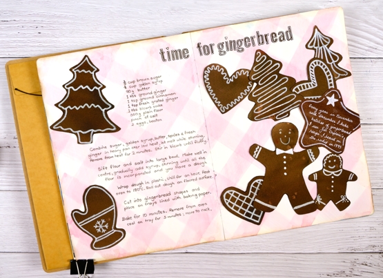
Six years ago I was given a delightful and incredibly thoughtful gift. Four friends I met through teaching card making classes gave me an art journal. It’s a large Dylusions 9″x11″, a very generous gift in itself.
The journal was just part of the gift. What amazed and touched me deeply was that these friends worked on individual pages in this journal far enough in advance to have completed four different spreads before they gave it to me. Each person completed a 2 or 3 page spread describing Christmas traditions they were familiar with.
I have in my journal pages about Polish and German Christmas traditions along with a description and illustration of Mummering in Newfoundland and a depiction of the carol, ‘I Saw Three Ships’. The depiction is set in Bass Strait with a view of a King Island lighthouse, a nod to my birthplace! I was speechless when I opened the gift and it still brings me joy whenever I look at it.
After Christmas that year I began two different spreads in the journal having decided it was to be filled with Christmas themed art journalling. Although I began soon after receiving the journal I didn’t finish a page until last week. I am embarrassed to have let it sit so long but in the interim I have completed many journal pages in other books and have ideas aplenty dancing around in my head – like sugarplums!
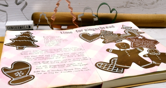
Gingerbread baking and decorating is a tradition for me and a fitting choice for my first Christmas spread. I started making gingerbread in Australia in 1995 after hearing a radio interview with Jill Dupleix whose recipe I use to this day, more often than not with gluten free flour now. This year I made several batches, a couple with friends on a Sunday afternoon where much mixing, cutting and decorating was enjoyed.
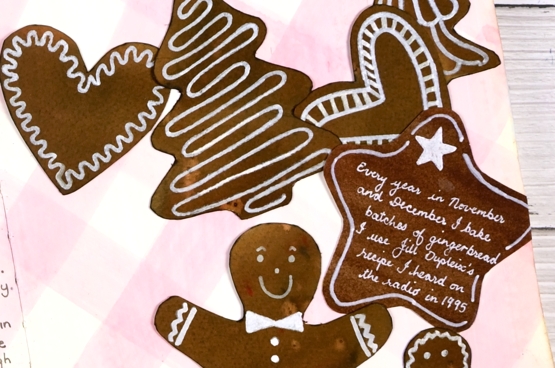
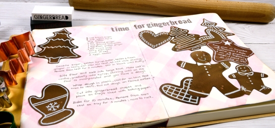
I used my own cookie cutters to trace the shapes onto watercolour paper painted with dark brown and light brown brusho. The background ‘check tablecloth’ I painted with a mix of Dr Ph Martin’s deep red rose and hansa yellow. The gingerbread shapes sat for years with pale white patterns on them and it was only this year after trying quite a few white paints and pens that I was able to make the patterns bolder with a posca paint pen.
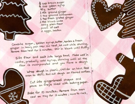
I finally added the recipe, glued the cookies down and added a title using MFT little lowercase letters (I think they are retired now but they worked to look like little gingerbread letters).
So that is the story of a wonderful journal, four kind and generous friends and an adventure started in 2015 which I am happily continuing even though I made a very slow start.
Supplies
(Compensated affiliate links used when possible)
You’re a star
Posted: February 19, 2021 Filed under: Alexandra Renke, Heather lowercase die set, My Favorite Things, ornamental star stencil, Pink Fresh studio, YAY for you | Tags: Alexandra Renke, My Favorite Things, Pink Fresh studio, Ranger Distress stains 7 Comments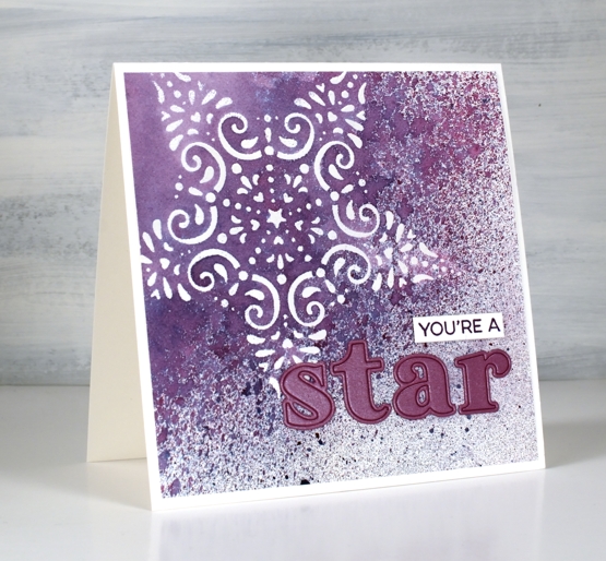
I’ve been wanting to work with some of my new stencils and the CAS Mix Up challenge is currently a embossed stencil challenge so I got to work. I taped the Alexandra Renke ornament star stencil to a piece of hot pressed watercolour paper and started sponging some versamark ink through the stencil. I soon switched to just squishing the versamark ink pad directly on the stencil as that was faster. I embossed the star in clear powder then put the panel in a box so I could spray some stain over it without decorating myself or my desk.
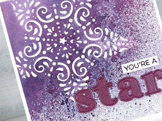
I sprayed seedless preserves, faded jeans and speckled eggs distress stains over the panel from 20-30cm away and ended up with a pretty speckled panel. I wanted to make the spotted sprayed area transition from speckled to solid so I painted water over one edge then spritzed water next to the painted area which achieved my goal leaving some of the panel barely touched by water. It took quite a while to dry and impatient me did smudge some of the speckles but they are underneath the die cut letters now so no harm done.
I applied tape to the back of a piece of co-ordiating cardstock then cut the letters s,t,a,r out using the ‘Heather lowercase alphabet’ die set from Pink Fresh studio. I searched through my stamps and dies to find a sentiment I could alter to say ‘you’re a’ and ended up using part of a stamp from the MFT ‘Yay for You’ set stamped in versafine monarch ink.
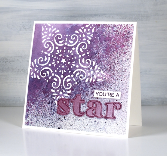
When I was doing the spray over embossing step I realised this stencil is probably going to pair up with spray stains again in an art journal page, the speckled effect over the lacy star is just so pretty.
I’m excited to participate in a challenge again, it has been a while! There is still time to get involved if, like me you have stencils that are waiting patiently to be the star or even the background of a card.
Supplies
(Compensated affiliate links used when possible)
See you soon
Posted: January 5, 2021 Filed under: Darkroom Door, gel press, My Favorite Things, Pink Fresh studio, starry night, Stencils | Tags: Darkroom Door stencils, gel press, gel printing, Pink Fresh studio 11 Comments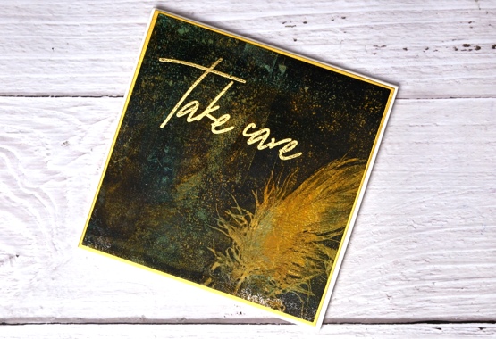
Just popping in with a couple of cards carrying a couple of messages for you. I hope your new year is off to a good start; I am still enjoying the beauty of an array of Christmas cards sent from around the world, thank you my creative friends for brightening up the midwinter days.
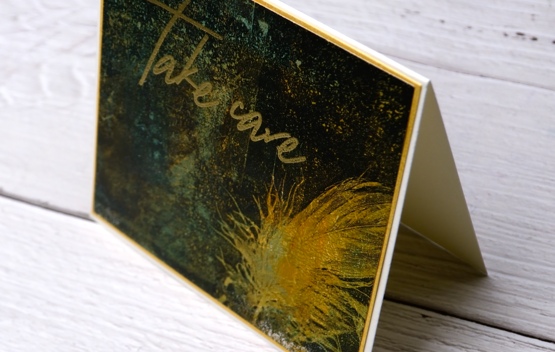
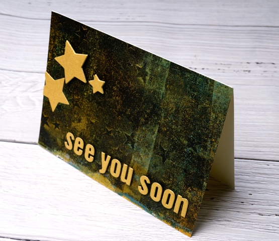
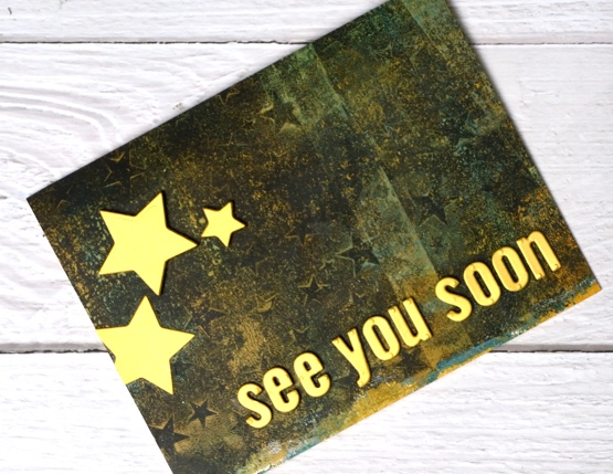
I made today’s cards from a gel printed panel done several months ago. I can’t remember the paints but you can see there was definitely orange, aqua and black. The panel I cut up is shown below, most of it included distinct or faint stars made with the Darkroom Door small starry night stencil. Along one edge there were two very distinct feather prints made with real feathers.
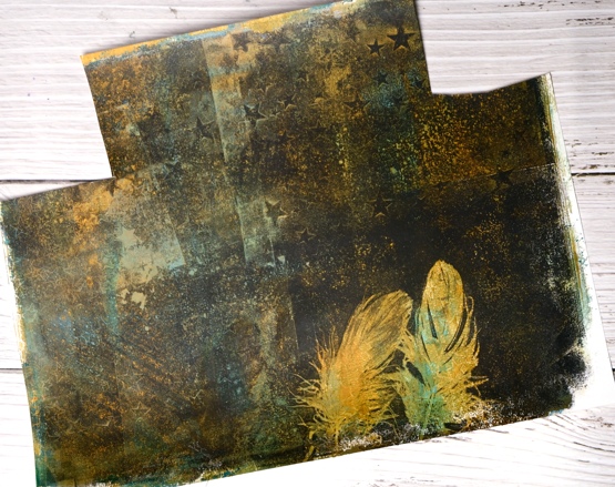
I ended up cutting a square which included one feather, leaving me one for another project. I also cut a rectangle covered in colour and texture which became the base for die cut letters and stars. I chose gold cardstock and gold embossing powder to add some brightness and shimmer on top of the dark background featuring a ‘scripted bold sentiments’ stamp from Pinkfresh Studio, alphabet dies from MFT and nesting star dies from We R Memory Keepers. I popped up the letters and the stars on black foam which kind of makes them appear to be floating.

I wanted to let you know I am taking a short blogging break so I can devote some time to planning and prep. I will be working on projects to share with you over the coming months. Ideally I would have done this before I stopped for Christmas but that didn’t happen so I’m doing it over the next week or so. I have lovely ideas and projects floating round in my head, I have a little stash of stencils and stamps that haven’t been out of their packets and some new release products from Penny Black on the way.
It has been a while since I devoted time to gel printing, alcohol inks, stenciling and lettering so that’s on the list along with some more hand painting. I will be making some videos to share here on my blog and youtube channel. I have a new online class in the works also. So you see while it’s quiet on the blog it will be busy behind the scenes.
As always I am happy to answer questions and I’m open to requests or suggestions for new projects and videos. If you feel like diving into one of my online classes just click on COLOUR CLUES or WINTER WONDER to learn more. (Here is a discount code for COLOUR CLUES which will take 20% of the price until January 15, 2021 HTNY21 )
So take care everyone, I’m looking forward to sharing techniques and experiments, cards, journal pages, paintings and more here on the blog during 2021. See you soon…
Supplies
(Compensated affiliate links used when possible)