Rose Dance & a Giveaway
Posted: May 19, 2021 Filed under: A2 layers, Additional A2 layers, Papertrey Inks, Penny Black, rose dance, Waffle Flower | Tags: Papertrey ink, Penny Black stamps, Waffle Flower dies 48 Comments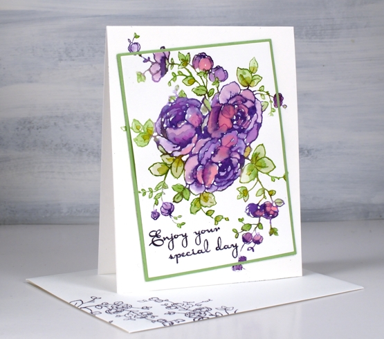
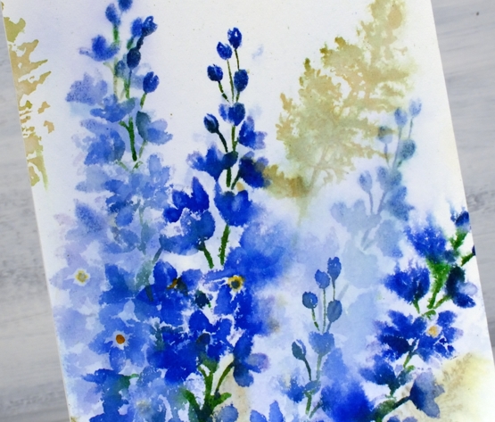
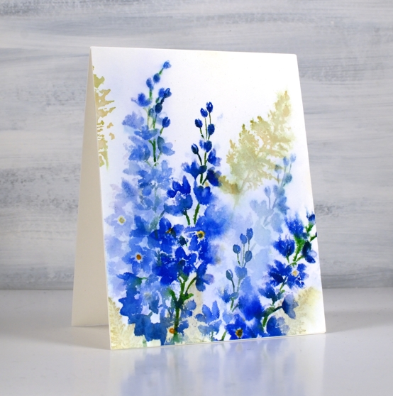
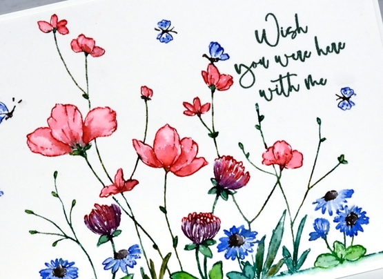
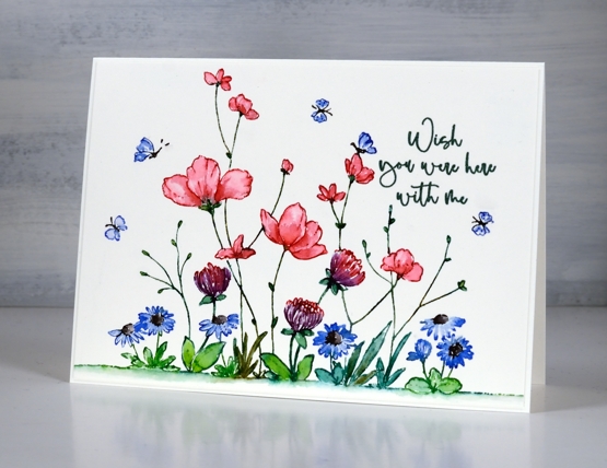
When I first posted a card with the PB ‘rose dance‘ stamp I mentioned I’d been putting it to work with several techniques. To create this card I worked on hot pressed watercolour paper with papertrey ink cubes.
With the stamp and paper in the stamp positioner I inked the roses in ‘royal velvet’ and a few dabs of ‘pure poppy’ inks, spritzed then stamped. I used three different greens (listed below) for the leaves and stems. The papertrey ink cubes are fairly juicy to start with but with a spritz of water before stamping the ink is wet enough to blend into the petals and leaves.
When it came to putting the card together I decided to mix things up a little by cutting out the main image on an angle before adding some dimension with a few extra layers of cardstock. The Waffle Flower A2 layer dies and additional layer dies made it possible to cut the image from the panel, cut a scrap the same size to fit in the space and cut a slightly larger green mat before putting it back together. I pulled out an older PB sentiment set ‘kind words’ and stamped the message in dusty concord archival ink.
This technique is covered in lessons 2 of my new online class FLORAL FAVES. The lessons cover a range of my favourite techniques, some simple and elegant, others requiring more time and fine detail but all outlined clearly on video so they can become your favourites too! Registration opens tomorrow and I will have all the information in tomorrow’s blog post.
If you would like to win a place in the FLORAL FAVES class please comment below telling me one of your favourite flower stamps. I will randomly pick a winner and announce it here on the blog on Monday.
Supplies
(Compensated affiliate links used when possible)
Mixed Media-ish
Posted: May 17, 2021 Filed under: daisy delight, Darkroom Door, French Script, scratches, scripty, Stampin Up, you are everything | Tags: Brutus Monroe, Darkroom Door stamps, distress oxide inks, Stampin Up, Tsukineko Versafine inks 5 Comments
I have in my workroom a few new items to try but with one thing and another I haven’t had a chance. I recently bought two new pads of paper, one is rice paper and the other is mixed media paper from Fabriano, that’s the one I used for today’s cards. I’m very taken with Fabriano 100% cotton watercolour paper so I wanted to see what I thought of the mixed media.
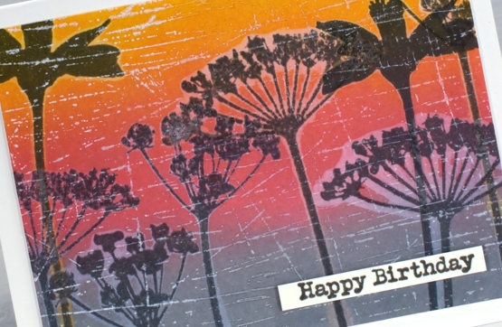
It is quite a while since I’ve done anything with my oxide inks so I pulled them out to make a blended background. After blending I did some water-stamping with both the DD ‘daisy delight’ background stamp and the floral silhouettes from the DD ‘you are everything’ set. The paper worked brilliantly for both steps. After drying the panels I stamped again with versafine clair inks and, as I hadn’t moved the stamps, the inked images landed inside the watermark images.
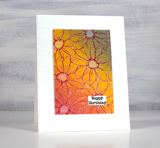
I dried all the stamping with a heat tool before adding background stamps over the top for added texture. I used white ink for both the DD ‘French script’ stamp and the DD ‘scratches’ stamp. The daisy stamp ended up with a double dose of script when I embossed a white base layer with the SU ‘scripty embossing folder.
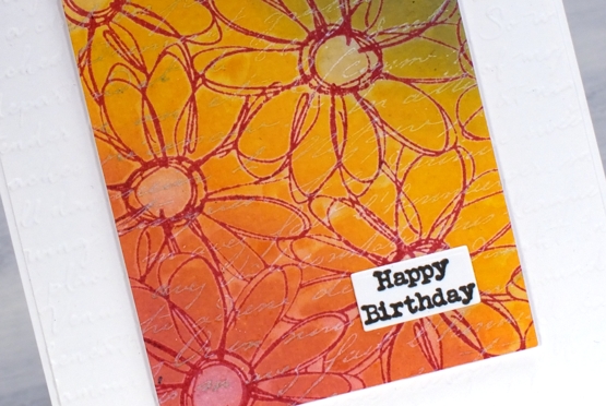
I gave both cards a little birthday label and pronounced the mixed media paper a success. Of course I will put it through it’s paces with gel printing and a few other processes but so far so good.
Supplies
(Compensated affiliate links used when possible)
Cow’s it going?
Posted: May 14, 2021 Filed under: Cow's it going?, Pink Ink Designs, Stampin Up, subtle | Tags: Fabriano Watercolour Paper, Pink Ink Designs, Stampin Up 18 Comments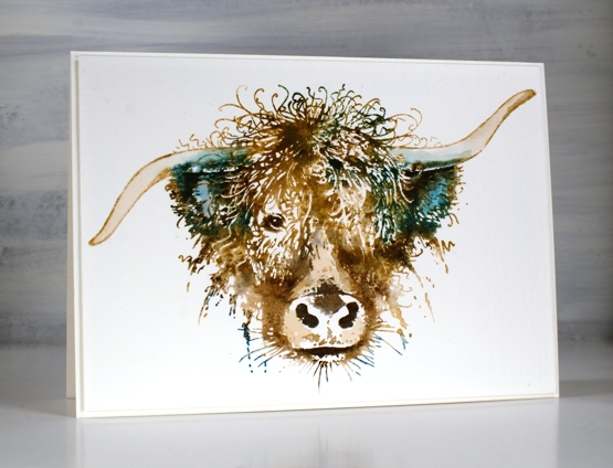
How much do you love this big highland cow? I hope you don’t mind this departure from my usual subject matter but there is something about this cow (and some other beauties from Pink Ink Designs) that amuses and inspires me! When I saw this stamp I knew it would make the perfect birthday card for someone I know who finds highland cows adorable. Although confused by my behaviour, Crop A While here in Ottawa ordered it for me and I’m so glad.
This card is stamped and painted with dye inks, classic kraft papertrey ink as a base colour then four distress colours to highlight, shade and add personality to the beautiful face and hair-do. I worked in a stamp positioner so I could add the colours bit by bit to build up the image. I did some painting and blending with a paint brush but kept white areas also as they add so much to the design.
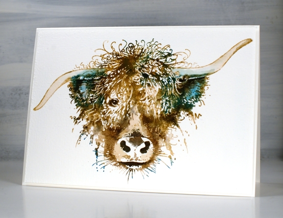
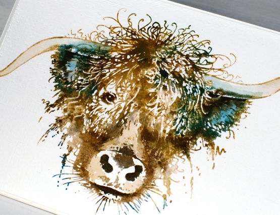
After I had completed the painting part I decided not to add anything more but instead ran the panel through the die cut machine inside the SU subtle embossing folder. If you look at the close up image you might just see the linen texture achieved. The ‘cow’s it going’ stamp set includes eleven smaller stamps along side this one including some distinctly Scottish ones so I’m looking forward to following that theme another time. My name is Heather after all, Heather McDonald originally!
Hope you are having a good hair day, like this cow obviously is!
Supplies
(Compensated affiliate links used when possible)

Lilac & Fern
Posted: May 12, 2021 Filed under: fresh ferns, Karin brushmarkers, lovely lilacs, Penny Black | Tags: Fabriano Watercolour Paper, Karin brushmarkers, Penny Black stamps, Ranger Distress inks 10 Comments
I don’t think I am alone in calling this stamp set a favourite. The two lilac stalks are pretty alone but with a sprig or two of fern they are delightful. I stamped this panel a while ago so the exact process is no longer firm in my memory but I do remember a crucial step which I will share with you.
I inked then stamped the lilacs with a mix of distress inks and Karin markers and the ferns with peeled paint distress ink. It looked ok but not the soft blended bunch I was after. I did like the combo of lilacs and ferns though so I thought I would dilute it all and see what happened. I didn’t spritz it; I drowned it. I dipped the whole panel in a bucket of water (the laundry is right beside my workroom) and watched a lot but not all of the colour drain away. The brightness of the peeled paint ink washed out but the olive stain remained. The lilacs washed out to a paler version of themselves and it was rather nice.
I re-inked the lilac stamps with the royal blue, lush green, henna and gold markers and stamped darker more distinct lilacs over the top. I have a friend who has had many successes with what she calls the ‘drowning’ method. It’s worth a try if your panel is not going in quite the direction you wanted; what have you got to lose? It’s only paper!
Although it is not quite ready yet my new online class, Floral Faves, is getting closer every day and I will be teaching techniques using your floral stamps to create card sized art works like the one above. I can’t wait to open the class and of course I will let you know as soon as it happens. Stay tuned!
Supplies
(Compensated affiliate links used when possible)
Patina peacock pattern
Posted: May 10, 2021 Filed under: Altenew, dancing peacock embossing folder | Tags: Altenew, delicata inks, Ranger Distress inks 7 Comments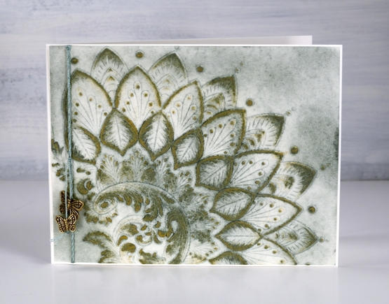
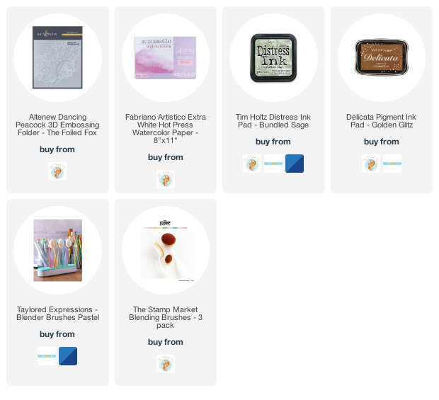
After creating a very colourful panel with the dancing peacock embossing folder I was happy to come up with a more muted and aged looking panel. Like most crafters I am always pleased to use my supplies in many different ways.
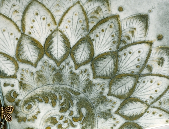
Once again I worked with hot pressed watercolour paper in case I wanted to add water but as it turned out I other than a small spritz to stop the paper from tearing in the folder I didn’t use water. This card turned out to be very much a ‘limited supplies’ card as the green ink (bundled sage) was applied in the embossing folder and then more with a blending brush after embossing. The gold ink (delicata golden glitz) was applied direct to paper so it just landed on the raised sections. Simple but effective definitely describes this technique.
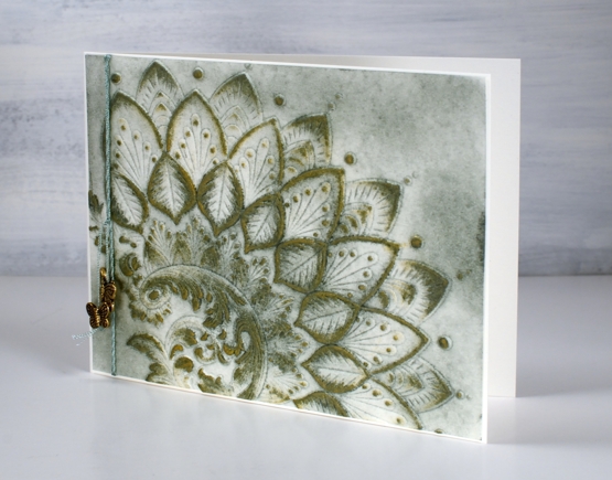
I played with a sentiment strip but ended up embellishing with only green embroidery thread and two brass toned butterflies given to me by a friend quite some crafty time ago. I am hoping for another day of simple but effective creating today!
Supplies
(Compensated affiliate links used when possible)
Pathway
Posted: May 7, 2021 Filed under: Karin brushmarkers, pathway, trailing | Tags: Karin brushmarkers, Penny Black stamps, Ranger Distress inks, Tsukineko Versafine inks 6 Comments
I’ve taken a moody path for today’s card using the new PB ‘trailing’ stamp for some overhead foliage and the scenic PB stamp ‘pathway’ for the background image.
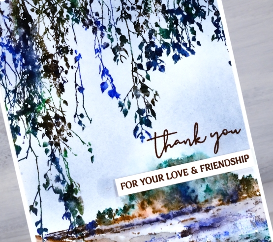
I inked both stamps with Karin brushmarkers, a brown, a green and a blue. I added a spritz of water before stamping both images and then did more blending with a brush of the pathway image on the panel. To add some background colour I blended stormy sky distress ink with a blending brush.
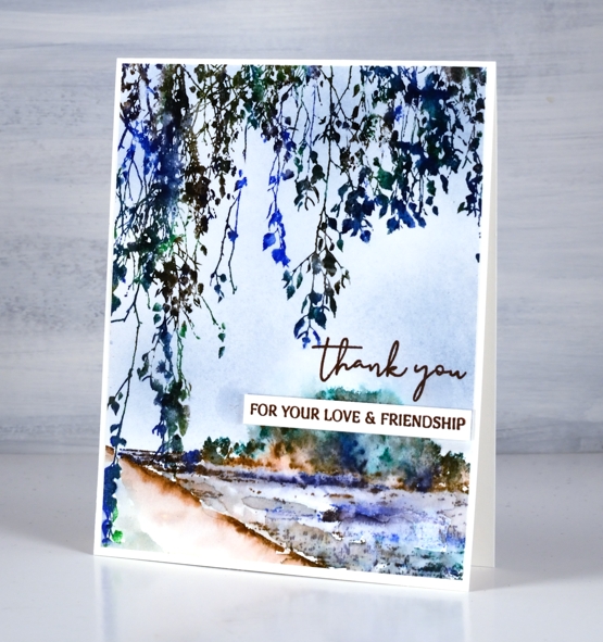
To complete the card I stamped the scripty thank you from PB ‘million thanks’ and a separate phrase from the PB ‘ever thanks’ both in versafine acorn ink.
Supplies
(Compensated affiliate links used when possible)
Simple Delight
Posted: May 5, 2021 Filed under: delight, Karin brushmarkers, Penny Black | Tags: Fabriano Watercolour Paper, Karin brushmarkers, Penny Black stamps 7 Comments
The colour scheme you see above is one of my favourites; I love pinks and blues and combinations of pink and blue. I also like green way more than I used to especially when paired with blue. I am talking about more than art and cardmaking; the clothes in my closet are blue, pink, burgandy, navy, white and combinations of the above!
I used Karin brushmarkers to both stamp and colour this panel featuring the PB ‘delight’ stamp; it’s a technique I often use and one that I teach in my new online class, Floral Faves. At the risk of boring you I am going to keep talking about my new class because I am very excited about it and very busy getting ready to launch it.
I used the following markers; magenta, lush green, henna, lilac, black, royal blue varying the greens with the help of the ‘henna’ marker to add more yellow tone. The stamp is a large one but I extended the edge of the ground even more with a few dots and dashes of green marker blended underneath with water. I kept this card design very clean with plenty of white space, the only added texture being the subtle border of the painted panel over a slightly larger card base in the same colour. I just felt the pretty colours were enough. To see a different look with the same stamp check out this card.
Supplies
(Compensated affiliate links used when possible)
2021 BuJo – May title page & to-do list
Posted: May 4, 2021 Filed under: Bullet Journal, Dingbat notebooks, Penny Black, Promise Me | Tags: Bullet Journal, Dingbats notebook, Penny Black creative dies, Ranger Distress inks, Staedtler watercolour brush pens 1 Comment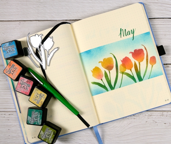
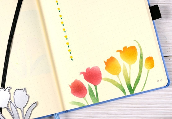
Each month I plan to post the theme for the next month just before the month starts. I even managed to finish this page a week before May 1st but didn’t get it photographed until this morning! Last month blossom was my theme and I am yet to see blossom in my garden, tulips however, have appeared. I only have one tulip that has survived the critters, it is a yellow-red mix and it is blooming at the moment.
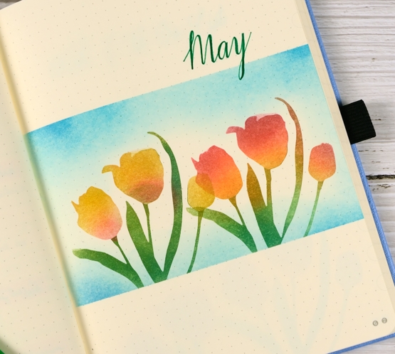
To create my tulip panel I masked above and below with large post-it notes then die cut the tulips from masking paper using the PB ‘promise me 2’ die. Like my own tulip these ones are a mix of red and yellow.
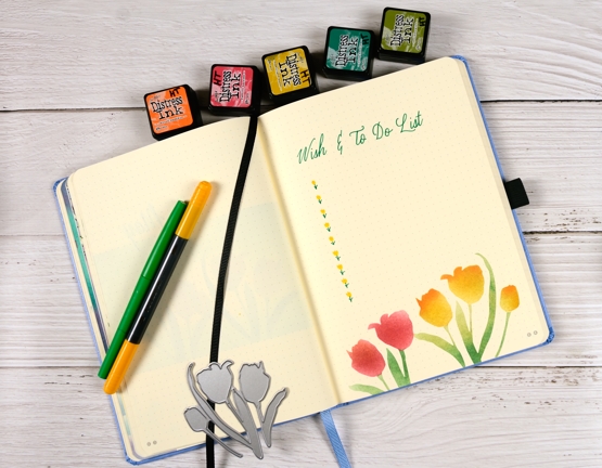
I blended distress inks with blending brushes and got better at protecting the leaves while blending the flowers by the time I did the wish/to-do list page. I drew little stems in green then used the brush tip end of the staedtler brush pen to make the yellow tulip petals.
Just for interest I looked back over my Jan-April wish/to do lists to see how if I am managing to get things done. Most months I check off more than I don’t but never all. I have had my next online class as an item on every list this year and some months I made progress, others I didn’t due to how I was feeling and what other commitments I had. But great progress has been made in April and May so ‘FLORAL FAVES’ is coming!
Supplies
(Compensated affiliate links used when possible)
Tropical florescence
Posted: May 3, 2021 Filed under: Brutus Monroe, florescence, Penny Black | Tags: brutus monroe embossing powder, Fabriano Watercolour Paper, Penny Black stamps, Ranger Distress inks 8 Comments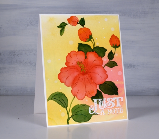
This is the second appearance of the beautiful hibiscus stamp from Penny Black (it’s called Florescence and it’s a stunner) and I’ve been working with it behind the scenes as I complete my next online class. To create this tropical look I smooshed worn lipstick and wild honey inks on my glass mat and spritzed water over them until they ran together then took a piece of hot pressed watercolor paper and swiped it through the diluted inks. To get good coverage and blends I tilted and spritzed more water on the panel then left it to dry.
With the panel in a stamp positioner I inked the large hibiscus and buds with worn lipstick ink stamped then inked the rest of the stamp with antique linen so I could see the whole image for some no-line watercolour. I painted one petal at a time with worn lipstick ink adding more towards the center of the flower. For the buds I used a mix of worn lipstick and wild honey.

For the leaves I stamped and painted with rustic wilderness distress and sometimes added worn lipstick to the blend so I’d have variation in the leaf colours.
That little sentiment seemed to lend itself to the tropical, surf shop vibe so I stamped once in worn lipstick, then moved the panel ever so slightly down so I could stamp again in white to create a drop shadow look. I definitely dried it and used an anti static tool before sprinkling the white embossing powder over the words otherwise it could have all ended up white.
I’m so excited to have another online class in the works; the projects are all filmed so it’s editing time, supply list creating time and intro filming time. I’ll have more details, dates and sneak peaks for you soon!
Supplies
(Compensated affiliate links used when possible)
Puppy’s Quilt
Posted: April 30, 2021 Filed under: Colorado Craft Company, puppy's quilt, sennelier watercolours, simple strips, Taylored Expressions, weathered | Tags: Colorado Craft Company, Fabriano Watercolour Paper, sennelier watercolours, Taylored Expressions 5 Comments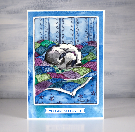
I created this sweet dog card for a friend to give her grand-daughter. You know it is unusual to see animals on my cards but this stamp had the perfect mix of watercolourable-quilt and not-too-difficult-to-paint dog. The colour scheme is all my own choice, no surprises there, but some of the technique was provided by the talented and prolific Sandy Allnock. When she created with this stamp she used the opportunity to teach how to paint a bold shadow. I decided not to add a bold shadow but just watching her paint the image was helpful. It made me realise there was absolutely no need to add more than one colour to each quilt square even though the fabric included patterns.
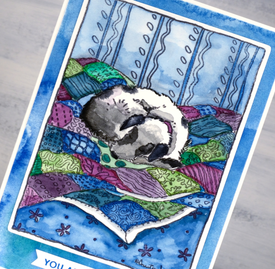
I stamped the image on hot pressed watercolour paper in versafine clair morning mist, a pigment ink which would not move when I added water and watercolour paint over the top. I used Sennelier watercolours for all the painting and to create a custom watercolour mat to frame the image also. I watched Sandy’s video more than once to help me paint the dog taking care to leave some areas bright white while the sections closer to the quilt were shadowy and grey.
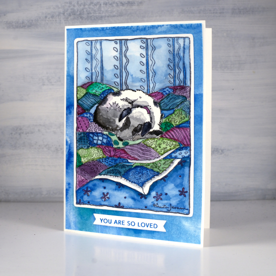
The sentiment is from the Taylored Expressions ‘simple strips’ set stamped in versafine deep lagoon and cut with the co-ordinating simple strips die. If you haven’t seen the simple strips series from TE they are very clever; you get one large stamp with 18 different sentiments and one die that cuts them all into banner style strips. Very handy to have a bunch of strips on hand to add to cards. It isn’t noticeable in the photos but the blue watercoloured mat has some texture as I embossed it with the weathered embossing folder, also from Taylored Expressions.
Supplies
(Compensated affiliate links used when possible)