Simple Delight
Posted: May 5, 2021 Filed under: delight, Karin brushmarkers, Penny Black | Tags: Fabriano Watercolour Paper, Karin brushmarkers, Penny Black stamps 7 Comments
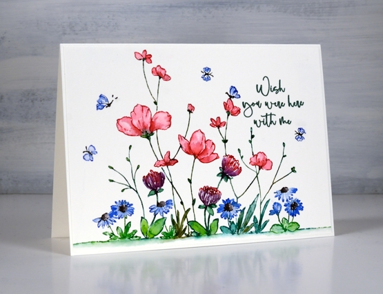
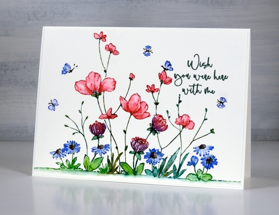
The colour scheme you see above is one of my favourites; I love pinks and blues and combinations of pink and blue. I also like green way more than I used to especially when paired with blue. I am talking about more than art and cardmaking; the clothes in my closet are blue, pink, burgandy, navy, white and combinations of the above!

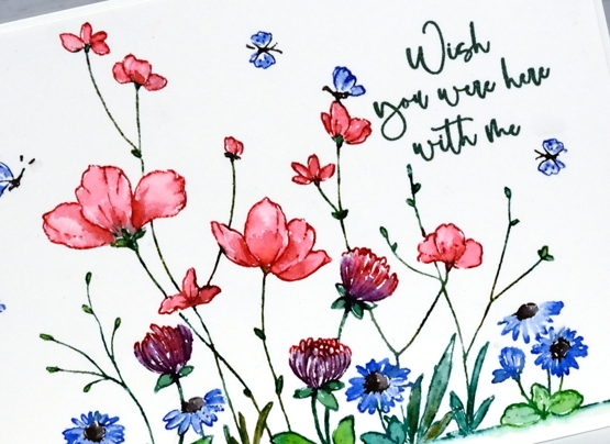
I used Karin brushmarkers to both stamp and colour this panel featuring the PB ‘delight’ stamp; it’s a technique I often use and one that I teach in my new online class, Floral Faves. At the risk of boring you I am going to keep talking about my new class because I am very excited about it and very busy getting ready to launch it.

I used the following markers; magenta, lush green, henna, lilac, black, royal blue varying the greens with the help of the ‘henna’ marker to add more yellow tone. The stamp is a large one but I extended the edge of the ground even more with a few dots and dashes of green marker blended underneath with water. I kept this card design very clean with plenty of white space, the only added texture being the subtle border of the painted panel over a slightly larger card base in the same colour. I just felt the pretty colours were enough. To see a different look with the same stamp check out this card.
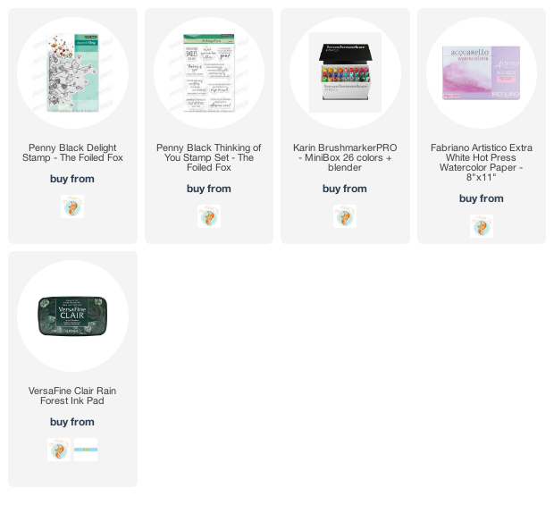
Supplies
(Compensated affiliate links used when possible)


Beautiful pic ! Especially like using burgundy in the colors
Sent from my iPhone
Love this
This is so striking with your color choices as well as the highlights in your painting. Love the white background, truly showcasing the artwork. Beautifully done!
I can just hear the bees buzzing! Your combination of colors is perfect! Love how the white space balances and makes the colors pop! Wow!!
Gorgeous colouring of this sweet image, Heather. LOVE pink too … looks amazing with the blue. xx
I wish I was there with you too, Heather! Love how you’ve colored this beautiful garden!
Perfect Heather, and seemingly simple but you could so easily have got a splash of ink on the background but it is pristine and the colours look great together. x