Autumn Bouquet
Posted: September 17, 2021 Filed under: autumn bouquet, fragile branches, fresh ferns, Penny Black | Tags: Fabriano Watercolour Paper, Penny Black stamps, Ranger Distress inks 12 Comments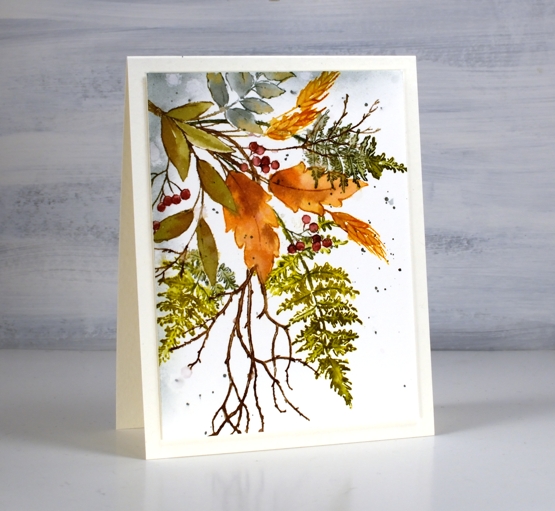
Are the leaves changing where you are? I noticed this morning a few patches of colour on the predominately green trees. The mornings are quite fresh too and the sunsets are amazing. Today’s card features a new Penny Black stamp ‘autumn bouquet’ teamed up with a couple of favourite filler stamps, ‘fresh fern’ and ‘fragile beauty’.
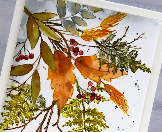
I kept the autumn bouquet stamp in the positioner so I could stamp each element one at a time. There are three types of leaves plus the wheat and the berries. All were done with a combination of inks. Often I ink the image using markers then smoosh the corresponding ink pad on my glass mat to give me ink for painting inside the stamped image.
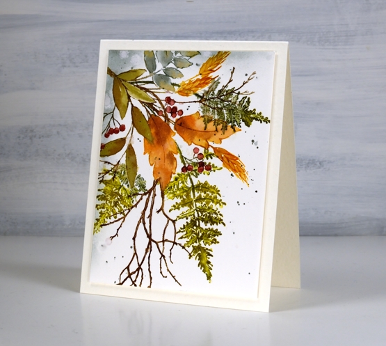
I used partial stamping to add the fern fronds and twigs. I usually ink the bit furtherest from the existing stamping then fill more in each time I stamp so as to avoid stamping over the top of other elements. This is because I am often too lazy to mask the stamping I’ve already done.
After painting and blending inside all the stamped images I used blending brushes to add iced spruce to two edges and splattered some over the panel. I trimmed and popped up the panel on a white luxe card base.
Have a wonderful weekend, thanks for dropping by.
Supplies
(Compensated affiliate links used when possible)
Butterfly art journal page
Posted: September 15, 2021 Filed under: Art Journal, Butterflies, Darkroom Door, diamonds, French Script, gel press, Mixed Media, starry night, Stencils, Wildflowers Vol 1 | Tags: Art Journal, Darkroom Door stamps, Darkroom Door stencils, gel press, gel printing, Mixed Media 4 Comments
My art journal is a place where I experiment with new techniques and mediums. It’s also a place for taking ideas further after making a card or creating a gel print. For this butterfly themed page I experimented with layering. I don’t find layering easy so it is a good technique to be playing with in my journal. You can’t see all the layers clearly on this page but there are layers of rice paper under gesso as well as on top of it.

Another technique which I am just beginning to play with is sewing on cards and mixed media pieces. Rachel Greig from Darkroom Door is a master at it and provided loads of inspiration during her recent Artful August challenge. I have tried sewing on paper with my precious Pfaff sewing machine but it didn’t like it so a few weeks ago I bought a second hand machine especially for sewing heavy and unusual materials. The machine is an old one but it is very sturdy and hums along beautifully.

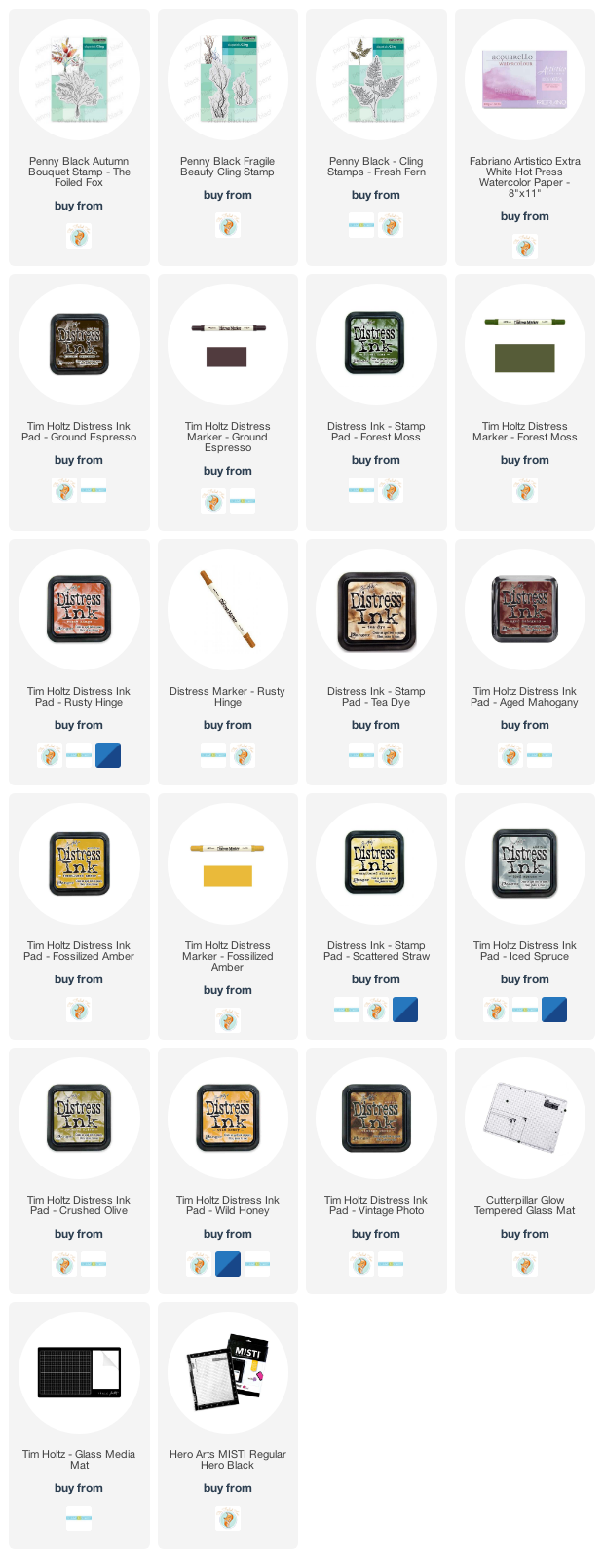
I began by tearing up a large gel print done on rice paper. It featured diamonds on one side and stars on the other, both patterns made with large Darkroom Door stencils. The colour scheme was blues, reds and gold. I glued the torn pieces around the edges with gel medium then painted over them with diluted gesso. After the gesso dried I stamped a few butterflies then added more gesso over the top.
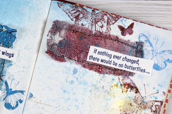
I spritzed over the pages with a faded jeans and broken china distress sprays, only enough to add a bit of speckle here and there, not so much as to cover the colour and pattern underneath. I stamped more butterflies from the DD butterflies set in colours similar to those in my gel print patches.
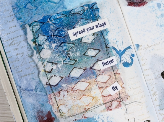
Once the stamping was done I sewed borders around two pieces of gel printed rice paper then glued them on the pages. I stamped, cut out and glued down sentiments from the DD wildflowers vol 1 stamp set.
Oh, and I stamped the DD French script stamp a couple of times on each page in gold to co-ordinate with the gold on the gel prints. Not a ton of layering or sewing but I am learning how to paint over background layers just enough to make them fade but not so much that they disappear. I realise looking at these photos that the gel print on the left looks like a pocket… it’s not but that’s an idea for another page.
Supplies
(Compensated affiliate links used when possible)
Trailing leaves
Posted: September 10, 2021 Filed under: mountain magic, Penny Black, Stamped Landscapes, trailing | Tags: Penny Black stamps, Ranger Distress inks 9 Comments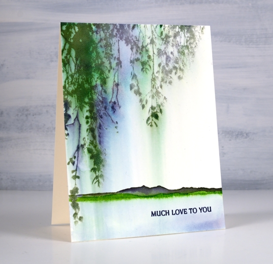
The PB ‘trailing’ stamp featured in this card is definitely a versatile one; it works both hanging down as is here and growing up from the ground.
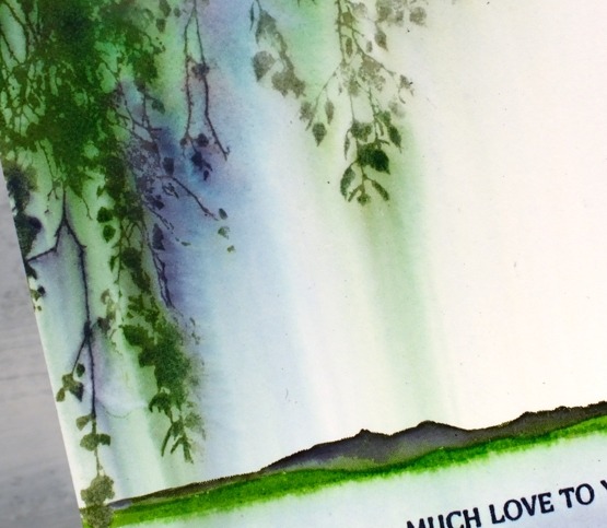
This card was very simple to make but I love the pretty blends and ‘weeping’ nature of the leaves. I inked the stamp with mowed lawn, chipped sapphire and iced spruce distress inks and stamped it on hot pressed watercolour paper. Soon after stamping I used a wide watercolour brush to paint water downwards over the stamping. The brush pulled ink from the stamping, blending and diluting it in the process.
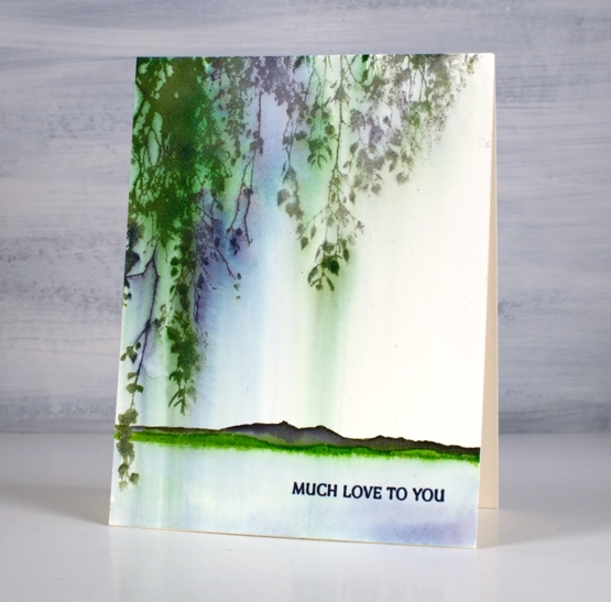
Once the panel was completely dry I inked the hills from the PB ‘mountain magic’ set in both mowed lawn along the base and then chipped sapphire along the top. I painted over the top with water and pulled the mowed lawn ink below the stamped image to look like the edge of a lake. As I am writing this I’m thinking about trying exactly the same design but in warm autumn tones…
Supplies
(Compensated affiliate links used when possible)

2021 BuJo – September theme
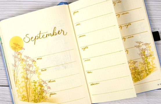
Posted: September 6, 2021 Filed under: Bullet Journal, Darkroom Door, Dingbat notebooks, Hand lettered, Nature Walk | Tags: Bullet Journal, Darkroom Door stamps, Dingbats notebook, Staedtler watercolour brush pens 6 Comments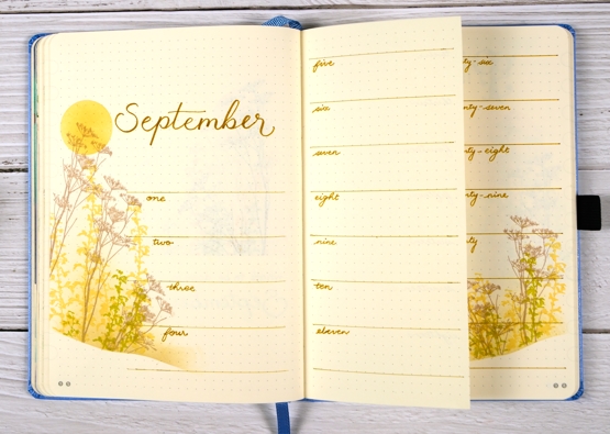
This was not the original plan I had for the September theme; I’d thought instead of doing apples. I sketched a few apples in preparation then realised I would want to have them on all my pages and that would take me half of September. I would then want to colour them in and that would take the other half of the month. I was already late on getting this done so….
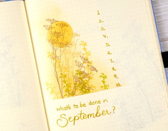
…when short on time and want something pretty what do you do? You pull out one of your faves! ‘Nature Walk’ from Darkroom Door is definitely a fave and for a late summer theme it works beautifully.
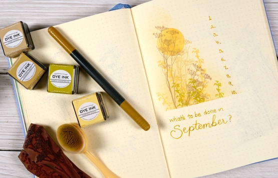
I began each page design with a masked sun, blended in harvest gold ink. Next I masked either a straight or hilly base and blended fine linen for the background then stamped flowers and grasses in gold, kraft and chartreuse.
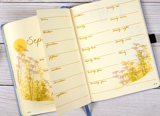
Life now includes a few more commitments so I decided to spread the month of September over a few pages with the middle one cut down narrower.
I also have a page for my work commitments, current projects, future projects, etc. The title is my attempt at a mixed up font. There are plenty of examples on the interwebs but I decided to make up this one out of my head. Not too bad for a first try. You would think it would be easy to do every letter a different way but even a mixed up font needs balance!
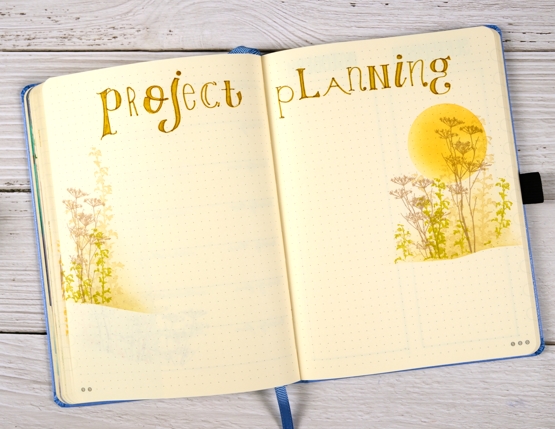
Hope you are feeling more balanced than mixed up! Have a great week.
Supplies
(Compensated affiliate links used when possible)
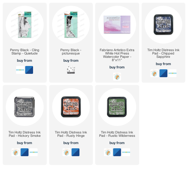
Lakeside Mountain
Posted: September 3, 2021 Filed under: Penny Black, picturesque, quietude, Stamped Landscapes | Tags: Penny Black stamps, Ranger Distress inks 12 Comments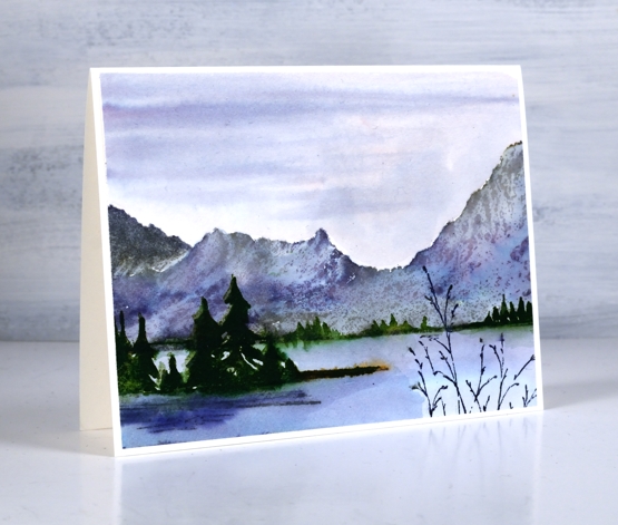
How did this happen? Another scenic card just snuck in while I wasn’t looking! I think it might be the fault of this mountain stamp, ‘Picturesque’. It is possibly the perfect stamp to put behind all other scenic stamps! And I haven’t even touched on winter scenes yet!
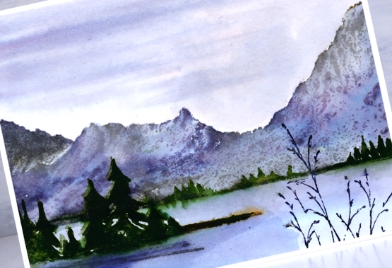
I stamped the mountains first in hickory smoke distress ink, painted inside the whole area with water and then added some chipped sapphire here and there. Once the ink dried I stamped the ‘quietude stamp in chipped sapphire, rustic wilderness and rusty hinge. I painted chipped sapphire in the sky and the lake and then painted more trees along the shore in the distance and pulled some of the ink into the lake to look like reflections.
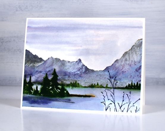
Doesn’t it look relaxing, like dusk with cloud cover? Hope you have a lovely weekend.
Supplies
(Compensated affiliate links used when possible)
Gouache Hand Painted Wreath
Posted: September 1, 2021 Filed under: Finetec paints, Gouache, Hand painted, Penny Black | Tags: Finetec artist mica watercolour paint, Gouache paints, Penny Black stamps, Stonehenge black watercolour paper 7 Comments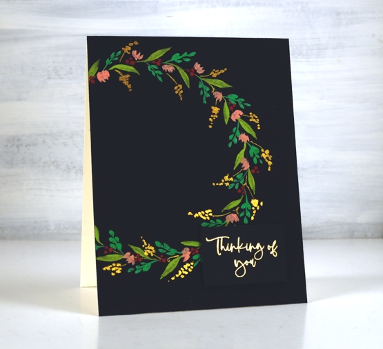
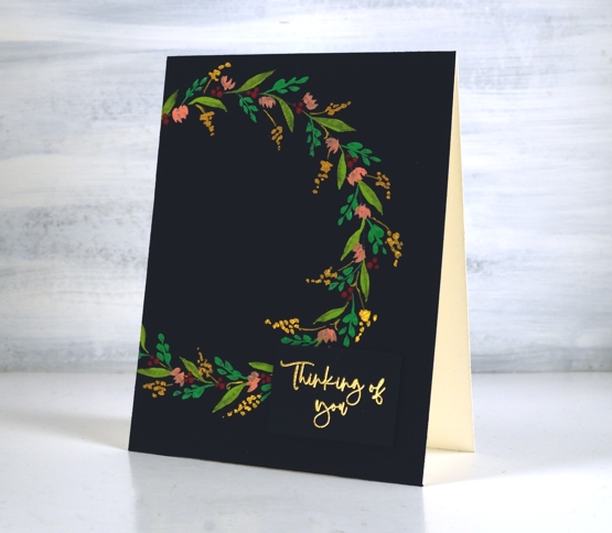
I’ve been experimenting with gouache paint. I posted a few cards with gouache painted backgrounds early last month and now I have a painted wreath to share. The Foiled Fox kindly sent me the set of gouache and I have been practising colour mixing and painting very simple shapes and patterns. You can find me on the Foiled Fox blog today with more tips and tricks about this card.
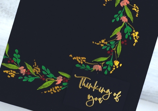
Even though I am still a gouache newbie I decided to film the process for painting a simple wreath. I only used four different gouache colours, a green, a yellow, a red and white along with one pearlescent paint. In the video you will see the process and all the colours listed by name.
You certainly don’t have to use gouache on a black background but it does really pop! I think my next path of experimentation might be to use watercolour and gouache in the same project. On a slight side note, I don’t set out to do such tiny details; I can’t help myself. My art teachers in high school and college always told me to use bigger, bolder strokes!
Supplies
(Compensated affiliate links used when possible)
Grid & Floral mix
Posted: August 30, 2021 Filed under: Background Stamps, contemporary, Dies, Penny Black, rosa | Tags: Papertrey ink, Penny Black creative dies, Penny Black stamps, Ranger Distress inks 3 Comments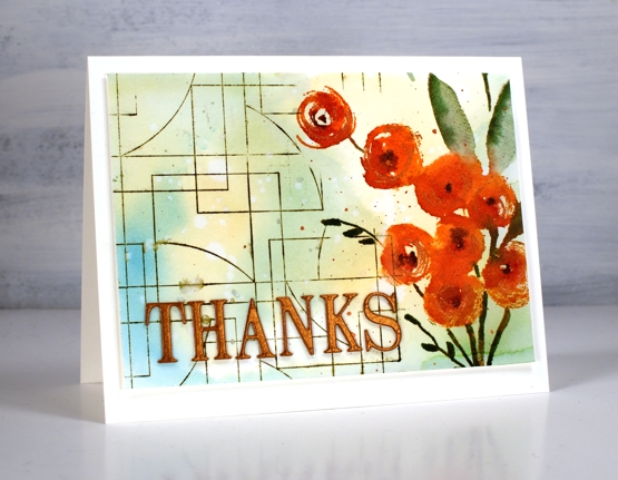
It was fun to pull out a floral and a background stamp for a new card design. I was planning to stamp the PB ‘rosa’ stamp a few times across the panel but ended up putting it snugly on the right hand side leaving room for the grid patterned ‘contemporary’ stamp on the other side.
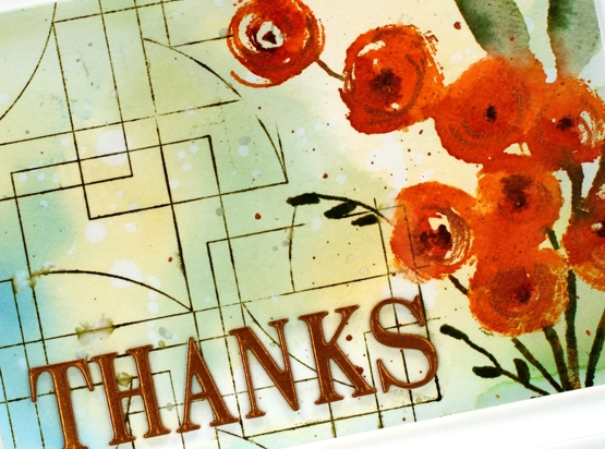
Before any stamping I smooshed some salty ocean, scattered straw and mowed lawn inks on my glass mat, spritzed water then swiped watercolour paper through the mix of colour. I let the colours dry for a while then dropped water on top and then absorbed it with a paper towel leaving pale water marks all over the panel.
I stamped the flowers in a mix of canyon clay and raspberry fizz inks (Papertrey ink) and the leaves and stems in rustic wilderness and bundled sage. I added copper pearlescent paint to the centres of the flowers as well as splattering some on the panel. I also added some black to the centres to define the flowers a wee bit more.
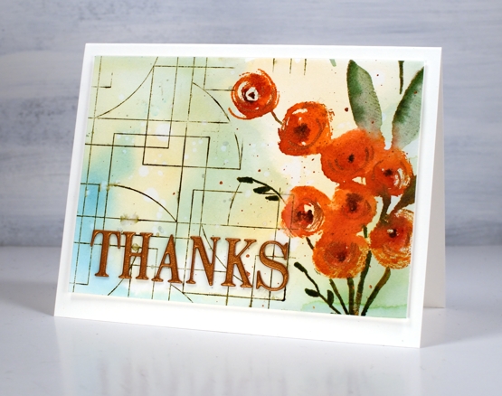
I added the PB ‘contemporary’ stamp to complete the panel along with the ‘THANKS’ die-cut from copper cardstock. You can see the fall colours are easing their way in but the summer colours are not leaving just yet!
Supplies
(Compensated affiliate links used when possible)
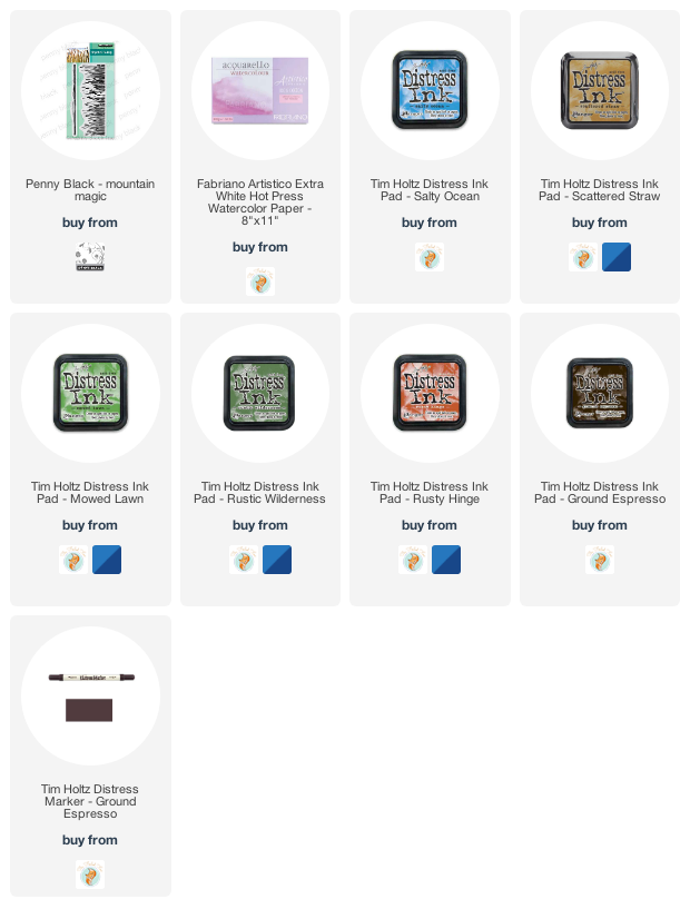
Through the rushes
Posted: August 27, 2021 Filed under: mountain magic, Penny Black | Tags: Penny Black stamps, Ranger Distress inks 10 Comments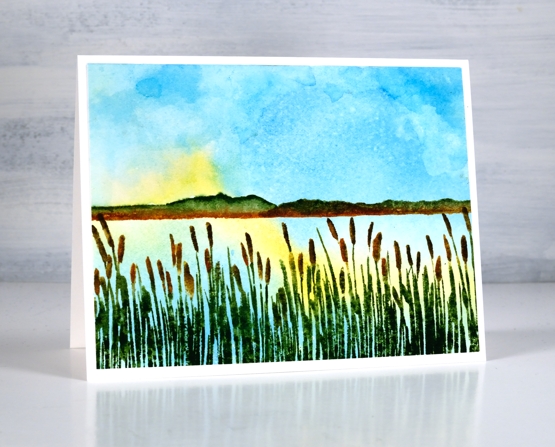
I could say this is my last scenic post for now but it probably isn’t! It is the last one I have on hand but I’m sure there will be more soon, especially as I start using these stamps with autumn tones. I woke up to a cool morning today, the first time in a week; summer isn’t over but there are hints of changes to come
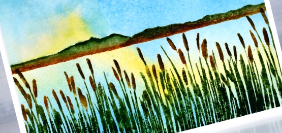
This one is definitely a summer by the lake scene. I watercoloured the sky first with salty ocean and scattered straw ink (technique shown here). Once that was dry I stamped the mountains in a combination of rustic wilderness, mowed lawn and rusty hinge inks. I added the rushes in the foreground stamped in rustic wilderness, rusty hinge and ground espresso.
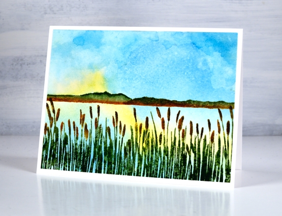
Hope you have a happy weekend, maybe with time to relax and contemplate a pretty outlook like this one.
Supplies
(Compensated affiliate links used when possible)
Artful August Home Journal page
Posted: August 25, 2021 Filed under: Art Journal, basket weave, Darkroom Door, fragments, gel press, honeycomb, Paper Rose, Stencils | Tags: Art Journal, Darkroom Door stencils, gel press, gel printing, Paper Rose, Ranger Distress inks 2 Comments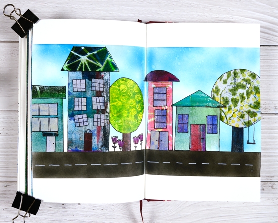
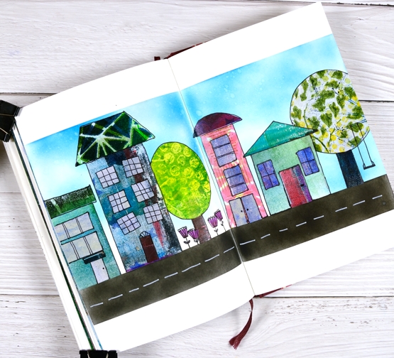
The fun and inspiration continues in Rachel Greig’s Artful August challenge. I am so impressed and inspired by what I have seen. Rachel’s own art has been beautiful and unique every single day. As I mentioned in my last post I have not participated every day but I have definitely enjoyed the times I have followed the prompts. Today’s prompt is ‘Home’ and I decided to make an art journal page of a street.
Make sure you read to the end of this post to find out the winner of Summer Giveaway I hosted with the Foiled Fox.
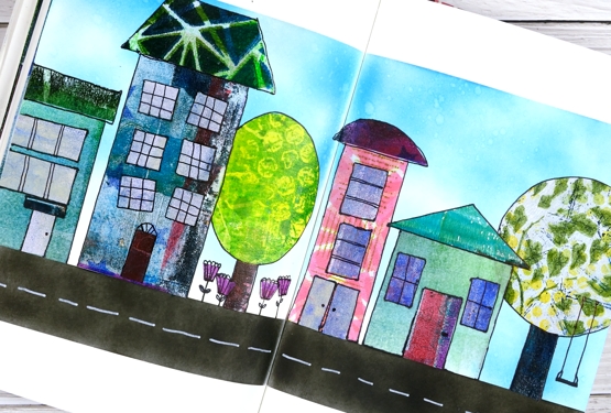
None of these quirky houses look anything like my home but I have had thirteen different homes over the years so I wasn’t going for realism, instead I wanted to create more of a neighbourhood feel. Once again I cut up gel prints to make the houses, trees and flowers. I particularly like the gel print trees. The one on the left was printed with bubble wrap and the one on the right features texture from three different stencils which ended up giving me leaves and a branch to hang a swing on.
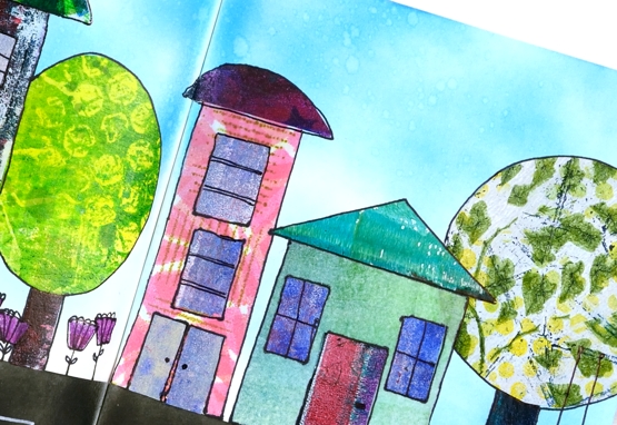
I began by masking the top and bottom edges then used blending brushes to fill the sky with blue distress inks and the road with black soot ink. I cut all the shapes by hand not worrying about perspective or scale and glued them on with multi matte medium. Once the glue dried I drew around all the edges and added detail with with a black ultrafine sharpie. I added markings to the road with a white sharpie paint pen.
Thank you to everyone who entered the Summer Giveaway by telling us your favourite summer activity. I enjoyed reading about beach walks, mountain hikes, picnics, porches and time spent with friends. I hope you are all still enjoying those pastimes. Summer is not over yet! Congratulations to Stephanie Clapper, check your email for your gift certificate to the wonderful Foiled Fox online store.

Supplies
(Compensated affiliate links used when possible)
Artful August
Posted: August 23, 2021 Filed under: bookworm, Darkroom Door, gel press, Hand drawn | Tags: Darkroom Door stamps, gel printing, Hand drawn 4 Comments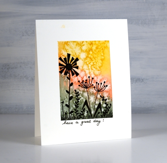
During August Rachel Greig from Darkroom Door has been hosting a challenge with prompts everyday to be interpreted in any artsy way you like. I haven’t managed to participate regularly but I have enjoyed making a few simple cards along with some gel prints and a journal page.
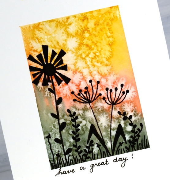
The card above was made for the silhouette prompt. I painted a watercolour background, sprinkled salt and then drew the silhouette flowers after the watercolour dried.
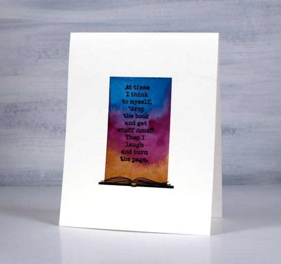
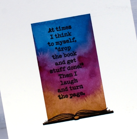
This one was for the words prompt. I am such a reader these days I thought of books when I saw the prompt. Once again I did a watercolour background then add the Darkroom Door book stamp and drew a book at the bottom.
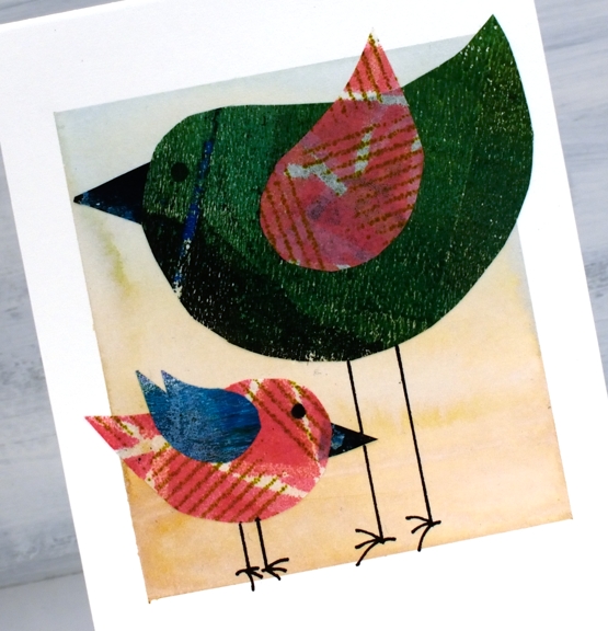
The next prompt I followed was birds. I cut body, wings and beak shapes from gel print pages then glued them over a pale watercoloured background
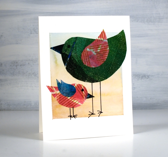
All these three cards began with the same masked and painted background. I found it was a simple way to start the projects and they are all one layer on hot pressed watercolour paper.
The prompts featured here are all from last week. I haven’t participated over the last few days but I plan to jump in again today with the butterflies prompt. If you are interested in seeing the wide range of projects hop over to instagram and check out the #artfulaugust and #rachelgreigartfulaugustchallenge
See you soon.
Supplies
(Compensated affiliate links used when possible)