
Tea, Coffee, Art Journalling?
Posted: February 28, 2023 Filed under: 6"x 6" journal, Art Journal, Background Stamps, coffee time, Cup of tea, Darkroom Door, Dies, Gazette, Penny Black, Script, Time, What's in your cup, World Map | Tags: Art Journal, Darkroom Door stamps, Penny Black creative dies, Penny Black stamps, Ranger Distress inks 2 Comments
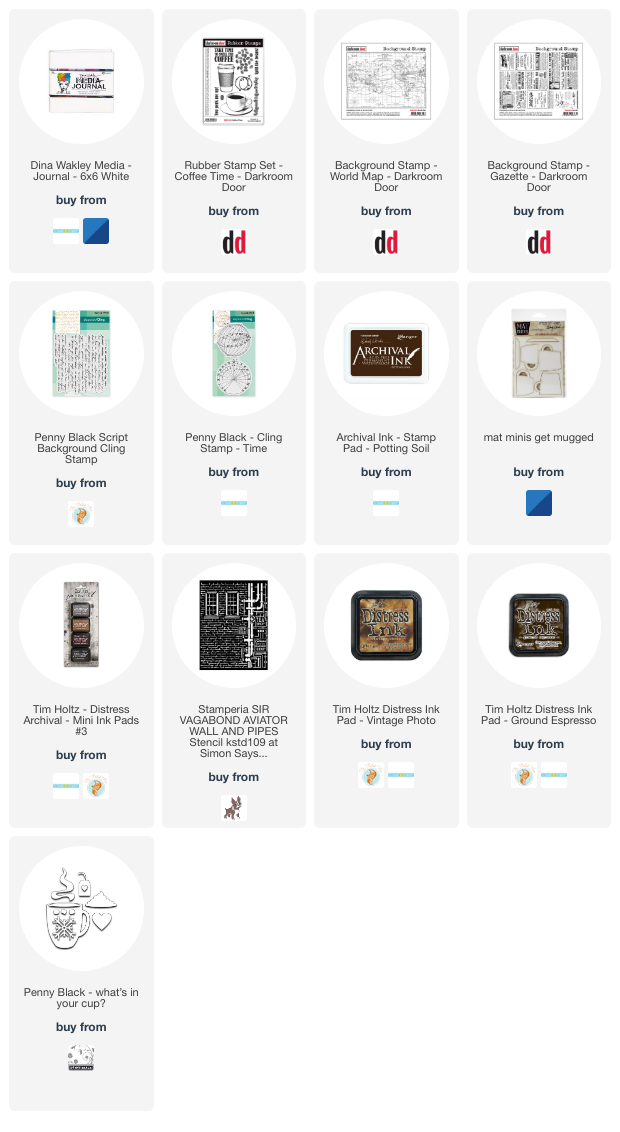
Today I am posting a few pages from last year’s Art Journal Adventure workshops. I taught seven different ‘episodes’ last year and one month the theme was coffee and tea. I did a few pages before the sessions and then created a different page during each class. I don’t like replicating the same spread in my art journal so each one had a different colour scheme and style.

Even though I am more of a herbal tea drinker than a coffee drinker I ended up creating three coffee themed pages and two tea themed. You can see the first coffee themed page here. As you can see from the three spreads featured here I use a variety of techniques, papers and elements in my pages. The common technique on these pages is a watercolour background and the common element is the chipboard cups. Both the coffee themed pages feature photos from an old coffee themed diary. In both cases I took my colour scheme from the photo and added browns.
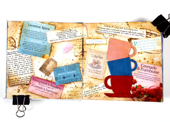
This tea themed page could also be called ‘these are a few of my favourite teas!’ I used packaging from boxes and sachets, embossed the teacups to match and add snippets from old books and magazines.
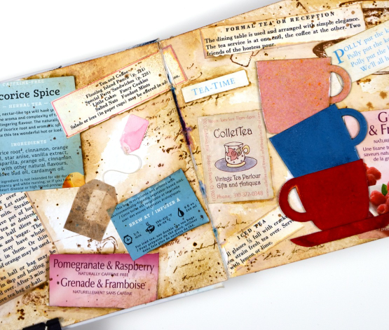
These pages show how I gather elements and papers from here, there and everywhere when creating a page. I used inks, embossing powders and glazes, stamps and stencils for these pages but I also used an old diary, packaging, pages from a vintage recipe book, and old teabags!
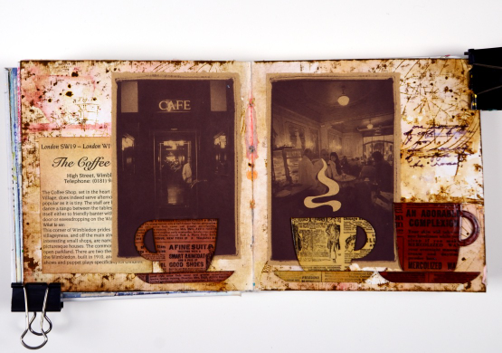
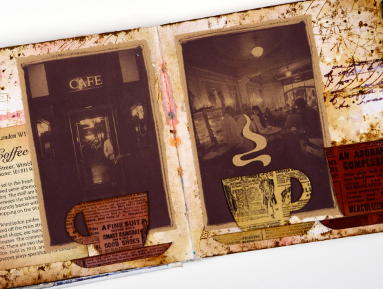
I almost didn’t finish this last spread but once I had stamped then glazed the cute chipboard cups I knew I had to finish. Now I want a mug with vintage newsprint on it!
Art Journal Adventure for 2023 kicks off this week. There is still space in the Friday class and the Monday class. We will be creating with semi- transparent papers.
(Compensated affiliate links from Foiled Fox, Scrap n Stamp)
Snowflake Cards
Posted: February 23, 2023 Filed under: crystalline, Dies, Echidna Studios, grafix, Penny Black, snowflake digital stamp set | Tags: Echidna Studios, Fabriano Watercolour Paper, grafix, Penny Black creative dies 9 Comments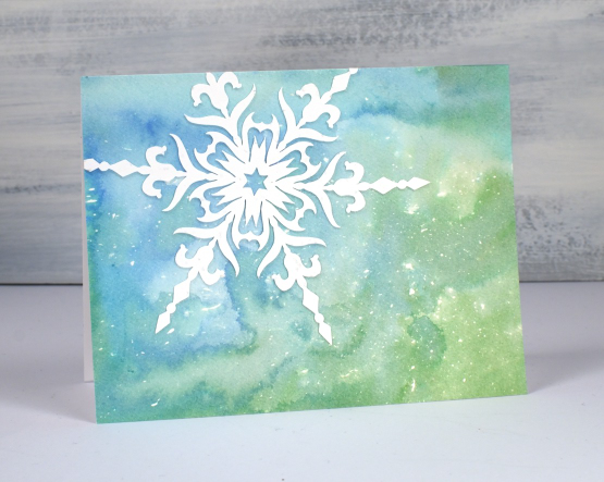
Apparently we are getting 10-20cm of snow tonight. So these cards are appropriate for late February! I teamed up with Grafix to complete these projects. I love using liquid frisket to create a scattering or a storm of snowflakes or stars across a watercolour background.
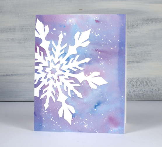
I splattered the liquid frisket on hot pressed watercolour, let the droplets dry then used dye inks to colour the panels. You can see the process in the video below.
I cut intricate snowflakes from lightweight white linen cardstock to add to the watercolour panels. All but the die-cut snowflakes on the final card are designs from Echidna Studios. I used snowflakes from the Snowflake Digital Stamp set. I have used them as stamps on previous cards but this time I cut them on a cricut.
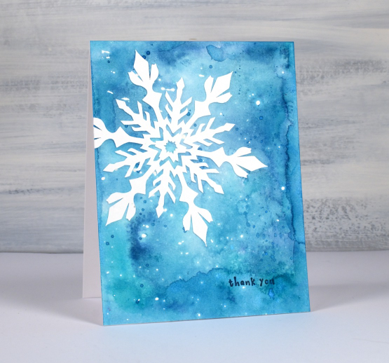
Because the snowflakes are quite intricate gluing them on with artist tac was very straightforward. I also use artist tac when I am attaching individual letters to create a word or sentiment.
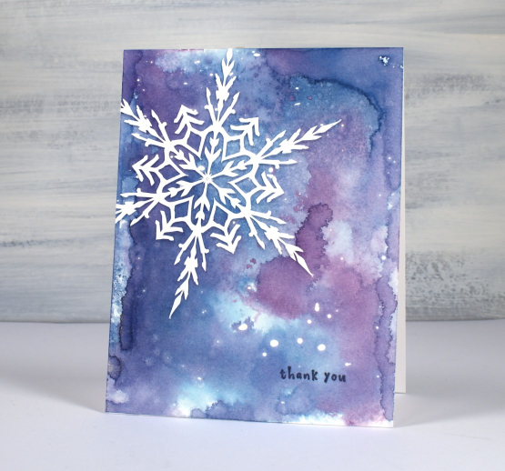
I used a few of the cards as thankyous and left a few blank.
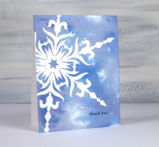
I used smooshed distress inks to create the watercolour backgrounds but you could use watercolour paints or powders to make soft blended backgrounds.
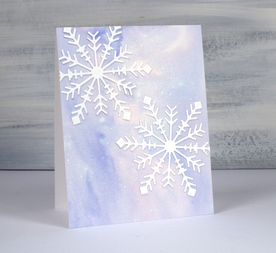
(Compensated affiliate links from Foiled Fox, Scrap n Stamp)
Salt & Dandelions
Posted: February 21, 2023 Filed under: Dandee, Penny Black | Tags: Fabriano Watercolour Paper, Kuretake Gansai Tambi watercolour paints, Penny Black stamps 6 Comments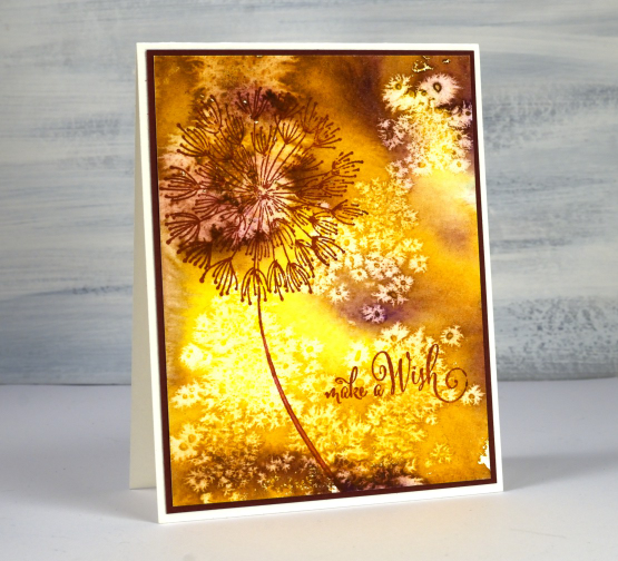
Just in case you are wondering this isn’t a recipe, well not an edible one! I know you can eat several parts of a dandelion plant but I don’t know about the little seeds that blow everywhere to plant new dandelions. This card has been hiding out in a drawer with a few others cards that give the impression of light and shade.
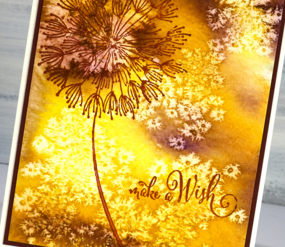
I didn’t create the multicoloured background for the dandelion stamp; I just created it while experimenting with watercolour paints and salt crystals. You have probably done the same sort of thing yourself. If not, try sprinkling salt crystals of different sizes on wet watercolour paint or die ink. As it dries it creates fabulous patterns. The ones on this panel looked so much like dandelion seeds I had to find the right stamp and sentiment to finish the card. You can find a video demonstrating the salt sprinkling technique here. After the paint and panel has dried you can gently brush off the salt to reveal the patterns.
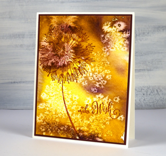
I used gansai tambi watercolour paints and a large PB stamp called ‘Dandee’. If I had wanted a background that looked like dandelion fluff blowing about I’m sure I couldn’t have created it. That’s why I play and experiment then see what I should make with the panels.
(Compensated affiliate links from Foiled Fox, Scrap n Stamp)
Leafy
Posted: February 15, 2023 Filed under: Finetec paints, leaf trio, nature's garlands, Penny Black | Tags: Finetec artist mica watercolour paint, Penny Black stamps, Ranger Distress inks 3 Comments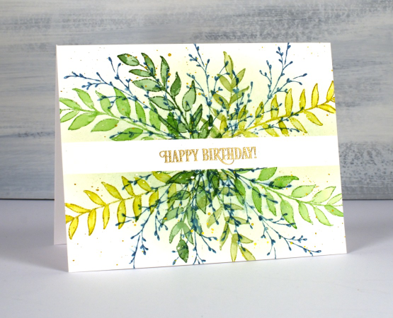
I am sharing this project on the Foiled Fox blog today. It’s a lovely place to visit; make sure you drop in and browse their blog and online store.
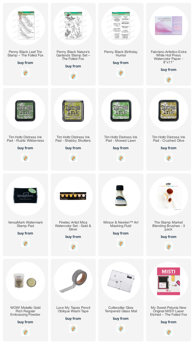
I know today’s card is completely unseasonal but occasionally I stamp outside my climate zone! I used a couple of Penny Black transparent sets to create a simple masked and watercoloured birthday card. Most of the leaves stamped were from the PB ‘leaf trio set’ which has three leaf sprays (I used two). The twiggy stamp is from the PB ‘nature’s garlands’ set.
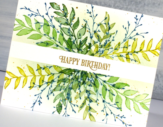
I worked on hot pressed watercolour paper which had some liquid frisket splattered on it. I kept the panel in my stamp positioner but you could easily do this technique without. I placed a strip of washi tape across the panel to mask the centre for a sentiment later. I stamped each leafy spray in one of four greens first with the panel facing one way then again with the panel flipped 180°.
Once I had stamped all the leaves in greens I used a paintbrush and water to blend ink into all the leaves. Once that was dry I stamped the twiggy stamp in uncharted mariner ink. Even though it was a green card uncharted mariner still demanded to be included!
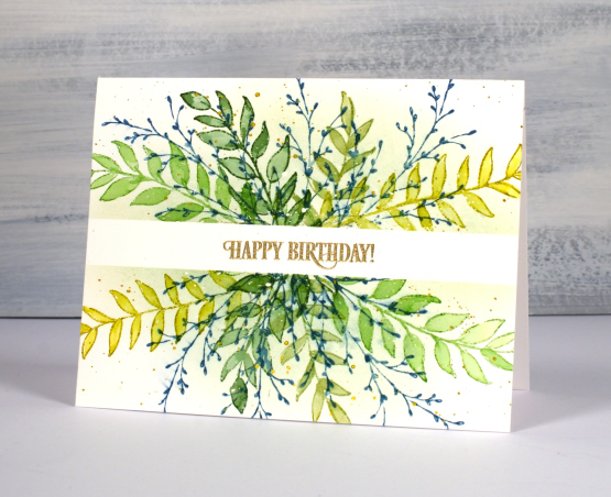
With the washi still in place I blended some shabby shutters ink over the stamping to give a crisp edge to the masked area. I might have been a little impatient and smudged some of the blue ink. I removed the washi to add the gold embossed sentiment but then wanted gold splatter so replaced the washi. I am making these mistakes so you don’t have to! I was happy with the fresh look to the card. It reminded me of an art journal page you can see if you scroll down to the end of another post here. I have said before that sometimes cards inspire art journal pages or vice versa. Today’s card was inspired by an art journal page which was in turn inspired by a card in my ‘Wreaths – Stamped & Painted‘ class.
Are you already creating springy cards? Have you left winter stamping behind?
(Compensated affiliate links from Foiled Fox)
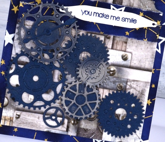
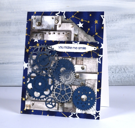
Robots? What? No!
Posted: February 13, 2023 Filed under: cog wheels, craft roulette, Dies, Penny Black | Tags: craft roulette, Penny Black creative dies 7 Comments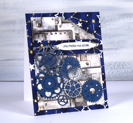
I mentioned last week that I was scheduled as a guest on Craft Roulette live youtube show on Friday. Thank you to those who dropped in to watch; I saw a few familiar names in the chat. The show is an improv crafting show hosted by the energetic and enthusiastic Mary Gunn. During the show a wheel is spun to choose four parameters then Mary and I each make a card live on youtube which follows all four parameters.
On Friday night before the wheel was spun Mary asked me if I would like to veto one of the parameters and I mentioned it was hard to choose between ‘robot’ and ‘gnome’ because I would be at a loss with either of those elements. Well, wouldn’t you know it, I vetoed gnomes and the wheel stopped on robots!
The parameters on Friday night were:
- project – MAP FOLD
- colours – BEACH COLOURS
- element – ROBOT(S)
- random – LABEL(S)
Here’s my reaction 46 minutes into the show!
It all turned out just fine and I made an’ out of my comfort zone card’ but featured two lovely pieces of paper from my stash and some fun dies.
(Compensated affiliate links from Foiled Fox, Ecstasy Crafts & Scrap n Stamp)
New YouTube channel – New Video
Posted: February 11, 2023 Filed under: Alcohol Ink, baby blue leaf embossing folder, Branch 9 die, cricut, Dies, grafix, Moda Scrap, my designs, ornate tile embossing folder, Paper Rose, Penny Black, Pink & Main, scripty, silhouette birds, so extra supporting sentiments, Stampin Up, thank you squares, Tim Holtz, Tutorial | Tags: cricut, grafix, grafix craft plastic, Penny Black creative dies, Penny Black stamps, Ranger Alcohol Ink, Stampin Up, Tim Holtz 6 Comments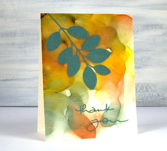
If you have been visiting this blog for a while you will know I had a youtube channel for many years. In 2022 after ten years of adding videos and gathering a community of 7000 subscribers my channel was deleted. In recent weeks I have started again with a new channel and some videos ‘from the archive’. My new channel is called Heather Telford Art and I would be very happy if you decided to like, subscribe and tell your friends! There is content on there that you may remember from the last few years and starting today there is new content also! The new ‘2 for 1 Alcohol Ink Panels’ is freshly filmed for my new channel and I hope it will be the first of many!
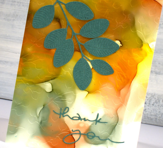
There are quite a few photos in this post because, well, this is a 2 for 1 technique and I created three panels which of course became six panels and one was cut in half so there are seven cards to show you in this blog post! Grab a cup of tea. I have added a linked supply list at the very bottom of this long post.
As well as a new youtube channel I am also a new Cricut owner. The stencil used on the card below was designed by me and cut on my Cricut. It is available as a cutting file from Echidna Studios etsy store.
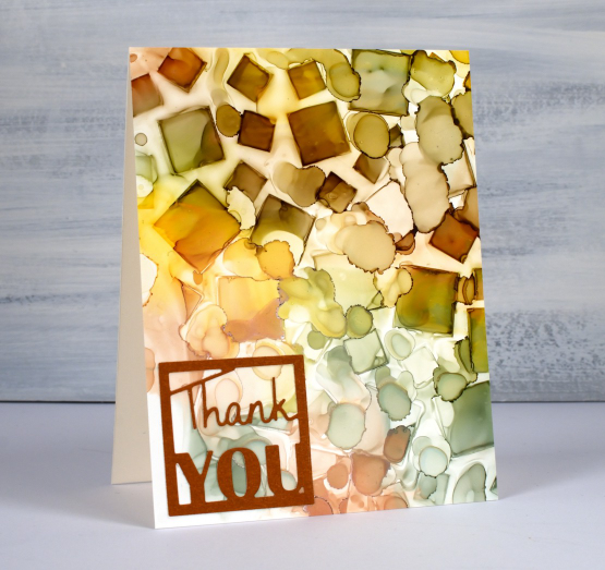
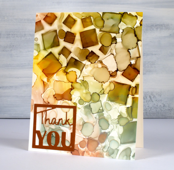
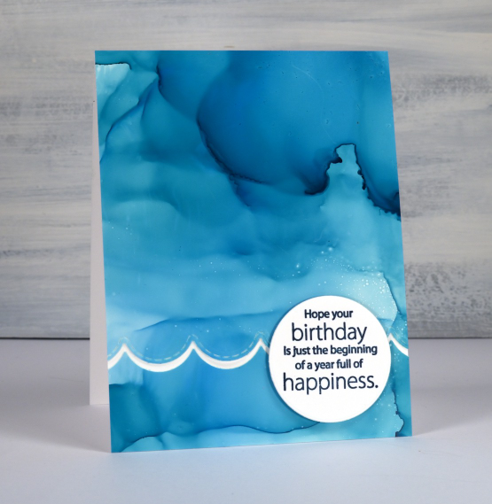
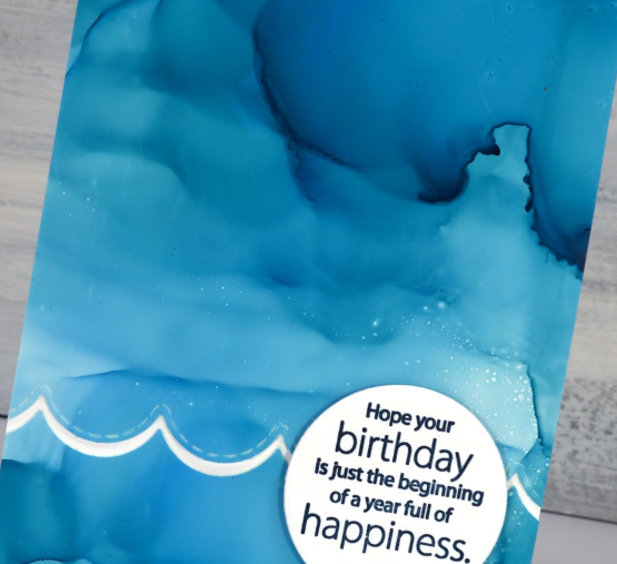
Most of the 2 for 1 smooshed panels I left as a full card fronts adding only a sentiment or some die-cutting. As the panel below reminded me of the ocean, the PB wavy scallop border seemed a nice touch.
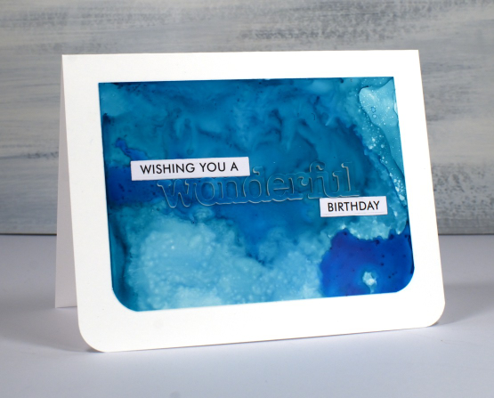
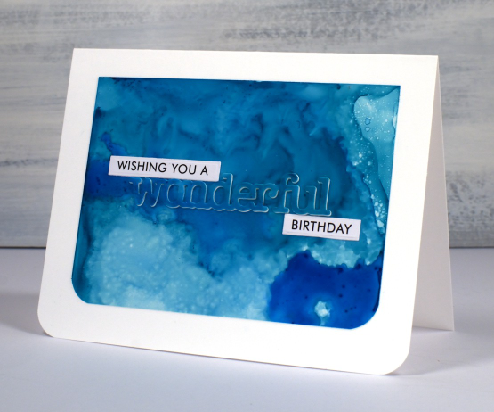
The panel below is a half panel from the first one I showed on the video. I love the patterns from the isopropyl alcohol ink spray even though they don’t stay distinct. Even when die-cutting the word from the panel I couldn’t leave it off so I popped it up. Not so funny story: I guess I haven’t popped up a die cut word in a while because I flicked those little shapes inside the letters into the garbage when I poked the word from the die. So yes, I had to hunt through my garbage to complete the card.
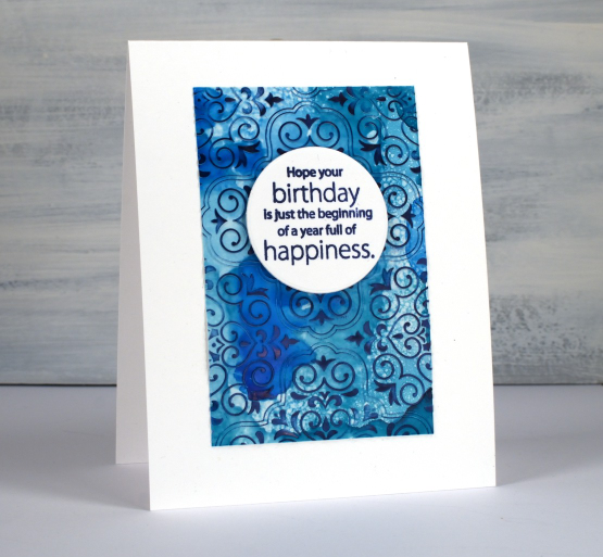
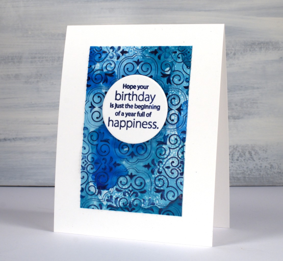
I don’t know why I hadn’t tried it before but seeing how well Grafix craft plastic responds when put in an embossing folder has been a revelation! I thought it might crack but it doesn’t so you can have the subtle impression of your embossing folder on a panel or the bold inked pattern as I’ve done on the card below. Sentiments in circles might be a little fad I go with for a while too; they look cute!
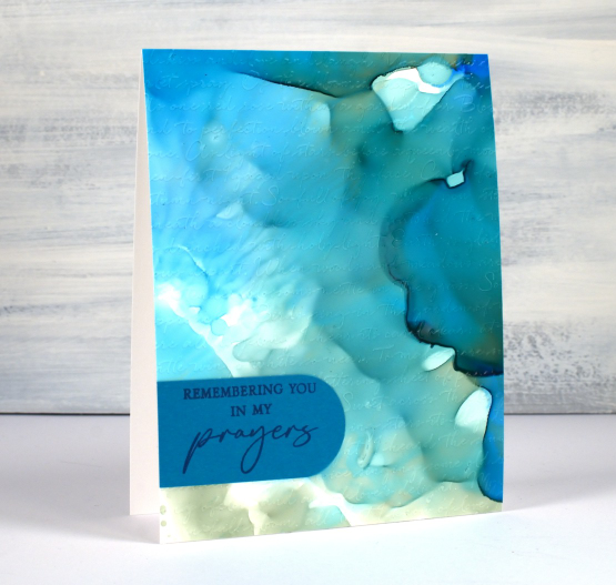
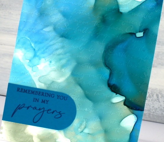
You can see the soft look of embossed script on the panel below, especially in the close up. This detailed embossing folder is from Stampin’ Up and is called ‘scripty’. I don’t think it is available anymore but you might something similar.
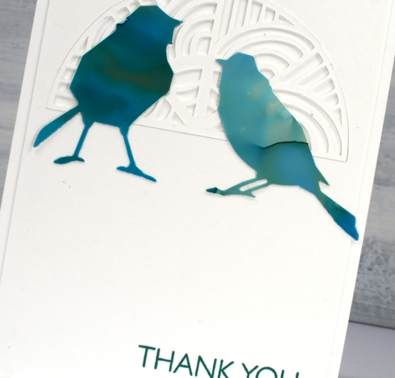
For this final card I cut six little birds from the panel and played with layouts for quite a while. I ended up just using two which means I have four birds in hand for another project. (pun definitely intended)
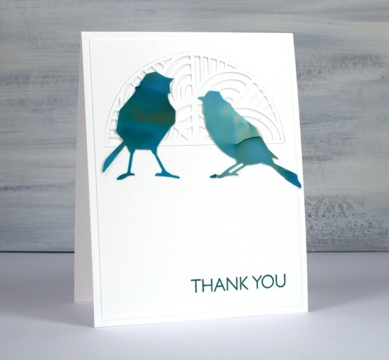
The intricate half circle cut out behind the birds is also one of my new cricut cutting files but more about that in another post. If you got this far, you’re a champion. Thank you for supporting me here on my blog and I would love to see you over on youtube as well.
(Compensated affiliate links from Foiled Fox, Scrap n Stamp)
Pretty Paint Pour birthday card
Posted: January 31, 2023 Filed under: Echo Park, heart border, mckell lowercase alphabet | Tags: Penny Black creative dies 7 Comments
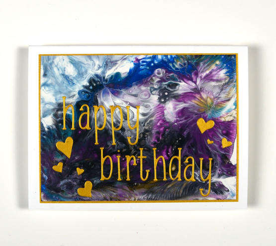
I am not the best at remembering birthdays in a timely manner. Also, I don’t make many birthday cards for children so when I need one I don’t always have one in my stash. I did, however have this groovy paint pour! Shall we bring back the word groovy? I have only done paint pouring a few of times. The last time I did it, a talented friend took me and a few others through the process step by step and we got some lovely panels like this one.

You know I love to have blues and purples blending in my cards so this panel featuring both colours along with some gold, black and grey definitely made me happy. Because of the the few pops of gold I chose gold metallic cardstock to frame it and add alphabet and heart die-cuts. It’s a larger than usual card because why would I want to cut off some of that yummy paint pattern and texture?
(Compensated affiliate links from Foiled Fox & Scrap n Stamp)
Streaming
Posted: January 26, 2023 Filed under: Penny Black, Stamped Landscapes, streaming | Tags: Fabriano Watercolour Paper, Penny Black stamps, Ranger Distress inks, Staedtler watercolour brush pens 8 Comments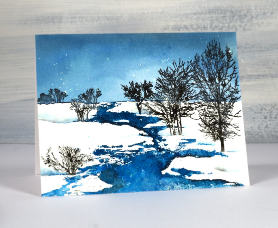
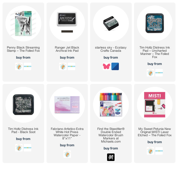
As I write this a snow storm continues outside so there will be scenes like this one to enjoy in days to come. The whole scene is one of Penny Black’s beautiful scenic stamps; this one is called ‘streaming’. I worked on hot pressed watercolour paper in a stamp positioner and had splattered masking fluid over the panel before I began.
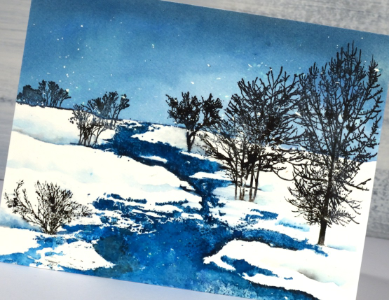
I used a few different inks so I could blend in some areas and get sharp images in others. The first thing I stamped was the top of the stamp including the horizon in uncharted mariner distress ink. Once I could see the horizon I painted more of the same ink to fill the sky adding a little black soot to the blending at the top to darken the sky. I let the panel dry before stamping the stream also in uncharted mariner ink. I took my time blending the stream because I wanted a bit of variety in the depth of colour. You can probably see a few areas that look quite dark where I added black ink to create the look of shadow at the water’s edge.
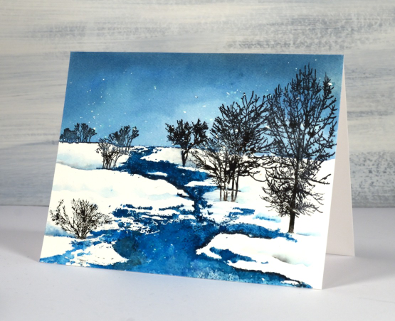
I inked the trees in black archival ink and black starless sky ink (from Ciao Bella) I also used black and blue markers here and there to add ink to fiddly places. I painted some of my own shadowy snow drifts to fill out the scene.
(Compensated affiliate links from Foiled Fox, Ecstasy Crafts & Scrap n Stamp)
Deer and Alcohol Ink Skies
Posted: January 20, 2023 Filed under: Alcohol Ink, grafix, leap of joy, Penny Black | Tags: grafix, grafix craft plastic, Penny Black creative dies, Ranger Alcohol Ink 8 Comments
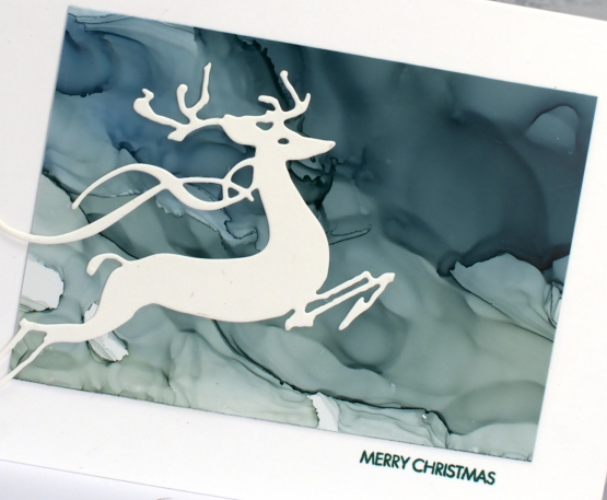
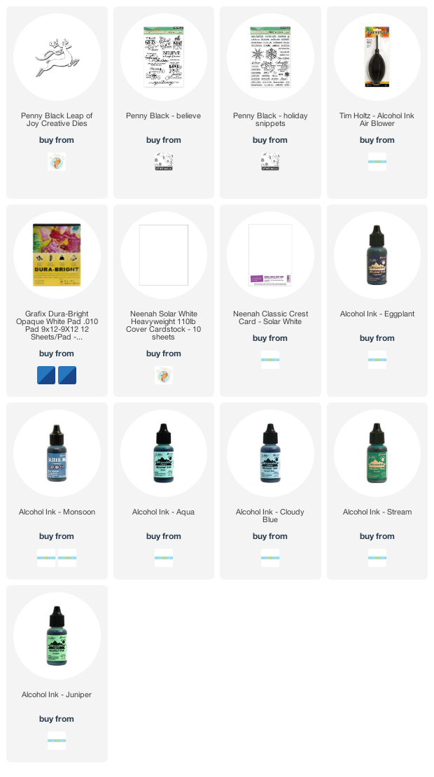
I know it is yet another alcohol ink sky post! If you look closely at the panel below you will see one of the things I love about alcohol inks and dye inks and that is the separation of pigments when a colour is diluted. It is more obvious in some inks that others but you can see it in the eggplant ink below. There is purple, grey, blue and shades of maroon. So yummy!

The panel above was diluted with isopropyl alcohol more that the panel below but I definitely used it on both to move the inks around.
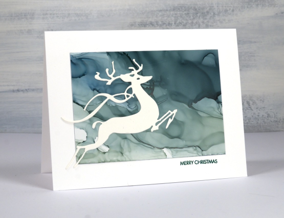
To complete the cards I die cut the PB deer from white cardstock and add small simple sentiments. Small sentiments are my favourite; I think I’ve mentioned that before.
I think my next post might not be alcohol inks! Stay tuned!
(Compensated affiliate links from Foiled Fox & Scrap n Stamp)
Alcohol Ink Sky Baubles
Posted: January 17, 2023 Filed under: Alcohol Ink, around town, Dies, grafix, Penny Black, trees and hills | Tags: grafix, grafix craft plastic, Penny Black creative dies, Ranger Alcohol Ink, Taylored Expressions 10 Comments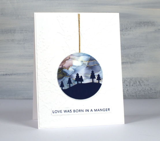
Yes, I have a few more alcohol ink skies to share. This time I have layered navy die-cuts over the alcohol ink panels and cut them into circles so they look like Christmas tree baubles. These ones were already cut and ready in my pile of possibility I just had to find suitable backgrounds and add cord and sentiments.
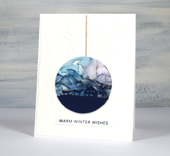
The skies were part of a big panel, alcohol ink on white craft plastic and there are some hints of gold here and there. Some is from gold alcohol ink but there are also threads of gold foil pressed onto the panel.
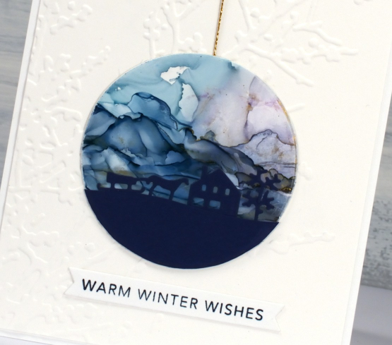
The backgrounds are embossed panels; sorry I don’t know the name of the lovely branch one, it doesn’t belong to me so I’m not sure who made it. The dies are Penny Black, ‘trees & hills’ and ‘around town’.
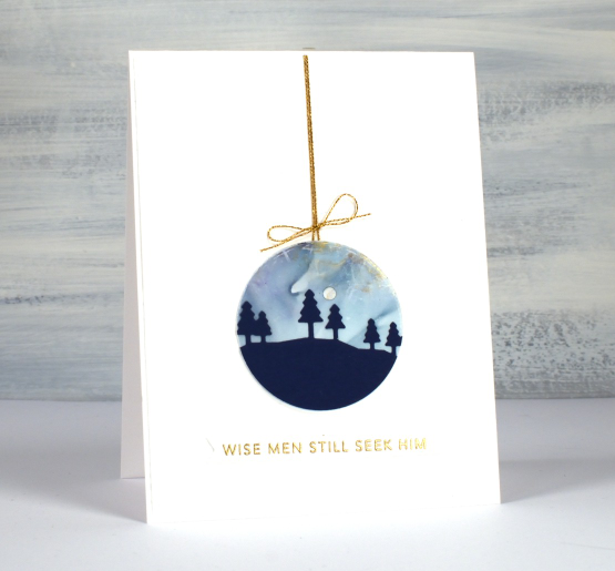
I added some gold cord and Taylored Expression sentiments to finish them off.
(Compensated affiliate links from Foiled Fox & Scrap n Stamp)












