Hollyhock Heaven Indeed!
Posted: May 11, 2023 Filed under: hollyhock heaven, how sweet, Penny Black | Tags: Fabriano Watercolour Paper, Penny Black stamps, Ranger Distress inks 9 Comments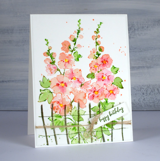
This is the stamp I didn’t know I’d been waiting for until I saw it in the new Penny Black release! Hollyhocks are such beautiful flowers. I don’t have any in my garden so obviously I need some on my cards!
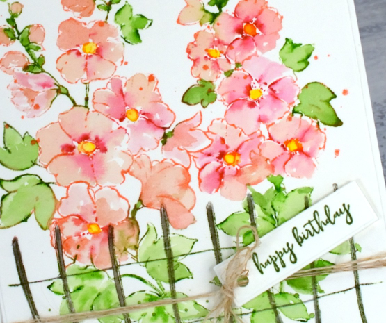
As usual I worked in the stamp positioner with hot pressed watercolour paper. I first inked the centres of the open flowers with a dark red zig clean color brush marker, spritzed with water and stamped. Next I inked the stems and leaves at the top of the image with a green zig marker and stamped. I used saltwater taffy distress ink to ink all the flowers wiping ink off where I could see there were leaves. This is a bit of a tricky step but a bit of green in the wrong place can usually be diluted and dabbed off with paper towel. I blended all the petals with a paintbrush pulling the dark red ink into the paler pink. When stamping the lower leaves with mowed lawn distress ink the fence ended up green so I went over that with some hickory smoke ink and a paintbrush. When I was sure the flower petals were dry I added yellow to the centres just like my reference photo. To finish I splattered some green and taffy ink, added a little greeting from the PB ‘how sweet!’ set and tied some twine to fit in with the little fence.
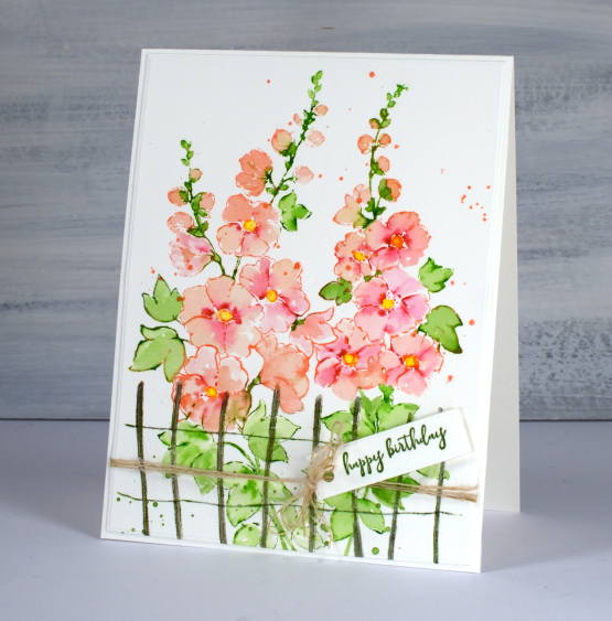
Isn’t this stamp a stunner? I can’t wait to try other colours and pair it with other florals.
Now back to my gel printing class; it’s not going to publish itself!
(Compensated affiliate links from Foiled Fox & Scrap n Stamp)
Gel Print Mandala Thank You Card
Posted: May 3, 2023 Filed under: beaded mandala, Deco Frame, Dies, gel press, Penny Black, The Crafters Workshop | Tags: gel press, gel printing, Penny Black creative dies, The Crafter's Workshop 3 Comments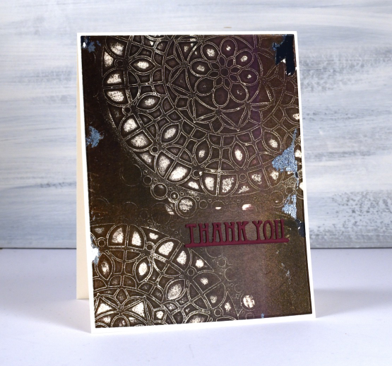
Gel printing continues to entice and delight me. This brown and burgandy print was done with a mandala mask from The Crafter’s Workshop; it’s called ‘beaded mandala’.
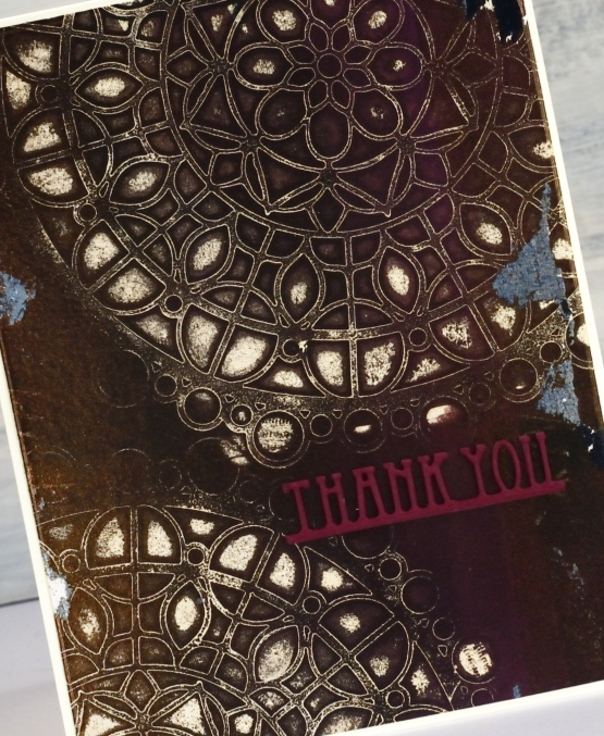
This print is a good example of the bonuses you pick up when you don’t start with a perfectly clean gel plate. If you look closely you can see some tiny remnants of text from an image transfer as well as the more obvious grey leftovers. I chose burgandy for the stacked PB diecut ‘thank you’ because there are some patches that look more burgandy than brown.
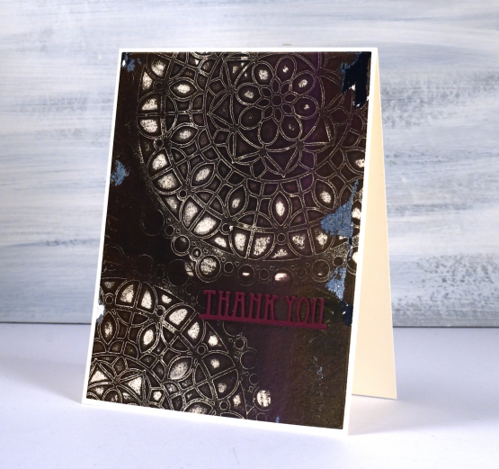
This technique with stencils is one of my favourites and is included in my upcoming online class Gel Print Journey. I am excited to be talking about it again despite the months that have passed since I began. I am back on it and excited to release it soon!
(Compensated affiliate links from Foiled Fox & Scrap n Stamp)
Turning
Posted: April 27, 2023 Filed under: Alcohol Ink, delicate daisies, Echidna Studios, grafix, Paper Rose, Penny Black, skewed squares, turning | Tags: Echidna Studios, Penny Black creative dies, Penny Black stamps, Ranger Alcohol Ink, Ranger Distress inks 2 Comments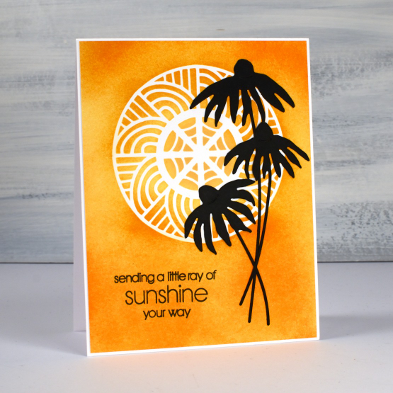
As you know I have recently been featuring some designs from my daughter’s etsy store Echidna Studios. They are available as digital stamps/cutting files. What I haven’t mentioned is that some of the designs in her store are designed by me! She has just added a batch of digital images that I designed as stencils but they can also be printed. The circle masked on the card above and the half circle on the second card are from a digital set called ‘turning‘. The beauty of digital designs is that they can be cut or printed in any size. I cut both stencils from Grafix matte duralar using my cricut.
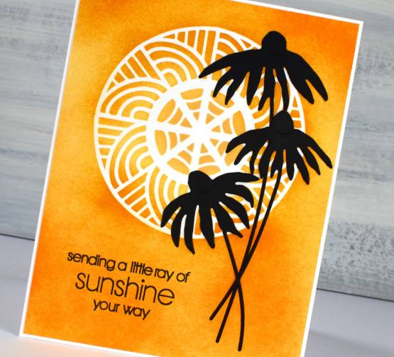
I blended three distress inks through the stencil onto neenah solar white cardstock then added the PB delicate daisies die-cuts and a PB sentiment.
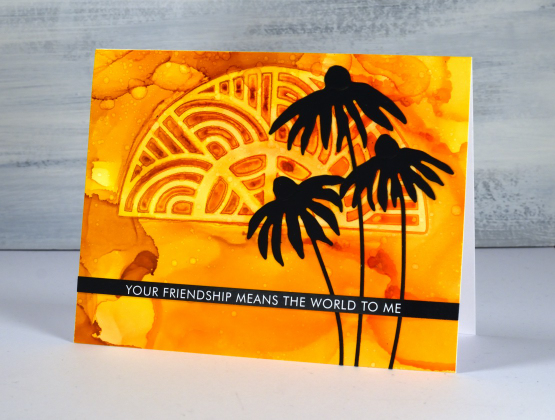
To create the half turn stenciled card I worked on Grafix white craft plastic with three alcohol inks. I dropped isopropyl alcohol and alcohol inks on the panel then dropped the stencil into position. I tried to be patient so the inks would dry and give me a complete impression of the stencil. I did help it along with an air blower and managed not to lift it too early! I splattered a little isopropyl over the top for extra interest.
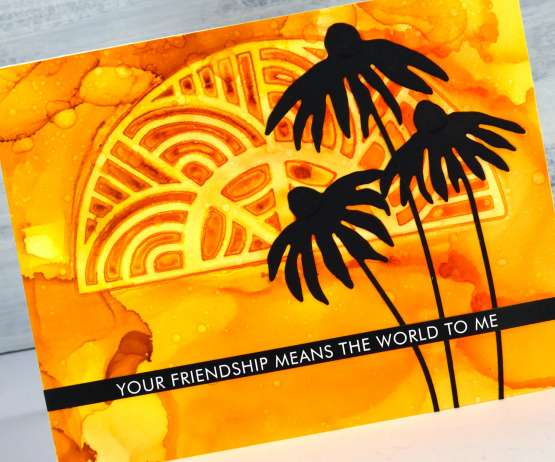
Once again I finished the card with black elements: the PB daisies and a sentiment strip from Paper Rose Studio. I hope you visit Echidna Studios store and check out the designs there. I will be featuring more in the weeks ahead. See if you can guess which of the stamp sets I designed, they are different from my daughter’s very realistic style. If you are on IG we would love you to follow Echidna Studios there too. And if you do happen to be on Instagram check out Gina Ferrari and see if you recognise anyone among her portraits.
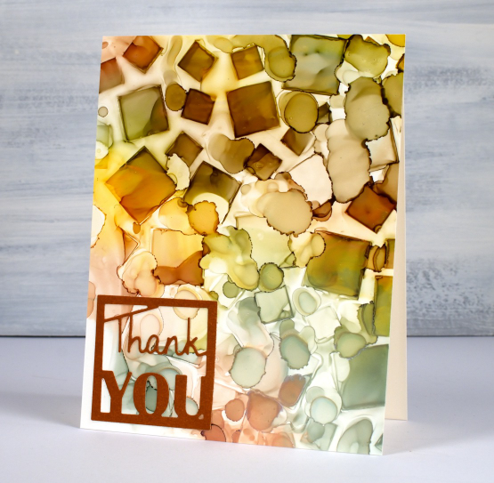
By the way, a while back I showed a sneak peak of a squares stencil I had designed and cut. You can see I used it on the card below and in the video here. The stencil is called skewed squares and it is now available as a digital file in the Echidna Studios store.
Thanks for dropping by today. I hope the sun is shining where you are; it is peeping through the clouds here.
(Compensated affiliate links from Foiled Fox, Ecstasy Crafts & Scrap n Stamp)
Birthday Window
Posted: April 24, 2023 Filed under: Penny Black, window | Tags: Fabriano Watercolour Paper, Penny Black stamps, Ranger Distress inks 4 Comments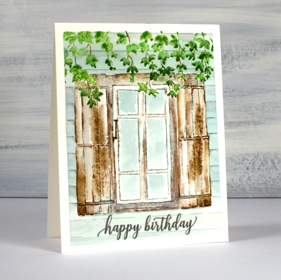
I’m a guest on the Foiled Fox blog again today featuring my first card with the new PB set, ‘window’. The window and the ivy are two separate stamps which makes them quite versatile. I wanted to try them together though so I worked in a stamp positioner with hot pressed watercolour paper.
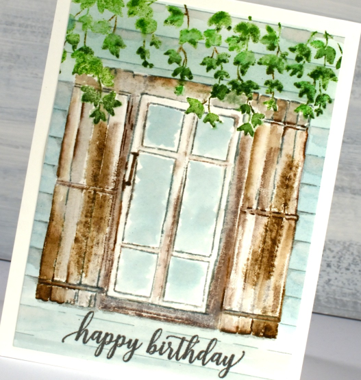
I stamped the ivy first in two greens because a range of greens definitely makes foliage look more realistic. I also added some brown for the stems. As I wanted the ivy to hang over the window and shutters I had to either mask the ivy or do some partial stamping. I did partial stamping, wiping ink off the very top of the window for the first impression then adding ink bit by bit to fill out the sections not obscured by the ivy. Once I had outlines stamped it was easy to use a paintbrush to fill out the rest of the wood around the leaves.
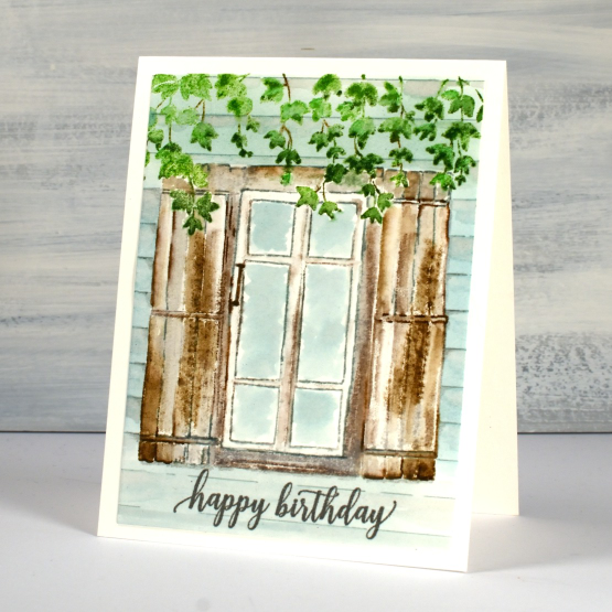
I used a mix of grey and brown for the window frame and speckled egg for the glass and side of the house adding some lines with a marker to suggest paneling. There are more details on the Foiled Fox blog so make sure you visit and say hi.
(Compensated affiliate links from Foiled Fox)
Hats Off
Posted: April 19, 2023 Filed under: Darkroom Door, hat's off, mixed boxes, Penny Black 4 Comments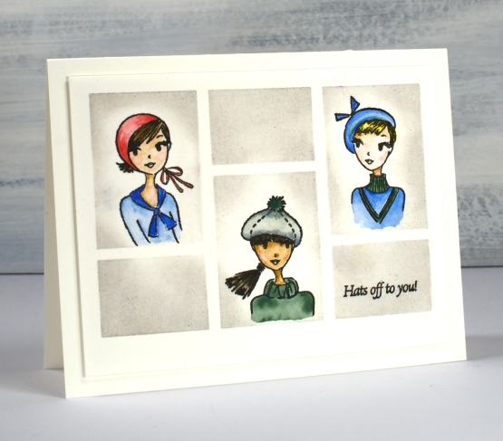
As you know I don’t often stamp, draw or paint people but these cute stamps featuring hats called to me and I decided to feature them in a grid pattern, Brady Bunch style. I taped the small Darkroom Door ‘mixed boxes’ stencil to hot pressed watercolour paper to provide the grid. Working in a stamp positioner I stamped the three hatted women in the large boxes and the sentiment from the same set in the small right hand box using Gina K’s obsidian amalgam ink.
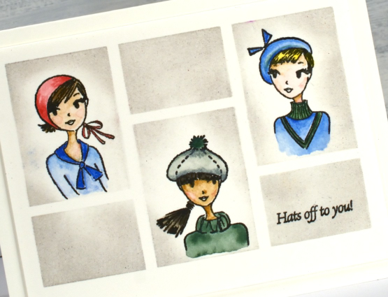
I painted the women in their hats first using Albrecht Dürer watercolour pencils, some colouring directly on the paper and some picking up paint from the tip of the pencil. As I had kept the stencil taped to the panel I was able to blend lost shadow distress ink in the spaces to frame the faces.
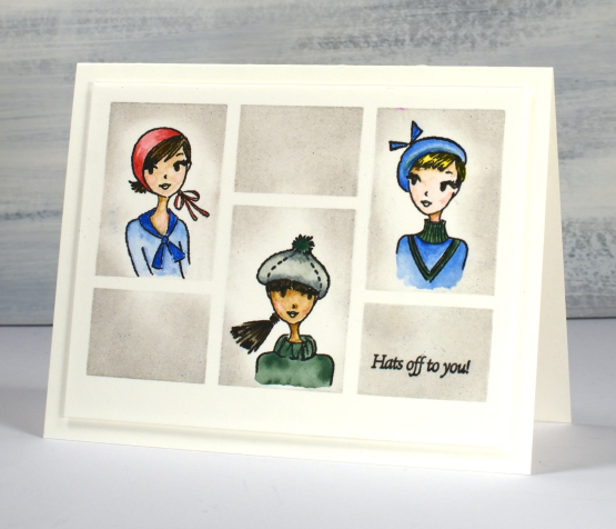
I’m thinking ‘hats off to you!’ might be a congratulatory sentiment. How would you use a card like this with that jaunty little phrase?
(Compensated affiliate links from Foiled Fox)

Spring Emerges
Posted: March 28, 2023 Filed under: Coloured pencil, Penny Black, spring emerges | Tags: Faber-Castell Polychromos Colour Pencil, Penny Black stamps, Waffle Flower dies 3 Comments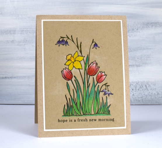
Spring is emerging around my place but not to the extent suggested in this stamp. I do have a daffodil plant that has broken through the soil and I can see a bud on it even though it is a couple of feet from the snow drifts! The stamp featured today is called ‘spring emerges’ and it is a small transparent stamp from Penny Black’s latest release.
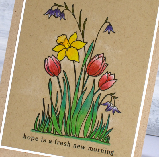
It’s been a while since my coloured pencils were the stars of the show but after finishing this little panel I might keep them on my desk a little longer. I particularly like pencils on kraft cardstock. I often add either a base of white pencil or just highlights so the brown of the kraft doesn’t make everything too muted. On this card I blended white and reds for the tulips and added white highlights purple flowers. I layered a mix of yellows and oranges for the daffodil and two greens for the leaves and grass. I kept the panel and stamp in the stamp positioner in case I wanted to restamp over the top after colouring (which I did). With a stamp this small sometimes my colouring goes outside or over the lines, restamping just sharpened the outline. I used Gina K’s osidian amalgam ink.
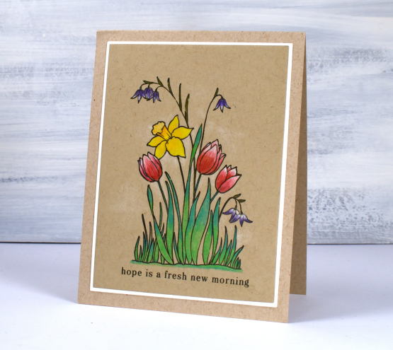
I used A2 layer dies to cut the panel and the mat and added a sentiment from the PB ‘hope is…’ set. You can see some very pale white shading around the flowers too which was done with the white pencil.
Wishing you a hope filled day.
(Compensated affiliate links from Foiled Fox, Scrap n Stamp)
Canopy
Posted: March 27, 2023 Filed under: canopy, Penny Black | Tags: Fabriano Watercolour Paper, Penny Black stamps, Ranger Distress inks 5 Comments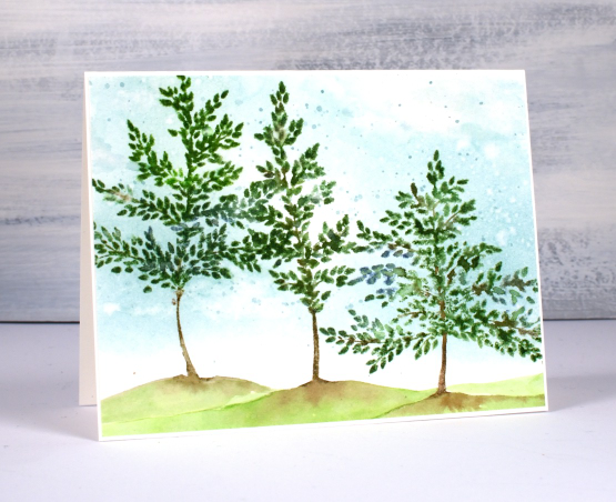
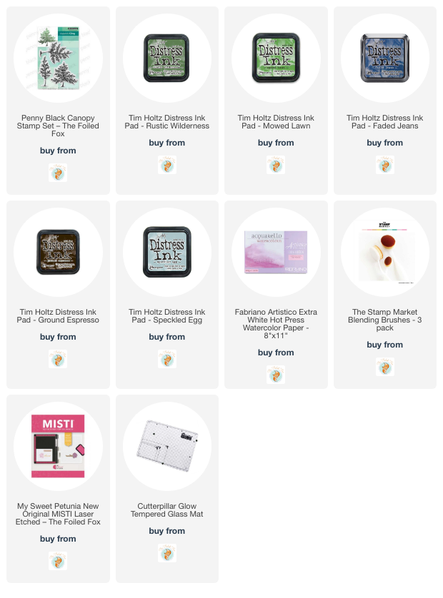
Today I am delighted to be sharing this card on the Foiled Fox blog. I have mentioned before how much I like the people at the Foiled Fox and we seem to enjoy a lot of the same artsy things. This new set from Penny Black is called ‘Canopy’ and it includes three similar trees of different sizes.
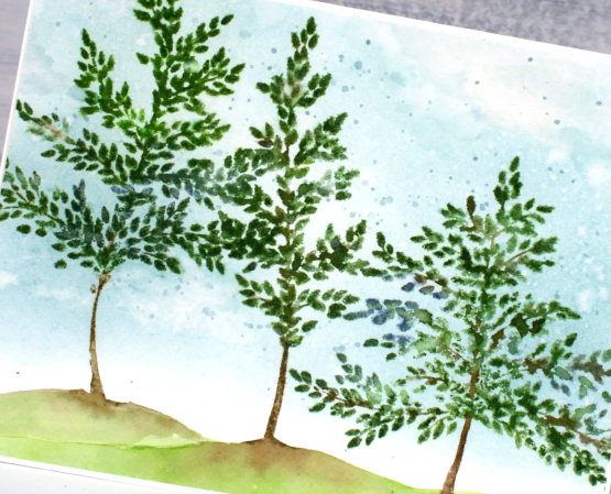
I completed the sky first by blending speckled egg ink over the panel of hot pressed watercolour paper. I painted over the blended ink with water then dabbed away some of the ink with a tissue to create the look of clouds. I also added some splatters because why not?
I stamped the trees one at a time and added a hill below the trunk each time. Painting the little hill while the ink on the trunk was still wet made it possible to softly blend the brown and green inks together.
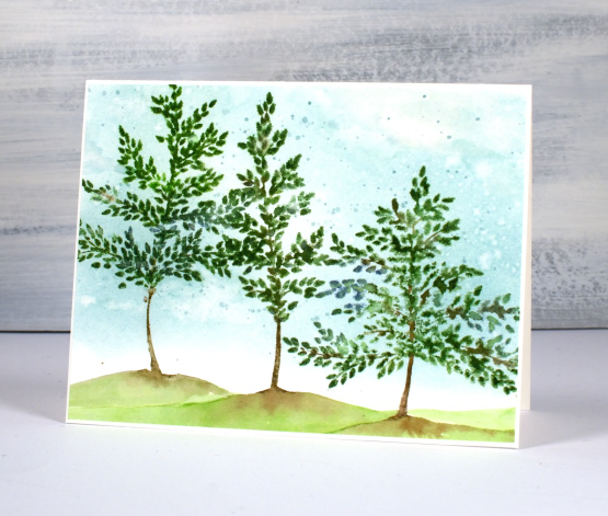
Make sure you pop over to the Foiled Fox blog to learn more about my process and to browse their lovely projects and products. You know how I feel about tree stamps; you can never have too many. I love the whimsical bendy trunks on these ones; they look like they are swaying in a breeze.
(Compensated affiliate links from Foiled Fox)
Welcome Home
Posted: March 21, 2023 Filed under: Penny Black, Welcome Home | Tags: Fabriano Watercolour Paper, Penny Black stamps, Ranger Distress inks 5 Comments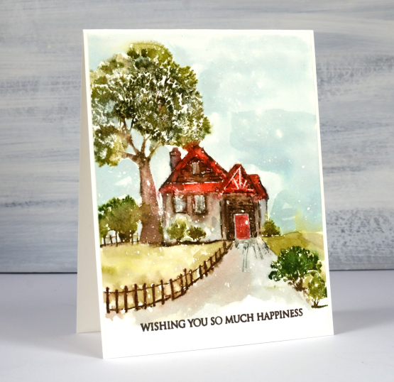
This sweet scene is called ‘Welcome Home’ and it is a new rubber cling stamp from Penny Black. Yes you can see little white flecks on the panel again, not snow, just textural interest, or perhaps rain. I used a panel of hot pressed watercolour paper splattered with masking fluid. As usual with a scenic stamp I kept the panel in a stamp positioner throughout the whole process.
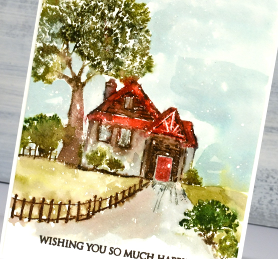
I stamped first in antique linen so I could see the whole scene as I added colour bit by bit to the cottage, fence and trees. I used a mix of distress ink pads and markers. To blend the inks I sometimes spritz the stamp before stamping so the inks start moving or I use a paintbrush after stamping to move the inks to fill an area like the roof or walls of the cottage. If some details get lost in the blending I use a marker to add definition back to the scene eg. bricks, roof and chimney outlines.
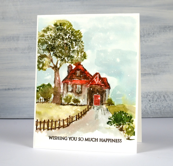
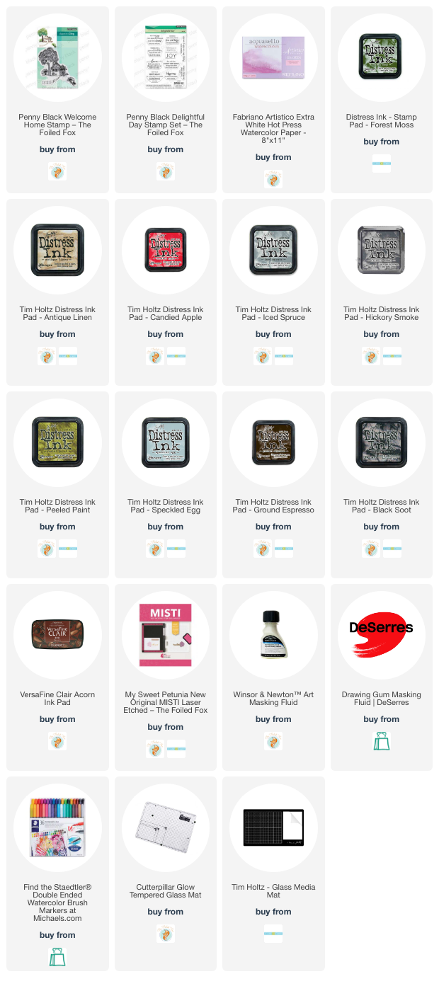
I loosely painted the grass, sky and driveway with smooshed distress inks. I thought the wide sentiment worked well to balance the height of the tree and stamped it in dark brown. It’s another new one from PB’s ‘delightful day’ set.
(Compensated affiliate links from Foiled Fox, Scrap n Stamp)
Lovely
Posted: March 13, 2023 Filed under: lovely, Penny Black | Tags: Fabriano Watercolour Paper, Penny Black stamps, Ranger Distress inks 7 Comments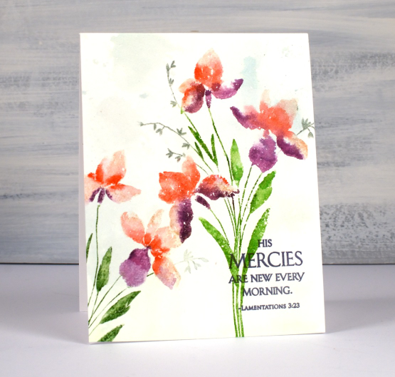
I have another lovely new stamp from Penny Black and it is aptly named ‘Lovely’! It is a brushstroke stamp, meaning that it is semi solid and made from a painted image to look like you painted it. I find that dye inks and water based markers are great for this type of stamp.
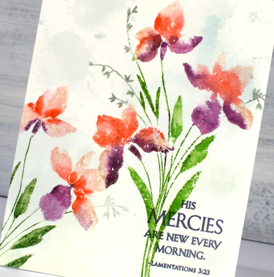
I worked on hot press watercolour paper which had some masking fluid splattered over it. I sometimes use masking fluid even when I am not creating a snowy scene because I like the slightly aged or ‘rainy’ look it gives my stamping and painting. I wanted to do the background before I stamped so I smooshed some speckled egg and mowed lawn distress inks on my glass mat, spritzed water to dilute it then swiped my watercolour panel through it. The result is very soft but enough to add subtle interest to the background.
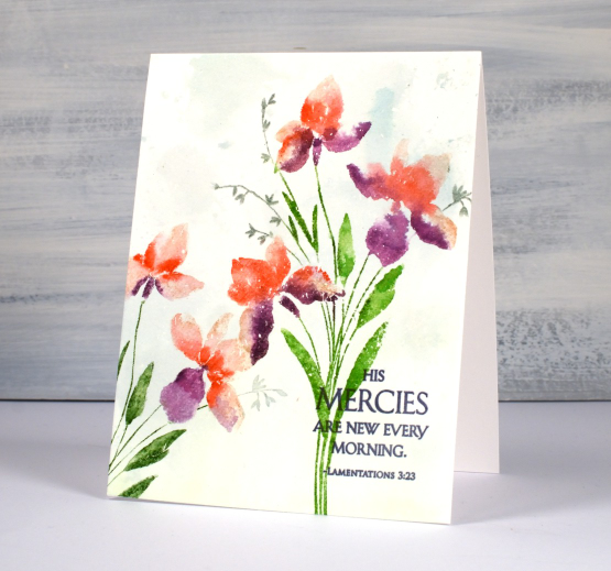
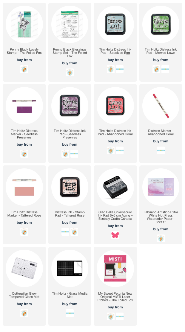
I inked the flowers with a mix of tattered rose, abandoned coral and seedless preserves distress inks, spritzed the stamp with water then stamped. I used a paintbrush to blend the ink to fill the petals. You can see me use this technique in a video here. I inked the stems with mowed lawn and the tiny flowers with iced spruce. I do use a mix of large and small ink pads when I ink the stamp along with distress markers. I know distress markers are discontinued but I will keep using mine until the bitter end. I managed to reink a marker the other day following a video a friend told me about. The video maker used a distress stain but I had a re-inker in the required colour so I used the re-inker. I didn’t see any improvement until the next day after the ink had time to soak through the tube and into the brush tip.
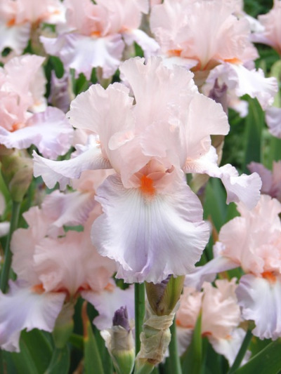
Because I love the matchy-matchy I pulled out a Ciao Bella ink to stamp the sentiment from the new PB set ‘blessings’. My colour inspiration was from a photo Jan sent me last year. My colours are not as subtle as the ones in the photo but I still like the unusual mix of coral and purple. Thanks for the inspiration, Jan, I went to my file of your pics as soon as I started working with this stamp!
(Compensated affiliate links from Foiled Fox, Scrap n Stamp & Ecstasy Crafts)
Prized
Posted: March 10, 2023 Filed under: Penny Black, prized | Tags: Fabriano Watercolour Paper, Penny Black stamps, Ranger Distress inks 17 Comments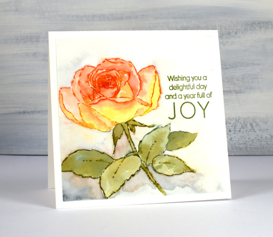
Penny Black has new stamps! And of course I am especially interested in new flowers and tree stamps. This rose, aptly named ‘prized’ is just one of the new stamps I will be sharing on the blog in the next few weeks.
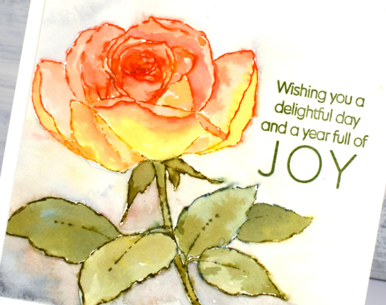
My mother loved roses and she and my father grew them in every garden they made. My dad has several lovely ones out the front and the back of his retirement unit. I think he has one with peachy/yellow colouring a bit like this one.
To colour the ‘prized’ rose I worked on hot pressed watercolour paper and kept it in a stamp positioner. I inked the petals with both fossilized amber and abandoned coral distress inks. I spritzed the inked stamp before stamping which made the ink wetter and easier to blend into each petal shape. When using this technique I always smoosh the ink pad on my glass mat so I can pick up ink there as well.
While the petals dried I inked the leaves and stem with forest moss and a small amount of faded jeans distress inks then followed the same technique as above to paint the leaves. I went back to the petals and did a second round of stamping and blending adding candied apple ink to the centre of the rose to deepen the colour.
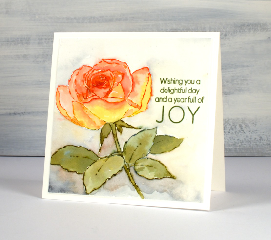
After I had completed the flower I used mix of diluted inks to paint around the rose. I added hickory smoke to the other four inks as I blended around the edges of the flower and feathered out to pale yellow or grey at the edges of the watercolour panel.
I chose the title sentiment from the PB set ‘delightful day’ and stamped it in peeled paint archival ink.
Hope you are having a delightful day!
(Compensated affiliate links from Foiled Fox, Scrap n Stamp)