
Planting time
Posted: May 19, 2020 Filed under: a garden, bench, buckets of flowers, hanging planters, Papertrey Inks, Penny Black | Tags: Papertrey ink, Penny Black creative dies, Penny Black stamps 2 Comments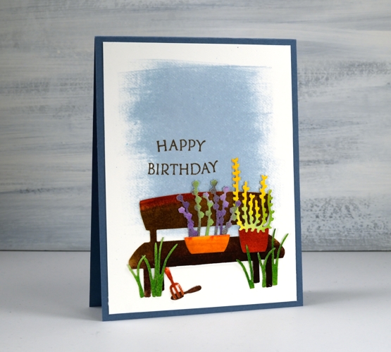
We’ve had all kinds of weather around here lately as we wait for the May long weekend before which outdoor planting is considered very risky! My daughter has been starting seeds inside so we have quite a few little plants ready for the great outdoors as well as an order of seedlings to come.
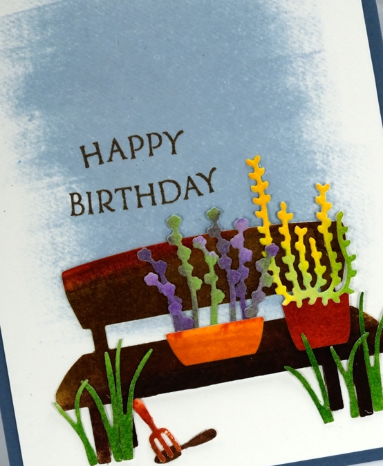
These plants are looking pretty healthy, probably because they are not relying on me remembering to water them! I used papertrey ink cubes to colour left over pieces of hot pressed watercolour paper. I swiped the ink cubes across the paper in colour groups, they are juicy little inkpads so they work well direct to paper. I did a panel of two browns, also some greens, another with purples and one with orange, yellow, green. After inking the paper I spritzed water onto it until the ink moved and blended a bit, covering more of the panel and making some light and dark areas.
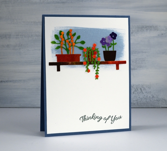
Once all the panels dried I used several die sets from Penny Black featuring little plants, pots and tools (they’re all linked below). I also cut out the cute little bench die to be part of my scene. I could have cut all the elements from coloured cardstock but I love the variation of colour and depth achieved with watercolour.
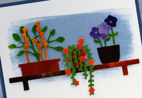
I created two backdrops on hot pressed watercolour paper by swiping the spring rain ink cube back and forth to create a solid blue patch. Over the blue I arranged and rearranged my tiny die cuts until I had two little scenes. I used a jewel picker and liquid glue to attach all the elements, making a few errors in the process resulting in some more painting and die-cutting to make replacement pieces. Once everything was attached I hunted through my cardstock to find a matching blue for card bases and added a couple of sentiments from PB ‘banner sentiments’ set.
As I write this the long weekend is drawing to a close and I can report some planting has been done. A couple of readers shared on my last post their planting plans and routines; I’d love to know more plus any clues for keeping the critters away!
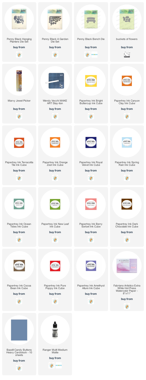
Supplies
https://linkdeli.com/widget.js?id=f5e8378456858c916708
Three colour brusho video
Posted: April 9, 2020 Filed under: Brusho, flutterby, Penny Black, Tagged, Tutorial, Watercolour | Tags: Brusho, Faber-Castell Polychromos Colour Pencil, Fabriano Watercolour Paper, Penny Black creative dies, Penny Black stamps, Tutorial, video 7 Comments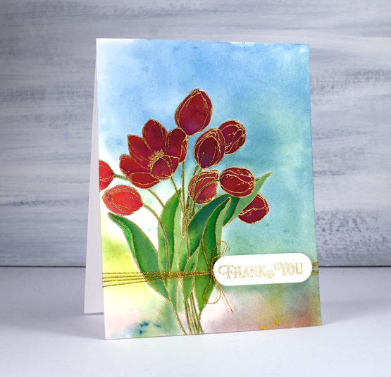
A while back I posted three cards all painted with the same three brusho paint colours and my Welsh friend, Karen requested a video. Well this is it, a different stamp and three different colours (Brusho sunburst lemon, prussian blue, rose red) but the same technique. Here is the one that prompted the video request.

As with the card above I embossed the outline stamp, ‘flutterby’ in gold powder then swiped up a brusho background by sprinkling brusho on my glass mat then spritzing water over it to activate the powders and turn them into liquid watercolour paint. From there I moved onto painting petals and leaves with individual colours and secondary colours. Take a look at the video and you will see what I mean.
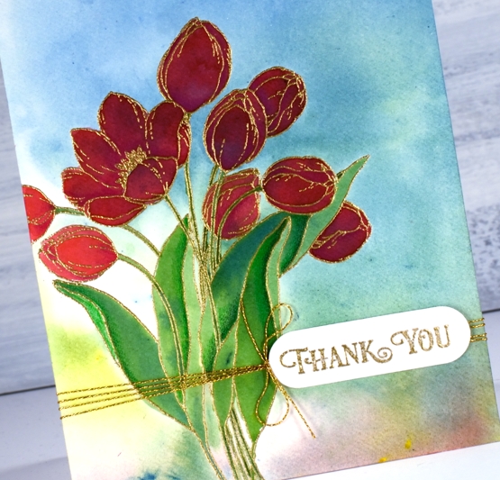
After all the painting was done I added some extra shading in shadow areas with Faber-Castell polychromos pencils and some gold thread detail. The sentiment is from PB ‘banner sentiments’ gold embossed and die cut with a die from the PB ‘tagged’ set.
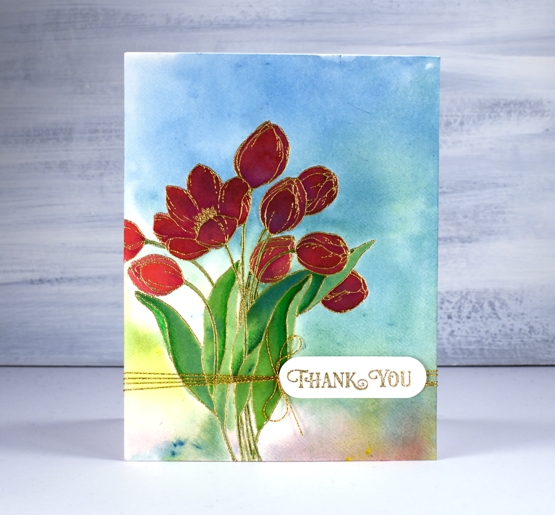
One of the things I like about this technique is the way the background works with the painted images even though the are painted right over the top of a multicoloured panel. The colours work because they are the same colours and because the background is not too bold. You can see in the tulip on the left what the true colour of the rose red brusho is, but the ones that are painted over the blue background still look red, just a deeper red perhaps in shadow not full sun.
Happy Easter my friends. Stay home, stay healthy, stay hopeful and maybe try a new art or craft technique!
Supplies
Shimmer floral
Posted: February 21, 2020 Filed under: Brutus Monroe, Coliro paints, floral medley, Penny Black, square frames | Tags: brutus monroe embossing powder, Coliro paints, Finetec artist mica watercolour paint, Penny Black creative dies, Penny Black stamps 8 Comments
The fun continues around here with pearlescent paints and black watercolour paper. I just wish the photos would show better how pretty the shimmery paints are. The Foiled Fox sent me some yummy new paints from Coliro, I used the ‘ocean’ and the ‘vintage’ sets for this card. I also tried out the ‘penny’ embossing powder from Brutus Monroe. It is a copper colour which worked nicely with the paints I chose. I embossed part of the Penny Black ‘floral medley’ stamp in one corner of my black watercolour paper panel then flipped the panel and moved the stamp around a little before stamping more flowers on the other corner. I paired up a couple of stamps from the PB ‘strength’ sentiment set to emboss a sentiment in between the florals.
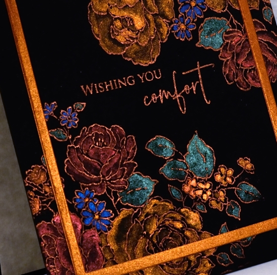
Coliro (or Finetec) paints are full of shimmer and look amazing on dark paper but can also be used on light or white paper for more subtle effects. I have painted them on neenah black cardstock before, the colours looked great but I like the way watercolour paper gives me more flexibility with blending from dark to light. When attempting light and dark areas on black paper I have to think about the direction of my blending. On white watercolour paper I paint strong colour then blend it with water to decrease the intensity and so end up with a lighter area. On dark paper I paint an area in bright pearlescent paint and then dilute it with water to get a darker or shadow area. Shading isn’t really necessary of course, the colours look great painted as solid sections without shading.
To finish off the card I die-cut a frame from copper coloured shimmer paper. I have two frame dies from the PB ‘square frames’ set still linked together so I get a plain frame when I run the two decorative dies through the machine together.
I am teaching a ‘Watercolour on Black’ workshop in Ottawa at the end of March where we will be playing with these lovely shimmer paints and creating stamped and painted panels that really shine. Click over to my upcoming classes page for more details.
Supplies

Pretty in pink
Posted: February 19, 2020 Filed under: Alexandra Renke, Autumn dragonflies, Autumn plant rose, Penny Black, shall we dance, the sweetest sound | Tags: Alexandra Renke cardstock, Penny Black creative dies, Penny Black stamps 7 Comments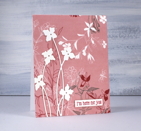
I’ve been playing with pretty paper again and have the Foiled Fox to thank for this lovely Alexandra Renke design. Make sure you pop over to the Foiled Fox blog where I’m sharing my process in making today’s cards. I believe I said it last time I worked with AR papers, the colours and patterns are so lovely I really don’t want to add much over the top.
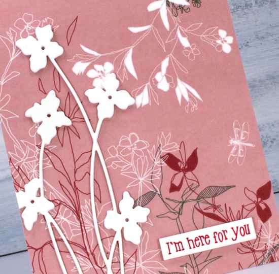
For both cards I covered the whole front with AR ‘Autumn Plant Rose’ paper. The delicate floral design covers most of the paper so I didn’t want to add too much that would clash with the paper. I chose instead to die-cut cream flowers and birds as focal images, keeping them cream coloured and stacked made them stand out from the background pattern. The tall flower die is from Penny Black and is called ‘shall we dance’. I like the way the long thin stems mimic the thin lines of the paper’s design.
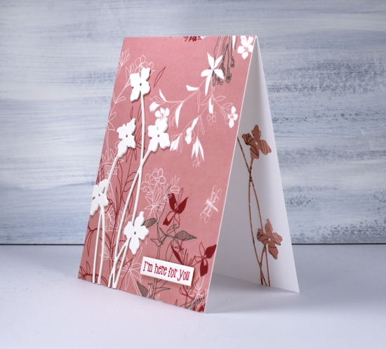
Adding the same die cut on the inside of the card was a must and simple to do after first adding stick it adhesive to the back of the patterned paper.
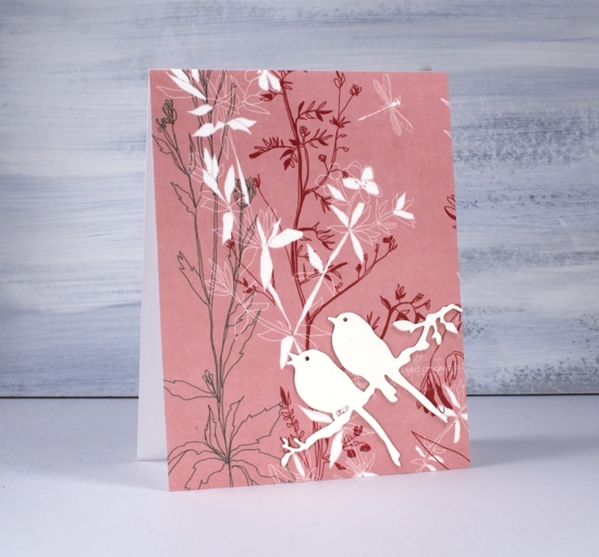
I used the same design idea and stacked three bird die-cuts for the second card and added a single patterned die-cut on the inside of the card. The die is called ‘the sweetest song’ and is another PB one.
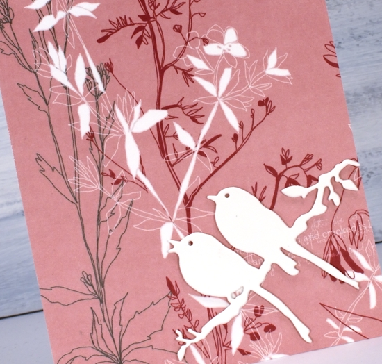
I debated whether or not to add any sentiments and ended up deciding on one with and one without.
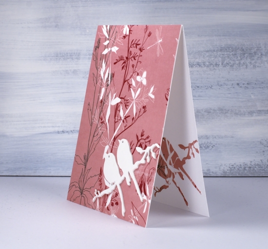
I will be doing more with this lovely paper and a pink abstract paper also by AR. I’ve linked the papers and supplies below and look forward to sharing more designs with you soon. Make sure you click over to the Foiled Fox and check out all the Alexandra Renke papers.
Supplies
Tenderness roses
Posted: February 7, 2020 Filed under: Peerless watercolours, Penny Black, tenderness, tenderness matching dies 10 Comments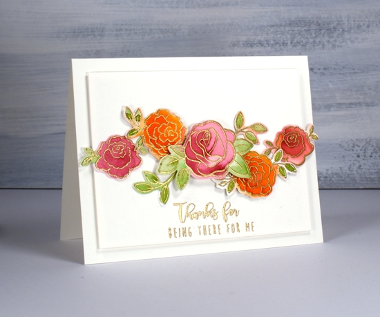
I am on the Foiled Fox blog today, one of my favourite artsy craftsy places to be. If you want to read how I created today’s cards then pop over there right now! If you want to read some of my musings and wonderings about stamps, dies and paints keep reading here and then click over there.
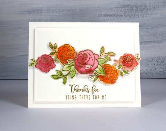
These roses are from a sweet little Penny Black set called ‘tenderness’ and it has co-ordinating dies. I have come a little late to the co-ordinating die game but you know I don’t like to fussy cut so it’s no surprise that I opted for the die cutting route. Another reason I haven’t used many co-ordinating dies is because I often stamp and paint directly on my panels with very few layers involved.
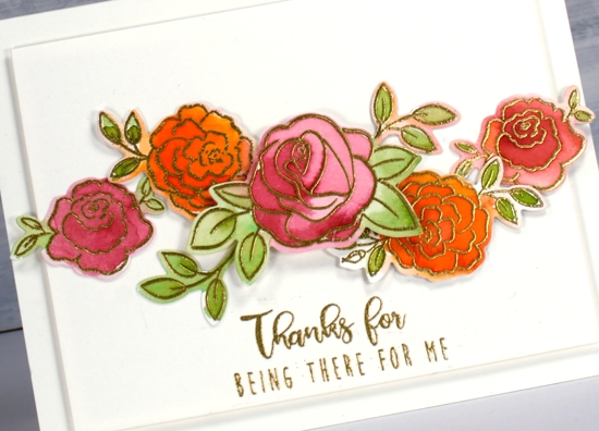
One of the questions with co-ordinating dies is how to deal with the white outline if you have a coloured background. I think I’m used to seeing it now so it doesn’t bug me as it once did. On the roses above I did paint outside the lines on a few of them so there is a mix of coloured edges and white edges. I don’t think it is too distracting either way.
Another thing you can do with co-ordinating dies is cut masks for layered stamping. The masks will be a bit bigger than the stamped image but it is easy to trim a little off or just position the masks to line up with the edge of the stamp that needs to be masked.
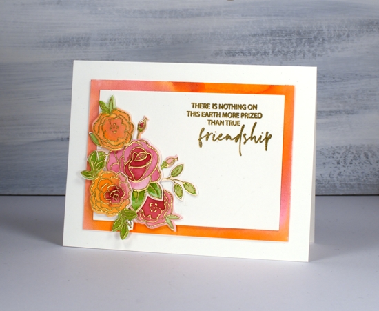
I did all the painting for these cards with peerless watercolours. Sometimes I forget about my peerless paints because they are an unassuming collection. If you haven’t heard of them before check out an earlier blog post I wrote about them. The colours blend beautifully, the range of colours is excellent and the price is pretty nice too.
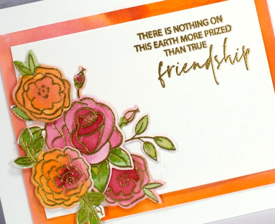
I chose friendship sentiments again, one from PB ‘love language’ and one from ‘bear cuddle’. All the supplies are listed below and here’s the link to my process on the Foiled Fox blog.
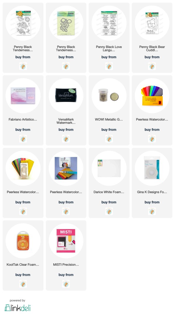
Supplies
Three colours – Bouquet Ballet
Posted: January 13, 2020 Filed under: bouquet ballet, Brusho, fluttering friends, My Favorite Things, Penny Black, square frames | Tags: Brusho, Fabriano Watercolour Paper, My Favorite Things, Penny Black creative dies, Penny Black stamps 12 Comments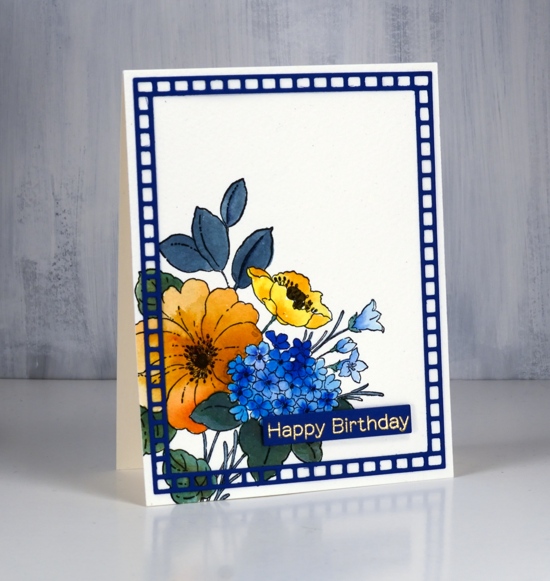
Above is the second of my three colour cards painted with only ost blue, sandstone and lemon brusho. The first card displayed some of the texture and blending which is easily achieved with brusho, in this card it is easier to see the three basic colours plus a couple of the colours I mixed myself. As with the first card I mixed the brusho powders with water in a palette but for this card didn’t sprinkle any brusho directly on the watercolour panel.
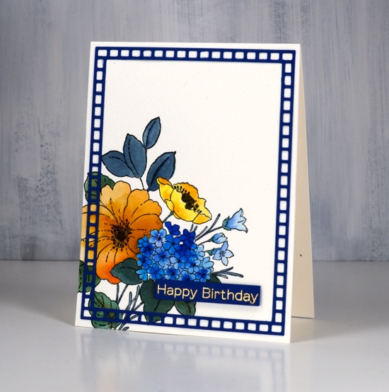
The PB bouquet ballet stamp is stamped in black ink on cold pressed watercolour paper; I used a stamp positioner as cold pressed watercolour paper has texture which prevents me from getting a perfect impression first go. The small poppy is painted in lemon brusho, the large flower with sandstone and the multi-headed flower in ost blue. On each one I dropped in more colour for extra depth. The small trumpet shaped flowers to the right are also painted in ost blue but a diluted coat. The stems and leaves are painted in a mix of blue and lemon. The centre of the flowers I painted in brown which was a mix of blue and sandstone brusho. I did use a black marker to colour the little flower centre thingies, but we are not going to count black as a fourth colour!
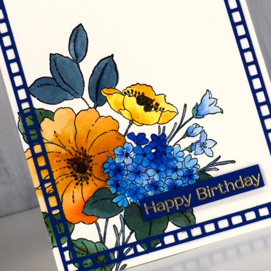
Happily I found a blue cardstock in my stash to create a sentiment strip and a frame. I embossed the sentiment from MFT fluttering friends in gold powder and popped it up over the panel. The frame is cut using PB square frames and glued on using on point glue because of the tiny tip on the glue bottle. I have one more card to show you in this miniseries and I think it might be my favourite. Check back soon.
Supplies

Pinecones & joy
Posted: December 19, 2019 Filed under: Darkroom Door, Ink to Paper, jumbo joy, Penny Black, pine cones, season of joy stamps | Tags: Darkroom Door stamps, Fabriano Watercolour Paper, Ink to Paper, Kuretake Gansai Tambi watercolour paints, Penny Black creative dies, WOW embossing powders 11 Comments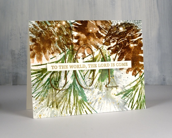
The pine needles and pine cone stamps I used for this card are from Darkroom Door and I love how realistic they are. The stamps are quite large and there are several sizes and shapes of cones which makes for lovely feature images and fillers as well. I used one pine cone stamp but two of the pine needle stamps and worked on hot pressed watercolour paper which had been splattered with masking fluid. If you look at the close up below you can see large white dots as well as tiny ones; they’re all made by the masking fluid.
I stamped the pine cone three times using a stamp positioner and four different brown distress inks. A spritz of water started the browns blending and I did a little blending with a paint brush as well.

I stamped the green pine needles with forest moss and evergreen bough distress inks and the fine needles in the background with iced spruce. I added some green splatter then some gold splatter using one of the gansai tambi starry colours. I used the ‘jumbo joy’ die from Penny Black to cut out the word joy from the stamped panel and cut three layers from shimmer gold cardstock as well so I could stack them up just a little offset so the gold peeps out on the side.
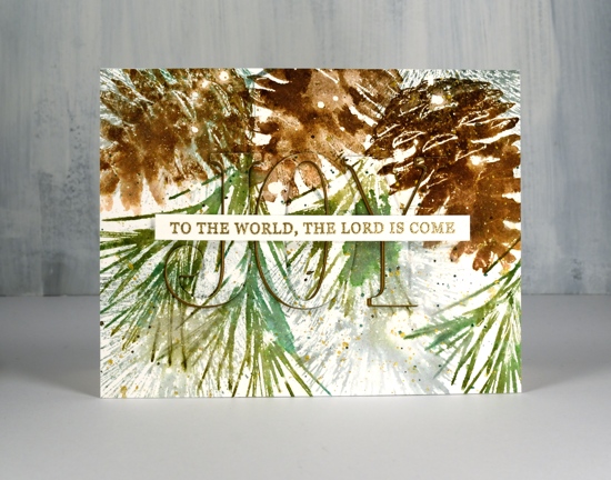
I stamped the rest of the Christmas carol lyric using a stamp from Ink to Paper’s ‘season of joy’ set and some gold embossing powder. The overall pattern may be a little messy but it reminds me of what I see if I look up into the branches of the very messy pine tree in my front yard, which is currently covered with snow but not gold splatter!
I have been blessed to receive some beautiful handmade Christmas cards in the mail this week and I am enjoying them on my window ledge. I hate to say it but as yet I have not sent a single one! As I’ve said before there are twelve days of Christmas so I haven’t run out of time yet!
Supplies
Pink poinsettia poem
Posted: December 17, 2019 Filed under: poinsettia poem, xmas poinsettia cut out | Tags: brutus monroe embossing powder, Fabriano Watercolour Paper, Papertrey ink, Penny Black creative dies, Penny Black stamps 4 Comments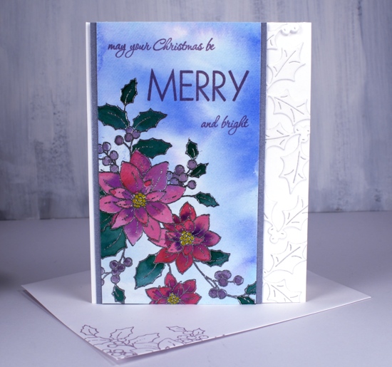
I have a less traditional colour scheme for you today featuring pink and purple on this pretty poinsettia stamp from Penny Black. I wasn’t set on being non-traditional when I started but it headed that way as I progressed. I started by smooshing tumbled glass and blueprint sketch distress stains on my glass mat, adding water then swiping a piece of hot pressed watercolour paper through it to create a soft background. Once it dried I used my stamp positioner to stamp and emboss the ‘poinsettia poem’ stamp in silver embossing powder.
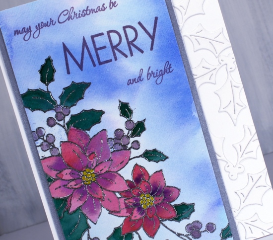
I smooshed papertrey ink cubes onto my glass mat to use as watercolours and painted the flowers in scarlet jewel and royal velvet, the leaves in pine feather and the berries in winter wisteria. I used a gold gel pen to colour the centres. The card is not quite so bold as the photo suggests but even so I wanted some light and bright features alongside the painted panel so I framed it in silver and added some die cut holly to the white card base.
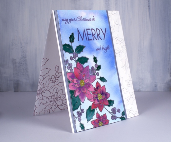
In keeping with my resolve I stamped inside the card and on the envelope with winter wisteria ink and add the sentiment in the same.
Supplies
Snowflake garland
Posted: November 20, 2019 Filed under: crystalline, snowflake tag | Tags: Penny Black creative dies 12 Comments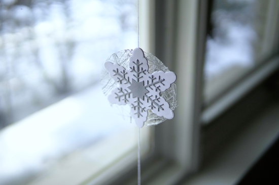
At the risk of boring you silly I will mention once again that I have a booth in an art market in four days! One of the items I wanted to make for the market was garlands. I thought the new ‘snowflake tag’ dies from Penny Black would be lovely with some sparkly beads and they are but it took me a lot longer than anticipated to put it all together. I almost left it at one but decided a pair might be nice; the second one was much quicker as I had thought it all through.
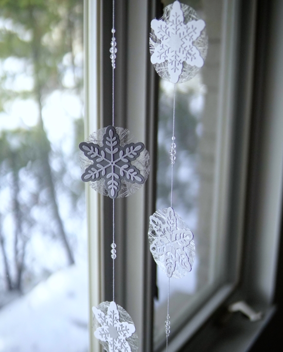
I used white cord with a silver thread through it, clear facet cut beads, a mix of shimmer silver and white cardstock and a spiderwebby silver fabric (from France).
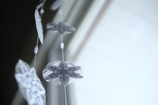
I ended up with six snowflakes on each garland with clear beads grouped on the twine in between the snowflakes. Each snowflake is actually double sided so the twine is glued in between the two and for some I glued a contrasting snowflakes on each side.
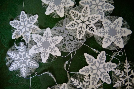
The spiderwebby fabric is apparently interfacing for dress making but its silver colour makes it perfect for adding a little shimmer and shine to paper craft projects.
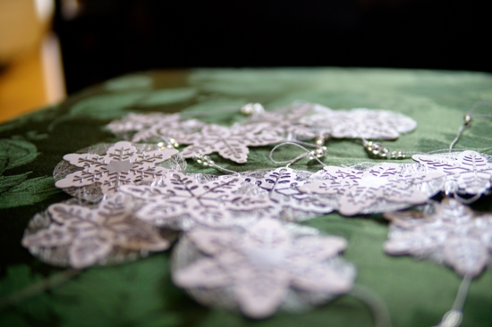
Despite being photographed in a tree the snowflake garland is a delicate thing and should not be used outdoors!

Supplies
https://linkdeli.com/widget.js?1559654439292
A happy anniversary
Posted: November 15, 2019 Filed under: Hand lettered, numbers, Penny Black, spontaneous joy | Tags: Finetec artist mica watercolour paint, Hand lettering, Penny Black creative dies, Penny Black stamps 9 Comments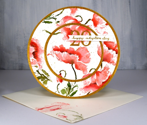
What a treat it was to design and make this card at the request of a friend of mine. Her daughter, also a friend of mine celebrated the 20th anniversary of her adoption day yesterday so an extra special card was needed. Inspired once again by the beautiful round card made by Peet Roeven I chose the PB stamp ‘spontaneous joy’ and a red and gold colour scheme. I worked in a stamp positioner to add colour to the flowers gradually beginning with worn lipstick distress ink for the petals then candied apple distress ink for extra depth and shadow. I blended a little with a paintbrush and water but I didn’t want to lose the detail by blending over all the stamping.
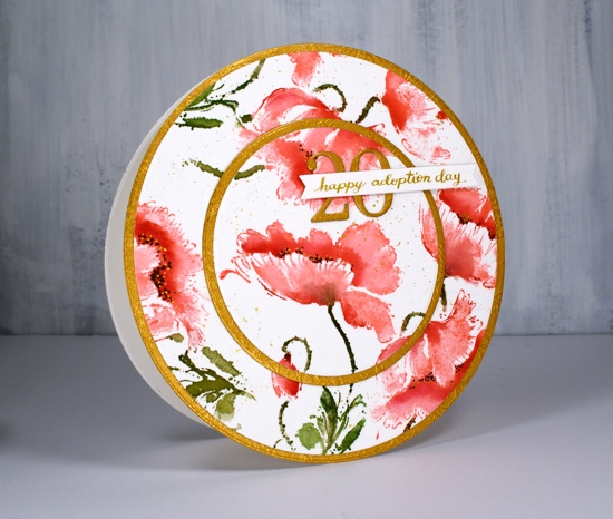
I used mowed lawn and peeled paint distress ink for the stems and leaves; two greens adds interest even on those small areas. I added black dots to the centres of the flowers then some gold dots with finetec pearlescent paint. To finish it off I splattered some of the same gold paint. I have been pulling out my finetec paints quite often recently, not so much for the main elements but for details and finishing touches. I used the same gold and a pen & nib to write my own sentiment strip.
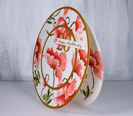
While all the inks were out I stamped a flower on a second panel of watercolour paper and on an envelope. I used a set of circle dies to cut the main panel and back panels into large circles and to cut a circle out of the centre of the front panel. I used a piece of embossed gold cardstock to cut extra circles and the number ’20’ using the PB ‘numbers’ die set.
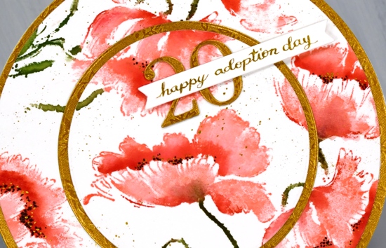
To assemble the card I scored across the top of the the back circle, applied adhesive above the score line and attached the two panels together. Having the score line on the back panel means the front decorative panel doesn’t need to bend at all. I also sliced a very slim bit of the bottom of the back circle so the card will stand up and not roll away!
Thanks for dropping by today, I hope you have a lovely weekend.
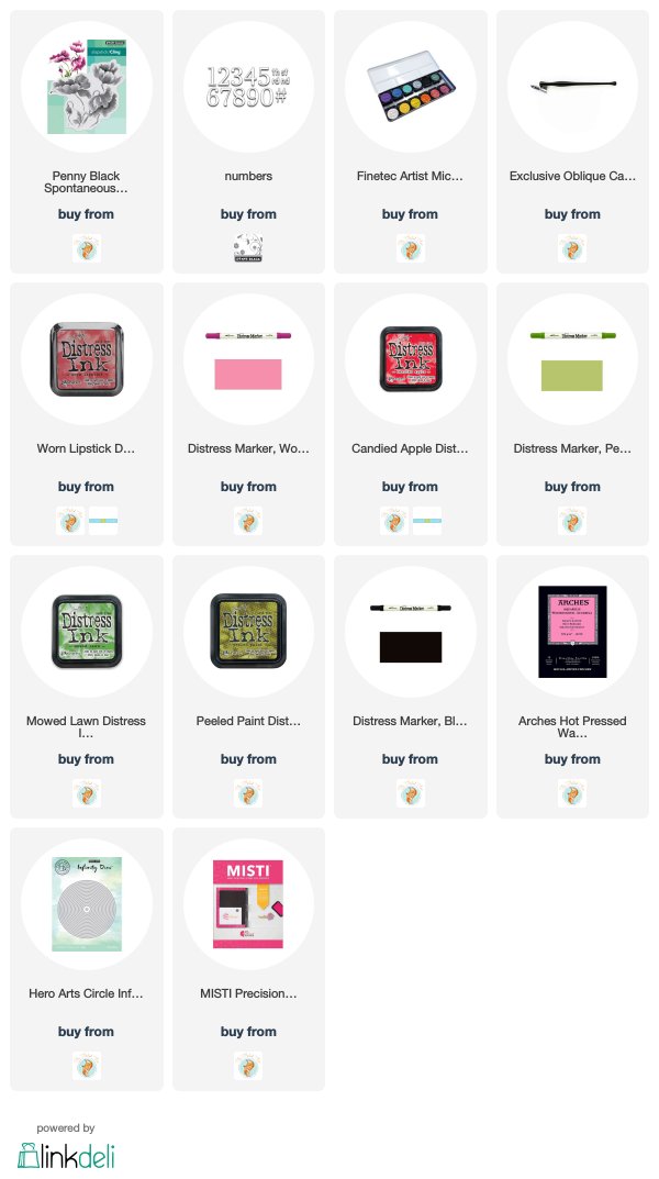
Supplies
https://linkdeli.com/widget.js?1559654439292












