Time for tea
Posted: November 6, 2019 Filed under: Cup of tea, Tagged, teacups | Tags: Darkroom Door stamps, Penny Black creative dies, Ranger Distress inks 10 Comments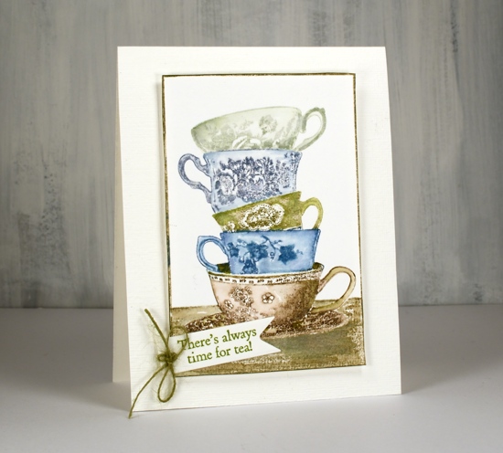
I love this little stack of teacups from Darkroom Door. I have some pretty teacups that belonged to my Nanna, some from my Grandma and some from my mother. I don’t often use them because I like a much bigger cup of tea but I love having them. There are intricate details on the cups on this stamp but I have chosen not to colour the patterns individually, instead colouring each cup a different colour. I kept my colour scheme muted sticking with inks I have been using to stamp forests and trees lately.
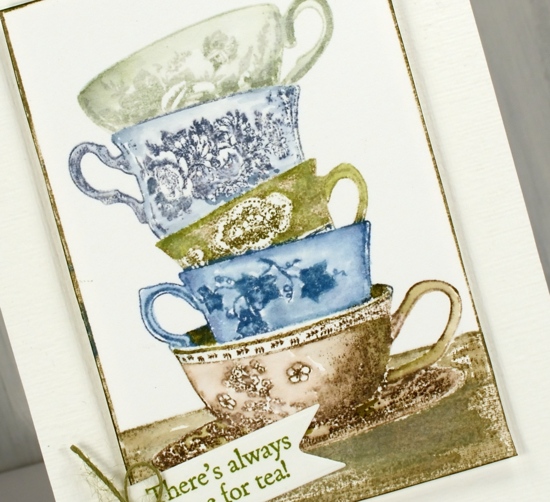
I used a stamp positioner so I could ink one cup at a time. I kept a wet cloth handy to wipe off any ink that ended up on the adjacent cups. after stamping I blended the stamping with a damp brush to gently spread ink into the cup but not dilute the pretty patterns.
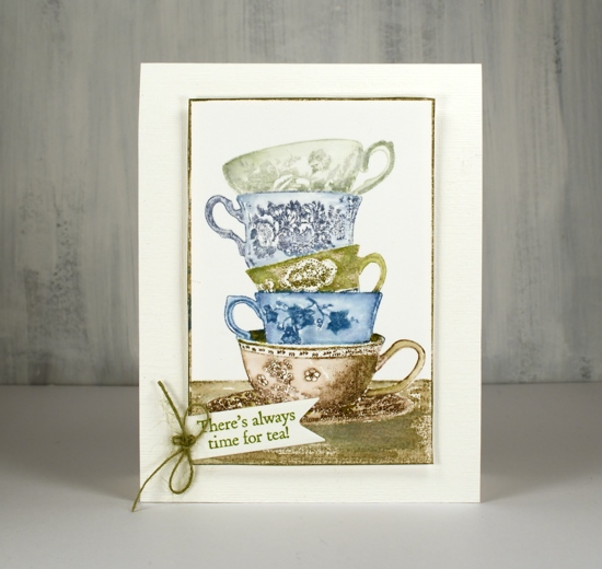
The stamp has its own frame so I trimmed with scissors right next to the frame and ran a peeled paint marker along the edge to make sure it was all inked. I chose my sentiment from another DD tea themed set, ‘Cup of tea” and cut it out with a PB tag die. I had hemp twine which exactly matched so I added a little bow to the tag. The stamped panel is popped up on adhesive backed foam on a textured cardbase.
Hope you have time for tea today, unless of course you are all about the coffee, but that’s a card for another day!
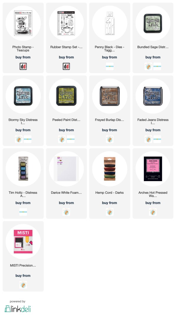
Supplies
Creamy poinsettias
Posted: October 9, 2019 Filed under: diamond cut, geometrix: rectangle die, Ink to Paper, jolly holly, layered poinsettia, Penny Black, scarlet season | Tags: Ink to Paper, Penny Black creative dies, Penny Black stamps 5 Comments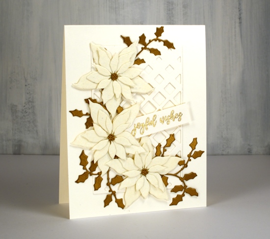
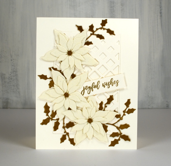
Lately I have been die-cutting poinsettias from all sorts of different cardstock. I have a poinsettia Christmas card class coming up so I’ve been playing around with lacy paper, shimmer paper, kraft paper and watercolour paper with plans to also cut up some pretty plaid paper. These two cards feature a lovely cardstock called ‘Ivory WorldWin twist’ which is a smooth ivory cardstock on one side a lace texture on the other side. I bought it at Crop A While, my local scrapbooking store. The lacy side is almost spiderwebby but in a delicate pretty way not a ‘look what’s behind the filing cabinet’ way.
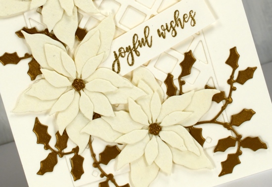
The card bases are neenah cream cardstock, and so is the sentiment strip and the PB ‘diamond cut’ behind the poinsettias. I used the PB ‘layered poinsettia die set’ for this trio of poinsettias; I like the size which makes it possible to fit three on a card front. (two more cards with these dies here and here) The PB jolly holly die cuts are a dark gold cardstock. I didn’t pop anything up on dimensional tape as it was getting pretty dimensional anyway with seven layers! That must be some kind of a record for me. I used glue for the flowers, narrow double sided tape for the diamond frame and stickit adhesive on the back of the holly.
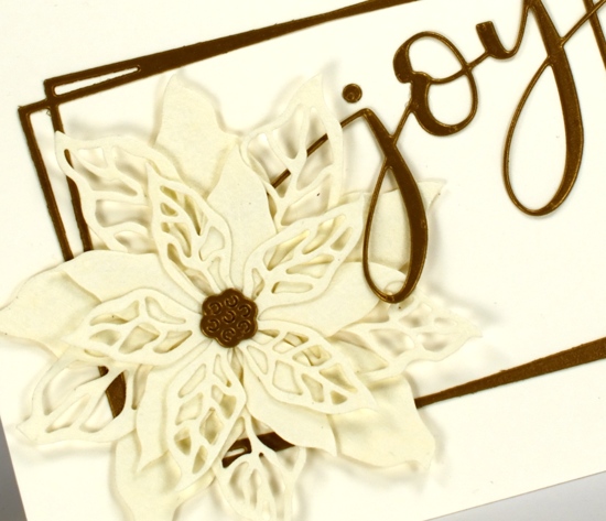
The second card features the same cardstocks but a new PB poinsettia stamp ‘scarlet season’ which has both solid and filigree flowers. I cut them once again from the lacy cardstock and layered them over a funky rectangle die from ‘Ink to Paper’ and added the PB ‘joy’.
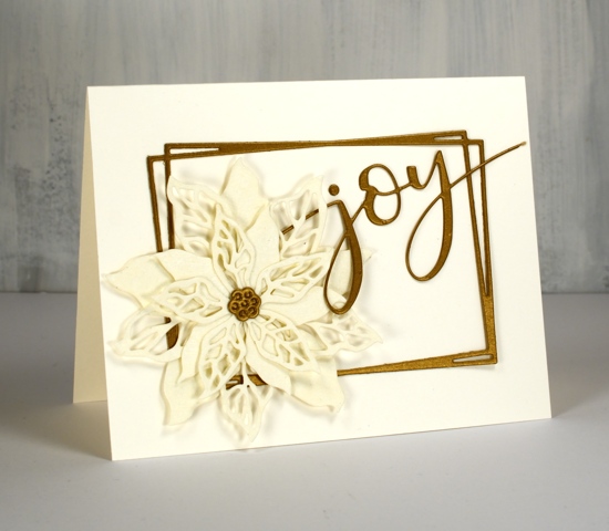
I’m not sure if it is the lacy paper or the colour combo but these cards have a bit of a retro look to them. I think these designs would be pretty with patterned vellum too.
As always the supplies are linked below; I have added a second affiliate with my Canadian readers in mind. The store is Scrap ‘n’ Stamp in BC. If you buy through my affiliate links from either Foiled Fox or Scrap ‘n’ Stamp there is no extra cost to you but I receive a commission. Thanks for dropping by today.
Supplies
I’ve been playing with the alcohol inks again!
Posted: October 2, 2019 Filed under: Alcohol Ink, Penny Black, simple serif alphabet dies, tall flowers | Tags: Concord & 9th, grafix craft plastic, Penny Black creative dies, Penny Black stamps, pinata alcohol ink, Ranger Alcohol Ink, Yupo Paper 11 Comments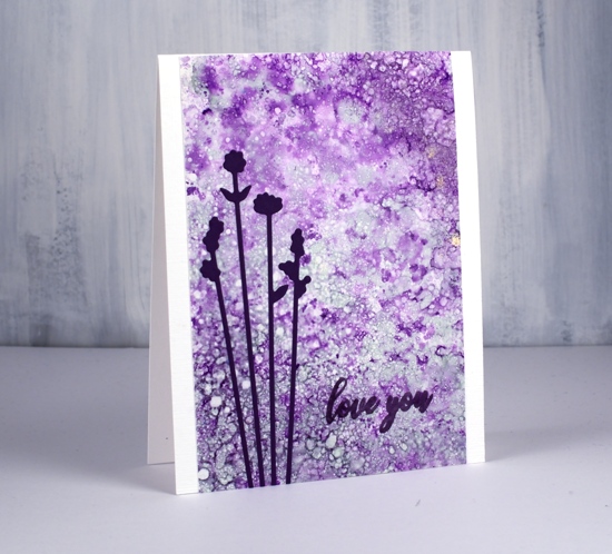
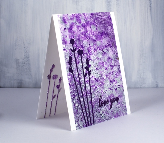
Last weekend I spent Saturday creating with alcohol inks while learning from Kathryn Kanadian who was in Ottawa teaching a couple of classes. Kathryn is a wonderful teacher and I now have a few new tricks to try and techniques to practice. This lavender panel was created with dots of ink on an applicator; I used passion purple, rich gold (Pinata) and juniper (Ranger) along with some blending solution or isopropyl alcohol. I dabbed the applicator all over the craft plastic for quite a while and added blending solution and more ink when needed. The gold ink didn’t move much but the other two colours created a lot of pattern. These delicate flowers which look a little like lavender are cut with PB ‘tall flowers’ dies. The sentiment from the PB ‘special sentiments’ set I stamped with dusty concord archival ink. I had a section of the patterned panel left over so I was able to die cut some more flowers to pop inside the card. You can be sure I put stick-it adhesive on those panels before I cut such skinny flowers out.
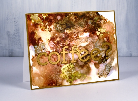
The panel of browns and gold below came together as Kathryn was encouraging us to experiment with blending solution to move the ink. I used more than I usually would and was delighted with all the variation of colour I achieved, the dotted patterns and the splotches of gold here and there. I used ginger, espresso (Ranger) and rich gold (Pinata). Kathryn had samples of her wonderful work including a coffee themed card that inspired this one.
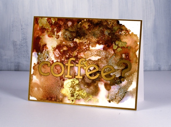
I used the Concord & 9 ‘simple serif’ alphabet dies to cut the letters from antique gold cardstock and framed the panel in antique gold also.
The daisy panel was a bit of a breakthrough for me as I had only made landscapes with alcohol inks by accident or trial and error in the past. With the introduction of a stylus and alcohol ink brushes I was able to paint some daisies and splatter a rain shower over the top of them.
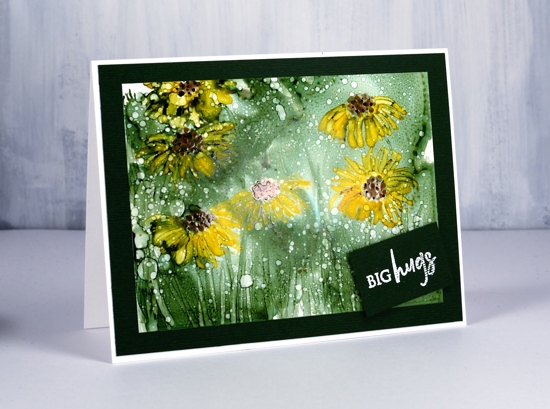
I began by creating a green background with the help of some isopropyl alcohol and green ink (not sure if it was meadow or pesto??) I used a stylus to dot the centres of the flowers in copper and pitch alcohol inks (Ranger) then I used a brush to paint petals around the centres and stems and grass at the base. The splatters of isopropyl alcohol pulled the composition together.
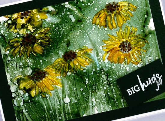
Although it looks black the cardstock framing the panel is actually dark green. I embossed a little sentiment from the PB ‘family sentiments’ set in white powder.
I created a few more panels during the class which hopefully I will turn into cards soon. Thanks Kathryn for a wonderful class.
Supplies
Homespun blessing
Posted: September 25, 2019 Filed under: Dies, golden delight, homespun, Penny Black | Tags: Penny Black stamps, Ranger Distress inks 16 Comments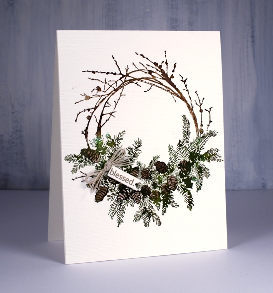
This beautiful wreath is part of the PB ‘Merry & Joy’ release. I know it is perfect for Christmas but I am putting it to use as a thanksgiving wreath first. I inked the wreath with two brown and two green distress inks both in marker and ink pad form. I inked the branch area in vintage photo and ground espresso inks and stamped a couple of times for good coverage on hot pressed watercolour paper. I inked the foliage area in forest moss and lucky clover inks then after stamping once it was easier to see on the stamp where the pine cones were so I could ink the pine cones in ground espresso ink and stamp again.
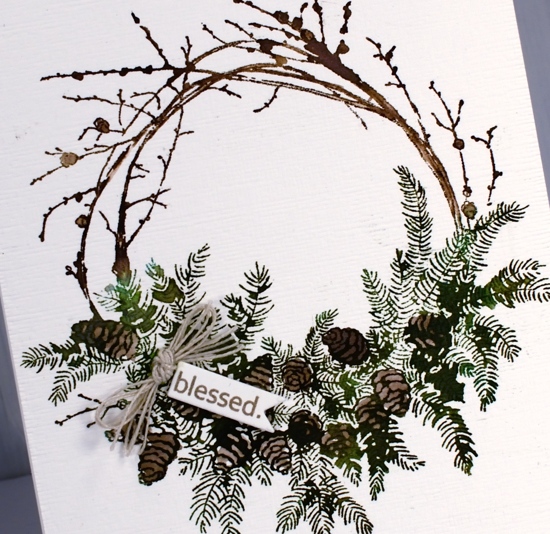
After the stamped image was complete I painted some water onto the stamp and stamped again (I kept the stamp in the MISTI the whole time) The amount of water transferred by the stamp was just enough to fill and darken parts of the image. I also coloured some of the pinecones in with a marker. One word from the PB ‘golden delight’ sentiment fitted on a tiny tag cut with a die from the PB ‘gift card pocket’ set. I rarely make gift card pockets but I use the different tag and label dies from this set often. To complete the wreath I added some hemp twine and popped up the tiny tag.
Supplies

Blushing blooms
Posted: September 16, 2019 Filed under: blushing, blushing cut out, Peerless watercolours, Penny Black | Tags: Peerless Transparent Watercolors, Penny Black creative dies, Penny Black stamps 10 Comments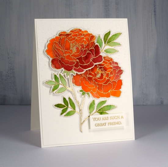
I have coloured this lovely flower a few times lately but I realised I hadn’t posted it all on my blog. I did some no-line colouring with the stamp which took a while due to the number of petals, but still produced a nice result which I’ll share at the end of this post. This weekend I decided to emboss the flower instead and paint it with peerless watercolours. I must say this technique was faster and less fiddly than the no-line petal by petal approach. I embossed two of them and painted them side by side with the same three paint colours. Peerless paint blends beautifully on the paper, in this case hot pressed watercolour paper, and I was able to add royal crimson over the top of flesh tint and vice versa until I was happy with the coverage and blending. The leaves were painted in olive green. I think I’ve mentioned before how much I love the quality, depth and blending of peerless watercolours.
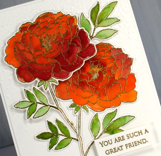
I used the co-ordinating die to cut out both flowers then arranged them on top of a ‘snowfall/speckles’ embossing folder background. I snipped a few of the leaves off and rearranged them to balance the composition. I also glued some pieces directly to the background and popped other pieces up on dimensional foam. The sentiment is from the grateful sentiments set and is embossed and popped up also. Because my orange/pinkish combo is opposite green on the colour wheel this card is a match for the current CAS watercolour challenge, a challenge I love but rarely get my act together to enter!
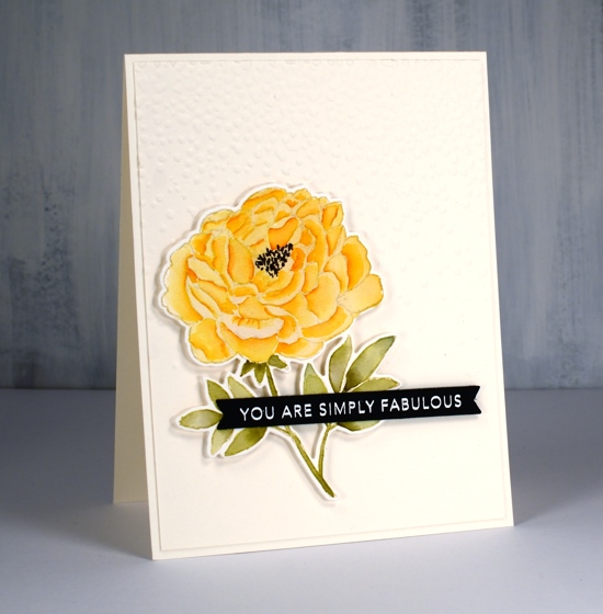
Here is a similar design I completed as part of my no-line watercolour class. I stamped in antique linen distress ink and used a selection of distress inks as ‘paint’. The sentiment is from a clever Taylored Expressions stamp and die combo.
Supplies
Autumn wreaths
Posted: September 13, 2019 Filed under: A Pocket Full, all natural, golden delight, Penny Black | Tags: Penny Black creative dies, Penny Black stamps, Ranger Distress inks, Tsukineko Versafine inks 10 Comments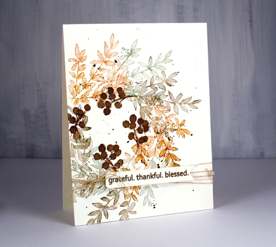
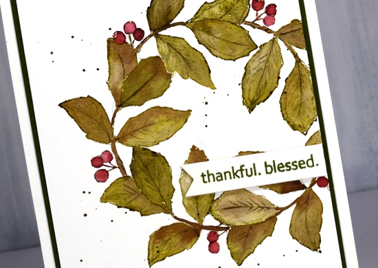
Much as I hate to admit it, things are beginning to feel distinctly autumnal. I don’t have any autumn wreaths to hang at home but if I did I think I would like one a bit like this, soft colours and delicate leaves.
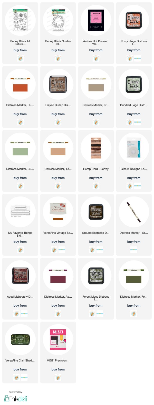
I worked in my stamp positioner to create this panel on hot pressed watercolour paper but I think you could easily do it with the stamp on an acrylic block, it might even be faster. I started by tracing a circle on my panel with a pencil. Using the circle as I guide I positioned the branch stamp from Penny Black’s new ‘All Natural’ set so the base stems were on the circle. I inked with rusty hinge, stamped, moved the stamp around the circle a little, stamped in bundled sage, moved it again, stamped in frayed burlap and then repeated until I was all the way around the circle. I used a small watercolour brush to blend inside the leaves adding extra ink when necessary. I love the combination of colours; frayed burlap is new to my collection and I like the way it gets along with the other two inks. Once the blended ink was dry I stamped just a section of the berry stamp around the centre of the wreath in gathered twigs distress ink then blended it to fill the berries.
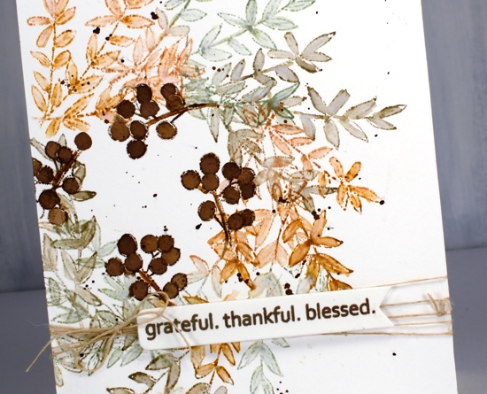
I used the same sentiment for both cards, it’s from another new and cute PB set called ‘golden delight’. I stamped both times on a little tag from the PB ‘a pocket full’ die set. To finish off the card I wrapped some twine around the panel, added a bow and popped the tag on top.
For the second card I grabbed another stamp from all natural and used the same process but needed a leaf mask cut from post-it note a couple of times where the leaves would have stamped over previous ones. This little stamp has both leaves and berries as well as a curved stem which just happened to conveniently match the curve of my traced circle. I used the same technique of blending the leaves and berries after stamping with forest moss and aged mahogany distress inks.
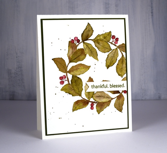
Both cards requested the splatter treatment and the second card wanted a olive green mat as well.
Hope the days are warm and sunny where you are.
Supplies
Bunches and bunches
Posted: June 3, 2019 Filed under: Penny Black, stitched nested frames, together | Tags: Penny Black creative dies, Penny Black stamps, Ranger Distress inks 10 Comments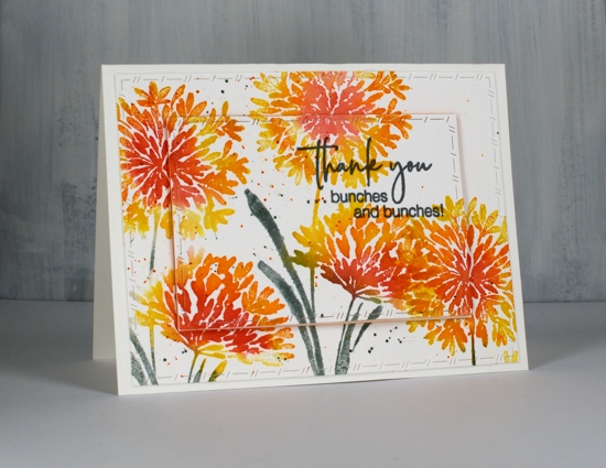
I’ve got something bright and breezy for you today. Even though the flowers on the PB ‘together’ stamp look like agapanthus to me and even though agapanthus do not come in orange or yellow, I chose this colour scheme anyway. The grey days continue here so I’m stamping sunshine instead!
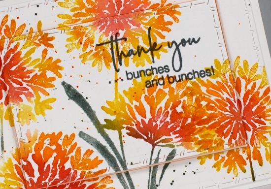
I worked in the stamp positioner so I could add a colour or two at a time and started by inking the centres of the flowers with festive berries, you could use the ink pads or the marker. I used the ink pad and wiped ink off any area where I didn’t want it. Around the festive berries I inked with ripe persimmon ink, spritzed the stamp and stamped on hot pressed watercolour paper. I wiped off the stamp then inked the outside petals in fossilized amber (my current fave yellow), spritzed and stamped again. Spritzing helps the colours blend and helps the ink give more solid coverage.
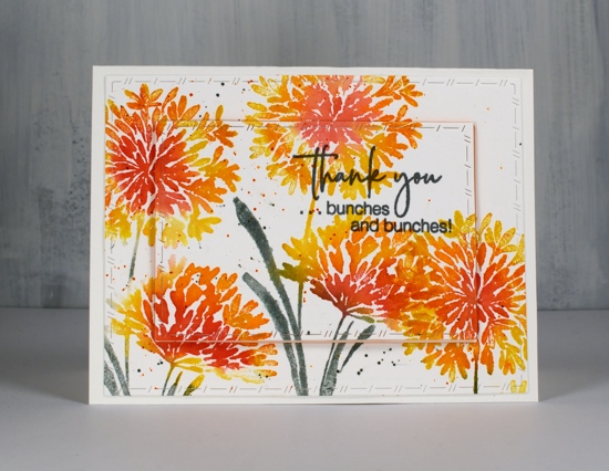
I inked the leaves in iced spruce because the time has come to hang out with other green inks; forest moss will always be special to me but there are other greens out there that need to be seen! I moved the panel and repeated the stamping to the left and to the right almost filling it with flowers. I added some orange and green splatter then die cut with the ‘PB stitched nested frames’ dies. The sentiment is inked in versafine clair misty morning ink because I thought the grey worked with the iced spruce leaves. The centre panel is popped up on a piece of foam for a bit of extra interest.
As I was choosing my sentiment with the words ‘bunches and bunches’ I was reminded of the word my mother used when she did my hair in two side ponytails. Up until grade 4 she did my hair every morning and it was usually ‘bunchies’! That was our name for the style shown below; I think we reserved the name ‘ponytail’ for just one. Did your mother do your hair in ‘bunchies’, if so what did you call them?
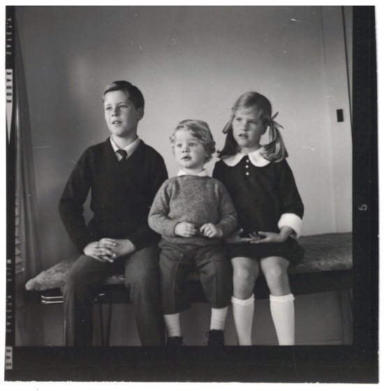
It’s quite the classic shot isn’t it? I guess the photographer told us to do that odd thing with our hands. I was six years old and my dress matched one my mother had.
Supplies
Love’s glow
Posted: May 20, 2019 Filed under: Leaves, love's glow, stitched square & circles, Triple Banner | Tags: Penny Black creative dies, Penny Black stamps, Ranger archival inks, Ranger Distress inks 7 Comments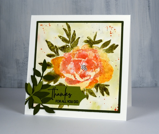
Here’s another new beauty from Penny Black. This one is a large rubber cling stamp called ‘love’s glow’. I’ve stamped it with a mix of archival and distress inks then added some die-cut extras on the corner. I think I might have gone a little over board with the splatter at the end but not enough to make me give up on the floral. There is a lot of shaded detail in this stamp so it is very helpful to stamp it in a medium to dark colour first on a scrap of paper so you can have the image off to the side while adding colour to your project. Before I started stamping I splattered some masking fluid on the hot pressed watercolour panel so the finished design would have some white dots here and there. You could use white paint at the end to get a similar effect. I used my MISTI so I could work on the oranges and reds separate from the green.
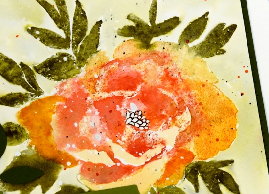
I stamped the flower first in archival spiced marmalade ink, it is one of the colours Ranger has recently brought out in mini archival packs. I learnt this trick from Jill Foster, just one of many tricks I have learnt from her! By stamping the flower first in archival I have an image on my paper that I can watercolour over but it will not be diluted and lost as I add water. Because I was using similar colours in distress inks the initial archival ink does not stand out as different. When I inked the stamp initially with archival ink I wiped any of the spiced marmalade that ended up on the leaves. To achieve the blended red and orange tones in the petals I inked and stamped the flower again in wild honey and festive berries distress inks. I then used a damp brush to blend the colours in the petals using my reference photo to help me when necessary.
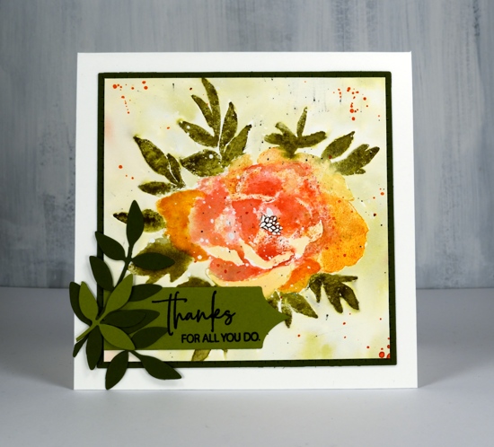
I followed the same process for the leaves stamping them first in archival peeled paint, then again in forest moss distress ink which I blended with water and a paint brush. I added definition to the centre with a black marker. Once the panel was dry I painted shabby shutters ink around the flower after first pressing my shabby shutters inkpad onto my glass mat and adding some water. I splattered with festive berries, forest moss and black soot ink. I trimmed the panel down to a square then die cut a square mat of olive green cardstock with the stitched square die.
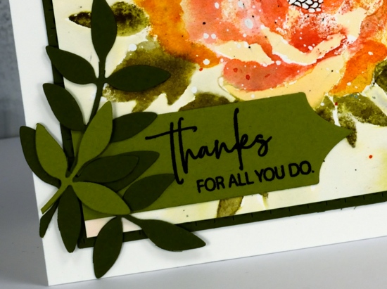
To finish off the card I added some green die cut leaves; I think these leaves might be from the first die sets I ever received from Penny Black. I’ve used them over and over. I cut a sentiment banner with one of the ‘triple banners’ set and trimmed one end so it could align with the mat. The sentiment is from the Best Mom set but I did some partial stamping to get only half the words on my banner.
I hope you are having a great Monday. I just want to remind you there is a sale happening at Foiled Fox all the long weekend and a ‘Color Trio challenge’ continuing until May 30.

Supplies
Little gardens
Posted: May 3, 2019 Filed under: a garden, art deco window, Dies, garden box, hanging planters, Penny Black, window treatments | Tags: Penny Black creative dies, Penny Black stamps, Tsukineko Versafine inks 5 Comments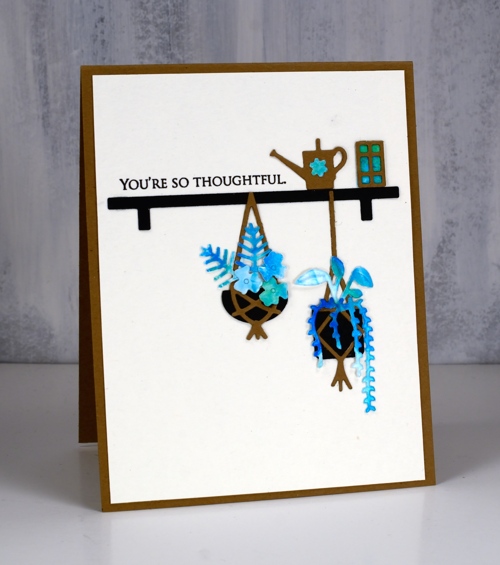
Today’s little garden cards contain unusually small die-cuts (for me) but I had fun arranging them and love the results. While I was putting these together I had Jill Foster’s video using the same die sets on pause in front of me so I could get inspiration from all her ideas. Make sure you check out Jill’s video; she includes plenty of tips and tricks and cool layouts.
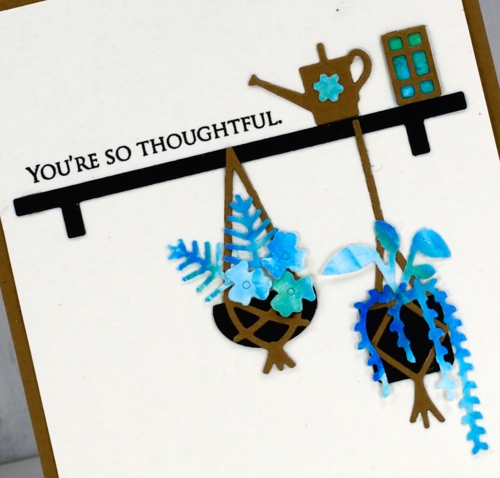
There are three ‘little garden’ sets that co-ordinate well and between them there are oodles of leaves, flowers, pots, hanging baskets and fixtures to choose from. I chose a limited palette of black, kraft and a blue/green patterned panel for all four cards. My patterned panel was a shaving cream marbled panel so I was able to get variation in colour without having to change cardstock.
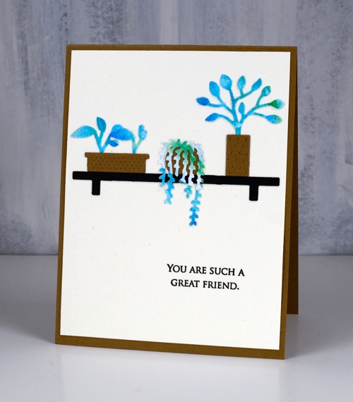
My garden box, a garden and hanging planters die sets are all still joined together so I cut everything from kraft, black and patterned then proceeded to create vignettes.
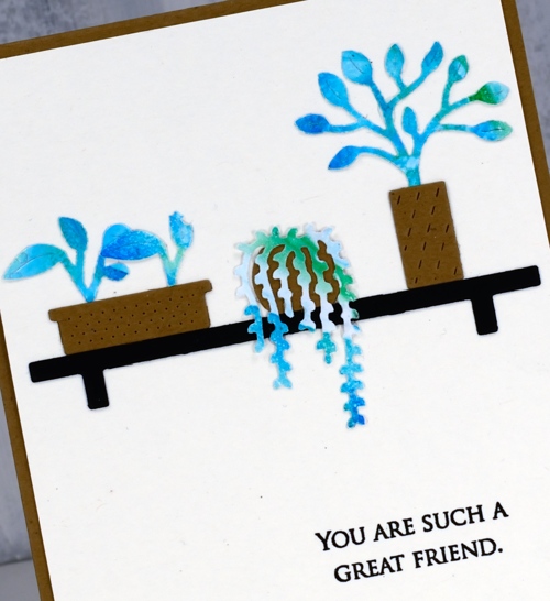
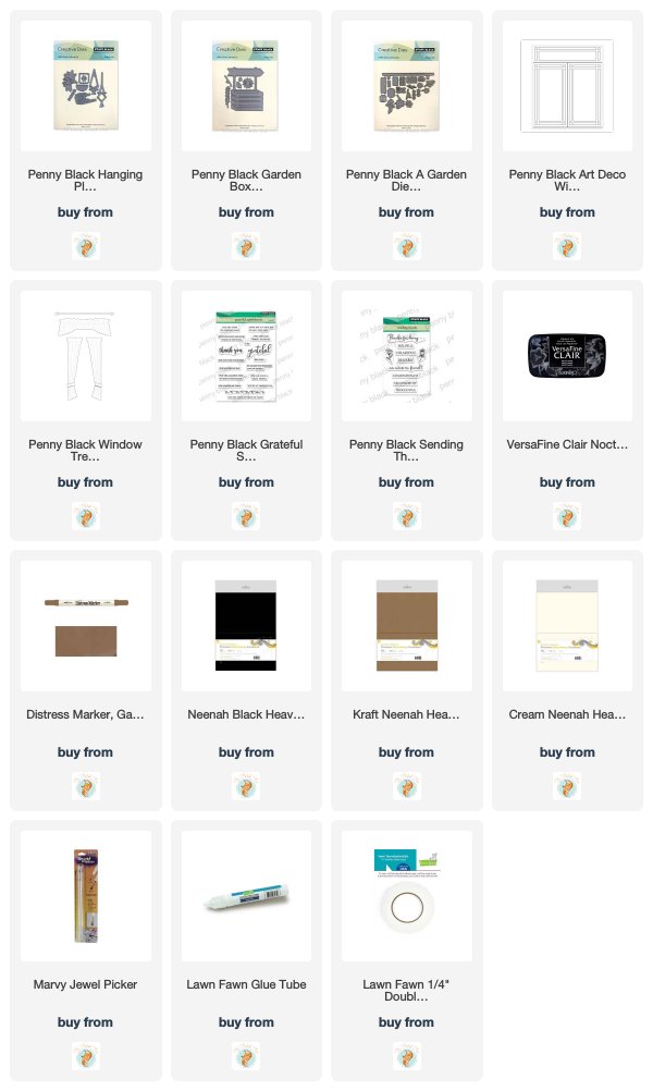
Once I had an arrangement that looked balanced I used my marvy jewel picker and lawn fawn glue tube to get everything attached to cream cardstock. The jewel picker saved my arthritic thumb joint; picking up little things is not good for it!
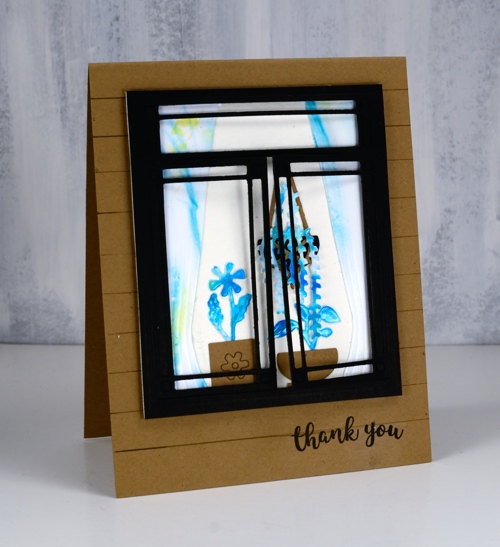
As you might imagine I still had plenty of little elements to spare after three cards and I remembered the ‘art deco window’ and ‘window treatment’ dies I had so I arranged another couple of pots inside the window and beside the patterned curtains.
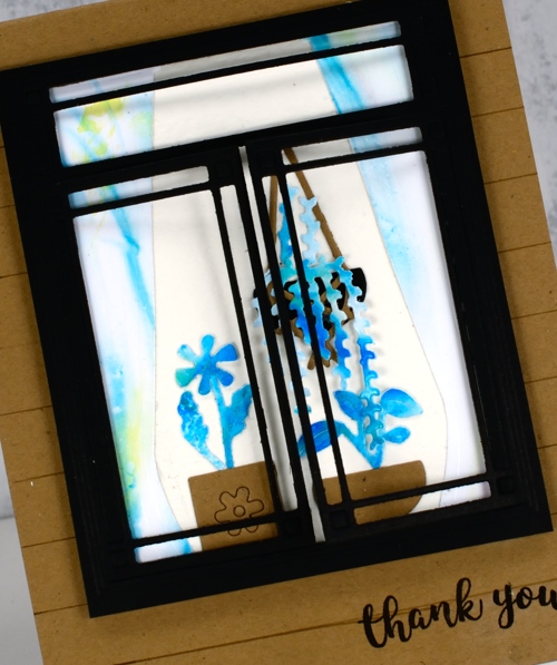
I ruled some lines on the kraft card base to make it look like wood panels on the side of a house. The window frame dies cuts a window that opens on each side which is a cute touch.
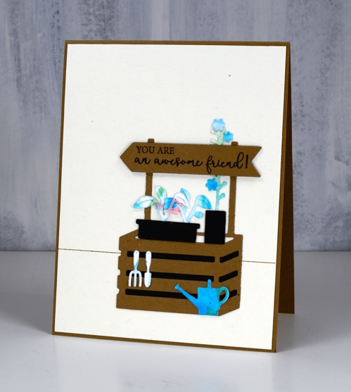
This last simple scene is created with elements from the ‘garden box die set’ along with leftovers from ‘a garden’ and ‘hanging planters’ sets.
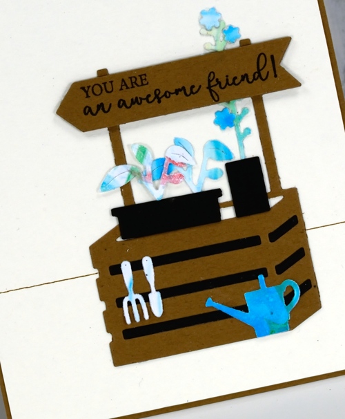
All the sentiments are stamped in versafine clair nocturne ink and taken from the ‘grateful sentiments’ and ‘sending thanks’ sets.
I had fun creating these little scenes despite the ‘fiddliness factor’ being a little higher than I am used to. I love the end result with the strong contrast between black, cream, kraft and blue/green pattern.
Supplies
Dreams of love
Posted: April 29, 2019 Filed under: dreams of love, Penny Black, Script, square and circles, Xmas sprigs | Tags: Penny Black creative dies, Penny Black stamps, Ranger Distress inks 12 Comments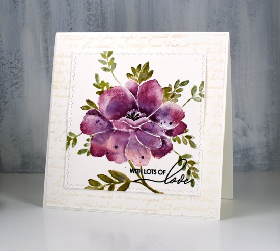
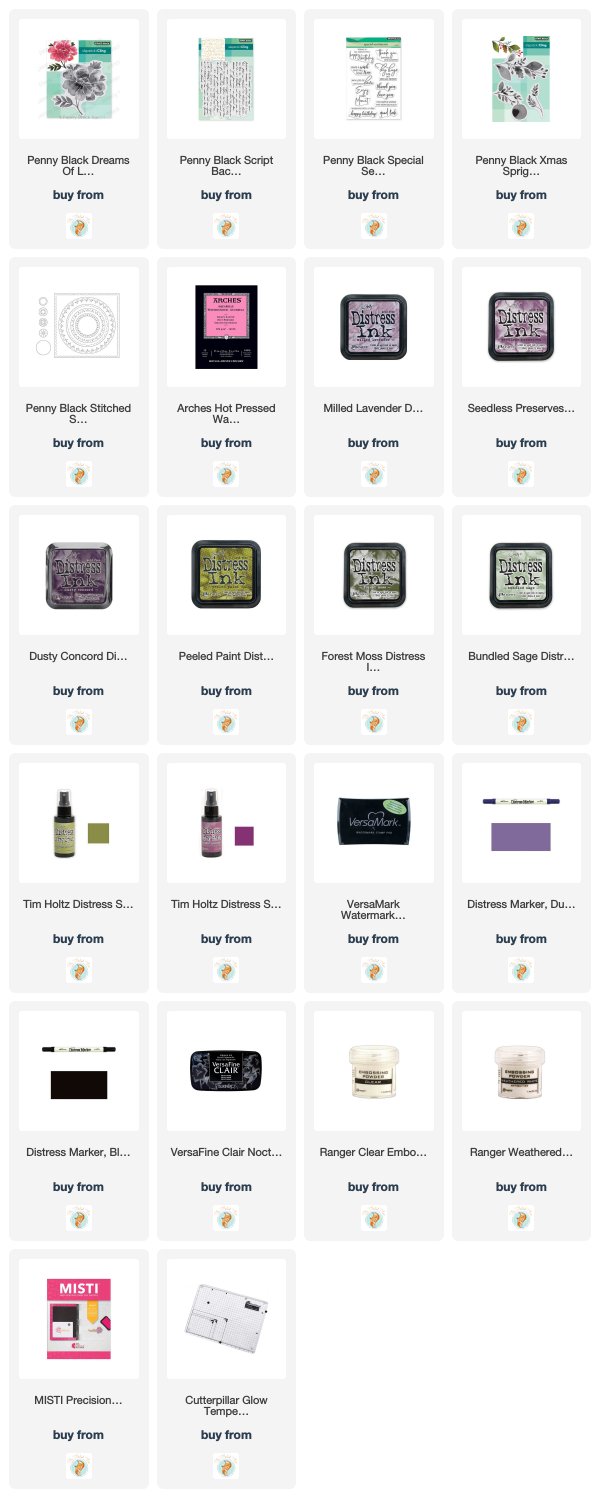
I think you can guess where this sweet floral came from. Penny Black has a new release, ‘Full Bloom’ and this is just one of the beauties I have to show you. As I often do with brushstroke stamps I pulled out distress inks for my first play with this stamp. I used three purple inks, milled lavender, seedless preserves and dusty concord to create variegated petals on this large flower. For the leaves I used a mix of peeled paint, forest moss and bundled sage. I would understand if you wondered whether I ever use any of the other greens, those three are definitely the first ones I reach for!
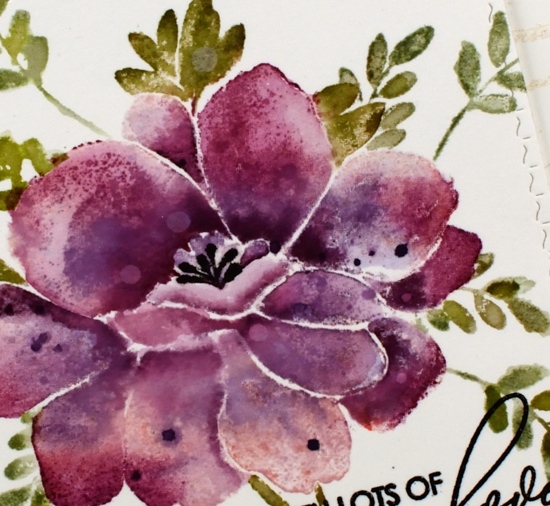
I used a stamp positioner and hot pressed watercolour paper and started by stamping the whole flower (but not the leaves) in milled lavender distress ink. On a stamp like this one it is sometimes hard to differentiate between petals and leaves when looking at the red rubber side of the stamp. I find it helpful to stamp it on scrap paper in a medium to dark ink as a reference. When doing partial inking as I did for this card, I ink all the petals then wipe off any ink that ended up on the leaves with a cloth or wet wipe. After stamping in milled lavender I inked the petals again, this time in seedless preserves ink and I did not cover all the petals. I gave the stamp a light spritz of water so the ink would blend when it layered over the previous stamping. Finally I inked it again in dusty concord keeping the ink concentrated around the centre of the flower not the edges. I then used a paintbrush and some water to blend the colours on each petal one at a time. To further define the petals I pressed the ink pads onto my glass mat so I could pick up ink with my paintbrush and add it to the edges or any areas where I wanted a strong shadow. I dried the panel before carefully inking the anthers with a black marker, unlike the rest of the image I wanted them sharp and defined rather than soft and blended. I also added distress stain drops and water drops while the panel was dry.
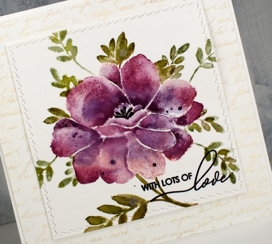
With the petals all finished I switched to the leaves and inked them with peeled paint and forest moss ink then blended them with water after stamping. I added a few more leaves of the same style using a stamp from the ‘Xmas sprig’ stamp set. To add them in I cut a rough post it note mask and positioned it over the petal edge before stamping the sprig in bundled sage and peeled paint inks.
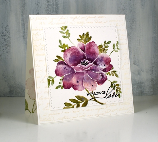
To finish the card I die-cut the panel using the square from the PB ‘stitched square & circles’ die set and clear embossed a sentiment from PB ‘special sentiments’ in black ink. I framed the floral panel with a script stamped panel which I embossed with Ranger weathered white embossing powder. I have not had success with this embossing powder until now, totally user error by the way, there is nothing wrong with the product! The embossing powder is called ‘weathered white’ for a reason, when you emboss with it the effect is not glossy and it is not even. It is, as the name suggests, weathered! For a large background area like this script panel it adds texture and subtle colour. The card is quite large and fits into a 6″ square envelope. I inked the stamp in milled lavender and bundled sage ink to stamp a pale image inside the card and used the same inks to stamp the ‘sprig’ on the envelope.
I’m looking forward to inking this stamp again with different colours schemes and maybe a looser watercolour look.
Supplies