
Dreams of love
Posted: April 29, 2019 Filed under: dreams of love, Penny Black, Script, square and circles, Xmas sprigs | Tags: Penny Black creative dies, Penny Black stamps, Ranger Distress inks 12 Comments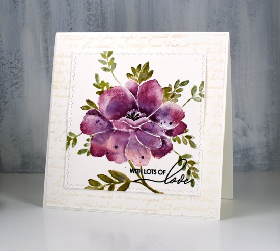
I think you can guess where this sweet floral came from. Penny Black has a new release, ‘Full Bloom’ and this is just one of the beauties I have to show you. As I often do with brushstroke stamps I pulled out distress inks for my first play with this stamp. I used three purple inks, milled lavender, seedless preserves and dusty concord to create variegated petals on this large flower. For the leaves I used a mix of peeled paint, forest moss and bundled sage. I would understand if you wondered whether I ever use any of the other greens, those three are definitely the first ones I reach for!
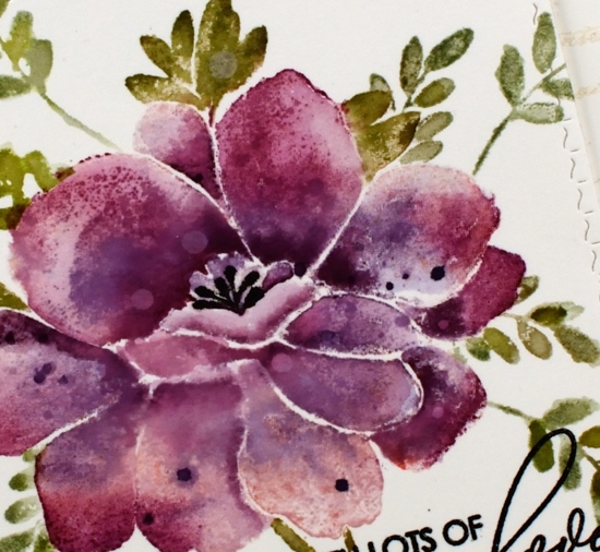
I used a stamp positioner and hot pressed watercolour paper and started by stamping the whole flower (but not the leaves) in milled lavender distress ink. On a stamp like this one it is sometimes hard to differentiate between petals and leaves when looking at the red rubber side of the stamp. I find it helpful to stamp it on scrap paper in a medium to dark ink as a reference. When doing partial inking as I did for this card, I ink all the petals then wipe off any ink that ended up on the leaves with a cloth or wet wipe. After stamping in milled lavender I inked the petals again, this time in seedless preserves ink and I did not cover all the petals. I gave the stamp a light spritz of water so the ink would blend when it layered over the previous stamping. Finally I inked it again in dusty concord keeping the ink concentrated around the centre of the flower not the edges. I then used a paintbrush and some water to blend the colours on each petal one at a time. To further define the petals I pressed the ink pads onto my glass mat so I could pick up ink with my paintbrush and add it to the edges or any areas where I wanted a strong shadow. I dried the panel before carefully inking the anthers with a black marker, unlike the rest of the image I wanted them sharp and defined rather than soft and blended. I also added distress stain drops and water drops while the panel was dry.
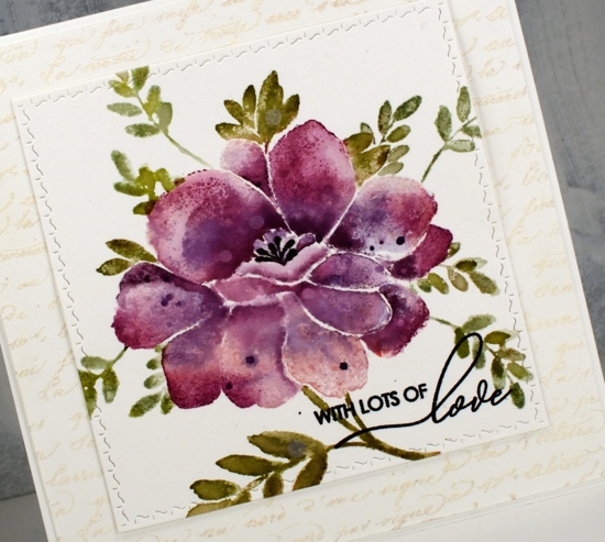
With the petals all finished I switched to the leaves and inked them with peeled paint and forest moss ink then blended them with water after stamping. I added a few more leaves of the same style using a stamp from the ‘Xmas sprig’ stamp set. To add them in I cut a rough post it note mask and positioned it over the petal edge before stamping the sprig in bundled sage and peeled paint inks.
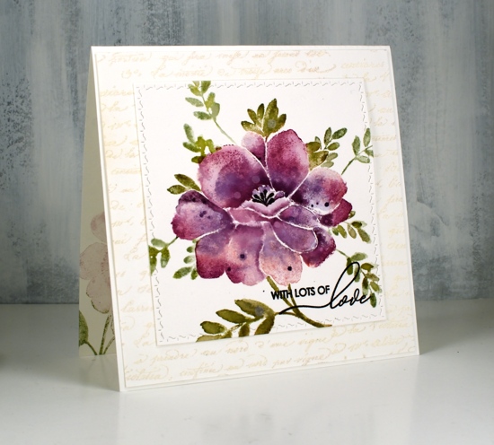
To finish the card I die-cut the panel using the square from the PB ‘stitched square & circles’ die set and clear embossed a sentiment from PB ‘special sentiments’ in black ink. I framed the floral panel with a script stamped panel which I embossed with Ranger weathered white embossing powder. I have not had success with this embossing powder until now, totally user error by the way, there is nothing wrong with the product! The embossing powder is called ‘weathered white’ for a reason, when you emboss with it the effect is not glossy and it is not even. It is, as the name suggests, weathered! For a large background area like this script panel it adds texture and subtle colour. The card is quite large and fits into a 6″ square envelope. I inked the stamp in milled lavender and bundled sage ink to stamp a pale image inside the card and used the same inks to stamp the ‘sprig’ on the envelope.
I’m looking forward to inking this stamp again with different colours schemes and maybe a looser watercolour look.
Supplies
Lantern
Posted: November 9, 2018 Filed under: winter branches, Xmas sprigs | Tags: Penny Black stamps, Ranger Distress inks, Ranger Distress stains 8 Comments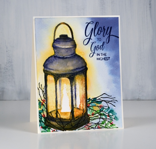
This little light of mine is the ‘lantern’ stamp from Penny Black paired with the ‘Xmas sprigs’ and ‘winter branches’ for added interest. I worked on this panel over several days leaving it in the MISTI the whole time so I could add a bit anytime I was waiting for something else to dry. I definitely made use of the MISTI to build up colour without loosing much detail from the stamp.
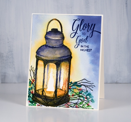
The panel is cold pressed watercolour paper; you can see a bit of texture in the yellow areas. I began by stamping the whole lantern in scattered straw distress ink. Next I stamped all but the very centre around the flame with wild honey ink, after than spiced marmalade ink and finally rusty hinge ink, each time leaving more of the centre of the stamp un-inked so the brightest ink was central and the darkest around the edges. At this point I hadn’t done any blending, it was all just stamped. I switched to a chipped sapphire marker and began stamping the details of the lantern and blending them with a wet paintbrush. Dark blue over all the orange tones looked almost black. I stuck with the chipped sapphire marker and kept adding detail, blending, then letting it dry before doing any more. I added detail and shadow to the lantern by painting with chipped sapphire ink then dried the panel before blending the warm tones inside the lantern.
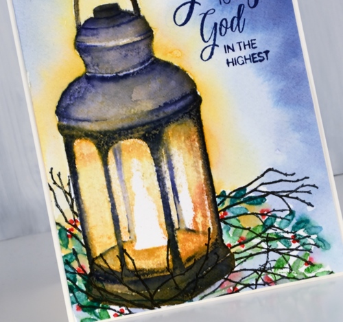
I stamped some foliage around the lantern after positioning a mask over it. I stamped a leaf stamp from the Xmas sprigs set in mowed lawn and pine needles distress inks then dotted some small berries with a candied apple distress marker. I added some winter branches stamped in versafine black then coloured with a fine black micron pen.
I wasn’t sure whether to try adding background colour at this point; It can be a bit risky. I painted scattered straw stain around the lantern and chipped sapphire stain around the edge of the panel then blended some water in between the colours because I didn’t want the yellow and blue mixing to create a strange green light! And it worked better than expected. The final detail was a sentiment in dark blue from the ‘holy night’ set.
Thanks for dropping in today. Enjoy your weekend.
Supplies
Stamps: lantern, Xmas sprigs, winter branches, holy night (PB)


Inks: scattered straw, wild honey, spiced marmalade, rusty hinge, mowed lawn, pine needles, chipped sapphire distress inks & nocturne versafine clair, majestic blue versafine


Markers: chipped sapphire, candied apple distress markers, micron pen


Paper: cold pressed watercolour paper, neenah cream cardstock


Stains: chipped sapphire, scattered straw


Also: MISTI, masking paper


Autumn Sprigs
Posted: September 28, 2018 Filed under: Xmas sprigs | Tags: Catherine Pooler inks, Penny Black creative dies, Penny Black stamps 23 Comments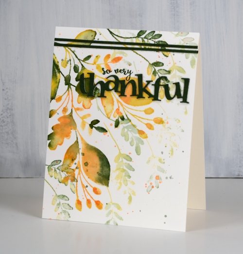
Our gratitude week continues both here and on the Foiled Fox blog. Next week we will return to our regularly scheduled programming but the gratitude themed posts will stay open for comments until the end of Friday October 5th. The Foiled Fox is giving away a $25 gift certificate to three of our readers who leave a comment here on my blog and/or on the Foiled Fox blog telling us something they are grateful for. It does not have to be related to art and craft at all. We will randomly choose a winner from each gratitude post and announce them on Tuesday, October 9th. Now before I move on to the card details I will add that I am very thankful for the people I have met through art and card making, those of you I know through this blog as well as those I have met in person at classes or crops. It is a great community that I love being involved in.

To create today’s gratitude themed card I used a Penny Black Christmas set. The only part of the set that is particularly Christmassy is the bauble hanging on one of the branches. I left that stamp out and used the other two that feature only leaves and berries. I used autumn tones too, three Catherine Pooler inks: spruce, bellini, shea butter. I started by inking the larger of the two stamps in shea butter ink then dabbed some spruce and bellini here and there on the leaves and berries. I spritzed the stamp with water then stamped on hot pressed watercolour paper. The inks had begun to blend after spritzing; I blended them more on the paper with a paintbrush. While there was still ink on the stamp I spritzed it and stamped again resulting in a paler image. I blended the pale leaves and berries with a brush too. I repeated the process with the large stamp then did the same thing with the small stamp and ended up filling 75% of the panel. You could leave the blending step out, I just like to get the look of painted leaves.
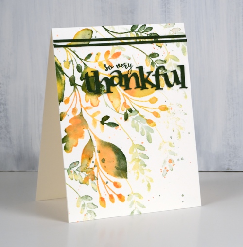
I did a little splatter in both spruce and bellini then moved on to the sentiment. To make sure my die cut sentiment and accent strips matched exactly I swiped the spruce inkpad onto some watercolour paper then let it dry. The CP inks are very juicy and gave great coverage. I added double sided adhesive to the back of the spruce coloured watercolour paper then die cut the word ‘thankful’ twice. The die is ‘thankful heart’ combined but I did a little surgery and removed the heart. I layered the two die cuts then worked out where I would put them on my leaf panel. There was an area where the ink and water had splodged so that was the perfect area to cover up with a sentiment. As I was using some stamped words right up next to the die-cut words I did the stamping first in my positioner so I wouldn’t have to try stamping around die-cuts already stuck down! I wonder how I knew to do that?! The stamped words are half a phrase from the very useful ‘happy snippets’ set.
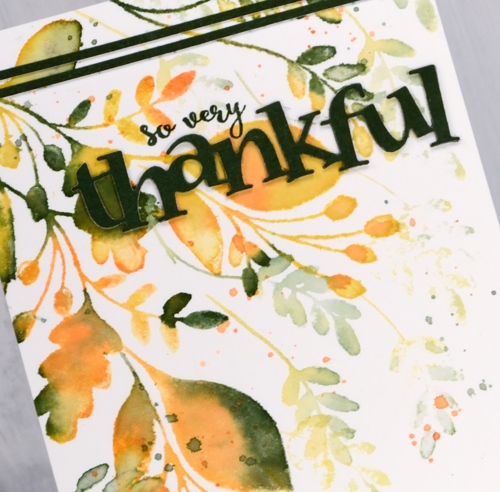
I cut a very narrow strip of spruce inked paper with my paper trimmer (linked below) and used a dot adhesive to attach two pieces to the top of the panel. I know ribbon or twine might have looked nice but my matchy-matchy heart wanted spruce green so inked paper was the way to go. I trimmed the panel to match the card front exactly, which seems to be my preference currently and now I have another card to send to someone I am thankful for.
Supplies
Stamps: Christmas sprig, happy snippets (PB)

Die: thankful heart (PB)

Inks: spruce, shea butter, bellini (Catherine Pooler)


Paper: hot pressed watercolour paper

Also: glass mat, paper trimmer, stamp positioner, double sided adhesive sheets, dot adhesive


