Shimmer floral
Posted: February 21, 2020 Filed under: Brutus Monroe, Coliro paints, floral medley, Penny Black, square frames | Tags: brutus monroe embossing powder, Coliro paints, Finetec artist mica watercolour paint, Penny Black creative dies, Penny Black stamps 8 Comments![]()
The fun continues around here with pearlescent paints and black watercolour paper. I just wish the photos would show better how pretty the shimmery paints are. The Foiled Fox sent me some yummy new paints from Coliro, I used the ‘ocean’ and the ‘vintage’ sets for this card. I also tried out the ‘penny’ embossing powder from Brutus Monroe. It is a copper colour which worked nicely with the paints I chose. I embossed part of the Penny Black ‘floral medley’ stamp in one corner of my black watercolour paper panel then flipped the panel and moved the stamp around a little before stamping more flowers on the other corner. I paired up a couple of stamps from the PB ‘strength’ sentiment set to emboss a sentiment in between the florals.
![]()
Coliro (or Finetec) paints are full of shimmer and look amazing on dark paper but can also be used on light or white paper for more subtle effects. I have painted them on neenah black cardstock before, the colours looked great but I like the way watercolour paper gives me more flexibility with blending from dark to light. When attempting light and dark areas on black paper I have to think about the direction of my blending. On white watercolour paper I paint strong colour then blend it with water to decrease the intensity and so end up with a lighter area. On dark paper I paint an area in bright pearlescent paint and then dilute it with water to get a darker or shadow area. Shading isn’t really necessary of course, the colours look great painted as solid sections without shading.
To finish off the card I die-cut a frame from copper coloured shimmer paper. I have two frame dies from the PB ‘square frames’ set still linked together so I get a plain frame when I run the two decorative dies through the machine together.
I am teaching a ‘Watercolour on Black’ workshop in Ottawa at the end of March where we will be playing with these lovely shimmer paints and creating stamped and painted panels that really shine. Click over to my upcoming classes page for more details.
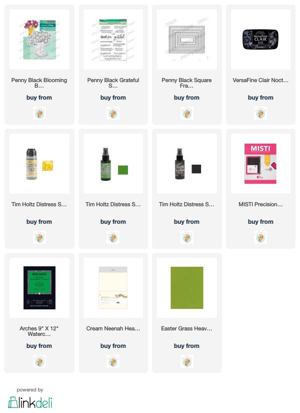
Supplies

Three colours – Bouquet Ballet
Posted: January 13, 2020 Filed under: bouquet ballet, Brusho, fluttering friends, My Favorite Things, Penny Black, square frames | Tags: Brusho, Fabriano Watercolour Paper, My Favorite Things, Penny Black creative dies, Penny Black stamps 12 Comments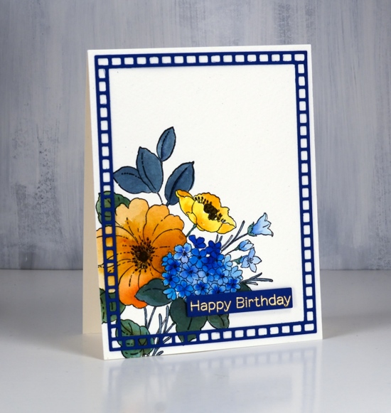
Above is the second of my three colour cards painted with only ost blue, sandstone and lemon brusho. The first card displayed some of the texture and blending which is easily achieved with brusho, in this card it is easier to see the three basic colours plus a couple of the colours I mixed myself. As with the first card I mixed the brusho powders with water in a palette but for this card didn’t sprinkle any brusho directly on the watercolour panel.
The PB bouquet ballet stamp is stamped in black ink on cold pressed watercolour paper; I used a stamp positioner as cold pressed watercolour paper has texture which prevents me from getting a perfect impression first go. The small poppy is painted in lemon brusho, the large flower with sandstone and the multi-headed flower in ost blue. On each one I dropped in more colour for extra depth. The small trumpet shaped flowers to the right are also painted in ost blue but a diluted coat. The stems and leaves are painted in a mix of blue and lemon. The centre of the flowers I painted in brown which was a mix of blue and sandstone brusho. I did use a black marker to colour the little flower centre thingies, but we are not going to count black as a fourth colour!
Happily I found a blue cardstock in my stash to create a sentiment strip and a frame. I embossed the sentiment from MFT fluttering friends in gold powder and popped it up over the panel. The frame is cut using PB square frames and glued on using on point glue because of the tiny tip on the glue bottle. I have one more card to show you in this miniseries and I think it might be my favourite. Check back soon.
Supplies

Thanks for being thoughtful
Posted: March 1, 2019 Filed under: Penny Black, square frames, Unfolding | Tags: Penny Black creative dies, Penny Black stamps, Ranger Distress stains 5 Comments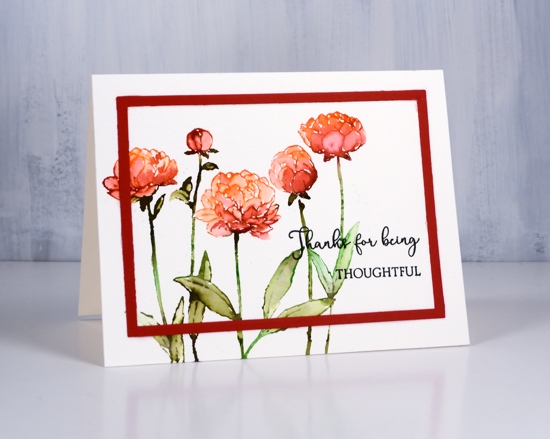
I have yet another distress stain no-line watercolour card for you today. I have received a few questions about my recent distress stain outline cards. Readers have asked if I stamped with ink of some kind first then painted the stain. Not for this card or the previous two. I ink the stamp with stain which is much more ‘liquidy’ than ink and stamp with a stamp positioning tool on watercolour paper. The stain soaks in a little but also sits on top of the paper for a short time. I try to blend straight away so I can take advantage of the wetness of the stain.
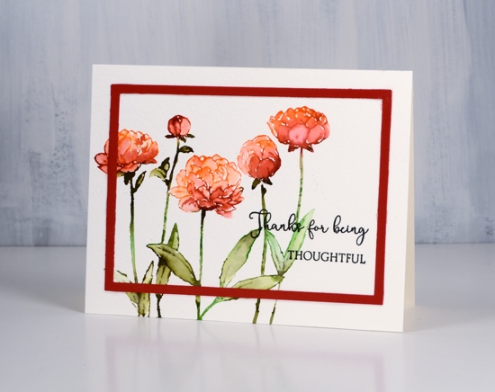
For this panel I inked the flowers with ripe persimmon and fired brick distress stain. You can paint both onto the stamp then print or you can do one colour then the other, allowing the stains to overlap a bit for some nice blending. I inked the leaves and stems with forest moss and mowed lawn then blended the leaves after stamping. If you have stains but haven’t tried inking your stamps with them it does create some pretty blends and the only outline colours are the ones you are blending into the petals and leaves.
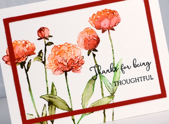
As with my other recent cards I added a sentiment in black ink and a simple frame cut with the square frames dies. The sentiment set is called ‘sending thanks’ and is a little set with lots of possibilities!
Thanks for dropping by this week; I’ll be back on Monday for a blog hop and other exciting news!
Supplies
To give you a hug
Posted: February 28, 2019 Filed under: flutterby, Penny Black, square frames | Tags: Penny Black creative dies, Penny Black stamps, Ranger Distress stains 10 Comments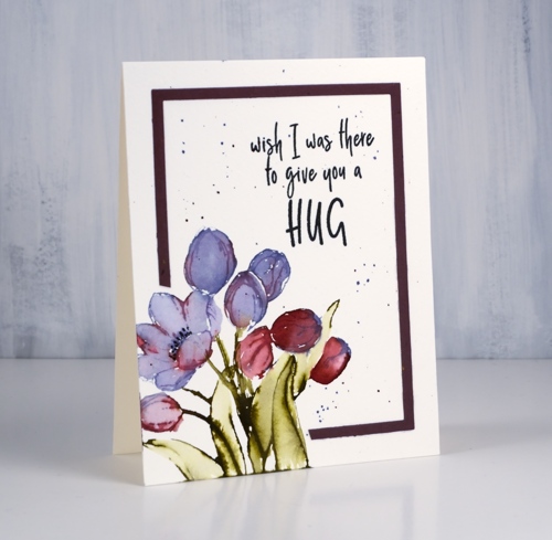
‘Tis the season for new floral stamps, even if it is not the season yet for new florals! I used my tried and true distress stain watercolour method for this little bunch of tulips. I inked the petals with dusty concord and festive berries distress stain. I often use a brush now and paint stain onto the stamp. That way I don’t contaminate the dauber top of my distress stains with other colours and if I’m using the spray stain I can just dip my paintbrush into the stain I have sprayed into a palette.
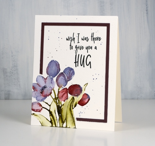
I try to paint straight after stamping so the stain is still wet on the watercolour paper and can be blended very easily to fill the petals and leaves.
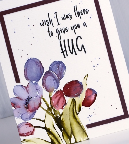
I added some splatter around the panel as my image was confined to one corner leaving a lot of empty space elsewhere. I used the ‘negative frame’ which is a bonus when I cut the whole set of ‘square frames’ from cardstock. I have kept my new square dies joined together in pairs so I can get these ‘negative frames’ easily. I didn’t want to cover my corner flowers so I snipped off some of the frame to wrap around the image instead.
Isn’t this a sweet sentiment?
Supplies

Timeless
Posted: February 27, 2019 Filed under: square frames, timeless | Tags: Penny Black creative dies, Penny Black stamps, Ranger Distress stains 9 Comments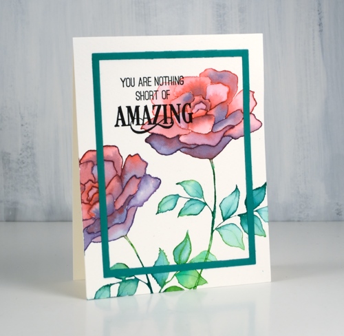
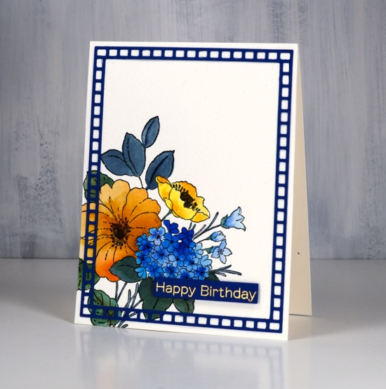
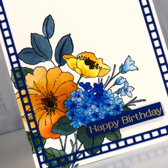
Today’s card features the ‘title stamp’ (like title track) from the new Penny Black release.This big bold rose stamp, ‘Timeless‘, is such a versatile one. I used blended distress stain for my card but it will be great for embossing, no-line colouring and pencil colouring as well.
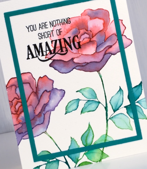
I used my stamp positioner so I could work with a few colours at a time but it would work without a positioner. I inked the top petals in festive berries distress stain, stamped on cold pressed watercolour paper then inked the lower petals with dusty concord stain and stamped again. If you still have the daubers you can ink direct to stamp but if you have the sprays you need to paint some stain on your stamp for this technique. You could use inks or markers but I like how wet the stamped image is when I use stain. I am able to use a brush and water immediately to blend the stain to fill the petals. You can see on some of the petals I added extra stain for shadow and depth
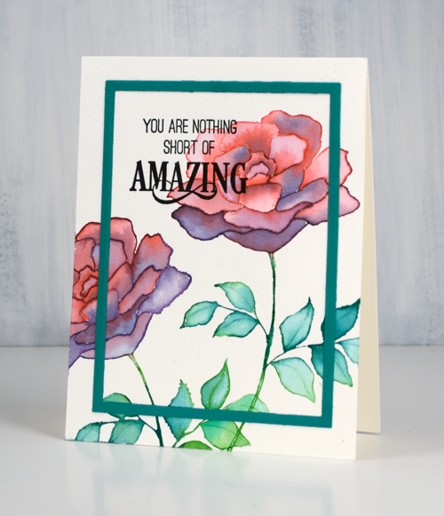
I stamped the leaves in two green stains and blended them also. I finished the panel off with a cool new sentiment then added a frame cut with the new ‘square frames‘ dies. I have kept my dies joined together so I will get both the decorative frames and the plain frames when I run it through the machine. It does mean that I get several frames each time I use it but that’s ok; I’m keeping them in reserve.
Supplies
Blooming boots!
Posted: February 20, 2019 Filed under: blooming boots, square frames | Tags: Penny Black creative dies, Penny Black stamps, Ranger Distress stains 6 Comments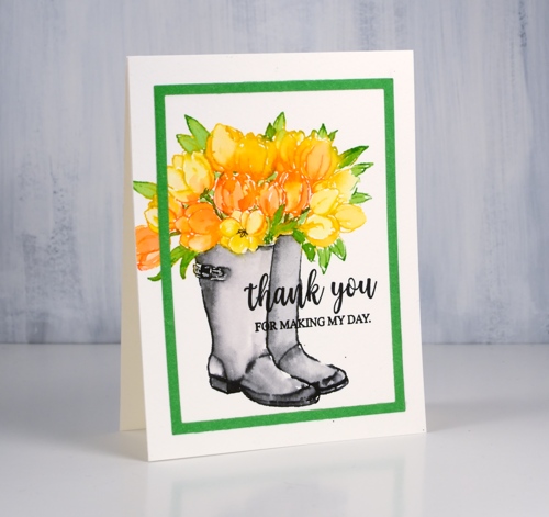
Penny Black has a new release; you probably saw some sneak peeks on the PB social media or maybe you saw this card as a peek on my instagram. The new release is called ‘Timeless‘ and it is full of spring and summer loveliness. To celebrate Penny Black is hosting a giveaway.
Isn’t this a cute stamp? Blooming boots! I guess boots could work as a vase if they were waterproof. I used distress stains to stamp this happy colour scheme but you could use any water soluble ink that blends well after stamping. I inked the tulips with mustard seed and spiced marmalade distress stains. Now that the daubers are discontinued I paint stain onto the stamp with a brush. After stamping the tulips I wiped the stamp and inked the leaves with mowed lawn stain. While the stamped stain was still damp I blended it with a brush and water then dried the panel.
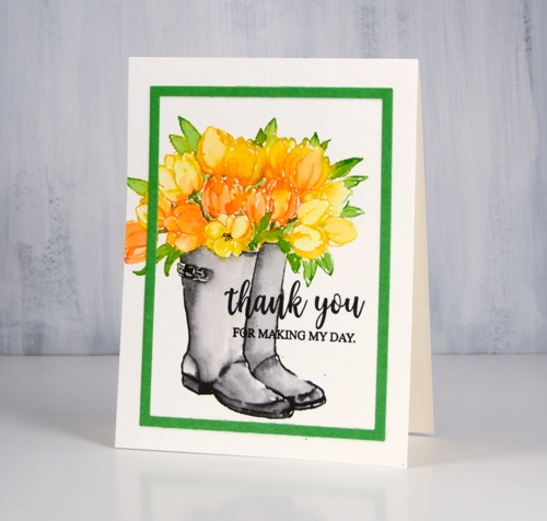
I painted black soot stain onto the boot part of the stamp then stamped and blended to fill the boots. By drying the rest of the stamping first I prevented the black stain from bleeding into the flowers and leaves. I used the new die set ‘square frames’ to cut a green frame. As my dies are not divided up they cut not only the decorative frames but also plain rectangles and that is what I used here. I finished the card with a sentiment from the super-useful new set ‘grateful sentiments’ in black versafine ink.
I am currently enjoying not tulips but a giant amaryllis; it is 80cm tall and each one of the five flowers measures 20cm across. It is huge and beautiful!
Supplies