Barrel of Blooms
Posted: July 8, 2020 Filed under: barrel of blooms, Penny Black | Tags: Fabriano Watercolour Paper, Inktense, Penny Black stamps, Ranger Distress inks 7 Comments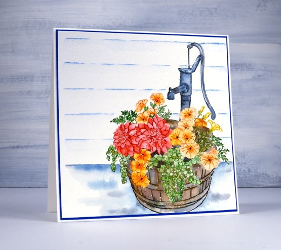
This washtub full of flowers is called ‘barrel of blooms’ and it’s a beauty from the new PB release. I worked on cold pressed watercolour paper in a stamp positioner so I could ink a section, stamp it, blend that section, wipe the stamp then ink another section.
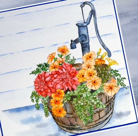
I stamped colour by colour, inking with distress ink cubes and markers. Once I’ve stamped a section I blend it with a paintbrush pulling out the ink of the outline and adding extra where necessary. I used a couple of different green inks for the leaves, candied apple, spiced marmalade and dried marigold for the flowers then a mix of brown and grey for the barrel. All the inks are listed below. Because I do all the stamping and painting with the panel in the stamp positioner I am able to re-stamp a section after I’ve painted to add some of the detail back in.
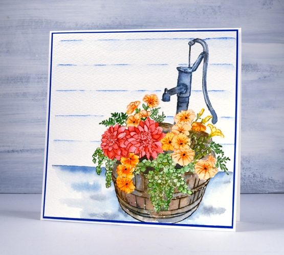
To ground the image I painted some faded jeans and hickory smoke ink around the base and behind the barrel. I used a dark blue inktense pencil and the Wendy Vecchi stay-tion + ruler to add the look of wood wall behind then matted the panel with co-ordinating blue cardstock.
I don’t have a barrel tub like this one for my flowers but I have three old galvanised tin tubs filled with herbs and they are thriving in the current summer weather.
Supplies
Refreshing
Posted: July 6, 2020 Filed under: illustrious, soulful silhouettes, Uncategorized | Tags: distress markers, Fabriano Watercolour Paper, Foiled Fox guest post, Penny Black stamps, Ranger Distress inks 28 Comments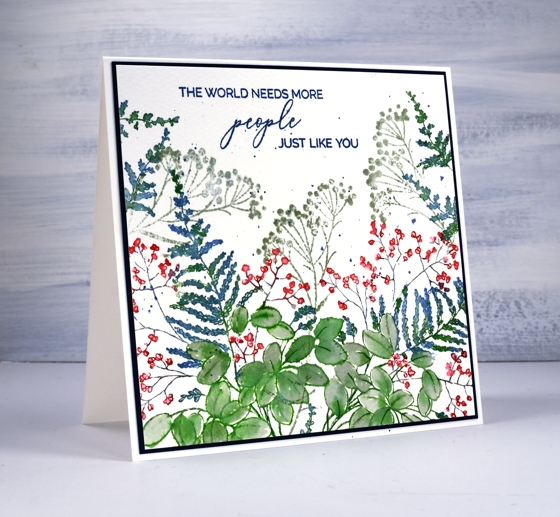
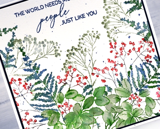
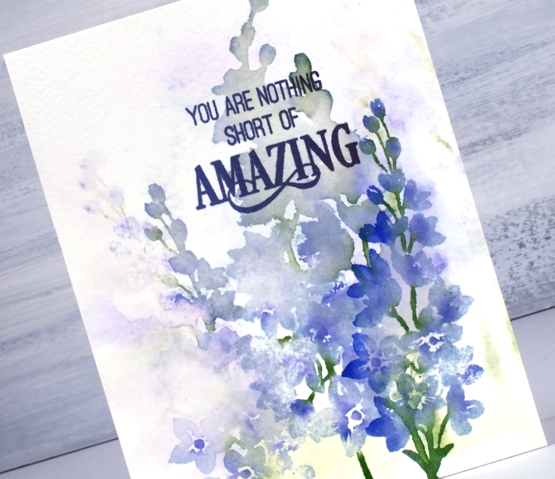
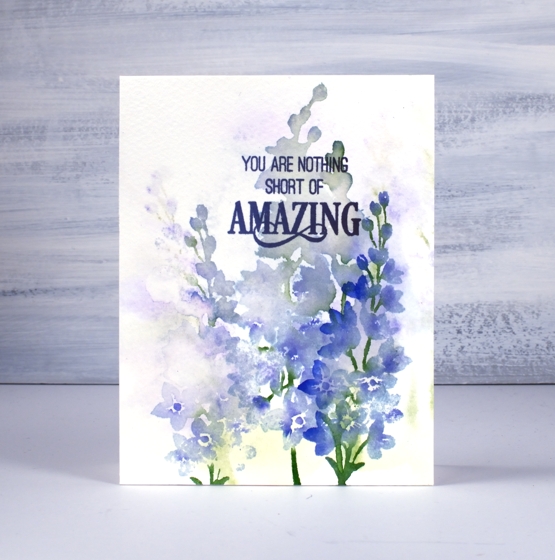
I’m excited to show you some new summery plant goodness from Penny Black and it’s happening here and on the Foiled Fox blog! I used the new cling stamp ‘illustrious‘, a stamp from the clear set ‘soulful silhouettes‘ and a sentiment from the ‘just like you‘ mini set.
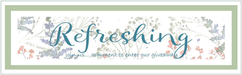
The new release is called ‘Refreshing’ so I have teamed up with Shauna from the Foiled Fox to provide a little refreshment through a giveaway!
All you need to do to enter is comment on this post telling me what you like to do for refreshment these days.
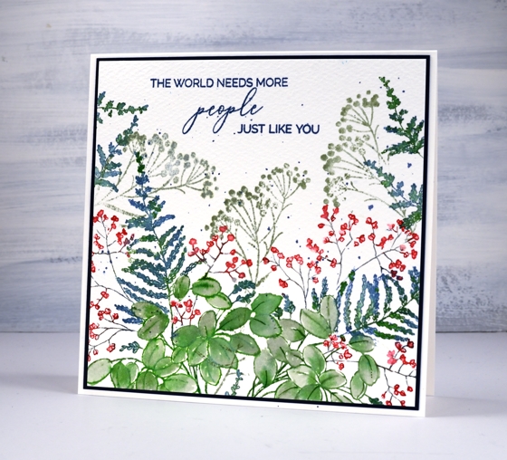
I used distress inks and cold pressed watercolour for this card. I definitely seem to be drawn to blues and greens right now; they’re a little cooler than my oft used pinks and orange combo. You can read more about my process on the Foiled Fox blog but let me say the MISTI was very helpful in creating this leafy panel. I worked on the large leaves first, inking them in mowed lawn then painting them with bundled sage. I moved onto the fern shaped plant which I inked with mowed lawn and faded jeans then did the tiny flowers last in candied apple and hickory smoke.
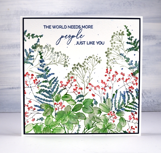
The illustrious stamp is stamped once on the left then partially stamped on the right and to fill the top edges I just inked and stamped the tip of the fern a few times. I used one stamp from the soulful silhouettes set as filler in bundled sage ink.
I would love to hear some of your most refreshing ideas or past times. Do you have a recipe, a book recommendation, a past time or favourite get away? We are still staying close to home here in Ottawa but I am enjoying my hammock in the backyard, oodles of audio books and the occasional iced coffee or tea.
Supplies
The Good Life
Posted: July 2, 2020 Filed under: birches, Penny Black, Stamped Landscapes, the good life | Tags: Dr Ph Martin Hydrus watercolor paints, grafix, Penny Black stamps, Ranger Distress inks 11 Comments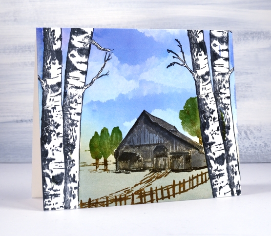
I am happy to have a stamped and painted scene to share today. I often create scenic cards and panels in winter but I used liquid frisket on this panel to create a summer vista seen through a frame of birches. I teamed up with Grafix , used their liquid frisket kit and filmed the process.
With a technique like this it would be easy to make a card for any season. The birches could frame a snow scene, autumn foliage or even some mountains in the distance.
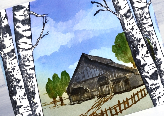
Painting the sky was fun, you can see in the video I painted the whole sky area in blue then added all the clouds by dabbing colour away with a kleenex tissue.
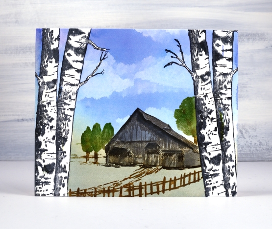
You can see in the video I stamped the house and trees with archival ink first then built up colour, depth and shadow with distress inks for the watercolour look. Because the Dr Ph Martin inks used on the sky are permanent once dry I was able to stamp and blend over the house and trees without affecting the sky at all and of course over the masked trees too.
Supplies
All about you
Posted: June 17, 2020 Filed under: Penny Black, springtime sigh | Tags: Fabriano Watercolour Paper, Penny Black stamps, Ranger Distress inks, sennelier watercolours 9 Comments
More than once I have created cards that inspire me to make art journal pages. This time it was the other way around; I created an art journal page that inspired this card. Perhaps I should be showing you the journal page first but it contains as yet unreleased stamps so I have to keep it under wraps for a little while longer. (just in case you hadn’t seen them yet, Jill has been sharing some sneak peeks of new PB products over on the PB blog). The panel is stamped on cold pressed watercolour paper. I kept it in the stamp positioner so I could add some detail once all the paint was completed.
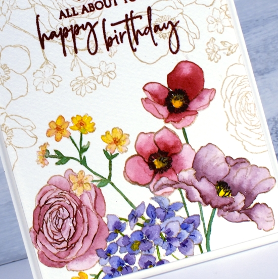
I stamped PB ‘Springtime Sigh’ in antique linen distress ink then painted the flowers with Sennelier watercolour paints. To keep the panel cohesive I used the same red and blue paints to create a variety of reds and burgandies for the four large flowers. The blue showed up in the purple flowers and the green stems. Once all the painting was finished I partially stamped the rose with ‘aged mahogany’ distress ink and added little details to the other flowers with a chipped sapphire distress marker and a black soot marker.
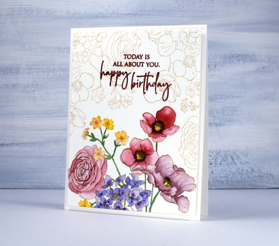
The combination of antique linen outline and faded burgandy petals gave the painted flowers a vintage look so I filled the rest of the panel with the same image stamped in antique linen, then chose crimson red versafine to stamp the sentiment from PB ‘special sentiments’.
Supplies
Birthday birdhouses
Posted: June 8, 2020 Filed under: A2 layers, Additional A2 layers, Good neighbours, Penny Black, Triple Banner, Waffle Flower | Tags: Fabriano Watercolour Paper, Penny Black creative dies, Penny Black stamps, Ranger Distress inks, Waffle Flower dies 7 Comments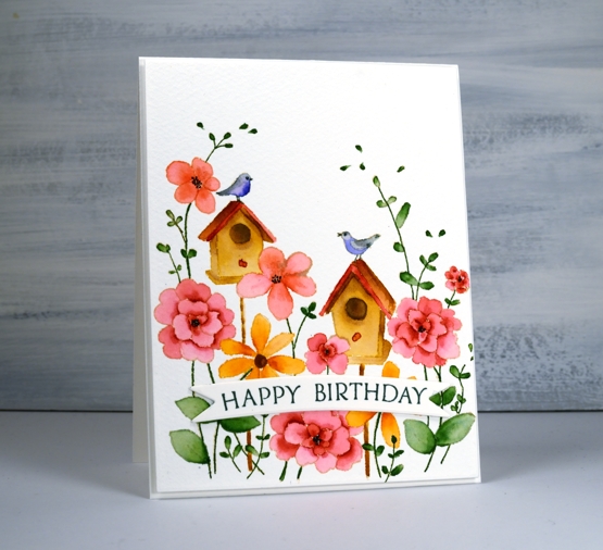
I hope your garden is full of birds and blooms right now, mine is getting there slowly. If you are having a birthday during this season, it’s possibly a little different to past celebrations. My birthday is in the dead of winter but I do remember fondly when it was in the height of summer when birds, blooms and strawberries were in abundance!
To create this bright happy card I did some no line watercolour with distress inks. I stamped the PB ‘good neighbors’ outline stamp in antique linen then did all the painting with distress inks smooshed on my glass mat. For fine lines and tiny spaces I used distress markers.
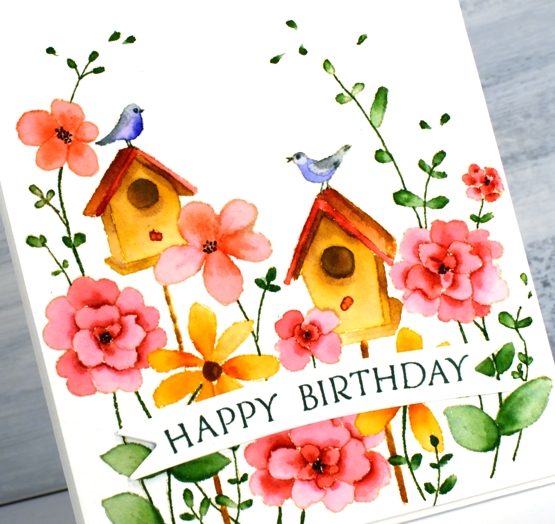
I used cold pressed watercolour paper for this one; I switch back and forth between hot pressed and cold pressed, often choosing hot pressed for the ease of stamping detailed stamps. Once I was finished I decided to pop up the panel on a piece of foam but first I cut the panel with the new love of my card making life, Waffle Flowers ‘additional A2 layers’ dies. I love both their A2 layers dies and additional layers dies the same, no favouritism, in fact the reason I love them is because there are two sets making it possible to mat panels with a ⅛” border. I’m not demonstrating that feature on this card but I will be on future projects. I also love the fact that my rectangle is even and perfect first go. My cutter still does a great job just not sure if my steady hand and eye do the stellar job they once did.

I finished off the card by cutting two banners with one of Penny Black’s triple banner dies, two so it was raised up just a bit, not as much as foam tape would raise it. I stamped a sentiment from banner sentiments on the banner but if you know this set you might realise the stamp doesn’t actually curve that way; let me tell you it does when you snip it in two and arrange it on the door of your misti.
Supplies
Warm wishes circle
Posted: June 5, 2020 Filed under: Darkroom Door, warm wishes | Tags: Darkroom Door stamps, Fabriano Watercolour Paper, Ranger Distress inks 3 Comments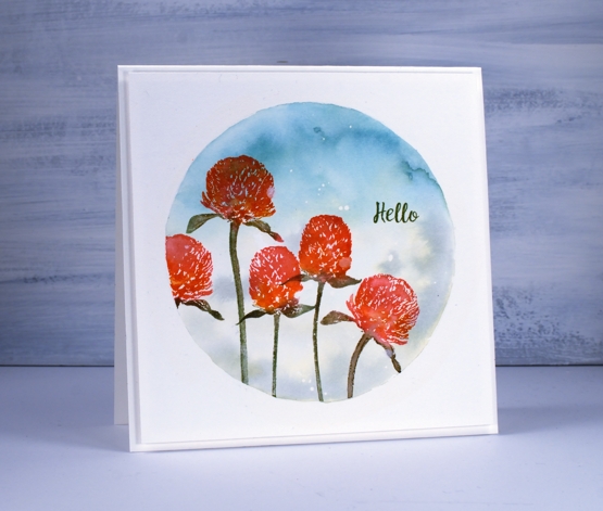
I am hanging out on the Foiled Fox blog today sharing a Darkroom Door project. I’m pretty happy to tell you Foiled Fox is carrying some Darkroom Door stamps now. I’m always happy when my favourite products come to my favourite stores! Today’s card features the DD ‘warm wishes’ set with it’s pretty clover flowers and sweet sentiments.
Before stamping I traced a circle on a piece of hot pressed watercolour paper then painted masking fluid around the edge of the circle to mask off the area inside. I also splattered some dots of masking fluid inside the circle. I used two distress inks to paint the background starting by smooshing the inks on my glass mat and adding a little water so I had a diluted ink to pick up with my paintbrush. I painted broken china ink on the top section of the circle and bundled sage on the bottom blending them together a little while keeping the centre of the circle lighter than the edges. Once the background was dry I placed the panel in my misti so I could stamp the flowers multiple times if necessary. The flower heads are a mix of worn lipstick and spiced marmalade distress inks and the stems are stamped in forest moss distress ink.
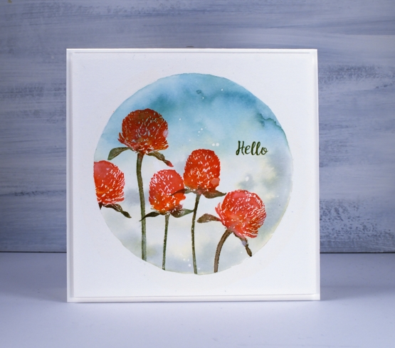
I splattered a few water droplets over the finished panel and dabbed them away with a paper towel to leave watermarks. With all the stamping and painting complete I removed the masking fluid (so satisfying) and popped up the panel on a piece of foam before attaching to a luxe white textured card base. Make sure you pop over to the Foiled Fox blog and store today to see the other Darkroom Door products in stock.
Supplies

Disappearing lilacs
Posted: June 3, 2020 Filed under: lilacs, Penny Black | Tags: Fabriano Watercolour Paper, Penny Black stamps, Ranger Distress inks, Tsukineko Versafine inks 9 Comments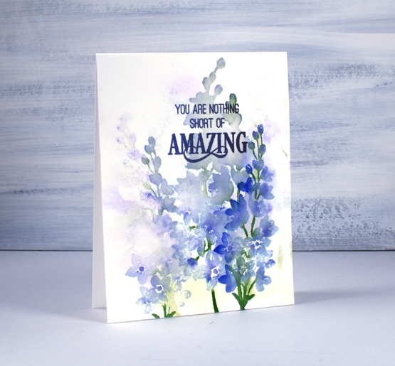
I keep returning to these lovely stamps because they handle watercolour effects so well. My other examples are more defined than this one but I like both techniques. I worked on cold pressed watercolour paper for this one and started by wetting the panel so I could stamp a pale washy background. I used only three distress inks, shaded lilac, blueprint sketch and mowed lawn. I inked the stamp with mostly shaded lilac and mowed lawn, spritzed it with water then stamped on the wet panel. The result is the pale disappearing images you see in the background.
I dried the panel before doing another impression with the lilac stamp, this time I added a few drops of water onto the panel and a spritz of water to the stamp. The ink blended on the stamp and pooled a little on the panel. My last impression was the more defined print on the right hand side. For this one the panel was dry but the stamp still got a spritz of water to move the ink.
I chose an area of stamping with very little definition as the spot for my sentiment stamped in versafine imperial purple.
Are your lilacs blooming? Mine are along with the first iris and some lupins so the blues and pinks are currently well represented in my garden. Yay!
Supplies

Masked Wildflowers Video
Posted: May 29, 2020 Filed under: Darkroom Door, Tutorial, warm wishes, Wildflowers Vol 1 | Tags: Darkroom Door stamps, Fabriano Watercolour Paper, Ranger Distress inks, Tutorial 11 Comments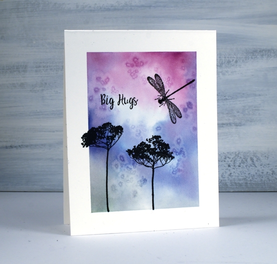
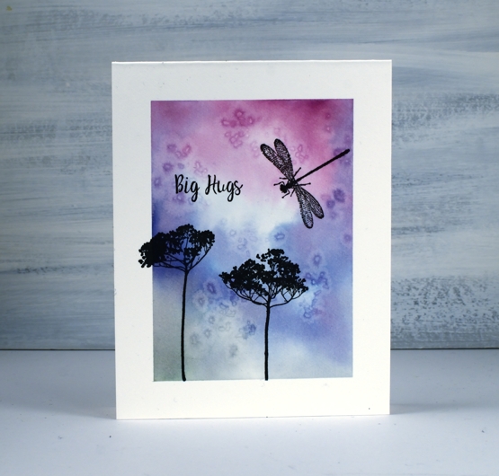
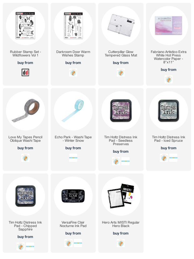
I have a simple design for you today and I turned on the camera while I was doing it. It’s probably something you have tried before but might be new to a few readers. I used washi tape to mask off a frame on a one layer hot pressed watercolour card base then created a watercolour background with distress inks and salt.
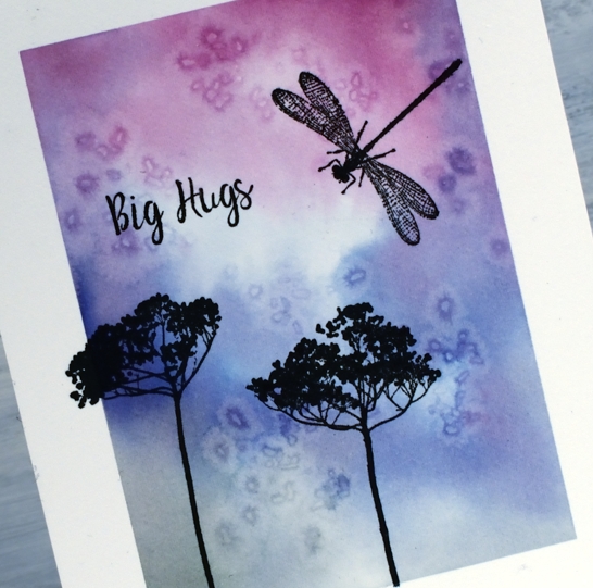
The stamps are some of my favourite silhouette stamps from the Darkroom Door ‘wildflowers vol 1’ set with a sentiment from a recent set ‘warm wishes’.
It was fun creating a one layer card again; some of you will remember when I was part of the ‘One Layer Wednesday’ challenge and ‘One Layer Simplicity’ challenge a few years back.
Let me know if you try this technique, I’d love to hear or see what you came up with.
Supplies
Alluring Cut Up
Posted: May 22, 2020 Filed under: Alluring, Penny Black | Tags: Fabriano Watercolour Paper, Penny Black stamps, Ranger Distress inks 10 Comments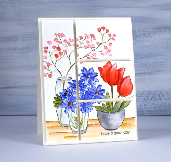
This watercoloured panel stamped with the PB ‘alluring’ stamp has been sitting around for a long time. I’ve been trying to come up with a slightly different way to turn it into a card. I create a great many cards with one large stamped and painted panel and little else so I wanted to mix things up a little with this one. I finally decided to slice up the panel then pop it up on foam backing.
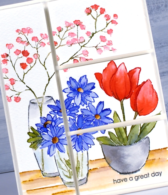
I stamped the original panel on cold pressed watercolour paper and used one of my favourite watercolour techniques. Instead of stamping in a pale water soluble ink then painting with ink or watercolour paint I ink the different parts of the scene with different inkpads or markers, spritz the ink with water then stamp. With some extra ink handy on my glass mat I use a paint brush to blend the stamped ink into the petals, leaves and other shapes adding extra ink where needed.
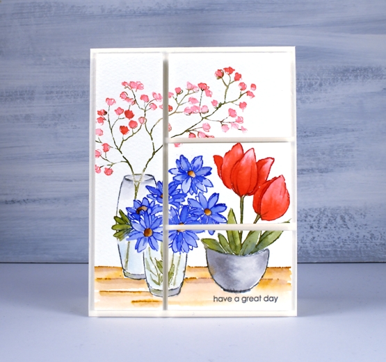
When slicing it up I took care to divide it unevenly while making sure some elements carried across to adjacent sections. That way the eye moves across the panel and doesn’t come to halt in the middle. I’ve listed the inks I used below, all distress inks in either ink cube or marker form. Oh and by the way have you seen the new distress colour? ‘Speckled Egg’ looks like it might be a blue green or even better a grey blue; I wonder how it compares with tumbled glass and broken china. Regardless, it’s part of the blue family so yes, I will be getting it in a few different forms. How about you?
Supplies
Virtual Coffee
Posted: May 4, 2020 Filed under: brick wall, coffee time, Darkroom Door, handwritten script, Stencils, World Map | Tags: Darkroom Door stamps, Darkroom Door stencils, Ranger Distress inks 4 Comments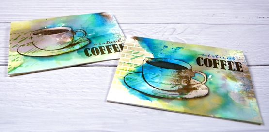
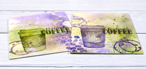
I posted a coffee themed card using the Darkroom Door ‘coffee time’ set recently which prompted a request for a pack of coffee themed cards. These ones are on their way to Australia, and were made with the addition of the word ‘virtual’ because, well, you know why. I rarely do multiples and when I do they are never exactly the same. This time I did four of one colour scheme with the cup and saucer stamp from Darkroom Door’s ‘coffee time’ set and then four more in a different colour scheme a little more like my original coffee card featuring the take out cup from the same set.
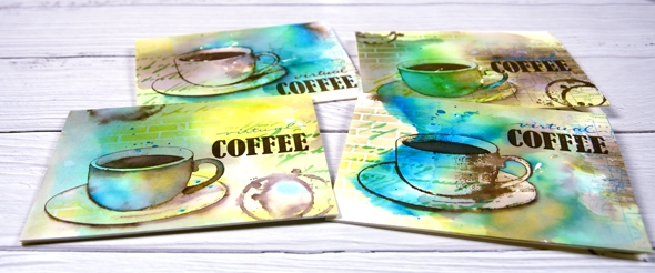
The nice thing about making multiples is starting with a large panel to create the background. I used hot pressed watercolour paper for both sets and splattered masking fluid over the panel first. I like the addition of some random white spots and shapes from a masking fluid splatter but often I wish I’d done more when I remove it from the finished project. To create the cards above I smooshed ground espresso, salty ocean and crushed olive distress inks on my glass mat. I spritzed water over the inks until they were spread over a large area then placed the watercolour panel over the top and moved it around to soak up random coloured patterns. When I turned the panel over there were blotches of each colour along with blends and blank areas. I did some further spritzing and picking up of colour until I was satisfied with the coverage. Once the panel was dry I cut it into four pieces and used both the DD handwritten script and brick wall stencils to add pattern in the same three distress inks. I used blending brushes to apply the ink which gave me soft blends that faded away into nothing at the edges.

Next I add coffee cups and coffee stains in ground espresso ink. I blended ink inside the cup on some panels but on others I added more ink outside the cup to darken the negative space. It is hard to describe my process with the cups as I did each one differently and kept playing with the three inks until I was happy with the results. On a couple of the panels I added a partial print of the world map stamp. With all the artsy stuff done I just needed to add the ‘virtual coffee’ label. The word ‘coffee’ is part of one of the word stamps from the set so I masked, stamped and embossed then wrote the word ‘virtual’ above and embossed that. I was interested to see I could write the words with a papermate flair pen and then if I covered it with clear embossing powder straight away I could get the shiny embossed effect. I do have clear embossing pens but it is impossible to see what I’ve written with a clear pen!
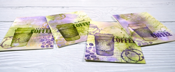
I also did four more cards with the takeaway cup stamp using much the same technique and a peeled paint/scattered straw/dusty concord colour scheme. I added a few stamped coffee beans to these ones; the ‘coffee time’ set is a very cool collection of stamps.
Thanks for joining me for ‘virtual coffee’ today. I hope your week is off to a good start.
Supplies