
All about you
Posted: June 17, 2020 Filed under: Penny Black, springtime sigh | Tags: Fabriano Watercolour Paper, Penny Black stamps, Ranger Distress inks, sennelier watercolours 9 Comments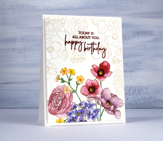
More than once I have created cards that inspire me to make art journal pages. This time it was the other way around; I created an art journal page that inspired this card. Perhaps I should be showing you the journal page first but it contains as yet unreleased stamps so I have to keep it under wraps for a little while longer. (just in case you hadn’t seen them yet, Jill has been sharing some sneak peeks of new PB products over on the PB blog). The panel is stamped on cold pressed watercolour paper. I kept it in the stamp positioner so I could add some detail once all the paint was completed.
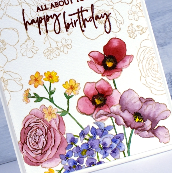
I stamped PB ‘Springtime Sigh’ in antique linen distress ink then painted the flowers with Sennelier watercolour paints. To keep the panel cohesive I used the same red and blue paints to create a variety of reds and burgandies for the four large flowers. The blue showed up in the purple flowers and the green stems. Once all the painting was finished I partially stamped the rose with ‘aged mahogany’ distress ink and added little details to the other flowers with a chipped sapphire distress marker and a black soot marker.
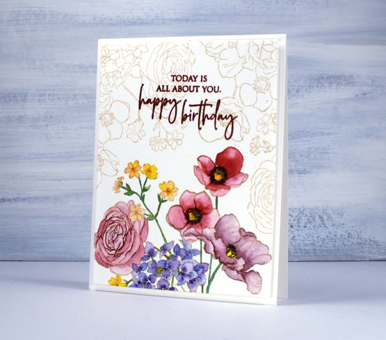
The combination of antique linen outline and faded burgandy petals gave the painted flowers a vintage look so I filled the rest of the panel with the same image stamped in antique linen, then chose crimson red versafine to stamp the sentiment from PB ‘special sentiments’.
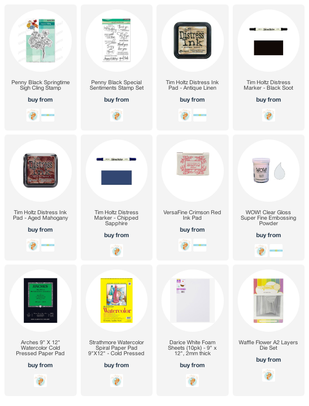
Supplies


This is a charmingly vintage look card Heather. The colours you have used for the painted flowers and the background stamping make me think of a flea – market find, but it is delightfully modern. It’s just lovely.
Thank you, Karen, It’s funny because I didn’t set out to make it vintagy, it just happened. It does look a little like a flea market find, maybe an embroidered tablecloth or the like.
So pretty Heather with the soft outline flowers in the background and then the pretty more muted tones for the flowers do add a vintage look..really beautiful. x
Thanks so much Pat, the soft outline flowers were not planned but the shape of the stamp filled the space perfectly when stamped on the left then the right.
This is beautiful, Heather! I love the colors and how you’ve blended the red and blue! Wonderful shading too! The soft stamping of the flowers in Antique Linen finishes this card perfectly! Can’t wait to see your journal pages!
I am so impressed by the delicate beauty of your card Heather! The way you outlined part of the rose with aged mahogany is like the icing on the cake. Using the same colour family to blend & achieve the purple & burgundy colours was perfect. I turn 65 in August, (can hardly believe it), & if I were to receive a birthday card like this, it would be a gift in itself. BTW, I just subscribed. Love, love your creativity. I hope to see your journal page soon. Blessings from BC.
Love how you designed the border stamping on this, Heather, beautifully done and very inspiring!
This is simply gorgeous…the detail work is fascinating to study. I LOVE the mahogany outlining parts and the two softly fading yellow blossoms. It is just beautiful…simply that!♥
Beautiful, I love the outline stamping for the upper background and your colored flowers are gorgeous!