Under the same sky
Posted: March 23, 2021 Filed under: Darkroom Door, long distance, vintage planes | Tags: Darkroom Door stamps, Dr Ph Martin Hydrus watercolor paints, Fabriano Watercolour Paper, Tsukineko Versafine inks 7 Comments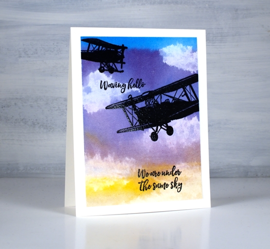
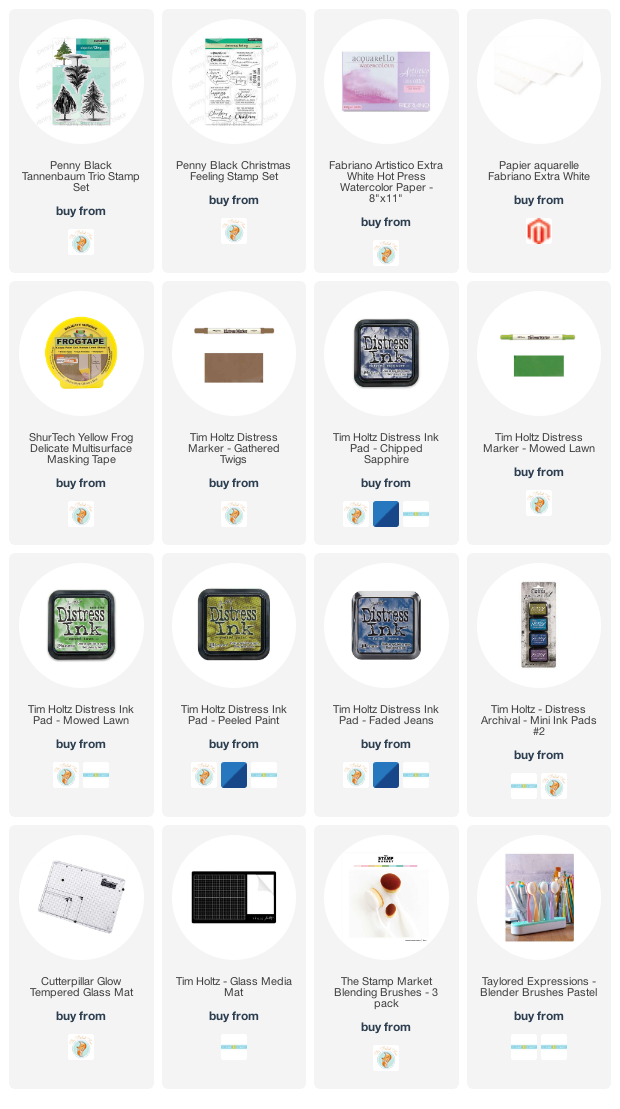
After pairing the cool new ‘long distance’ sentiments from Darkroom Door with a map stamp I took another look at the strip of sentiments (there are eleven) and picked out a couple that would work with planes and a sunset sky. I must admit my matchy-matchy side was pretty happy these two sentiments are in the same font and the three on my map card were also in the same font.
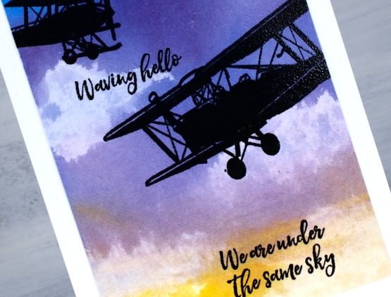
I taped a piece of hot pressed watercolour paper to my glass mat and painted six colours from top to bottom of the panel with plenty of water to dilute and mix the colours as I went. I used the Dr Ph Martin’s Hydrus watercolours for the sky and the colours are linked below. I put only a drop of each in wells of the palette then added three or four drops of water. Considering the paint brush was also dipped in water before picking up paint you can see these liquid watercolours are highly pigmented. I painted the whole panel twice starting with the phthalo blue each time and finishing with the gamboge. While the panel was still wet I scrunched up a tissue and dabbed paint off. You can see the tissue takes out a lot of colour bringing the dabbed area almost back to white.
Once the panel was totally dry I trimmed it and stamped two planes from DD vintage planes and two sentiments in versafine clair nocturne before embossing over the black ink in clear powder.
I was thinking about a comment my dad left on the long distance + map card about the recipient being able to return the same message to the sender on receipt of the card and I wondered about a ‘send it on’ idea. It is a bit different to what my dad suggested but instead of writing in the card I will write on a piece of loose paper inside the card and suggest the recipient remove my note and add one of their own before sending the card on to another person. For fun the senders and recipients could note their names on the back of the card. Hmmmm, perhaps I should try it with the map card and maybe this one too.
Supplies
(Compensated affiliate links used when possible)
Daisy Delight
Posted: March 22, 2021 Filed under: Brusho, daisy delight, Darkroom Door, you are everything | Tags: Brusho, Darkroom Door stamps, Fabriano Watercolour Paper, Tsukineko Versafine inks 7 Comments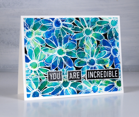
When I have a new line-art background stamp my first choice is usually to try emboss resist with brusho paint powders. This new background stamp from Darkroom Door is called ‘daisy delight’ and has plenty of loops and lines for trapping brusho.
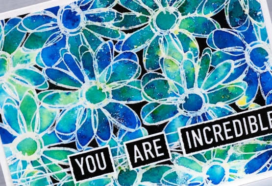
I embossed the stamp in clear powder on hot pressed watercolour paper. With scrap paper spread under the panel I sprinkled brusho powder over the panel, both turquoise and sea green. I spritzed water over the brusho and sat back to watch the magic happen. As the brusho diluted I saw pockets of colour appear which were exactly what I wanted. You can see different shades of blue and green as well as a few pops of yellow. There were a few blank or pale sections so I sprinkled more brusho, spritzed more water and then waited again to see what happened. Once the paint was really soaking in I took a small brush and started filling some of the petals where the colour hadn’t reached all the edges. In a few places I took bold colour from a petal and used it to fill a petal somewhere else.
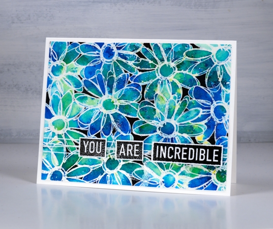
I dried the panel with a heat tool then trimmed it and did a test on a trimmed scrap to see if I would like black background in amongst the flowers. I went with it and coloured in the few areas that are not part of the flowers with a black Karin brushmarker. To finish the card I wrapped white/silver twine around it and popped up some embossed words from the new DD ‘you are everything’ set.
Supplies
(Compensated affiliate links used when possible)
Long Distance
Posted: March 19, 2021 Filed under: Darkroom Door, global postmarks, long distance, World Map | Tags: Darkroom Door stamps, Fabriano Watercolour Paper, Ranger Distress inks, Tsukineko Versafine inks 7 Comments
Many of us are separated from family and friends these days so when I saw this new set of sentiments from Darkroom Door I knew immediately that I could put them to good use. The set is called ‘long distance’ and is a long strip of sentiments one under the other, eleven in total. I have several sentiment strips from Darkroom Door and have not cut any of them into individual strips. Instead I tend to stamp the whole strip or a section of the strip and then snip off or die-cut the ones I want to use.
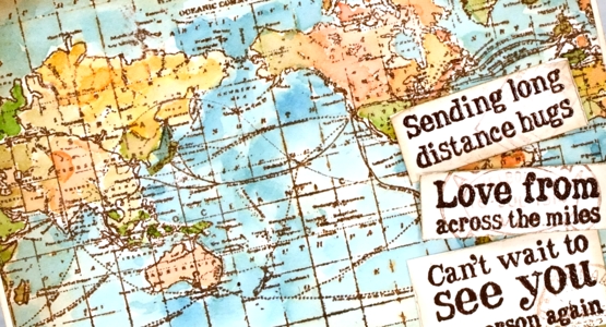
As many of you know I am originally from Australia and all my family still lives there while my husband, children and I live in Canada and have done for twenty years. When I designed this card featuring the DD ‘world map’ stamp I did so with my Australian family and friends in mind so I had to make sure both countries were still on display after I added the sentiments. I stamped the map on hot pressed watercolour paper in tea dye distress ink and acorn versafine clair, dried the inks then started painting colours over the map. I smooshed tea dye, carved pumpkin, abandoned coral, broken china and mowed lawn distress inks on my glass mat and painted loosely with no major concern for borders or accuracy. I searched ‘antique map’ for an inspiration photo to guide me.
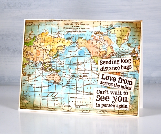
I cie-cut the map panel with a Waffle Flower A2 additional layer die then applied vintage photo ink around the edge of the map and the sentiments with a blending brush. It’s a subtle addition but I also stamped pale postmarks on the sentiments using the DD ‘global postmarks’ stamps. I will be showing you more of the new stamps from Darkroom Door over the next few weeks but there are already several blog posts on the Darkroom Door blog featuring the new beauties so make sure you pop over there to take a look.
Supplies
(Compensated affiliate links used when possible)
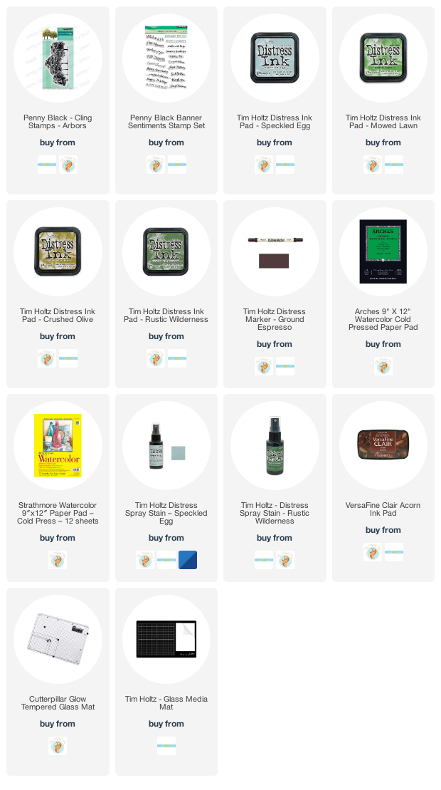
Arbors in green
Posted: March 18, 2021 Filed under: arbors, Penny Black | Tags: distress markers, Fabriano Watercolour Paper, Penny Black stamps, Ranger Distress inks, Ranger Distress stains, Tsukineko Versafine inks 9 Comments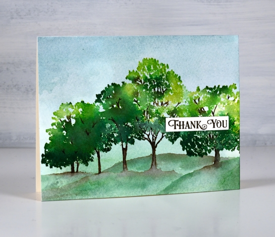
I can’t believe I am only just getting this beautiful tree stamp inked, especially considering my mantra, ‘you can never have too many tree stamps!’ This new stamp from Penny Black is called Arbors and I’m sure I will put it to use often. For its first inking I decided on keeping things traditional and green. We are just beginning to see grass appear here and there as the snow melts but no leaves yet.
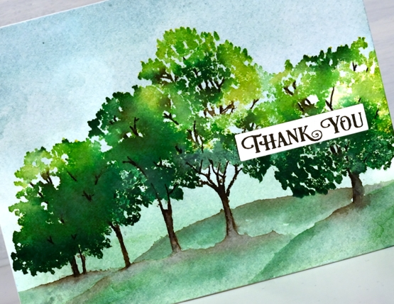
Before I started stamping I put some speckled egg and rustic wilderness stain on my glass mat and diluted it with a few spritzes of water. I swiped a piece of cold pressed watercolour paper through the stains, dried it and then repeated the process to fill my background with blue and green.
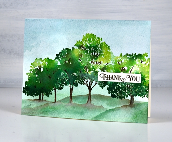
With the stamp and panel in a stamp positioner I inked the foliage of the trees with dabs of crushed olive, mowed lawn and rustic wilderness distress inks. I spritzed the stamp lightly before stamping to get the inks mingling with each other. It took several applications to build up the coverage. After applying quite a bit of green I inked the trunks and branches with a ground espresso distress marker leaving the base below the trunks uninked so I could paint some hills in and around the trunks. To do this I spread brown ink from the trunks left and right then added diluted rustic wilderness stain and painted hill shapes across the panel. I checked to see what I was short on in my stash and added a thank you from the banner sentiments set in acorn ink.
I can’t wait to ink this one up in autumn tones, but I guess a few trees in blossom might be timely first.
Supplies
(Compensated affiliate links used when possible)
Filled with daydreams
Posted: March 10, 2021 Filed under: branch of love, daydream, dotlets, Penny Black, rain or shine | Tags: brutus monroe embossing powder, distress markers, Fabriano Watercolour Paper, Penny Black stamps, Penny Black stencils, Ranger Distress inks 11 Comments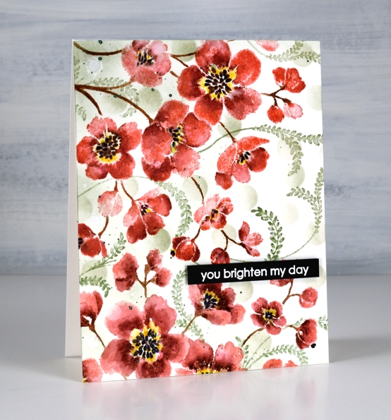
I’ve created with the Penny Black ‘daydream‘ stamp before but you might not recognise it as the same stamp used on today’s card. Last time I stamped the large rubber cling stamp once in blue. This time I’ve stamped it twice to almost fill the card front in pink and deep red. I’ve also added some filler foliage.

I kept the stamp in the stamp positiioner while I completed one print of the stamp then rearranged the panel and stamp to be able to stamp again in a slightly different direction to cover the lower third. I inked the stamp first with worn lipstick distress ink, added shading with an aged mahogany distress marker, stems with ground espresso and centres with black soot. I spritzed ever so lightly because I didn’t want to loose much definition but I did want the inks to blend a bit. After one impression I blended a few areas with a paintbrush and stamped more aged mahogany where needed to help define the petals. Once the ink and blending was dry I coloured around the black centres with a mustard seed marker.

To add filler around the red blooms I stamped the fronds from the PB ‘branches of love’ set in bundled sage ink then blended over them with a paintbrush and minimal water. I also used a blending brush to blend some bundled sage circles through the PB ‘dotlets’ stencil. I splattered some moss green pearlescent paint then popped up an embossed sentiment to finish the card.
Thanks for dropping by today; you do brighten my day!
Supplies
(Compensated affiliate links used when possible)
Vintage collage card
Posted: March 8, 2021 Filed under: Coliro paints, Darkroom Door, diamonds, Dies, Finetec paints, French Script, Gazette, gerberas, gift card pocket, global postmarks, Penny Black, shall we dance, Stencils | Tags: Coliro paints, Darkroom Door stamps, Darkroom Door stencils, Fabriano Watercolour Paper, Finetec artist mica watercolour paint, Penny Black creative dies, Penny Black stamps, Ranger Distress inks 4 Comments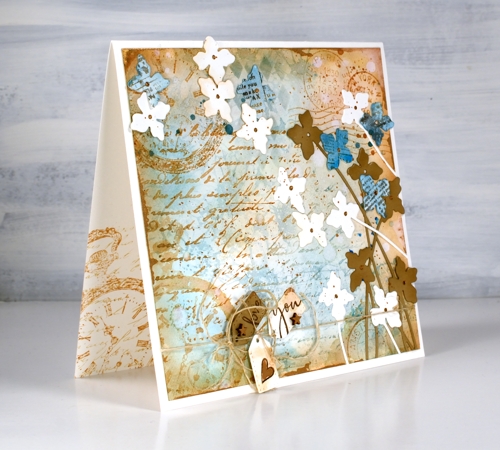
A friend commissioned me to make a ‘vintage’ themed card recently and I happily pulled out a bunch of Darkroom Door stamps to do so. You can see the pocket watch stamp managed to feature three times but the French script, global postmarks, and gerberas also contributed. I stamped, blended and painted with two brown tones of distress ink, two blues and a black. (all the supplies are listed below)
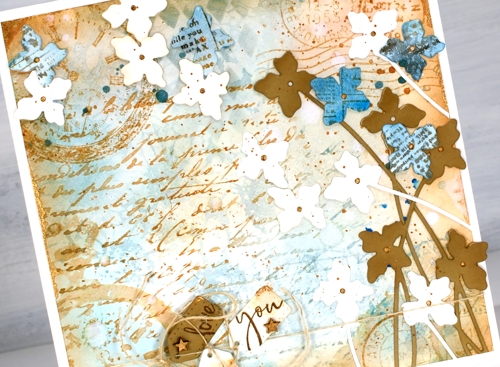
To begin I smooshed some speckled egg and antique linen distress inks on a glass mat, added water swiped the panel through the diluted ink. After that the gerbera background stamp became part of the base layer in speckled egg distress ink. I layered the other stamps over the top in tea dye and antique linen inks and blended some speckled egg ink through the DD diamonds stencil. Of course there is splatter, watermarks and extra blending to darken the edges. To add a dimensional feature I die cut several stems of flowers with the Penny Black ‘shall we dance’ die, some are from watercolour paper, some from tan cardstock and a few from paper painted with salty ocean ink and stamped with the DD gazette stamp.
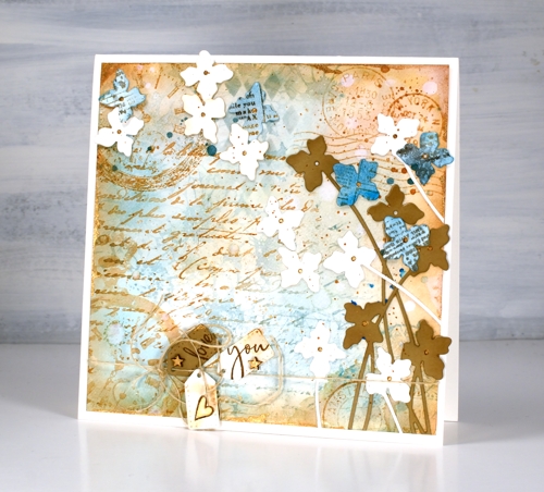
Almost finished, I added a strand of twine around the base and tied some tiny tags on with stamped PB sentiments on them and some little wooden stars I found. I was pretty happy with all this vintageness but decided to risk some gold paint. I splattered and added it to the tiny stars and heart, the flower centres. Where it worked best though was unevenly painted along the edges of the square panel. You probably can’t even see it clearly but it ended up being one of my favourite parts of the card.
By the way there are yummy new stamps on the Darkroom Door website. You will see them here soon, a few are winging their way here as you read this! Have a great day.
Supplies
(Compensated affiliate links used when possible)
Floral notes slim
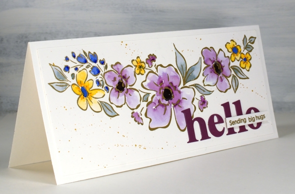
Posted: March 3, 2021 Filed under: floral notes, Heather lowercase die set, Karin brushmarkers, Pink Fresh studio | Tags: Fabriano Watercolour Paper, Karin brushmarkers, Pink Fresh studio, WOW embossing powders 5 Comments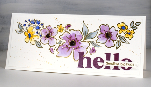
I’ve teamed up with the Foiled Fox again to share this lovely slimline Pinkfresh Studio stamp. The stamp is called ‘floral notes’ and it’s just over 8″ long! The set also includes some sentiments which I will feature another day.
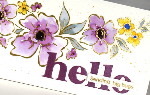
I embossed the floral stamp in gold powder then added colour with dabs of ink from the Karin brushmarkers (I only used royal blue, lilac, gold and black). I say dabs because that is really all it takes to watercolour with the Karin markers. I dab a few dots of ink where I want the colour to be strongest then blend from that point with water to fill the petals or leaves. I was wanting variation in the petals and was happy to achieve it particularly in the large flowers coloured in lilac.
After the colouring was complete I splattered ‘pearl gold’ pearlescent paint from Finetec; it was a close match to the WOW metallic gold embossing powder. For a sentiment I cut ‘hello’ with the Pinkfresh ‘Heather lowercase alphabet dies’ and left the border off so the letters would not be too big then added a blended sentiment using dies from the Pinkfresh ‘scripted bold sentiments’ set.
Previous to making this card I lost the letter ‘t’ die from the alphabet set. It was after cutting the word ‘star’ for another card. As you can imagine this caused me great dismay. Without the ‘t’ there would be only birhdays, bes wishes and merry Chrismasses! I searched high and low and went my workroom garbage and recycling multiple times. Yesterday, after eleven days without it, the ‘t’ was returned to the alphabet. It had fallen into the MFT box in the filing cabinet right between ‘YAY for you’ and ‘painted prints’!
I’ll be using this pretty floral stamp again and not necessarily just on slimline cards. The sentiments from the set are also lovely so keep an eye out for them. Don’t forget to visit the Foiled Fox blog today for more details including measurements.
Supplies
(Compensated affiliate links used when possible)
Freshly cut flowers
Posted: February 15, 2021 Filed under: Foiled Fox store, fresh cut, love you Mom, Papertrey Inks, Penny Black | Tags: Fabriano Watercolour Paper, Papertrey ink, Penny Black creative dies, Penny Black stamps 2 Comments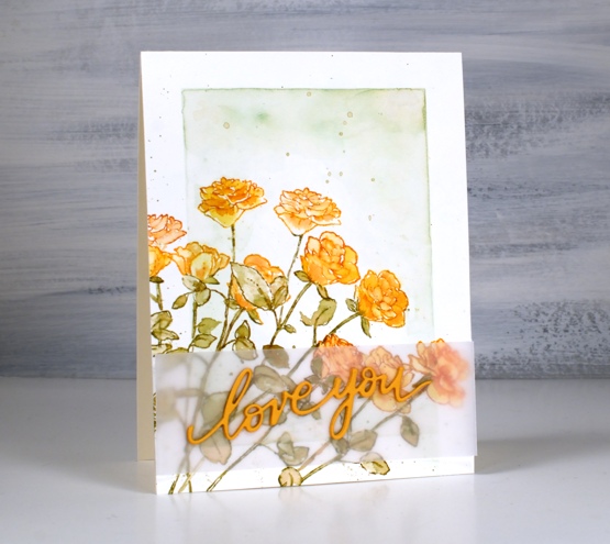
I’ve teamed up with the Foiled Fox again to share a post on their blog. If you pop over there you can read all the process details for this floral card featuring a stamp and a die from Penny Black.
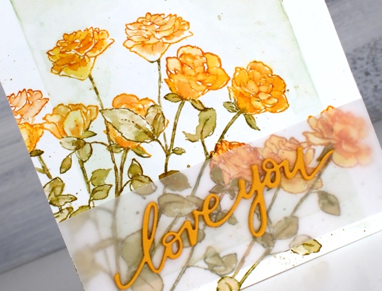
This stamp is called Fresh Cut and it is a rubber cling stamp of five long stem roses. I did some masking and partial stamping to fill the corner of my panel with eleven orange roses. I guess I should have added one more to have a dozen!
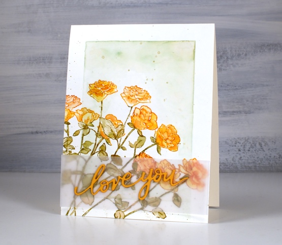
You might recognise the background style on this card; it is inspired by some of Jill Foster’s amazing cards for Penny Black. Because all those roses make the panel a little busy I separated the stacked die-cut words from the roses with a piece of vellum, just to make it easier to read. Don’t forget to visit the Foiled Fox blog today for all the details and while you are there browse awhile for more inspiration.
Supplies
(Compensated affiliate links used when possible)
No-line Watercolour with Karin brushmarkers
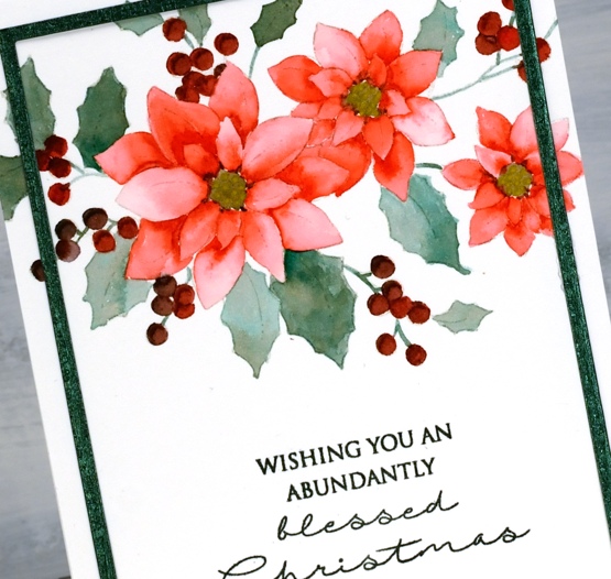
Posted: December 21, 2020 Filed under: frozen vista, Karin brushmarkers, Penny Black, poinsettia poem | Tags: Fabriano Watercolour Paper, Karin brushmarkers, Papertrey ink, Penny Black stamps, Tsukineko Versafine inks 8 Comments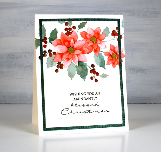
I’m happy to be teaming up with the Foiled Fox again to bring you some more Karin brushmarker experimenting, this time I put them to work on no-line watercolour. I was pretty sure they would do a good job and I wasn’t disappointed. I also discovered that Papertrey Ink’s ‘soft stone‘ ink works well as a base stamping ink for no-line watercolour. To begin I stamped the same Penny Black poinsettia poem stamp on two pieces of hot pressed watercolour paper. On the design above I used only three Karin brush markers (red 209, teal 377 and henna 105) When colouring the leaves I inverted the red marker tip to tip with the teal before colouring to create the more browny green you see on the leaves.
I painted the petals one by one as is usually the case with no-line watercolour and I used the Red 209 marker. I used a slightly different methods for each card. On the above panel I barely touched the marker to the paper in each petal then blended the ink with water to fill the petal. On the panel below I painted a petal with water first then added a dot or two from the marker which flowed into the wet area. The effect is similar but the petals are paler where I applied water first and marker second.

On the second card I used magenta 170, lush green 228 and sepia 074. Once again I did a bit of tip to tip colour blending for the leaves and berries. It takes a bit of trial and error plus some scrap paper for testing to get the right mix of colour when doing the tip to tip blends. After adding ink to a marker tip the first strokes of colour will be the most intense and as you continue to apply ink to paper the intensity will decrease as the colour returns to its original tone. Make sure you visit the Foiled Fox blog where I provide even more detail about today’s projects.

I used a textured shimmer green cardstock to create a die-cut frame for the card at the top of the post. It is easy to cut a narrow frame by using two rectangle dies from the Waffleflower A2 layer dies. For the second card I used mulberry cardstock to create a co-ordinating mat and stamped with both versafine clair tulip red & chianti to stamp the sentiment in a matching colour. When I don’t have the exact ink colour for a sentiment I try a combination of two inks, something a stamp positioner makes quite straight forward. I stamped the sentiment on the first card with my beloved memento northern pine ink. The sentiments are from Penny Black sets, Christmas feeling and frozen vista.
Supplies
(Compensated affiliate links used when possible)
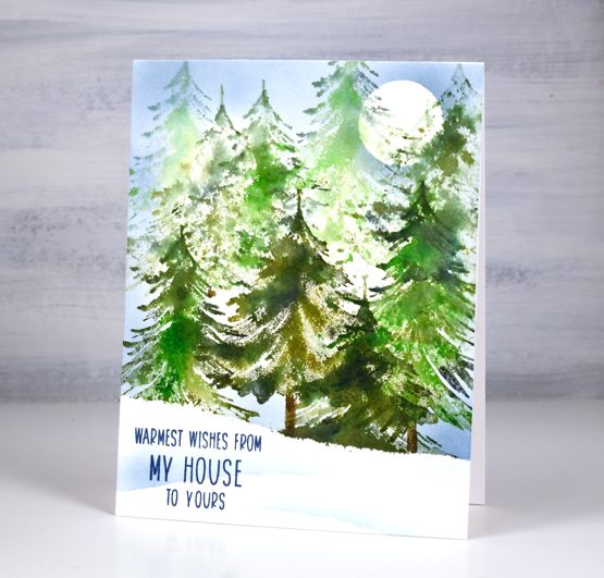
Tannenbaum Forest – video
Posted: December 4, 2020 Filed under: Penny Black, tannenbaum trio, Uncategorized | Tags: Fabriano Watercolour Paper, Penny Black stamps, Ranger Distress inks 11 Comments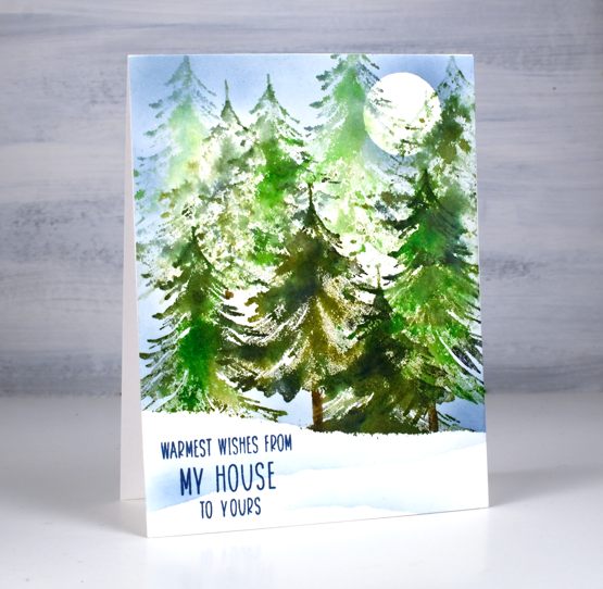
Funny story about this card, I realised last night that, although I had written in it, addressed it and even added the stamp to the envelope, I hadn’t taken the photos to go with today’s video tutorial. I pulled it out of the envelope, took some photos, did a little editing magic so you couldn’t see my handwriting on the inside then popped it back in the envelope. It’s mailed now, on its way to Australia.
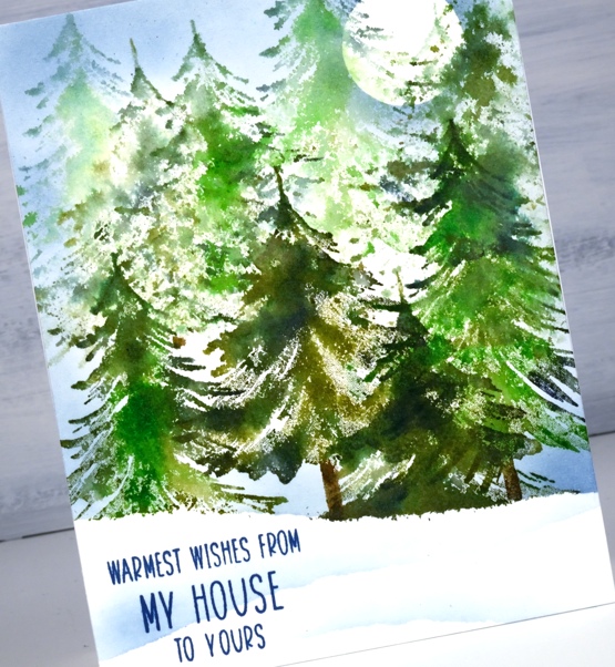
This is one of two videos I’ve made featuring the tannebaum trio set from Penny Black. I’ll post the other one soon. I did generational stamping in a few colours to get the background trees to appear to be in the distance. It’s a fairly speedy technique which you could mass produce once you got into the swing of things.
As I’ve said before ‘you can never have too many tree stamps’ and the three in this set are no exception. You have already seen me pop them in a few cards on their own to add a foreground tree to a snowy scene or to be a single focal point on one of the mini cards I posted yesterday.
Thank you again for your interest in and support of the Dressember campaign. A couple of close friends I have made through card making helped move my fundraising total along yesterday. Thank you so much!
Supplies
(Compensated affiliate links used when possible)