Shimmer ride
Posted: June 29, 2020 Filed under: Finetec paints, grafix, My Favorite Things, Penny Black, the ride | Tags: Finetec artist mica watercolour paint, grafix craft plastic, My Favorite Things, Penny Black stamps 4 CommentsWhat better subject for shimmer on black than a shiny little scooter. ‘The Ride’ is a PB rubber stamp. Once again I had trouble catching the real shine on camera but there is shimmer and shine in real life when the light catches it. I embossed with alabaster embossing powder from Brutus Monroe and made sure I kept the heat tool moving while I embossed so as to not buckle the craft plastic.
I used the new black craft plastic from Grafix to show off the little scooter and painted with pearlescent paints from the Finetec Artist Mica Watercolor Pearlescent paint set.
Painting on the craft plastic is very smooth and particularly straightforward with an embossed image. I also did some detail on the tires and black sections with a grey pencil but it was hard to capture that in my photo.
I wanted to highlight the little orange flowers so cut a mat and a sentiment strip from orange cardstock. The words are from the MFT ‘All About You’ set.
Supplies
Quote & floral journal page
Posted: June 26, 2020 Filed under: a little secret, Art Journal, Concord & 9th, dainty whispers, Penny Black, simple serif alphabet, Unfolding | Tags: Art Journal, Concord & 9th, Penny Black stamps 8 Comments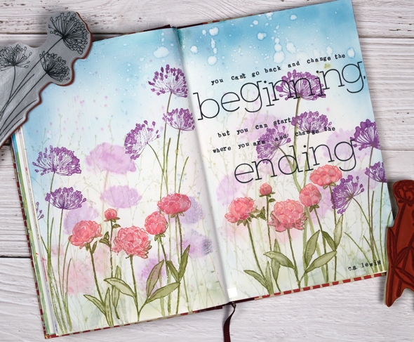
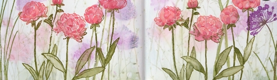
I completed another page in my art journal a few days ago; not the one that inspired a recent card, that one is still to come. This one I started, stopped and restarted again.
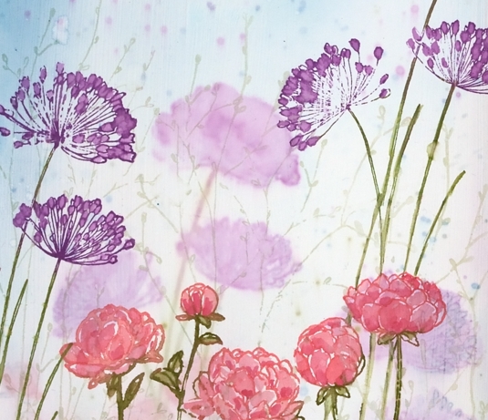
You can see there are some shadowy flowers in the background. They are the first flowers I stamped and painted straight on the journal page. The journal isn’t watercolour paper so diluting and painting with ink didn’t work well. I tried to fix it by drawing black outlines and then white gel pen highlights but that didn’t look good either. I like to think of the art journal as a place I can try techniques but sometimes those experiments don’t end up looking pretty.
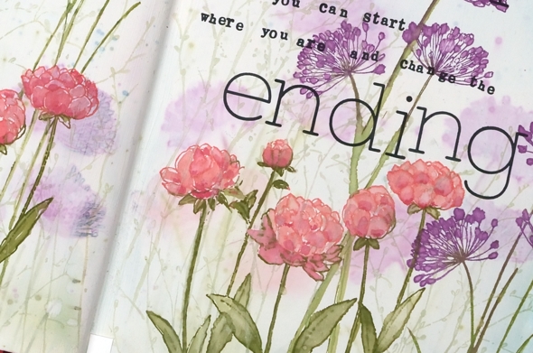
When I’ve wanted to paint on other pages I have prepped the pages with absorbent ground first; it makes the surface more conducive to ink and water blending. Adding one layer of absorbent ground covered the surface but not the images underneath. When it dried though, I liked the misty images in the background and decided not to do another layer. Instead I proceeded to stamp again with the same inks (listed below) and this time blending the inks with water was more successful. To stamp on the uneven book pages I used acrylic blocks and the Wendy Vecchi ‘perfect stamp positioner’.
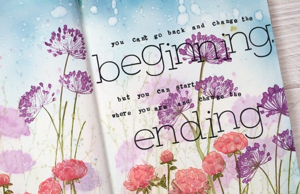
Once I finished stamping and painting the PB floral stamps ‘unfolding’ and ‘dainty whispers’ I stamped the delicate ‘a little secret’ stamp repeatedly in old paper distress ink to fill in some grass. I blended broken china ink directly onto the pages to fill the sky area and splattered water over it to break up the flat blue expanse.
Finally I chose the quote from a favourite author, C.S. Lewis and used the C&9 ‘simple serif’ alphabet stamps and some tiny stamps I bought long ago at Hanji gifts in Toronto. I’ve since found out C.S. Lewis did not say this; I guess I should have done a fact check before stamping it all in my journal.
I do like the effect of coloured images under a layer of white. I might do it on purpose next time!
Supplies
Apricot watercoloured flowers
Posted: June 24, 2020 Filed under: A2 layers, Hand painted, Penny Black, sennelier watercolours, Waffle Flower | Tags: Fabriano Watercolour Paper, Hand painted, Penny Black stamps, sennelier watercolours, Waffle Flower dies 11 Comments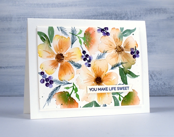
I have another hand painted watercolour today paired with a sweet little stamp from the new Penny Black set ‘trust me builder’. I used my Sennelier half pan watercolours on Fabraino cold pressed watercolour paper. I am still learning how to arrange elements in my paintings but I know for a random pattern (is that an oxymoron?) it is best to do the largest elements first, then the next biggest and so on, in this panel ending with the small splatters and dots.
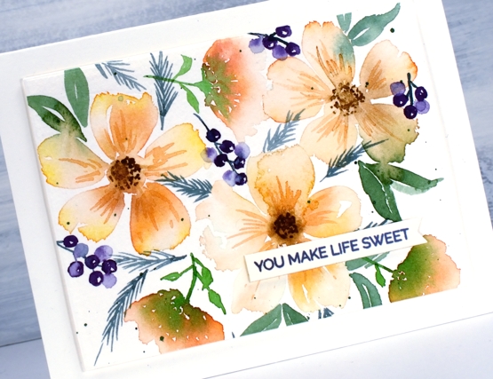
Unless you are after a symmetrical design odd numbers of elements are usually more pleasing to the eye so I have three large flowers then three medium sized flowers but I slipped up on the berry clusters, there are four not five and I can see where I should have painted another!
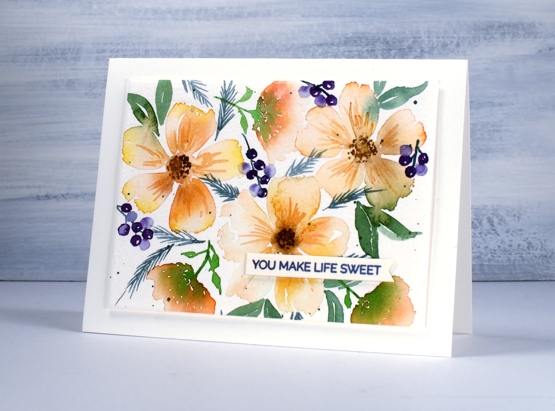
I painted this design on a larger panel and then cropped it to make it look more balanced. I used a rectangle die to choose the part of the panel I wanted but you can do the same with two pieces of ‘L’ shaped cardstock held on opposite sides of a panel and moved to ‘frame’ the design. I popped up my painted panel on foam and my stamped sentiment on one extra piece of cardstock.
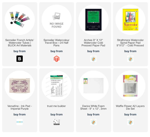
Supplies
New Black Craft Plastic
Posted: June 19, 2020 Filed under: Coliro paints, Finetec paints, grafix, Penny Black, splendiferous | Tags: brutus monroe embossing powder, Coliro paints, grafix craft plastic, Penny Black stamps 12 Comments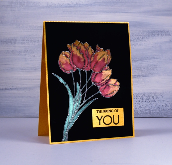
Introductions are necessary, I have a new crafting surface to share with you. Opaque black craft plastic has just been released by Grafix and I found it to be a perfect base for pearlescent paint. It was tricky to photograph but I think you can see the shimmer in the both the paint and the gold card base. Here is a video of my process.
The craft plastic also comes in white which I’ve used successfully with alcohol inks. I can’t wait to try the new Ranger Alloy inks on the black.
Grafix gave me the opportunity to try the black craft plastic and I had fun with the alcohol inks and paint markers as well as the pearlescent paints shown here. I’ll be sharing more projects in the future and I will be asking my favourite stores if they can carry this new product.
Supplies
All about you
Posted: June 17, 2020 Filed under: Penny Black, springtime sigh | Tags: Fabriano Watercolour Paper, Penny Black stamps, Ranger Distress inks, sennelier watercolours 9 Comments
More than once I have created cards that inspire me to make art journal pages. This time it was the other way around; I created an art journal page that inspired this card. Perhaps I should be showing you the journal page first but it contains as yet unreleased stamps so I have to keep it under wraps for a little while longer. (just in case you hadn’t seen them yet, Jill has been sharing some sneak peeks of new PB products over on the PB blog). The panel is stamped on cold pressed watercolour paper. I kept it in the stamp positioner so I could add some detail once all the paint was completed.
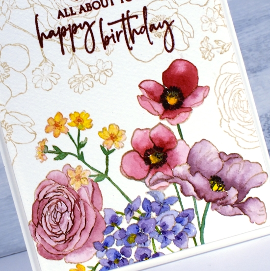
I stamped PB ‘Springtime Sigh’ in antique linen distress ink then painted the flowers with Sennelier watercolour paints. To keep the panel cohesive I used the same red and blue paints to create a variety of reds and burgandies for the four large flowers. The blue showed up in the purple flowers and the green stems. Once all the painting was finished I partially stamped the rose with ‘aged mahogany’ distress ink and added little details to the other flowers with a chipped sapphire distress marker and a black soot marker.
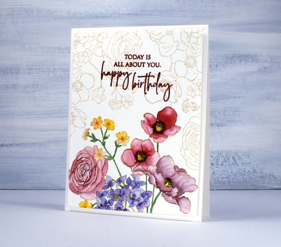
The combination of antique linen outline and faded burgandy petals gave the painted flowers a vintage look so I filled the rest of the panel with the same image stamped in antique linen, then chose crimson red versafine to stamp the sentiment from PB ‘special sentiments’.
Supplies
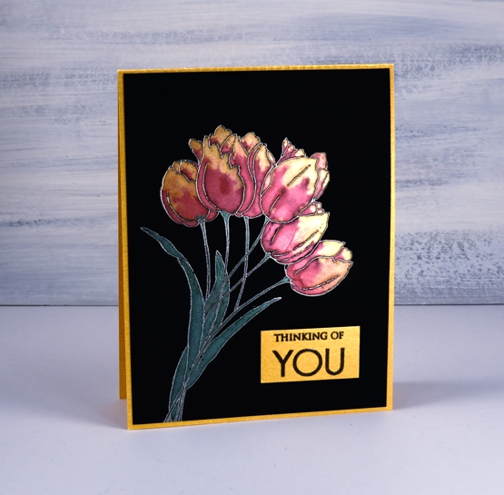
Birthday tulips
Posted: June 15, 2020 Filed under: blooming bunch, Penny Black | Tags: Kuretake Zig clean color real brush markers, Penny Black stamps, Waffle Flower dies 6 Comments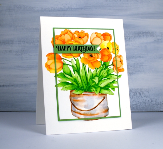
Are all your tulips gone? None of mine flowered this year, not even the faithful two that predated our move into this house! I have planted quite a few over the years but I believe they became squirrel lunches. These ones are coloured with zig clean colour real brush pens. I chose an orange and a yellow then coloured some in just orange, one just yellow and a few with a mix of the two pens. The whole image was first stamped in antique linen distress ink which is so good for no-line colouring.
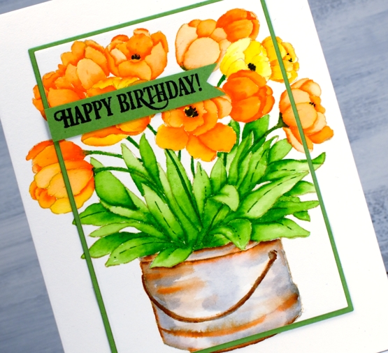
Once again I really enjoyed painting the bucket to give it an aged look with a mix of grey and brown pens. I drew the black centres in after colouring.
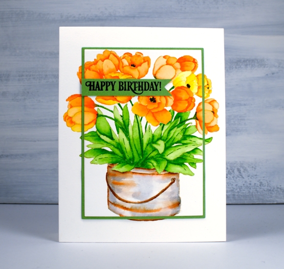
To frame the tulips I used two dies, a smaller one from the Waffle Flower A2 layer dies to cut the stamped panel and the other from Waffle Flower additional A2 layers to cut a very narrow green ⅛” mat.
The sentiment is from PB ‘birthday humor’ set but I stamped only part of the phrase and cut it with a die from the PB ‘pocket full’ die set.
Supplies
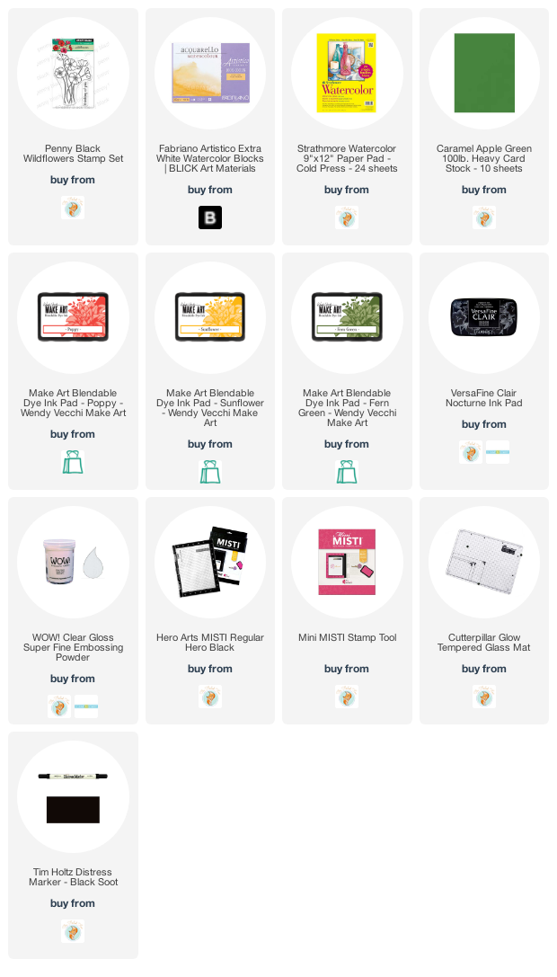
Golden wildflowers
Posted: June 12, 2020 Filed under: Wendy Vecchi, wildflowers | Tags: Penny Black stamps 9 Comments
This card is a combination of things I have been meaning to try but hadn’t got around to yet. The sentiment featured on today’s card has popped up on a few projects already; I like the size and clean font. Each time I’ve used it I have thought, ‘I must use the flower stamp some time’. Today’s the day. The set is from Penny Black and it’s called ‘wildflowers’; it’s a mini set made up of one floral stamp and one sentiment, both featured on this card.
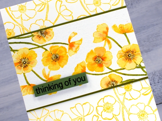
The other products that have been waiting patiently on my work table are the bright happy inks on this card. Rachel from Darkroom Door kindly sent me these Wendy Vecchi’s ‘Make Art Blendable Dye inks’ to try out. That’s quite the title isn’t it? I am happy to say they blended well on the cold pressed watercolour panel in the centre and stamped beautifully on the card base. They beaded a bit on contact but soaked into the paper to make a smooth complete outline. I stamped the painted panel in sunflower and green fern then smooshed both inks on my glass mat along with ‘poppy’ for painting all the flowers and stems. You can’t tell from my card but the floral stamp is made up of a group of flowers on stems all pointing upwards. I stamped my panel on both ends so the flowers are actually coming in from the corners. Once I had painted all the petals and stems I put the panel back in my MISTI and stamped the centres in black soot distress ink.
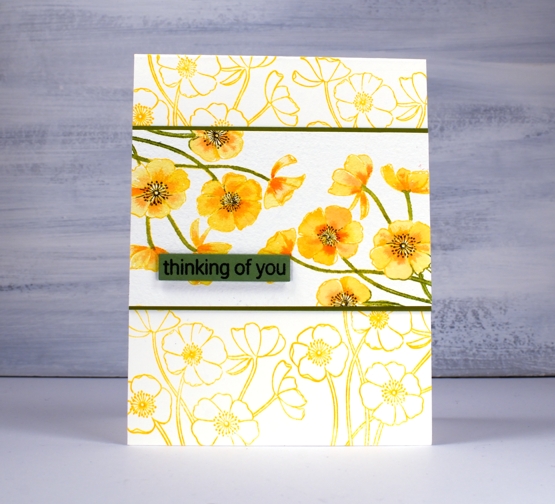
I matted the panel in green cardstock added the sentiment on the same green then decided to create my own patterned card base by stamping the floral stamp twice on the bottom and twice at the top.
Hope you have a sunshiny weekend! Thanks for dropping by.
Supplies
Birthday birdhouses
Posted: June 8, 2020 Filed under: A2 layers, Additional A2 layers, Good neighbours, Penny Black, Triple Banner, Waffle Flower | Tags: Fabriano Watercolour Paper, Penny Black creative dies, Penny Black stamps, Ranger Distress inks, Waffle Flower dies 7 Comments
I hope your garden is full of birds and blooms right now, mine is getting there slowly. If you are having a birthday during this season, it’s possibly a little different to past celebrations. My birthday is in the dead of winter but I do remember fondly when it was in the height of summer when birds, blooms and strawberries were in abundance!
To create this bright happy card I did some no line watercolour with distress inks. I stamped the PB ‘good neighbors’ outline stamp in antique linen then did all the painting with distress inks smooshed on my glass mat. For fine lines and tiny spaces I used distress markers.
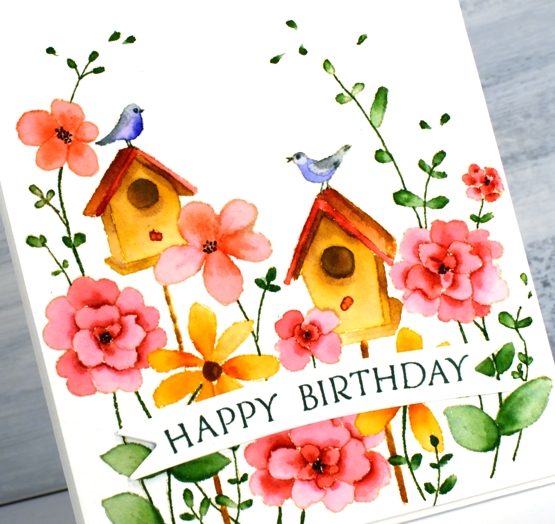
I used cold pressed watercolour paper for this one; I switch back and forth between hot pressed and cold pressed, often choosing hot pressed for the ease of stamping detailed stamps. Once I was finished I decided to pop up the panel on a piece of foam but first I cut the panel with the new love of my card making life, Waffle Flowers ‘additional A2 layers’ dies. I love both their A2 layers dies and additional layers dies the same, no favouritism, in fact the reason I love them is because there are two sets making it possible to mat panels with a ⅛” border. I’m not demonstrating that feature on this card but I will be on future projects. I also love the fact that my rectangle is even and perfect first go. My cutter still does a great job just not sure if my steady hand and eye do the stellar job they once did.

I finished off the card by cutting two banners with one of Penny Black’s triple banner dies, two so it was raised up just a bit, not as much as foam tape would raise it. I stamped a sentiment from banner sentiments on the banner but if you know this set you might realise the stamp doesn’t actually curve that way; let me tell you it does when you snip it in two and arrange it on the door of your misti.
Supplies
Disappearing lilacs
Posted: June 3, 2020 Filed under: lilacs, Penny Black | Tags: Fabriano Watercolour Paper, Penny Black stamps, Ranger Distress inks, Tsukineko Versafine inks 9 Comments
I keep returning to these lovely stamps because they handle watercolour effects so well. My other examples are more defined than this one but I like both techniques. I worked on cold pressed watercolour paper for this one and started by wetting the panel so I could stamp a pale washy background. I used only three distress inks, shaded lilac, blueprint sketch and mowed lawn. I inked the stamp with mostly shaded lilac and mowed lawn, spritzed it with water then stamped on the wet panel. The result is the pale disappearing images you see in the background.
I dried the panel before doing another impression with the lilac stamp, this time I added a few drops of water onto the panel and a spritz of water to the stamp. The ink blended on the stamp and pooled a little on the panel. My last impression was the more defined print on the right hand side. For this one the panel was dry but the stamp still got a spritz of water to move the ink.
I chose an area of stamping with very little definition as the spot for my sentiment stamped in versafine imperial purple.
Are your lilacs blooming? Mine are along with the first iris and some lupins so the blues and pinks are currently well represented in my garden. Yay!
Supplies

Oh Baby
Posted: May 27, 2020 Filed under: balloons!, City Stacks dies, Concord & 9th, Papertrey Inks, Penny Black, sennelier watercolours, simple serif alphabet dies | Tags: Concord & 9th, Papertrey ink, Penny Black creative dies, sennelier watercolours 8 Comments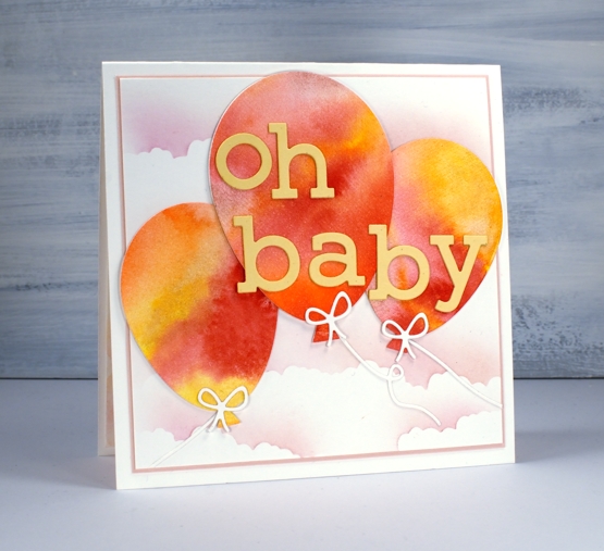
I’m not sure if I have ever posted a baby card on my blog; if I have it was so long ago I can’t remember! This one is a commission for a friend; she asked me months ago and I totally forgot. When she texted the other day to see if it was ready I admitted it was not but I would make sure it was by the next day! I was happy to have thought up a concept all those months ago and my idea came together without hiccoughs.
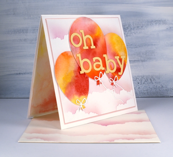
I painted pink, yellow and orange paint on watercolour paper, added water then let it blend and bleed together. Once it was dry I used the Penny Black ‘Balloons!’ die set to cut three balloons then cut the strings and bows from unpainted watercolour paper. I added stick-it adhesive to the back of some peach coloured cardstock then cut two sets of letters to stack for the words using the C&9 ‘simple serif alphabet’ dies.
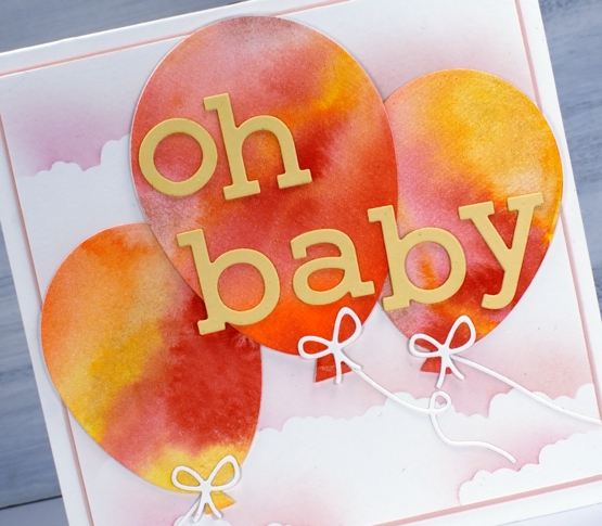
To create the cloudy sky I cut post-it masks using the cloud die from C&9 ‘city stacks’ die set then blended over the edges on a background panel and an envelope using Papertrey ink cubes in ‘sweet blush’ and ‘lovely lady’. I cut a very narrow mat of pale rose cardstock to frame the panel and attached everything to a cream card base.
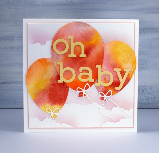
I wondered about cutting more balloons to put inside but instead painted some of the same pink, yellow and orange paint on my glass mat, spritzed it generously to dilute it then placed an extra panel of watercolour paper on top to pick up a pale wishy-washy print.
Seeing that I rarely make baby cards this might become my design of choice when I do need one; I’ll just change the colour scheme to keep things interesting.
Supplies