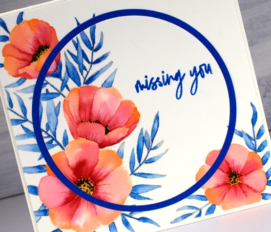
Meadow blossoms
Posted: April 27, 2020 Filed under: Concord & 9th, Inktense pencils, meadow blossoms, Peerless watercolours, Penny Black | Tags: Concord & 9th, Fabriano Watercolour Paper, Inktense, Peerless Transparent Watercolors, Penny Black creative dies, Penny Black stamps 6 Comments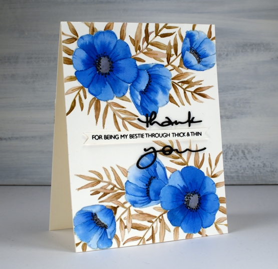
I attended a class not too long ago taught by my clever friend, Liane, where we used paint chips to make cards. Some paint chips have colours from the same family displayed but others have colour combinations that are suggestions when painting and decorating a room. I used one such card to choose the colours for this blue floral card. The paint chip featured colours called nautica, blizzard and tahini. I found similar colours on my peerless watercolour palette and did some no-line watercolour.
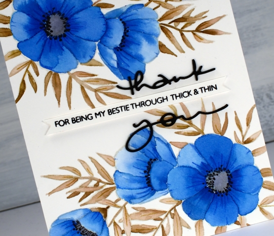
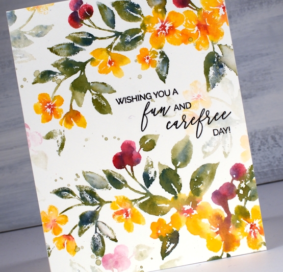
I started by stamping C&9 ‘meadow blossoms’ floral stamp in Gina K ‘whisper’ ink. The ink is a pale beige/grey dye ink which disappeared nicely as I painted with peerless watercolour paint over the top. I worked on non adjacent petals so the paint and water would not bleed from one area to the next. On the largest flowers I painted a dab of ‘Alice blue’ paint then blended it with water to fill the petal.
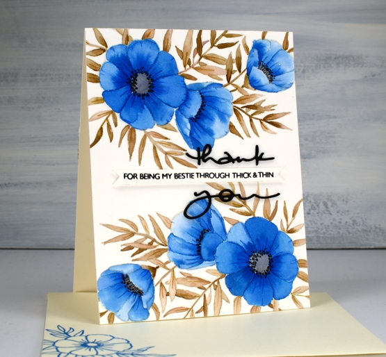
On the smaller flowers I switched the order and painted each petal with water first then dabbed in some blue paint. The second method resulted in slightly paler flowers. I painted all the leaves and stems in ‘warm sepia’ and the flower centres in ‘pearl grey’. Once all the paint was dry I used two inktense pencils to add veins and shading to the leaves and petals. I painted black dots in the flower centres then drew tiny stems to the dots with a very fine tip black pen. The black thank you die cut is from the PB ‘many thanks’ die set cut from black cardstock and stacked for extra dimension. I think it works well either side of the cute phrase from the PB ‘million thanks’ set which is stamped in nocturne black on a strip cut with the Taylored Expressions ‘simple strips’ die.
If you are stuck for a colour combo try some paint chip inspiration; I don’t think I would have thought up the blue, brown, grey combo without the inspiration on the chip. And call your bestie!
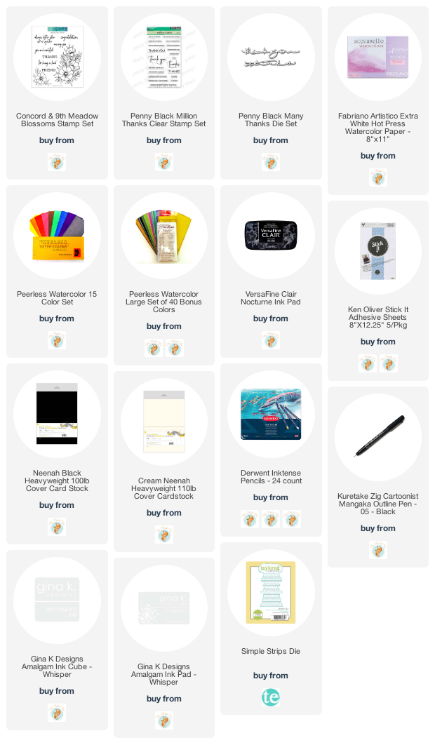
Supplies
Sending Love
Posted: April 24, 2020 Filed under: bold blooms, floral Christmas, Ink to Paper, Papertrey Inks 8 Comments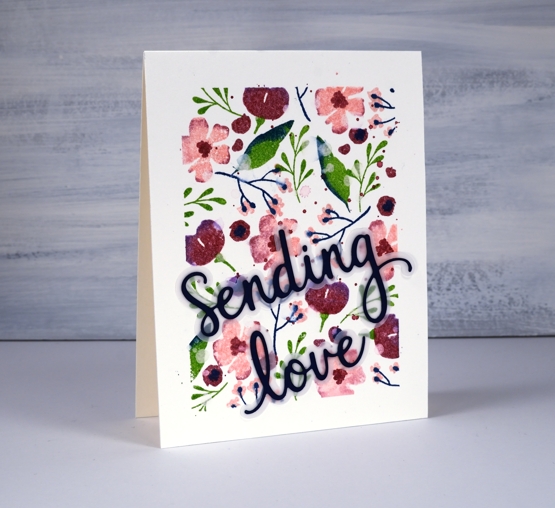
I love it when sets can work for multiple seasons; today’s card features a new Ink to Paper set, ‘bold blooms’ paired up with a set I used many times for Christmas cards, ITP ‘floral Christmas’. I used flower stamps and a large leaf from the bold blooms set and some little twiggy stamps from the floral Christmas set. I taped all four edges of a piece of hot pressed watercolour paper before I started stamping so I would have a masked ‘frame’ for the floral pattern.
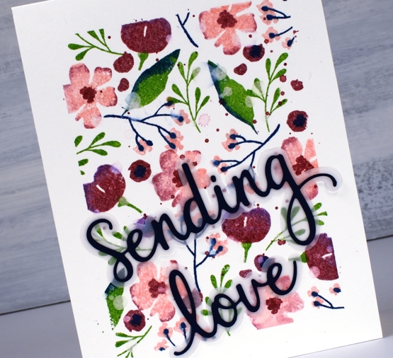
All the stamping was done with Papertrey ink cubes, some solid colour and some combined on the stamps. I think the technique was once called ‘rock and roll’ when you inked a stamp with one colour then rolled the edge along another ink pad to pick up a border of another colour. You can see the flowers have two colours and some of the leaves. I have linked all the colours I used in the supply list below. The stamps that were’rolled also got a spritz of water before I printed them so there was a little blending happening before they hit the watercolour paper. I added splatter in ‘autumn rose’ ink and then once that was dry water splatter which I then dabbed with a paper towel to get washed out dots on some of the stamping. It looks a little like spring flowers caught in the rain. Not that I have seen any spring flowers just yet, I have however seen rain, snow and hail this week and it was all in the one day!
I removed the tape to reveal lovely straight edges and wanted to add a sentiment that didn’t cover too much of the pattern. The background was too busy for just the die cut words but adding the shadow for each word cut from vellum created enough separation to make the words ‘sending love’ readable. The dies are from Pink Fresh Studio and the set is called ‘Phrase Builder – Sending’; unfortunately it isn’t linked below because I could not find it available anywhere. I bought it a few months back for a class that was originally scheduled for March…
I am in the process of planning my first online class and I’m wondering what techniques you would like to see me teach in online classes. Here are a few ideas I’m considering: no-line watercolour, watercolour powder techniques, stamped scenes, masking, gel printing. Let me know what you think.
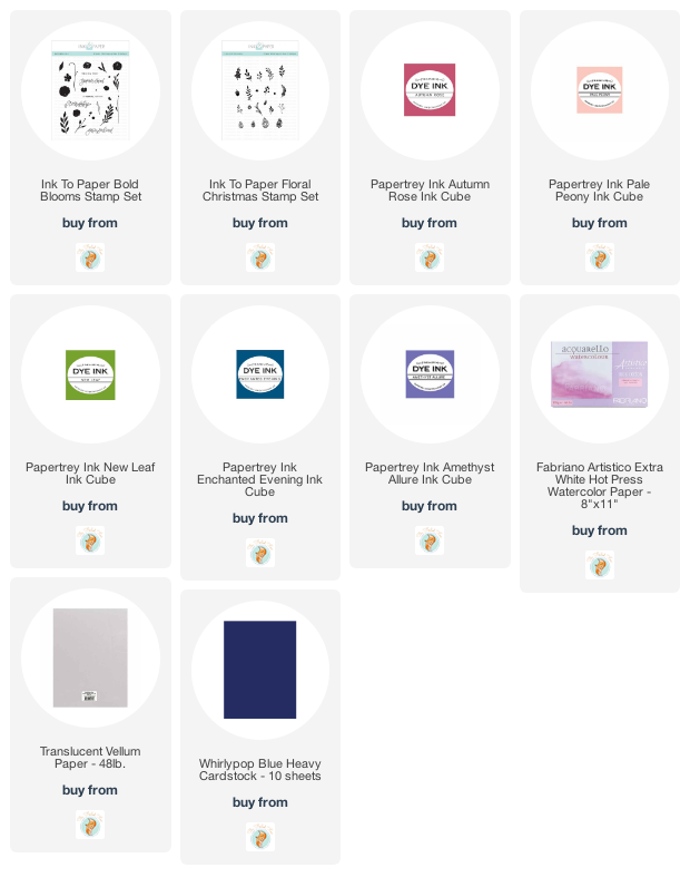
Supplies
Coffee with a friend
Posted: April 22, 2020 Filed under: coffee time, Darkroom Door, global postmarks, handwritten script, World Map | Tags: Brusho, Darkroom Door stamps, Darkroom Door stencils, distress oxide inks, Ranger Distress inks 6 Comments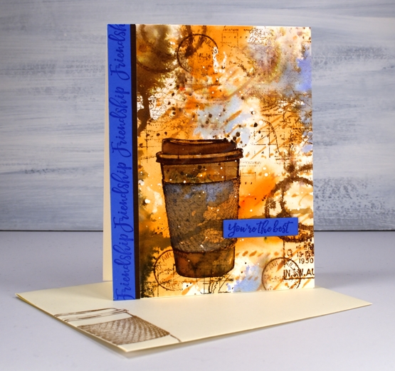
Are you missing the coffee shops? I’m sure you are missing your friends and perhaps you are missing coffee with friends. This one is for a friend of mine who loves her coffee!
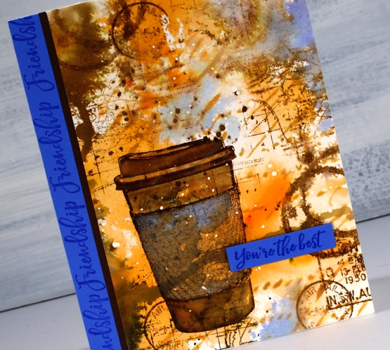
I began with a piece of hot pressed watercolour paper and splattered a few drops of masking fluid over the whole thing. Once the masking fluid was dry I sprinkled sandstone brusho on my glass mat, spritzed the brusho with water and swiped this panel through it. It took a few swipes before I had an orange and brown abstract background. I added some dark brown brusho on one side and spritzed that to make it blend and spread a bit. Once I’d dried that I blended through the new Darkroom Door ‘handwritten script’ stencil with rusty hinge oxide ink.
At this point the panel was very much just an abstract background so I stamped the cup from DD ‘coffee time’ in gathered twigs distress ink and blended the stamping with some water and extra ink. The set also has a coffee cup stain stamp so I added that here and there, spritzing it to make it blurry. I stamped some postmarks from the ‘global postmarks’ set because I can’t help myself.
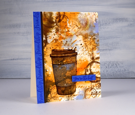
Unfortunately the coffee cup did not stand out enough from the background and the background itself looked incomplete. DD world map stamp and blueprint sketch distress ink came to the rescue. I stamped the world map several times on the panel in gathered twigs ink and then, to break up the orange and brown monopoly, I added some blueprint sketch ink in just a few places. I found some blue cardstock that matched the blue and stamped ‘friendship’ and ‘you’re the best’ from the DD ‘friendship’ strip of sentiments to finish the card. Oh, and I added a thin strip of brown cardstock separating the blue from the patterned panel.
I’m glad I didn’t give up on this panel; it is just the thing for my friend who I will enjoy a coffee with again one day.
Supplies
Purple Dazzle
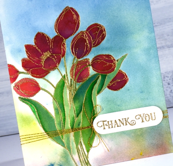
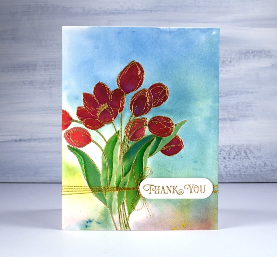
Posted: April 20, 2020 Filed under: dazzle 7 Comments
I have a quick and easy technique for colouring these tulips so they have a little depth and variation in both petals and leaves. Sometimes I spend quite a bit of time with brushstroke stamps, adding depth bit by bit in a stamp positioner. This time I added all the colour then stamped once.
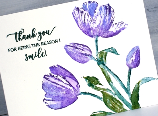
I inked the tulips with shaded lilac and wilted violet distress inks, just dabs of colour to cover the flower head. The leaves I did with markers, a peeled paint and a pine needles. Then, before stamping I spritzed the stamp with water then stamped on hot pressed watercolour paper. In a few places I blended the inks with a paint brush afterwards but really not much at all. You can still see plenty of white space on the tulips and a little on the leaves.
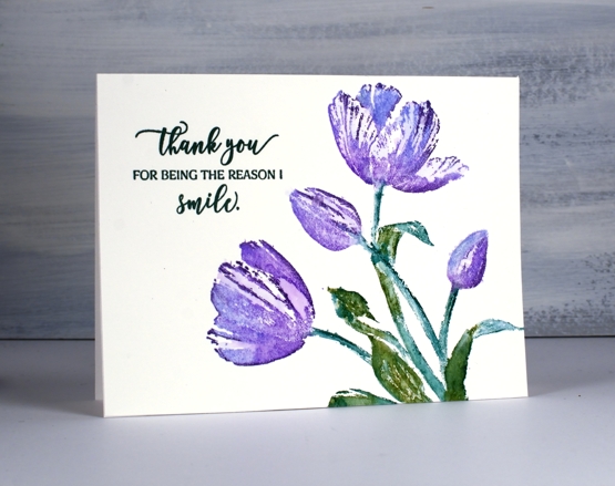
I kept the whole layout clean with just a sentiment from ‘magical friendship’ stamped in versafine nocturne ink.
To see a totally different look with this stamp click over to a couple of cards I posted last month.
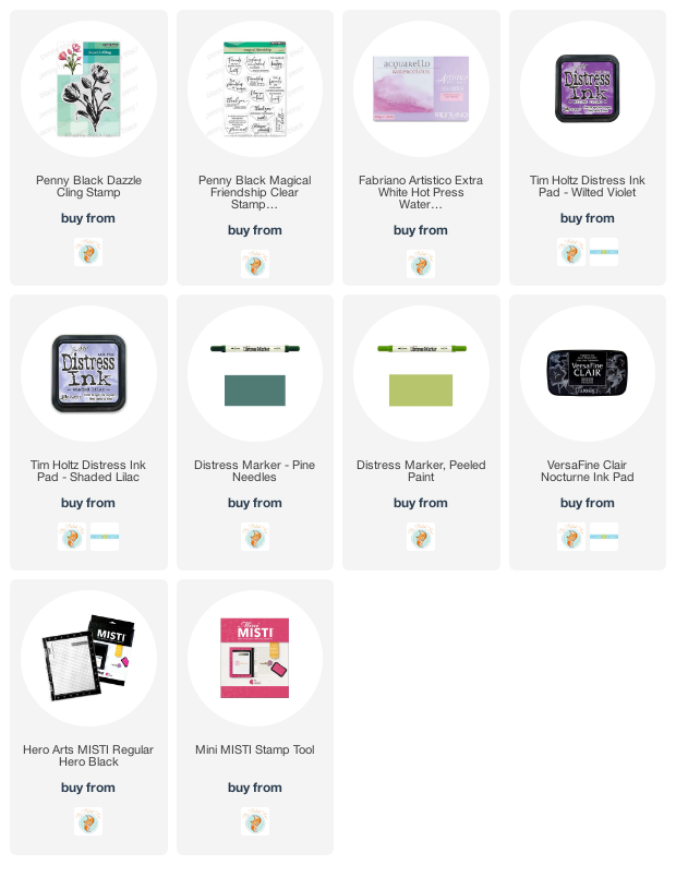
Supplies
https://linkdeli.com/widget.js?id=36e575d4b4503edd8f9a
Stamping with Arteza Real Brush pens
Posted: April 17, 2020 Filed under: Arteza, nature's glory, Penny Black, Tutorial, Watercolour, watercolour real brush pens | Tags: Arteza, Fabriano Watercolour Paper, Penny Black stamps, Tutorial, video 10 Comments
Hi there, this pretty stamp, ‘nature’s glory’ is making its second appearance on the blog and I’ve paired it up with Arteza real brush pens. I did all the inking with the brush pens and made a video to give you an idea of the process. One of the tricky steps when creating watercolour cards with stamps is when, where and how much water to add, hopefully the video will give you an idea.
You probably noticed in the video the way the brush pen bristles were able to easily get into small sections of the stamp so I could ink the flowers, berries and leaves. I spritzed the stamp before pressing onto the hot pressed watercolour paper so the inks would blend on the stamp rather than me blending them on the paper. I love the softness of the blends including the areas that get more water and the ones that look a little dry because they got less water.
The soft background leaves and flowers were all stamped with ink left on the stamp after doing the bold images. The ink is certainly intense enough that an extra spritz of water is all you need in order to stamp the pale images that appear to be further back between the branches. Dabbing these pale images with a paper towel after stamping makes them even paler and removes any liquid sitting on the surface.

I even had enough ink on the stamp to get a pale print on my envelope then finished with splatter as you know I like to do.
The card below was done with the same stamping technique but I created the soft coloured background at the beginning of my process. I scribbled the blue, yellow and green pens on my glass mat first, spritzed with water then swiped the hot pressed watercolour panel through the ink picking up sections of diluted colour which I dried before transferring the panel to my stamp positioner to do all the flowers. If you are wondering about the sentiment, it is for one of my friends who was told this by a student! When she relayed the experience to me I knew it had to become a card. I did a bit of partial stamping with MFT ‘birdie brown greeting stamps’ then cut the letters b, a, b, y from dark green cardstock (I know it looks black ) with MFT ‘little lowercase dies’.
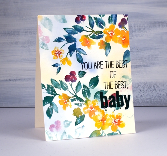
If you are a teacher connecting with your students on line, encouraging them and trying to come up with methods that work in the current situation please know I think you are the best of the best…baby!
Supplies
Meadow blossoms gone tropical
Posted: April 15, 2020 Filed under: Inktense pencils, meadow blossoms, Peerless watercolours | Tags: Concord & 9th, Gina K inks, Inktense, Peerless Transparent Watercolors 9 Comments
I am over on the Foiled Fox blog today sharing these pretty flowers from Concord & 9th and some no-line watercolour. Make sure you head over there for more details, then take a little stroll through the inspiration on their blog.
It wasn’t my intention to create a tropical looking card but that is absolutely what happened wouldn’t you agree? I chose three colours, geranium pink and alizarine pink from my set of Peerless watercolours and sea blue from my Inktense pencil set. All three colours ended up being bolder than I expected. I stamped flowers from the C&9th ‘meadow blossoms’ set in Gina K’s amalgam ink, ‘barely there’ which is a pale buttery colour, great for no-line watercolour.
There are various methods for no-line watercolour; here I painted water on each petal first then dropped in a little geranium pink at one end of the petal and alizarine pink at the other then blended the two. The leaves I did by colouring one end of each leaf with the inktense pencil before blending blue into the whole leaf. I also used an inktense yellow, to fill the flower centres and a pink to add veins to the petals after painting. I added little black dots to the flowers with a fine tip pen
I embossed the sentiment from the same C&9 set and did some die cutting with nesting circles to add a little interest with a co-ordinating blue cardstock. I hope you enjoyed this little taste of the tropics; as I write this post it is snowing outside. Yep, a little April snow, just to keep us guessing.
As always I love connecting with you in the comments below or over on the Foiled Fox blog.
Supplies
Classic motorcycle
Posted: April 13, 2020 Filed under: alphabet medley, brick wall, classic cars vol 1, classic motorcycles, Darkroom Door, number medley | Tags: Darkroom Door stamps, distress oxide inks 13 Comments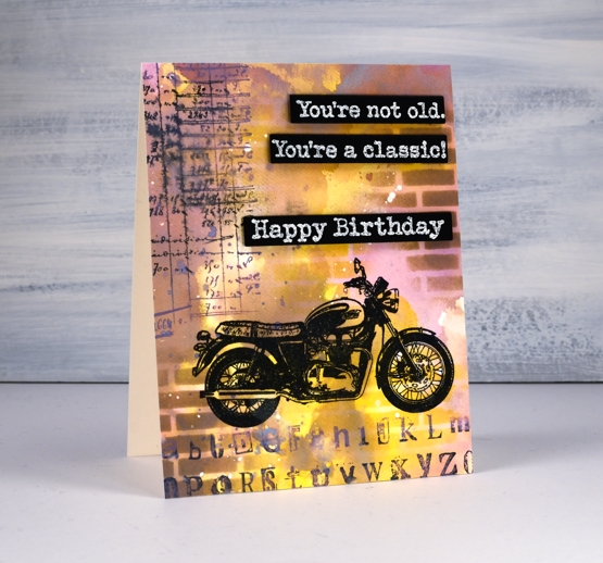
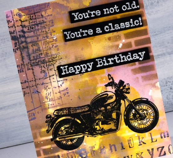
Recently I posted a classic car card and both my brother and father responded that it was time for a classic motorcycle card. It is my dad’s birthday tomorrow so here is a motorcycle themed birthday card. Unfortunately it won’t arrive in his mail box anytime soon but we will chat via the interwebs. Happy Birthday, Dad!
To create the card I pulled out the distress oxide inks; I haven’t used them lately and had forgotten the cool effects I can get when I layer them. I started by smooshing three colours on my glass mat then spritzing them with water. The three inks were dusty concord, frayed burlap and fossilized amber. The dusty concord looks more pink than purple when it’s wet, the amber gives a nice bright pop of colour and the burlap is a neutral that works with both. Before I swiped my watercolour panel through the spritzed ink I had splattered some masking fluid on it and let that dry. The little white spots here and there on the finished card are the results of using masking fluid before adding any ink. I know they are a subtle effect but I like the contrast of a few white spots.
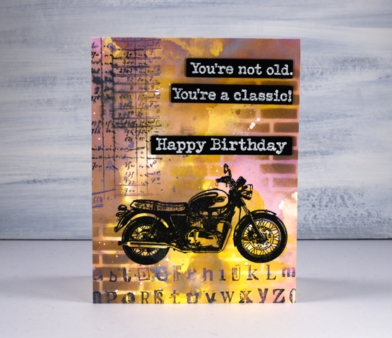
I ended up swiping the panel through the inks several times, letting it dry between swipes so the colours would layer rather than turn to mud. Once all the layering was finished I used the new Darkroom Door small brick wall stencil to blend some bricks over the panel with frayed burlap and fossilized amber inks. I stamped the motorcycle from DD ‘classic motorcycles’ set in versafine clair nocturne then added some collage numbers and letters using stamps from DD ‘alphabet medley’ and ‘number medley’ sets in black soot and dusty concord oxide ink.
I stamped and embossed sentiments from both ‘happy birthday’ and ‘classic cars vol 1’ and die cut them so I could pop them up down the side of the card. The embossing powder is Ranger ‘weathered wood’ to fit with the slightly grungy style of the card.
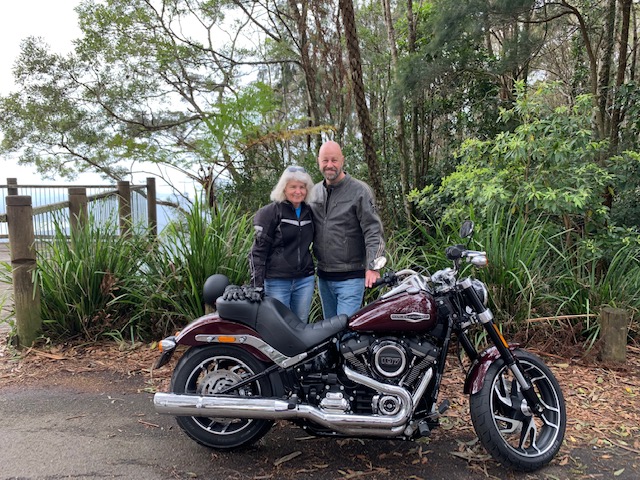
I have no idea what kind of motorcycle this is but maybe my brother can fill me in on that. About six months ago he became a Harley owner; that’s him and his lovely wife out for their first ride on the new bike. It is certainly not his first bike so maybe he will recognise some distinctive feature of the one on my card.
Thank you for getting in touch on my last post about online church and hope at this time of isolation. I am happy to hear it was an encouragement to so many of you.
Supplies
Church on the couch
Posted: April 10, 2020 Filed under: Uncategorized 18 CommentsLife is very different right now isn’t it? I thought I would do something different here on the blog too and talk about one of the ways my life is different during quarantine. I’ve been sitting on the couch for church the last three weeks as it has been live streamed or filmed in advance to be viewed via the internet. If you’d like to attend church from your home I’ve provided a few links below. If you are feeling like it’s not a very good Friday this year, please watch this short message from my brother reminding us why it still is.
Alta Vista Baptist Church in Ottawa is connecting via recorded messages on their website.
Resurrection Church in Ottawa is livestreaming on Sunday mornings and then making services available on their website afterwards.
On the other side of the world Salt Community Church is meeting live on line as well as making video and audio recordings available.
I mention these three as I have a connection with each one but there are many others. Easter looks different in many ways this year but God has not changed and neither has His love for us or the hope He provides.
Three colour brusho video
Posted: April 9, 2020 Filed under: Brusho, flutterby, Penny Black, Tagged, Tutorial, Watercolour | Tags: Brusho, Faber-Castell Polychromos Colour Pencil, Fabriano Watercolour Paper, Penny Black creative dies, Penny Black stamps, Tutorial, video 7 Comments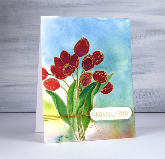
A while back I posted three cards all painted with the same three brusho paint colours and my Welsh friend, Karen requested a video. Well this is it, a different stamp and three different colours (Brusho sunburst lemon, prussian blue, rose red) but the same technique. Here is the one that prompted the video request.

As with the card above I embossed the outline stamp, ‘flutterby’ in gold powder then swiped up a brusho background by sprinkling brusho on my glass mat then spritzing water over it to activate the powders and turn them into liquid watercolour paint. From there I moved onto painting petals and leaves with individual colours and secondary colours. Take a look at the video and you will see what I mean.
After all the painting was done I added some extra shading in shadow areas with Faber-Castell polychromos pencils and some gold thread detail. The sentiment is from PB ‘banner sentiments’ gold embossed and die cut with a die from the PB ‘tagged’ set.
One of the things I like about this technique is the way the background works with the painted images even though the are painted right over the top of a multicoloured panel. The colours work because they are the same colours and because the background is not too bold. You can see in the tulip on the left what the true colour of the rose red brusho is, but the ones that are painted over the blue background still look red, just a deeper red perhaps in shadow not full sun.
Happy Easter my friends. Stay home, stay healthy, stay hopeful and maybe try a new art or craft technique!
Supplies
You are nothing short of amazing
Posted: April 8, 2020 Filed under: exhilaration, Penny Black, Script | Tags: brutus monroe embossing powder, Fabriano Watercolour Paper, Papertrey ink, Penny Black creative dies, Penny Black stamps, Ranger Distress inks 12 Comments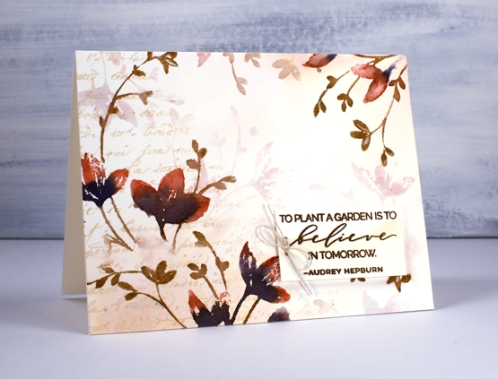
I got together with some friends a while back for a crafting afternoon, seems like an age ago now! While there I stamped the two panels you see here. For a while they were forgotten as I was working on other projects then I fiddled around to create two quite different cards. The basic technique is the same for both panels and involves stamping and restamping without reinking in between impressions. The card above began as a vintage looking panel stamped in antique linen ink. I smooshed some antique linen distress ink on my glass mat, spritzed with water then swiped my panel through it to pick up inky stains. I dabbed some areas with paper towel which makes them dry a more yellowy colour. I partially inked the Penny Black script background stamp in antique linen and stamped on one side.
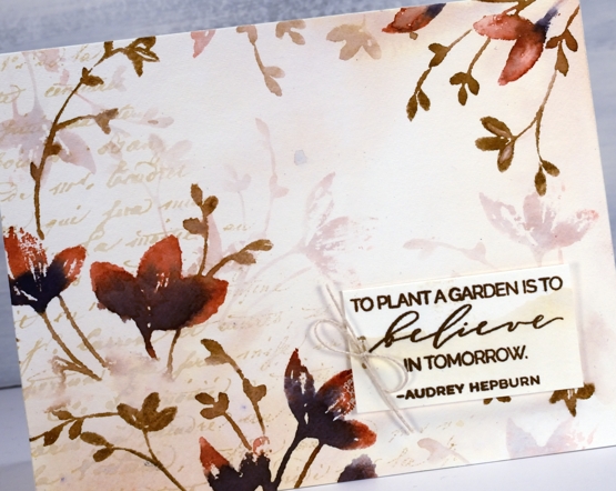
Once the background was dry I used the PB stamp, ‘exhilaration’ to stamp some coloured flowers. I inked the flowers with a Papertrey Americana ink cube and chipped sapphire distress ink then the stems with a gathered twigs distress marker. I wiped ink off the stamp in some areas so the image would be patchy on purpose, spritzed then stamped on the panel. I did both the left hand side and right top corner then, without cleaning the stamp spritzed it again and stamped paler images which immediately appear to be in the background. I stamped a sentiment on an ‘antiqued’ scrap in versafine vintage sepia ink, added a twine bow and popped it up on some foam tape.
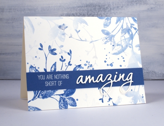
Now that I have described my process for the first card you can probably see that I used the same technique for the blue card but only used one colour, Papertrey ink ‘blueberry sky’. I didn’t start by making a vintage style background, I just jumped right on in with the first stamping. I spritzed the stamp and did another print, then another and one more very pale one and that was it! I added some splatters but nothing more to this pretty blue panel. It was very quick and probably took longer to find a matching cardstock. Once I found a co-ordinating blue I stamped part of a sentiment from the PB ‘sentiment’ set and embossed in alabaster powder. I finished the sentiment by stacking three die cut ‘amazings’ from the PB OMG die set.
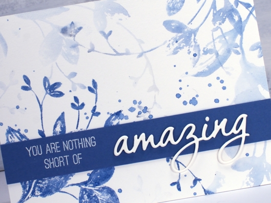
I love this technique for adding depth and dimension to flat stamped panels. I have a video coming next week demonstrating a similar process so stay tuned!
Thanks for visiting here today, I hope you are safe and well where you are and thanks again if you are on the front lines taking care of health, food and safety needs. You are nothing short of amazing!