Purple Dazzle
Posted: April 20, 2020 Filed under: dazzle 7 Comments
I have a quick and easy technique for colouring these tulips so they have a little depth and variation in both petals and leaves. Sometimes I spend quite a bit of time with brushstroke stamps, adding depth bit by bit in a stamp positioner. This time I added all the colour then stamped once.
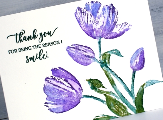
I inked the tulips with shaded lilac and wilted violet distress inks, just dabs of colour to cover the flower head. The leaves I did with markers, a peeled paint and a pine needles. Then, before stamping I spritzed the stamp with water then stamped on hot pressed watercolour paper. In a few places I blended the inks with a paint brush afterwards but really not much at all. You can still see plenty of white space on the tulips and a little on the leaves.
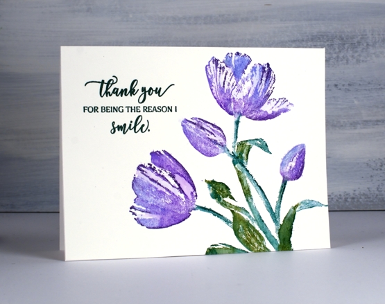
I kept the whole layout clean with just a sentiment from ‘magical friendship’ stamped in versafine nocturne ink.
To see a totally different look with this stamp click over to a couple of cards I posted last month.
Supplies
https://linkdeli.com/widget.js?id=36e575d4b4503edd8f9a
Dazzling postcard
Posted: March 20, 2020 Filed under: dazzle, Penny Black, Script, vintage postcard | Tags: Fabriano Watercolour Paper, Penny Black stamps, Ranger Distress inks 11 Comments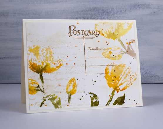
I am sharing these tulip cards over on the Foiled Fox blog today. You know I like it over there, I enjoy the inspiration on their blog, the range of products in their store and the interaction with the Foiled Fox staff and their readers. Make sure you pop over there.
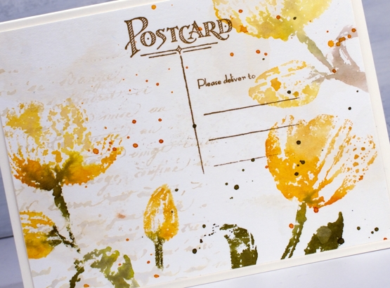
To create a vintage background I smooshed antique linen distress ink on a glass mat then spritzed water over the ink before swiping a hot pressed watercolour panel through the it. I dried the panel before repeating the step. Next I inked the ‘script’ background stamp in antique linen ink, spritzed it then stamped it on one side of the panel. I let everything dry before moving onto the tulips. The stamp is a new one from Penny Black called ‘dazzle’; it is large and features two tulips and two buds. Neither of today’s cards show you the whole stamp; I was after the look of patterned paper rather than a complete image. You will see the whole stamp on another card in the future.
I inked the stamp with scattered straw, wild honey and forest moss distress ink, spritzed it lightly then stamped over the edges of the panels. I also wiped ink off the stamp before pressing it down so the tulips would appear to be floating not anchored to the base of the panel. On the second card I blended over the stamped tulips with water to create a transparent look but on the card above I left them looking ‘lacey’. After the ink dried I splattered both panels with wild honey and forest moss inks.
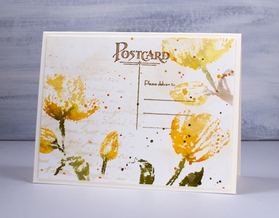
To finish the card above I stamped part of the new ‘vintage postcard’ stamp in vintage photo archival ink. On the card below I added some hemp twine and a popped up sentiment panel also stamped on ‘aged-looking’ paper.
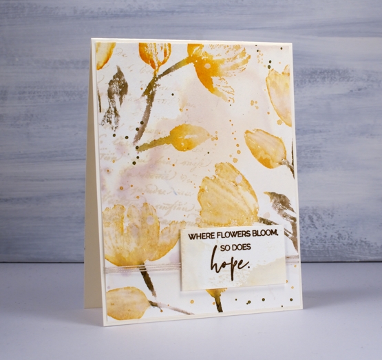
You have already seen this sentiment once this week; it does seem appropriate for the uncertain circumstances we are experiencing right now. I made both cards before the virus situation escalated in North America but I hope having these cards and those words end up on the blog this week is an encouragement to you.
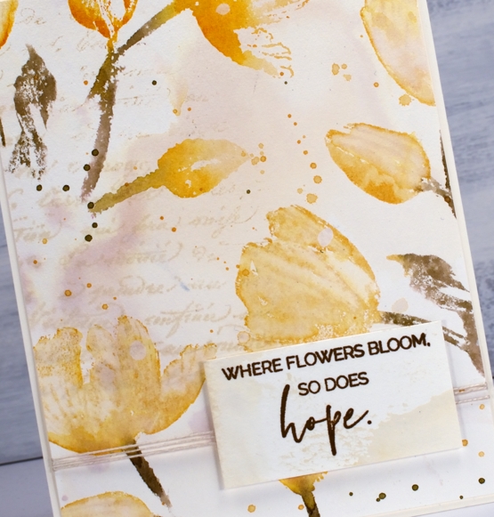
In the close up above you can see clearly the variation of colour achieved by picking up diluted antique linen ink on my watercolour panel; there seems to be a purply tone in there! I love this kind of background and it is so easy to do. Thank you for dropping by today. I appreciate you all and am encouraged to hear that these posts are providing you with some inspiration during a difficult time.
Supplies