Artful August Circle Journal Page
Posted: August 5, 2021 Filed under: Art Journal, basket weave, Christmas bush, Darkroom Door, fragments, gel press, gelli plate, little swirls, mesh, Nature Walk, Paper Rose, Wildflowers Vol 2 | Tags: Art Journal, Darkroom Door stamps, gel press, gel printing, gelli plate 6 Comments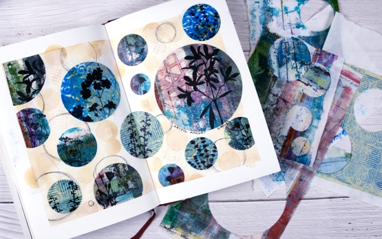
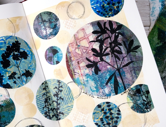
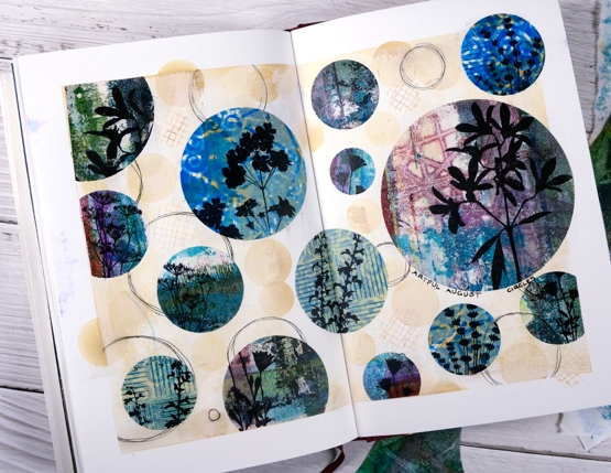
Rachel Greig from Darkroom Door is hosting ‘Artful August’, a challenge to make something arty each day in August. She has provided 31 prompts and I am going to play along as often as I can. Circles was the prompt yesterday so I cut circles from a just few of the many gel print panels I have piling up. I used only gelprints done on rice paper and they cut and adhered very easily.
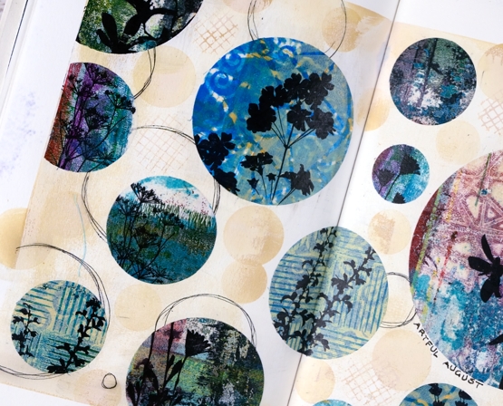
Once I had cut circles in different sizes from different gel printed panels I stamped flower silhouettes from several Darkroom Door sets. Before gluing the circles to the pages I painted the pages with a base of gesso + light brown paint and added some scribbly circles by tracing inside circle dies.

I glued the printed, stamped circles with matte medium both on the back of the paper and over the top to seal it. To add a bit more interest around the circles I blended antique linen ink through a homemade paper stencil.
The prompts in the challenge are very open and participants are encouraged to interpret them in any way and with any medium. If you are on instagram you can view the submissions by searching for #artfulaugust or #rachelgreigartfulaugustchallenge
As I participate in the challenge I will have simple experiments along with some completed projects like this one. The fun is simply playing with the prompts. In making today’s journal pages I was very happy to use some pretty scraps, experiments and clean up pages from gel printing sessions. There are always too many to turn into cards but each one has a unique texture and colour mix.
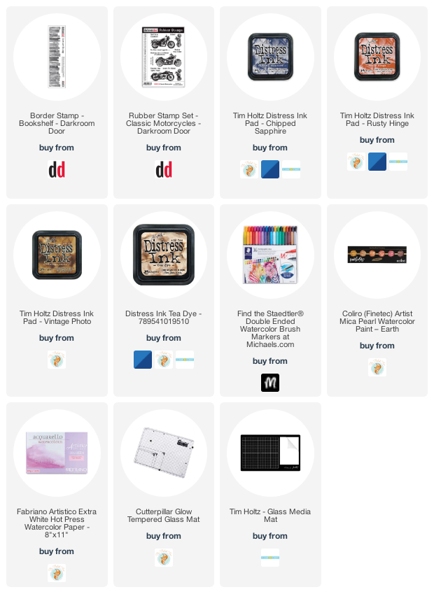
Supplies
(Compensated affiliate links used when possible)
Seashells
Posted: August 4, 2021 Filed under: Catherine Pooler inks, seashells | Tags: Catherine Pooler inks, distress markers, Penny Black stamps 8 Comments
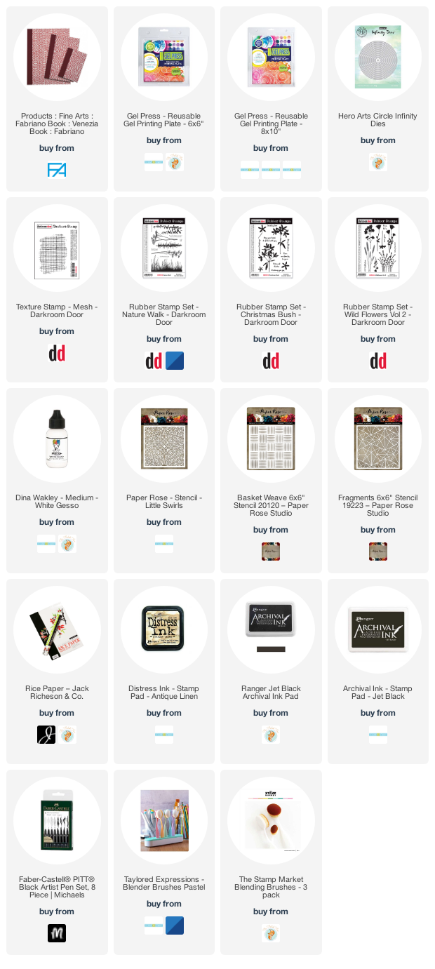
Penny Black recently came out with new stamps that had me daydreaming of the beach. I was a shell collector as a child and still love wandering the shore looking for seashell beauty when I get the chance.
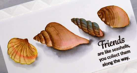
To bring these clear stamps to life I stamped initially in various colours of Catherine Pooler ink then blended out the colours to fill the shells. I smooshed the inks on my glass mat so I could use it as a palette and featured brown inks in all four shells but added different colours to make each one stand out a little. After blending colours for a while some of the initial detail was lost so I used a few distress markers to add some lines back in.
Once the shells dried I used a warm grey Karin brush marker to add shadows below the shells. I drew around the base of each shell in grey then blended it out with water before adding extra grey right beside the shell for depth.
I popped the panel up up an embossed background made with the ‘mod squares’ folder from Altenew.
Oh I would like to be beside the seaside!
Supplies
(Compensated affiliate links used when possible)
Fine Flowers watercolour video
Posted: August 3, 2021 Filed under: Darkroom Door, fine flowers vol 2, Tutorial | Tags: Darkroom Door stamps, distress markers, Ranger Distress inks, Tutorial, video 6 Comments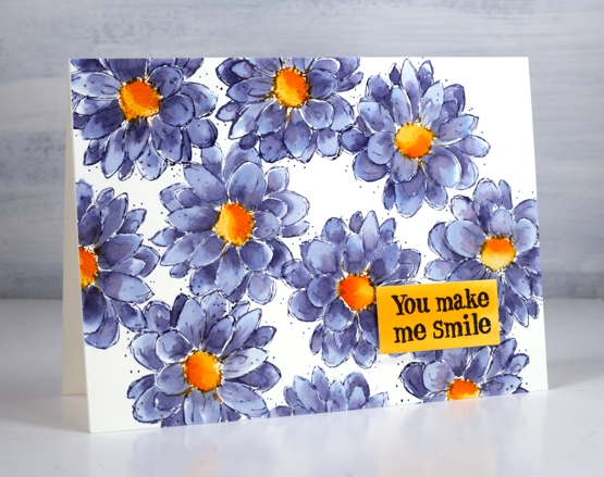
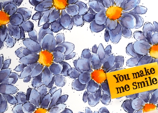
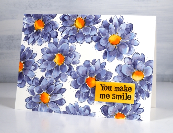
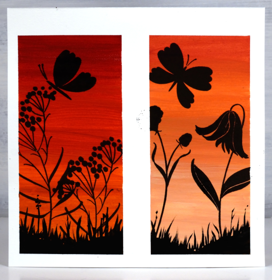
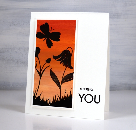
This pretty outline flower is from the Darkroom Door set ‘fine flowers vol 2’. There are six flowers in the set and I am working my way through trying out each stamp. I began inking and stamping this zinnia/dahlia style flower and was so happy with the colour combination I stopped stamping and set myself up to film. You can see the process in the video below.
I’ve exclaimed about inks that colour separate before( and go into more detail in my online class Colour Clues ) but one of my favourites in this regard is chipped sapphire distress ink. You can see in the close up below grey blue, navy blue, pale blue and purply blue. Hardly any effort required!
All the stamps in the set have the same sketchy style and tiny dots so I did not add any further fanciness. It really was a minimal supplies card in the end even though I did not start with that plan in mind.
By the way Rachel Greig from Darkroom Door is running a challenge throughout August called #artfulaugust. If you check her instagram you can see a list of prompts. I am going to join in as often as possible as it is an open ended no pressure challenge. I have already missed one day but I am not going to dwell on that I will just dive in when I can. Kathy Racoosin is also running the Daily Marker colouring challenge during August, another low pressure, designed for fun and relaxation challenge. I hope to participate in that when I can too. Let me know if you are joining in.
Supplies
(Compensated affiliate links used when possible)
Gouache skies
Posted: August 2, 2021 Filed under: Gouache, Penny Black, snowy village, soulful silhouettes | Tags: Gouache paints, Penny Black stamps, Tsukineko Versafine inks 9 Comments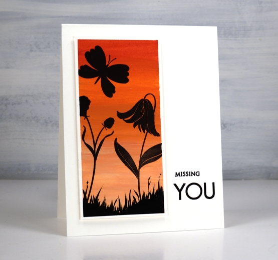
Some of you may remember me mentioning a while back an interest in trying gouache paint. The Foiled Fox kindly sent me some to try and I have been learning and practicing the techniques over the last couple of months. I am sharing over on their blog today so make sure you visit to read more about my process. Gouache is an opaque acrylic paint with some similarities to watercolour paint. It is possible to dilute with water until it becomes somewhat transparent but it is more common to see it used in its opaque form. I watched several videos to learn what to do (and what not to do!) and will continue to experiment.
One key fact I learnt after trying to paint with several colours right out of the tube is the need to mix with a little water to get a creamy consistency. Another important thing to note is that unlike watercolour, where I add water to get a lighter shade, with gouache I add white paint. In the photo above you can see two panels side by side. I taped the watercolour paper with washi tape and painted the one on the left without adding white paint to the red and orange paints used. For the one on the right I added white to both the red and the orange increasing the amount of white to get the lighter colour at the bottom.
I also included the photo of the uncut panel so you could see how well the washi tape masked against the paint but was not thick enough to keep out all the versafine clair nocturne ink.
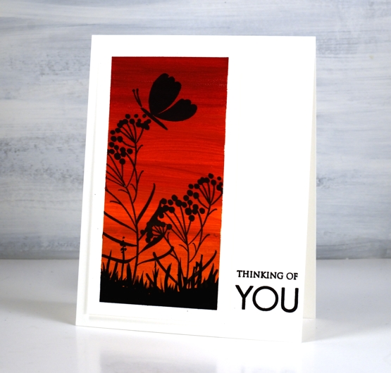
To turn the painted panels into scenes I used PB ‘soulful silhouettes’ stamped in nocturne versafine clair ink. It stamped really well on the gouache.
I popped up the panels and added sentiments using the PB ‘only you’ sentiment set.
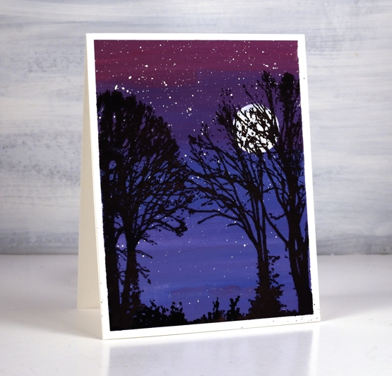
After some success with the warm toned panels I taped off a larger one and used blues and red to create a gradated purple sky. Although it is quite dark I did mix white paint with each of the colours used. ( I listed the paint colours used on the Foiled Fox post)
Once the background sky paint dried I splattered white gouache for stars then painted a circle for the moon. Once again the nocturne ink worked beautifully over the painting as I stamped trees from the PB ‘snowy village’ set.
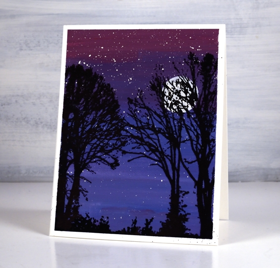
I finished all three panels by painting some black foliage along the base to look like grass and plants.
Let me know if you use gouache either for cards or other purposes. I have a few projects I hope to try as I continue to learn more about the medium. Thanks for dropping by.
Supplies
(Compensated affiliate links used when possible)
2021 BuJo – August theme
Posted: July 31, 2021 Filed under: Bullet Journal, Dingbat notebooks, Hand lettered, perfect pairing | Tags: Bullet Journal, Dingbats notebook, Papertrey ink, Staedtler watercolour brush pens, Tsukineko Memento inks 5 Comments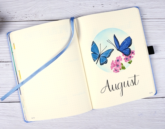
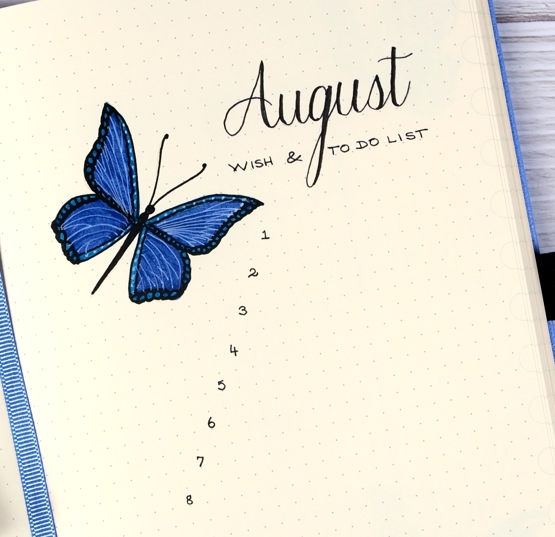
This might be a first, having my month theme set up and ready to share before the month has even started! I wanted to include butterflies as the garden has been attracting quite a few. I’ve been enjoying both blooms and wings.
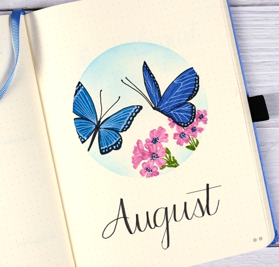
I masked the circle with an ‘express-it mask it sheet then stamped butterflies and flowers from the PB ‘perfect pairings’ set with soft stone ink. Before colouring I added memento summer sky ink with a blending brush.
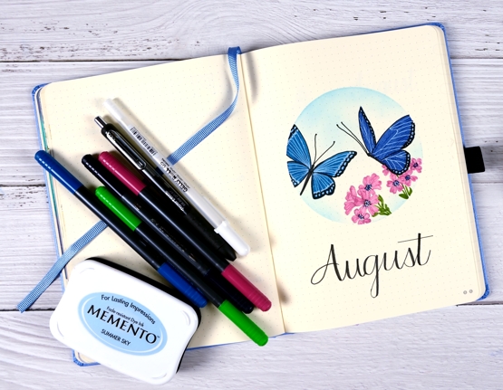
As I did the last two months I used markers to colour the flowers and butterflies; I am still new to (non-blended) colouring with markers. Usually when I use markers for colouring I add a little ink then blend it with water to fill a space. As the bullet journal pages do not handle water in the same way as watercolour paper I’ve avoided water blending.
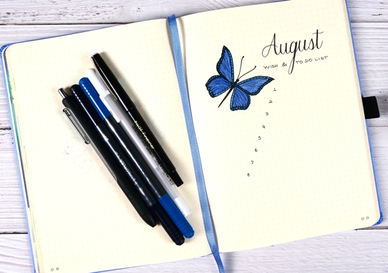
On both the title page and list page I filled the wings with blue first then added all the details over the top with black and white gel pens. I switched to a pilot fineliner to do the numbers and lettering.
After prepping my August pages with flowers and butterflies it is time I headed out to my garden and did some real life tidying up. Thanks for dropping by.
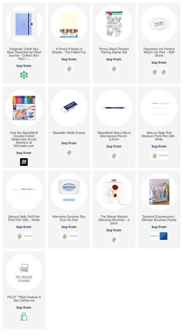
Supplies
(Compensated affiliate links used when possible)
Work & Relax
Posted: July 30, 2021 Filed under: paws and relax, Peerless watercolours, zooming by | Tags: distress markers, Papertrey ink, Peerless Transparent Watercolors, Penny Black stamps 2 Comments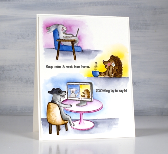
Are you surprised to see another critter post? Regular programming will resume I promise but first let’s enjoy Scooter and her friends working from home and pampering themselves!
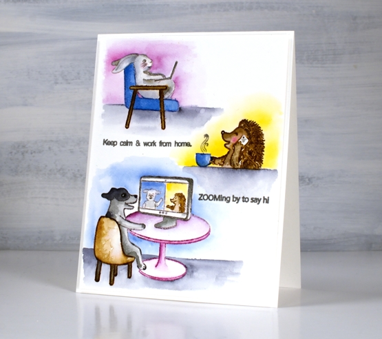
Once again I stamped the images with Papertrey ink’s soft stone. It is great for no-line watercolour. I used Peerless watercolours to paint the little scenes concentrating on a few main colours for each card. For the hedgehog I switched to brown distress markers, easier for getting all those spikes!
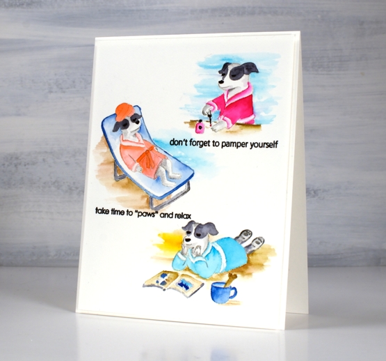
If you didn’t read it in my earlier post, Penny Black is donating some of the proceeds from the Scooter release to Muttville a rescue program for senior dogs.
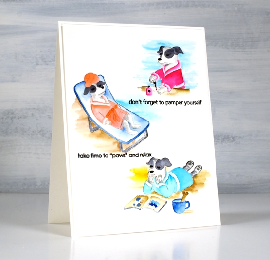
Hope you get to ‘paws & relax’ this weekend. It’s a long weekend here in Ontario!
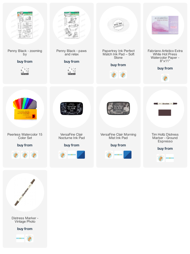
Supplies
(Compensated affiliate links used when possible)
Hot Diggity
Posted: July 29, 2021 Filed under: doggone great, hot diggity dog, Peerless watercolours, Penny Black | Tags: distress markers, Peerless Transparent Watercolors, Penny Black stamps, Ranger Distress inks 4 Comments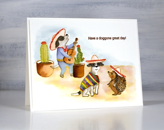
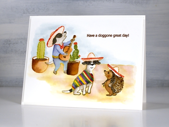
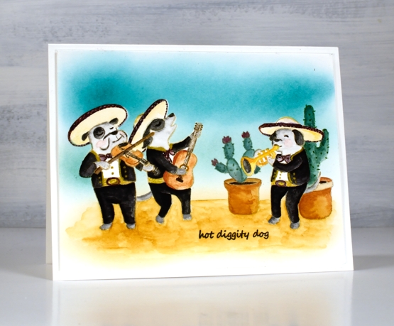
I have another cute Scooter card for you today. Once again I watercoloured, this time with distress inks. I think this is my favourite set from the release; what’s not to like about a canine mariachi band?
I stamped some images with soft stone ink then painted with distress inks. Other images, including the hedgehog I stamped in brown distress inks and blended them to fill the image. I painted the background with distress inks smooshed and diluted on my glass mat.
The second card I stamped in antique linen distress inks and stamped on masking paper also so I could create the scene with cacti in the background and one musician behind another.
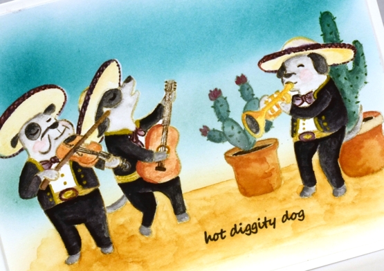
I painted with peerless watercolour paints and added gold details with a gel pen. I used the masks a second time so I could blend ink over the background.
These Scooter scenes were definitely a departure from my nature (and book) themed projects but as a friend said to my yesterday, ‘always good to step out of your comfort zone!’
Supplies
(Compensated affiliate links used when possible)
Scooter
Posted: July 28, 2021 Filed under: Dies, gift card pocket, Karin brushmarkers, Penny Black, puptastic | Tags: Karin brushmarkers, Penny Black creative dies, Penny Black stamps 4 Comments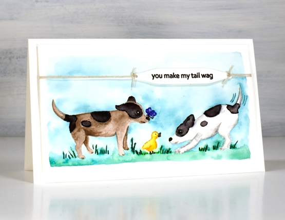
If you have visited the Penny Black blog lately you will have met Scooter; that’s her on the right. The Scooter release features a pup and her friends. The real life Scooter was part of the Penny Black family and now there is a range of stamps featuring her real and imagined activities. Penny Black is donating a portion of the proceeds from Scooter stamp set sales to Muttville a senior dog rescue program.
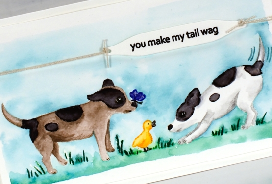
Unaccustomed to painting cute critters like Scooter it took me a while to get in the groove. For this little scene featuring stamps from the Puptastic set I stamped the outline images in papertrey soft stone ink then watercoloured with Karin brushmarkers. The sky and grass is also diluted ink from the Karin markers.
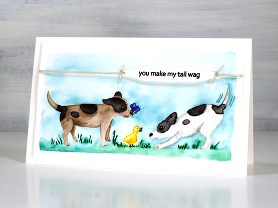
To complete the card I stamped the sentiment from the same set on a label cut with a tag from the PB ‘gift card pocket’ die set, tied it with twine and popped it up on dimensional tape.
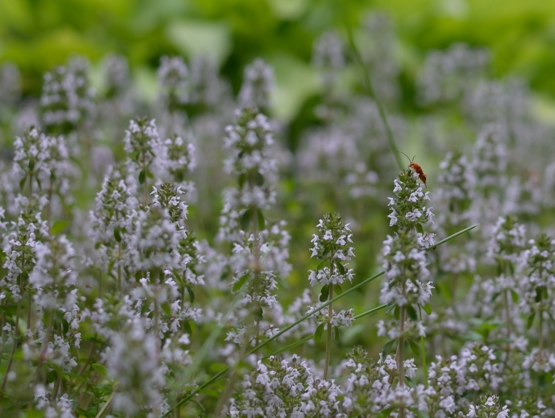
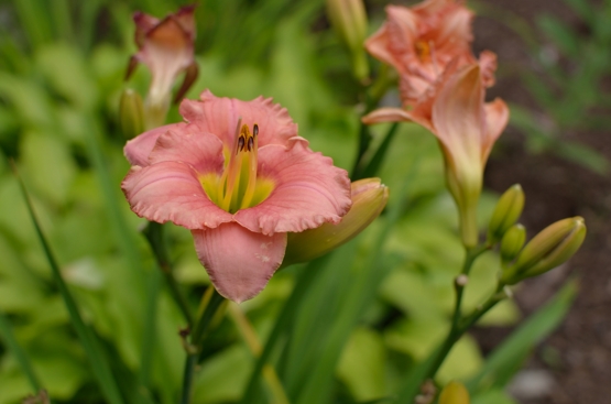
Thank you for all your kind words about my garden pics. It really has become a relaxing pastime for me. I think because it is finally under control I can enjoy working on a patch for a short time or strolling around trimming off deadheads. It is no longer just about weeding!
Supplies
(Compensated affiliate links used when possible)
Out the back door
Posted: July 27, 2021 Filed under: Uncategorized 13 Comments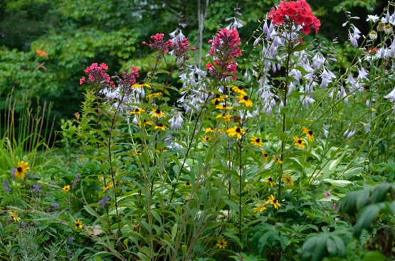
Floral inspiration today but not the stamped and painted kind. I thought I would give you a glimpse of my backyard garden. I am not a knowledgeable or careful gardener but after years of working and learning the half circle garden is thriving and blooming.
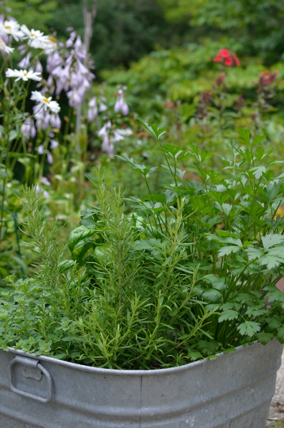
I am not the only one who has put time into this garden. For the last couple of years my daughter has spurred me on by spending hours weeding and mulching. During past visits my dad has done plenty of digging and weeding also.
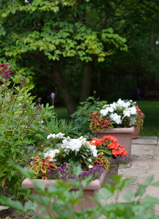
Several friends with expertise have guided me along the way.
It’s not fancy but it is pretty. My mother, an avid gardener would be surprised but pleased so see how much time I spend on this pastime.
Vintage Style Bookshelf + Video
Posted: July 26, 2021 Filed under: bookshelf, classic motorcycles, Coliro paints, Darkroom Door, Finetec paints, Tutorial | Tags: Darkroom Door stamps, Finetec artist mica watercolour paint, Ranger Distress inks, Staedtler watercolour brush pens, video 13 Comments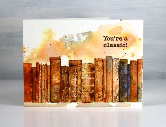
This isn’t my first time stamping books with Darkroom Door stamps. This time I filmed the process so you could see how I made them look all old and vintagey!
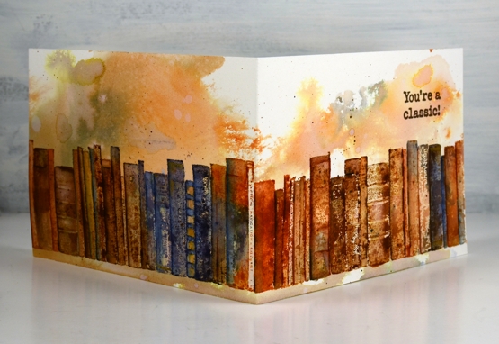
The fun thing about the Darkroom Door ‘bookshelf’ stamp is its length (just under 12″) so I decided to wrap it around my cards for maximum effect. I worked on two cards at the same time giving them slightly different paint jobs and background finishing touches. Watch the video to see my process.
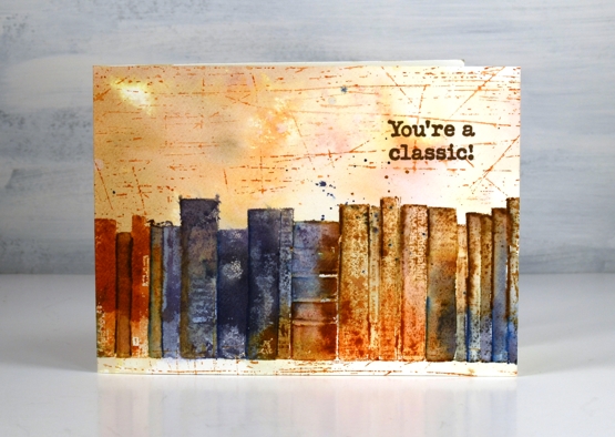
Because I inked the bookshelf stamp randomly the colours moved where they willed and left me with a mix of blues and browns. This second card has some extra scratches from the DD stamp of the same name.
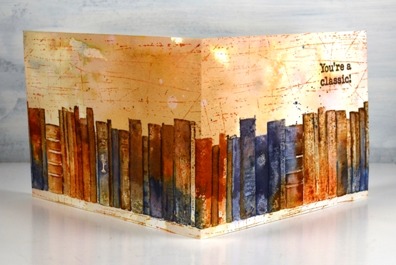
The insides of the cards have random paint splotches here and there so I added paper inserts for a clean place to write a note. Now that I have made a wraparound card with this border stamp I might have to try it with the other DD one I own, ‘butterfly garden‘.
Thank you so much for your interest and discussion about the gel printing I shared last week. I really enjoyed the gel printing session which resulted in my last two videos and turning a few of the prints into cards and a journal page was very satisfying. Several of you mentioned wanting to get your gel plate out to try the techniques; I hope you do. I also hope you try this brown and blue vintage style on some of your own stamped projects. If you do be sure to let me know.
Supplies
(Compensated affiliate links used when possible)