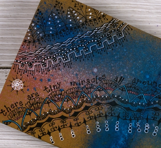
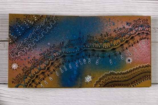
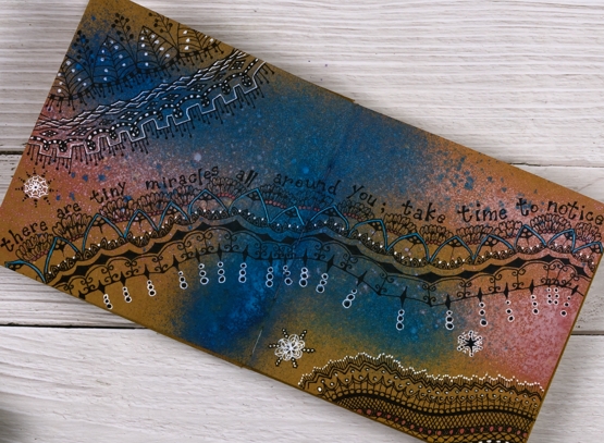
Birches on Kraft
Posted: March 9, 2022 Filed under: Alexandra Renke, Art Journal | Tags: Alexandra Renke, Art Journal 10 Comments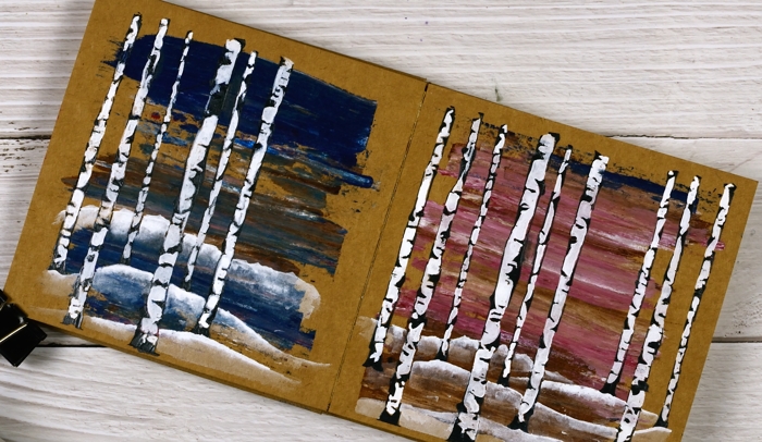
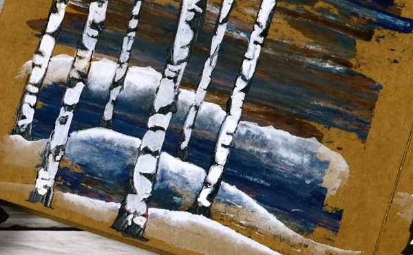
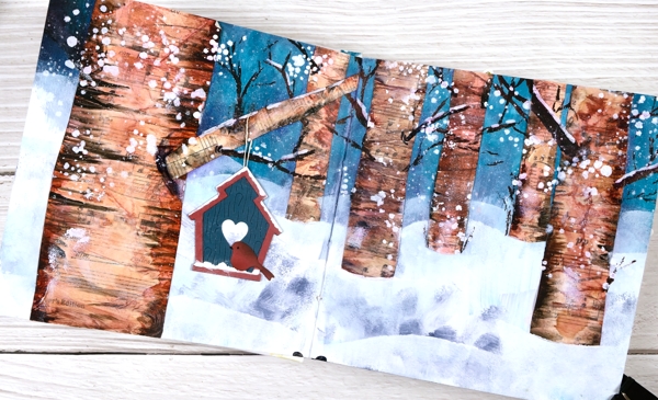
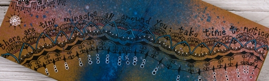
These two pages began as ‘clean up’ pages after completing pages in another art journal. I had some pink and brown paints left over and also some blue with brown. I used an old key card to lift the excess paint and swiped it onto the pages in my 6×6 kraft journal.
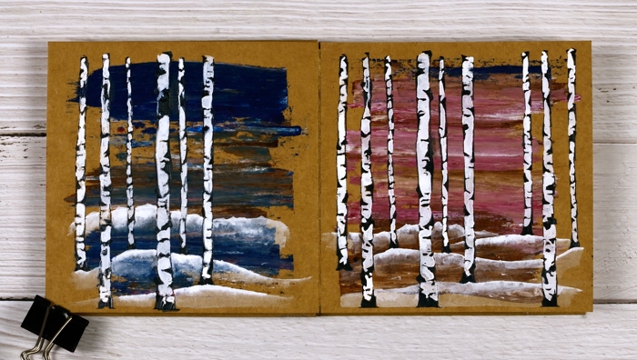
I didn’t have a plan straight away but a few weeks later I pulled out an Alexandra Renke stencil which I’d never used and decided to do a couple of simple landscape pages.
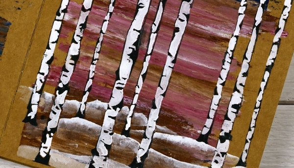
The stencil exposes only the edges of the birch trees which I wanted to be black so I mixed some black gesso with some black texture paste to make it thicker then spread it through the stencil onto the painted pages. Once it dried I painted the white spaces first with white gesso but it wasn’t opaque enough so I used Dr Ph Martin’s Bleedproof white paint.
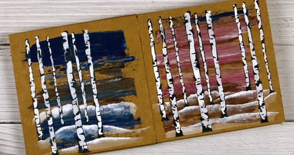
After completing the trees I painted some snow covered hills with the same white paint and diluted them with water to reveal the land underneath. This is the opposite technique to my usual watercolour technique where I paint the shadows or hills and dilute the tops.
So far I have tried distress sprays, gel pens, acrylic paints and texture paste on the kraft pages. As long as I include some light colours in my designs the brown background words really well. Next experiment? Collage, stamping or maybe coloured pencils.
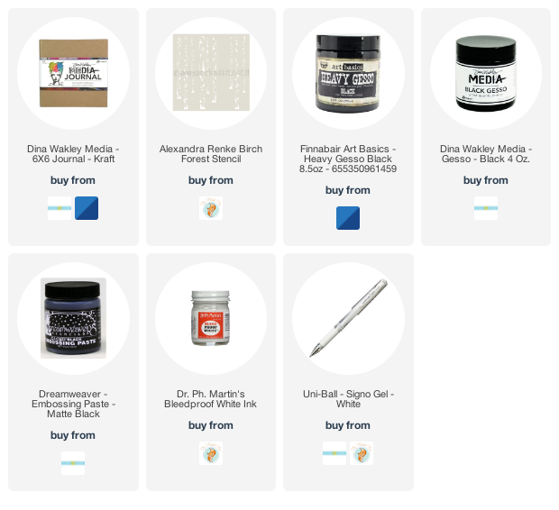
Supplies
(Compensated affiliate links used when possible)
New Penny Black Florals
Posted: March 8, 2022 Filed under: letter background, modesty, Penny Black, sweet sprouts | Tags: Fabriano Watercolour Paper, Penny Black stamps, Ranger Distress inks 8 Comments
It snowed all day yesterday but spring arrived anyway in a package from Penny Black! I have a nice little stack of PB florals to share with you in the days to come and I should manage a video or two as well.
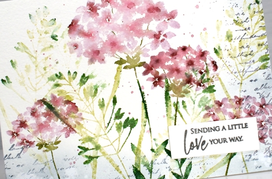
This first card features four stamps from the new Springtime release. Those of you who have been PB fans for years might notice a re-release among them. I stamped the large and small flowers from the ‘modesty’ set over foliage from the ‘sweet sprouts’ set; both sets include two large cling stamps. I used milled lavender and aged mahogany distress inks for the flowers and a mix of three distress greens for the leaves and stems. All the supplies are linked below.
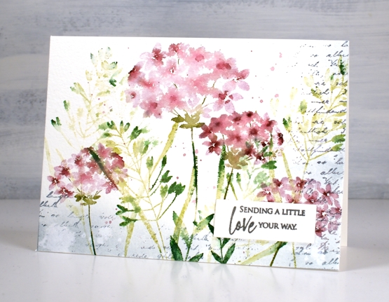
The washy blended look in the petals was achieved by spritzing the stamp before stamping along with some paint brush blending afterwards. I stamped a border of script in weathered wood with the ‘letter background stamp’ and blended the same ink around the edges. I splattered water for some watermarks and a mix of the milled lavender and aged mahogany around the flowers.
The card is 6¼”x 4½” on cold pressed watercolour paper finished with a sentiment from the new ‘love big’ set. I love the snowy cards as you are aware but I am definitely excited to be stamping florals again!
Supplies
(Compensated affiliate links used when possible)
Blue flowers on red gel print
Posted: March 2, 2022 Filed under: gel press, harmonious, Penny Black, Tim Holtz, wild flowers #1 | Tags: gel press, gel printing, Penny Black stamps, Tim Holtz, To 3 Comments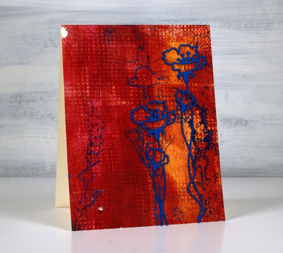
Here is another of my gel prints from last week. When I sit down to write my process for you I get a little confused as to the order I did things. With gel printing you need to do the top layer of the final print first on the plate then layer the background over the top. I don’t list the paints I use for my prints because I end up with many paints over my work surface during a printing session of several different brands. If you are wondering about paints for gel printing, use any acrylics you have and see what you like best.
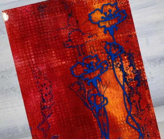
I imagine I brayered blue paint on the plate first, then pressed the fiddly flower die cuts into the paint, took a print to remove all but the outlines of blue then brayered the orange and red over that. I added texture to the red layer and took the final print, I think. The grid print you see was made by pressing a textured piece of cardstock into the paint on the gel plate. I guess I need to video my process for myself as well as to share with you!
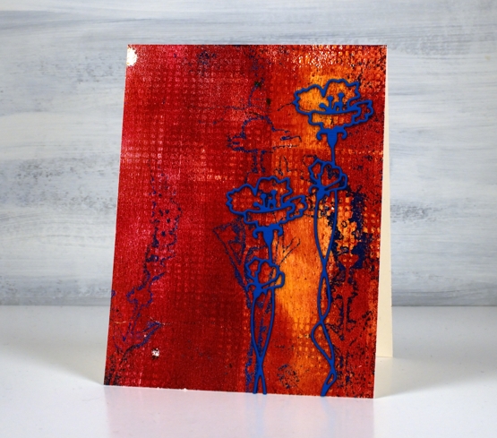
The blue prints were not as distinct as I had hoped; I’ll keep working on that. I do like the shadow flowers though and when I found an outline flower die from Penny Black I stacked two blue layers and added it over the shadows. I like its grunginess, bold colours, shadow flowers and grid texture. And those two odd white dots were made as old paint peeled off the plate. Gel printing is full of delightful surprises.
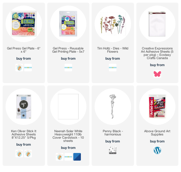
Supplies
(Compensated affiliate links used when possible)
A Wintry Introduction to Art Journalling
Posted: March 1, 2022 Filed under: Art Journal, Classes | Tags: Art Journal, Classes 3 Comments
My Art Journal Adventure workshops kicked off last Saturday with this wintry page. As I mentioned yesterday I thoroughly enjoyed myself. It was great to be in the room as the creating happened. I know not all my readers live near me but if you are in Ottawa and would like to do some art journalling there are still a few places in the next two Wintry Introduction sessions (March 4 & March 12). Hope you are not too tired of seeing all things winter but at least I have titled the above pages ‘winter’s end’!
This is another take on the wintry theme. If you haven’t tried art journalling before you will not be alone. Click over to the Crop A While website to learn more or register. If you drop into Crop A While one of my journals is there to give you an idea of what we’ll be doing this week and in future episodes of the Art Journal Adventure.
Tomorrow we will return to regular programming…
Gel printing & a new crafty crush
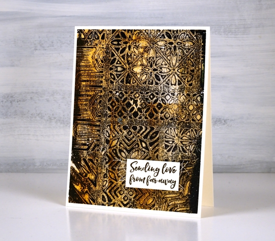
Posted: February 28, 2022 Filed under: Ciao Bella, Darkroom Door, gel press, patchwork, Penny Black, tall flowers | Tags: Ciao Bella, Darkroom Door stamps, gel press, gel printing, Penny Black creative dies 5 Comments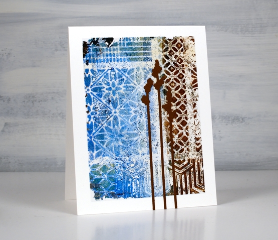
I had a couple of opportunities to gel print last week and it was, as always, most enjoyable. The prints did not all work out but I have a couple that made me very happy.
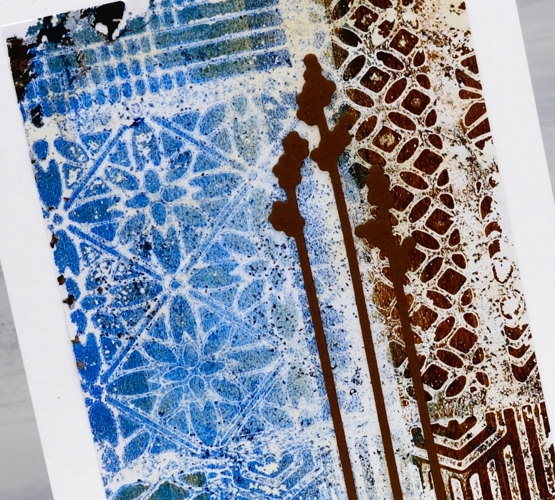
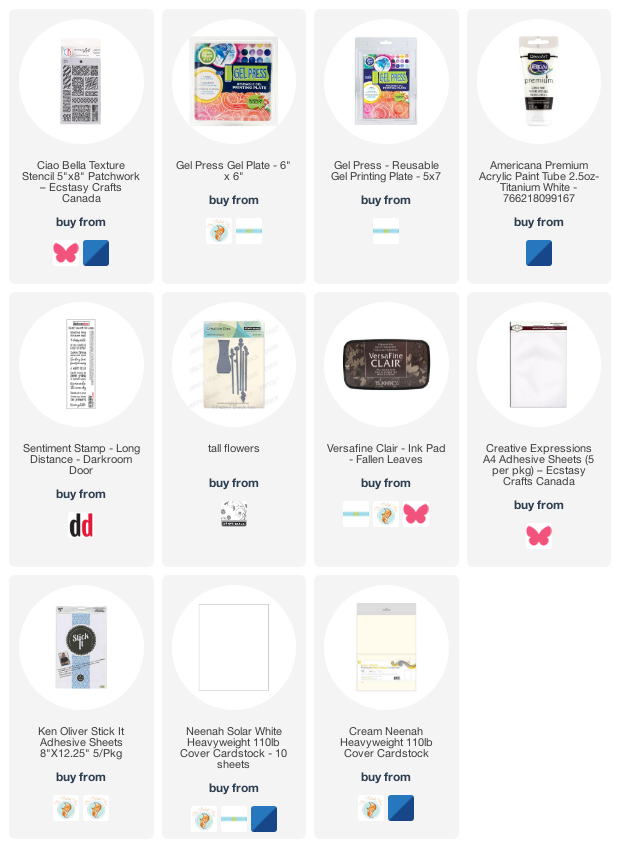
Now would be the time to tell you I have a new crafty crush! Not a crafter, a craft company. I have fallen for the beautiful stamps, stencils and papers from Ciao Bella. The stencil I used to create today’s prints is called ‘patchwork’. I bought it because it features eleven different patterns that will be good for adding texture to art journal pages. I had no idea how beautiful it would look when I printed it as a whole! (Both Crop A While and Ecstasy Crafts carry Ciao Bella products; if you shop from Ecstasy make sure you use my link to get there and the discount code heathertecs10 for a 10% discount at checkout.)
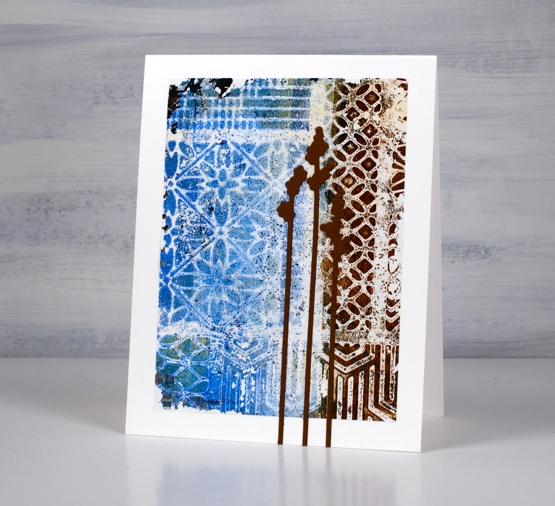
I brayered some blues and browns on my gel plate then placed the stencil over the top followed by a piece of paper so I could remove some of the paint. When the first layer was dry I brayered a layer of white over the top and pulled the print. This is only a small section of the stencil but it was the best part of the print. I used adhesive sheets to attach it to the card base then added three Penny Black ‘tall flowers’ die cuts.
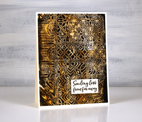
I used browns and black for the base of this print then light browns and white for the second layer before pulling the print. (yes I will do a video sometime soon)
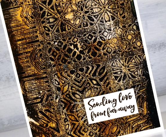
The sentiment is from the Darkroom Door ‘long distance’ sentiment stamp.
I have no immediate use for many of the prints but they will go in my collage collection for now because they might come in handy for art journalling.
I taught the first Art Journal Adventure workshop on Saturday and enjoyed it so much. The workshop was held at Crop A While; there are spaces in the Friday workshop this week, March 4, and the Saturday March 12 workshop.
Supplies
(Compensated affiliate links used when possible)
Doodle on Kraft
Posted: February 23, 2022 Filed under: Art Journal, Hand drawn | Tags: Art Journal, distress oxide inks, Hand drawn 6 Comments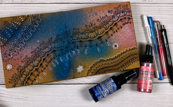
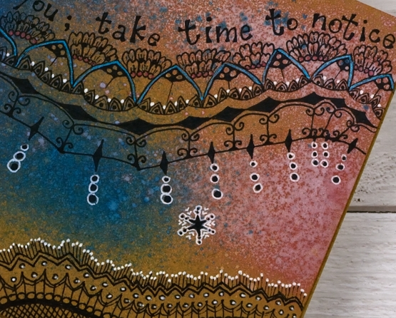
As you know I’ve been enjoying the 6″x 6″ white Dina Wakley journal; I have two on the go now full of experiments and ideas for my upcoming Art Journal Adventure workshop. Ranger has also made a kraft journal the same size so yes, I had to try it.
As you can see in these photos working on a kraft background tones down the colours used on top. I could paint the pages white before starting but I am interested in experimenting with kraft backgrounds for now. I also bought a few distress oxide sprays the other day. I love the traditional distress sprays but hadn’t tried the oxide sprays before. They are a good match for the kraft journal as a little ink soaks in while plenty of pigment sits on the surface.
I used prize ribbon and worn lipstick sprays on this page then doodled with a black gel pen. For inspiration I looked at zentangle pages I’d saved on pinterest and instagram and adapted them to spread across the pages. I also found pink and blue metallic gel pens from years ago and did some colouring in. I used a white gel pen to highlight parts of my design.
As I worked I wanted to make everything brighter to compensate for the brown background but that is an experiment for another page. If I had started my doodling in white the overall effect would be brighter but I like the opacity of the black.
I found the quote in a book I am currently reading and it seemed to fit my meandering pattern.
The art journal workshops that were originally planned for January have been rescheduled in late February and early March. You can find out more on my classes page or on the Crop A While website where you can register for either the March 4th or 12th workshop.
Supplies
(Compensated affiliate links used when possible)
AI Brussel Sprouts video
Posted: February 18, 2022 Filed under: Alcohol Ink, Concord & 9th, grafix, simple serif alphabet dies, Tutorial | Tags: Concord & 9th, grafix, grafix craft plastic, pinata alcohol ink, Ranger Alcohol Ink, Tutorial, video 9 Comments
If you are a little baffled by the title of this post don’t worry no brussel sprouts were harmed or eaten or even incorporated into the making of this video! But would you agree that the little patterns formed inside the circles on the panel look a bit like brussel sprouts?
You will see in the video I didn’t set out to make a brussel sprout pattern; I actually changed track part way through the process. The video shows the technique I started with along with stencil technique I ended up doing. So it’s basically a 2 for 1 deal.
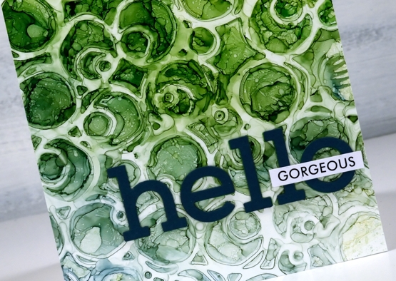
There are several ways to use a stencil with alcohol inks and this is just one. Make sure you check out Ardyth’s youtube channel for more ideas. I mentioned in the video that some alcohol inks tend to be a bit pushy and end up taking over a colour scheme. The lime green did so on this card but I’m glad there are some blues tones still visible at the base of the card.
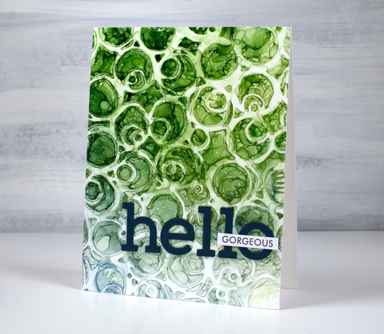
I finished the card with die-cut letters and a single word from Paper Rose Studio’s So Extra sentiment strips.
You can see other cards made using this technique here and here.
Supplies
(Compensated affiliate links used when possible)
Trilling Duo
Posted: February 16, 2022 Filed under: Brusho, Penny Black, trilling trio | Tags: Brusho, Penny Black stamps 7 Comments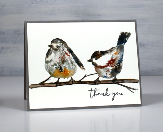
A couple of weeks back I created a card with the cardinal stamp from the PB set ‘trilling trio‘ and promised to be back with the other birds before too long. The set is called trilling trio because there are three bird stamps. I have paired up the other two for this panel and used brusho watercolour powder to add colour to the images. I love brusho powders but have not had them out much lately.
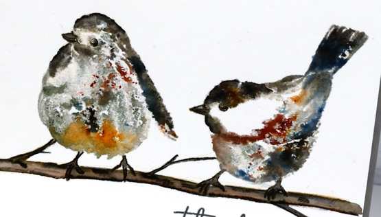
To stamp these two sweet birds I used neutral inks, water and the powders. I worked in a stamp positioner so I could stamp multiple times adding a little this or that each time. I used antique linen and hickory smoke inks for the first impression. Antique linen is pale and hickory smoke is grey so I put them where I wanted the light and dark areas to be but neither colour was so strong it couldn’t be diluted. The second time I stamped I spritzed the stamp with water so it was transferring ink and water. While the image was still wet I sprinkled some brusho very sparingly. If you haven’t used black brusho before you should; it is the absolute bomb because it is made up of other colours. The cute bird on the right is sprinkled with black brusho which resulted in spots of black, red, blue and grey. I also sprinkled some brown brusho.
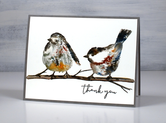
On the left hand bird I used some black brusho as well as some sandstone on the lower front feathers. I blended the stamping a little with a paint brush but not much as I wanted to see the magic speckles where the brusho lands and dilutes. I drew and painted the little branch with watercolour pencils and some black soot ink then added the ‘thank you’ from PB ‘ever thanks’ set. I just realised as I stare at the bird on the left that it appears to have three legs! That’s a twig on the far left just in case you were wondering!!
Supplies
(Compensated affiliate links used when possible)
Crumple & Colour journal page
Posted: February 14, 2022 Filed under: Art Journal, gel press, Hand drawn | Tags: Art Journal, Dr Ph Martin Hydrus watercolor paints, gel printing 6 Comments
While creating art journal pages lately I’ve noticed that they often look a bit rubbishy until the end or just before the end! It’s a good thing to keep in mind throughout the process, especially as the process sometimes stretches over a few days.
I started this page while I was at Crop A While and a friend looked over at me and said, “Heather is having fun playing with toilet paper!” For the record I was having fun with tissue paper not toilet paper! Working in the 6″x 6″ Dina Wakley journal I glued crumpled tissue paper over the whole spread with gel medium, scrunching it as I went to make folds and texture over the pages. (it didn’t look at all special at this point)
Later I used my Dr Ph Martin’s hydrus watercolours to drop blue, yellow and red ink over the pages. I worked one ink at a time tilting and diluting the ink so it would spread over and around the crumpled paper. (still underwhelming)
I let the watercolours dry and left the page for several days. The colours were bright and there were some nice blends and patterns but too bright for me so I painted over the spread with white gesso. My aim was not to totally cover the watercolours but to soften their impact and highlight the texture of the paper. I used my fingers to move the paint and a baby wipe to remove it where it was too thick. (looking better but still messy)
Settling on a focal point for an art journal page is sometimes hard; I don’t always begin with one in mind. You won’t be too surprised to see I chose flowers. I have a box of gel printed panels, some on rice paper and some on light card or computer paper. I found several prints on rice paper that matched the colours on the page and doodled flowers and leaves on them with a permanent black marker. I cut them out and started arranging them on the pages. (it was beginning to show promise)
After quite a few rearrangements I glued down the flowers and leaves making sure I didn’t cover up all the yummy colour and texture but also didn’t cover up the important white space. (it was finally looking ok) With the elements in place I continued to doodle more foliage on the pages including a border around the whole spread. I scribbled some thoughts around the flowers then splattered gold paint over the finished pages.
I am very happy with the final result but had no idea it would end up like this. At one point during the process I thought, “hmmm, I don’t think I’ll do this technique again…”
But I will.
Supplies
(Compensated affiliate links used when possible)
Winter Sky
Posted: February 11, 2022 Filed under: panoramic, Penny Black, Picturesque (trees) | Tags: Penny Black stamps, Ranger Distress inks 4 Comments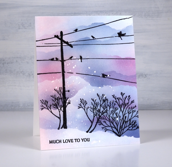
I’m teaming up with the Foiled Fox today to bring you this wintery sunset sky. Make sure you pop over to the Foiled Fox blog and online store to see what they have been creating lately. This slightly unrealistic scene features stamps from Penny Black. The telegraph pole and little plant on the right are from the ‘panoramic‘ set, the plant on the left is from the ‘picturesque‘ set and the sentiment is from the ‘ever thanks‘ set.
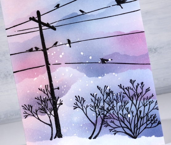
I worked on a piece of hot pressed watercolour paper but you could do this design on normal white cardstock by leaving out one step. I splattered masking fluid over the panel then when it was dried swiped it through some kitsch flamingo and faded jeans ink. The swipe gave me a pale blue, pink and purple background. I stamped the telegraph pole first with jet black archival ink then decided to mask a snow bank at the base of the panel. Even though the panel was already coloured I blended more colour above the mask to make the sky darker than the foreground snow. While the mask was in place I stamped all the plants along the edge.
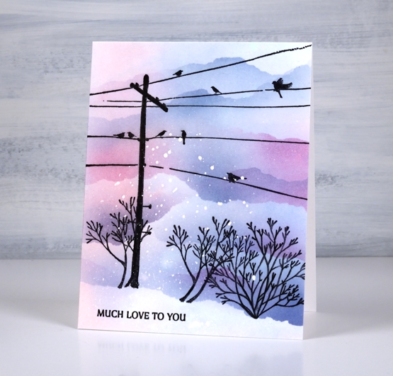
I used blending brushes to add the colour using the original two inks plus chipped sapphire and tore more masks to create clouds/snowbanks to fill the top of the panel. I hadn’t set out include all that masked blending but it looked so pretty I just kept blending! So if you wanted to work on normal cardstock and do all the colour with blending brushes you would just omit the ‘swipe through the ink’ step. Hope the sky is looking pretty where you are; I have seen some beautiful skies lately, both morning and night.
Supplies
(Compensated affiliate links used when possible)