Joy, joy, joy!
Posted: November 7, 2024 Filed under: Darkroom Door, Dies, Heather lowercase die set, immense joy, jumbo bauble, jumbo joy, Penny Black, Pink Fresh studio, World Map 8 Comments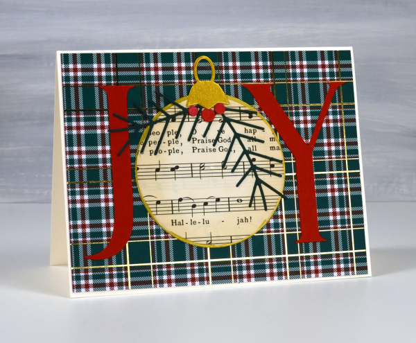
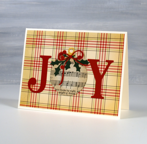
I’m using old book pages in some of my Christmas cards this year, partly because ‘Bookish Christmas’ was the theme of my recent Christmas card workshop but also because I am still enjoying creating with vintage papers.

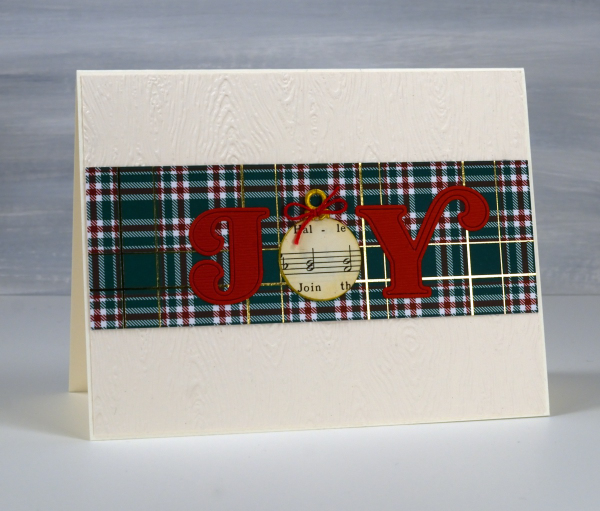
All of the cards featured today are variations on a theme; I left the ‘O’ out of Joy and replaced it with a bauble. All the baubles except one I cut from Christmas carol music. One is cut from a map because joy to the ‘world’… get it? I used different Penny Black ‘JOY’ dies for the large letters. I used circle dies or bauble dies for the baubles.

I used embossing folders and patterned papers for the background and some die-cut foliage and bows to decorate the baubles.
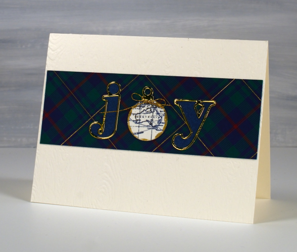
For these last two cards I cut the j and the y with Pinkfresh Studio alphabet dies and added very cute little baubles to replace the o.
This post includes affiliate links from Scrap N Stamp. If you buy through these links I receive a small commission at no extra cost to you.
Pink Majesty
Posted: November 4, 2024 Filed under: Finetec paints, Penny Black, Scarlet Majesty, Stampin Up, subtle | Tags: distress markers, Fabriano Watercolour Paper, Finetec artist mica watercolour paint, Papertrey ink, Penny Black stamps, Ranger Distress inks 10 Comments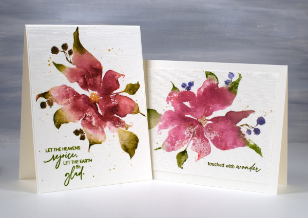
Today’s cards feature the beautiful Penny Black stamp, ‘scarlet majesty‘ but as the title suggests, I have chosen pinks over scarlet for the ink colours. I worked on Fabriano hot pressed watercolour paper in my stamp positioner.
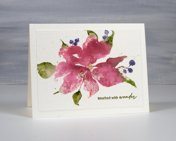
I inked most of the petals with a pink ink then added darker ink with more of a burgandy such as aged mahogany. I use a mix of small cube ink pads and markers to ink the stamp. The leaves were inked with peeled paint and the berries a purply blue such as chipped sapphire. Before stamping I spritz the stamp so the inks can move a little. I stamp the first impression then decide whether more ink is needed, more water or often some blending with a paintbrush and water.
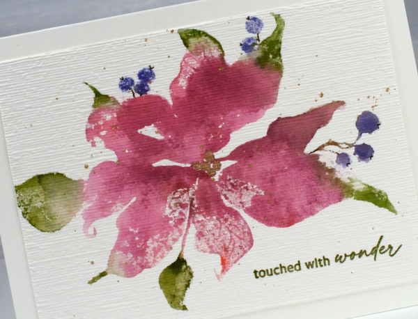
I don’t remember fiddling much with this panel as I liked the watery blends and the paler veins showing through here and there. I painted the centre of the poinsettia with gold finetec paint and of course added some splatter.
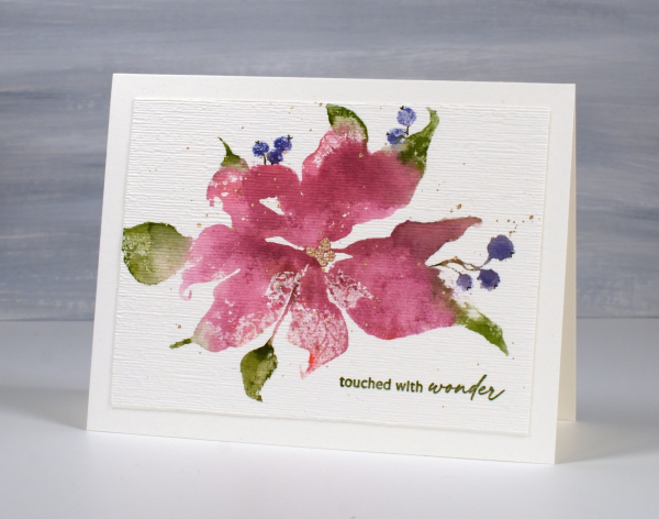
The sentiment is from PB ‘jolly snippets‘ and the texture from the retired SU ‘subtle’ embossing folder.
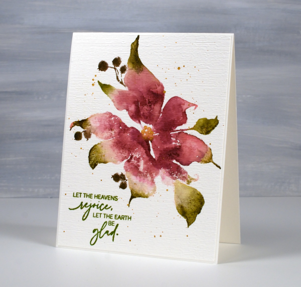
I used the same technique on this second card but used darker inks for leaves, petals and berries. My guess is aged mahogany, forest moss and a dark brown which was possibly made by mixing the first two. (I don’t always take note of my ink colours)
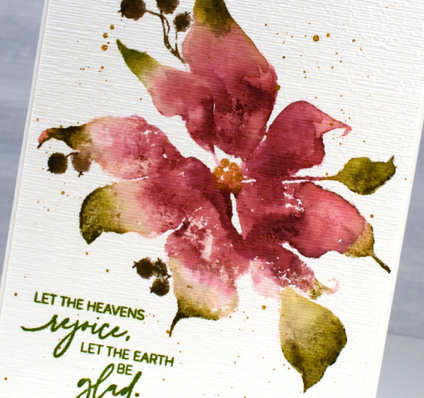
I think ‘scarlet majesty’ is a stunning stamp; I like the curl at the ends of the petals. Here are a few more cards made with it. I will admit that it is tricky to ink because you can’t always see where to try and define edges. I have another post coming up where I handle this issue by adding lines after stamping. I’ll share that soon. The sentiment this time came from the PB set, ‘promise of hope’.

Today’s post features affiliate links to The Foiled Fox. If you buy through these links I receive a small commission at no extra cost to you.
Leaf Print Sympathy cards
Posted: August 6, 2024 Filed under: gel press, Penny Black | Tags: gel press, gel printing, Penny Black stamps 10 Comments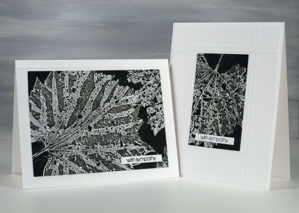
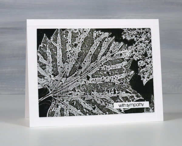
I’ve been collecting leaves, flowers and grasses over recent weeks for botanical gelprinting and thought I would try some damaged leaves eaten by beetles. The holes in the leaves leave a lacy pattern on the print which is delicate alongside the leaf veins.
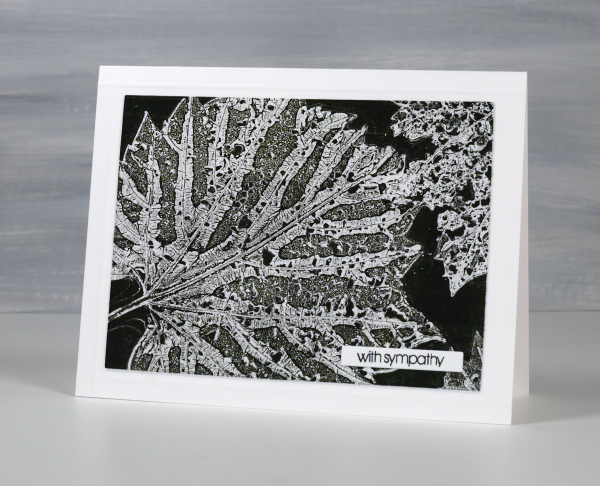
I applied black and green paint to a 5″x7″ gel plate and lay the leaves vein-side down in the paint. I used printer paper for this print and pressed it down on top of the leaves.
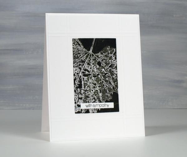
After pressing the paper firmly over the whole surface I lifted one corner to remove a leaf then pressed it down again and repeated on other corners to remove all three leaves. By lifting just a corner at the time the paper stayed in the same place to pick up the texture print left by the leaf on the plate. You can see the process in the short video below.
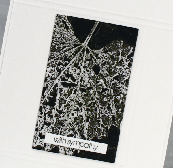
I decided to make a couple of sympathy cards using a small Penny Black sentiment. To add a bit of interest around the gel prints I scored criss-crossing lines on the background panel using my scor-pal. So don’t bypass those imperfect leaves when looking for gel printing elements; the intricate patterns are quite beautiful. This post includes affiliate links from Scrap’n’Stamp . If you buy through these links I receive a small commission at no extra cost to you.
Totally Dotty
Posted: July 15, 2024 Filed under: AALL & Create, Foiled Fox store, nesting squares, Penny Black, The Foiled Fox, totally dotty stencil, Waffle Flower | Tags: AALL & Create, Penny Black stamps, Ranger Distress inks, Waffle Flower dies Leave a comment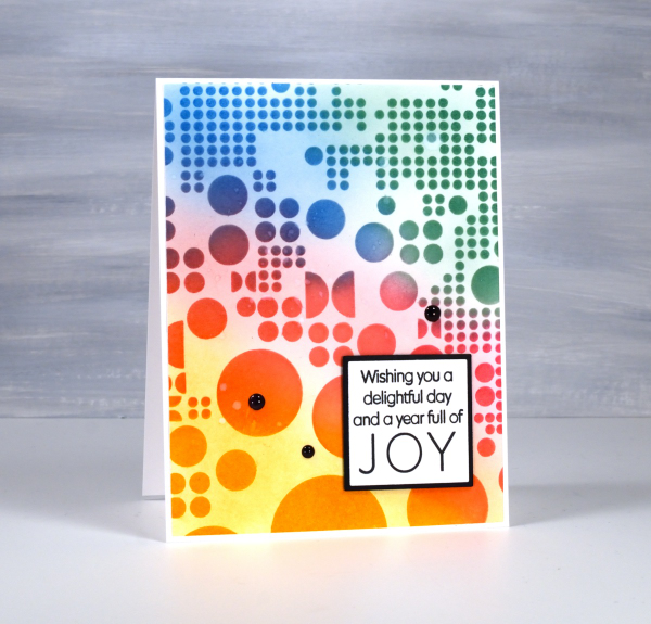
Yes, the stencil used for this card is called ‘Totally Dotty’! I mean what else would you call it? It is a large stencil from AALL & Create sent to me by the Foiled Fox so I could do totally dotty things with it. I blended inks through it for this card but I have also blended paint through it on gel prints and will no doubt use it with alcohol inks and art journals as well.
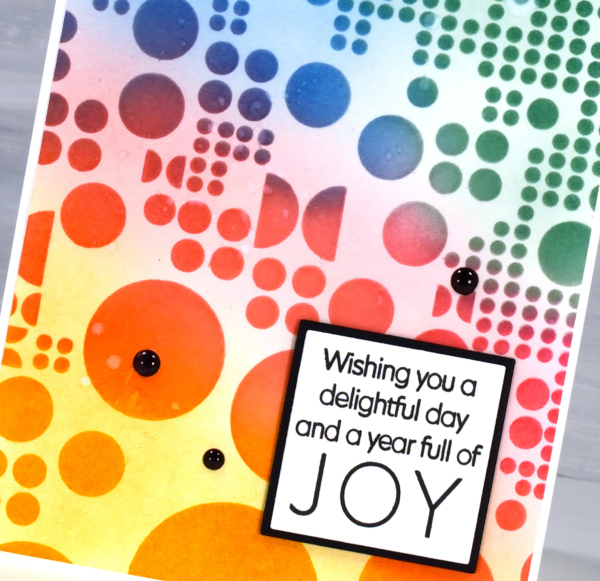
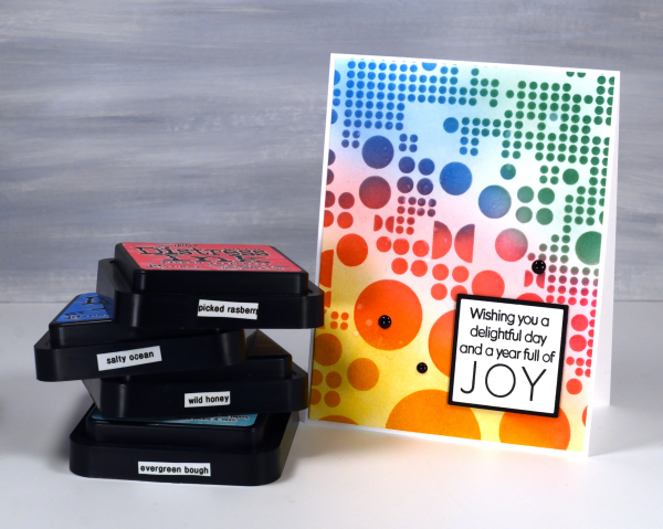
I blended wild honey, picked raspberry, salty ocean and evergreen bough distress inks through the stencil with blending brushes then, when I lifted it, blended more ink to soften the stark white background. This is a technique I’ve seen the blending wizards use.
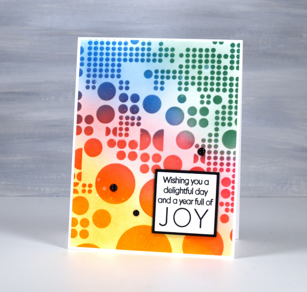
Such a colourful background called for a contrasting sentiment so I stamped in black on white then matted in black using Waffle Flower square nesting dies. Nesting dies definitely cut down on the mistakes I make in creating very slim mats for panels. Did you see I added enamel dots; not a common embellishment for me but the water splatter just didn’t make enough impact so shiny black dots to the rescue. Make sure you pop over to the Foiled Fox blog and online store to be inspired and delighted. (Yes, there are affiliate links used in this post, no extra cost for you but a bonus to me!)
Birds & Feathers
Posted: June 5, 2024 Filed under: Collage cards, Darkroom Door, Feathers, gel press, on a wire, Penny Black | Tags: Darkroom Door stamps, gel printing, Penny Black creative dies 2 Comments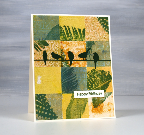
Same concept, different colour palette. I’ve been sharing my collaged gel print cards over recent weeks featuring a lot of blue prints. You know I love blue but it isn’t the only colour I print with. Although I have gel-printed with feathers, the ones featured here were all stamped. You can add interest to your prints with stamping or stenciling or other techniques; you don’t have to leave them just the way they pulled off the plate.
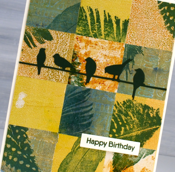
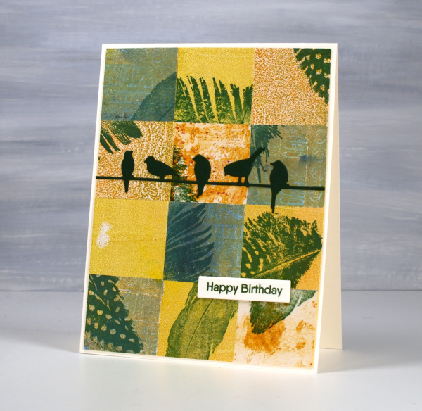
For this bird themed card I chose yellow, orange and greenish prints then stamped feathers on them before cutting them into squares. To make the squares I sometimes use a square punch, but often tear the panels with a metal edge ruler so I get some white of the paper on the edge. The feather stamps are from Darkroom Door ‘Feathers’ set. The birds die is called ‘on a wire’ and it’s from Penny Black.
Zig Zag Print cards
Posted: May 28, 2024 Filed under: gel press, Heather lowercase die set, Penny Black, Pink Fresh studio, Stencils, Tim Holtz, wild flowers #1, Zigs & zags 3 Comments
Recently I posted several ’tiled’ collage cards on the blog and mentioned there would be more to come. Today’s cards once again feature gel printed panels arranged and decorated in two ways.

I used three different gel prints to ’tile’ the card above, a plain blue print, a print created with a zig-zag stencil and a print made with the an impression from an embossing folder. To tie together the dark blue, light blue and yellow + blue prints I added a navy wildflower (Tim Holtz) and navy ink splatter.

To create the square birthday card below I used ’tiles’ from the same print but rearranged them on the card front so they didn’t fit together like a jigsaw.

The brassy-gold paint used on the gel print prompted me to die-cut letters, stars and the word birthday from a similar colour cardstock to create a sentiment. This post includes affiliate links from Foiled Fox. If you buy through these links I receive a small commission at no extra cost to you.

Florals on Black
Posted: May 21, 2024 Filed under: Concord & 9th, fine line florals, meadow blossoms, online class, Penny Black, radiant | Tags: Concord & 9th, Finetec artist mica watercolour paint, online class, Penny Black stamps 6 Comments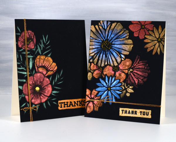
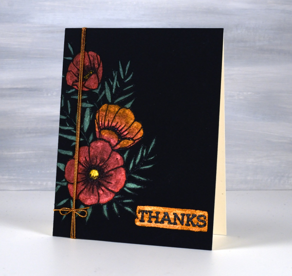
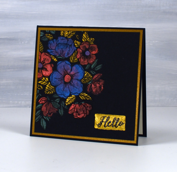
I haven’t used this eye catching technique in a while but I really should try it more often. These two cards were made as part of my Floral Faves online class, a lesson about using metallic watercolours on black watercolour paper. Maybe black watercolour paper has been around for a long time but when I first found it several years ago I was very keen to try it.
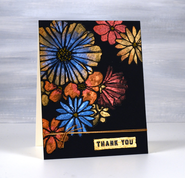
As you can imagine the paints need to be somewhat opaque to show up on black. I use Coliro and Finetec metallic watercolours (two names but all made by Finetec). I have also been given some Beam metallic watercolours which I will try out soon. I used Stonehenge Black watercolour paper for these cards and it worked well. It is very soft so I am careful if using tape on the edges as it lifts the surface off. I just work on a piece slightly larger than I need so I can trim it down to size after painting. I recently bought some of the Van Gogh brand so I will report back once I have tried it.
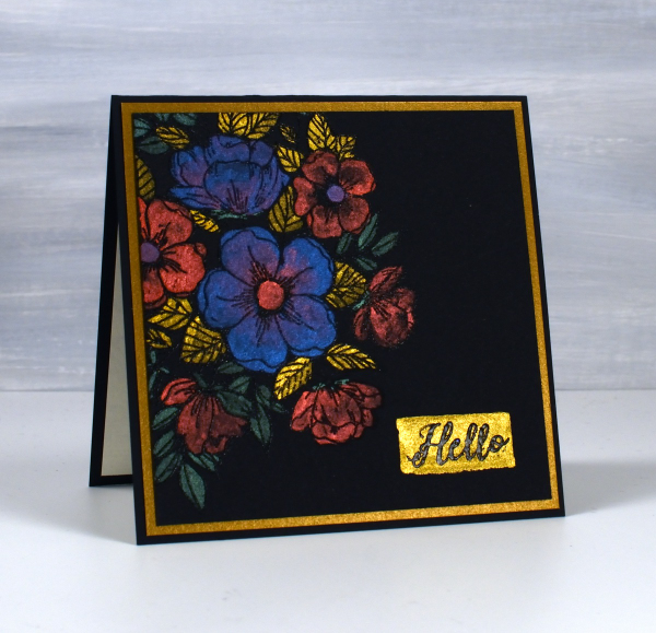
All these designs were made with embossed outlines making it easier to stay inside the lines. One feature of these cards that I quite like and need to remember to incorporate is the little painted strip where I embossed a sentiment over the top. It’s a trick that doesn’t have to be used only on a black background; I could paint a strip on any colour then emboss on top of it. For the cards featured today I used Penny Black ‘radiant’ set and Concord & 9th ‘fine line florals’ and ‘meadow blossoms’
If you have metallic watercolours let me know in the comments your favourite ways to use them.
Pink & Blue Squares
Posted: May 18, 2024 Filed under: Collage cards, Dies, gel press, gift card pocket, Penny Black, Tim Holtz, wild flowers #1 | Tags: collage, gel printing, Penny Black creative dies, Tim Holtz 3 Comments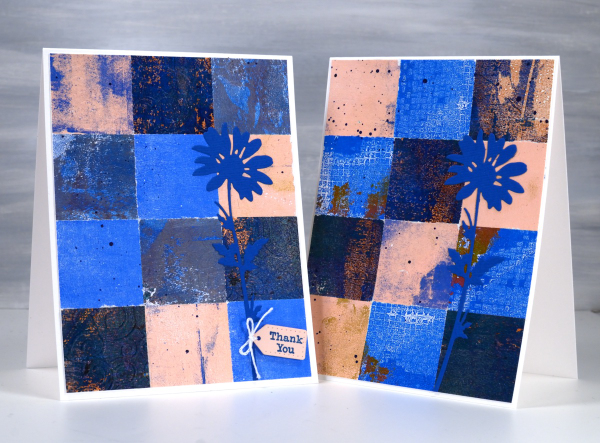
As mentioned in previous posts my stash of gel prints is considerable. I am always on the look out for ways to use them. Large prints are great for covers on handmade books; I use many smaller prints for card fronts and collage.
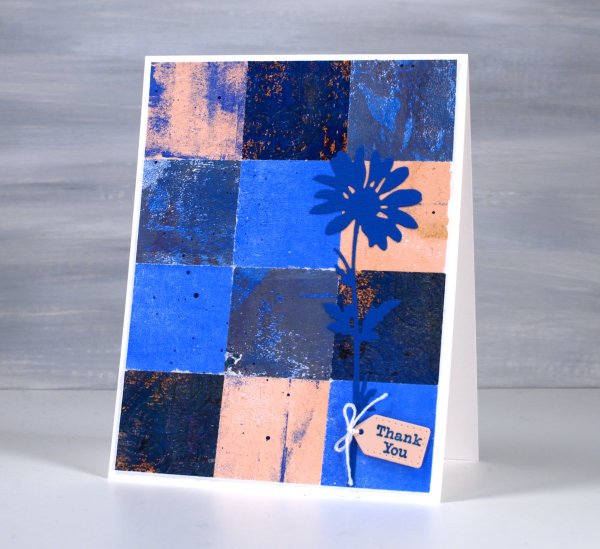
These two collage cards are made from four or five different gel prints. I punched the squares with a 1 3/8″ punch then fiddled around with the layout until I was happy with it. Because I love things to match all the prints had some blue in them and there is some repetition of pink as well.
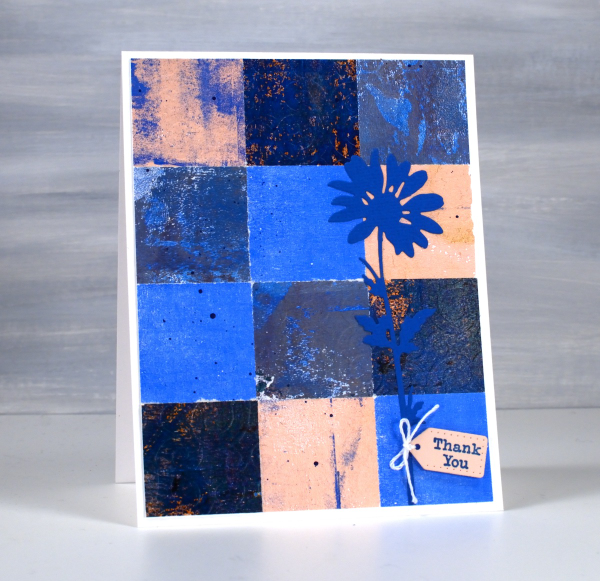
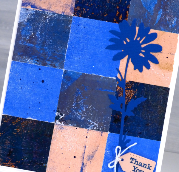
The prints were part of my stash and were not made specifically for these cards so some have patterns and others were probably second or third pulls to clean off a plate. Once I had them arranged to my satisfaction I die-cut Tim Holtz wildflowers and added a tiny Penny Black tag. You’ll see more of this style in the next few weeks as I made them in several different colour combinations. Those of you who know me might have noticed the dark blue splatter on the both cards; I always think a bit of splatter ties thing s together.
Dancing Pink Daisies
Posted: April 24, 2024 Filed under: dancing daisies, Penny Black | Tags: Fabriano Watercolour Paper, Papertrey ink, Penny Black stamps 4 Comments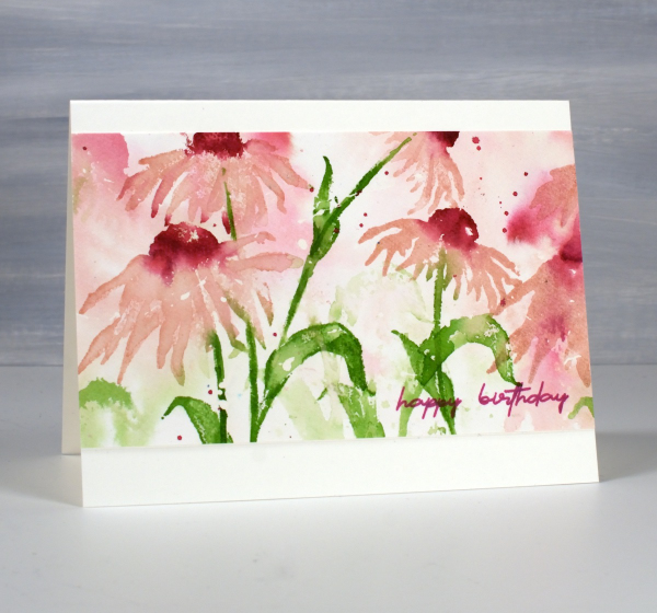
April showers bring May flowers I’ve heard so the showers we’re having today should only help bring some colour to the garden in the coming weeks. The dancing daisies stamp from Penny Black is such a beauty and I love to create a sense of movement with layered stamping.
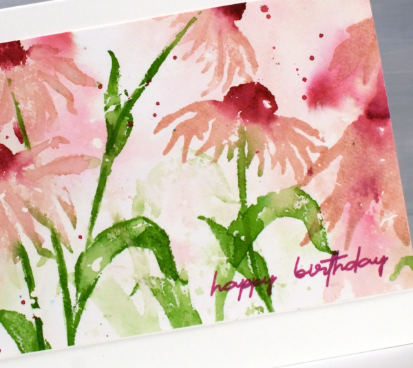
I created this panel on hot pressed watercolour paper a few years back as added inspiration for my Floral Faves online class but it was sitting in a folder not being enjoyed. I recently trimmed the ends off, turned it into a card and it is on it’s way to a friend for her birthday.
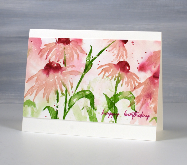
I only used three ink colours and relied on water to dilute their intensity along with second generation stamping for paler background hues. I used sweet blush, scarlet jewel and new leaf inks from Papertrey ink but you could do something similar with any watersoluble inks you have. This post includes affiliate links from Foiled Fox. If you buy through these links I receive a small commission at no extra cost to you.
Alcohol Ink & Foil – Video
Posted: April 17, 2024 Filed under: Alcohol Ink, grafix, Penny Black, Tutorial | Tags: Alcohol Ink, grafix, grafix craft plastic, Penny Black stamps, Ranger Alcohol Ink, video 4 Comments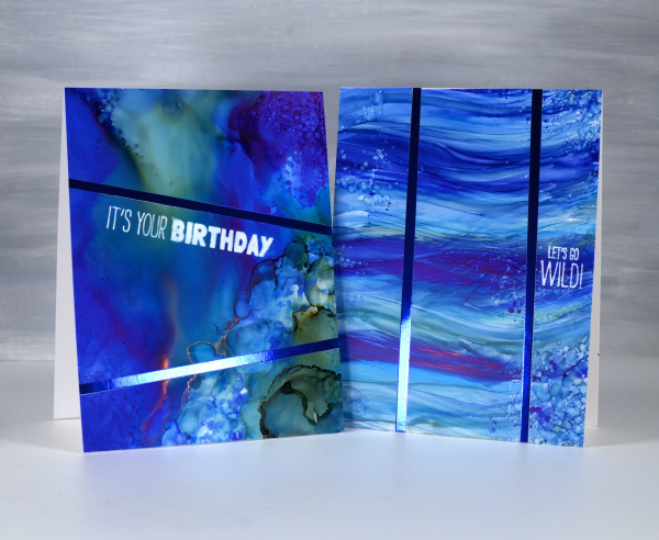
Recently I spent a happy few days creating with alcohol inks after quite a break. They did not disappoint! I am looking forward to more experimenting and maybe some Christmas card designs.
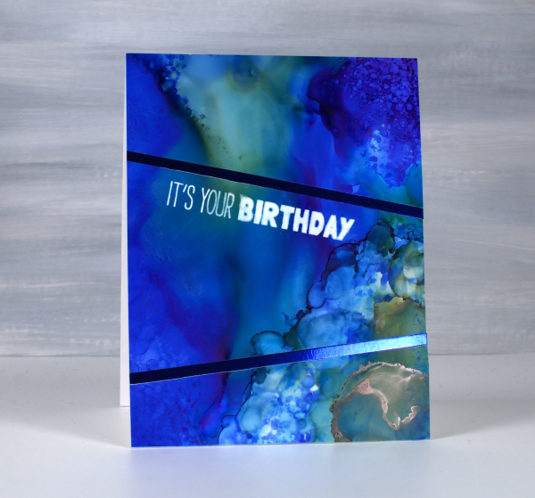
I created some cards using Grafix white craft plastic (also called bright white dura-lar), Grafix metallic foil board and Grafix double tack adhesive. These are all products I’ve used before and definitely recommend. You can see my process in the video below.

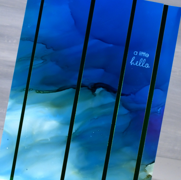
In the cards above and below you can see the wavy ocean effects I achieved easily by applying alcohol inks with a felt applicator. I love watching the inks continue to move after I lift the applicator.
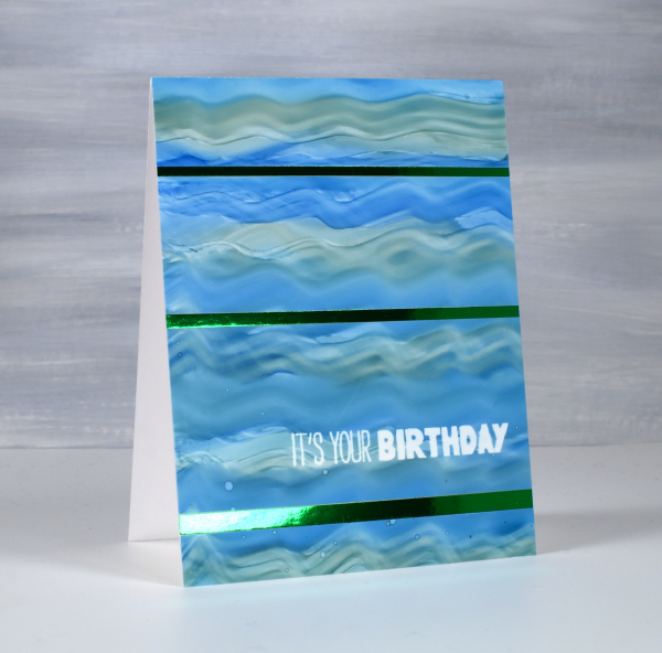
The panels below were all made by moving the alcohol inks and isopropyl alcohol around. I tilt the panel and use an air blower to move the the ink. Where there was too much of one colour or too much intensity of colour I diluted with isopropyl alcohol or just dabbed ink off the panel with a paper towel
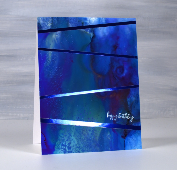
I used some of the green and the blue metallic foil board from Grafix to add to my designs. To see another project using the foil board click here.
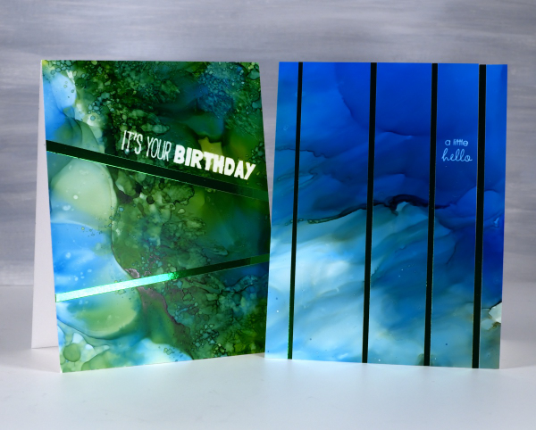
To add the sentiments I used an alcohol lift inkpad from Ranger. Its been a while since I’ve used alcohol lift ink and I was thrilled with how well it lifted the ink from the grafix white craft plastic. With a few repeat impressions and removal of diluted ink I was able to remove the bold green and blue inks to reveal sharp white words.
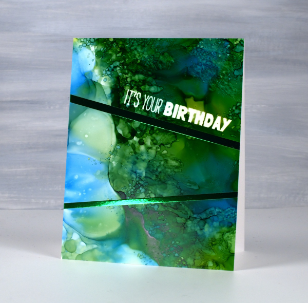
The sentiments are from the Penny Black ‘how sweet!’ set and ‘Let’s Go Wild’ set. Both are rubber cling sets which seem to hold the lift ink well and apply it evenly. This post includes affiliate links from Foiled Fox and Scrap’n’Stamp . If you buy through these links I receive a small commission at no extra cost to you.