Winter Gem
Posted: August 22, 2022 Filed under: Dies, Penny Black, winter gem | Tags: Fabriano Watercolour Paper, Penny Black creative dies, Penny Black stamps, Ranger Distress inks 5 Comments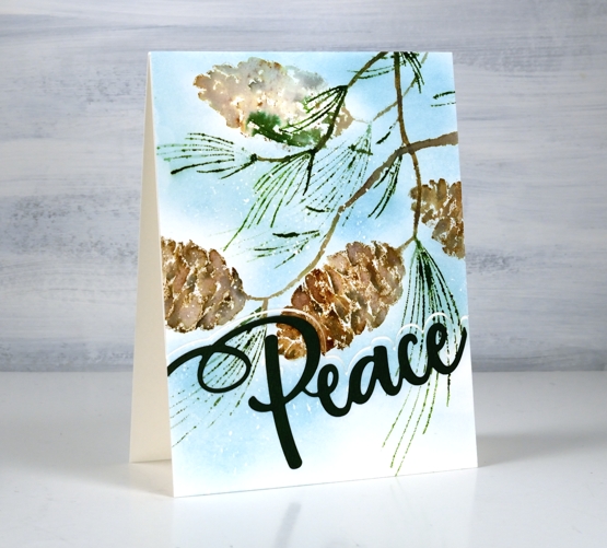
This lovely pinecone stamp is a new one from Penny Black called ‘winter gem’. The stamp has one pinecone plus groups of needles but I stamped it several times to fill my card front. The way I oriented the pine cones makes it look a little breezy with all the needles pointing to the left. I have a large and not very attractive pine tree in my front yard. It drops things all. year. round! There are always needles on the lawn, driveway and flower beds and most of the year there are pinecones too. It isn’t a tidy tree.
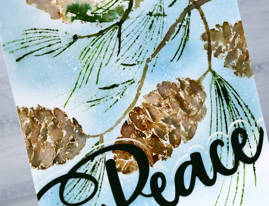
The one time the pine tree looks beautiful is after a fresh snowfall when all the snow is balancing on pinecones, needles and branches. For this panel I worked on hot pressed watercolour paper with masking fluid splattered over it before starting. I worked in a stamp positioner and inked the pinecone with three browns. I spritzed the stamp with water before stamping and spritzed again after before stamping a second generation image. I decided to stamp the pinecone a couple more times on the edges of the panel. I used a slightly wet paintbrush to blend the browns on the pinecones and touched up some of the pine needles also with a fine tip paintbrush.
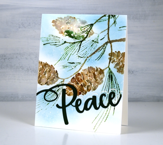
Once the panel dried I blended speckled egg ink around the pinecones. Because there was masking fluid spots all over the panel little white dots of snow appeared after the masking fluid was removed.
Penny Black has come out with a few clever sentiment dies which pair a large word with a one sided outline. I cut the outline from the stamped panel but it looks fresh and snowy if you cut the outline from white cardstock and place it at the base of the your panel. My word is cut from dark green cardstock but looks black; it’s always the way with dark colours in my photos.
(Compensated affiliate links from Foiled Fox, Scrap n Stamp and Ecstasy Crafts)
Holly Days
Posted: August 16, 2022 Filed under: Dies, holly-days, jumbo bauble, Penny Black, Spellbinders, stocking stuffers | Tags: Penny Black creative dies, Penny Black stamps 3 Comments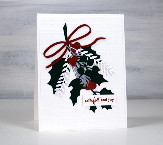
Today’s simple fresh card showcases some new dies from Penny Black. I chose solid colour cardstock, some shimmery, to create this little garland but I know I will use these dies again with gel prints or patterned papers.
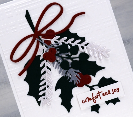
It is a little hard to tell in the photo but I have red shimmer, quartz shimmer and silver shimmer cardstock along with matte green for the leaves. The dies are from three new PB sets, holly-days, stocking stuffers and jumbo bauble. The card design is clean and simple but I added texture to the background with a spellbinders plaid embossing folder.
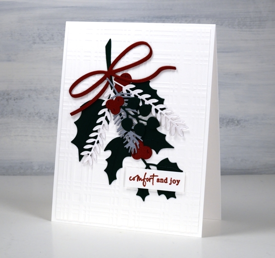
I finished off the card with one of the new little sentiments from the PB ‘jolly sentiments’ set. I think I have mentioned before how much I like little sentiments so a whole new set of them is exciting.
(Compensated affiliate links from Foiled Fox, Scrap n Stamp and Ecstasy Crafts)
Dancing on gel prints
Posted: July 21, 2022 Filed under: butterfly dance, Dies, Paper Rose, Penny Black, shall we dance | Tags: gel press, gel printing, Penny Black creative dies, Penny Black stamps 8 Comments
I have a couple more cards incorporating gel prints today. This first one is made with a clean up sheet; maybe you can recognise the criss cross of brayer marks on the paper. When I stamped the PB ‘butterfly garden’ stamp over the background it was a bit too delicate to show up well. Highlighting petals and wings with a white gel pen worked to keep the design subtle but still noticeable.
I cut the gel print to fill the card front and added a sentiment from the Paper Rose Studio ‘so extra’ sentiment strips.
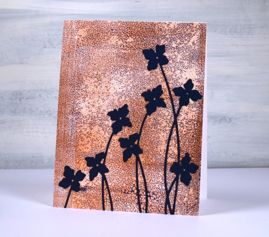
The gel print below has a delicate blue pattern over bronze made when the paint separates on the gel plate before you get a chance to take a print. I used a bronze print to pull the blue paint which had separated evenly over the whole plate. You can’t tell from the photo but the bronze has a metallic sheen to it.
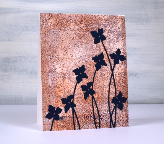
I cut flowers from navy cardstock using the Penny Black ‘shall we dance’ die to complete a card I can use for any occasion.
The Penny Black sale continues at The Foiled Fox so if you have a wish list, take a look.

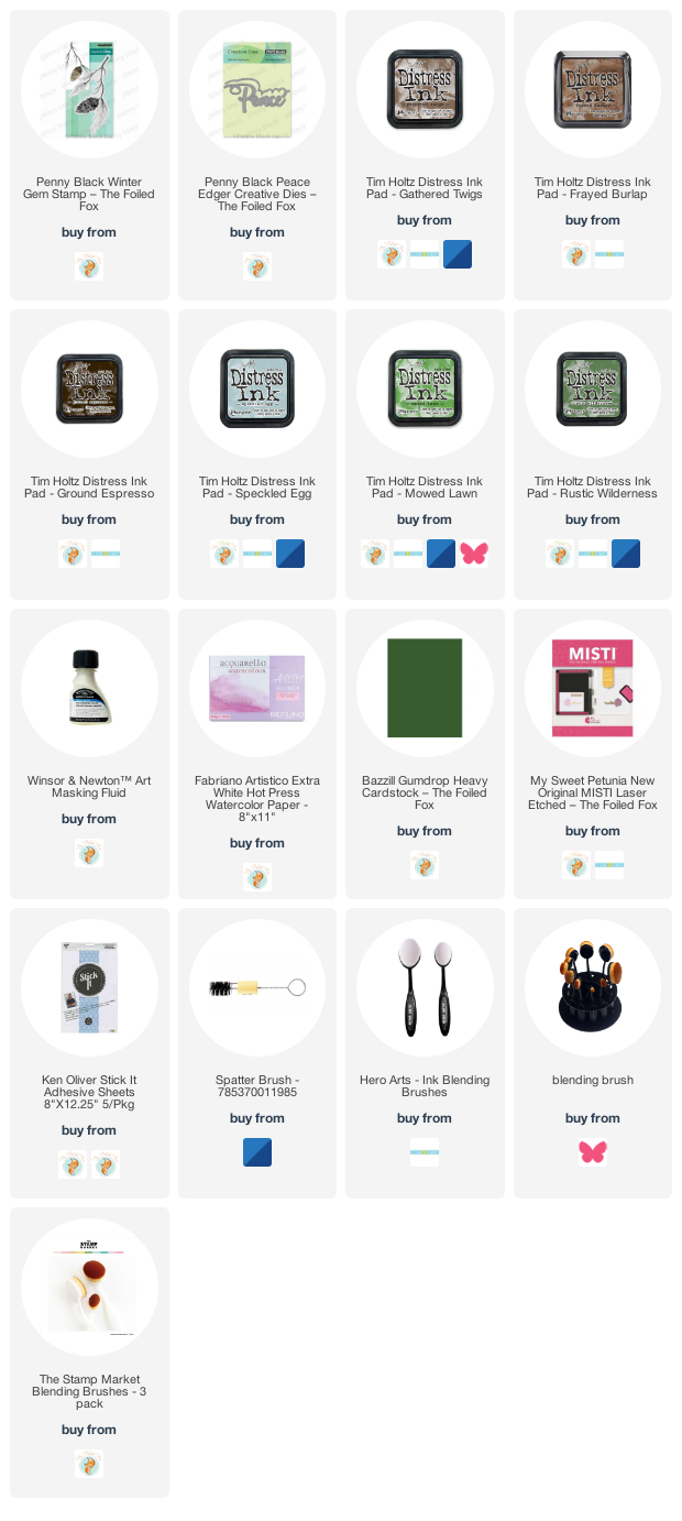
Supplies
(Compensated affiliate links used when possible)
Die-cut gel print florals
Posted: July 20, 2022 Filed under: gel press, Penny Black, splendid, Taylored Expressions | Tags: gel press, Penny Black creative dies, Penny Black stamps, Taylored Expressions 5 Comments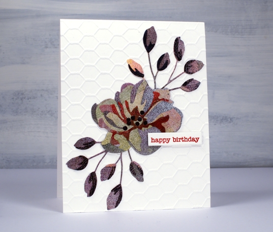
If you are thinking that’s an unusual choice of colours, patterns and textures, you’re right, but it actually makes me quite happy. This is the only layered flower die cut I have of the this type; I don’t generally do layered die cuts. It’s from Penny Black and it appealed to me because of the little buds rather than the complex flower. I know the idea of these dies is to layer in shades of the same colour going from light to dark in the layers. Instead I grabbed one of my gel printing clean up sheets which was covered in black, blue, green, pink, red and purple sections. The texture is from the brayer which I clean off on a thick sheet of paper when I’m gel printing.
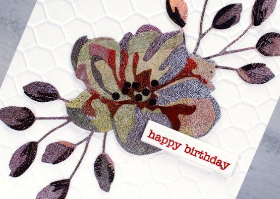
In keeping with the combination of colours and texture I decided to go for an unusual background also and attached the flower and buds to a card-base embossed with the a Taylored Expressions chicken wire pattern. I won’t be surprised if you find it a bit odd but I just can’t help reaching for gel prints and this odd scrappy combo makes me smile. By the way, those little black dots in the centre, I added them myself; they aren’t part of the original die.
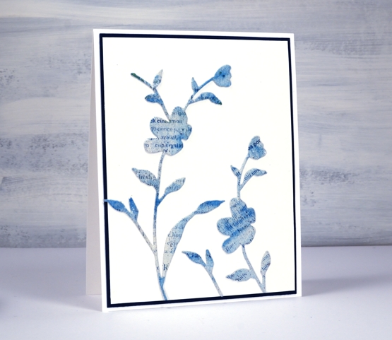
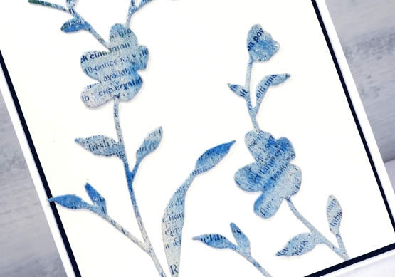
This second card has a bit more elegance. I used the PB ‘whisper’ die to cut flowers from a gel printed text transfer. The text is from a recipe page in a magazine so you might be able to pick out the word cinnamon if you look closely. The dark mat looks black but is actually dark blue to co-ordinate with the gel print. I’ve used the same die to cut both blooms but used only a portion on the right hand side.
Do you use layered dies? Do you blend the cardstock with inks or pick co-ordinating cardstock? Or perhaps you go for random colour combos like I did!
By the way, Foiled Fox is having a Penny Black sale, so pop over and have a browse.
Supplies
(Compensated affiliate links used when possible)
Blooming Blue Again
Posted: July 6, 2022 Filed under: blooming, Dies, how sweet, Penny Black, Tagged | Tags: Penny Black creative dies, Penny Black stamps, Ranger archival inks, Ranger Distress inks 11 Comments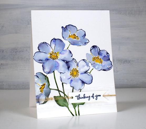
I’m still having fun with PB ‘blooming’ stamp. Once again I used blue inks but this time the combo was chipped sapphire and blueprint sketch. When blended I got blues and purples but not the pinks that seedless preserves provided. If you read my last post you might remember I unintentionally ended up with brown centres. This time I made sure I inked with fossilized amber and wild honey to create yellow centres.
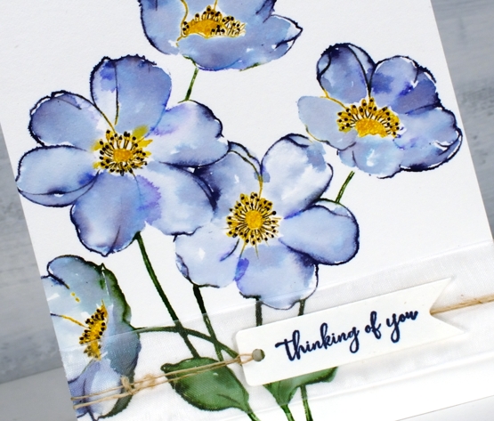
I worked in the stamp positioner to make this panel and did all the green and blue inking and stamping first. I left the centres un-inked so I could add them after the petals were stamped, blended and dry. I don’t mind some blending but I didn’t want the blue and yellow to get too close and blendy because that would mean green centres. Once the yellow centres dried I used a black gel pen to add stamen.
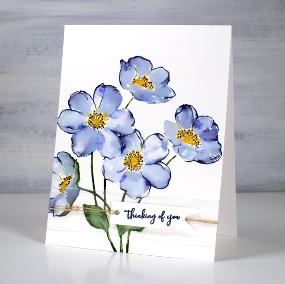
I wanted to gussy this one up a little but still keep the clean look so I used a small piece of organza ribbon across the base of the panel then stamped on a banner die cut and tied it on with twine.
Supplies
(Compensated affiliate links used when possible)
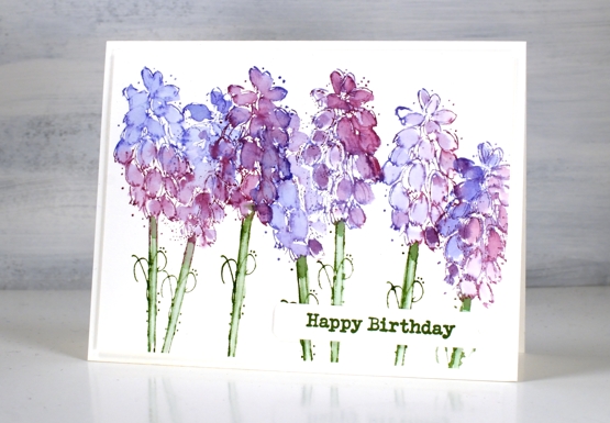
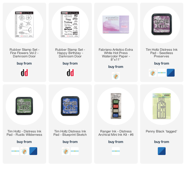
Grape Hyacinths
Posted: May 16, 2022 Filed under: Darkroom Door, Dies, fine flowers vol 2, Penny Black, Tagged | Tags: Darkroom Door stamps, Penny Black creative dies, Ranger Distress inks 7 Comments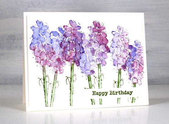
My garden seems to have lost its grape hyacinths; I used to have quite a few that would pop up year after year but I only saw a couple this year.
We had three days above 30°C last week so there is plenty happening in the garden. The crab apple is blossoming and the last of the daffodils are hanging on. I bought some annuals and started filling pots yesterday.
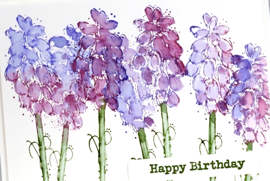
The stamp featured is from the Darkroom Door set ‘fine flowers vol 2’ designed by Godelieve Tjiskens. I inked the petals with seedless preserves and blueprint sketch distress inks then blended with water after stamping. The stems are rustic wilderness distress and the sentiment rustic wilderness archival.
Hope you are enjoying some colour in the world around you; perhaps you’re seeing warm tones if you are in the southern hemisphere.
Supplies
(Compensated affiliate links used when possible)
Green Truck in the City
Posted: May 6, 2022 Filed under: ...is coming, Dies, gel press, Metropolitan, Penny Black | Tags: gel press, gel printing, Penny Black creative dies 4 Comments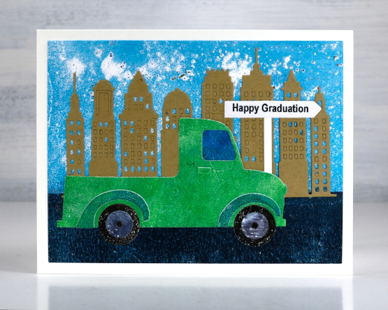
This little green truck card was made on request, and probably not a focal point I would have come up with myself. The end result however made me very happy and all but the kraft buildings and road sign were cut from gel prints.
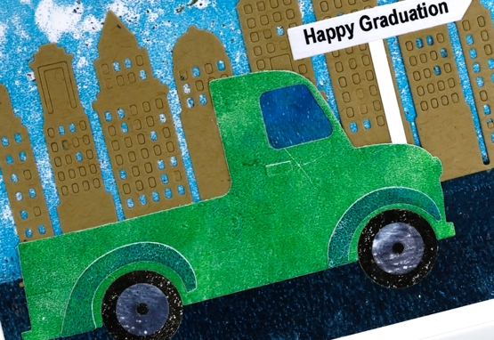
I could have cut all the components from coloured cardstock but I chose instead to use gel prints and mixed the green and blue paints on the gel plate in order to match the green of the truck requested. I love the added texture a gel print gives. The sky is very textured because it was printed on my damaged gel plate. I use it mainly as a palette where I mix colours or roll off excess paint. I pull prints off it now and again during a session and the patchy blue and white print made a perfect sky. I don’t have a truck die but I did some mods to a van die-cut and ‘ta-da’ I had a little green truck on its way to graduation!
Would this be a good time to mention there are a couple of spaces left in next Friday’s gel printing workshop?
Supplies
(Compensated affiliate links used when possible)
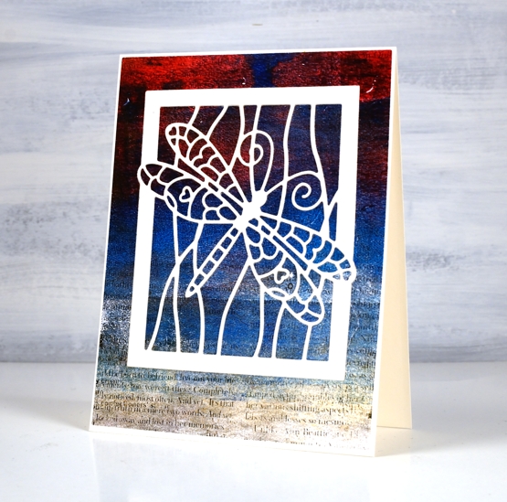
Dragonfly on text
Posted: April 15, 2022 Filed under: Dies, Dragonfly Frame, gel press, gelli plate, Penny Black | Tags: gel press, gel printing, gelli plate, Penny Black creative dies 4 Comments
All the coloured sections of this pretty dragonfly are inlaid between the outlines of the cream die-cut! Does it look the same as if I had just glued the cream die-cut over the top? Yes, I’m afraid it does. Perhaps if gel print had been on cardstock the same thickness as the dragonfly it might have been more noticeable. Lesson learned.

One branch of my current gel printing obsession is image transfer. In the past I have tried it mainly with high contrast photos of people but it works with text as well so I added interest to this blue, gold and red print with some black magazine text. I notice now as I stare at the screen the random line across the panel makes it look a little like an ocean view.
While I was painstakingly inlayaing every little bit of dragonfly wing I was listening to the audio book version of The Salt Path, a memoir with many references to ocean views, cliffs, weather and unexpected encounters. The author and her husband hiked the South West Coast path in the UK in rather traumatic and totally unexpected circumstances. I found the whole account fascinating and heartrending in places. By the end I had google maps open so I could see where the path was taking them.
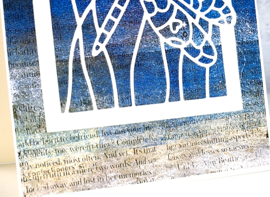
Once again the photos don’t show the shimmer of the finished project. The sand coloured foreground is actually gold paint so there is shimmer spreading half way up the panel. Can you see why I love gel printing?
Supplies
(Compensated affiliate links used when possible)
Pods & Wings
Posted: April 14, 2022 Filed under: Dies, Flutters, gel press, Lavinia, Penny Black, pods stencil, soaring | Tags: gel press, gel printing, Lavinia, Mixed Media, Penny Black creative dies, Penny Black stamps 4 Comments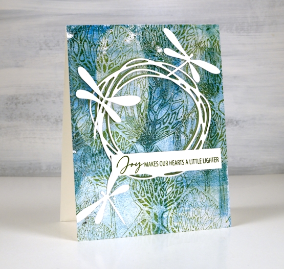
The background of today’s card is another gel print featuring a gorgeous Lavinia stencil called ‘pods’. You can’t see in the photos but in real life there is some shimmer on the print as I used silver paint along with blue, green and white.
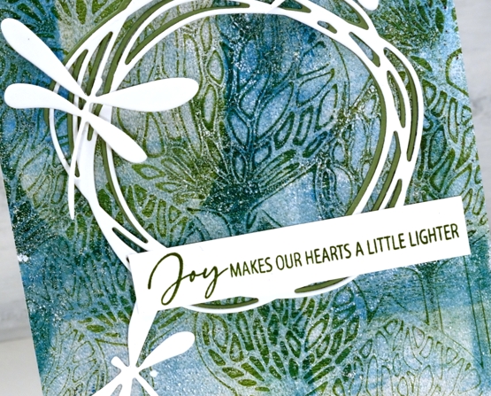
Over the print I added a green and a white wreath die cut from Penny Black. It is part of the new ‘soaring’ set which also includes four butterflies. The background called for dragonflies rather than butterflies so I die cut three from the ‘flutters’ set, an oldy but a goodie.
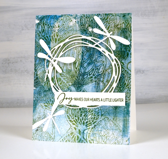
As I spent a chunk of time yesterday listening to Ann Voskamp’s book ‘One Thousand Gifts’, the joy sentiment seemed like a good match for the design.
I was watching a Julie Balzer book club discussion on youtube today as I worked and she mentioned how addictive gel printing is and how if you haven’t tried it you must (48 minute mark)! She called it the one tool that has changed her life! So I will again shamelessly plug my upcoming gel printing workshops and hope you will join me in this addiction!
Supplies
(Compensated affiliate links used when possible)
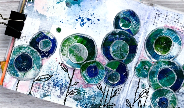
Circle Flowers journal page
Posted: March 25, 2022 Filed under: abstract flowers, alphabet medley, Art Journal, checkered, Classes, Darkroom Door, gel press, Hand drawn, mesh, Stencils | Tags: Art Journal, Classes, Darkroom Door stamps, Darkroom Door stencils, gel press, gel printing, Mixed Media, Penny Black creative dies 8 Comments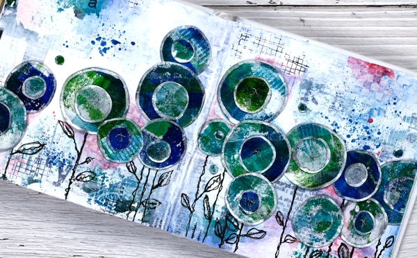
Last week I spent several happy hours gel printing. One of the prints I completed has ended all over this art journal spread. If you are a gel printer you know you can sometimes pull a couple of prints of the same design. The first one is full of colour and pattern and the second is often called a ghost print as it displays outlines and left over bits of paint.

For this journal page I used both the bold blue and green print and the ghost print. The ghost print can be seen on the top left and bottom right corners and is peeping out in a couple of other places. The first print which was very geometrical has been turned into circle flowers. It also had traces of a new stencil called ‘pods’. You will see more of it here on the blog because it is fabulous!
Also in the background you might see some black ink stamping (DD mesh and alphabet medley) and the texture of paste through the DD ‘checkered stencil. The text you see is a fabric tape with dictionary definitions of happiness; it is the first 49 & Market product I have bought and it is going to be handy!
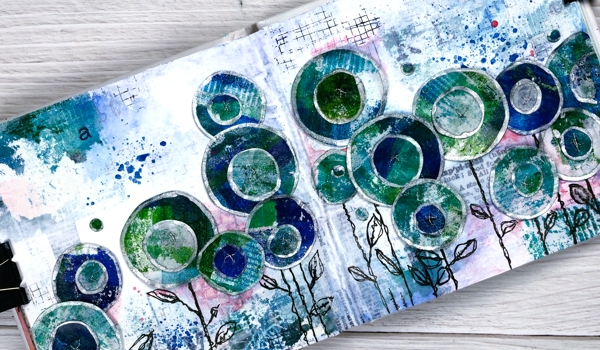
There is plenty of white gesso over the background to pull it together and mute some of the bold elements.
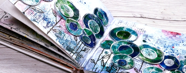
The flowers are all cut with Penny Black ‘abstract flowers’ dies which basically cut slightly wonky circles so I could have cut them myself but why bother when the machine will do it. The print was on rice paper so I could cut a few layers at once. After drawing an edge on each circle with a silver paint pen I stuck a small circle on a larger one, then sewed a cross in the centre with silver thread. There are stems in the set of dies but I doodled mine with a black marker. The blue splatters and pops of pink are from inktense pencils which are coming in handy for art journalling.
I know that was a lot of photos and chit chat but that is the way with some art journal pages especially the collage ones which involve different papers, paints, stencils, and mediums. I probably haven’t mentioned everything I used but if you are still here now I’m sure you’ve heard enough!
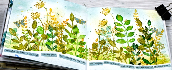
If you are in Ottawa and feel like doing a little art journalling of your own, there are still spaces left in my next Art Journal Adventure workshop where we will be creating a watercolour green and leafy spread similar to what you see below. All the details are on the Crop A While website.
Supplies
(Compensated affiliate links used when possible)