
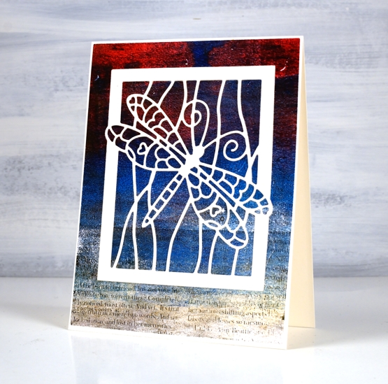
Dragonfly on text
Posted: April 15, 2022 Filed under: Dies, Dragonfly Frame, gel press, gelli plate, Penny Black | Tags: gel press, gel printing, gelli plate, Penny Black creative dies 4 Comments
All the coloured sections of this pretty dragonfly are inlaid between the outlines of the cream die-cut! Does it look the same as if I had just glued the cream die-cut over the top? Yes, I’m afraid it does. Perhaps if gel print had been on cardstock the same thickness as the dragonfly it might have been more noticeable. Lesson learned.

One branch of my current gel printing obsession is image transfer. In the past I have tried it mainly with high contrast photos of people but it works with text as well so I added interest to this blue, gold and red print with some black magazine text. I notice now as I stare at the screen the random line across the panel makes it look a little like an ocean view.
While I was painstakingly inlayaing every little bit of dragonfly wing I was listening to the audio book version of The Salt Path, a memoir with many references to ocean views, cliffs, weather and unexpected encounters. The author and her husband hiked the South West Coast path in the UK in rather traumatic and totally unexpected circumstances. I found the whole account fascinating and heartrending in places. By the end I had google maps open so I could see where the path was taking them.
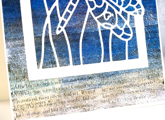
Once again the photos don’t show the shimmer of the finished project. The sand coloured foreground is actually gold paint so there is shimmer spreading half way up the panel. Can you see why I love gel printing?
Supplies
(Compensated affiliate links used when possible)


What a fabulous print! Your colors always draw me in. An image transfer is a new to me technique and something I’d love to try. Thank you for the inspiration and the need to pull out my gelli print again.
Such a fascinating story as you are working. Very intriguing.
Your details on your method are excellent. Yes. Gel printing is fun.
Thanks for sharing.
Tish
Oh she did the background with a gel print. The dragonfly is a die from penny black. I am sure I could do the same on my silhouette.
Sent from my iPad
>
This is beautiful and the magazine script has worked beautifully in the background Heather, and the wonderful colour going from dark to light with the purple red and then the more creamy brown tone at the bottom does remind me of a stormy day by the sea and there does appear to be a horizon. The white die cut dragonfly frame is so pretty over the top too. We live in the south west and we have walked bits of the coastal path but not in its entirety, and it is very testing so I think this couple were very courageous to do it the way they did. x