Bethlehem scenes with Karin brushmarkers
Posted: December 17, 2020 Filed under: Ink to Paper, Karin brushmarkers, lighting the way, Penny Black, three kings, Uncategorized | Tags: Ink to Paper, Karin brushmarkers, Penny Black creative dies, Penny Black stamps 2 Comments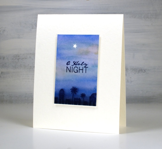
I’ve continued to experiment with the Karin brushmarkers from the Foiled Fox, this time using them for watercolour backgrounds. These three backgrounds feature combinations of rosewood 272, cyan 207, royal blue 045 and black 030.
I tried different methods of applying the marker to the hot pressed watercolour paper and found that to achieve smooth transitions from one colour to the next it was better to touch the markers to wet paper. It still worked applying the marker first then the water but I prefer the very soft blends made when the paper was already wet. I don’t think I will often use the markers for backgrounds as it probably uses up ink at a faster rate but little scenes like the one above did not require much application.
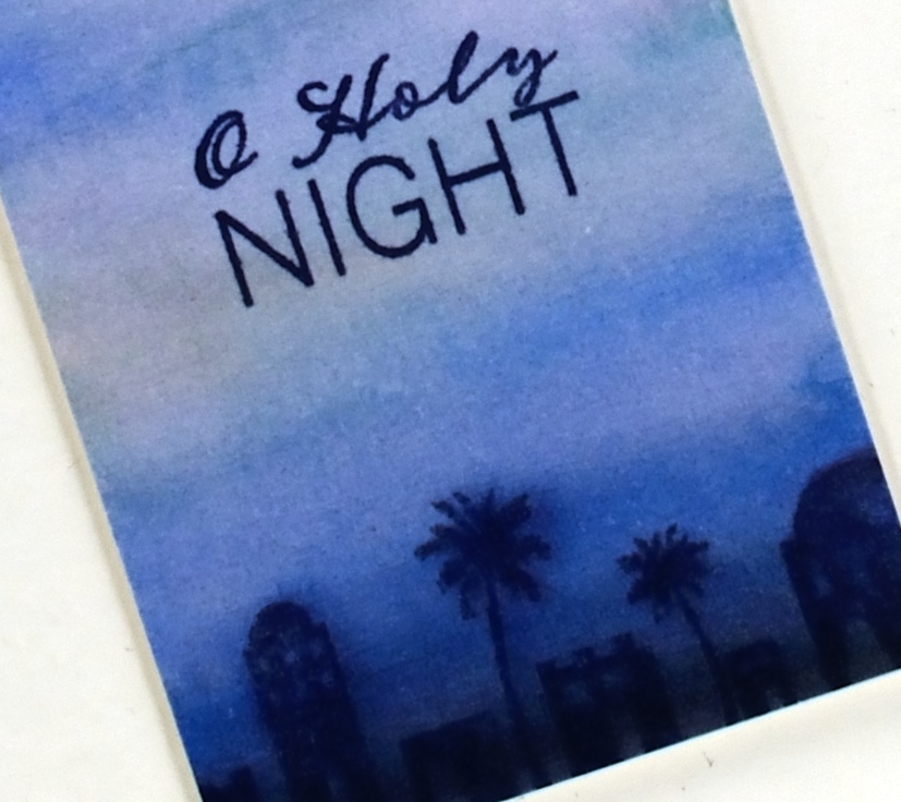
The tiny star was masked by die cutting a star (PB Xmas tree border set) from frog tape (painter’s tape for delicate surfaces) then positioning it firmly on the panel before painting. I stamped the manger above in versafine clair nocturne once the panel was totally dry.
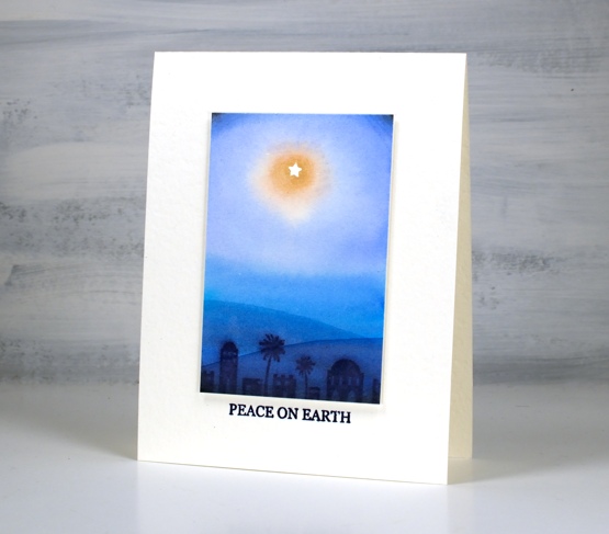
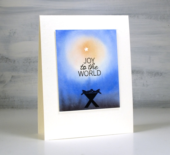
To get a soft image of the Bethlehem stamp I stamped it in chipped sapphire distress ink while the background was still slightly wet. On the panel above I took a wet paint brush and painted a hill shape across the lower part of the panel waited then painted another one even lower down. I didn’t need to add any ink the paint brush just dragged ink from the Bethlehem image. I popped up each panel with two pieces of cardstock, attached it to a white luxe card base then added sentiments from the Ink to Paper Be Merry Mini set.
The current Christmas card designs are looking minimal for two reasons, I still need quite a few cards and I like simple and elegant!
Supplies
(Compensated affiliate links used when possible)

Frozen Vista
Posted: November 25, 2020 Filed under: frozen vista, juniper, layered Xmas wreath die set, Penny Black, Uncategorized, Winter lantern | Tags: brutus monroe embossing powder, Penny Black creative dies, Penny Black stamps, Ranger Distress inks 6 Comments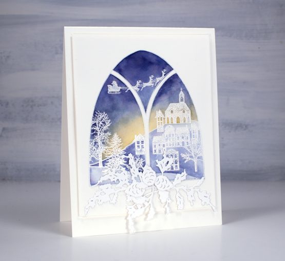
This lovely window stamp is from a Penny Black set, frozen vista which includes two arched window stamps. I stamped it on hot pressed watercolour paper in versamark then embossed in white powder. I used three distress inks to paint over the embossing, chipped sapphire in the sky, scattered straw at the horizon and stormy sky on the snowy ground.
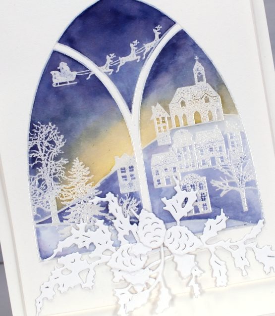
To make a swag below the window I added double sided adhesive to some neenah solar white cardstock then die cut the PB juniper dies, holly from the layered Xmas set and pinecones from the winter lantern set.
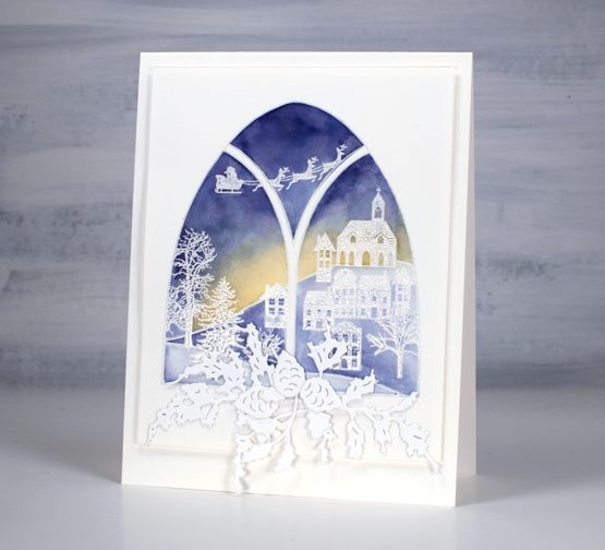
Because of the subtle colours and abundance of white and offwhite I popped up the painted panel on a couple of layers of cardstock to give it a shadow frame on the same coloured card base.
Supplies
(Compensated affiliate links used when possible)

Winter Window
Posted: November 9, 2020 Filed under: art deco window, juniper, layered Xmas wreath die set, Penny Black, Winter lantern | Tags: Dr PH Martin, Penny Black creative dies, Penny Black stamps 6 Comments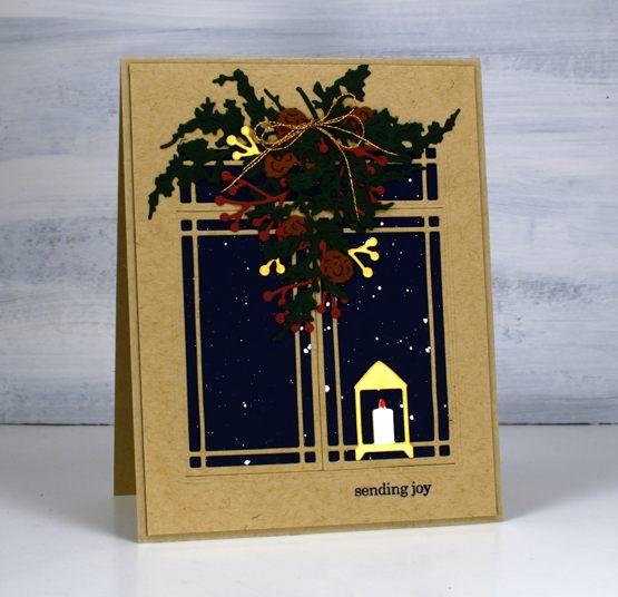
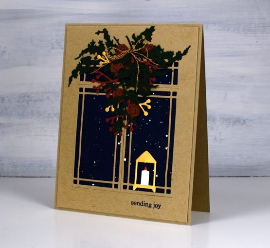
Sometimes I get inspired by the detailed and delicate foliage dies from Penny Black. The new ‘juniper’ die set got me started for this design along with a navy panel of cardstock splattered with white paint.
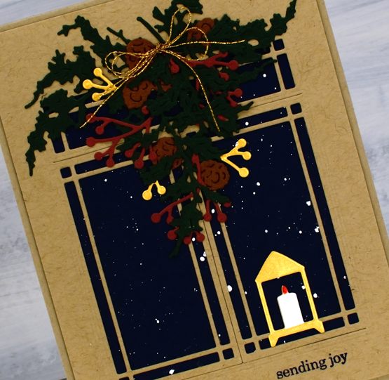
I gathered other dies to combine into a winter window scene. I could have chosen brighter reds and greens but I am in a muted vintage style phase right now so forest green and burgandy were my picks for the juniper and berries. All the dies are listed below; I picked from a few sets and added double sided adhesive to all the cardstock before die cutting. The window die is designed to open but I chose the adhesive backing so it would be stuck down firmly to keep the snow outside and the candle from blowing out!
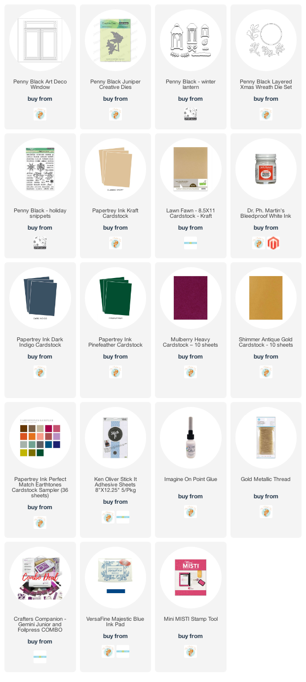
Supplies
Wreath & Wings
Posted: November 4, 2020 Filed under: Coliro paints, Hand lettered, mirthful, wreath & wings | Tags: Coliro paints, distress markers, Hand lettering, Penny Black creative dies, Penny Black stamps, Ranger Distress inks, Staedtler watercolour brush pens 6 Comments
I’ve combined a new PB stamp, ‘wreath & wings’ with a new PB die, ‘mirthful’ for simple elegant style Christmas card.

I used distress inks and markers to ink the wreath elements and birds, keeping the stamp in the positioner so I could work a bit at a time. I inked the stamp, stamped the image then did a bit of blending with a paintbrush to fill the leaves, berries and birds.

I used a gold gel pen to colour some of the berries then continued the gold highlights in the die cut word. The die has decorative diamond cut outs so I cut gold ones to add to the burgandy letters and framed the panel in the same burgandy cardstock.
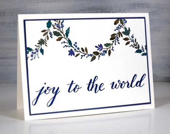
For the second card I decided to use the curve of the wreath as a hanging garland. Using a centering ruler to help me with positioning I stamped half the wreath on the centre top edge of the watercolour panel, then stamped another part loop either side.
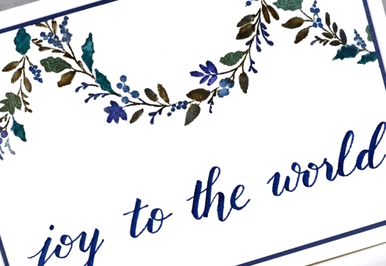
Once again I worked on hot pressed watercolour paper so I could blend the ink on the leaves. I used ocean coliro pearlescent paint on some of the leaves and berries for a little shimmer.
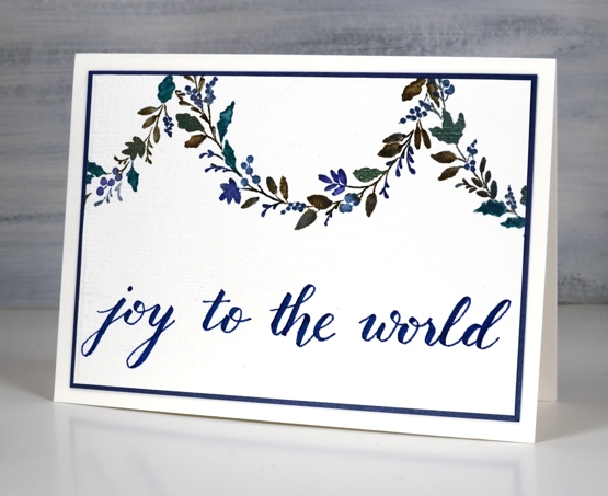
I wrote the sentiment for this one using the darkest blue marker from the Staedtler watercolour 36 brush pen set and matted the panel in a dark blue cardstock.
Even though I don’t like to over do my designs I’m wondering if the blue card is a bit sparsely decorated. What do you think?
Burgandy Card Supplies
Blue Card Supplies
 <
<
Autumn Grove
Posted: October 5, 2020 Filed under: birches, Chat Bubbles, Penny Black, winter's forest | Tags: Fabriano Watercolour Paper, Papertrey ink, Penny Black creative dies, Penny Black stamps, Tsukineko Versafine inks 7 Comments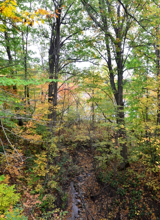
As I mentioned last week; I’m a seasonal stamper which shows in today’s card. I’ve included some inspiration pics taken on a walk last weekend not far from where I live.
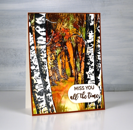
I stamped the PB ‘birches’ first in nocturne ink on hot pressed watercolour paper then embossed them in clear. I masked them with tape then, stamped PB ‘winter’s forest’ in Papertrey ‘cocoa bean’ and ‘dark chocolate’ ink then, while still in the stamp positioner stamped again with versamark ink so I could emboss in clear powder.
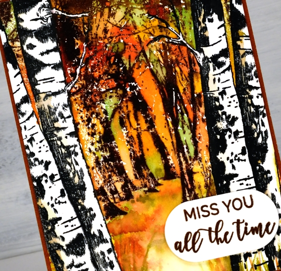
With all the trees embossed I started painting dabs of autumn toned inks around the trees and on the forest floor. The inks are listed below. Once I had the look of autumn leaves around the branches and scattered on the ground I used a white gel pen to draw back in the little birch branches I had accidentally painted over.
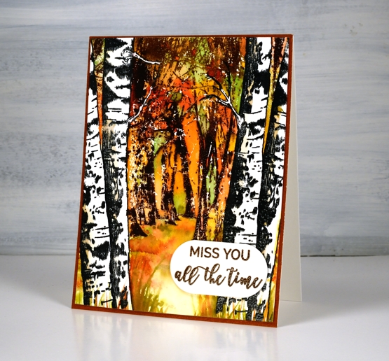
I stamped words from PB ‘family sentiments’ and cut them out with a speech balloon die which was exactly the right size. I matted the whole panel in brown then popped up the sentiment on a couple of pieces of cardstock.
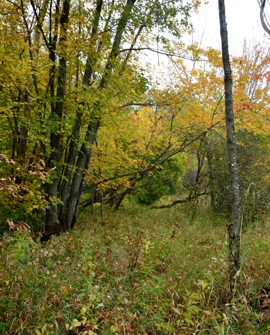
The colours are lovely around here right now and there are still plenty of leaves on the trees. We had an enormous tree removed from our yard earlier in spring so it will be interesting to see if the leaf collecting is a little easier this year. We still have four big trees plus others over the fence daring to drop their leaves in our yard too!
Supplies

Oxide Leaves Video
Posted: September 25, 2020 Filed under: Dies, fall foliage, golden delight, Penny Black, pumpkin & leaves, Tutorial | Tags: distress oxide inks, Fabriano Watercolour Paper, Penny Black creative dies, Penny Black stamps, video 5 Comments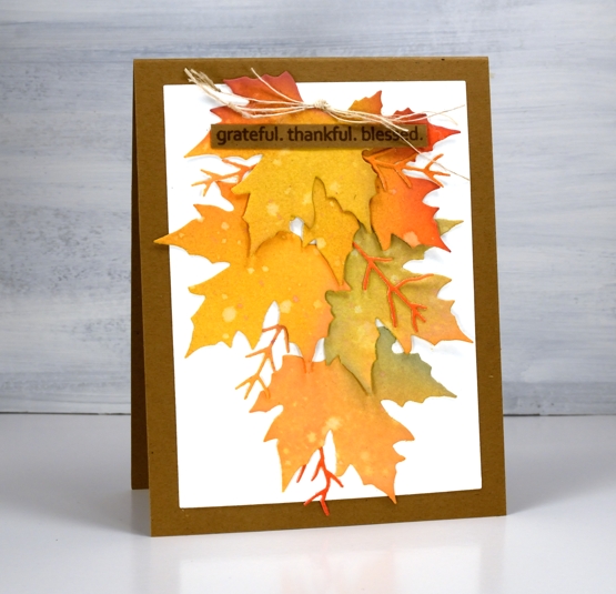
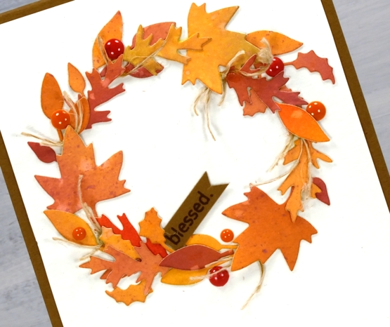
There is no denying it anymore, autumn is in the air and on the trees and definitely in the cards. This week the weather has been lovely, the sun has shone and the frost warnings have gone. Can’t complain.

I really am a seasonal stamper; I’m inspired by what is going on outside in the world. With a few exceptions, like Christmas card prep, I like to stamp what I see in the garden and surrounds. The leaves on my trees are beginning to turn, nothing spectacular yet and nothing to rake (yay) but the signs are there. I chose oxide inks to blend several three coloured panels which I then cut up into leaves. The process and chit chat is all in the video below.
After the video was completed I looked at the wreath and decided it needed some brighter pops of colour and luckily I had some enamel dots which matched exactly. I added them before taking the photos below.
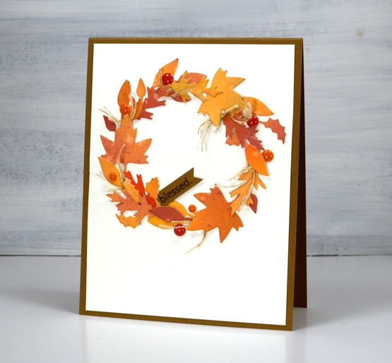
I really enjoy arranging all the elements on die cut cards like the two I’ve shared today but the gluing drives me a little crazy. Sometimes I use double sided adhesive but if the die cuts are not going to be sitting flat that doesn’t really work. If you have any suggestions for attaching fiddly little die cuts please leave them in the comments; I’d love to know. You might notice I try not to include much gluing in the video because it doesn’t make for very entertaining viewing.
I hope you are surrounded by some fall beauty where you are or perhaps enjoying some spring sunshine in the southern hemisphere.
Supplies
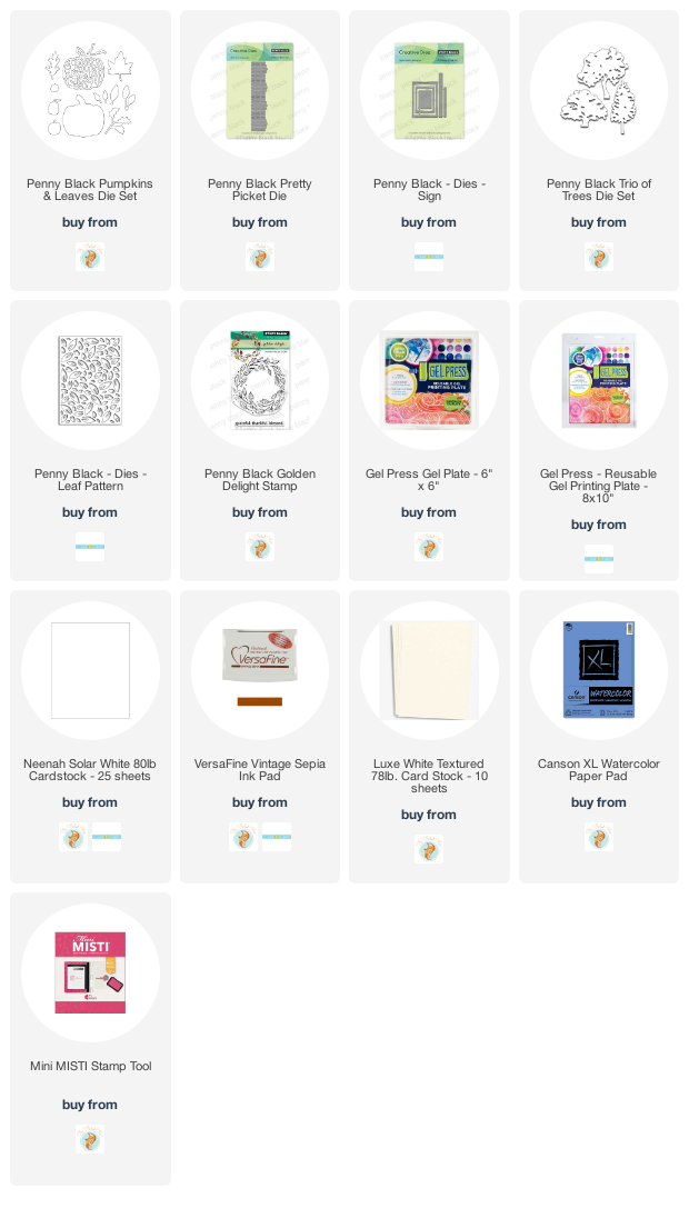
Gel print pumpkins
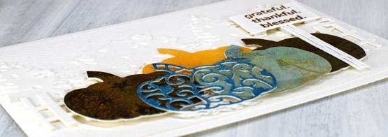
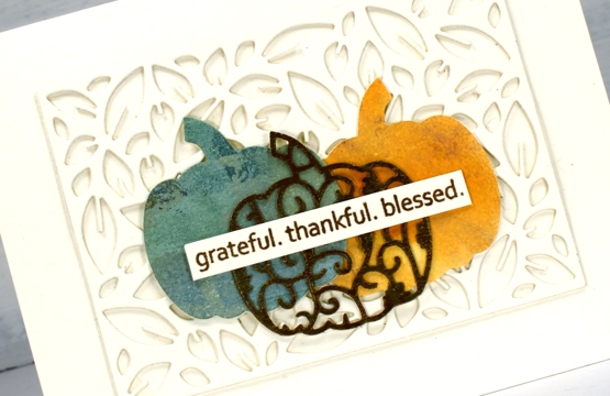
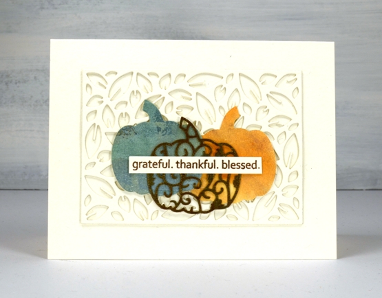
Posted: September 21, 2020 Filed under: gel press, leaf pattern, Penny Black, pretty picket, pumpkin & leaves, sign, trio of trees | Tags: gel press, gel printing, Penny Black creative dies, Penny Black stamps 4 Comments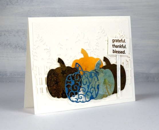
Despite what the title suggests this post isn’t about gel printing, it’s about using more dies on one card than I’ve ever done before. I tend to use dies sparingly, not because I don’t like them, but because they are usually called in to highlight or frame some watercolouring. This time the dies are the feature and I used some leftover pieces of gel printed paper for the pumpkins.
On the first card I built up a background for the gel print pumpkins with a row of die cut trees and then a die cut picket fence. Each pumpkin is two layer as the original cardstock used for printing was light weight. I tried to find prints in pumpkin colours and found a couple of blue/greens, some goldy browns and a pale orange; I didn’t have a strong orange in the pile. The fact that one of the prints had stars on it was definitely a bonus.
On the second card I stacked two leaf pattern die cut panels to create a textured background then layered the pumpkins on top of that. All the background die cutting and card bases are either luxe textured white cardstock or a cheap cold pressed watercolour paper that I thought was luxe textured white until I placed them side by side and had to rearrange things a bit.
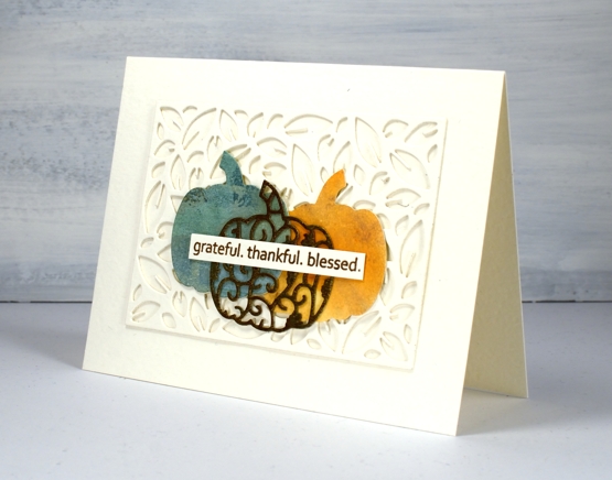
All the dies are listed and linked below and I made two messages with the same ‘golden delight’ sentiment stamp. I know I have other sentiments for thanksgiving but I can’t go past this one. For the cute little sign by the pumpkin patch I stamped one word, masked, then next word, masked and then the last one and wonder of wonders, it worked first go!
The layering and adhering of dies was a labour of love because I am just not great at the whole fiddly nature of gluing die cuts. When I imagined the card in my head it was way more intricate than either of these but it’s important to know your own limits and sometimes quit while you’re ahead!
Supplies
Falling Leaves
Posted: September 17, 2020 Filed under: Brusho, falling leaves, Penny Black | Tags: Fabriano Watercolour Paper, Penny Black creative dies, Penny Black stamps 5 Comments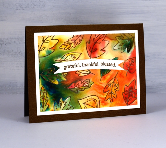
Falling Leaves is a new transparent set from Penny Black, part of the ‘Autumn Extraordinaire’ release. I made a random pattern with most of the little leaf stamps by embossing them on a piece of hot pressed watercolour paper. I taped the edges of my panel before I started and was able to keep a clean frame around the patterned area.
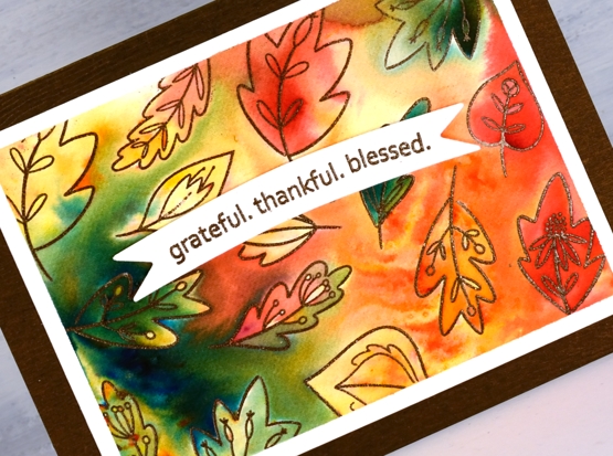
I arranged the leaves on the panel and embossed with versamark and potting soil powder. To add colour I started with just two brusho powders, gamboge and olive green sprinkled sparingly here and there over the leaves. After spritzing with water the colours started to move and fill the leaves and surrounding area but the gamboge diluted to pale orange and yellow so I added some brilliant red brusho to create a few more pops of colour. Most of the colour placement was random but I did move some around with a paintbrush.
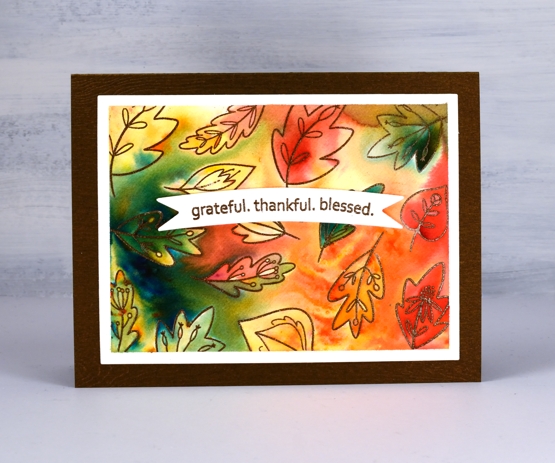
Once the design was complete I dried it, removed the tape and cut the panel with a rectangle die. I stamped the lovely sentiment from ‘golden wreath on a banner die cut then looked at my cardstocks to choose a base colour. I ended up with a lovely metallic brown wood textured piece which worked exactly how I thought it would. Then I wondered, did I make a very similar autumn card with this cardstock last year? Yes, yes I did.
Supplies
Foiling without heat
Posted: August 10, 2020 Filed under: balloons!, Brutus Monroe, Catherine Pooler inks, Penny Black, silver sketch deco foil | Tags: Brutus Monroe, Catherine Pooler inks, Foiling, Penny Black creative dies, sizzix embossing folder 4 Comments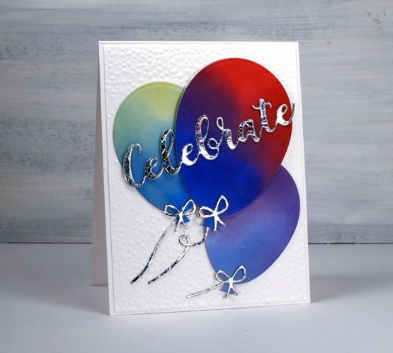
I’m celebrating the opening of my online class today. All the lessons and projects are now available so if you haven’t heard click here to see what it’s all about.
What’s a celebration without balloons and shiny things? I know you don’t see too much sparkle and shine around here but I was intrigued to see how this Brutus Monroe deco foil would look with some watercoloured balloons.
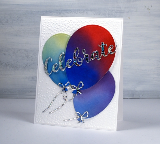
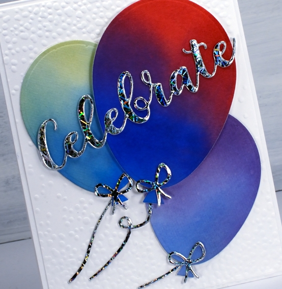
Once I had created a foiled sentiment and some bows I flipped the arrangement and paired foiled balloons with a blended sentiment. As you can see in the photos below I allowed some of the foil to be over exposed in the photo so you could see how it pretty the pattern is as it picks up the light.
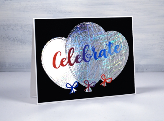
I did my foiling without heat by attaching double sided adhesive (stick-it) to cardstock then removing the backing so I could lay the ‘silver sketch’ transfer foil’ directly on the adhesive. I pressed it down with my fingers carefully to avoid air bubbles then die cut the balloons, strings and sentiment from the foiled cardstock. Once cut I removed the foil top layer to reveal beautifully foiled die cuts. Rather than attaching the balloons to plain black or white card stock I ran the panels through my die cutter inside the ‘snowfall/speckles embossing folder, then flipped the panel around to emboss speckles on both ends.
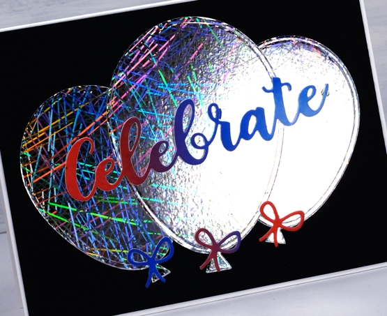
You can see all that pretty reflective pattern on the foil even better in this close up. Thank you Foiled Fox for sending pretty shiny things my way!
Supplies
Hydrangeas
Posted: August 7, 2020 Filed under: Arteza, hydrangea, it's your birthday, Papertrey Inks, Penny Black, Studio Katia, watercolour real brush pens | Tags: Arteza, Papertrey ink, Penny Black creative dies, Penny Black stamps, real brush pens, Studio Katia 10 Comments
When I tried a bit of hydrangea painting the other day it got me thinking about hydrangea stamps and I’m not sure if I have ever inked this PB one before. As you know I tend to go for the blues and purples (like my mother before me) but I decided to go more for the pinky red you can find in some hydrangeas. As you can see I didn’t end up with pinky red; I have orangy red which I have never seen on a hydrangea! My mother always wanted her hydrangeas to be blue, purple or pink so she and my dad added something to the soil to make that happen.
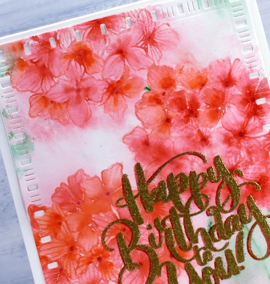
Before I began stamping I scribbled rouge pink and punch pink Arteza real brush pens on my glass mat, spritzed it with water then swiped my hot pressed watercolour panel through it. I dried the panel before beginning the stamping. In the stamp positioner I inked the hydrangea first with Papertrey ‘pale peony’ ink then dabbed the arteza pens on the stamp as well to get a variegated print. I spritzed then stamped and repeated the process to get three hydrangeas. To colour inside the petals I used three arteza pens (rouge pink, punch pink, apricot) to dab a little colour then blended to fill the petals with a paintbrush and water.
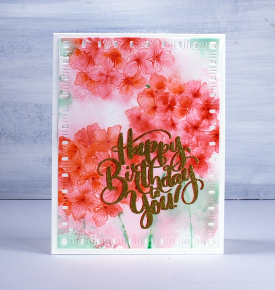
I decided to try a fancy drop shadow greeting and it kind of worked; don’t look too closely. I stamped first in versafine clair tulip red, dried that, powdered it with the anti-static-thingy, dried it again and powdered it again and then moved the panel ever so slightly left before stamping with versamark and embossing with gold. Despite all my efforts gold powder still stuck to the supposedly dry tulip red ink. As a fix I used a red marker to make the shadow to the left a little more prominent. Then in another fit of fanciness I cut the panel with a dainty dashes die. I don’t know what came over me! Maybe it’s because it’s Friday or maybe it’s because I am getting increasingly excited about opening my online class on Monday.

Thank you to all of you who have signed up already; I am thrilled by the response so far. If you don’t know what I am talking about pop over here and find out!
Supplies