Unfolding
Posted: April 22, 2019 Filed under: trees in bud, Unfolding | Tags: Penny Black stamps, Ranger Distress inks, Tsukineko Versafine inks 15 Comments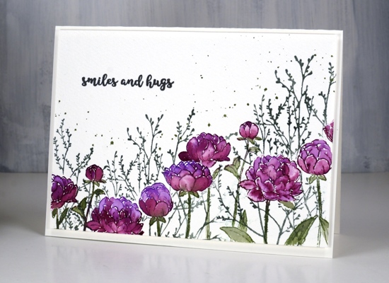
Like many card makers I have numerous boards on Pinterest filled with inspiration for future art and cards. I opened one such board yesterday looking for inspiration and decided to have all my flowers and foliage along the top of the card hanging down, then empty space below. I did all the painting with the flowers upside down but when I had finished it didn’t make sense to have the flowers upside down at all so here they are right side up.
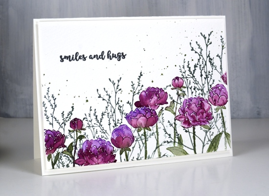
Working on cold pressed watercolour paper I stamped the PB ‘unfolding’ stamp twice which involved masking a flower head in the middle of the panel so I could overlap the flowers. I inked the flowers with wilted violet and seedless preserves distress inks and the stems in bundled sage then blended all the stamping with a little water and a small paintbrush. I wanted extra colour in the petals so I pressed all three stamp pads on my glass mat so I could pick up ink for painting.
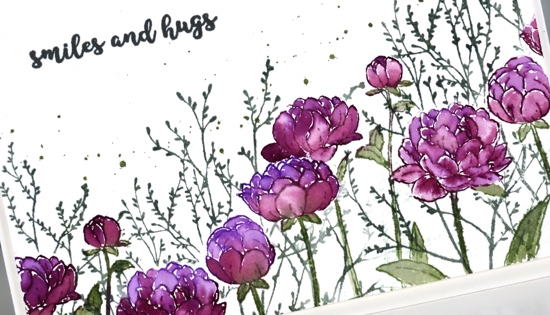
Once I had painted all the flowers I realised I would need a mask for each one so I could stamp background foliage. It didn’t take too much time to stamp and cut masks of the flower heads, I didn’t worry about masking the leaves. The foliage is PB ‘trees in bud’ stamped in iced spruce distress ink and the splatter is bundled sage. To finish the card I add a sentiment from the handy PB set, ‘banner sentiments’ in versafine clair morning mist and popped up the whole panel on foam over a hot pressed watercolour paper card base. Sometimes I want a frame around a panel but nothing as bold as a coloured mat would be so I pop the panel up creating what I call a ‘shadow frame’ simply because the small distance between panel and card base casts a subtle shadow.
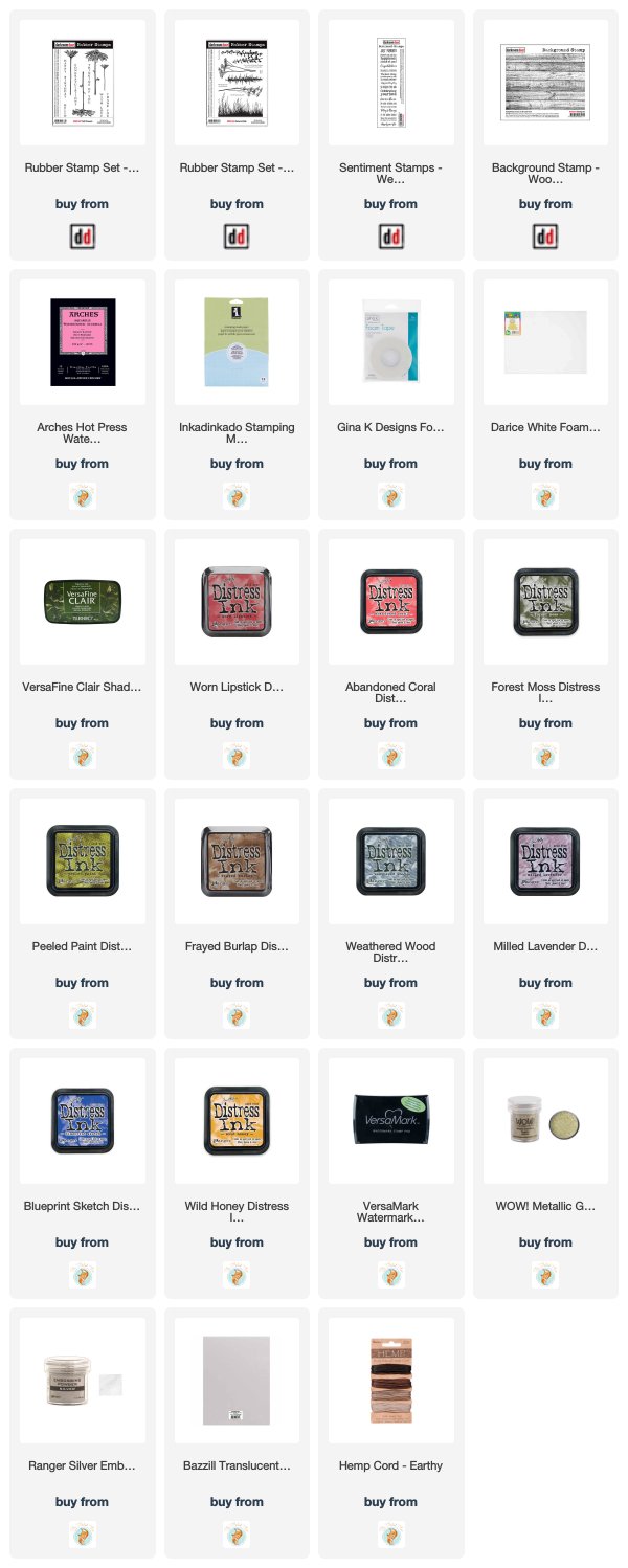
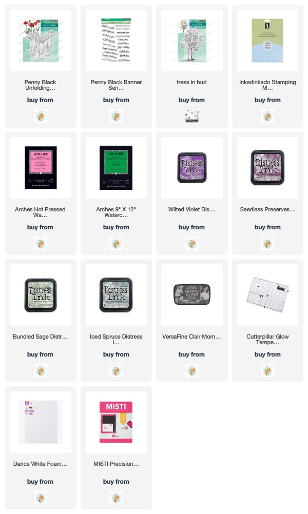
Supplies
https://linkdeli.com/widget.js?1552642647875
Fine floral journal page
Posted: April 17, 2019 Filed under: Art Journal, Concord & 9th, dots and hearts, Feathered stamp set, fine line florals, Inktense pencils, songbird | Tags: Art Journal, Concord & 9th, Fabriano art journal, Inktense 5 Comments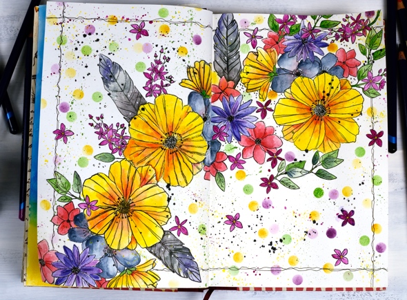
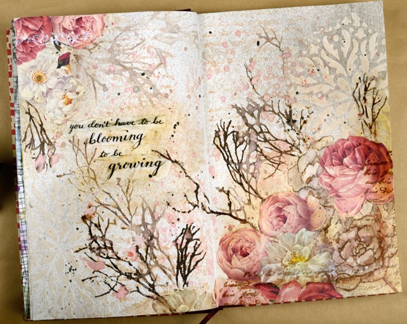
I’ve been experimenting in my journal again featuring some new and old stamps from Concord & 9th. Once again I had an idea in my head and although this does not look like my original idea, I’m very happy with the vibrant look of the massed flowers. I haven’t put any words on this page yet and possibly wont. Now if you are not an art journal type of person, hang in there, I have cards made with the new ‘fine line florals’ set coming over the next few weeks.
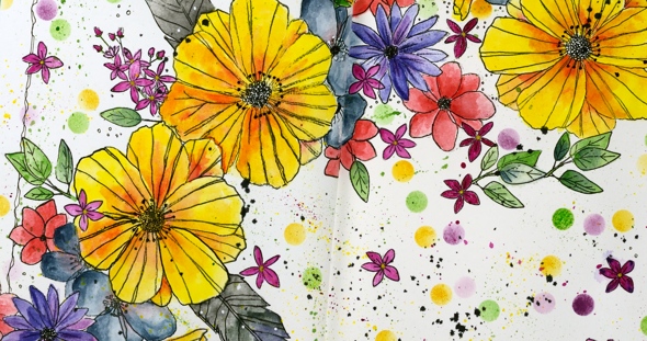
As I mentioned last time a couple of my journals do not have watercolour pages, this one is drawing paper. Sometimes I paint my pages with gesso or absorbant ground before I start or glue other papers to the page. I’ve also glued two pages together a few times to make sure liquids don’t soak through the page. The glued pages are very bulky and bumpy though so I don’t think I’ll keep that up. With this page I wanted to see if I could add watercolouring to an untreated page without it soaking through, breaking down the page or seeping outside the stamped images. Even though I love watercolouring with distress inks or stains I thought they might be too wet. I decided instead to used inktense pencils as I hoped to get vibrant colour with limited water. I tried picking up colour from the pencil lead with a wet brush and painting it into my stamped images as well as colouring the image with the pencil then adding the water over the top. I preferred the look of the former method. When I coloured directly on the page it was more likely that I would end up with shading lines or the colour would seep outside the stamping once I added water. I did get some paint soaking through the next page of the journal so I’ll cover that up with my next spread.
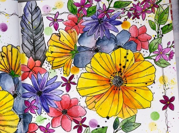
The big flowers are part of a large multiflower stamp from the new C&9 set, fine line florals. I stamped it three times on my journal double page but the page doesn’t sit flat so I was not able to get perfect prints. I was using the fiskars stamp press on the flatter right hand page but used my hand to press the stamp on the bumpy left hand page and tried to do the stamping across the centre of the two pages in two steps while masking the left then right. I kept going even with my patchy stamping and used micron pens to add in missing lines and trace over the pale stamping. I wondered whether the lines I added would be obvious but once all the colour was added it was hard to tell the difference between the stamped and the hand drawn outlines.
The other stamps in my floral explosion are a feather from the C&9 ‘feathered’ set and leaves, flowers and little sprays from the C&9 ‘songbird’ set. I did several layers of colour on the large flowers, letting it dry after each one but just one layer on the leaves, little flowers and feathers. The dots were distress inks sponged through a homemade die cut vellum stencil made with C&9 ‘dots and hearts’ die.

I also did quite a bit of splattering by flicking a wet brush across the lead of the inktense pencils. I added black outlines as I did the watercolouring but when all the painting was finished I went over the centre of the flowers drawing little circle centres with the micron pens and adding little white dots here and there with a white gel pen. To frame the spread I drew a squiggly frame with in black then added some black soot distress stain splatter here and there.
I had fun with this spread and learnt a few things along the way. Hope you are having a great day; thanks for spending some of it here on my blog.
Supplies
https://linkdeli.com/widget.js?1552642647875
He is risen
Posted: April 15, 2019 Filed under: little lowercase letters, painted prints | Tags: Catherine Pooler inks, My Favorite Things 10 Comments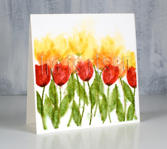
He is risen indeed. Jesus came to earth; he gave his life and he rose from the dead. It was because of his great love for us.
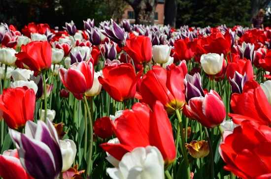
Although much snow has disappeared this week there are not many signs of life in my garden, definitely no tulips yet. I will look forward to the real ones while I create gardens with the stamped ones! Here in Ottawa we enjoy the Tulip Festival each May and in Canberra where I lived for many years, Floriade is held each September. Both festivals feature massed flowers some in blocks of colour, others mixed like confetti. It was the blocks of coloured tulips that inspired this card. I’ve added a photo from each festival below.
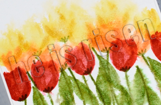
I began by taping hot pressed watercolour paper to my glass mat and spritzing water over the whole panel. First I stamped the yellow tulips from MFT’s ‘painted prints’ set in Catherine Pooler’s shea butter ink. Because the paper was wet the ink bled into the surrounding area but still hinted at tulips shapes especially when I stamped the second layer of the tulip in the same colour. I chose a different tulip and stamped a row in CP bellini ink underneath and finally CP ‘rockin robin’ ink for the foreground row. The paper was slowly drying as I did this so the foreground tulips, stems and leaves were more distinct than the background (first) ones.
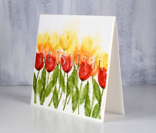
I die cut my words from the painted panel and popped them up on three layers of die-cut white cardstock letters. I put stick-it adhesive on the back of the cardstock before I cut all my little letters but forgot to put it on the back of the painted panel so I used a Lawn Fawn glue pen. The marvy jewel picker also came in handy as did some teeny tweezers; fiddly jobs like small stacked die cut letters tend to take me a while but I am finding it easier using tools rather than fumbling with my fingers. Jennifer McGuire did a fabulous video with stacked letters a couple of weeks ago and referred to this technique as the ‘eclipse’ technique. I think that sounds rather classy and clever so I will now use that terminology too.
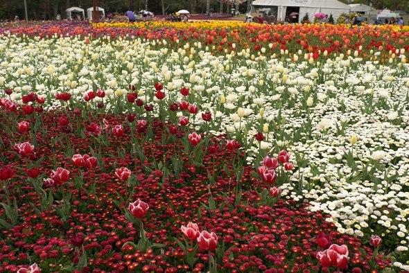
Here is the real thing, above in Canberra, below in Ottawa.
Hope you have a blessed Easter.
Supplies
Dotty thanks
Posted: April 12, 2019 Filed under: big thanks, dots and hearts, dotted fill in | Tags: Concord & 9th, Ranger Distress inks, Tsukineko Versafine inks 5 Comments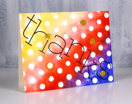
Polka dots are make happy patterns in my opinion. Add rainbow colours and it’s a double happy. I created this simple card with the Concord & 9th ‘dotted fill-in stamp set’. I inked the background stamp with a rainbow of distress inks, spritzed the stamp with water to blend the overlapping colours a little then stamped on watercolour paper.
I thought a bold black sentiment would stand out so I arranged the letters from the C&9 ‘big thanks’ set across the panel and stamped in versafine clair nocturne ink. The only embellishments are little gold circles die cut with the ‘dots and hearts’ die from gold foiled cardstock and popped up over a few of the polkadots.
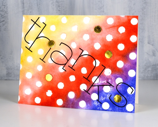
So simple. So dotty. So happy.
Supplies
Gelli butterflies and blossoms
Posted: April 10, 2019 Filed under: Alexandra Renke, cherry blossom, gelli plate, monarch, Script | Tags: gelli plate, Penny Black creative dies, Penny Black stamps, Tsukineko Versafine inks 3 Comments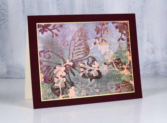
Thank you for all your lovely comments about my recent art journal page. I’m glad you enjoyed it. I have a couple more pages in process in my journals which I look forward to showing you in the future. I would love to hear from other art journallers. What are some of your favourite mediums and techniques?
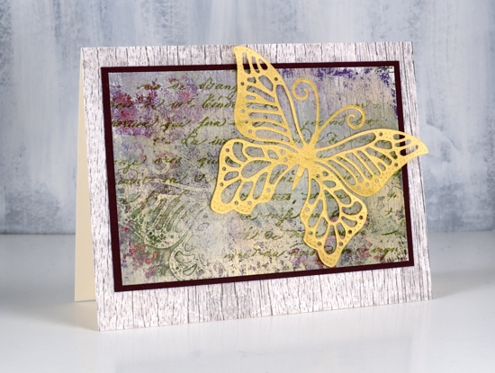
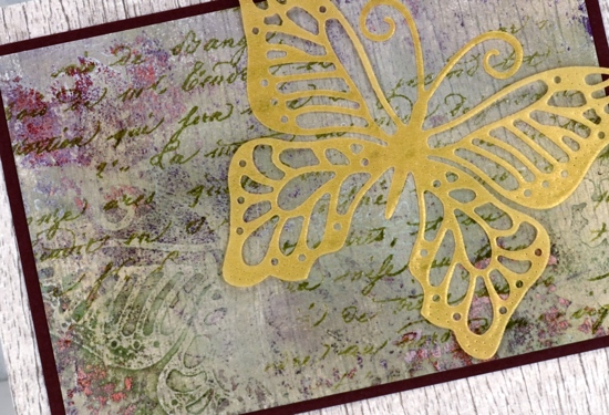
Today’s cards are made with my latest fave: the gelli plate! I am very much a beginner but learning as I go and watching the myriad of techniques shared on the Gelli Arts youtube channel. The panels in today’s cards were made by printing layer after layer while rearranging die cut paper butterflies and blossoms on top of each new layer of paint. The dies are Penny Black ‘monarch’ and cherry blossom’.
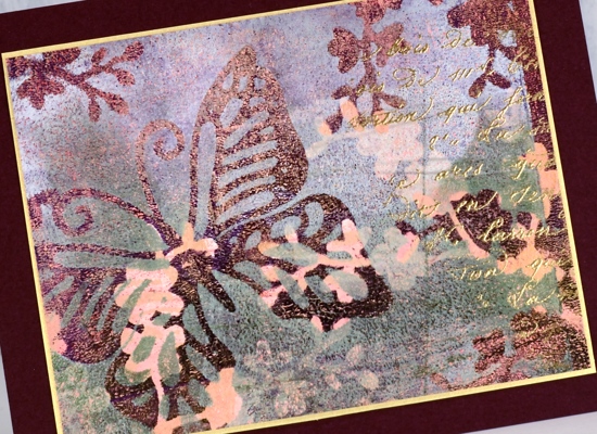
I wont’ try to describe my process because I don’t remember exactly what my order was or what paint colours I used. I know there was green, white, burgandy, gold and pink liquitex basic acrylics but there could have been more. Like many artistic techniques success with a layered gelli print can be knowing when to stop. Once I was happy with the one above I still had paint and pattern showing on the gelli plate so I added one more layer of paint then pulled a ghost print (I’m learning the lingo!) on patterned paper. The paper I chose was a woodgrain print from Alexandra Renke.
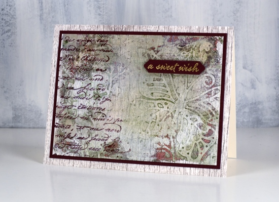
You can see the woodgrain print through the paint and pattern. I ended up matting both panels in burgandy cardstock then attaching them to a base panel of the same AR woodgrain paper.
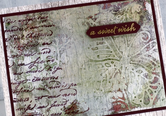
It’s always hard to capture shimmer on camera but all three panels have gold shimmer on them so I added some gold accents to each one. On the top panel I stamped the PB script stamp, embossed in gold powder and matted the panel with gold cardstock. On the card above I added a gold embossed sentiment from the PB set happy snippets and stamped the same script stamp in chianti versafine clair. On the card below I stamped the script stamp in shady lane versafine clair ink and added a gold vellum die cut butterfly, the same butterfly used as a mask in the gel printing process.
I love all the texture from the gelli printing process, the paint which builds up after several layers of printing adds so much interest
I did another butterfly and blossom print in a different colour scheme but I’ll share that another day. Thanks for dropping in.
.
Blooming journal page
Posted: April 8, 2019 Filed under: Art Journal, Hand lettered, Hypnotic, Penny Black, Script, timeless, winter branches | Tags: Penny Black stamps, Penny Black stencils, Ranger Distress inks, Ranger Distress stains 13 Comments
I’m been working in one of my Fabriano Venezia art journals again experimenting with vintage style. I started by painting absorbant ground over the double page spread then stamped the PB ‘script’ stamp in tea dye and antique linen distress inks. I spritzed the inked stamp before pressing it onto the page so I would get blurred prints.

Once that dried I spread modeling paste through the PB hypnotic stencil and had to go and do something else so I wouldn’t mess it up before it was dry. Even so I still stuck my finger on it while it was wet and smudged some.

Once the paste dried I spritzed the ‘see ya latte’ shimmerz spray over the pages then wiped it off the stencilled area so it would darken the background. I am not an experienced art journaller but I am using one to try things out. On this page I was trying to create a vintage look. I stamped the ‘timeless’ rose stamp from Penny Black three times in brown distress inks then blended the ink into the petals. My journal is not watercolour paper so ink and paint don’t move on the page as easily. I didn’t like the roses enough to keep them all, instead I covered some with flowers cut from leftover Italian papers. I glued them on with matte medium and painted diluted gesso over them to decrease the contrast then added a bit of distress vintage medium for the aged tea stain look.

I did a smaller collage of flowers on the opposite corner then stamped PB winter branches over the pages with vintage photo and ground espresso distress inks. I added some pretty scroll stamping with the PB set ‘flourish borders’ in white ink and some more of the ‘script’ stamp in brown ink. Tattered rose distress stain matched the paper flowers so I splattered a decent amount of that over everything too! I mentioned on my previous journal page post how I struggle with adding words to a page. I chose a quote from Ruth Chou Simon’s book ‘Gracelaced‘ which encourages and challenges me every time I open it. I wanted to write the words with my nib pen but when I tried, the ink spread into the page and looked like a blob so I wrote on calligraphy paper, tore the words into strips and glued them over the blob. Some of the letters are blurred because I didn’t let it dry long enough. I need a bit more patience when working in my art journals…
Not exactly what I set out to create but as I said, the art journal is for playing with mediums and ideas. Have a great day
Supplies
Brusho emboss resist
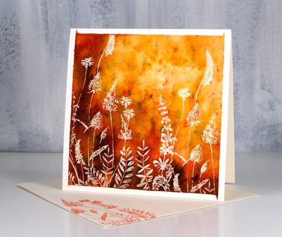
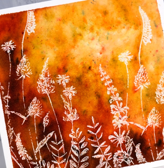
Posted: April 5, 2019 Filed under: a floral twist, Brusho, trees in bud | Tags: Brusho, Penny Black stamps 7 Comments
Emboss resist with brusho makes me happy for several reasons. You never know quite what you will get but it is almost always pretty and sometimes amazing. I recently used the technique in a class I taught and realised I hadn’t used it on the blog for a while. There are several ways to do emboss resist panels with brusho and I have two methods for you today. You can watch another technique I’ve done in a video for that you can find here.
A single brusho colour (same with colorburst, bister and nuvo shimmer) is usually made up of a mix of pigment crystals which combine to give you one colour when activated with water. If you don’t mix the powder and water thoroughly you can see all the different pigments that make up the colour. I often sprinkle brusho on a panel, spritz it and wait to see where different colours appear. Lime green is made up of a mix of yellow and blue, more yellow than most other greens. When I sprinkle it on a panel there will be plenty of yellow powder that will activate when I add water. When I spritz the water over the powder and don’t move the paint around it will dry in different coloured patches especially on an embossed panel because the embossing traps the powder and water.
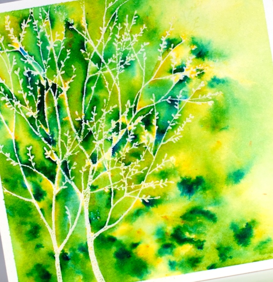
On this first panel I did what I have just described, I let the powders ‘fall where they may’ and did minimal blending with my paintbrush. I used only lime green brusho and sprinkled mainly where the embossing was then used the paintbrush a little to make sure paint filled every nook and cranny and to blend diluted colour to the right of the tree. The stamp is PB trees in bud embossed in clear powder on hot pressed watercolour paper. The stamp below is ‘a floral twist’ also from Penny Black.
On this second panel I started by using the same technique as above but did not get as much colour variation or ‘trapped colour’ so I blended my first colour ‘sandstone’ with a paintbrush, dried the panel with a paper towel then sprinkled ‘terracotta’ brusho over the embossed area, spritzed with water and did some more blending with the paintbrush before adding just a little burnt sienna brusho. The overall effect is smoother blends but still some spots of different colours here and there.
The technique I show in the video is even more controlled where I sprinkle different colours of brusho in specific parts of an embossed image.
I wanted the white frame effect on today’s panels so I taped them down firmly with frog tape before doing any painting. A little colour leaked under the corners on the second panel but that didnt worry me. I attached the panels to cream card bases and stamped the same image on cream envelopes. I decided not to add sentiments on the front this time; I can always add one inside.
Supplies
Butterfly Garden
Posted: April 3, 2019 Filed under: butterfly garden, Penny Black, Tagged | Tags: Peerless Transparent Watercolors, Penny Black creative dies, Penny Black stamps, Ranger Distress inks, Tsukineko Versafine inks 3 Comments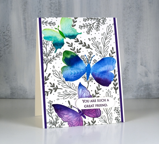
Butterfly garden is a new transparent set from Penny Black with a nice mix of butterflies, leaves and flowers. I chose to watercolour the butterflies first then mask them before adding background foliage. I stamped the top butterfly in shabby shutters distress ink, the middle in broken china and the bottom one in dusty concord on hot pressed watercolour paper.
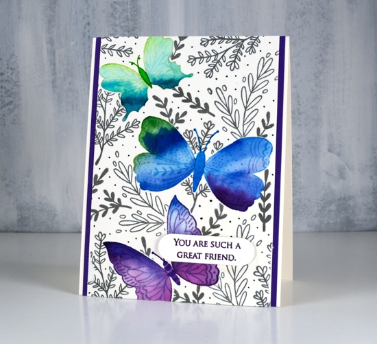
I used peerless watercolours to fill each butterfly with colour starting with a light green then blending to darker greens to fill the wings. I then added green first to the middle butterfly and blended into blue and a little bit of purple. The last one I blended from blue to purple. I stamped them again on masking paper, cut them out and covered the watercolouring before stamping leaves all over the panel in morning mist versafine clair ink. As I wanted to fill the panel with lots of stamping I used acrylic blocks so I could easily turn the stamps around to fit them in all the spaces. I drew little dots in grey marker to fill the background even more.
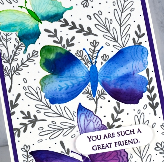
To finish the card I matted with purple cardstock, stamped a sentiment from the PB grateful sentiments set in monarch versafine clair, die cut it and popped it up with Gina K’s dimensional tape which adds just a little height without being too bulky.
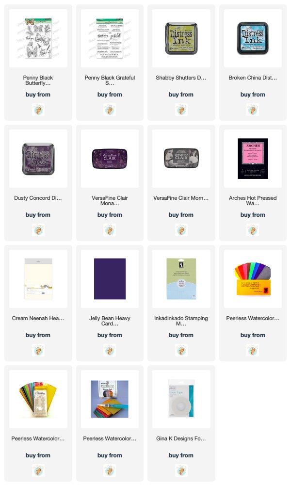
Supplies
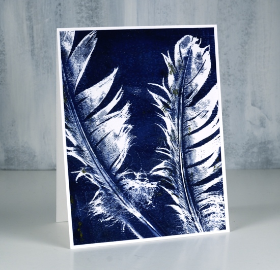
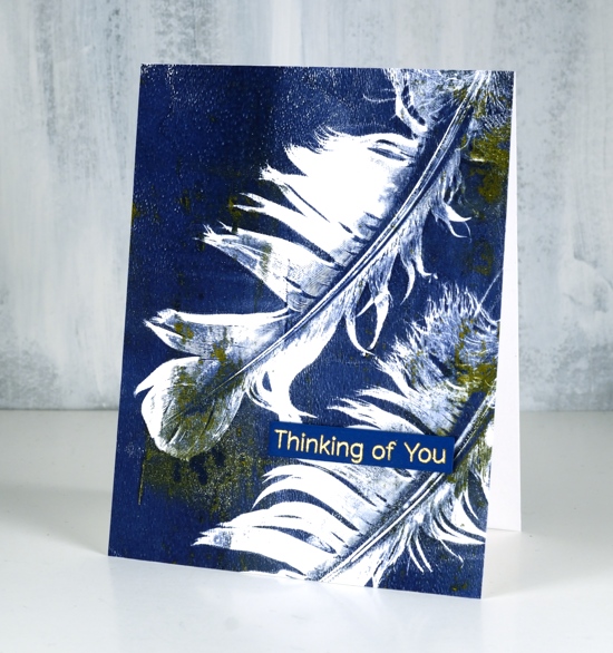
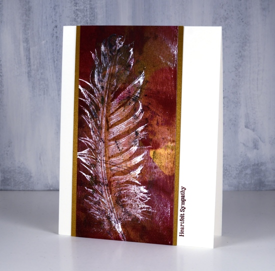
Gelli plate feathers
Posted: April 1, 2019 Filed under: Darkroom Door, diamonds, Feathers, gelli plate | Tags: Darkroom Door stamps, gelli plate, My Favorite Things 22 Comments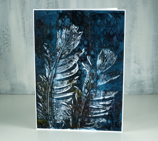
I spent a delightful day learning how to use my gelli plate last week. I have had it for years and only used it once or twice so everything my friends showed me was new and exciting.
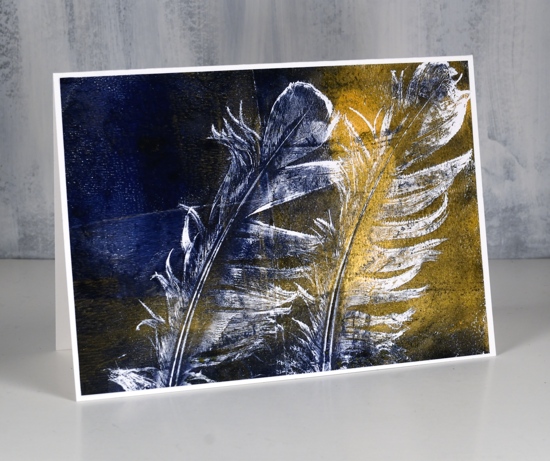
I was so happy with these feather prints, I couldn’t believe the detail using real feathers. If you want to see how it’s done check out this video on the gelli arts youtube channel.
I did a few with navy and shimmery gold paint as well as some with burgandy and gold. Half of them got sentiments but only small ones as I didn’t want to cover up the lovely detail. I had a MFT sentiment already stamped and die cut which matched the panel below. I haven’t listed or linked any of the paints because I don’t remember what brands I used or colour names. If I continue with my gelli plate (and I’m pretty sure I will!) I will let you know what paints I buy.
My favourite panel is the one at the top of the post which also has the texture of the new ‘diamonds’ stencil from Darkroom Door in the background. As I was learning and experimenting I used computer paper for most prints, not the weight of cardstock I would usually use for panels on my cards. To make sure I didn’t tear or buckle the panels with glue or narrow adhesive I covered the back of all the panels with double sided adhesive sheets.
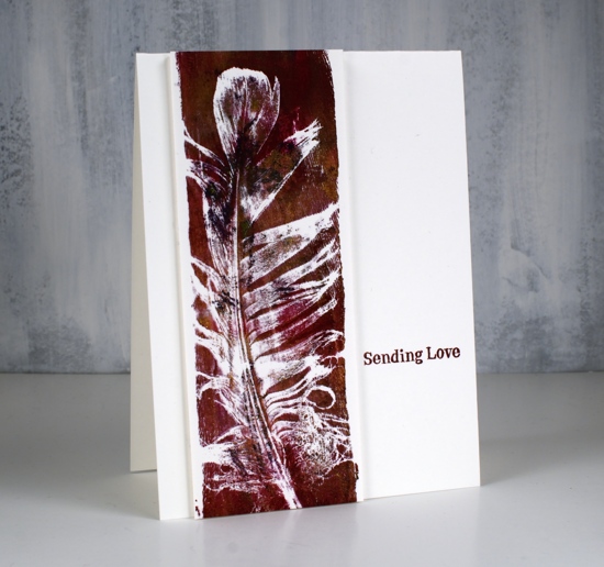
These last two narrow panels were done on watercolour paper strips. I decided to add sentiments from the new Darkroom Door sentiment strip ‘Sympathy’
Have you used a gelli plate? I love to hear what your favourite techniques are.
Supplies
Darkroom Door wedding cards
Posted: March 25, 2019 Filed under: Darkroom Door, Nature Walk, tall flowers, Woodgrain | Tags: Darkroom Door stamps, Ranger Distress inks, WOW embossing powders 9 Comments
I’ve been creating with the tall flowers and nature walk stamps from Darkroom Door again, this time with a wedding theme in mind. Darkroom Door now has eight different sentiment stamps collections in list format, each one has a different theme. For two of today’s cards I isolated one sentiment by masking either side but on the second card I used a large chunk of the stamp as a feature over a soft blurry floral background. I am over on the Darkroom Door blog sharing these cards so make sure to pop over there for more details on my process.
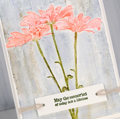
This first wedding card made me think of a country style-decorate the barn type of wedding. I did a bit of masking to get the look of three daisies against a timber background and used twine to keep things natural and not too fancy. I inked the daisy from ‘Tall Flowers‘ set in worn lipstick, abandoned coral, forest moss and peeled paint distress ink, spritzed lightly with water and stamped in centre of a hot pressed watercolour paper panel, then used masks to stamp another on each side. I masked all three daisies so I could stamp the Woodgrain Background Stamp in weathered wood and frayed burlap distress inks.
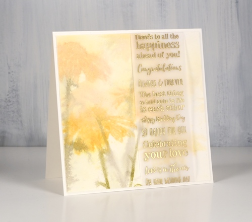
My second card features the ‘wet on wet’ watercolour technique. The watercolour panel was very wet before I stamped the daisy stamp in wild honey and forest moss distress inks. I restamped to get paler images then dried the panel before wrapping a vellum strip with gold embossed wedding sentiments over the stamped flowers.
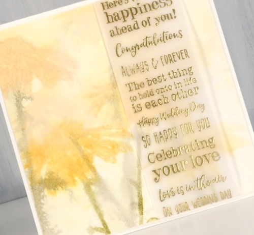
The very blurry style is not for everyone but in real life it does have a soft romantic look to it.
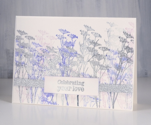
My final card features wildflower silhouettes in blueprint sketch and milled lavender ink stamped repeatedly to get first, second and third generation images as well as silver embossed flowers and sentiments with some very sparkly silver ribbon.

Working with sentiment strips that have fifteen different sentiments gives me plenty of options, some of the ‘wedding’ sentiments are totally appropriate for other events too.
I enjoyed the process of creating wedding cards in three different styles and I know I could have gone even fancier. What’s the fanciest card you have ever made?