
Brusho emboss resist
Posted: April 5, 2019 Filed under: a floral twist, Brusho, trees in bud | Tags: Brusho, Penny Black stamps 7 Comments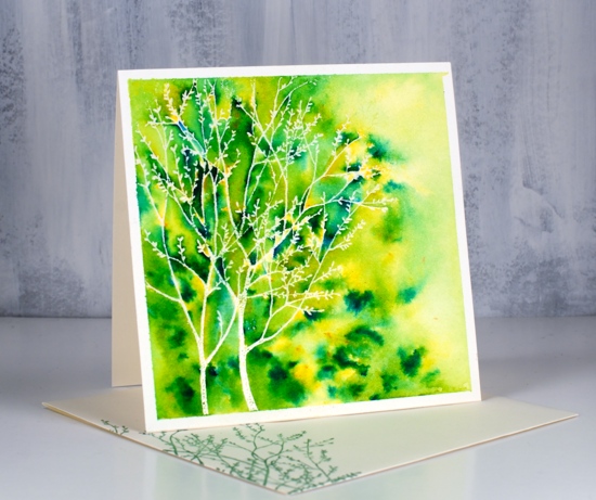
Emboss resist with brusho makes me happy for several reasons. You never know quite what you will get but it is almost always pretty and sometimes amazing. I recently used the technique in a class I taught and realised I hadn’t used it on the blog for a while. There are several ways to do emboss resist panels with brusho and I have two methods for you today. You can watch another technique I’ve done in a video for that you can find here.
A single brusho colour (same with colorburst, bister and nuvo shimmer) is usually made up of a mix of pigment crystals which combine to give you one colour when activated with water. If you don’t mix the powder and water thoroughly you can see all the different pigments that make up the colour. I often sprinkle brusho on a panel, spritz it and wait to see where different colours appear. Lime green is made up of a mix of yellow and blue, more yellow than most other greens. When I sprinkle it on a panel there will be plenty of yellow powder that will activate when I add water. When I spritz the water over the powder and don’t move the paint around it will dry in different coloured patches especially on an embossed panel because the embossing traps the powder and water.
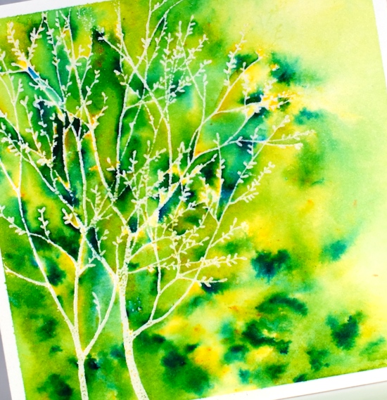
On this first panel I did what I have just described, I let the powders ‘fall where they may’ and did minimal blending with my paintbrush. I used only lime green brusho and sprinkled mainly where the embossing was then used the paintbrush a little to make sure paint filled every nook and cranny and to blend diluted colour to the right of the tree. The stamp is PB trees in bud embossed in clear powder on hot pressed watercolour paper. The stamp below is ‘a floral twist’ also from Penny Black.
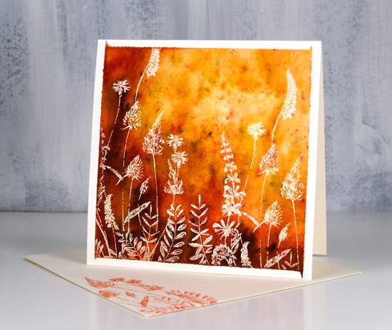
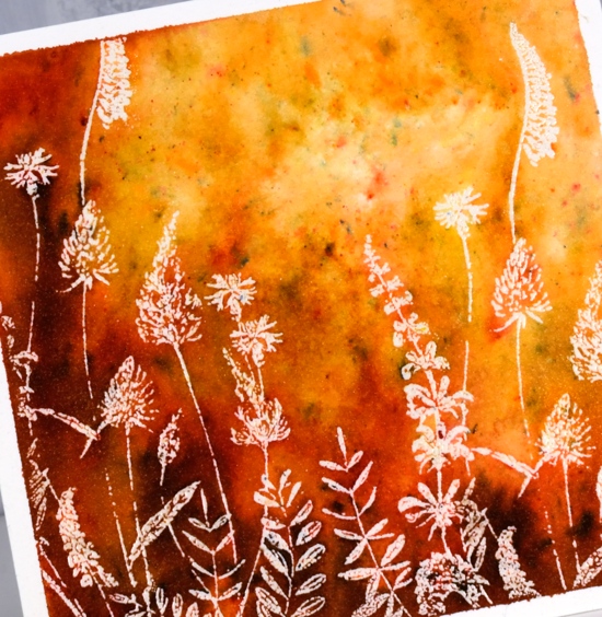
On this second panel I started by using the same technique as above but did not get as much colour variation or ‘trapped colour’ so I blended my first colour ‘sandstone’ with a paintbrush, dried the panel with a paper towel then sprinkled ‘terracotta’ brusho over the embossed area, spritzed with water and did some more blending with the paintbrush before adding just a little burnt sienna brusho. The overall effect is smoother blends but still some spots of different colours here and there.
The technique I show in the video is even more controlled where I sprinkle different colours of brusho in specific parts of an embossed image.
I wanted the white frame effect on today’s panels so I taped them down firmly with frog tape before doing any painting. A little colour leaked under the corners on the second panel but that didnt worry me. I attached the panels to cream card bases and stamped the same image on cream envelopes. I decided not to add sentiments on the front this time; I can always add one inside.
Supplies


These cards are beautiful, Heather!
I love the emboss resist with Brusho, too. You never know what you’ll get. Very pleasing to the eye for some reason. Great work, as always.
I haven’t played with my powders in such a long time. I love the look on both cards. The second one almost looked like a fire behind the stamped image.
I love your cards. They are so gorgeous with such great colors. The backgrounds make the white just pop.
Two brilliant and bright Brusho backgrounds Heather which are the perfect backdrop to the emboss resist stamping using these pretty flowers. I adore the stamping on the envelopes too. x
Fabulous Brusho cards Heather. You are so good with this technique. my favourite is the red/orange one, but the green one is quite energising, just right for Spring.
super gorgeous!