Almost a gel press card
Posted: August 12, 2020 Filed under: gel press, My Favorite Things, simple sentiments | Tags: gel printing, My Favorite Things, Waffle Flower dies 10 Comments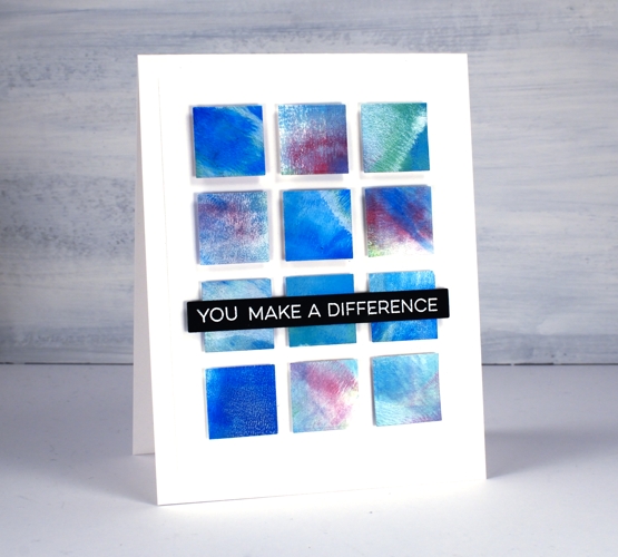
I have been waiting for some time to get the gel press out again and it has finally happened. A gel press session needs a decent amount of time and space otherwise I barely remember what to do before I have to pack up again. I find when I am working with the gel press my first prints or ‘pulls’ are very uninteresting as I get back into the process and build up some interesting colour and texture on the gel plate. That was definitely the case yesterday when I got started. The squares above did not come from a gel print. I cut them all from the cardstock off to the side where I was cleaning off my brayer!
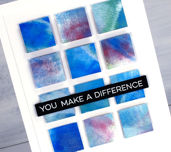
Maybe you can guess from the squares that I was using dark blue, dark green and deep violet acrylic paint. The reason most of the squares look softer and more pastel is because I also used white paint each time I rolled some colour onto the plate. I may not use any of the gel prints I made yesterday but the scrap sheet for cleaning my brayer was perfect for making a card inspired by ‘Dear Paperlicious’. I am often inspired by Joan; I’m sure you will be too if you take a look at her blog or instagram. Her cards are clever and cool, just like her!
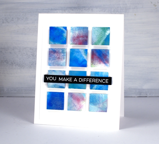
I cut all my squares using one of the dies from the Waffle Flower color combos die set then popped them up on craft foam and added a sentiment from MFT. Hopefully you will see some actual gel printing in the days to come but until then don’t discount the usefulness of a pretty piece of scrap paper!
Don’t forget to check out my new online class about cards, colour and making pretty things!
Supplies
Foiling without heat
Posted: August 10, 2020 Filed under: balloons!, Brutus Monroe, Catherine Pooler inks, Penny Black, silver sketch deco foil | Tags: Brutus Monroe, Catherine Pooler inks, Foiling, Penny Black creative dies, sizzix embossing folder 4 Comments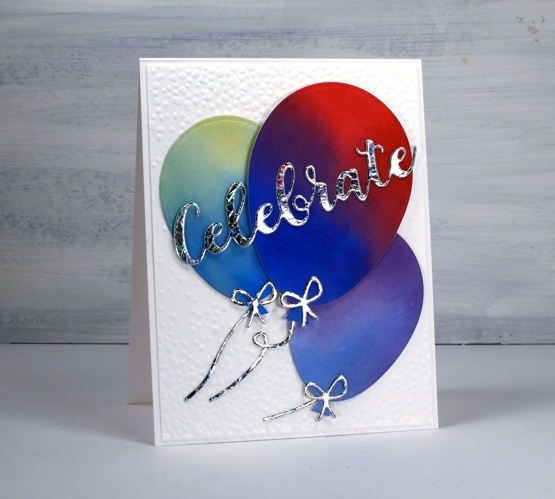
I’m celebrating the opening of my online class today. All the lessons and projects are now available so if you haven’t heard click here to see what it’s all about.
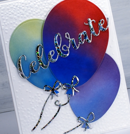
What’s a celebration without balloons and shiny things? I know you don’t see too much sparkle and shine around here but I was intrigued to see how this Brutus Monroe deco foil would look with some watercoloured balloons.
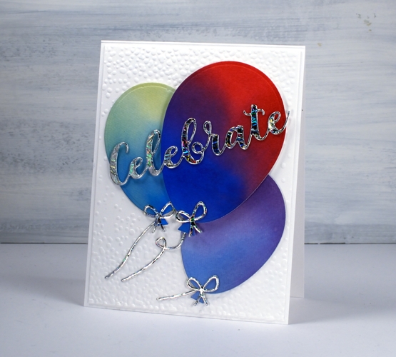
Once I had created a foiled sentiment and some bows I flipped the arrangement and paired foiled balloons with a blended sentiment. As you can see in the photos below I allowed some of the foil to be over exposed in the photo so you could see how it pretty the pattern is as it picks up the light.
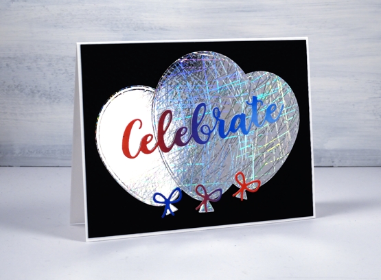
I did my foiling without heat by attaching double sided adhesive (stick-it) to cardstock then removing the backing so I could lay the ‘silver sketch’ transfer foil’ directly on the adhesive. I pressed it down with my fingers carefully to avoid air bubbles then die cut the balloons, strings and sentiment from the foiled cardstock. Once cut I removed the foil top layer to reveal beautifully foiled die cuts. Rather than attaching the balloons to plain black or white card stock I ran the panels through my die cutter inside the ‘snowfall/speckles embossing folder, then flipped the panel around to emboss speckles on both ends.
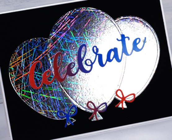
You can see all that pretty reflective pattern on the foil even better in this close up. Thank you Foiled Fox for sending pretty shiny things my way!
Supplies
Hydrangeas
Posted: August 7, 2020 Filed under: Arteza, hydrangea, it's your birthday, Papertrey Inks, Penny Black, Studio Katia, watercolour real brush pens | Tags: Arteza, Papertrey ink, Penny Black creative dies, Penny Black stamps, real brush pens, Studio Katia 10 Comments
When I tried a bit of hydrangea painting the other day it got me thinking about hydrangea stamps and I’m not sure if I have ever inked this PB one before. As you know I tend to go for the blues and purples (like my mother before me) but I decided to go more for the pinky red you can find in some hydrangeas. As you can see I didn’t end up with pinky red; I have orangy red which I have never seen on a hydrangea! My mother always wanted her hydrangeas to be blue, purple or pink so she and my dad added something to the soil to make that happen.
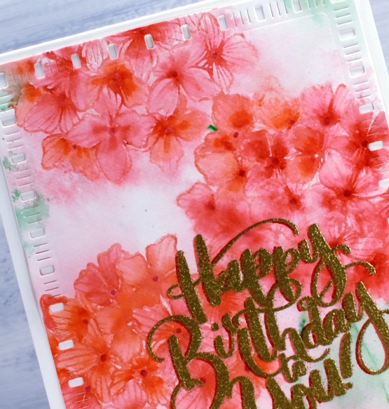
Before I began stamping I scribbled rouge pink and punch pink Arteza real brush pens on my glass mat, spritzed it with water then swiped my hot pressed watercolour panel through it. I dried the panel before beginning the stamping. In the stamp positioner I inked the hydrangea first with Papertrey ‘pale peony’ ink then dabbed the arteza pens on the stamp as well to get a variegated print. I spritzed then stamped and repeated the process to get three hydrangeas. To colour inside the petals I used three arteza pens (rouge pink, punch pink, apricot) to dab a little colour then blended to fill the petals with a paintbrush and water.
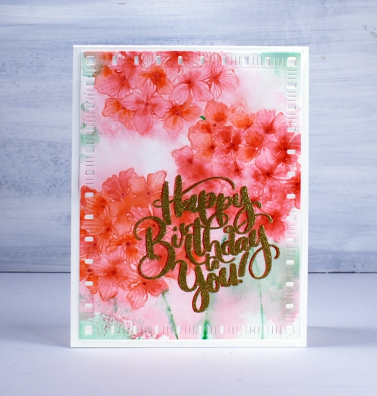
I decided to try a fancy drop shadow greeting and it kind of worked; don’t look too closely. I stamped first in versafine clair tulip red, dried that, powdered it with the anti-static-thingy, dried it again and powdered it again and then moved the panel ever so slightly left before stamping with versamark and embossing with gold. Despite all my efforts gold powder still stuck to the supposedly dry tulip red ink. As a fix I used a red marker to make the shadow to the left a little more prominent. Then in another fit of fanciness I cut the panel with a dainty dashes die. I don’t know what came over me! Maybe it’s because it’s Friday or maybe it’s because I am getting increasingly excited about opening my online class on Monday.

Thank you to all of you who have signed up already; I am thrilled by the response so far. If you don’t know what I am talking about pop over here and find out!
Supplies
Colour Clues – online class
Posted: August 5, 2020 Filed under: Classes, online class | Tags: colour clues, online class 4 CommentsI am pretty much beside myself with excitement and nerves as I tell you about my new online class COLOUR CLUES! I have wanted to create an online class for years and it has finally happened. My son Ben and I have been working on this for a few months and it’s finally time to share it with you.
In the class I focus on how we choose and use colours in our card making projects. We’ll do plenty of experimenting with blending, diluting and placing colours in combinations that will really catch the eye. We use stamps and dies to create backgrounds and foreground images on ten different cards.
I use a range of my favourite techniques throughout the class working with dye inks, watercolour paints and oxide inks. There are three complete lessons and each features three or four projects with additional suggestions and photos for further inspiration and experimentation.
Click here to find out more and register
There will be prizes and surprises so register early to be in the running!
Nature’s glory background
Posted: August 3, 2020 Filed under: nature's glory, Papertrey Inks, Penny Black, Triple Banner | Tags: Fabriano Watercolour Paper, Papertrey ink, Penny Black stamps 3 Comments
The nature’s glory stamp from Penny Black is a current fave of mine so I decided to try it with a different colour scheme. (previous cards here and here)
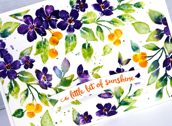
I worked on hot pressed watercolour paper with papertrey ink cubes then distress markers for some smaller details. The spray of flowers has a curve to it so I was able to move it around and stamp it four times in order to fill the 4¼” x 6″ panel.
I used a Papertrey ink royal velvet ink cube to ink the flowers and wiped any stray purple ink off the stamp before inking the leaves with green parakeet and the berries with bright buttercup. I spritzed the stamp before stamping so the inks would move a little. Before stamping again I added spiced marmalade distress ink to the berries and pine needles distress ink to the leaves with markers, gave the stamp another light spritz and stamped again.
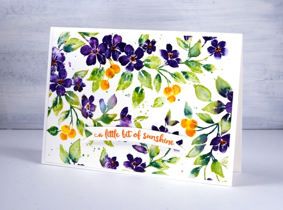
I switched to a paintbrush to blend some of the leaves, berries and petals. When the ink dried I used the spiced marmalade marker again to add orange centres to the purple flowers.
I stamped a sentiment from PB ‘happy snippets’ on a banner die cut and popped it up over the panel. Oh and I splattered too…you probably noticed that.
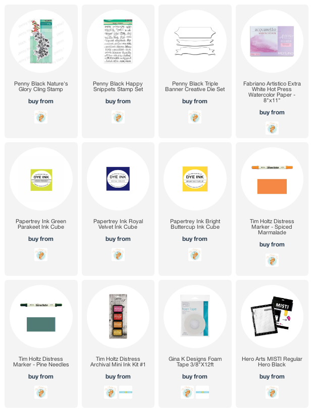
Supplies
Painting atmosphere
Posted: July 29, 2020 Filed under: Brusho, Coliro paints, Darkroom Door, Finetec paints, Hand painted, Leaves, tall flowers, Wings | Tags: Brusho, Darkroom Door stamps, Faber-Castell Albrecht Durer Watercolour pencils, Fabriano Watercolour Paper, Hand painted 27 Comments
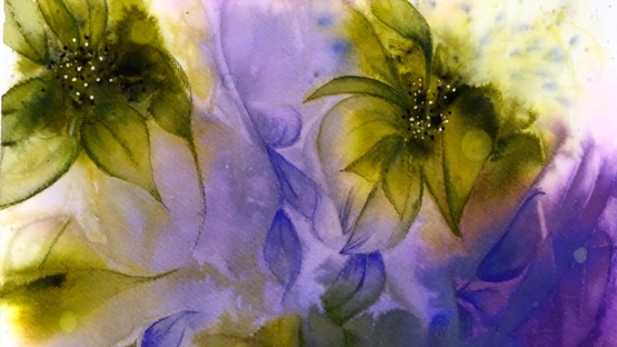
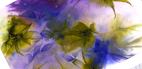
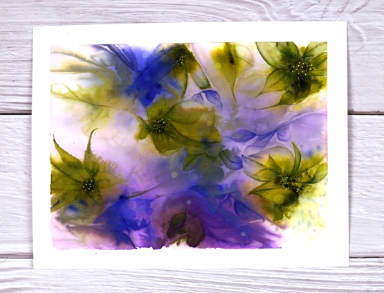
I’ve done some more playing with watercolours and clingwrap. Quite a lot of playing actually; it’s addictive. I don’t even remember if the panel above was painted initially with brusho powders or pan watercolours or both. I do know I started with a large piece of cold pressed watercolour paper taped to a glass mat. I wet the panel then added the paint and let it move around and blend a little before I placed the cling wrap on top. I did remember to take a photo of the panel after it had dried and I’d removed the cling wrap. The card above which looks a bit like some hydrangea flowers was painted on the bottom right corner below.
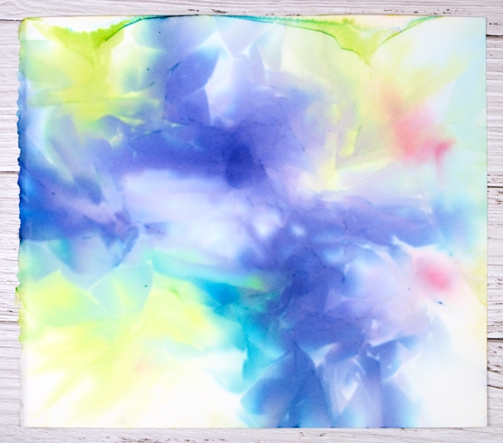
The butterfly card below was made from the top left corner of the large panel and the flower card was made from the top right corner. I did work on the bottom left corner but didn’t end up liking what I’d made.


For the butterfly card I used a stamp from Darkroom Door ‘wings’ set and stamped it on the panel in blueprint sketch distress ink. After stamping I blended the ink plus some pearlescent paint from a finetec palette to fill the butterfly’s wings. It’s not obvious in the photo but the wings shimmer.
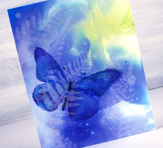
Once the butterfly was dry I did some water stamping using a fern stamp from the DD ‘leaves ‘ set.

The flowers are from the DD ‘tall flowers’ set and were stamped in festive berries, mowed lawn and wild honey distress inks. I also added gold paint to the flower centre. You can see some more water stamped ferns and some second generation stamping with the flowers also. The little circles on all three cards were made just by adding some droplets of water, letting them sit on the panel then dabbing them up with a paper towel.
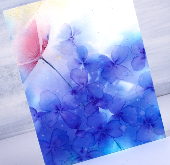
The card above with the purple flowers doesn’t feature any stamping, the patterns made by the cling wrap made me think of a hydrangea flower head so I painted a bunch of little flowers using a purple watercolour pencil to draw centres then a paintbrush and water to blend the pencil into petals. While the petals were still wet I used the pencil again to add some darker areas in the centres.
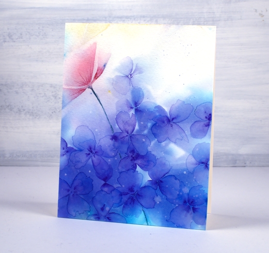
The red shape on the left hand side looked a bit like a flower so again I used a watercolour pencil to add a bit more colour and followed the lines left by the cling wrap.
Whether painting or stamping over the panel, I love the patterns and play of light and dark in the background; I think it creates atmosphere. Have I finished with this technique now I hear you ask? No, definitely not. Have you tried it?
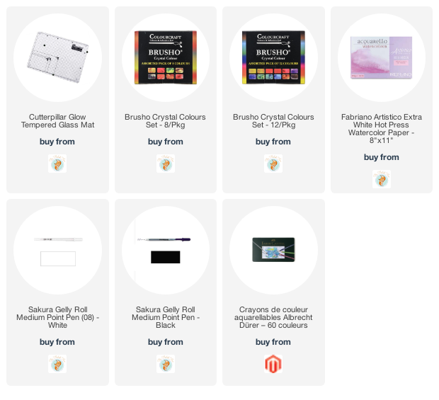
Supplies
Refreshing winners
Posted: July 24, 2020 Filed under: Catherine Pooler inks, Penny Black, Script, soulful silhouettes | Tags: Catherine Pooler inks, Penny Black stamps 6 Comments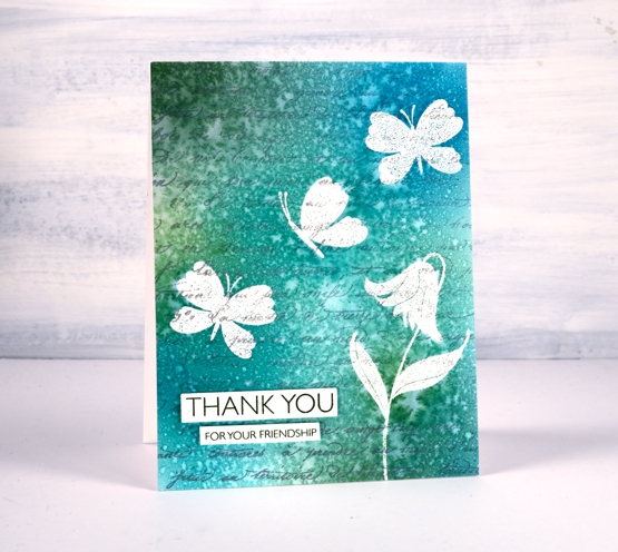
I want to thank everyone who participated in the ‘Refreshing’ giveaway I hosted with the Foiled Fox. I enjoyed reading your preferred ways to find refreshment and noticed many of you head to your garden during the cooler parts of the day, sit by the water if you have some nearby, or on your porch or patio. Some find doing something creative refreshing and there were quite a few mentions of drinks and good books. I would love to be sitting by the water these days but as that is not possible right now I am doing many of the things you are. Thanks so much for sharing those snapshots of your life. Without further ado, I would like to congratulate Martha and Kathy.
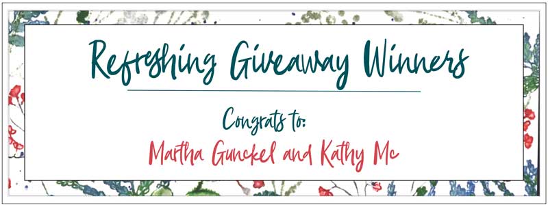
You have won a gift certificate to go shopping at the Foiled Fox online store. I am sure you can find some refreshment there! Shauna from the Foiled Fox will be in touch with more details.
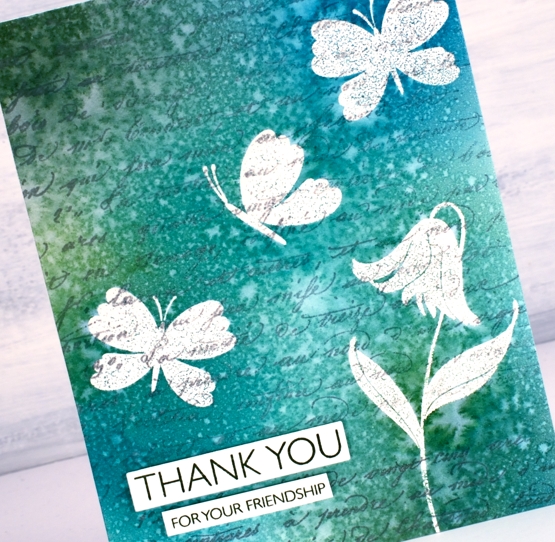
Today’s card features a technique I’m going to call emboss resist masking. It involves embossing in order to resist the application of ink over the top but I wanted the finished project to look as though I masked the butterflies and flowers rather than have shiny raised images at the end. The trick is to iron off the embossing powder once the project is completed.
I know this isn’t a new technique but I was looking at some inspiration pics on pinterest and decided it was a good way to get the effect I wanted.
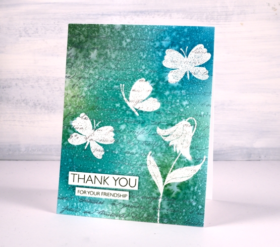
I stamped the PB ‘script’ background stamp in hickory smoke archival ink so the print would not attract embossing powder or be blurred when I added others inks or water. The archival ink is fast drying and permanent.
I used a stamp positioner to stamp a flower and some butterflies from the PB ‘soulful silhouettes’ set in versamark then I embossed in clear powder. To cover the panel with colour I chose four Catherine Pooler inks (listed below) and applied them with blending brushes. I gave the whole panel a couple of spritzes with water which resulted in the lovely pattern you see on the finished card. I didn’t dab it with paper towel or dry it with a heat tool. I was actually patient and let it air dry on the desk because the spritz looked like rain on a window.
Once it was dry I got some scrap paper and lay the panel face down on the scrap paper and ironed it without steam. I changed the scrap paper several times because the embossing powder transfers to the scrap. Eventually there is none left on the original panel. I chose a couple of sentiments from the million thanks set and stamped them in CP spruce ink.
Supplies
Brusho & cling wrap
Posted: July 22, 2020 Filed under: Brusho, Hand painted | Tags: Brusho, Hand painted 18 Comments
Before we talk about the freestyle, abstract floral above I want to direct you to CeeCee, the inspiration for today’s post. Her website is CreationsCeeCee and I’ll link to her youtube further down in this post.
As the title suggests this panel was created with brusho paints and cling wrap plus a few pencils and pens in the second half of the process.
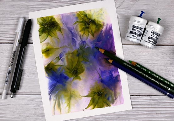
This painting was inspired by a beautiful painting CeeCee Creations did recently. I watched her video which you can see here. She used watercolour paints and cling wrap to create a pattern then used coloured pencils to add shading. I loved her process and end result and have been playing with the technique for the last couple of days.
I taped some watercolour paper to my glass mat, wet the whole panel then scattered brusho over it. I just used two colours of brusho, olive green and violet and I tried to keep them a bit separate. I spritzed the panel lightly to keep the paint moving then lay a piece of cling wrap over the panel and scrunched it over the whole area. The wet paint sticks to the clink wrap creating coloured areas. Where the cling wrap is raised and bunched together there are gaps in the paint. It’s hard to explain but CeeCee’s video gives you the idea. The covered panel takes a long time to dry but once it has you remove the cling wrap to reveal intersecting lines and spaces. I studied my panel and instead of the purple flowers with green leaves I was hoping to see I saw the suggestions of green flowers and purple ‘things’. The idea is to enhance the lines and patterns made by the cling wrap rather than draw whole new patterns. I wish I had taken a photo before I did any colouring that would have given you a better idea.
I used watercolour pencils to turn some of the cling wrap patterns into flowers and shapes and then blended the pencil with water. (CeeCee used polychromos pencils so my shading ended up looking slightly different to hers.) I used a purple and two green Albrecht Dürer watercolour pencils then once my shading and shaping was done I highlighted the centres of the green ‘flowers’ with white and black gel pens.
I’m not sure which way is up so I’ve posted photos of both a portrait and a landscape orientation. What do you think? Does it matter?
Supplies
Stencils and oxides
Posted: July 20, 2020 Filed under: Designs by Ryn | Tags: Concord & 9th, Designs by Ryn, distress oxide inks 6 Comments
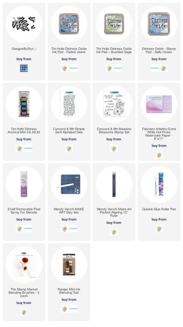
This is the first time I’ve used this beautiful stencil. I ordered it from a Canadian artist, Designs by Ryn. I love how delicate the maidenhair fern design is.
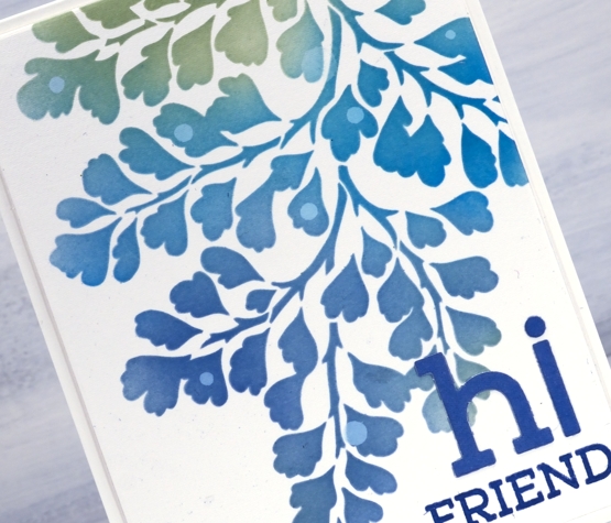
It was also the first time I have used pixie spray which is designed to keep stencils from moving on your paper while you apply ink or another medium. I followed the instructions on the spray bottle and then blended through the stencil onto hot pressed watercolour paper with oxide inks. It worked brilliantly. I used Ranger blending tools for this card but switched to blending brushes for the next card.
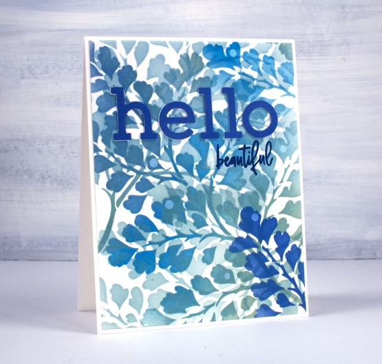
For both cards I used salty ocean, bundled sage and faded jeans distress oxide inks. When blending on the panel above I moved the stencil several times and the adhesive from the pixie spray continued to hold it. I didn’t clean the brush between colours which gave me a range of teal tones as I moved from bundled sage to the blue inks. This one might look a bit messy but I love all the layering of pattern and colour.
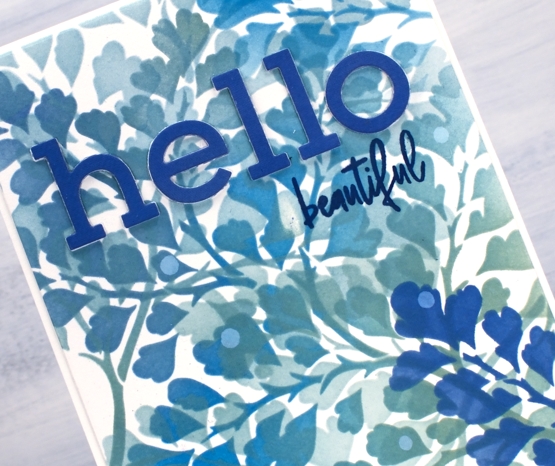
I blended faded jeans oxide ink on a piece of watercolour paper so I could cut letters from an exact match of blue then popped up the ones above on a layer of white letters. The letters are die cut with C&9 ‘simple serif alphabet dies’ and the words are from the C&9 set ‘meadow blossoms’. The little circles are watermarks made by adding a drop of water, leaving it for a minute then dabbing it up with a paper towel.
I also tried a journal page using similar techniques but took it a step too far! I will try again though, because the potential was there for a pretty spread. I made one more panel while I had the oxides and stencil out but I have another plan in mind for that one.
Supplies
Ferns & friendship
Posted: July 17, 2020 Filed under: Brusho, Butterflies, Darkroom Door, gelli plate, global postmarks, Leaves, mesh | Tags: Brusho, Darkroom Door stamps, gel printing 4 Comments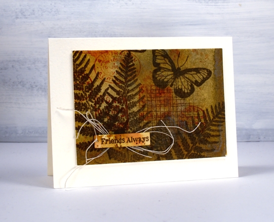
It is a long time since I had my gel plate out for monoprinting; I’m definitely keen, but for the last few months my time has been taken up by an exciting new project I’ll be sharing with you soon. I decided to go through prints from previous gel print adventures to make a few cards with Darkroom Door stamps.
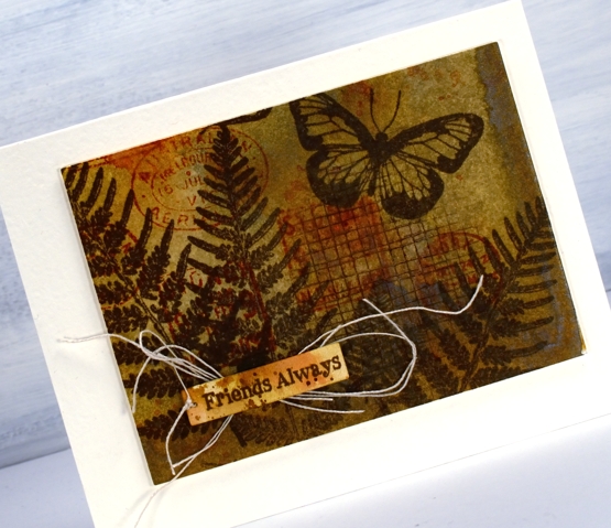
Most often I use acrylic paints on my gel plate but to make this natural coloured background I used water colour powders. I can’t remember which paint colours I used, possibly only one like sandstone which can give a range of browny orange tones. To turn the monoprints into cards I used stamps from DD sets ‘leaves’, ‘butterflies’ and ‘global postmarks’. I also used the small ‘mesh’ texture stamp.
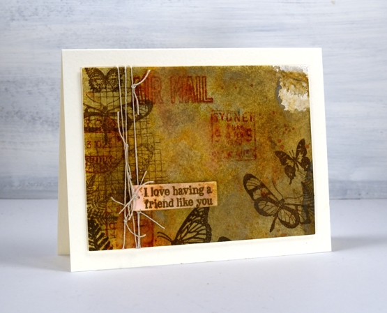
I stamped in ‘vintage sepia’ versafine ink, brushed corduroy and rusty hinge distress inks. Initially I stamped the sentiments from the ‘friendship’ sentiment strips on watercolour paper scraps but they looked too stark and clean so I splattered and swiped some ink on them so they blended into the background a bit more.
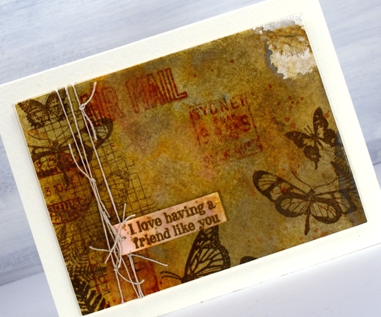
I also added some linen thread which worked with the natural tones and the postal images. I popped up the panels with a couple of cardstock layers on white luxe textured card bases.
Supplies