No-line watercolour Magnolias -video
Posted: September 2, 2020 Filed under: Inktense pencils, magnolia blossoms, My Favorite Things, Tutorial | Tags: Gina K inks, Inktense, My Favorite Things, Tsukineko Versafine inks 11 Comments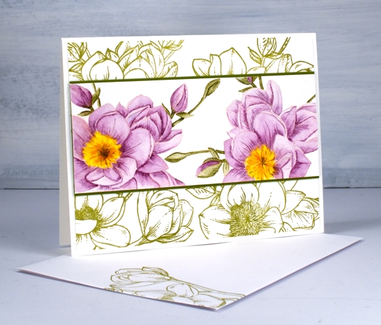
This is a card which changed shape and style several times before it turned into the design you see above. The watercoloured flowers and the green stamped flowers are from the same MFT ‘magnolia blossoms’ set.
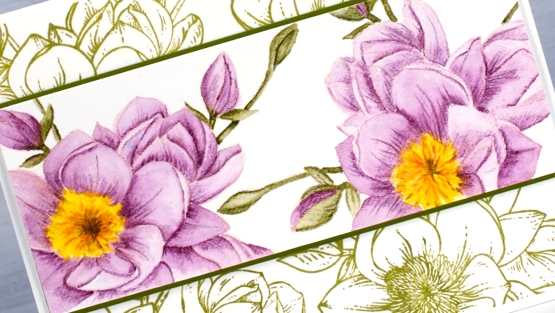
I almost didn’t keep making the video as I made mistakes and alterations but the point of the video was the no-line colouring not the card layout so I kept going. I used Gina K’s ‘barely there’ amalgam ink to stamp the flowers; the ink is a pale peach colour which almost disappeared with both the purple and the green watercolouring. I used Derwent Inktense pencils for the no-line watercolour shading an area lightly and minimally before blending the ink to fill the petal or leaf.
My initial layout for the painted panel involved both stamps from the set but you see in the video a series of unfortunate events caused me to slice up the first panel, add another flower and come up with the layout you see below.
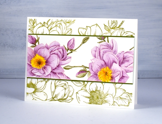
One thing I didn’t initially plan was the simple green stamping behind the coloured panel but I’m glad I tried it. These stamps are definitely stunning when left uncoloured in their simple outline beauty.
Supplies
Double Embossed
Posted: August 31, 2020 Filed under: Background Stamps, Brutus Monroe, dotted fusion, Penny Black | Tags: brutus monroe embossing powder, Penny Black stamps 8 Comments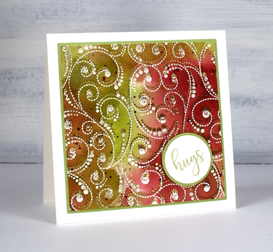
At the risk of losing you I have to begin this post by directing you to the beautiful inspiration for this card. Just pop over to the wonderful blog of Anna-Karin Evalddson to see her double embossing. There is so much texture in her card. When I first saw it I was sure it was heat embossed and then dry embossed because the surface looked so 3D. Anna-Karin did a video of her process, which I watched then immediately went and made the card above. I often see cards which inspire me and I save or tag or pin them for another time; rarely do I immediately act on the inspiration.
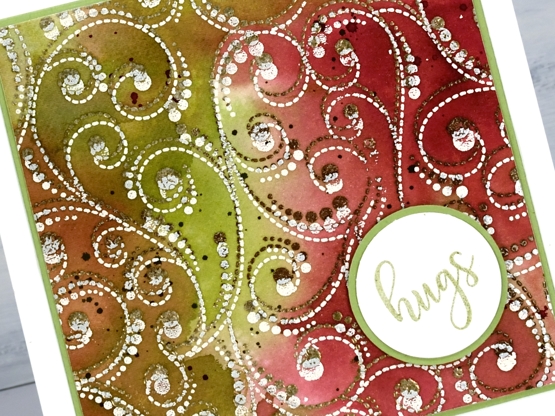
I didn’t achieve the 3D effect that Anna-Karin did but I like the play of double embossing and the unusual combination of colours and embossing powders. I worked on hot pressed watercolour paper, embossing the ‘dotted fusion’ stamp from PB first in a mix of ‘sandcastle’ & ‘potting soil’. (supplies linked below). I moved the panel a little to one side then embossed again in a cream embossing powder.
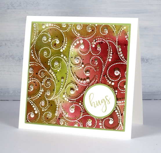
To colour the panel I pulled out my distress stains, not the sprays, (but they would work) the daubers. I hardly ever reach for them now as they are no longer available so I don’t want to taunt you with something you can’t have. I still really like the daubers for applying a strong liquid ink in a confined space. In this case I dabbed them on the glass mat, spritzed some water and swiped the embossed panel through the colours (aged mahogany, peeled paint and old paper). Anna-Karin just used distress inkpads and her results were amazing.
To keep with the circle/dotty theme I stamped a word from PB ‘huggable’ set on a circle, matted on a circle and put the card together. Oh and there is splatter too, no surprises there.
that’s a booster colour scheme btw, if you do my online class you will hear about that! 😉
Supplies
Gel Print Leaves video
Posted: August 28, 2020 Filed under: Darkroom Door, gel press, gelli plate, Nature Walk | Tags: Darkroom Door stamps, gel printing, Wendy Vecchi 18 Comments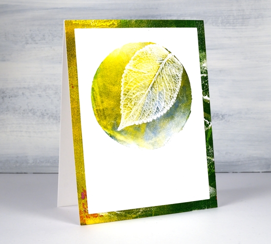
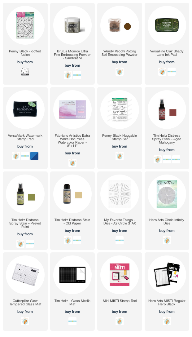
Last week I posted a card featuring gel printed leaves from herbs I grew. I tried to explain my process but a few of you wished for a video so I picked some more leaves and had some fun printing them.
I used two different methods in the video, the leaf printed in yellow at the top of the page uses a two step method. The blue + green leaf above uses three steps and has one technique layered over the other technique.
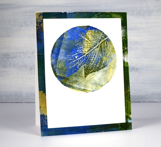
I think the part of gel printing that gives me most inconsistent results is the way I apply ink. I’m getting better but I still get unwanted lines from the edge of the brayer. That wasn’t so evident on these prints as I was working on little gel plates called ‘petites’ from Gel Press.
I did a bunch of prints for this video on the square and the circle ‘petite’ plates as shown on the top cards. For the ‘slimline’ card I used three of the square prints but die-cut them smaller so I could fit them side by side on a 8¾” x 3¾” card.
I hope you give this a try, it’s quite satisfying and addicting once you get going!

….And did I mention I now have an online class called COLOUR CLUES?…
Supplies
Magnolia Blossoms
Posted: August 26, 2020 Filed under: magnolia blossoms, My Favorite Things | Tags: Dr Ph Martin Hydrus watercolor paints, Fabriano Watercolour Paper, My Favorite Things, Tsukineko Versafine inks 6 Comments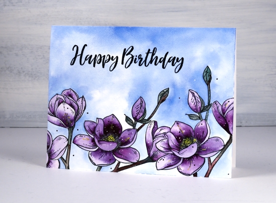
I have teamed up with the Foiled Fox again to bring you these pretty purple blooms made with My Favorite Things, ‘magnolia blossoms’ stamp set. The set contains two stamps; I have used one, stamped three times. To hide one bloom behind another I stamped a mask first on masking paper. I worked on hot pressed watercolour paper, stamped in versafine clair nocturne and embossed in clear powder.
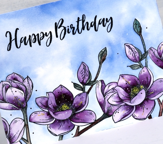
I painted both the sky and the flowers with Dr Ph Martin’s Hydrus watercolour paints. They are highly pigmented so I added a droplet of each colour to a palette then added water. I describe the whole process on the Foiled Fox blog today so pop over there to learn more and take a look around.
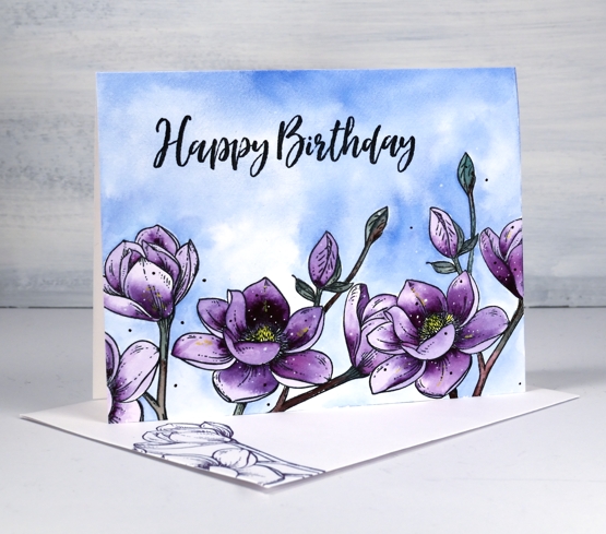
The sentiment is also from a MFT set, ‘brushstroke expressions’ stamped in nocturne and embossed in clear for a little shine. See that little pop of yellow in the centre of the blooms, it’s what I call a booster in my new ‘Colour Clues’ class. If you want to know more, click here.
Supplies
Ink and doodle journal page
Posted: August 25, 2020 Filed under: Art Journal, Correspondence, Darkroom Door, Feathers, mesh, starry night 12 Comments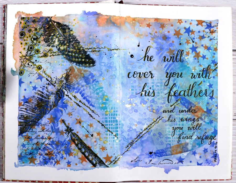
I’ve had oxide inks out on my desk the last few days so I put them to use on a journal page.
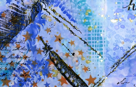
I taped the edges of the pages with painter’s tape which gave me a border and held the pages flattish while I worked and painted the page area inside the tape with absorbent ground so I could add water to the inks and move them around a little.
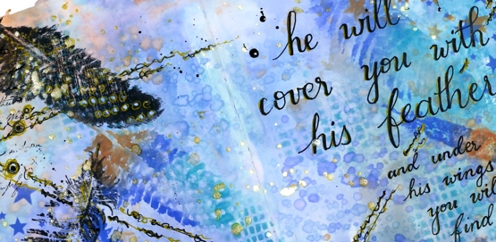
Because the journal pages do not lie flat any more I was only able to pick up sections of ink from my glass mat. To get more coverage I squished ink on a piece of acetate, spritzed it and dragged it across the pages spreading ink as I went.
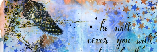
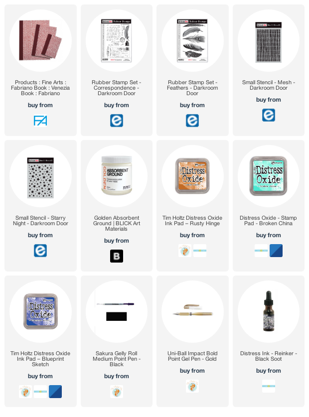
I added visual texture with two stencils from Darkroom Door then stamped feathers from the DD ‘feathers’ stamp set in black and then in the oxide inks. When it came to doodling on the page I used black and gold gel pens and wrote the verse with the same pens. I finished it off with gold and black splatters then removed the tapes to reveal an uneven but quite artistic border.
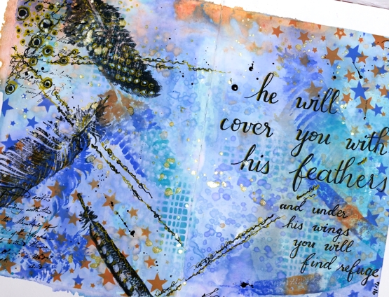
This was an unplanned experimental page as many of my pages are. I was inspired mainly by what was on my desk and a desire to doodle some of the design and not just stamp.
I am rather frustrated by the paper in this journal. It is good paper but not made to handle wet media so I am limited in creating the kind of blends and wet into wet designs I love to do. The question is do I persevere and learn some new techniques that don’t rely so much on watercolour (gasp) or do I buy a good watercolour journal?
Supplies
Loosely Lined Flower background
Posted: August 20, 2020 Filed under: Brutus Monroe, Color Burst, loosely lined floral background, My Favorite Things, Taylored Expressions | Tags: brutus monroe embossing powder, My Favorite Things 7 Comments
These loosely lined flowers cover a large background stamp, new from My Favorite Things. I chose three colorburst powders and kept the painting loose and funky as well!
After embossing the large stamp on hot pressed watercolour paper in white I sprinkled cerulean blue, lemon yellow and terre verte powder sparingly on the panel. I tried to be a little strategic in my placement of the colours, as much as you can with something as unpredictable and airborne as a paint powder! I sprinkled blue in the half flowers, green and blue in the full flowers and yellow in the spaces. ‘Really?’, I hear you say! I know colorburst powders don’t always stay in their lanes but I was happy with all the pretty blends and patterns anyway.
There are some little anthers coming out of a few flowers which I coloured with a gold gel pen. I used three sentiments from another MFT set, ‘all about you’, embossed in white on black then popped them up down the side of my panel. You’ll be seeing more of this pretty stamp; it’s a fun one! Thank you Foiled Fox for sending it my way.
Join my online class COLOUR CLUES to create beautiful eye-catching cards!
Supplies
 End –>
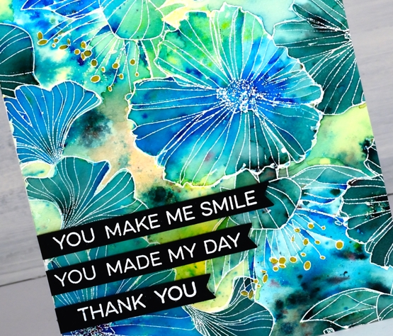
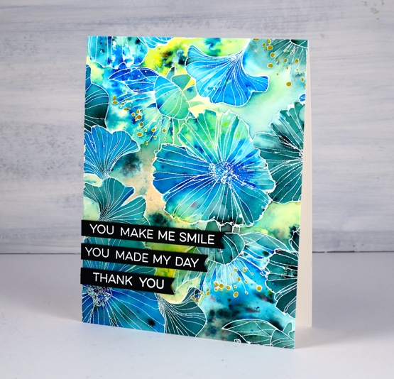
Parsley, sage & mint
Posted: August 18, 2020 Filed under: Brutus Monroe, gel press, Penny Black | Tags: brutus monroe embossing powder, gel printing, Penny Black stamps 16 Comments
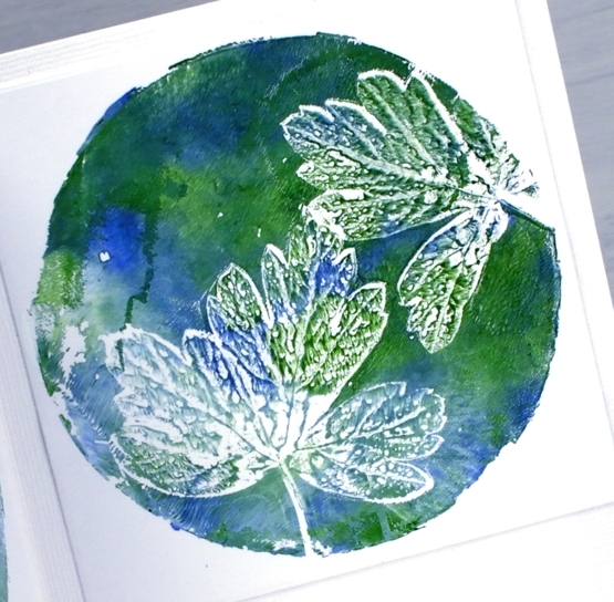
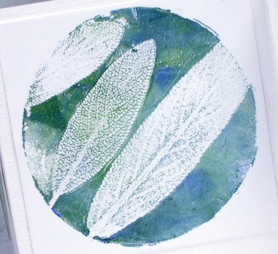
As I hoped I fitted in some gel printing the other day. I picked leaves from my garden and experimented to see which would give me a good print. It also took me some trial and error to get the amount of paint right too.
I brayered titanium white, ultamarine blue and hooker’s green onto my circle gel plate then lay down the back of the leaf on the paint. I lay white cardstock over the top and taped one edge of the cardstock to my table before lifting it to see the print. Without untaping the cardstock I removed the leaves and lay the cardstock back down to take another print, that which was left by the leaf.
I know some extra visuals, even a video might be more helpful than a description so I am working towards that goal. Gel printing can be rather hit and miss for me so I haven’t done any filming yet.
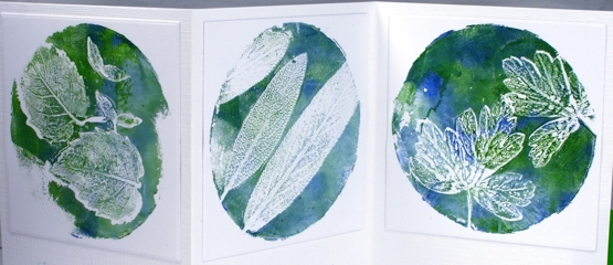
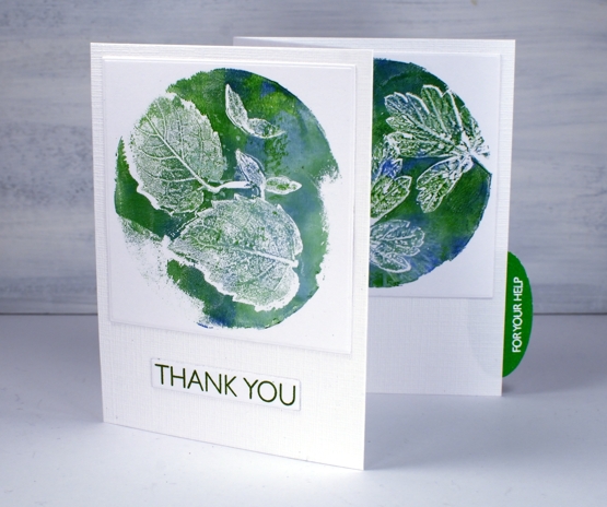
I decided to use all three prints on the one card so cut a piece of snowbound textured cardstock 10⅞ ” x 4¾” and scored it at 3⅝” and 7¼”. I die cut each print using a 3¼” square die and attached them directly to the textured card base. I stamped ‘Thank you’ from PB ‘million thanks’ set on white in peeled paint archival ink then embossed ‘for your help’ from the same set in white on green then cut it out with an oval punch to make a tab on the side of the card.
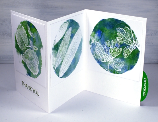
This card is for my daughter who has put hours or work and loads of enthusiasm into our garden this year. It’s looking good and we have high hopes for the tomatoes, brussel sprouts and cantaloupes still growing!
Join my online class COLOUR CLUES to create card sized works of art!
Supplies
Old gel print, new card
Posted: August 14, 2020 Filed under: carved flowers, Darkroom Door, gel press, majestic mountains | Tags: Darkroom Door stamps, gel printing 4 Comments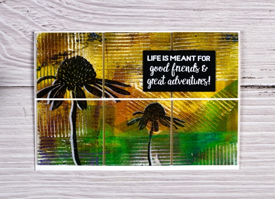
I am getting closer to doing some satisfying gel printing but this card was made from a previous gel printing session. You can probably tell the texture on this panel was from a piece of corrugated cardboard. So simple and effective.
There is definitely some leftover paint printed on this panel. Leftovers are a feature of gel printing I really like. I usually print and print without cleaning the plate so the leftovers, often on edges or corners appear in subsequent prints.
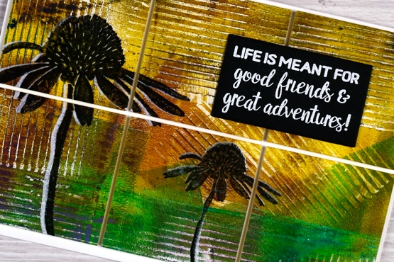
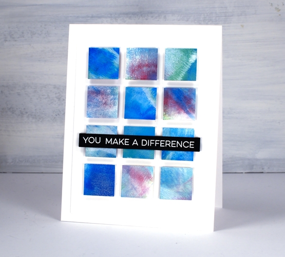
I stamped the large and small cone flowers from the Darkroom Door ‘carved flowers’ set first in white ink then offset in black before embossing in clear powder. White ink is very sticky so when I stamped on top of it the stamp lifted some of the white ink off. It was necessary to wipe the stamp each time and restamp in black to build up a solid black layer. After embossing I used the large six square grid die from Waffle Flower’s color combo set to cut my panel into squares. I popped them up on foam on a 6″x4.25″ card base.
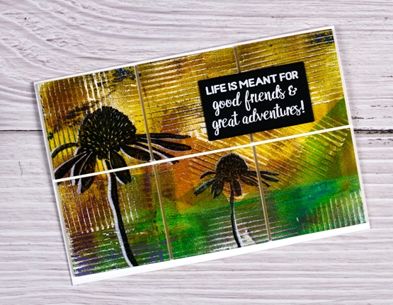
The sentiment is the DD ‘majestic mountains’ set and reminds me that not all adventures have to be in person or in the outdoors right now, although I am missing that. I am enjoying the adventure of creating with new and old friends through my online class. (yes maybe this is another shameless plug, but it’s true!) As I see what class members are creating I am inspired and encouraged to be ‘in class’ with friends even while I can’t be in class in person.
And I am sure new gel printing is imminent; I want to print fresh leaves and maybe petals from my garden so stay tuned.
Supplies
Almost a gel press card
Posted: August 12, 2020 Filed under: gel press, My Favorite Things, simple sentiments | Tags: gel printing, My Favorite Things, Waffle Flower dies 10 Comments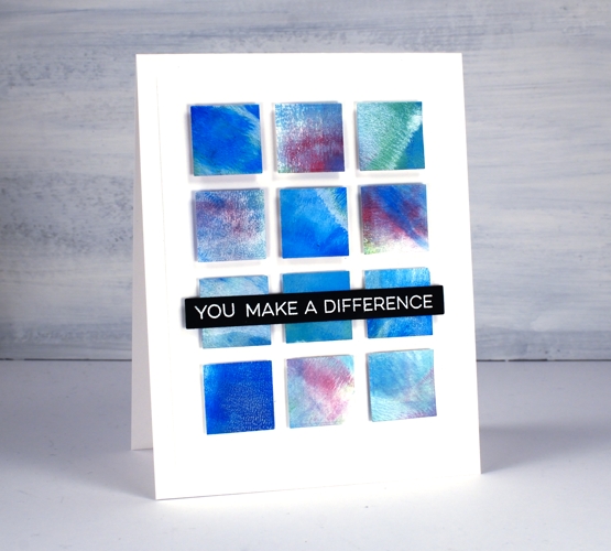
I have been waiting for some time to get the gel press out again and it has finally happened. A gel press session needs a decent amount of time and space otherwise I barely remember what to do before I have to pack up again. I find when I am working with the gel press my first prints or ‘pulls’ are very uninteresting as I get back into the process and build up some interesting colour and texture on the gel plate. That was definitely the case yesterday when I got started. The squares above did not come from a gel print. I cut them all from the cardstock off to the side where I was cleaning off my brayer!
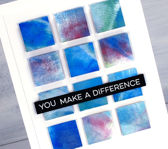
Maybe you can guess from the squares that I was using dark blue, dark green and deep violet acrylic paint. The reason most of the squares look softer and more pastel is because I also used white paint each time I rolled some colour onto the plate. I may not use any of the gel prints I made yesterday but the scrap sheet for cleaning my brayer was perfect for making a card inspired by ‘Dear Paperlicious’. I am often inspired by Joan; I’m sure you will be too if you take a look at her blog or instagram. Her cards are clever and cool, just like her!
I cut all my squares using one of the dies from the Waffle Flower color combos die set then popped them up on craft foam and added a sentiment from MFT. Hopefully you will see some actual gel printing in the days to come but until then don’t discount the usefulness of a pretty piece of scrap paper!
Don’t forget to check out my new online class about cards, colour and making pretty things!
Supplies
Foiling without heat
Posted: August 10, 2020 Filed under: balloons!, Brutus Monroe, Catherine Pooler inks, Penny Black, silver sketch deco foil | Tags: Brutus Monroe, Catherine Pooler inks, Foiling, Penny Black creative dies, sizzix embossing folder 4 Comments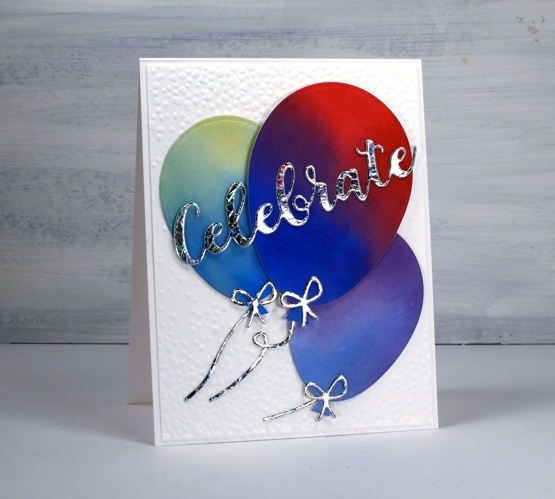
I’m celebrating the opening of my online class today. All the lessons and projects are now available so if you haven’t heard click here to see what it’s all about.
What’s a celebration without balloons and shiny things? I know you don’t see too much sparkle and shine around here but I was intrigued to see how this Brutus Monroe deco foil would look with some watercoloured balloons.
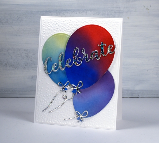
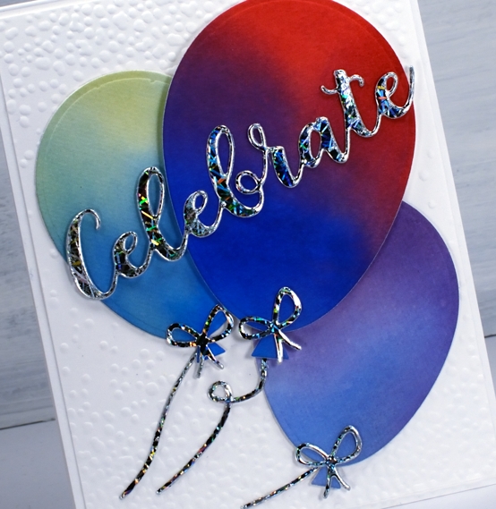
Once I had created a foiled sentiment and some bows I flipped the arrangement and paired foiled balloons with a blended sentiment. As you can see in the photos below I allowed some of the foil to be over exposed in the photo so you could see how it pretty the pattern is as it picks up the light.
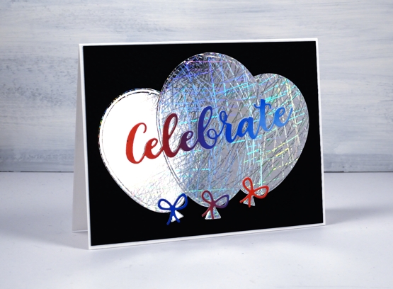
I did my foiling without heat by attaching double sided adhesive (stick-it) to cardstock then removing the backing so I could lay the ‘silver sketch’ transfer foil’ directly on the adhesive. I pressed it down with my fingers carefully to avoid air bubbles then die cut the balloons, strings and sentiment from the foiled cardstock. Once cut I removed the foil top layer to reveal beautifully foiled die cuts. Rather than attaching the balloons to plain black or white card stock I ran the panels through my die cutter inside the ‘snowfall/speckles embossing folder, then flipped the panel around to emboss speckles on both ends.
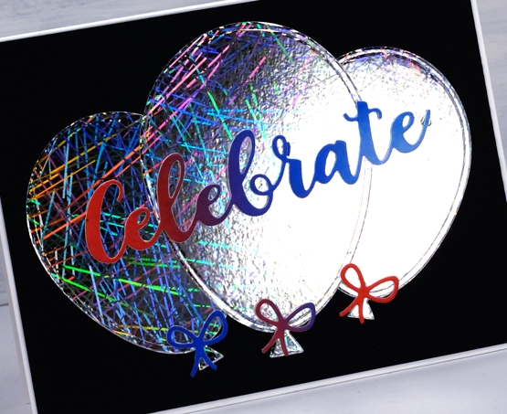
You can see all that pretty reflective pattern on the foil even better in this close up. Thank you Foiled Fox for sending pretty shiny things my way!
Supplies