
Almost a gel press card
Posted: August 12, 2020 Filed under: gel press, My Favorite Things, simple sentiments | Tags: gel printing, My Favorite Things, Waffle Flower dies 10 Comments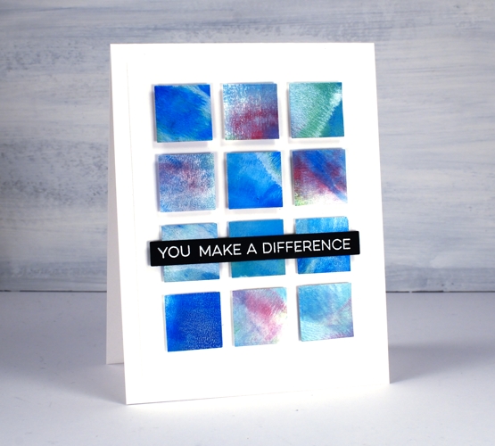
I have been waiting for some time to get the gel press out again and it has finally happened. A gel press session needs a decent amount of time and space otherwise I barely remember what to do before I have to pack up again. I find when I am working with the gel press my first prints or ‘pulls’ are very uninteresting as I get back into the process and build up some interesting colour and texture on the gel plate. That was definitely the case yesterday when I got started. The squares above did not come from a gel print. I cut them all from the cardstock off to the side where I was cleaning off my brayer!
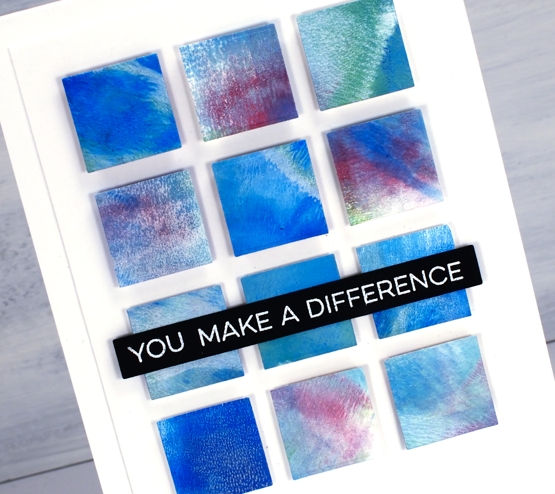
Maybe you can guess from the squares that I was using dark blue, dark green and deep violet acrylic paint. The reason most of the squares look softer and more pastel is because I also used white paint each time I rolled some colour onto the plate. I may not use any of the gel prints I made yesterday but the scrap sheet for cleaning my brayer was perfect for making a card inspired by ‘Dear Paperlicious’. I am often inspired by Joan; I’m sure you will be too if you take a look at her blog or instagram. Her cards are clever and cool, just like her!
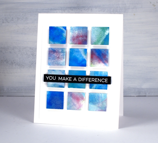
I cut all my squares using one of the dies from the Waffle Flower color combos die set then popped them up on craft foam and added a sentiment from MFT. Hopefully you will see some actual gel printing in the days to come but until then don’t discount the usefulness of a pretty piece of scrap paper!
Don’t forget to check out my new online class about cards, colour and making pretty things!
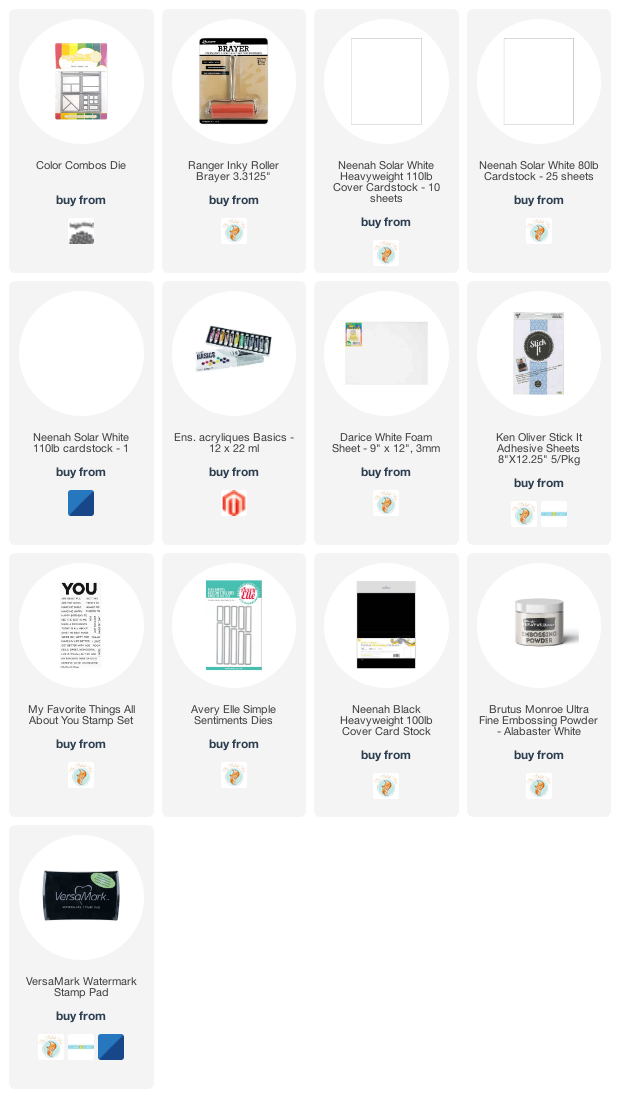
Supplies


Beautiful!
There is beauty everywhere in art!
Your card is a beauty ! Good that you kept your scrap paper !
Thank you for the inspiration.
I’m just so impressed how you lined up all those little squares so evenly!! Fun card …and love the back story too…
This is a beautiful and interesting card with the squares in lovely strong complementary colours Heather and a great sentiment in white on black which works well going right the way across the squares. It just goes to show you should never throw anything away. x
Clever you, to see the possibilities in the brayer rub-offs! I love it! Here’s to happy accidents, and recognizing beauty and usefulness in unexpected places. :–)
Beautiful! Having the space between the squares makes it so fresh.
Creative as usual. Brayering makes such interesting patterns when cleaned. Usually, I use a paper towel, but now this gives a whole new look on using it.
Never thought about this die either. Had no idea it even existed. See….all the goodies that we learn from you!!
tish
Very pretty! Love the soft blends!
thanks for being open about gel printing — the card looks great