
Loosely Lined Flower background
Posted: August 20, 2020 Filed under: Brutus Monroe, Color Burst, loosely lined floral background, My Favorite Things, Taylored Expressions | Tags: brutus monroe embossing powder, My Favorite Things 7 Comments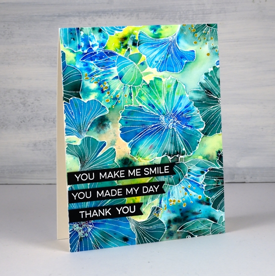
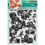
These loosely lined flowers cover a large background stamp, new from My Favorite Things. I chose three colorburst powders and kept the painting loose and funky as well!
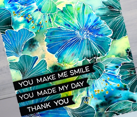
After embossing the large stamp on hot pressed watercolour paper in white I sprinkled cerulean blue, lemon yellow and terre verte powder sparingly on the panel. I tried to be a little strategic in my placement of the colours, as much as you can with something as unpredictable and airborne as a paint powder! I sprinkled blue in the half flowers, green and blue in the full flowers and yellow in the spaces. ‘Really?’, I hear you say! I know colorburst powders don’t always stay in their lanes but I was happy with all the pretty blends and patterns anyway.
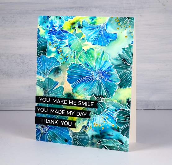
There are some little anthers coming out of a few flowers which I coloured with a gold gel pen. I used three sentiments from another MFT set, ‘all about you’, embossed in white on black then popped them up down the side of my panel. You’ll be seeing more of this pretty stamp; it’s a fun one! Thank you Foiled Fox for sending it my way.
Join my online class COLOUR CLUES to create beautiful eye-catching cards!
Supplies
 End –>
Golden Delight
Posted: October 8, 2019 Filed under: Color Burst, golden delight | Tags: color burst, Penny Black creative dies, Penny Black stamps 5 Comments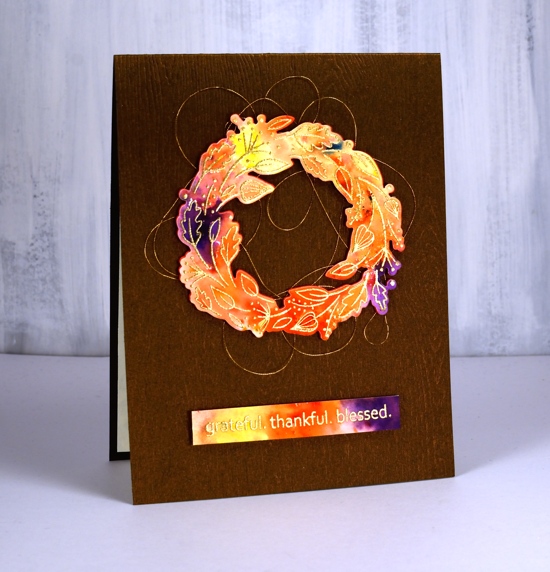
I decided to let the colorburst paint powders do the colouring for me on this cute little wreath from Penny Black. I embossed the wreath in gold on hot pressed watercolour paper and embossed the sentiment at the same time.
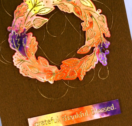
I sprinkled four colours of Ken Oliver’s colorburst powders over the embossing then spritzed with water and watched the colours emerge and spread. I helped them out a little with a paintbrush so paint filled every nook and cranny. Once the panel was dry I die cut the wreath and trimmed the sentiment to the right size then cut a wreath from adhesive backed foam also to pop up the watercoloured one. Before I attached the wreath to the card base I looped some gold embroidery thread back and forth around the wreath letting the adhesive hold it in place.
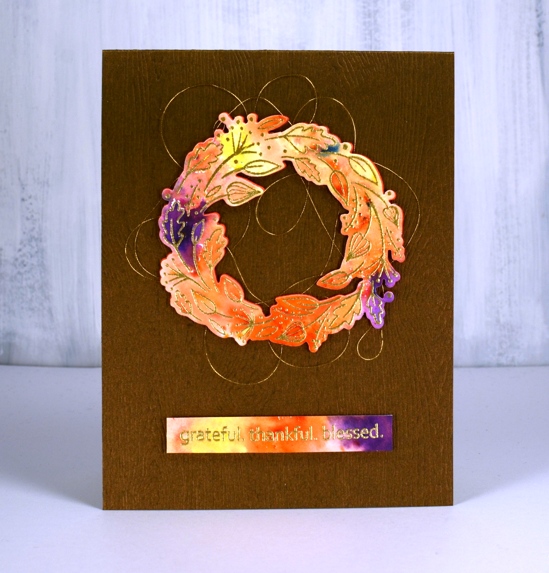
The woodgrained card base not only has texture it also has a little bronze shimmer to it. I bought it from my local scrapbooking store but you could get the same effect with a woodgrain embossing folder.
Feeling grateful, thankful and blessed to be part of this encouraging and inspiring community.
Supplies
Effulgence note
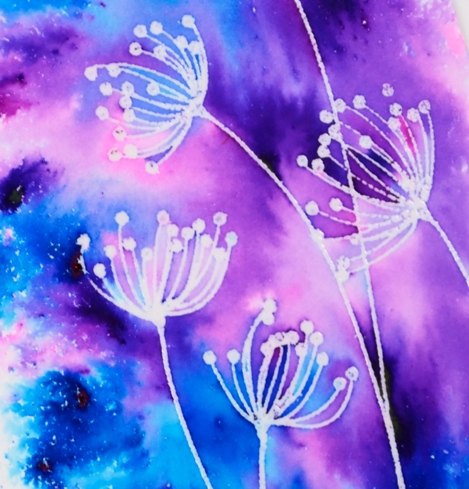
Posted: February 7, 2017 Filed under: Color Burst, Effulgence | Tags: color burst, Penny Black stamps, WOW embossing powders 13 Comments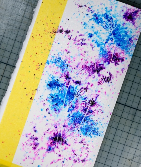
When I was making my pink and gold love card last week I had two panels on the go. I created both using the emboss resist method along with colorburst powders. I didn’t do too much blending on this one so the patterns the powders made after I’d spritzed them remain, especially on the left hand side of the panel.
I embossed the ‘Effulgence’ stamp on hot pressed watercolour paper in clear powder then sprinkled ultramarine and violet colorburst powders over the panel. I spritzed the panel from above and watched the colour move before adding any more powder or water.
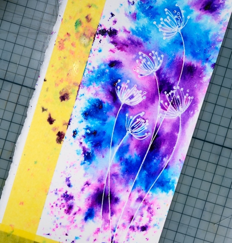
I wanted the area around the flowers to be completely covered in paint so I blended some areas with a paintbrush. Around the edges I left it abstract. The panel was very tall and thin so I ended up with a tall thin card finished with a sentiment popped up over the flower stems.
Supplies:
Stamps: effulgence, sentiment collection (PB)
Paint: violet & ultramarine Colorburst watercolor powder (Ken Oliver)
Cardstock: hot pressed watercolour paper
Ink: versamark (tsukineko)
Also: clear embossing powder
Lovely Neighbourhood
Posted: February 1, 2017 Filed under: Color Burst, Neighborhood love | Tags: color burst, Fabriano Watercolour Paper, Penny Black creative dies, Penny Black stamps 2 Comments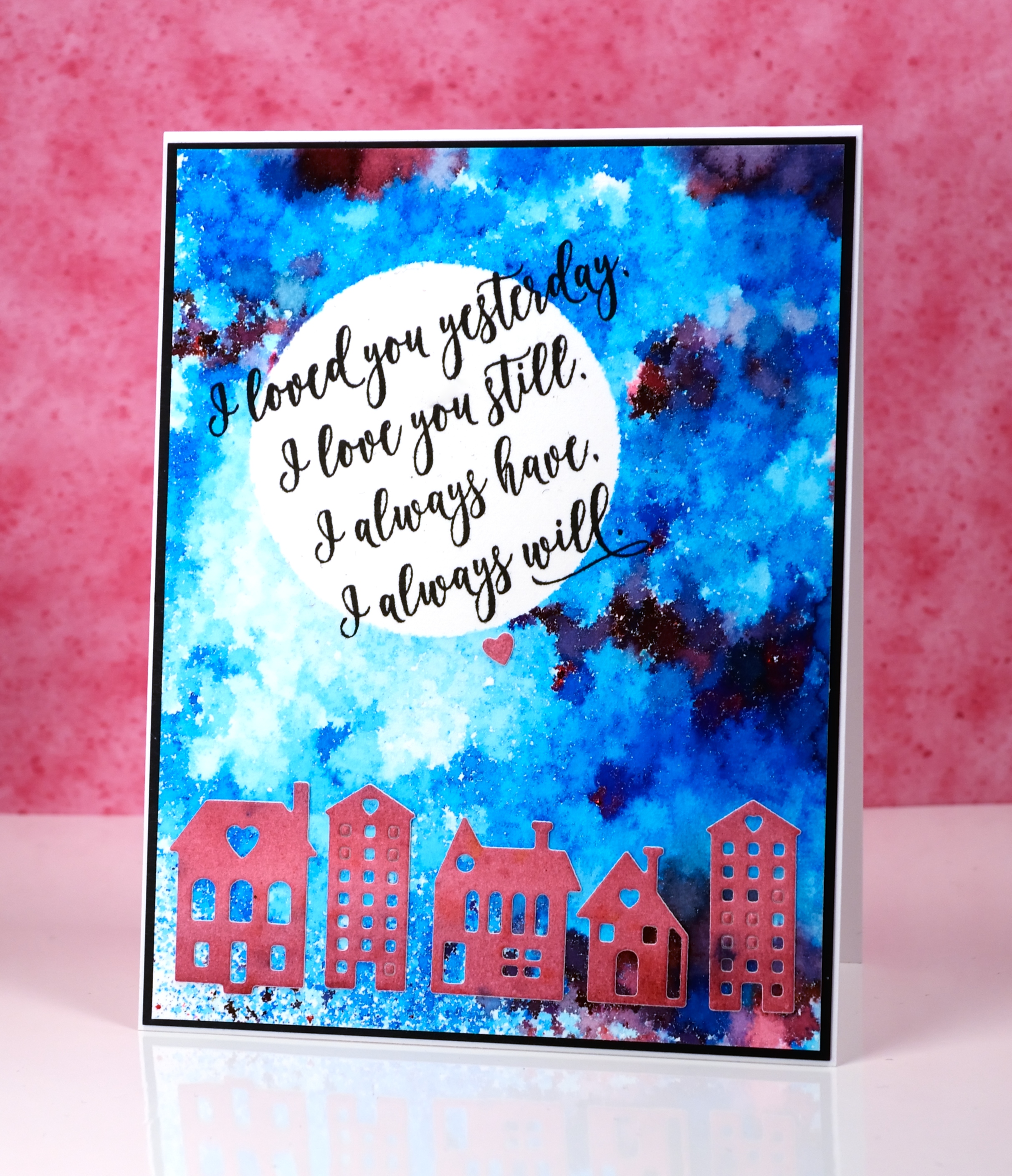
These cute little dies are part of a set called Neighborhood love; I love the little house and building dies Penny Black has brought out even though they challenge my fear of the fiddly factor. I started this card by positioning a frisket film circle mask on a piece of watercolour paper. I sprinkled ultramarine blue powder and a tiny bit of merlot over the panel and spritzed it lightly from above. I spritzed only until I could see some patterns appearing but stopped before all the spots of colour started joining together. I used a heat tool to dry it, pointing the tool down at the panel not from the side to reduce the chance of the wet paint moving across the panel. It reminds me of a mosaic.
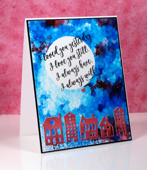
I painted another small piece of watercolour paper with merlot colorburst powder then die cut the buildings from the piece and attached them across the bottom of the panel.
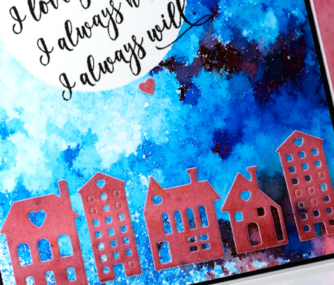
I removed the mask then wanted to hand letter a sentiment inside the moon; I ended up not being game and chose this sweet sentiment from the ‘forever & always’ set.
Supplies:
Stamps: Forever & Always (PB)
Die: Neighborhood Love (PB)
Paints: Merlot & Ultramarine Blue Colorburst powders (Ken Oliver)
Inks: Versafine onyx black ink (Tsukineko)
Cardstock: hot pressed watercolour paper, neenah epic black cardstock
Also: Grafix frisket film
Gold love
Posted: January 31, 2017 Filed under: Color Burst, Effulgence, Guest design | Tags: color burst, Penny Black stamps, WOW embossing powders 12 Comments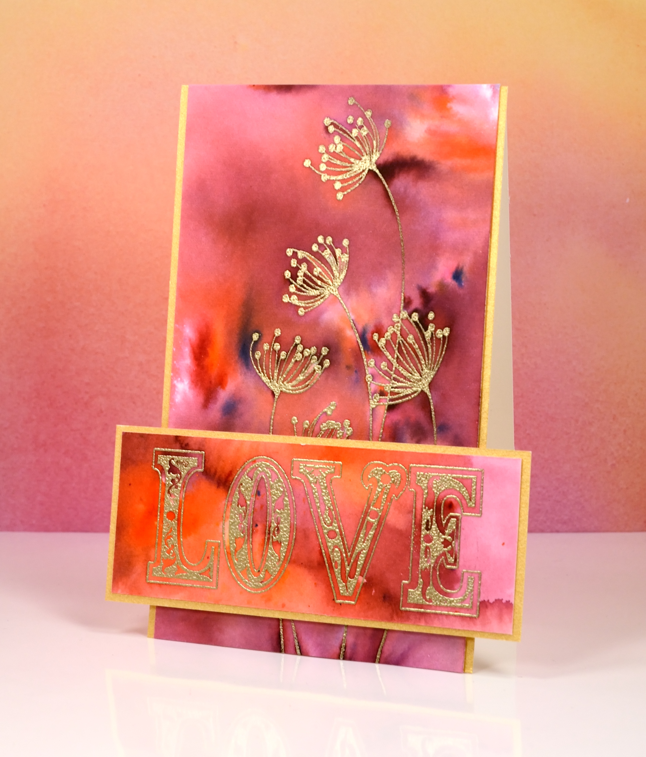
I’m thrilled to be a guest on The Foiled Fox blog today. If you have never visited The Foiled Fox you absolutely should; their blog is full of delightful projects and their shop is stocked with all the good stuff, paints, inks, stamps, markers, tools…and so much more. To find out more about this card just pop over to The Foiled Fox where there are some more pics and details.
Supplies:
Stamps: effulgence, all about love(PB)
Paint: Merlot & Tangerine Colorburst watercolor powder (Ken Oliver)
Cardstock: hot pressed watercolour paper, gold shimmer
Ink: versamark (tsukineko)
Also: gold embossing powder
Powdered snowflakes
Posted: January 20, 2017 Filed under: All is Bright, Color Burst, Soft Grace | Tags: color burst, Penny Black stamps 19 Comments
The keyword for the January challenge over at CAS watercolour is snowflake and there are a few days left to participate. I have very simple looking cards to share but they are not quite so simple to make. There is a bit of trial and error involved in order to avoid a colourful mess. To create these two little cards I used what I like to call the ‘water stamping technique’. I stamped with only water then lightly sprinkled colorburst powder over the water stamped image. I left it alone to dry then shook off any extra powder that hadn’t been activated by the water.
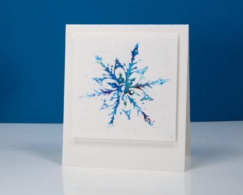
The problem comes when you have too little or too much water. Too little gives you an incomplete image, too much and you get a mess! I applied water to my stamp with a paint brush rather than a spritzer and stamped on watercolour paper. It’s a fun technique to try and won’t really deplete your supply of materials too much!
Supplies:
Stamps: All is bright, Soft Grace (PB)
Paint: Colorburst watercolor powder (Ken Oliver)
Cardstock: hot pressed watercolour paper
Mid winter sky
Posted: January 12, 2017 Filed under: Color Burst, Into the sky | Tags: color burst, liquid metals, Penny Black stamps, Tsukineko Versafine inks 13 Comments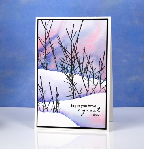
The sky has been very pretty around dusk lately, not the deep colours in today’s card but a soft apricot glow on the horizon along with yellows, pinks and blues. I used Colorburst powders to create this sky and the shadows between the snow banks. First I positioned a torn post-it mask across the watercolour panel and stamped the ‘into the sky’ branches over the mask. I removed the mask and repositioned it lower down and stamped some more branches on the right then finally placed the mask even further down the panel and stamped the tips of the branches on the left, all in versafine black ink.
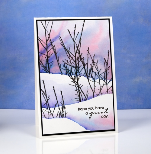
Once the ink was dry I painted the sky in the top portion of the panel making sure I kept the paint above the bottoms of the branches. I tilted the panel to let the pinks and blues mix into patterns and new shades. I did the same behind the remaining branches but did not paint right up to the top of the snow bank above.
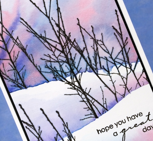
I mixed the paint powders in a palette and added platinum liquid metal for a little shimmer and sparkle. I hope the beauty around you inspires you today.
Supplies:
Stamps: Into the sky, Amazing (PB)
Paints: Alizarin Crimson, Indigo & Ultramarine Blue Colorburst powders (Ken Oliver)
Inks: Versafine onyx black ink (Tsukineko)
Cardstock: hot pressed watercolour paper, neenah epic black cardstock
Also: Platinum Liquid Metal (Ken Oliver)
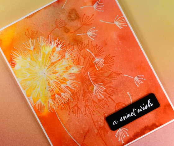
Dandee Wishes
Posted: August 2, 2016 Filed under: Brusho, Color Burst, Dandee | Tags: Brusho, color burst, liquid metals, Penny Black stamps, Tsukineko Versafine inks 20 Comments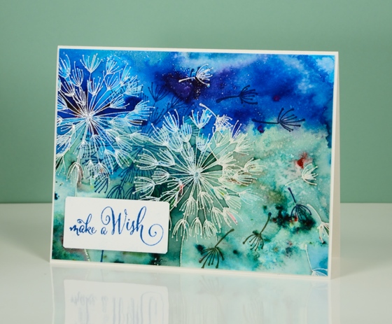
This is the birthday card we gave our older daughter today.

I painted the panel a while ago but just turned it into a card for her birthday. Both this blue one and the orange one further down the page were emboss resist experiments. What is fun with emboss resist and watercolour powders is the variation and depth of colour changes from one side of an embossed line to another. To see an awesome example of this, check out Lindsey’s card.
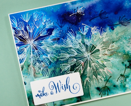
For both colour schemes I embossed the dandee stamps in clear powder on watercolour paper. I sprinkled blue and green brusho powders on the one above then spritzed water to activate the powders. I used a paintbrush to do some colour moving but not much; most of the design is the magic of the paint.
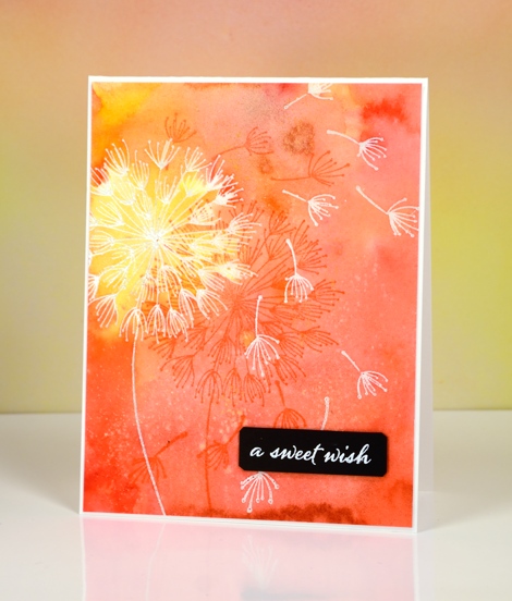
The orange and yellow card was done in a similar fashion but I used colorburst powders and added some yellow gold liquid metal when I added water. There is a shimmery patch of colour as well as specks of gold in real life.
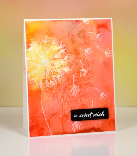
When I came back to the panels the other day I stamped the dandee stamps again over the panel in versafine inks and added popped up sentiments.
Thanks for dropping by.
Supplies:
Stamps: A Sweet Day, Dandee, Happy Snippets (PB)
Paints: Colorburst powders and Liquid Metals (Ken Oliver) Brusho powders (Colourcraft)
Inks: Versamark, Versafine Habanero, Deep Lagoon, Majestic Blue, Olympia Green(Tsukineko)
Cardstock: Fabriano 100% cotton hot pressed watercolour paper, Neenah epic black
Also: clear embossing powder, white embossing powder
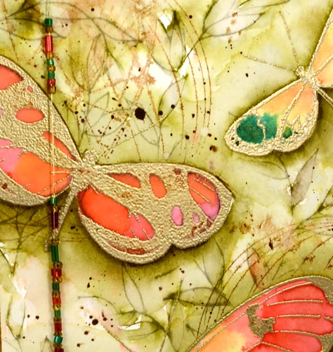
Limberlost card
Posted: July 8, 2016 Filed under: Butterfly trio, Color Burst, Time, Wondrous | Tags: color burst, Penny Black stamps, Ranger Distress stains 28 Comments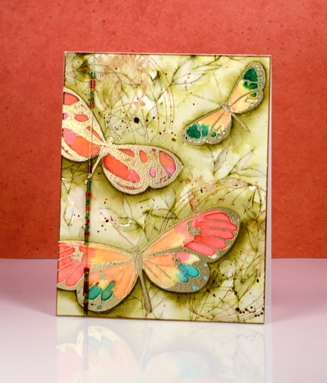
Earlier in the week I posted my art journal page inspired by ‘A Girl of the Limberlost‘. After completing the page I wanted to create a card with a similar feel. When I created my first book inspired journal page (The Lion, the Witch and the Wardrobe) I created the card first then expanded the scene into a double page. This time I am working the other way round.
I created the butterflies the same way as shown on the video but directly on the watercolour panel. I used gold embossing powder and changed the colour palette for the wings. I stamped the butterflies again on label paper and cut them out to make masks to protect the painted butterflies while I stamped and coloured the background foliage. This panel was my colouring for day#3 of Kathy Racoosin’s 30 day colouring challenge.
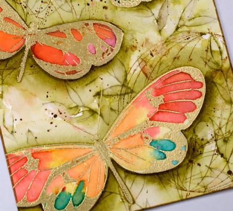
I used the large leafy outline stamp, Wondrous, inked with forest moss distress stain to fill the background with leaves then painted forest moss stain in and around the leaves. I painted extra layers around the edges of the butterflies to lift them a little. When that all dried I stamped on of the new ‘time’ stamps and spritzed it so it would bleed into the background. To finish the background I splattered some dark brown stain and some water.
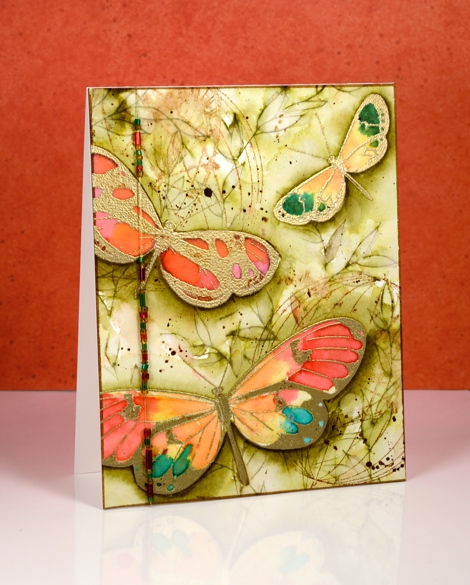
The panel was already quite large so I decided not to mat it in a co-ordinating colour. Instead I chose to string some beads on a gold thread and attach that down the side of the card. Thank you for all your generous comments this week. I am thrilled you enjoy what I share here and always love to hear from you. I was very interested to read that several of you enjoyed ‘A Girl of the Limberlost” as much as I did.
Supplies
Stamps: Butterfly trio, Time, Wondrous (PB)
Ink: Versamark ink, (Tsukineko) vintage photo, forest moss distress ink and stain
Paints: Colorburst alizarin crimson, merlot, tangerine, phthalo green and liquid metal yellow gold, iron oxide (Ken Oliver)
Paper: hot pressed Fabriano watercolour paper, Neenah Epic black cardstock, vellum
Also: gold embossing powder, gold thread, seed beads
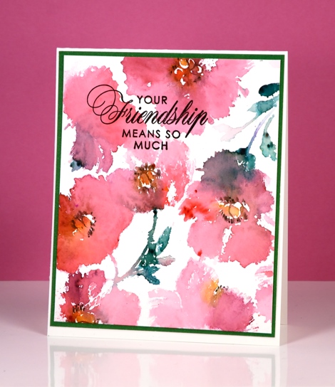
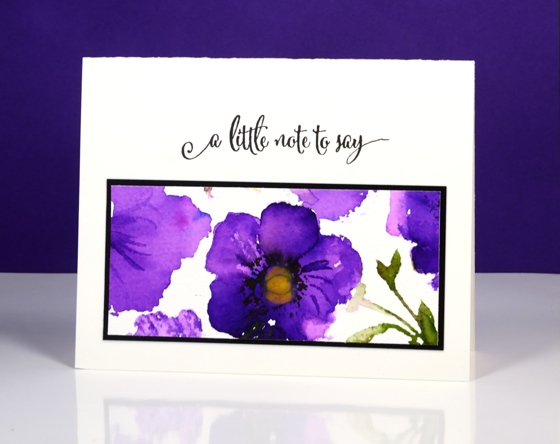
Poppy Pattern Party
Posted: May 3, 2016 Filed under: Color Burst, Poppy Pattern | Tags: color burst, Penny Black creative dies, Penny Black stamps, Ranger Distress stains 15 Comments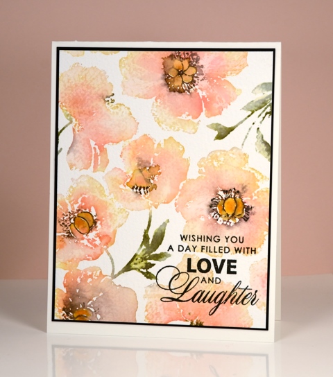
It’s the poppy pattern stamp’s turn to be featured today. I have a variety of colour schemes but only two mediums. The most subdued version is the one above done with forest moss, worn lipstick and scattered straw distress stains plus a black marker to add definition to the poppy centres once the stains had dried a little. I used a MISTI to add colours one at a time.
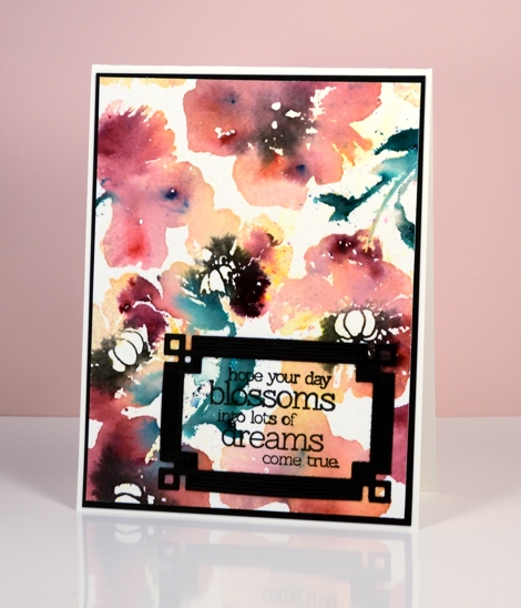
The remaining cards were all done with colour burst powders dropped onto water stamping. You lose a lot of definition with this technique but you achieve some gorgeous bold colours and in some cases some magical blending. Above I used phthalo green, lemon yellow and merlot (I think). Below it was probably alizarin crimson.
The bright purple panel below was the one section I saved from the large stamped image. I stamped it with water but when I went to sprinkle violet colorburst powder I got a little more than I bargained for. I let it dry, then chose one section to touch up, trim and turn into a card.
Supplies:
Stamps: Poppy Pattern, Special Wishes, Friendship, Sentiment Collection (PB)
Dies: Deco Frame (PB)
Mediums: Versafine onyx black (Tsukineko) distress stains (Ranger) Colorburst powders (Ken Oliver)
Cardstock: Fabriano 100% cotton hot & cold pressed watercolour paper, Neenah Epic Black cardstock


